Adoxo Projekt—Type Foundry by Shillington Teacher
After years of being completely consumed by a fascination with type, it was no surprise that John Palowski decided to set up his very own type foundry, Adoxo Projekt. Whenever he’s not teaching on the full-time course in Manchester, John is busy dreaming up his next typeface. Keen to find out more we spoke with John about his process when creating a new typeface, his tips for students wishing to design their own type and what he’d ask his very own type hero if he ever got the chance.
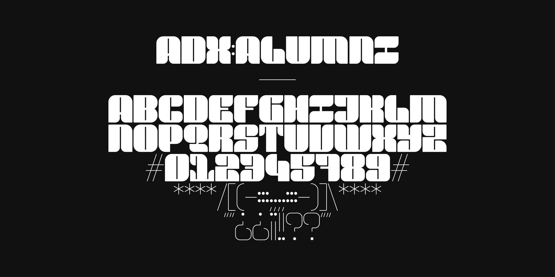
Scroll to the bottom for a free download of Adoxo Projekt’s new typeface, Alumni!
What’s the driving force behind Adoxo Projekt (ADX)? What made you want to set it up in the first place and what’s spurred on your creativity since?
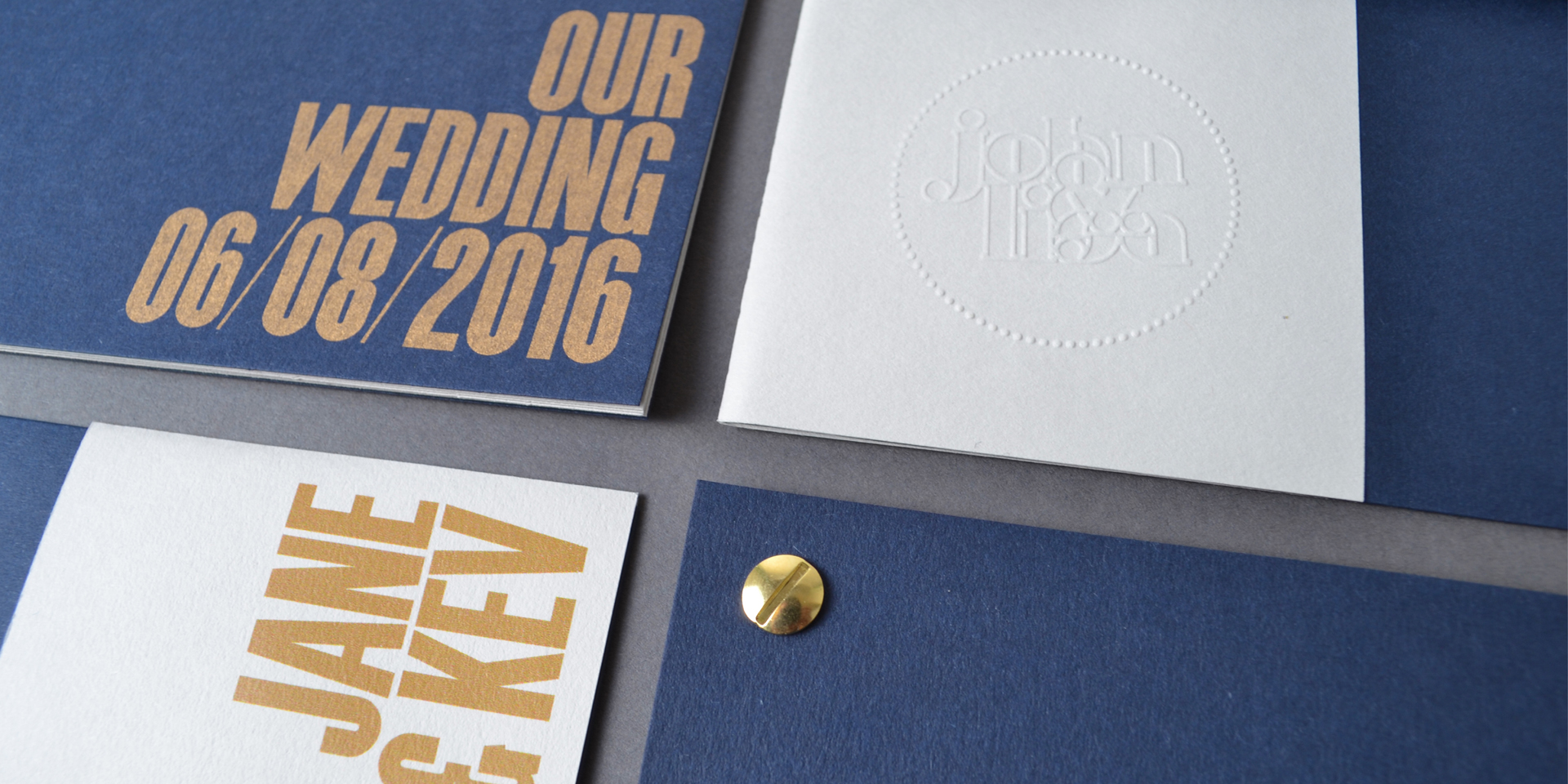
Initially it was set up as an gateway to my personal work and typeface experiments—things that needed a home, rather than poking about on social media or hiding on my desktop. I’ve always found value, comfort and therapy in personal projects. Ideas that are inspired by the enjoyment of residing and working in Manchester and living for adventures big and small, near and far.
I enjoy the reflection period after each episode, which then manifests into some kind of visual memento. Whether it’s a minimal postcard (for the Forgotten Postcards series), or a typeface based on a single event—I can look back and take a hit of pleasure from the memories they evoke, or help form stories that have yet to be told.
Is there a personal favourite within your type collection so far?
When I first started developing the collection, it was whichever one I was working on at the time. I wouldn’t leave my desk until I had the foundation of the character set mapped out (much to the annoyance of my Fiancée if it was a rare sunny day at the weekend). I became wholeheartedly invested in each typeface—until it was time to move onto the next. Then that one would instantly become my new favourite.
Now, as I have more and more on the go at the same time, my attention and passion for each is divided. Actually I’ve just had to have a quick count up to see what I’m up to. It appears that I have the basis for 29 typefaces completed (although not yet turned into fully functional fonts), with 16 more that are near on completion. It’s obviously getting out of hand.
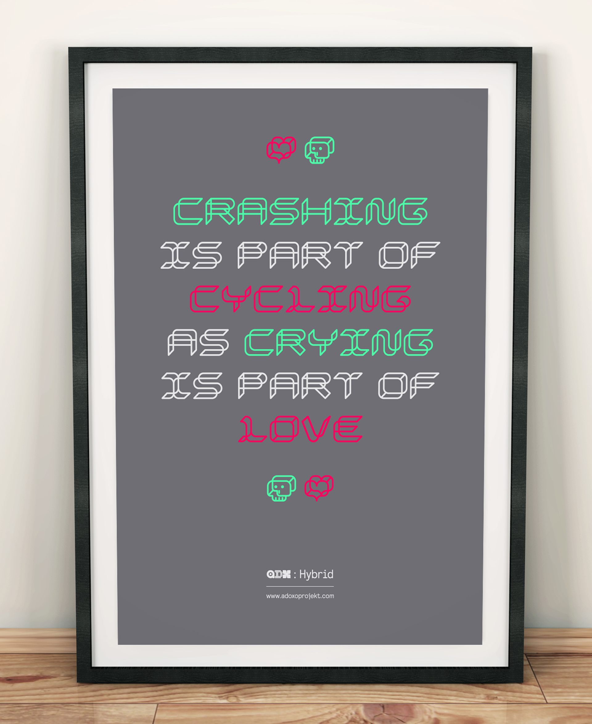
If I were to suggest a couple of favourites by looking at what story each typeface told and how it visually takes shape, I would have to say that ‘Ginnel’ perfectly sums up cherished childhood memories; whereby the more recent adventure that inspired ‘Newlands’, helps to remind me to move away from my Mac and get a little bit more bike fit!
A lot of the ADX typefaces embody a certain fluidity and even have a touch of otherworldliness about them. Given that you’ve animated a number of them do you envisage more of the typefaces being used in a motion graphics or three dimensional context?
It would be great to eventually see each typeface picked up by different creative bodies, who might use them in a variety of inspirational ways in their respective fields.
I think I’d get the same buzz if it were cut into a natural material or used in a computer game environment. That’s what part of this project is all about: making a collection available for other creatives to discover and utilise.

Can you take us through your process for designing a new typeface—from initial inspiration, to eventual refinement?
Although I’d like to say that there was a set method to the process—there isn’t. However they all do start with a story in mind. How that story is recalled, in terms of vivid (and sometimes not so vivid) memories and emotions, will then inspire an unique starting point for the development of that project.
A project stops being interesting when the process suddenly creeps into familiar territory, i.e. rules that I set myself become too closely linked with that of another project. Sometimes that can come right at the end when all 26 letters and 10 numbers have been developed. At that point, I’ll either scrap it or revisit the project with a fresh perspective at a later date. I don’t tend to get too precious about it.
What’s the ultimate goal for ADX, where do you see it heading in the future?
Throughout my whole life I have worked toward (long term) fixed goals. I think ADX has been a turning point, whereby things are set up a bit looser—intrigued by what unexpected doors it will open.
I’ve read inspirational advice from design greats (and other influential creatives) who speak highly of the notion that you should focus on the things that you truly enjoy doing. Now that doesn’t sound like a bad plan moving forward, does it?

Who are your type heroes—and do you have any burning questions you’d like to ask them?
I have a history of freaking out when I meet famous people, if I’ve not had a couple of calming beverages beforehand. So although I’d want to ask Wim Crouwel something about how he connected interesting typographic experiments to normal briefs, or what was the best client reaction he had ever received… I’d probably end up quizzing him about that famous silk space suit he proudly wore for a photo shoot in his Total Design studio back in 1969.
Would you encourage students interested in typography to have a stab at designing their own typeface? And any tips to help them along the way?
It’s a vital skill. Designing bespoke type is a neat little trick that designers should always have up their sleeve. It adds extra value and a real sense of ownership for the client. Whether it’s a few characters for a logo word mark; or a type-lock up for an editorial piece.
During the early stages of teaching Illustrator on the course—we introduce students to the process of designing bespoke type for a chosen theme, for something to experiment & have fun with. Many enjoy getting to grips with the process and the therapeutic qualities it can evoke.
We time it so it’s before we have even looked at the (often feared) Pen Tool—so it’s a perfect opportunity for students to investigate the relationships of combining simple geometric shapes and using a strong grid, to aid the sense of repetition and balance for each character they develop.
I always like to see students continue creating bits of type throughout the course, where often it makes it into their final portfolios. It can be a real talking point in future interviews—I mean, who doesn’t like a bit of beautifully crafted bespoke type, for a brief that was crying out for it?
To mark the launch of Adoxo Projekt’s new typeface, Alumni we’re giving it away as a free download, simply link the following link and install the font on your device. Download Alumni!
Head over to Adoxo Projekt to check out the full collection of typefaces, you can sign up to the newsletter to receive all the latest type news or follow on Twitter for regular updates. If you’re as crazy about type as John keep an eye out for our weekly #typetuesday posts on Instagram.
Posts you might like

One of the best things about graphic design is that it never stands still for a moment. But that does mean that keeping up with...
Are you a graphic designer who is finding themselves lacking skills, slow on one of the major graphic design programs or just...

https://www.youtube.com/watch?v=wZ_tffGtZMs New York graduate Simon Fréour worked as a software engineer in France for seven...
Are you working with graphic designers day-to-day and finding yourself jealous of the work they're doing? You're certainly not...
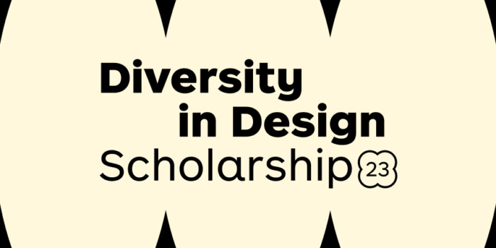
Diversity in design is an important topic to us at Shillington and we aim to support and strengthen equity by cultivating...
Last year Shillington launched, for the first time, our Diversity in Design Full Scholarship opportunities—in New York City,...
Diversity in design is an important topic to us at Shillington and we aim to support and strengthen equity by cultivating...

Last year Shillington launched, for the first time, our Diversity in Design Full Scholarship opportunities—in New York City,...
Want to win some amazing prizes and stay in the loop with all things Shillington? Sign up to our newsletter to automatically go in the draw.