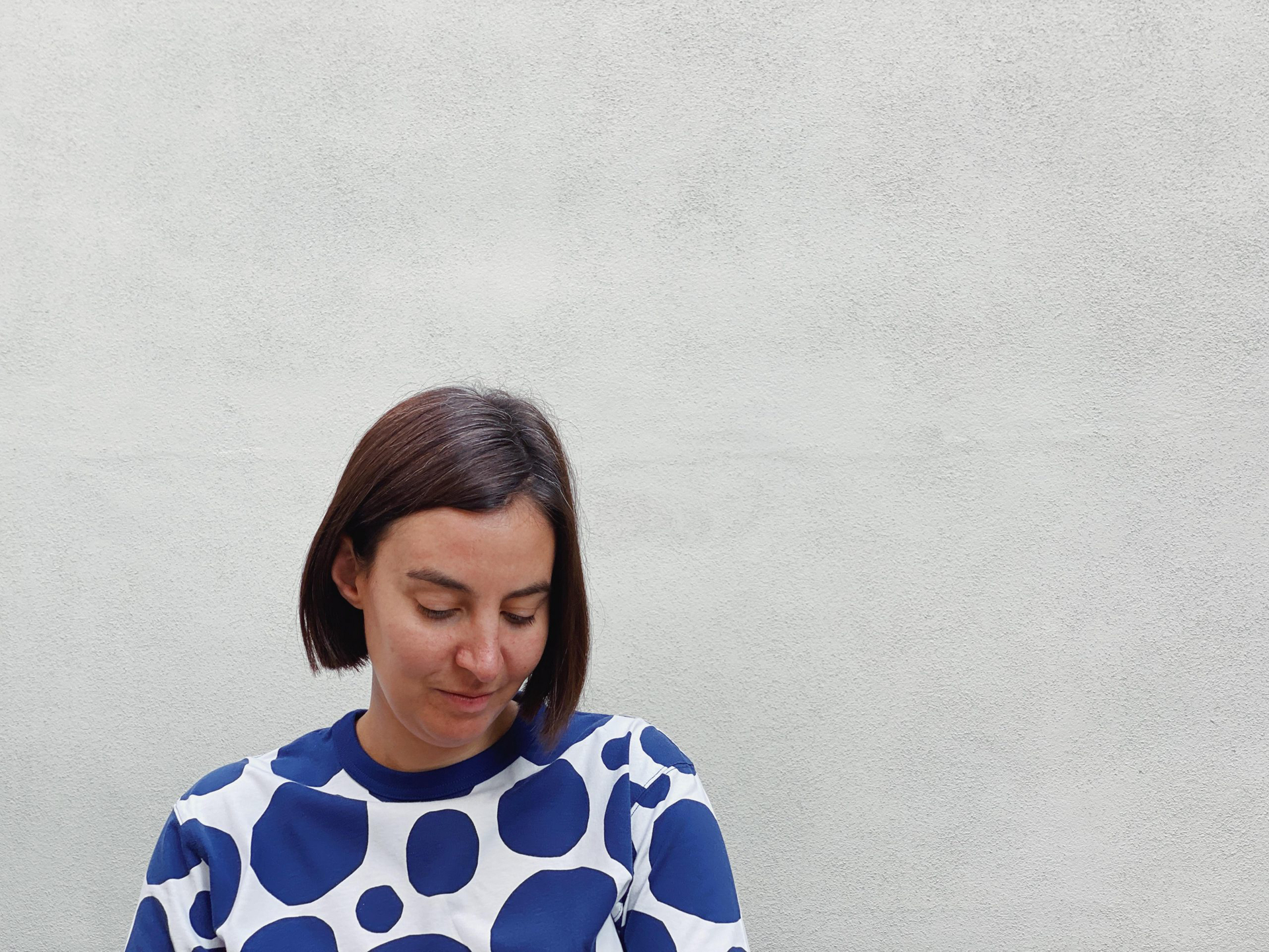
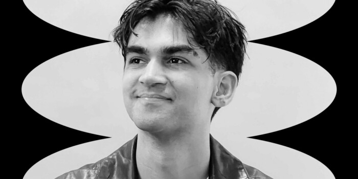
Interview with Alessia Mazzarella, Co-Founder and Designer at Typeland
After falling in love with designing typefaces on her degree, Alessia Mazzarella embarked on a Master’s in Typeface Design where she met her partner Vaibhav Singh and the rest, as they say, is history. The pair founded Typeland, a design studio specialising in typeface design. The type-loving duo create custom fonts, and offer flexible font licensing for their retail typefaces. Alessia recently joined our Shillington London students for a guest lecture about all things type—and she’s also the newest member of our part-time teaching team in London!
Read on to find out more about her design and type adventures, her favourite letters and some top notch advice for budding type designers.
Can you tell us about your design journey so far? How did you get to opening Typeland?
I have a background in graphic design. I realised during my BA at Central Saint Martins that all my projects had a strong emphasis on typography and I wanted to learn more about making typefaces. I took my interest forward with an MA in Typeface Design at the University of Reading. I started working as a freelance type designer after graduating and then went into full-time employment in UK based type foundries. These were extremely valuable experiences and I also got to learn more about running a business, liaising with clients, and managing project budgets. These things were all new to me but I benefitted from facing challenges quite early on and taking on significant responsibilities.
As a designer, I’ve always had this ambition and desire of creating something that embodied my vision from the very early conceptual stages right to the end. This resulted in slowly laying down the foundations for an independent practice, Typeland, which I finally launched with my partner Vaibhav a couple of years ago.
How did you and Vaibhav end up working together? What’s his design background?
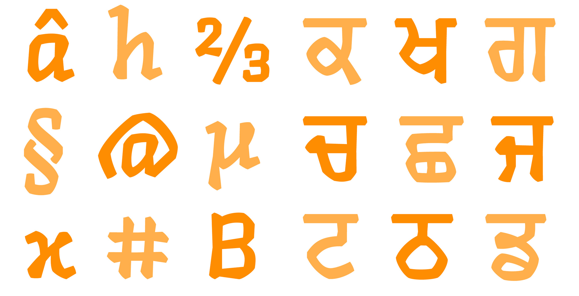
Vaibhav is a typographer and typeface designer. He has wide-ranging interests in design with a background spanning architecture, visual communication, book design, film & video and exhibition design. He specialises in designing typefaces for Indian scripts in addition to developing Latin typefaces. He did his MA in Typeface Design and PhD at the University of Reading, which is where we met. An interest in research-informed practice is something we both share from our time at Reading. Vaibhav is also the editor and publisher of the journal Contextual Alternate, an independent initiative for research at the various intersections of technology, design, and history.
In your lecture, you said that you don’t refer to Typeland as a type foundry. Why is this? What do you see yourselves as?
We prefer the term type design studio. A type foundry not only suggests the kind of metalwork that we aren’t capable of, but it also implies the kind of tradition and practice that we don’t necessarily associate with.
While we are deeply interested in history and historical research, we don’t take a nostalgic view of type founding, or the tradition of work that it implies.
We think our vocabulary needs to reflect the distance that exists between two entirely different kinds of work, in different periods of time. Our practice sits within the framework of a design studio for now, when this changes we would like to find other ways to think about it.
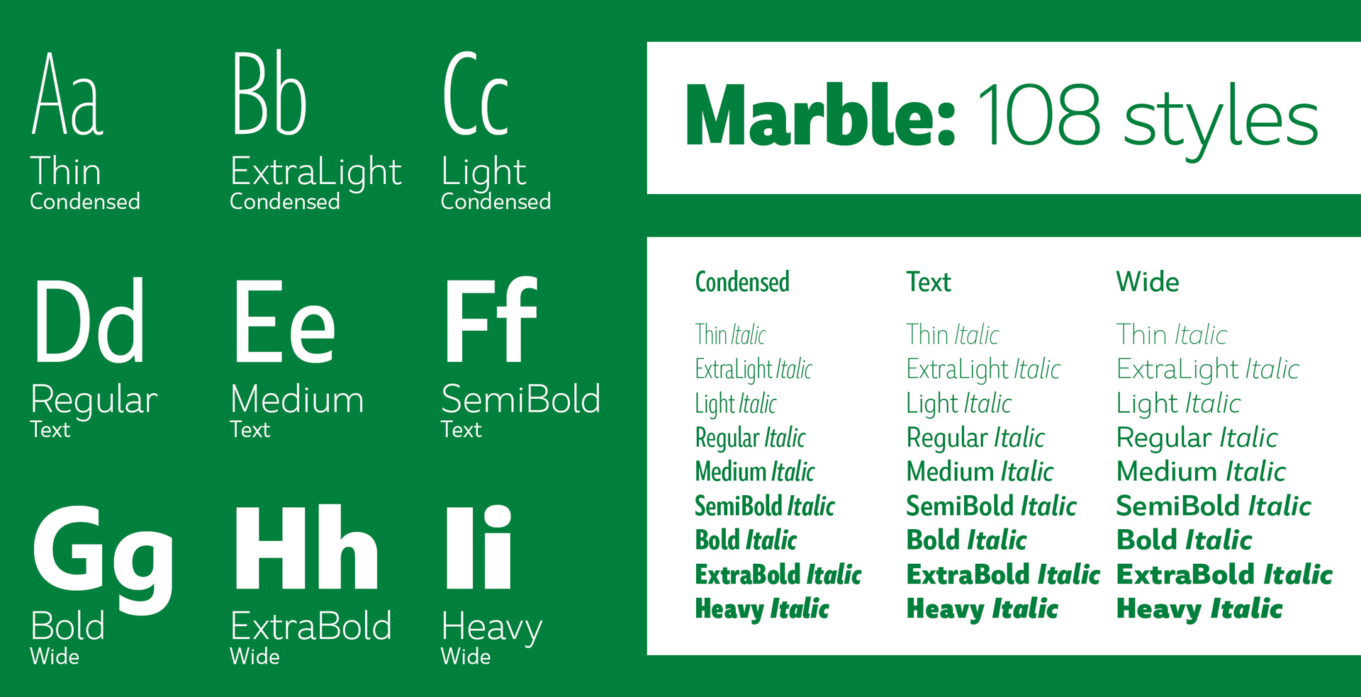
Can you tell us about some of your favourite typefaces you’ve designed? Do you have your own particular favourite?
I don’t have a favourite—how can I? it would be unfair! The development of most of the typefaces I’ve worked on has stretched for long periods of time and it’s sometimes difficult to separate the beginning of one or the end of another.
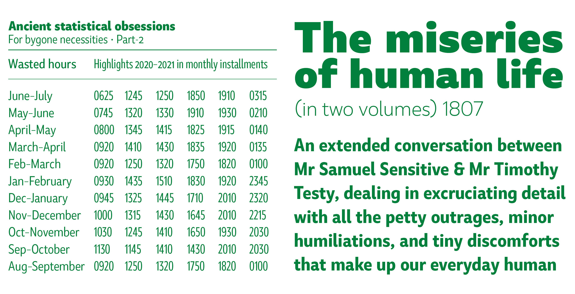
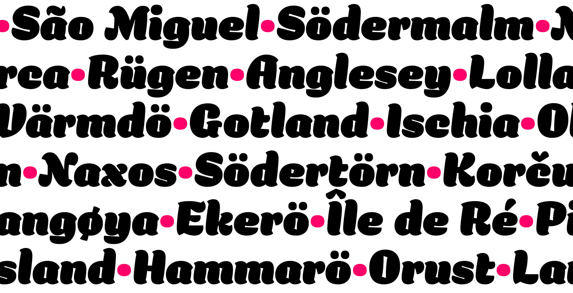
That being said, Balbum is something I am particularly attached to, as it departs from my usual work with text typefaces and I could be more experimental with the shapes. It’s a display design so the boundaries for expressive interpretation are more open.
I’m now working on a new design that I started during the first lockdown—the concept has to do with the idea of space, and the lack of space, but more directly I was also inspired by the old warehouses and buildings I’d see during long walks in south London.
As we’re sure there’s some budding typeface designers reading this, could you share your process? How do you go about designing a typeface from scratch?
I start from pretty abstract inspiration—this is often a general idea, or the feel of a shape or texture. I steer away from trends as much as possible.
Good typefaces have long lives, typefaces designed over a hundred years ago are still being used today (in updated versions and formats of course).
Type families can take a considerable amount of time to be finalised and released, and are often developed in between commissioned jobs.
I usually want to avoid as much as possible going back to the project and finding that it now feels outdated or not worth releasing anymore. Once I have an idea of what I’m trying to achieve I write it down, even if it’s a list of keywords. Then I start testing out how proportions, rough details, and rhythm work with a few key letters. When I’m happy with my prototype I continue with the work, with a good amount of questioning and iteration as things progress.
After your lecture, one of our students asked how you go about naming a typeface. Would you be able to go into this again for us?
We consider a few things when naming a typeface and have different approaches, no fixed solutions. I sometimes look for a connection between the name and the project. Often I use the name as an opportunity to showcase the most flavourful characters in the design, and I think of the sound of the word alongside that.
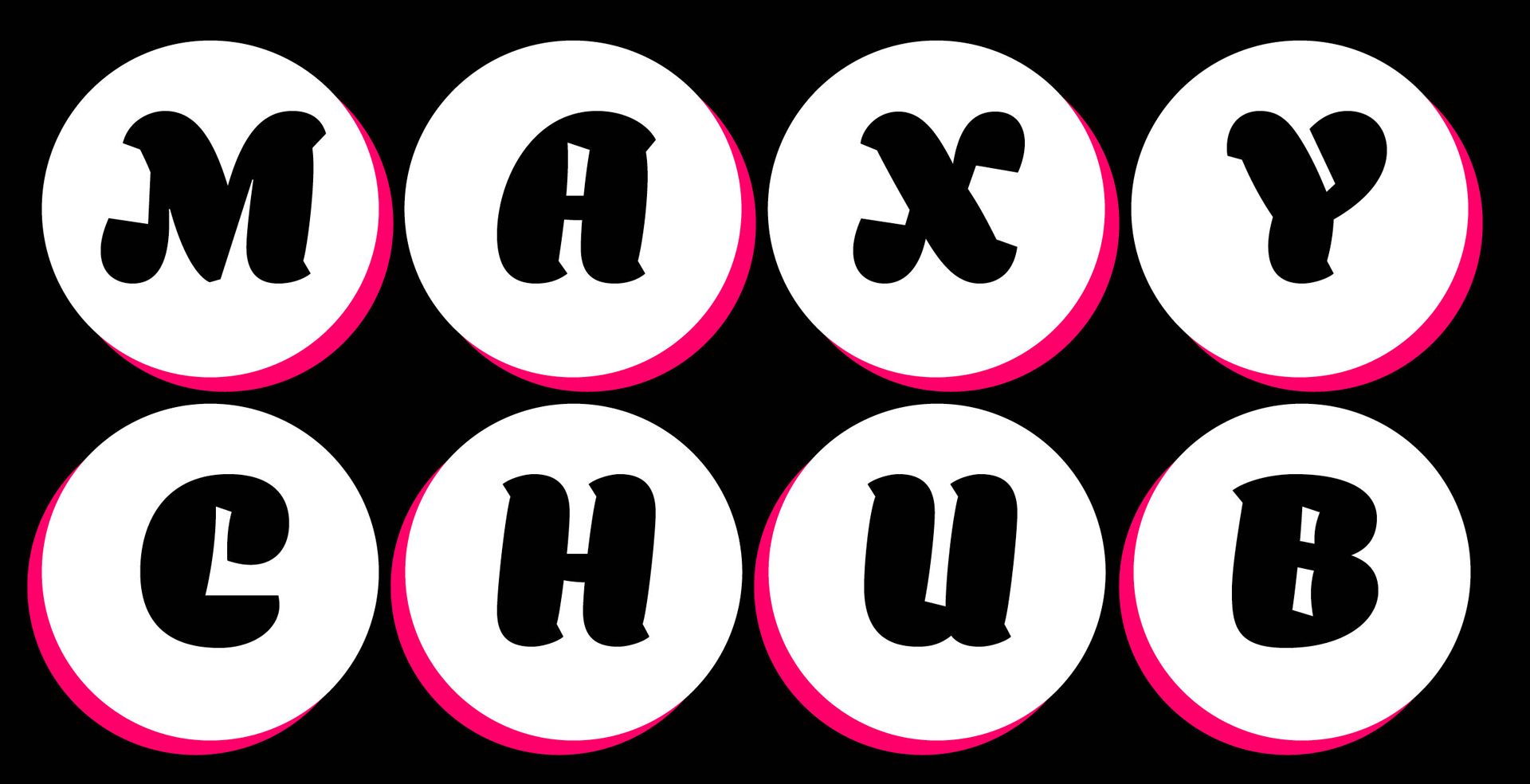
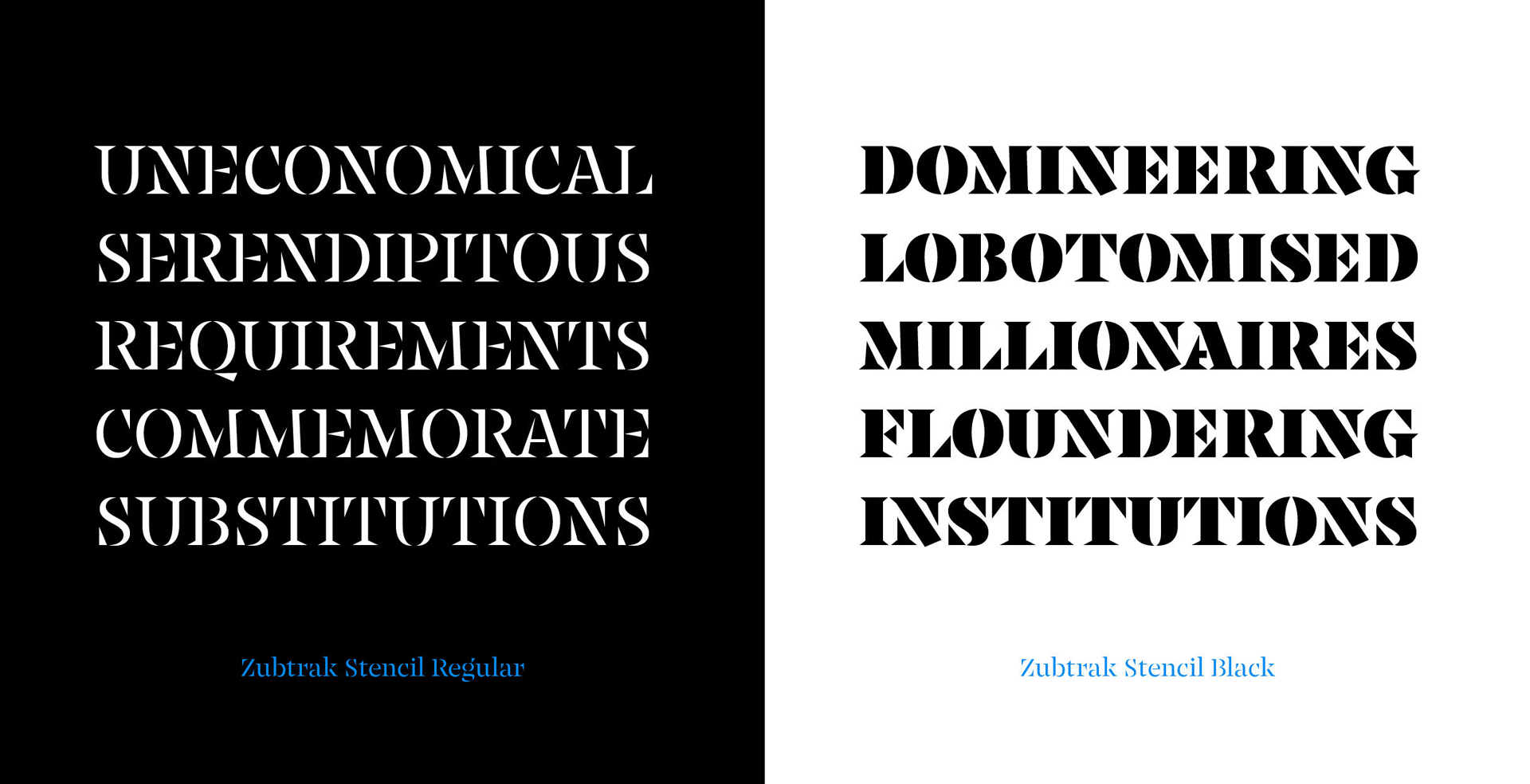
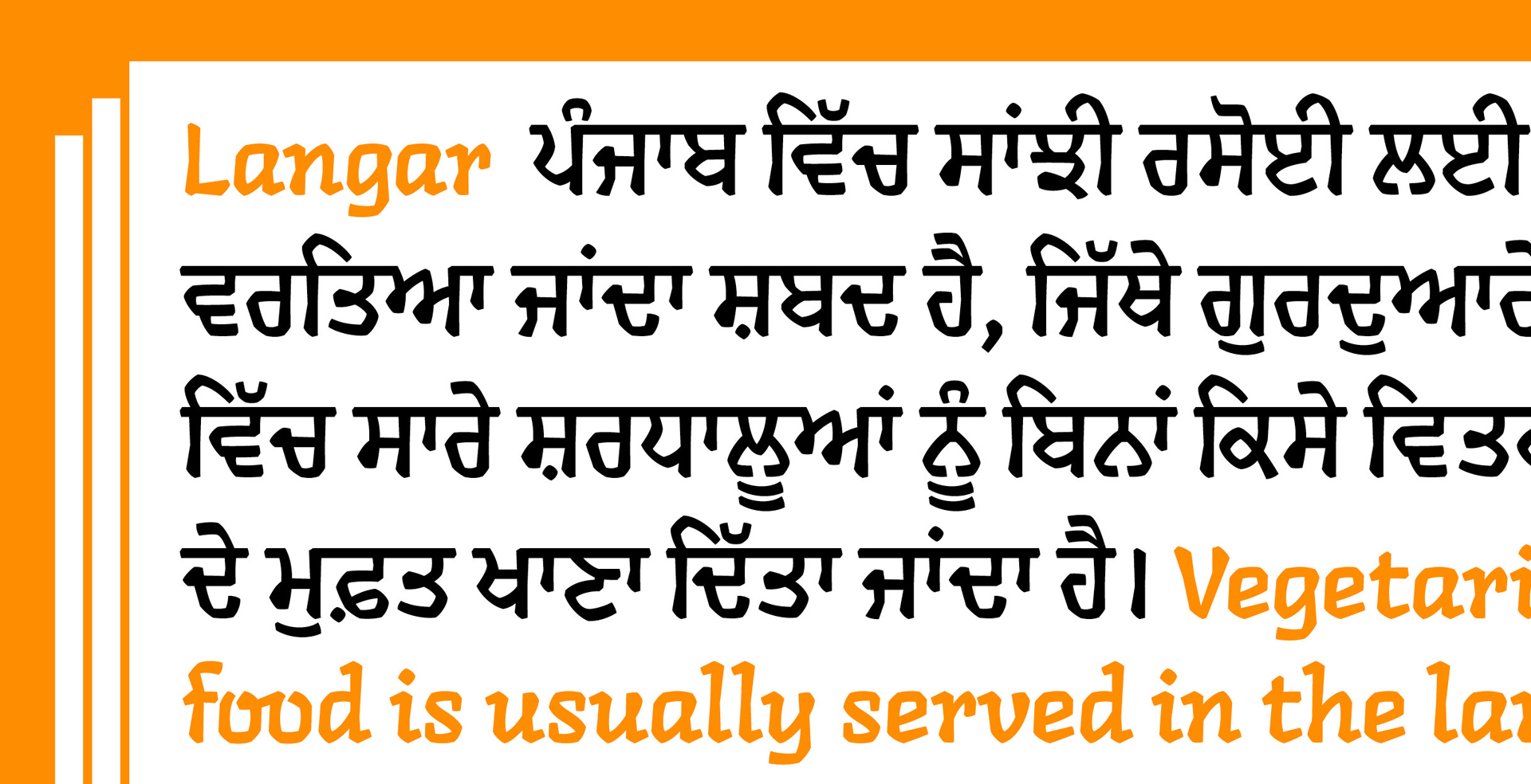
Some of the names can be verbal plays on things related to the process, or design history of the project—for example, Zubtrak is a play on the subtraction of the stencil design from Vaibhav’s student project into a standalone project, Langar refers to the community kitchen serving free meals at a Gurdwara since the font started with the Gurmukhi script and is freely available etc. But in any case, the name has to look and sound right for the visual feel that the typeface offers—at least to us!
Another student question was, as a typeface designer, what is your favourite letter (or character). We’d love to hear if you have one?
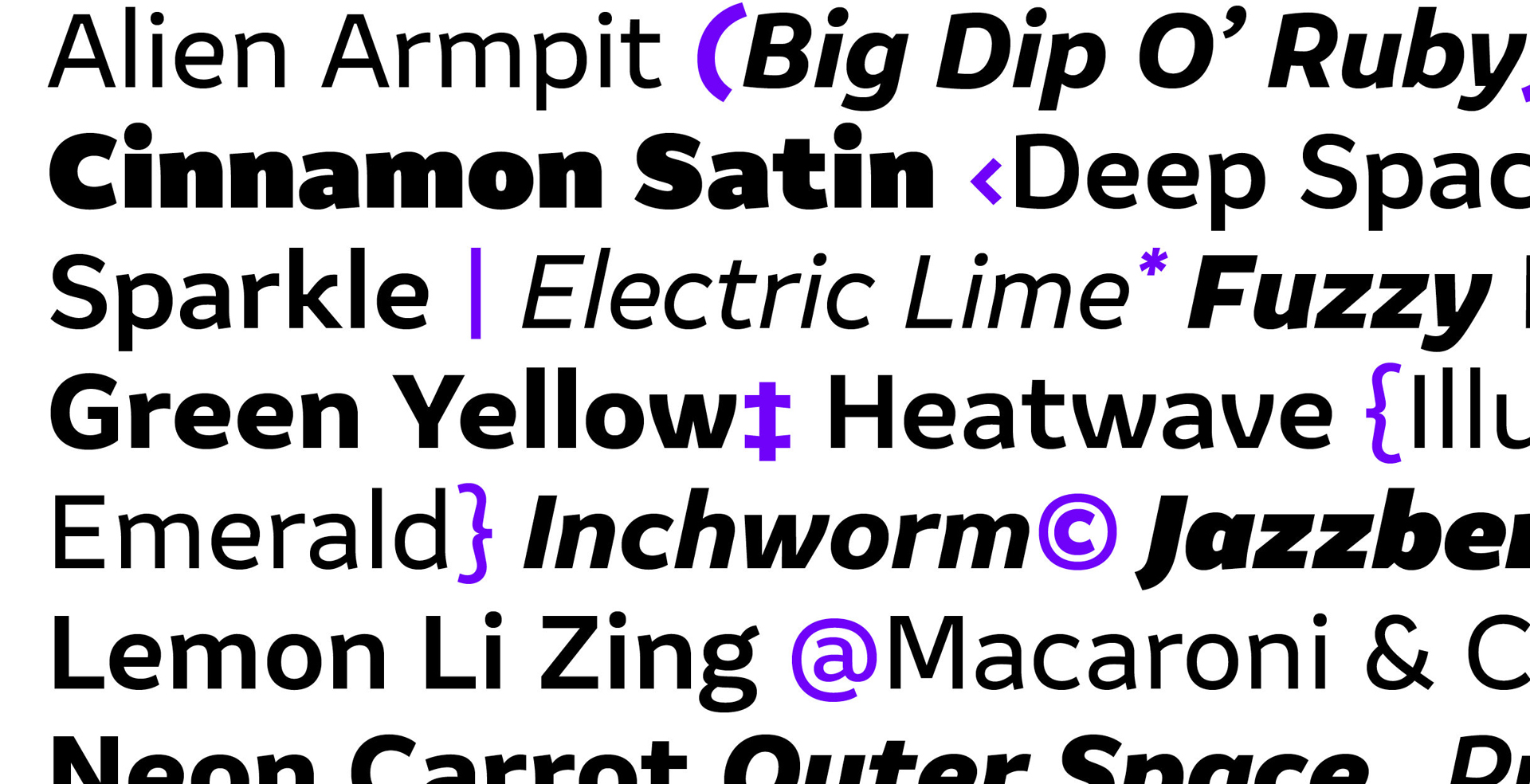
My favourite letter and my favourite letter to draw are very different answers! Lowercase double-storey ‘g’ and lowercase ‘s’ are my favourite letters, they have a lot of character and can be quite distinctive. But they are not my favourite letters to draw. Balancing a lowercase ‘s’ can turn into a long agonising process! And lowercase ‘g’ often seems like an invitation to go expressive when the design demands otherwise. But it is really satisfying when all this finally clicks together, not in isolation, but in relation to all the other letters. I usually start my designs with the lowercase ‘n’ and move to ‘o‘, ‘d’, and ‘a’. These shapes allow me to clarify a lot of the defining characteristics of a typeface early on in the process, and I can derive a lot more shapes from them.
What advice would you give a recent graduate who is looking to get into typeface design?
Don’t be afraid of jumping in headlong! There are several helpful communities for type design out there that can help you develop your work, no matter where you may be.
When drawing type, start with a simple, clearly defined process and don’t be afraid to experiment with forms. But most importantly, test in different contexts and don’t just design individual letters without reference to the whole.
Look closely at typefaces, analyse them, try and understand the logic, engage in conversation about why certain decisions were made and what effect they have on the design. Always draw with an objective in mind and don’t follow the latest trends, by the time the typeface is done the trends will have been replaced by some others anyway.
Finally, give us five words that describe you and your creative style.
Care, quietude, and honest work.
Huge thanks to Alessia for joining our London students for an amazing guest lecture, and for talking to us afterwards. Make sure to follow Typeland on Instagram and check out their website to keep an eye on any new projects.
We’ve hosted some of the world’s top creatives, design studios and advertising agencies at Shillington. Check out more interviews from guest lecturers.
Posts you might like
Are you a graphic designer who is finding themselves lacking skills, slow on one of the major graphic design programs or just...
https://www.youtube.com/watch?v=wZ_tffGtZMs New York graduate Simon Fréour worked as a software engineer in France for seven...
Are you working with graphic designers day-to-day and finding yourself jealous of the work they're doing? You're certainly not...
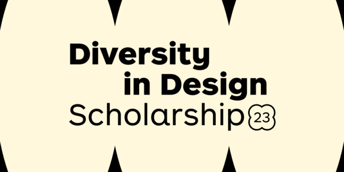
Diversity in design is an important topic to us at Shillington and we aim to support and strengthen equity by cultivating...
Last year Shillington launched, for the first time, our Diversity in Design Full Scholarship opportunities—in New York City,...
Diversity in design is an important topic to us at Shillington and we aim to support and strengthen equity by cultivating...
Last year Shillington launched, for the first time, our Diversity in Design Full Scholarship opportunities—in New York City,...
Diversity in design is an important topic to us at Shillington and we aim to support and strengthen equity by cultivating...
Want to win some amazing prizes and stay in the loop with all things Shillington? Sign up to our newsletter to automatically go in the draw.