Building an Icon Set from the Ground Up
We’re excited to welcome Anika George—part-time Shillington New York graduate and Graphic Designer at Nelson Cash NYC—as our newest guest author!
Last month, we helped the team at Signac with a completely new identity system. Signac works with financial institutions to strengthen employee supervision and reduce operational risk, and they do this by building technology that evolves alongside unauthorized trading methods and other risky activities, allowing institutions to detect and stop this behavior before it escalates.
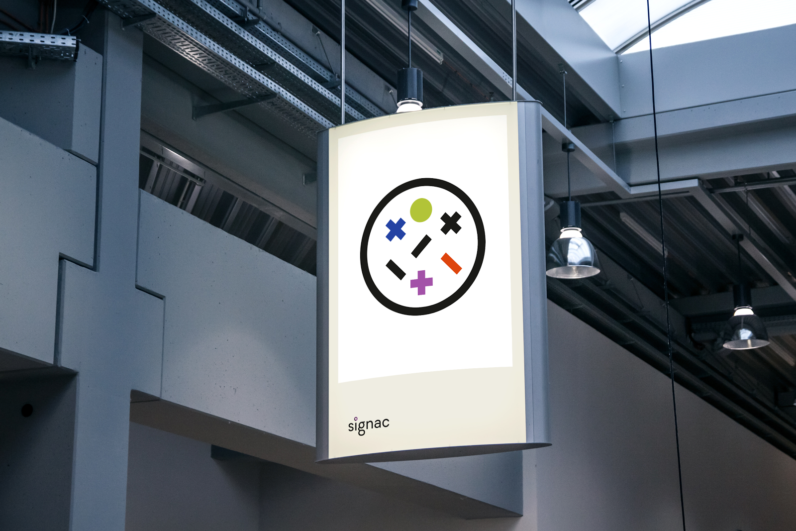
We abstracted the concept of spotting fraudulent activity within financial data sets to something as simple as dots in a grid.
This was inspired by some materials shared by the Signac team that included great examples of Swiss modernist style design. Abstract, geometric forms were used for a minimal look that established order, with pops of bright colors giving them an extra punch. We felt that this contrast was a good starting point for building out the icon set.

We were given 38 terms to create symbols for, ranging from the concrete to the abstract. Defining each term meant putting our Economics 101 hats on, digging deep into investopedia.com for jargon otherwise unfamiliar to the non-financial professional. After each word was clearly defined, a series of sketch sessions followed to begin resolving how each one would play out visually. More time was spent refining the concepts to their most granular form. The challenge here was to make each icon instantly recognizable, yet still hold true to the actual meaning of each.

The shapes we ended up building the set of icons around were x’s, + signs, squares, circles, slashes and triangles.
These simple forms were chosen for their ability to interact with one another to create more complex symbols.

The colors used were based on the larger Signac branding, with green representing a positive connotation; red, negative; blue representing technology and purple standing in for a neutral.


The result is an icon set that feels serious and corporate, but is far from dry and boring.
Read about the 4-day sprint we used to come up with the branding concept here.
This article was originally published on Medium.
Posts you might like
Looking to study in the Lone Star State? You won’t be alone, Texas is host to three of the United States’ most populated...
Looking to study graphic design along the Blue Ridge Appalachian Mountain range? North Carolina sits snuggled between Virginia...
Looking to expand your creative horizons? Want to study design surrounded by the beauty of nature? Look no further than...
Are you seeking a holistic introduction to the design industry, theory of practices, more exploratory projects for...
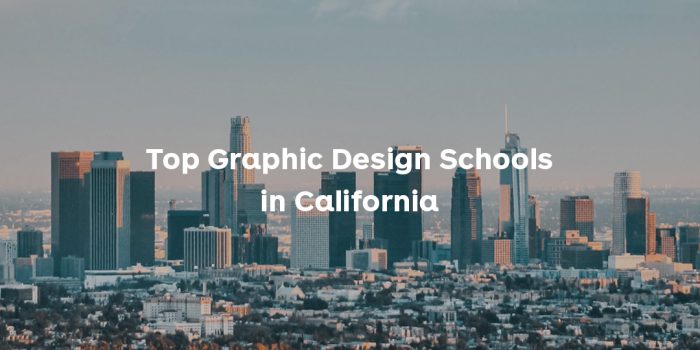
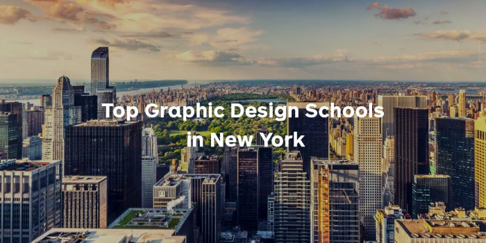
Are you based in the West Coast and looking to study graphic design? We’ve compiled a list of the top graphic design schools...

We’ve just launched our exciting 2022 Diversity in Design scholarship opportunities—open to aspiring designers from...
We’ve just launched our exciting 2022 Diversity in Design scholarship opportunities—open to aspiring designers from...
We’ve just launched our exciting 2022 Diversity in Design scholarship opportunities—open to aspiring designers from...
Want to win some amazing prizes and stay in the loop with all things Shillington? Sign up to our newsletter to automatically go in the draw.