#ILoveTheseGuys Creative Inspiration: Concept Arts
I love the work of the Concept Arts advertising agency.
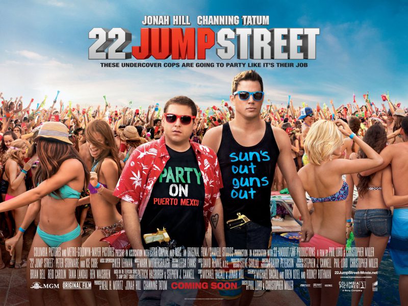
The type package in this particular project 22 Jump Street looks similar to what they would use on a NBA jersey. It’s definitely a contrast to what both characters are wearing. The use of shadowing in the title gives it a nice dimension and hierarchy to the sub heading. The actor’s names still stand out even when they are placed smaller on top of the movie title. ‘Jump’ being red adds so much depth and yet doesn’t take away from the whole title.
Posts you might like

One of the best things about graphic design is that it never stands still for a moment. But that does mean that keeping up with...

The best graphic design books can take you on an exciting journey of the imagination, transport you to new creative worlds or...

At Shillington, our dedicated graphic design students are taught all about how to design for packaging—from FMCG (that’s fast...

At Shillington, our graphic design course teaches students how to design campaigns for a brand, helping to spread its message....
Exposing yourself to examples of good graphic design is a healthy practice no matter who you are. Maybe you’re a student...
At Shillington, our graphic design bootcamp students are taught how to design for digital, incorporating aspects of both UI and...
We love graphic design. And we're guessing, as you're here, you love graphic design too. This means that we all love graphic...
In graphic design, quite a few decisions happen behind the scenes that clients may not grasp the importance of, yet have a huge...
Want to win some amazing prizes and stay in the loop with all things Shillington? Sign up to our newsletter to automatically go in the draw.