#ILoveTheseGuys Creative Inspiration: DutchScot
Shillington students and staff from around the world share the work of creatives who inspire them in the #ILoveTheseGuys series. In this post, Sydney student Lloyd Keiderling highlights projects from London-based design and branding studio, DutchScot.
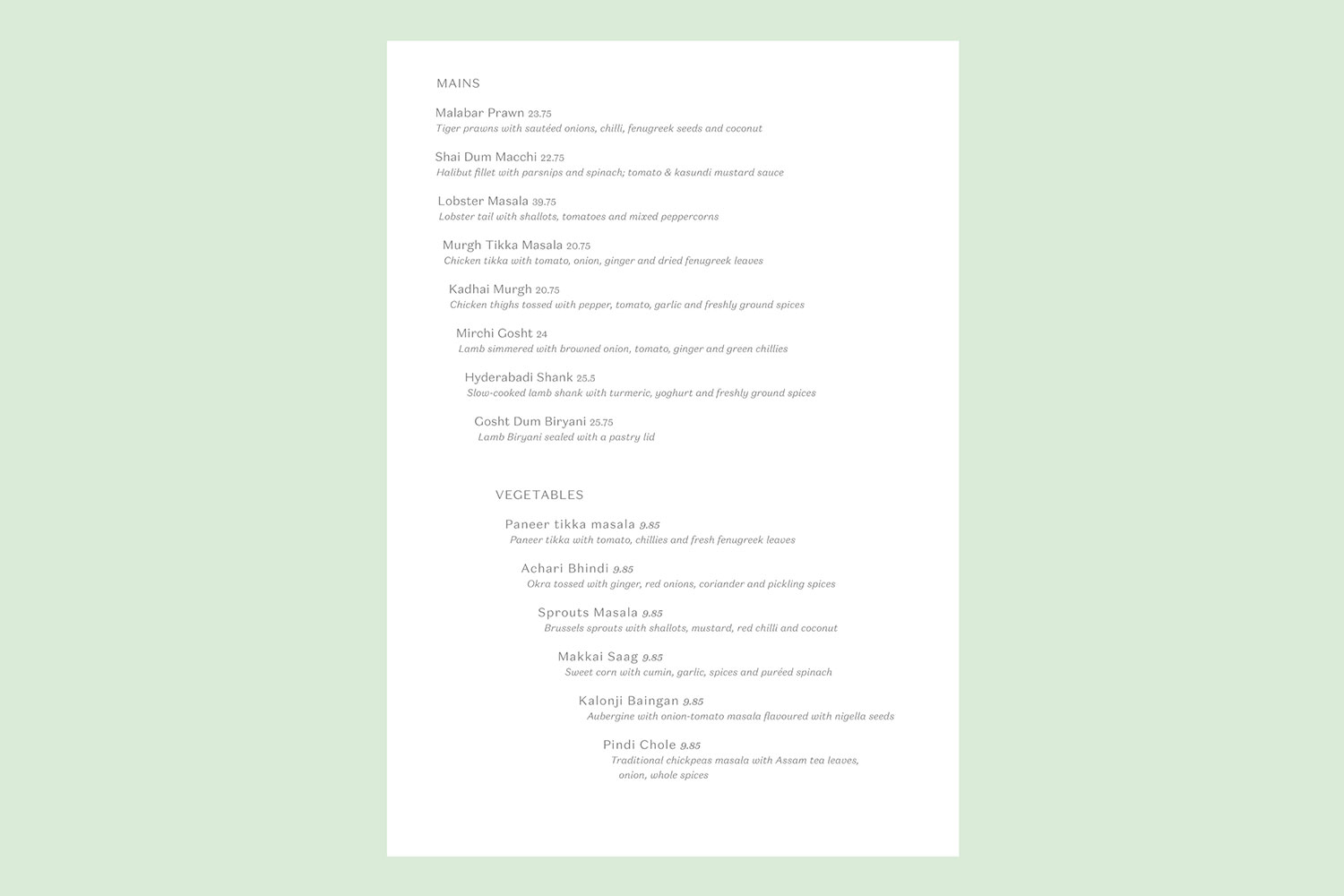
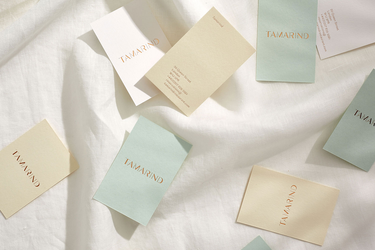
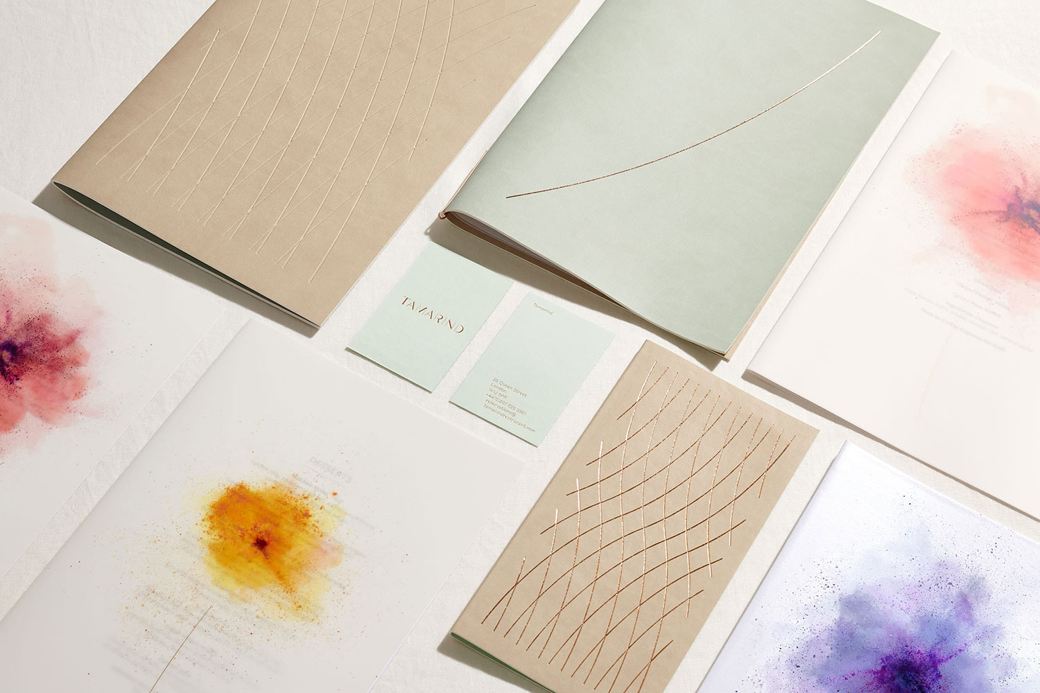
The designer has created a great visual language with the floral theme through the repeated use of the simple curved line representing the stem of a flower. Additionally they have created several different “powder flower” graphic elements for the inside covers of their menus. Together these elements work together to create a very light and feminine branding style that was just what the client was seeking.
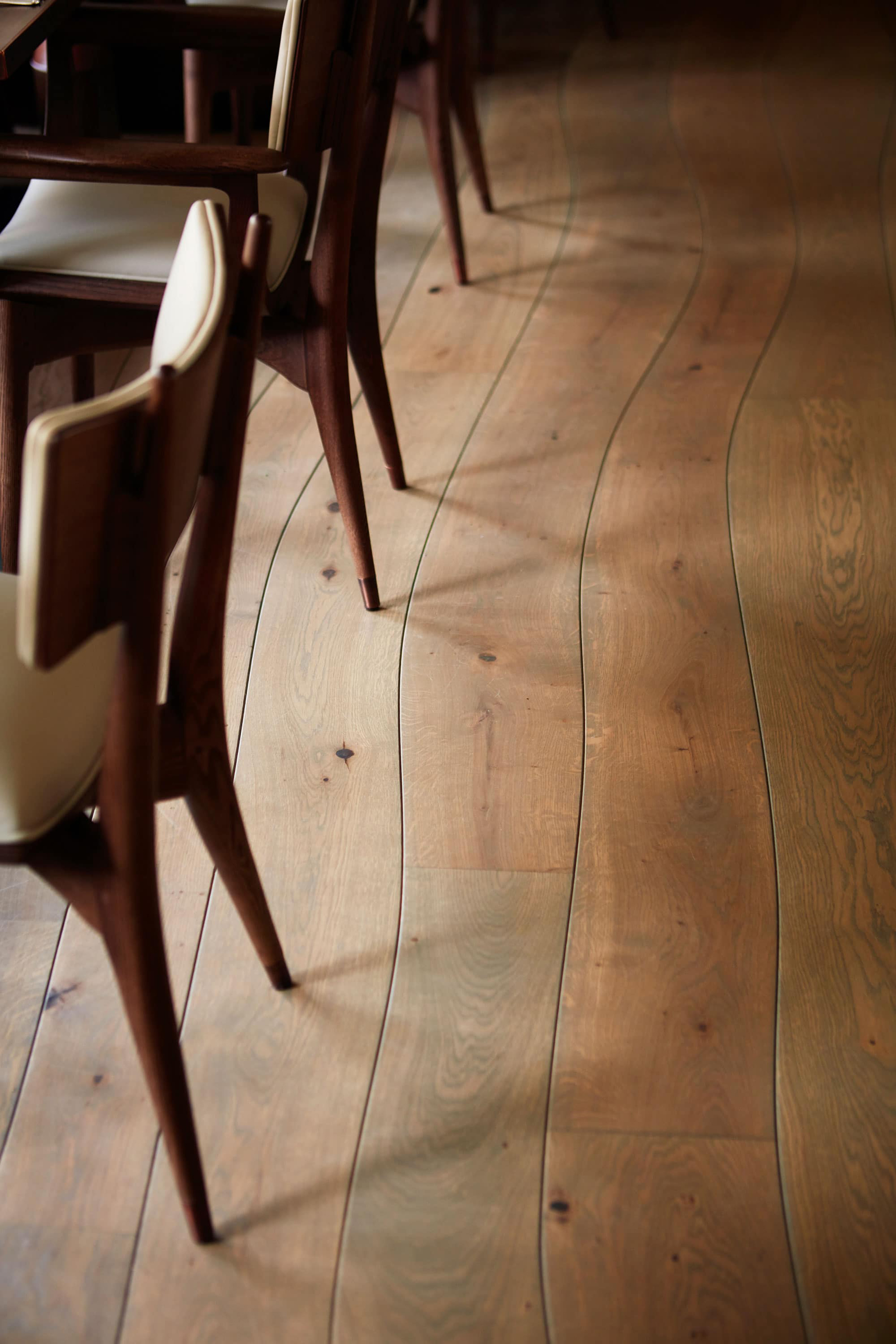
Throughout this project the designer has shown a great example of repetition in design. Repetition can be seen in the pastel colours with gilded accents. The floral theme is also repeated across all aspects of the restaurant from the menu covers to the layout of the type inside the menus to the seat cushions and even to the curves in the cut of the timber floor. The typeface used in the logo indicates a classy and timeless feel which is compounded by the main logo element and curved line being debossed and gilded on the stationary and menus.
Tamarind
![]()

Want to discover more studios and creatives from around the world? Check out our previous #ILoveTheseGuys posts.
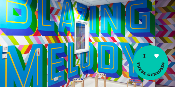
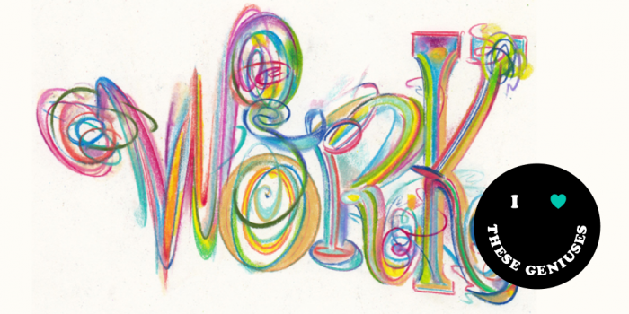
Posts you might like
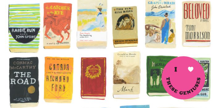
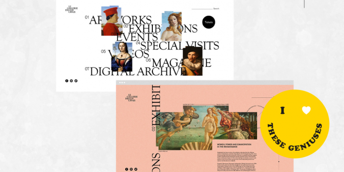
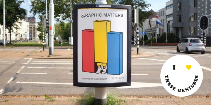
Shillington students and staff from around the world share the work of creatives who inspire them in the #ILoveTheseGeniuses...
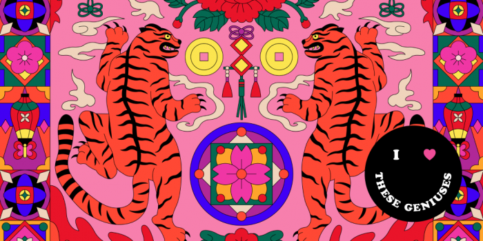
Shillington students and staff from around the world share the work of creatives who inspire them in the #ILoveTheseGeniuses...

Shillington students and staff from around the world share the work of creatives who inspire them in the #ILoveTheseGeniuses...
Shillington students and staff from around the world share the work of creatives who inspire them in the #ILoveTheseGeniuses...
Shillington students and staff from around the world share the work of creatives who inspire them in the #ILoveTheseGeniuses...
Shillington students and staff from around the world share the work of creatives who inspire them in the #ILoveTheseGeniuses...
Shillington students and staff from around the world share the work of creatives who inspire them in the #ILoveTheseGeniuses...

Shillington students and staff from around the world share the work of creatives who inspire them in the #ILoveTheseGeniuses...
Want to win some amazing prizes and stay in the loop with all things Shillington? Sign up to our newsletter to automatically go in the draw.