Career Change: From the Finance Industry to Becoming a Visual Designer
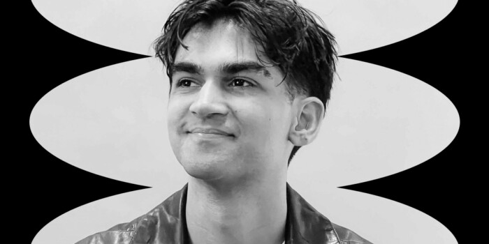
Megan Dweck studied economics and Latin at university and then went on to work in finance for 10 years at Goldman Sachs. In 2017, she decided to quit her job and enroll in the Shillington full-time course to give her the design skills and experience needed to change careers. Since graduating, Megan has won awards from GDUSA and The Type Directors Club. She’s currently working as a visual designer for a global managing consulting firm, McKinsey & Company.
Read on to hear about Megan’s career transition from finance to design, tips for creating a custom typeface and her favorite side project.
In 2017 you left your 10-year job working at Goldman Sachs to study graphic design. What kind of work were you doing prior to Shillington?
I built a team focused on digital learning. We modernized Goldman’s learning-content delivery by experimenting with formats like podcasts and enhancing employee experience in and out of the classroom. I also taught communication skills, data visualization and personal branding.
What inspired your career change from finance to design?
I started in my department as a summer intern in college and remained in the same department for 10 years! It was a really tough decision to leave—I enjoyed my role and loved the people I worked with, but I felt the itch to be challenged in a new way.
As someone who is most satisfied when learning new skills and trying new things, I wanted to get outside my comfort zone.
I had no formal design experience—I studied Economics and Latin in college. Looking back, I realize now that I did dabble in design-related things without even knowing it: I was the layout editor of my high school yearbook and newspaper, I took on silly Photoshop projects for my friends and family and I fussed over alignment and spacing in every PowerPoint slide I’d ever made.
What was the moment when you realized you would want to focus on more creative assignments?
In the finance world, charts and graphs are a core part of your life and I spent a lot of time creating “one-pagers” to show impact through charts. My partner had a copy of Edward Tufte’s The Visual Display of Quantitative Information and once I read it, I felt like I’d stepped into a whole new world. I hadn’t heard of the term “data visualization” before and I couldn’t believe there was so much science behind how people perceive visual information.
I needed more, so I took night and weekend classes at NYU and earned a Certificate in Data Visualization. It was there that I met the Adobe Creative Suite and I never looked back. At work, I became the go-to person for presentations, posters, and websites, and I spent my free time reading books to understand what made a visual objectively better or worse.
Goldman Sachs produces a public-facing newsletter and every week it features a chart from their research. When I received it, I would always think about the little things that I would do to improve the chart design. I reached out to someone I knew on the team and volunteered to be their chart person. I was actually pretty lucky that they agreed (and didn’t laugh in my face). I got to have a new challenge every week with data I hadn’t seen before and I got to think about how to not only make it look better but also make it inviting and easy to understand, even for readers who weren’t financial analysts.
If you could give one piece of advice to someone starting at Shillington, what would it be?
Trust the process. You will get a lot of feedback and suggestions from teachers and peers and though some of it may be hard to hear, you shouldn’t shut any of it out.
You may really like something you created or an idea you had, but if you trust that everyone around you will push you to improve your work, you’ll end up with something better than you imagined it could be.
In the beginning, I just wanted to dive in and start creating things on the computer right way, but the course taught me to trust the design process—to spend time building and deepening my concept, moodboarding, thumbnailing and sketching before I actually fire up the Adobe Creative Suite. I didn’t listen to this advice for the first half of the course and I didn’t produce anything that great. But once I allowed myself to trust the process and the feedback, I created more original work with deeper concepts, and that had more impact as a result.
How did the course build your skill set?
In addition to internalizing the design process, the Shillington program made me a Creative Suite rock star. I appreciated that we learned application shortcuts from the start. It has definitely been a differentiating factor since I’ve entered the design field—I can do things faster and cleaner than other design-school graduates and sometimes even experienced designers say “wow, how’d you do that?!”
What was your biggest challenge during the course?
I felt like I had to rewire my brain to tackle problems in a different way. In my previous job, even on what felt like a design-heavy day, I was only flexing my creative and right-brained skills for a couple of hours. Using creativity to solve problems, produce results and pushing visual ideas to their limits all day every day for 12 weeks—and the rest of my life was a hard but rewarding adjustment.
What are some of your proudest career achievements since graduating?
Getting a job! Seriously though, I was afraid I wouldn’t be able to find a design job after graduation and that quitting my former job was a huge mistake. In any creative field, you constantly doubt yourself and whether your work stacks up to what’s around you. I was so thankful to get job offers (even bad ones!) and hear that people were impressed with my portfolio. It was awesome to see the same success for all my peers in the program as well.
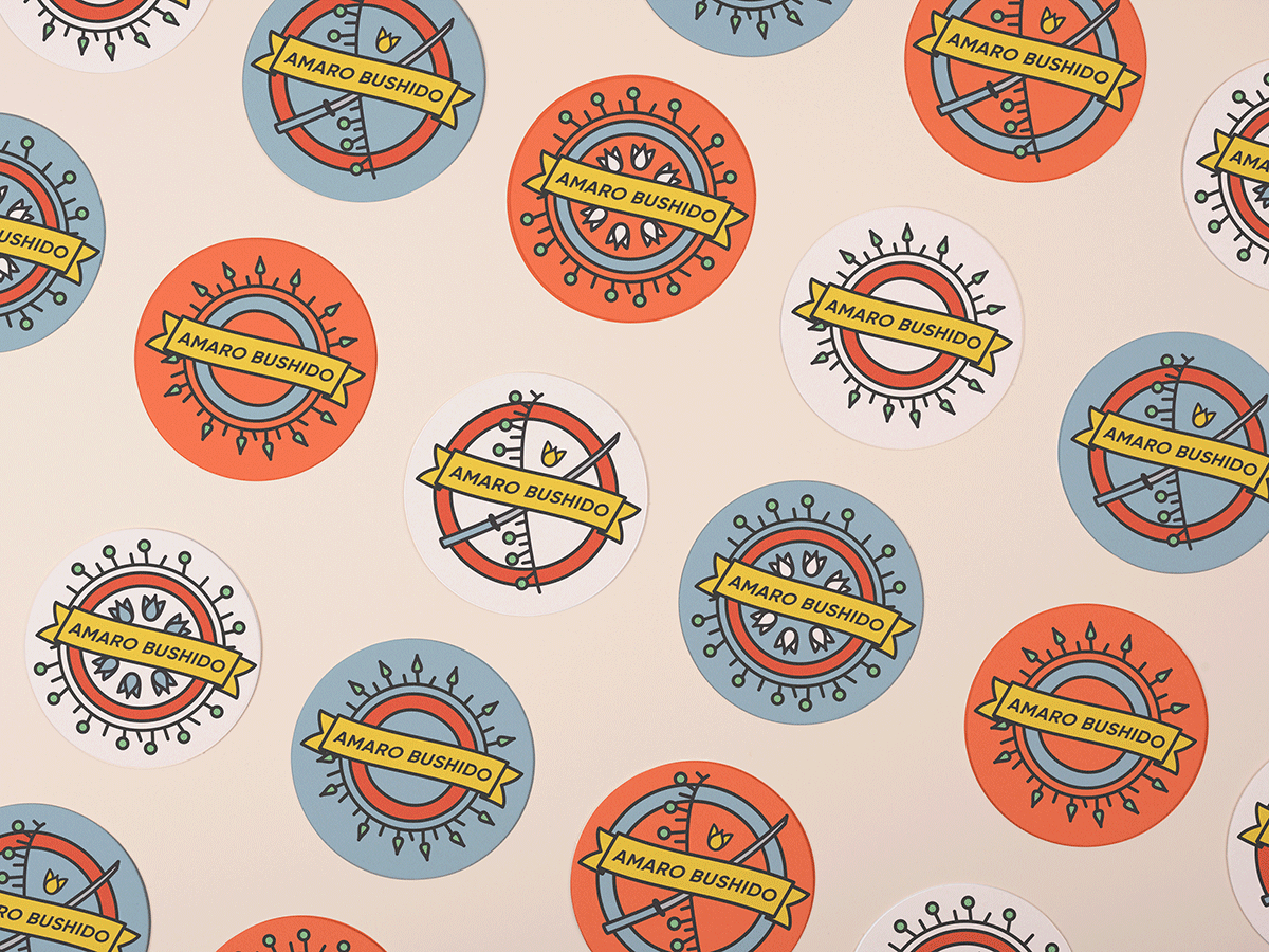
In 2017, your packaging project, Amaro Bushido won the 2017 American Graphic Design Award for Student Packaging Design from GDUSA. Can you talk about your concept and process from conception to launch?
This was my favorite project at Shillington! I love drinking amaro and have always found the packaging beautiful, so when we were allowed to choose a product, I knew I would have tons of inspiration.
My assigned demographic was samurai, so I had to think about how to combine the traditional floral Italian amaro designs with the Japanese warrior culture.
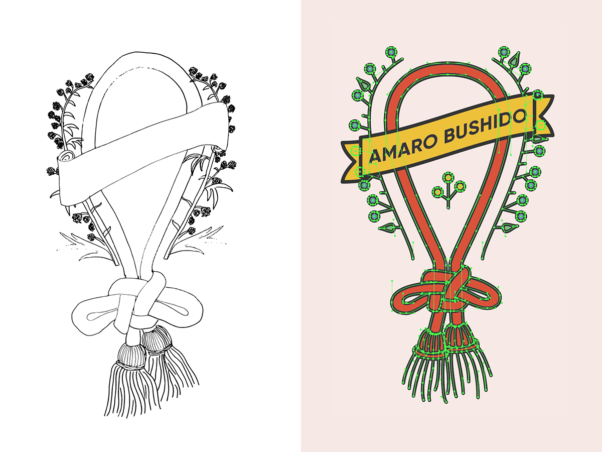
The first approach I explored was something hand drawn to mirror the ornate, flowery labels of Italian amaro, but featuring imagery inspired by things a samurai might come across, like the particular knots that are used in ropes on samurai armor. The feedback I got from the teachers was that it imitated the source material well, but as a designer, I should aspire to modernize and transform the design into something new and unique. I pivoted to a modern, linear illustration style, while keeping similar content and layout. While I was reluctant to switch paths, I knew that the teachers were right and I was so happy with the results. I also got to purchase and drink lots of amaro in the process so that helped.
Congratulations on the Type Directors Club 2018 Certificate of Typographic Excellence for your Shillington project, Road Rally. It’s such an accomplishment to have your work shown at their 64th Awards Exhibition (TDC64) in New York and over 16 countries. Can you give some tips to other designers who may want to create their own custom typeface?
I was really inspired by the way lines and stripes in vintage car racing posters mirror race tracks, evoking movement and speed.
I found some cool references of interweaving linear typography, but I worried it was too complex to achieve within the eight hours allotted for the project. However, my teachers encouraged me to try it, so I focused on building the letters for the campaign title ROAD RALLY. For this, I created each character in Illustrator using the pen tool. Establishing a system for how the letters would connect was like a fun puzzle.
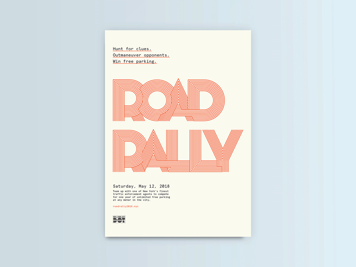
After graduation, I really wanted to build out all the other characters to make a full set. I did this for myself as a fun challenge, continuing to work predominantly in Illustrator. I’ve since taken a “Principles of Type Design” class at Cooper Type, where I learned how to use Robofont and Glyphs to turn my own creations into a real, typable typeface!

For aspiring type designers, I suggest exploring calligraphy (with both pointed pen and broad nib), even just for a few hours. Learning how to create the characters by hand helps you understand where to put thick and thin stresses, serifs or half serifs and other structural nuances. Also, starting with the lowercase characters n, o, p and uppercase H, O, D helps you build a good foundation for most of the other letters in the English alphabet (for example, the p can become a d, b, and q with only slight tweaks). Getting those right first will save you a lot of time.
You’ve been working as a Visual Designer at McKinsey & Company since September 2017. What is your typical day like?
I am part of an in-house creative team focused on internal communications. We work on two main types of projects: broad campaigns, each with a unique visual identity that we build; and news articles about our work and people.
I’m always working on a few projects at the same time, so I bounce between them depending on which task I have the mental energy to complete. The morning might be putting pen to paper to flesh out ideas that struck me overnight or knocking out different sizes and crops of assets.
In the afternoon, I spend time moodboarding or finding inspiration for new projects, thumbnailing, illustrating, and bringing my sketches to life on the computer. I’m constantly asking others on my team to take a look and get their feedback. There will usually be a team meeting or two where we talk discuss campaign updates, upcoming design needs, and feedback on work in progress, but most of my time is spent actually designing. I love that I know my future deadlines and that I have the autonomy to plan and organize in the way that’s most effective for me.
What interesting projects have you worked on at McKinsey & Company?
Since I’m a dataviz nerd, I love projects where I get to create infographics and tell stories with data. I’ve had opportunities to do both serious infographics—for example, I made one that detailed the impact of a Firm project over 10 years—and more fun ones analyzing our internal user-generated content to see what makes a post go “viral.”
Some of my favorite projects have been one-off pieces for news stories where I get to illustrate art to go alongside the article.
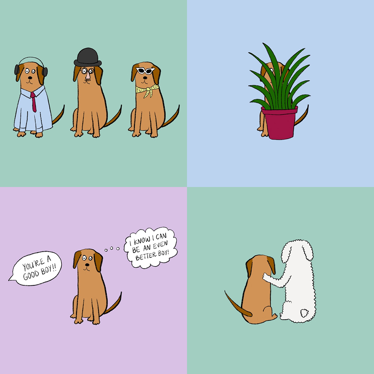
Some examples are illustrations inspired by Grecian urns for a story about unearthing insights from a people survey, simple diagrams for stretches you can do at your desk and a piece on overcoming impostor syndrome. Since I’m an illustration newbie, these are fun challenges where I can try out different styles and learn a little about myself in the process.


What’s your #1 piece of advice to a recent design graduate?
Don’t let the roller coaster of starting a new career scare you or make you doubt your worth.
You’re going to constantly question yourself, your design aesthetic, how much you should charge clients, who you work with, why you didn’t get that project and so on. Try to think of each challenge as the first time you get to experience something new. You’ll learn from each success and each misstep, and you might actually kick ass.
What do you love about being a designer?
It might be silly, but I love the feeling when you show something to colleagues, friends, or family and they say “oh my god, you made that?!”
If someone gets a subtle reference or double meaning in your design, it’s amazing to see your work make someone smile. Knowing that an email you designed is something that people look forward to getting every week really reinforces my decision to change careers. I get to create things that make people happy. How cool is that?
Could you share a few of your go-to creative resources for inspiration?
As cliché as it sounds, I think Instagram is a wonderful tool for designers. I try to follow as many studios, illustrators, designers, artists, agencies, publications and publishers as I can (in addition to a few fluffy cats) to flood my feed with different design styles. I love to see work that makes me stop scrolling or browse someone’s profile to find inspiration for my own work. @nytimesopinionart, @laurencekingpub, @itsnicethat and @creativeboommag are a few great accounts that feature work from many different artists.
I am always looking for inspiration in the world around me. I recently discovered this Australian magazine Frankie at a hair salon. It had a ton of amazing female illustrators and features on photography, fashion, travel, music, crafts and more. I took pictures of something on almost every page for inspiration!
I also still look at the work of recent Shillington graduates every time a new showcase is published on the website. It is so inspiring to see how a new batch of budding designers tackles some of the same briefs that I worked on! The Shillington environment produces some of the most creative and distinct work, as the teachers push students out of their comfort zones and without the limitations of working in the ‘real world,’ students can experiment with all the colors, typefaces and influences they can imagine.
Describe your creative style.
I have a very clean, modern and playful aesthetic. I love order, grids, hierarchy, balance and don’t do particularly well with abstract designs.
I love playing with color and my absolute favorite thing to do is use the pen tool in Illustrator! I’m working hard at developing my illustration skills, so I find illustration briefs to be the most exciting for me.
Anything else you would like to share? Surprise us!
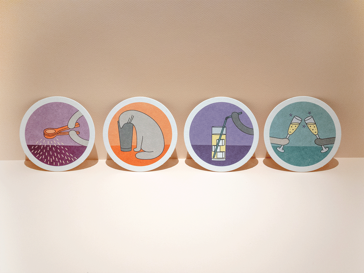
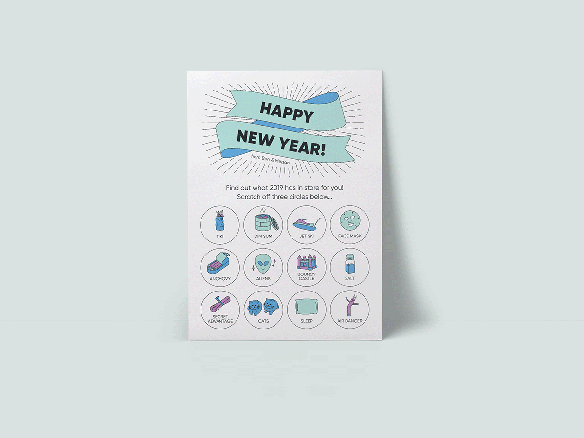
My favorite side project is my annual new year’s card: I challenge myself to take on a project that is unrelated to my day job and that brings fun and joy to my friends and family.
Last year I designed a set of coasters themed around “cats making cocktails,” because it combined two of my favorite things. I wanted to make something people would keep and use and think of us.
This year I made a scratch-off lotto card with illustrations that predict the recipient’s fate for 2019. It was fun to come up with the illustrations; some were things my partner and I enjoy, like cats, tiki drinks, anchovies, face masks and others were completely random, like aliens, jet skis, air dancers. It was exciting to hear from recipients and see which ones they got (I think aliens was the top pick)!
Big thanks to Megan for sharing her story! Check out her website and Instagram for updates on the projects she’s working on.
Want to learn more about studying graphic design at Shillington? Learn about our 3 month full-time and 9 month part-time course in New York, London, Manchester, Sydney, Melbourne or Brisbane.
Posts you might like

One of the best things about graphic design is that it never stands still for a moment. But that does mean that keeping up with...
Are you a graphic designer who is finding themselves lacking skills, slow on one of the major graphic design programs or just...

https://www.youtube.com/watch?v=wZ_tffGtZMs New York graduate Simon Fréour worked as a software engineer in France for seven...
Are you working with graphic designers day-to-day and finding yourself jealous of the work they're doing? You're certainly not...
Diversity in design is an important topic to us at Shillington and we aim to support and strengthen equity by cultivating...
Last year Shillington launched, for the first time, our Diversity in Design Full Scholarship opportunities—in New York City,...
Diversity in design is an important topic to us at Shillington and we aim to support and strengthen equity by cultivating...
Last year Shillington launched, for the first time, our Diversity in Design Full Scholarship opportunities—in New York City,...
Want to win some amazing prizes and stay in the loop with all things Shillington? Sign up to our newsletter to automatically go in the draw.