Fluent in More Than Design? Enter Shillumni Universal Type Competition!
Shillington graduates! Are you blessed with being able to speak another language? Well if so, it’s time to impress us in your native tongue by entering our universal type competition.
Have you ever looked at typography in another language and thought to yourself “that just looks so much better!”? Well here’s your chance to experiment in a different dialect. Get creative with an umlaut, put your own spin on a circumflex or get acquainted with kanji. You could even give a little airtime to a lesser used language (Cymraeg anyone?) or why not invent your own alphabet?
With our Shillumni coming from just about every inch of the globe we thought it time to celebrate the universal language of design. Our teachers have gotten the ball rolling with some of their own international typography experiments—scroll down for some inspiration.
The Brief: What we’re asking you to do.
Create a type lock-up in your chosen language using the inspirational quote; “Design is a universal language”. The format of the type is entirely up to you eg: hand lettered, digital, static, motion—go wild. In terms of palette the colour is also up for your interpretation as long as it’s RGB, just remember how to think about how it relates to your concept.
Be inspired: Take a look at the Teacher’s Examples.
Our talented teaching team have created some examples to act as inspiration, check them out below!
The Entry: We want you to send us.
- Design a type lock-up using the quote ‘Design is a Universal Language’ in your language of choice to the dimensions; 1080 x 1080 px.
- Your design format can be static or contain motion. Submit a high res PDF for static files and an mp4 file (10 seconds+ in length) for motion.
- Colour palette is entirely up to you, but please only send one design—be discerning!
- Along with your submission also include a short concept explaining the choices behind your design.
- Remember to state your name, where and when you studied at Shillington and what you’re doing now.
- Send your design to shillumni@shillingtoneducation.com by 3pm GMT on Friday 13th July 2018.
The Prize: What you’ll get in return.
If you really blow our socks off and are crowned the overall winner you’ll receive;
- Wacom Intuos Tablet.
- GF Smith goodie bag.
- Exposure via Shillington Design Blog and Shillington social media channels.
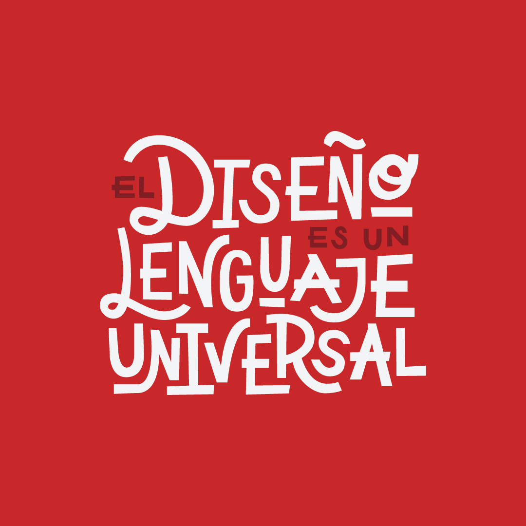
Alan Barba, New York Full-time Teacher—Spanish
Inspired by the incredible hand painting lettering tradition by Mexican artisans (called Rotuladores in Spanish)—which can be seen all around Mexico. The mono-weight style lettering that I’ve created represents the technique and dedication that this incredible artist have to their craft with a contemporary approach. The use of variant baselines and subtle swirls connects the white characters with the red background portraying the warmth, passion, and inclusiveness of the Mexican household.
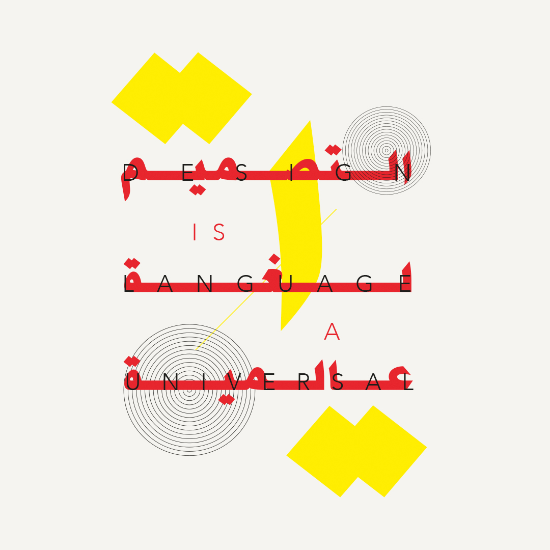
Dina Hany, Sydney Full-time Teacher—Arabic
Inspired by the beauty and fluidity of the Arabic language, the idea was to elongate and and stretch the Arabic typeface whilst overlapping the latin one. The chunky lettering was a perfect fit for its contemporary, representing harmony and peace between both languages/cultures as each word is directly translated on top of the other without losing its original meaning. The graphic elements are a colourful interpretation of Arabic dots and numbers mixed with concentric circles portraying the playfulness and duality of both cultures.
John Palowski, N.H Course Content Manager—Polish
Inspired by post-war Poland—where the nation witnesses a huge spurt of creativity & boost for the entertainment industry (posters for concerts / theatre productions etc). Before they had access to mainstream typography, a lot was expertly hand-crafted . So every poster had a sense of uniqueness to them. They explored a lot and had to make do with what they had, or could create. So this was created from scratch, pushing the rules for baseline play, character width, and mixed case use, to add to the jauntiness of the whole package. The layout was explored via balance though tension, apt for that era of the nation’s history.

Fiona Martin, London Full-time Teacher—Irish
Inspired by the medieval style of typeface called Gaelic script. It was widely used from the 16th until the mid-18th century in Ireland. Taking particular inspiration from the illustrious type found in old Irish manuscripts where this style of type was commonly used. The use of dots were a popular addition to the letterforms and illustrations found within these ancient texts. Neon colours were used to add a contemporary feel. The friendly, warm nature of Irish people is represented through the roundness and energetic placement of the letterforms within the type package.

Nikita Prokhorov, New York Full-time Teacher—Russian
While researching for this project, I found a lot of Cyrillic lettering that was very traditional. I wanted to take brush lettering and merge that aesthetic with the Cyrillic alphabet, which is quite different from the Roman alphabet. The colour choices reflect the Shillington brand.

Good luck with your submission and if you have any questions email shillumni@shillingtoneducation.com. Submissions are only open to Shillington graduates and entrants will be cross referenced with our database.
Whether you graduated in 1997 or 2018, you’re part of our global graduate network. If you haven’t already be sure to join our private Shillumni Facebook Group and check out our Shillumni page for offers and announcements.
Posts you might like

One of the best things about graphic design is that it never stands still for a moment. But that does mean that keeping up with...
Exposing yourself to examples of good graphic design is a healthy practice no matter who you are. Maybe you’re a student...
In graphic design, quite a few decisions happen behind the scenes that clients may not grasp the importance of, yet have a huge...

Looking to make a creative career change at 40? There’s no time like now. It may seem like a daunting decision, but we’re...

Making a career change in your 30s can seem daunting, like really daunting. But we’re here to tell you, it’s not. As a...

Are you seeking a holistic introduction to the design industry, theory of practices, more exploratory projects for...

Are you based in the West Coast and looking to study graphic design? We’ve compiled a list of the top graphic design schools...
Ever thought about studying graphic design abroad in London? Well you can do that with Shillington’s graphic design course....
Want to win some amazing prizes and stay in the loop with all things Shillington? Sign up to our newsletter to automatically go in the draw.