Margaret Vivienne Calvert: Famous British Typographer & Graphic Designer
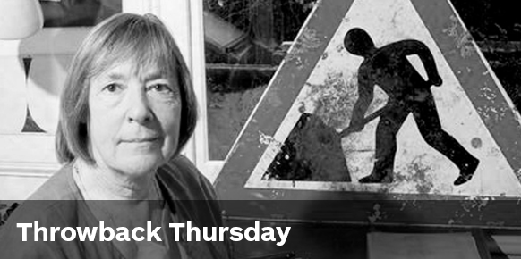
Margaret Calvert (b. 1936)
Margaret Calvert is a Southern-African born, British graphic designer famous for transforming signage and typography throughout Britain’s roads, railways and airports. She has a massive fan club of creatives from all around the world. In fact, next week she’ll receive the President’s Award, the highest accolade from D&AD.
When Calvert studied illustration at the Chelsea College of Art, graphic design wasn’t really “a thing” yet. Instead, it was classified as commercial art. While studying, her tutor Jock Kinnear saw immense potential and asked her to assist him in professional projects. Together, this dynamic duo set the design aesthetic for very important transport systems—most of which are still used today.
First, Calvert and Kinnear worked together in the development of the new Gatwick Airport signage.
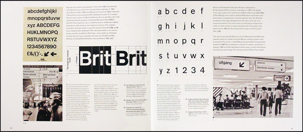
After that success, they were tasked to design signage for all the new motorways in the UK. It was a project they had to start from scratch. The brief was to design signage that could be read and understood at speed. Calbert and Kinnear caused a stir when they decided to use both upper and lower case letters in the designs, rather than the standard block text. But they were definitely onto something—eventually the government decided to implement Kinnear and Calvert’s typeface across the whole of the UK transport.
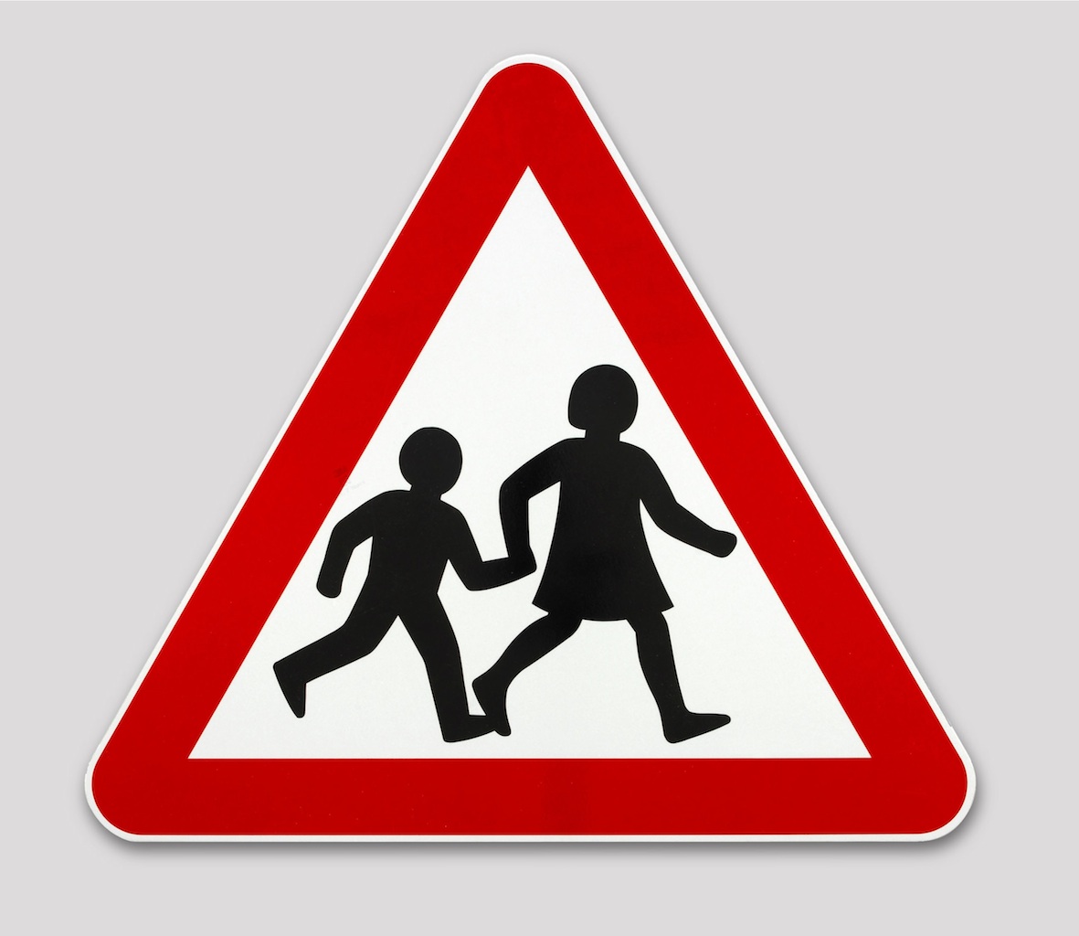
Calvert’s illustration background also proved to be an asset and she drew all of the pictograms. Those simple, easy-to-understand pictograms are the ones you still see on road signs today!

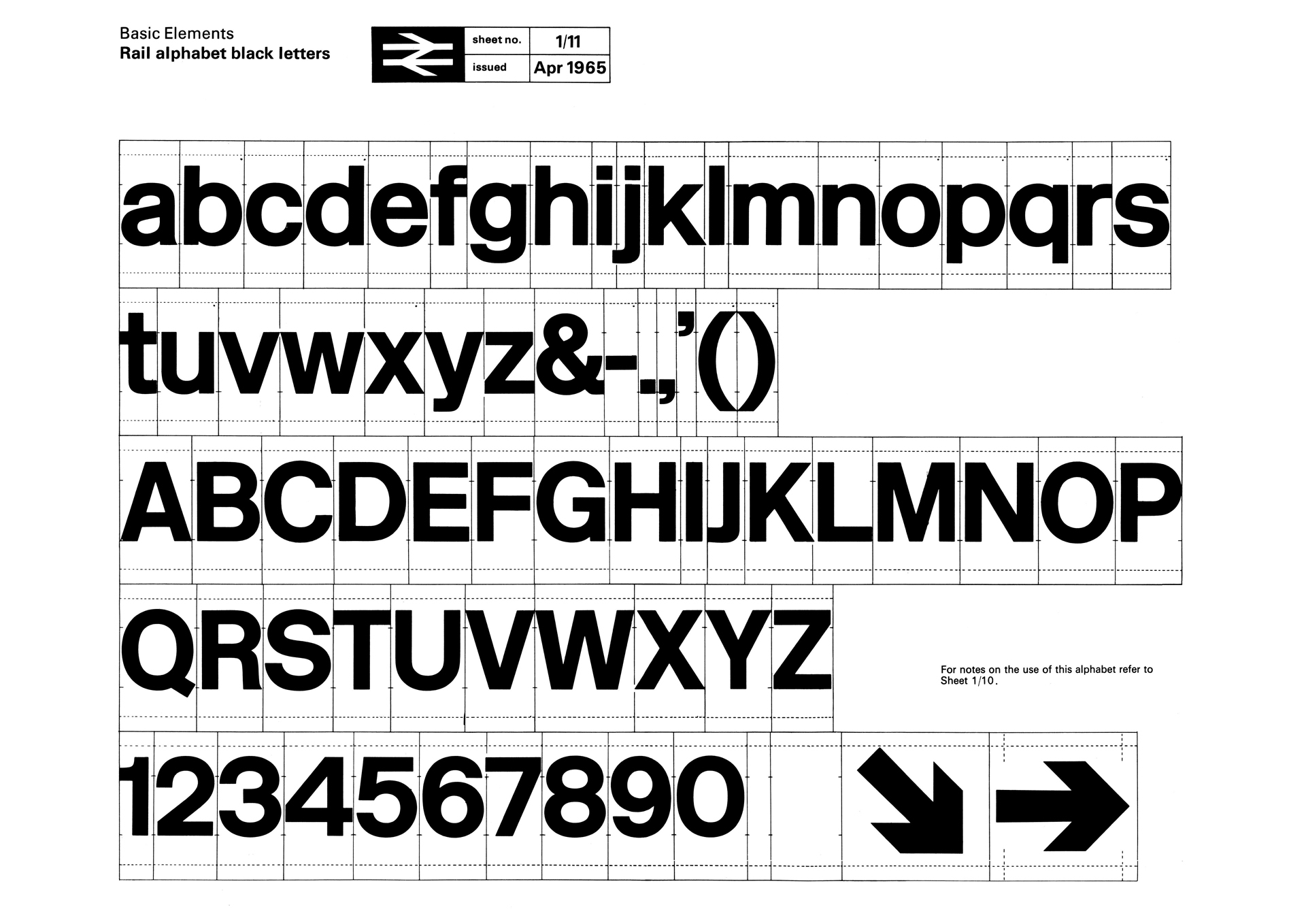
Keeping with the transport theme, the duo’s third major project was commissioned by the National Rail, who asked them to refresh their brand identity. As a result, Rail Alphabet was created and replaced Gill Sans.
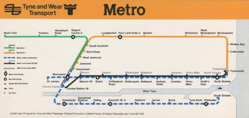
In 1980, Calvert developed the Calvert typeface, which was used on the Tyne & Wear metro.
I found out about Calvert whilst studying and instantly fell in love with her approach to design. She’s modest, intelligent and produces design that is thoughtful and functional. She’s not interested in just aesthetics but is more concerned with how it works. I believe Calvert’s success is due to her philosophy: “It’s about asking the right questions and knowing who you are designing for.” As a designer she believes: “You have the very responsible position of making things clear so that they can get from A to B. It’s not about putting your personality into that particular design.”
I like the fact that Calvert transformed the face of signage throughout the UK. It’s crazy that people have no idea how much time and effort was spent on it! People engage with her work everyday and they take it all for granted. You can’t walk down a street or drive down a road without seeing or using her design. That’s graphic design on an epic scale.
Here’s a final fun fact: she changed the school pictogram from a picture of a boy to an image of a girl leading a boy. And guess what? The girl was based on an image of herself!
Keen to learn more about Margaret Calvert? Watch her tell her own story or check out her timeless fonts.
Who’s up next week for Throwback Thursday? Here’s a hint: it’s not an individual designer, but a revolutionary company that shocked the world through technology and design.
Posts you might like

One of the best things about graphic design is that it never stands still for a moment. But that does mean that keeping up with...

Exposing yourself to examples of good graphic design is a healthy practice no matter who you are. Maybe you’re a student...
In graphic design, quite a few decisions happen behind the scenes that clients may not grasp the importance of, yet have a huge...

Looking to make a creative career change at 40? There’s no time like now. It may seem like a daunting decision, but we’re...

Making a career change in your 30s can seem daunting, like really daunting. But we’re here to tell you, it’s not. As a...

Are you seeking a holistic introduction to the design industry, theory of practices, more exploratory projects for...

Are you based in the West Coast and looking to study graphic design? We’ve compiled a list of the top graphic design schools...
Ever thought about studying graphic design abroad in London? Well you can do that with Shillington’s graphic design course....
Want to win some amazing prizes and stay in the loop with all things Shillington? Sign up to our newsletter to automatically go in the draw.