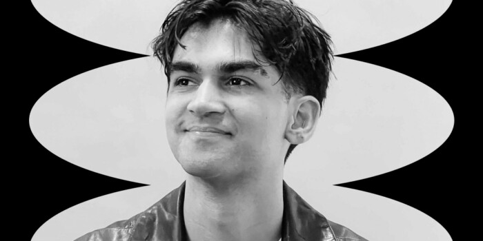
Meet Ambigrammist Nikita Prokhorov—Shillington Teacher
We’re continuously inspired by the work our global teaching team creates. A specialist in typography and a self-proclaimed ambigrammist, New York teacher Nikita Prokhorov tells us about his design approach as well as advice for those hoping to follow in his brushstrokes.
Nikita’s passion for ambigrams led him designing and publishing a book in 2013. Ambigrams Revealed is filled with articles about ambigrams, case studies, and examples of the best ambigram work in the world. Go to Ambigrammist to see his showcase of ambigrams, from hand-drawn to digitally created.
This interview is part of The Shillington Post 06. In this issue, we cover the Shillumni Talk Series featuring Design legends Debbie Millman and Adrian Shaughnessy, 12 notable graduates on Instagram and the design hustle of Shillington graduate Adam Sharatt. View the post on Issuu to read the rest of the articles.
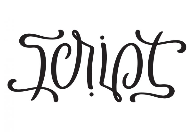
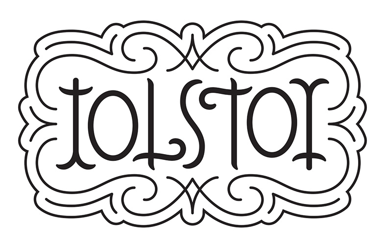
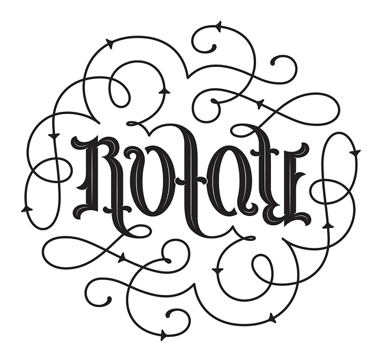
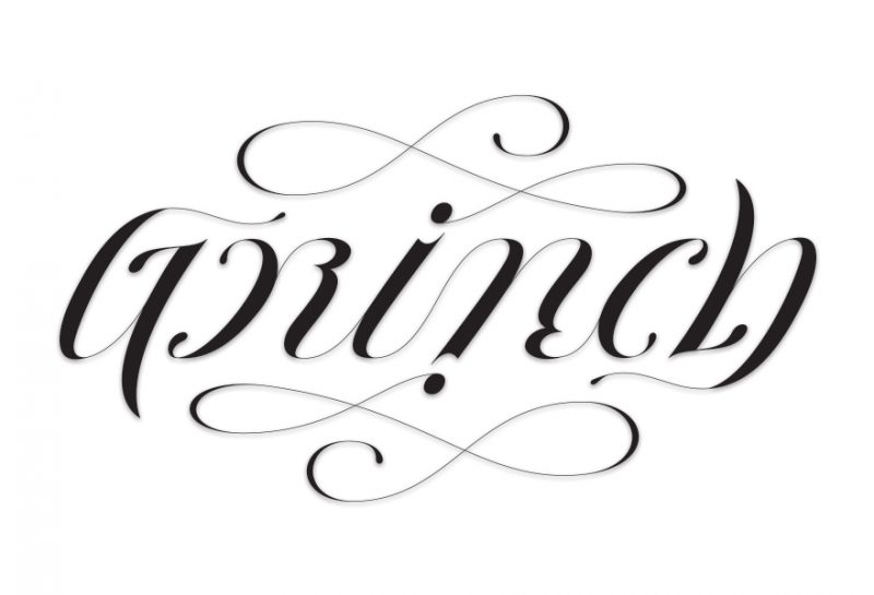
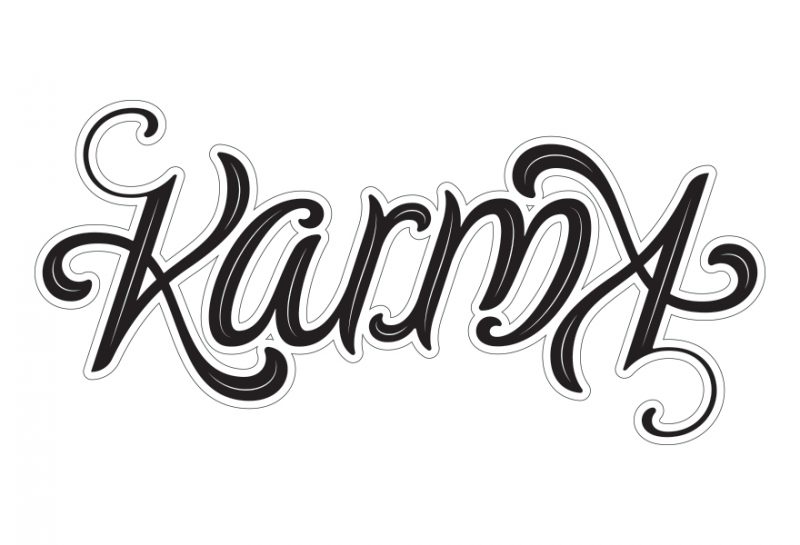
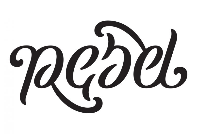
You’re a self-titled ‘Ambigrammist’—what is an ambigram and what do you enjoy so much about working in this medium?
An ambigram is a word that, when viewed from a different perspective, reveals the original word a second time, or a completely different word. The ‘different perspective’ could be rotational, mirrored or reflected.
It could be the same language or a different language, although the latter can be pretty difficult. What I love about ambigrams is their unpredictability. The process for an ambigram can take many directions, and quite frequently the end result may not be what you expected. The typographic aesthetics of the final solution are driven by the process, and it is quite challenging to create an ambigram in a specific typographic style. You have to remain flexible and let the process guide you, taking you in multiple directions. What I love most about ambigrams is they make you keep coming back for a second or third look, especially if the ambigram is so well drawn that you don’t even realise it’s an ambigram. That’s the level I strive for with every ambigram, and even if I don’t achieve that every single time—I still enjoy the process just as much.
Can you share with us your process when embarking on a type-based brief, such as the work you did for Art Directors Club NYC?
When the Art Directors Club asked me to create the event branding for the Paper Expo, I had recently visited a friend’s letterpress studio and the printing process was very fresh in my mind. Watching the paper being fed through a letterpress machine and observing the movement of the machine itself was utterly mesmerising. While those visuals were in my mind, I started developing the idea. The overall focus on the movement, the process of paper and the rest of the design fell into place once the overall concept was developed! The design elements on the invitation were a combination of the printing process and actual parts of letterpress machines that I found in my research, which I redrew to slightly simplify them.
You have to remain flexible and let the process guide you, taking you in multiple directions.
As far as approaching the overall type-based brief—my process is fairly traditional. I ask the client several questions to determine what typographic style they’d like to pursue. If they aren’t sure what they are looking for stylistically, I show them several samples to help them determine their direction. Once a stylistic direction (or two) are determined, I start thumbnailing to figure out what composition may or may not work for the word/phrase that the client provided. My focus is the overall typographic lockup and flow of the text. In the next stage, I start refining the chosen thumbnail at a larger scale, using the typographic style previously discussed with the client. Finally, I either use the refined sketch to create the final hand-lettered piece that I give to the client, or I scan it into the computer and vectorize it if the client requires a digital version in lieu of a hand-lettered version.
You recently designed and hand-painted a mural for our New York campus. Can you tell us a little bit about this project and any tips for those hoping to embark on a mural design?
The best piece of advice—do plenty of research and ask others who have worked on similar projects!
I had never done a mural before, so I reached out to several designers I know who have done small and large-scale murals. Between my research and personal contacts, I was able to figure out the nuances such as paint brush types and the kind of paint I wanted to use, as well as the process of transferring a small sketch to a large mural. After that, it was a matter of setting up the area. Placing plastic sheets to protect the floor, a ladder to reach places above my vertical abilities and about seven hours of painting. I had to paint with both left and right hands, which in itself was unusual for me as I am right-handed and never had to draw left handed. So, maybe some practice ahead of time would also be useful!
Do you have any advice for graduates hoping to specialise in lettering?
Firstly, inspiration! Find artists that specialise in hand-lettering and digital lettering. Browse their websites; look at case studies and the step-by-step process that those artists follow to get from rough doodles to beautiful hand-lettered or digitally lettered designs. Analyse how consistency is established within each design. Look at typography from different eras; industrial signage, old records, war propaganda posters… the sources of inspiration are endless! Study traditional typography, including both typographic theory and typographic examples. Secondly, start practicing!
Nothing can replace hours and hours of practice. Redraw classic typefaces. Mimic some of your favourite hand-lettered examples to get your hand used to drawing custom letters.
Thirdly, draw custom letters! Start with shorter words, and strive to establish consistency in the lettering style, typographic flow, legibility, and readability. As you get better and better, try longer words and phrases, whilst keeping the same objectives in mind.
Big thanks to Nikita for taking the time to answer our questions. Follow his lettering projects on Instagram and read more about the Shillington Team on our website.
Did you enjoy this interview? We have lots of similar interviews in our Resources category. Do you want to learn about type and develop your typography skills? Come to one of our Info Sessions to learn more about the course and ask our staff questions about studying design at Shillington.
Posts you might like
Are you a graphic designer who is finding themselves lacking skills, slow on one of the major graphic design programs or just...

https://www.youtube.com/watch?v=wZ_tffGtZMs New York graduate Simon Fréour worked as a software engineer in France for seven...
Are you working with graphic designers day-to-day and finding yourself jealous of the work they're doing? You're certainly not...
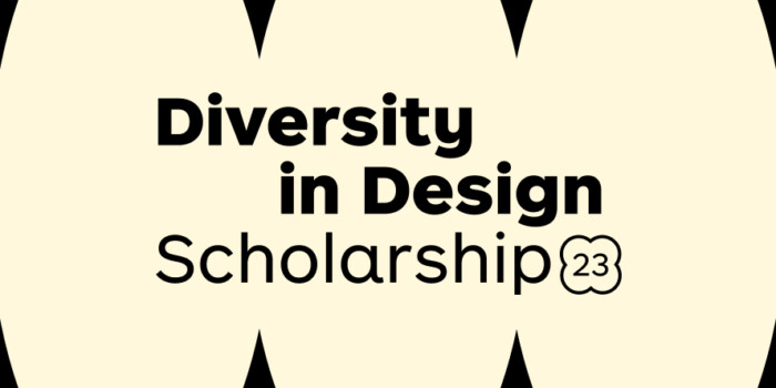
Diversity in design is an important topic to us at Shillington and we aim to support and strengthen equity by cultivating...
Last year Shillington launched, for the first time, our Diversity in Design Full Scholarship opportunities—in New York City,...
Diversity in design is an important topic to us at Shillington and we aim to support and strengthen equity by cultivating...
Last year Shillington launched, for the first time, our Diversity in Design Full Scholarship opportunities—in New York City,...
Diversity in design is an important topic to us at Shillington and we aim to support and strengthen equity by cultivating...
Want to win some amazing prizes and stay in the loop with all things Shillington? Sign up to our newsletter to automatically go in the draw.