My Process
by Studio Fellow
It’s not often we get to see the hard work that goes into a design—the endless thumbnails, discarded logos presented to the client, Illustrator files. Usually, we only get to see the end result in all its finely-excuted glory. We asked part-time teacher Carlos Chavez, founder of Studio Fellow, to share a recent project from start to finish.
Studio Fellow was approached to brand a new, up-and-coming online retailer for sports-luxe fashion called Runway Warrior. The theory behind the name was simple—it brought together high-fashion luxury seen in model runways, and the powerful and active (yet feminine) fitness warrior. It was self-described as a “luxury destination that takes women to and from their workouts”.
Getting Stuck Into it
The brief was simple: design something luxe. But the more simple the brief, the more possible pitfalls. So we began the process by writing a Reverse Brief. We outlined the company’s mission, vision, and most importantly why they do what they do—we find it to be a more engaging area to build brands on, rather than only hearing what the client is doing. This was followed by a series of moodboards based on brand aesthetics, colours, photography styles and brand attitude.
Originally the direction was to make the brand appear bright, colourful and empowering—active. This initial direction was challenged. We had discussions on the nature of high luxury brands and products. They don’t seek to empower, but rather, they’re aspirational. This became the new driving motivator, which lead to a more mature and elegant black & white aesthetic.
Justifying Minimalism
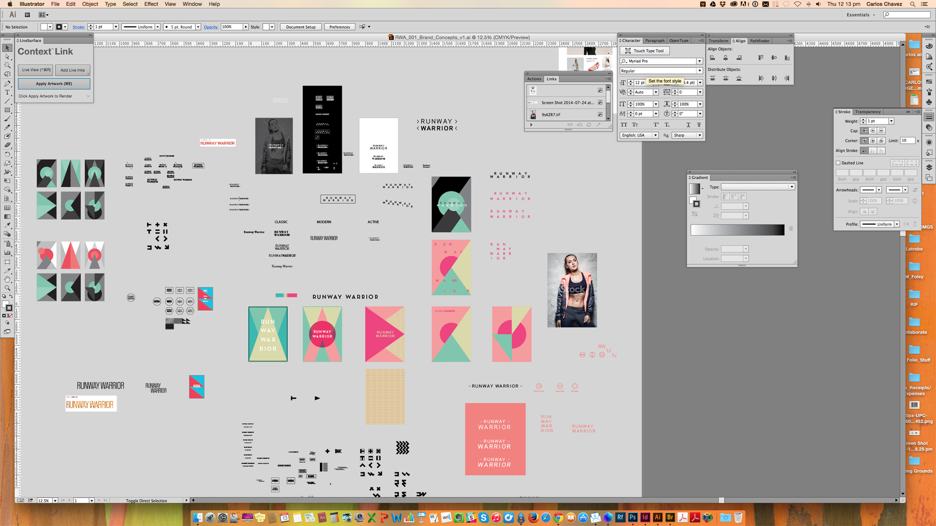
As we entered the conceptual phase, the brand took on a more minimalist aesthetic. We explored many typographic styles and eventually settled on three options.
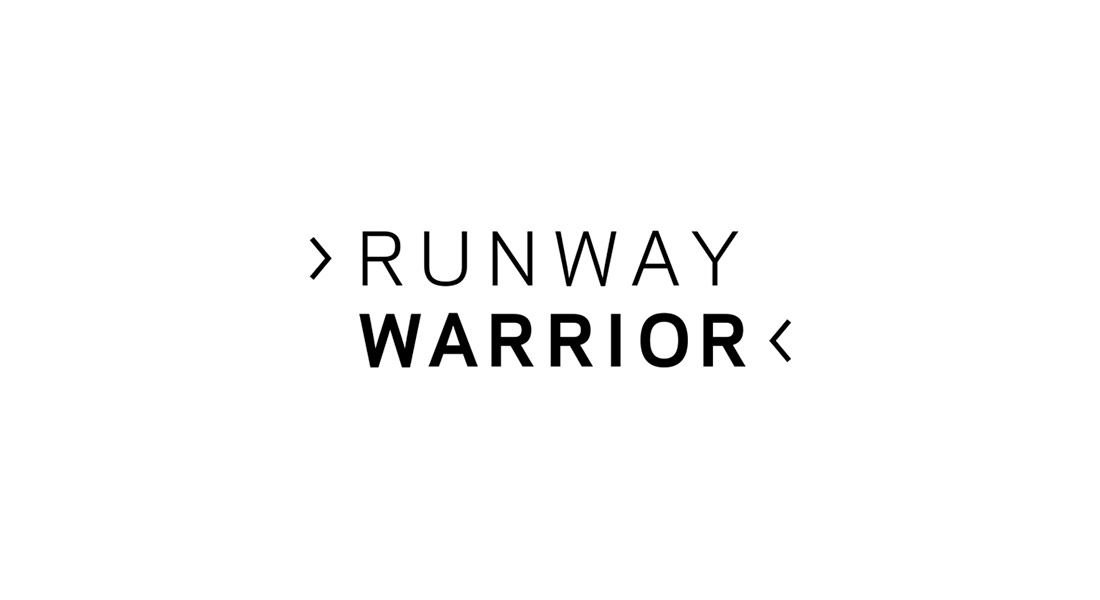
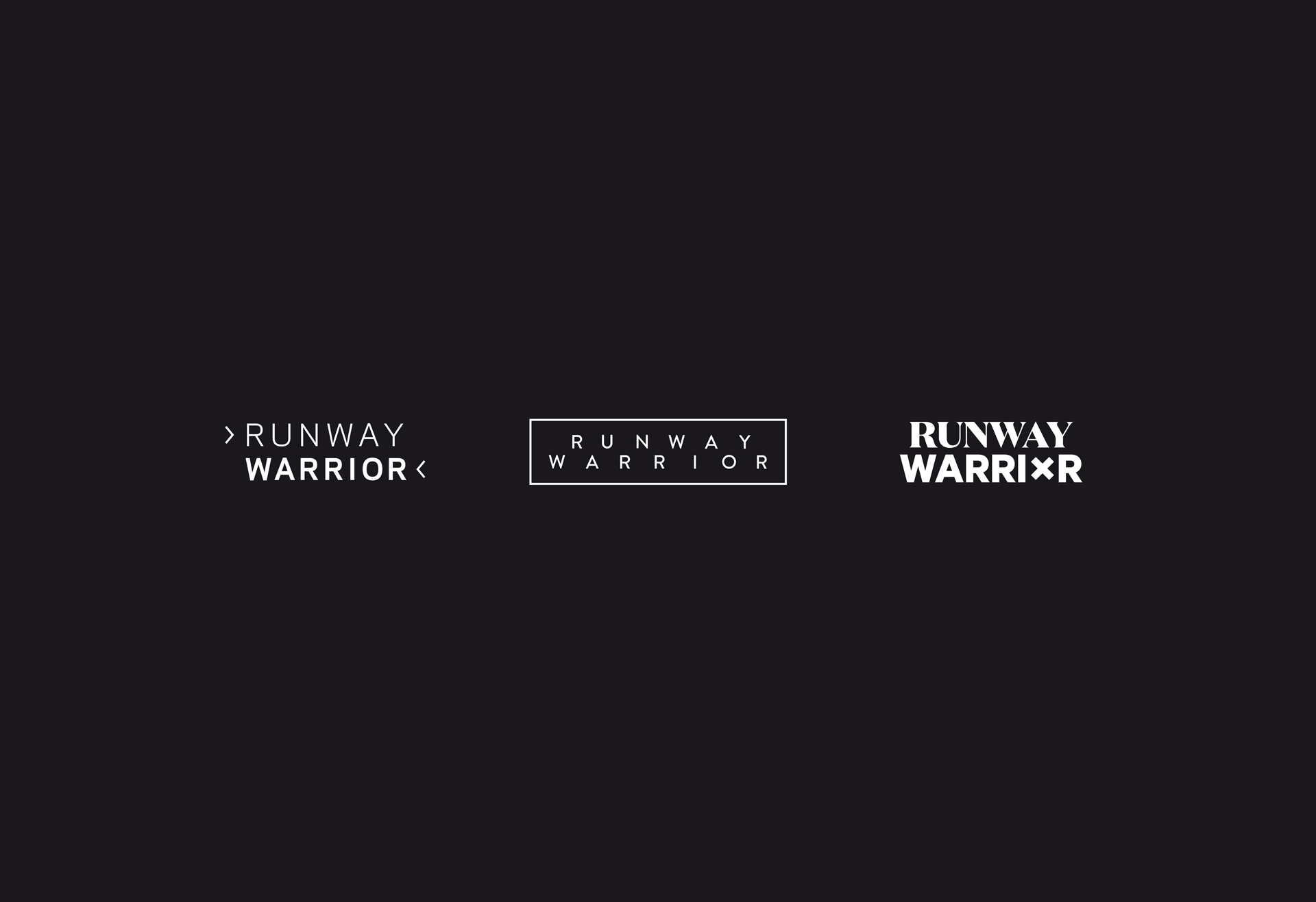
1. A minimal design that simply illustrated walking a runway, with arrows that also appeared sharp and warrior-esque.
2. A staggered version where the letters appeared to have movement—signifying an active lifestyle.
3. A final version that combined a serif and a sans serif typeface with the O in WARRIOR crossed out—giving it a combative nature. The typography represented old luxury meeting the new, sports-luxe.
Less was definitely more
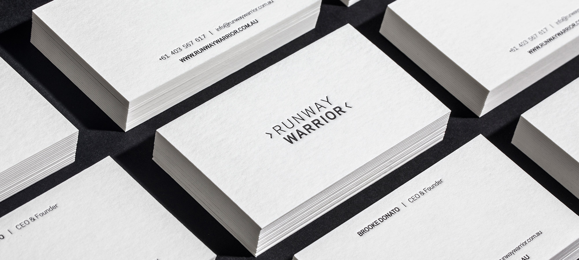
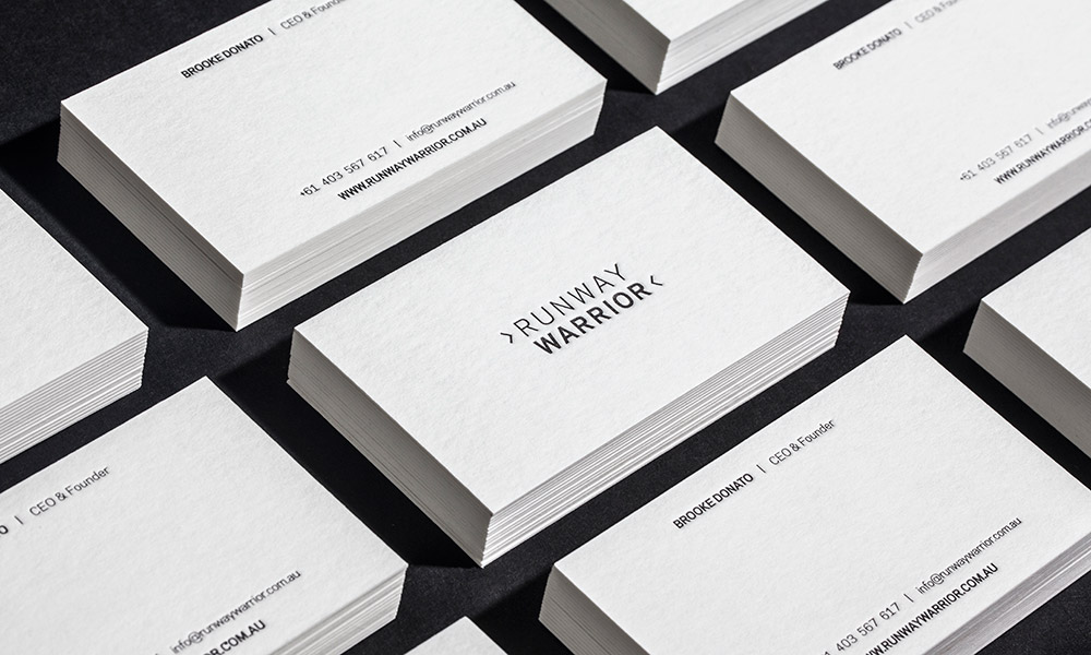
It was decided the first concept was the strongest, and best represented the style that the brand sought to portray. The concept was simple and to the point. We chose Galaxie Polaris Bold for the typeface, a strong, geometric sans serif that contrasted the soft, overtly rounded, humanist typefaces currently used in more generic sport fashion brands.
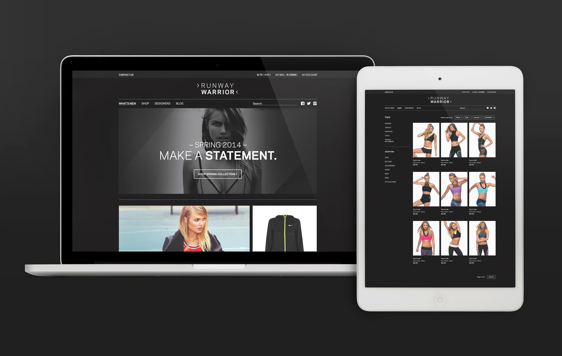
The brand roll-out consisted of stationery, media kit, website, blog and packaging, as well as social media materials. Through the design of these separate pieces, the overall brand took shape in a consistent and minimal way. The difficulty lay in keeping each layout or webpage simplified whilst still retaining a luxurious edge over the piece.
The rollout focused first on the website and blog for the online presence and then moved on to the printed collateral, each piece organically informing the next.
Posts you might like
Are you a graphic designer who is finding themselves lacking skills, slow on one of the major graphic design programs or just...
https://www.youtube.com/watch?v=wZ_tffGtZMs New York graduate Simon Fréour worked as a software engineer in France for seven...
Are you working with graphic designers day-to-day and finding yourself jealous of the work they're doing? You're certainly not...
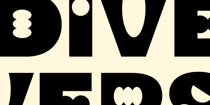
Diversity in design is an important topic to us at Shillington and we aim to support and strengthen equity by cultivating...
Last year Shillington launched, for the first time, our Diversity in Design Full Scholarship opportunities—in New York City,...
Diversity in design is an important topic to us at Shillington and we aim to support and strengthen equity by cultivating...
Last year Shillington launched, for the first time, our Diversity in Design Full Scholarship opportunities—in New York City,...
Diversity in design is an important topic to us at Shillington and we aim to support and strengthen equity by cultivating...
Want to win some amazing prizes and stay in the loop with all things Shillington? Sign up to our newsletter to automatically go in the draw.