Shillington Student Case Study—Monvelo
Tjerk Zumpolle graduated from the full-time course at our London campus just two months ago. He’s since returned to his home city, Amsterdam, where he’s embracing his new career as a graphic designer. Keen to find out more about Tjerk’s approach to design we asked him to take us through ‘Monvelo’ one of his portfolio projects which involved designing a bike sharing website for Montreal.
Tjerk shares with us his love of UX/UI and why sketching ideas before leaping onto the computer is paramount to creating a well considered piece of design.
So, what was the initial brief for this project?
The initial brief for this project was to create a bike sharing platform to attract people to the ‘bike lifestyle’ in Montreal. Creating a website where tech savvy people could easily navigate through.
Before embarking on the actual design how did you first approach the project. What kind of research did you do?
First I focused on the demographic. In my case, local residents of the city of Montreal. I created an persona to really step into the shoes of the user. What are their needs, what would they look for, when would they use it, how often would they use it? I questioned what language they’d speak, what movies they’d watch, and even considered what they would likely eat when they were hungover! But ultimately: why would they actually want to use this platform?
Apart from the demographic, I did research into the beautiful city of Montreal (a real bike-friendly city!) From the number of inhabitants and ratio of men to women, to the celebration of Victoria Day—which is a party for Montreal’s patios and parks with plenty of activities on offer around the city. Every characteristic was taken into account to create an as clear as possible overview before starting the actual design.
Being from Amsterdam, you’re obviously very well acquainted with bicycles and cycling. Do you think this familiarity helped drive your thought process during this project?
When I received this brief it definitely felt like a more personal project than usual. What I said earlier about the demographic, I actually took myself as a persona (I like to eat sushi when I am hungover) and this made it a bit easier to start things of.
So I asked myself; what would I look for in a bike sharing platform if everybody has their own bike? It has to be more than just the regular “touristy” bike sharing website. It needs to bring something to the table that I can engage with, it has to have personality and most importantly, it needs to win my trust.
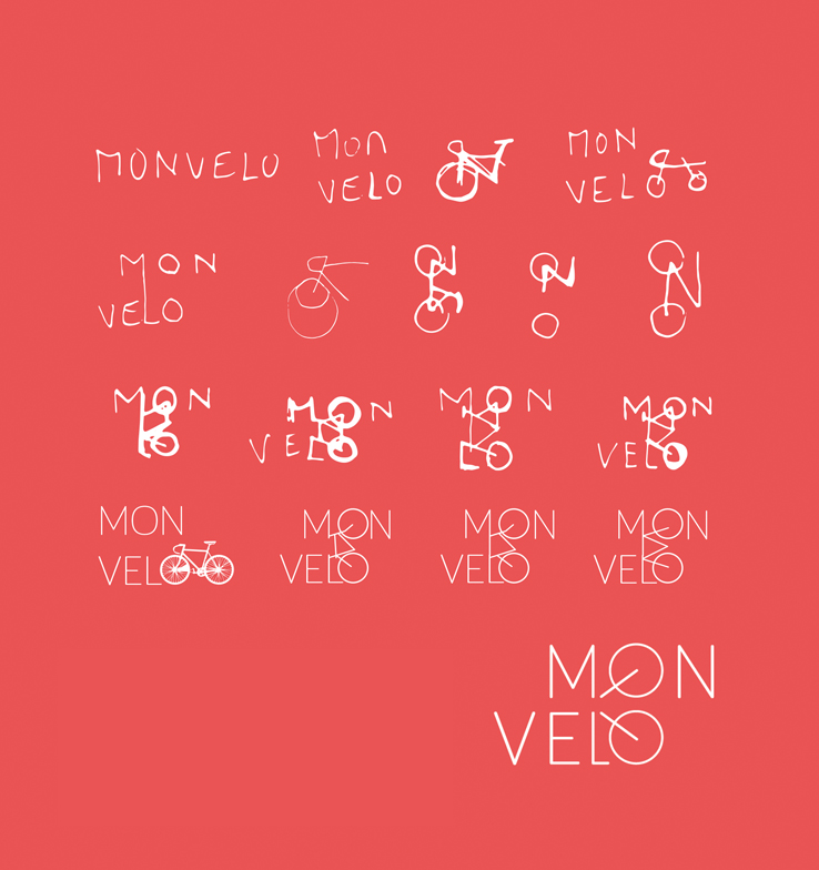
Your sketches really show the journey you went through before refining the final logo, how important do you think drawing out ideas and sketching elements are before approaching the computer?
Drawing out your initial ideas is key.
The first thing I do when receiving a brief is sketching out my first thoughts. Just some small scribbles, the uglier the better, the faster the better.
Just get it out on paper and have a look over it later. On paper you can really get your thoughts out quickly—whereas if you start drawing them directly on the computer you might get one idea on there but in the end just find yourself pixel pushing and not using your full imagination and potential.
Also when you draw your ideas and sketches out on paper, because you work so fast you can really slingshot yourself into new ideas, forms and shapes which lead to much more interesting outcomes. Only when you’ve sketched and scribbled through half of your notebook and are happy with two or three directions can you then draw them out on the computer and see what new opportunities come up on there.
Can you tell us a bit about some of the design choices you made, what made you choose the name, colour palette and typography for the Monvelo brand?
With all the previous research in mind I wrote down three keywords which I could use to lead the entire design process. “Personal”, “Quality” and “Easy”. (easy to use, and easy to navigate).
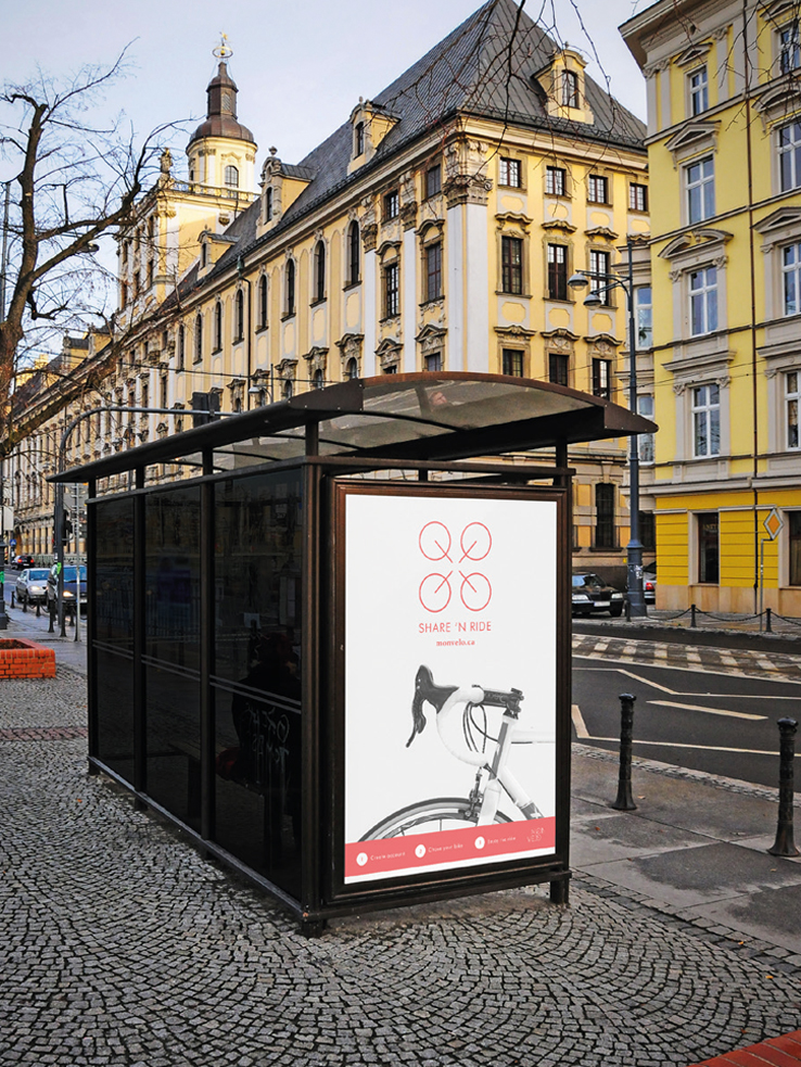
With those three words in mind I started designing, first thing on the list—the name. I started writing down all the words related to biking and Montreal and narrowed it down to Monvelo. All the research, keywords and back story come together in this name. “Mon velo” means “my bike” in French (referring back to the official language of Montreal) and also the “Mon” part of Monvelo is derived from the city’s name, Montreal. In addition, the word Monvelo just breathes quality.
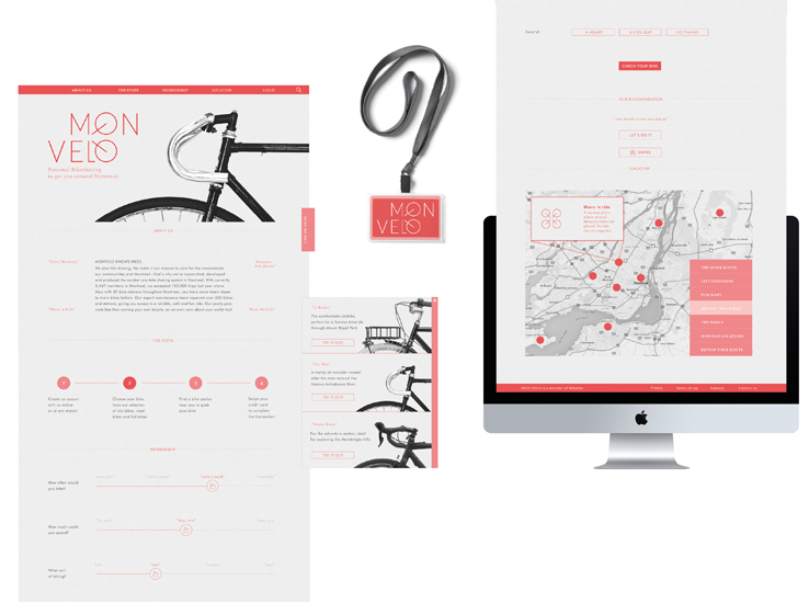
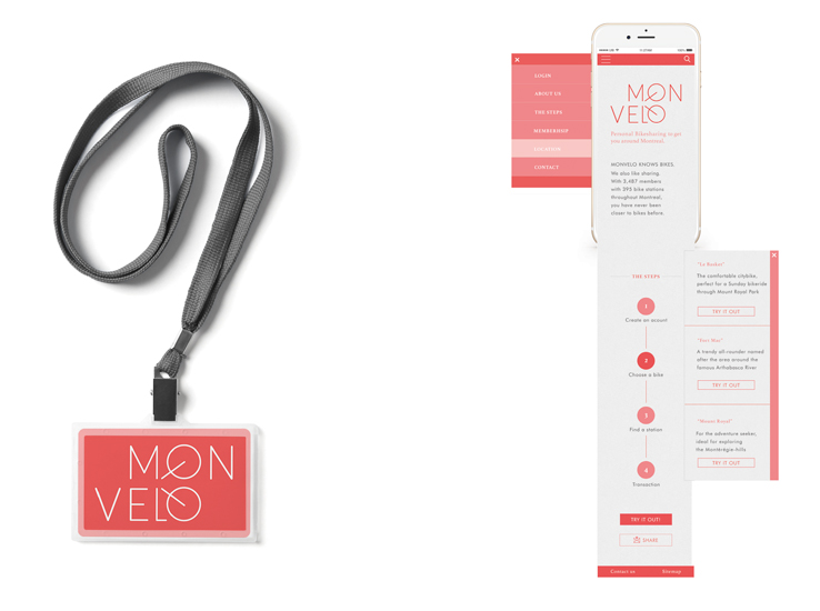
With the name settled I started to design the logo, which in my opinion should involve a subtle hint to the fact that it’s about bikes. I used a thin typeface and merging the two O’s to give the impression that a bike is used in the logo. Simple but effective.In terms of colour, because the website is aimed at local residents I thought a sense of unity and similarity could be reflected through colour. Therefore I chose a warm monochromatic red colour palette, complemented with a beige tint to give it more depth and quality.
I used two typefaces. A modern serif-typeface to give the impression that the website has been around for a long time, bringing a sense of trust to the user. To balance this serif-typeface, I used a modern sans-serif typeface with the same geometrical characteristics as the Serif type. Together they give the website a solid, trustworthy and modern look.
With a project like Monvelo there must of been a lot consideration when designing the website side of things—how did you find the UX/UI, is this an area you’d like to work in full time?
In the case of Monvelo, I decided to give the user only the strictly necessary information and buttons needed so a clear overview would be preserved.
Both the UX and UI are super important. A good user experience can so drastically change the way a user thinks about your brand. It’s an opportunity to win their trust.
Brainstorming about the steps the persona will take, wire-framing and endless testing with my classmates where the steps I took to find out what would work best. It transpired that a scroll down menu with simple steps to the end result ensured the user wouldn’t get lost and gave a maximum user experience.
In general UX/UI design combines the endless possibilities of the digital world with branding, for me that is where you can make a significant impact and really add value through design. So if this is an area I can see myself work in? Definitely!
What part of this project did you find the most enjoyable? And is there anything you’d do differently on reflection?
I enjoyed so many parts of this project. The research stage and initial decision making were instructive and fun. During those stages I got to know a lot about Montreal, but that goes for all branding projects; if you really dive into the subject matter you will learn so many things you’d never have thought you’d learn, which for me makes designing an engaging and enjoyable way to enhance my knowledge and develop my skills.
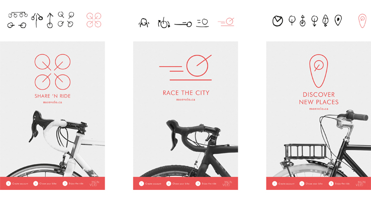
Also, coming up with an engaging UX design gave another dimension and boosted the design process which was really exciting. With the substantiated UI elements added to the design, the website came to a completion. When I created the final logo, I immediately saw the potential for other roll-out of the brand. The spokes of the logo served as a kit of parts to create different icons, which I then used to design posters. Posters to create awareness about the different possibilities Monvelo had to offer in the city of Montreal.
If I could change anything on reflection it would perhaps have been to go deeper into creating a tone of voice in the body copy, playing with a slightly different slang, to give it an even more personal Montreal touch.
Huge thanks to Tjerk for explaining his Movelo project in more depth. Head over to Tjerk’s website to see more of the work he completed while at Shillington.
If you’re curious about embarking on a career in digital design we’re currently enrolling for our September intake at London, Manchester, New York, Sydney, Melbourne and Brisbane. Find out more over here shillingtoneducation.com
Posts you might like

One of the best things about graphic design is that it never stands still for a moment. But that does mean that keeping up with...
Are you a graphic designer who is finding themselves lacking skills, slow on one of the major graphic design programs or just...

The best graphic design books can take you on an exciting journey of the imagination, transport you to new creative worlds or...

At Shillington, our dedicated graphic design students are taught all about how to design for packaging—from FMCG (that’s fast...
https://www.youtube.com/watch?v=wZ_tffGtZMs New York graduate Simon Fréour worked as a software engineer in France for seven...

At Shillington, our graphic design course teaches students how to design campaigns for a brand, helping to spread its message....
Are you working with graphic designers day-to-day and finding yourself jealous of the work they're doing? You're certainly not...
Diversity in design is an important topic to us at Shillington and we aim to support and strengthen equity by cultivating...
Want to win some amazing prizes and stay in the loop with all things Shillington? Sign up to our newsletter to automatically go in the draw.