Top 20 Fonts That Will Be Popular with Designers in 2020
It’s around this time of year at Shillington that we love to take a closer look at our students’ work and the wider design community to see if we can predict the fonts that will be popular in future.
From brand identities and packaging to editorial pieces and website designs, we’ve scoured through all of this year’s projects from our six campuses across the globe to pick out 20 typefaces that look set to be big in 2020.
These are fonts from some of the biggest type foundries in the world—although you’ll find a few options from the independents, too. Take a look and see if you agree with our predictions.
1. Ambit
CoType Foundry’s Ambit is an eccentric and unique sans serif font inspired by early grotesques but adapted for modern use. With seven weights and a distinctive look, it’s no surprise that we’ve seen it used for branding, packaging, and editorial projects, both printed and online.
2. Helvetica Now
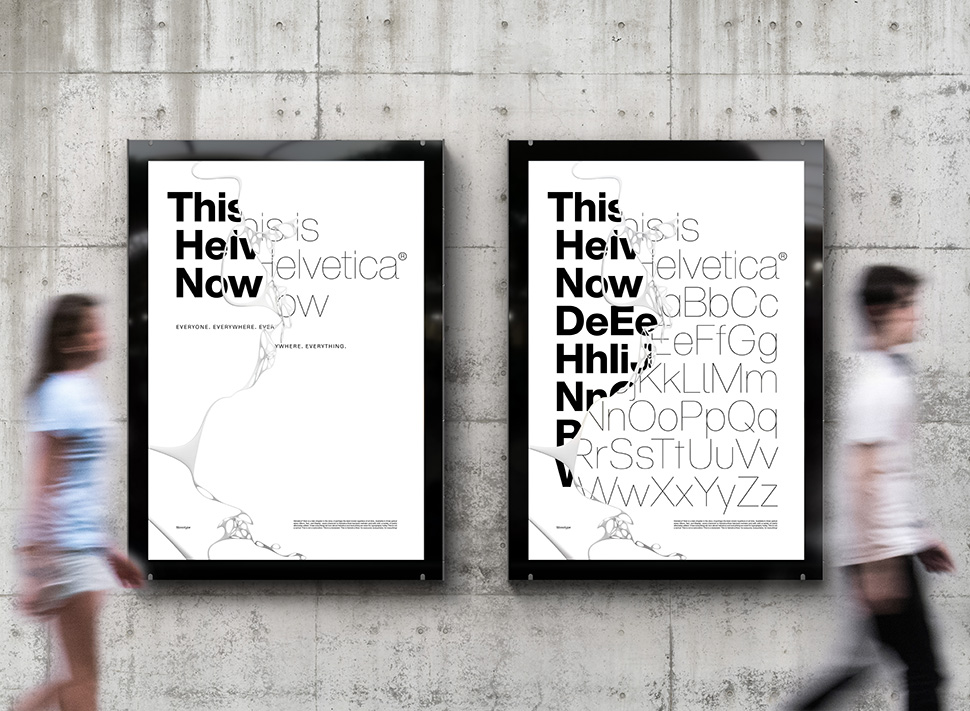
Following its big launch in April, Helvetica Now by Monotype is undoubtedly 2019’s winner. But let’s be honest – it was always going to be in demand. And we can see its popularity continuing right into next year, too. A complete redesign of the classic Helvetica, this is a typeface for the 21st Century with every letterform revised and redrawn.
3. Avenir Next Pro

Linotype’s Avenir Next Pro has been huge in 2019, and it’s a bestseller online, too. A new take on an absolute classic, Akira Kobayashi worked alongside Avenir’s original creator, Adrian Frutiger, to bring this new font to life. A genuinely superior sans family for all your projects.
4. Plantin
An old-style serif named after the 16th-century printer, Christophe Plantin, this typeface was created in 1913 by the British Monotype Corporation for its hot metal typesetting system. Body text in Plantin has a rich texture and is ideally suited for editorial or book designs – though it performs perfectly well on screens as well. We’ve seen Plantin make something of a comeback in recent months and its growing popularity shows no sign of slowing.
5. Futura PT
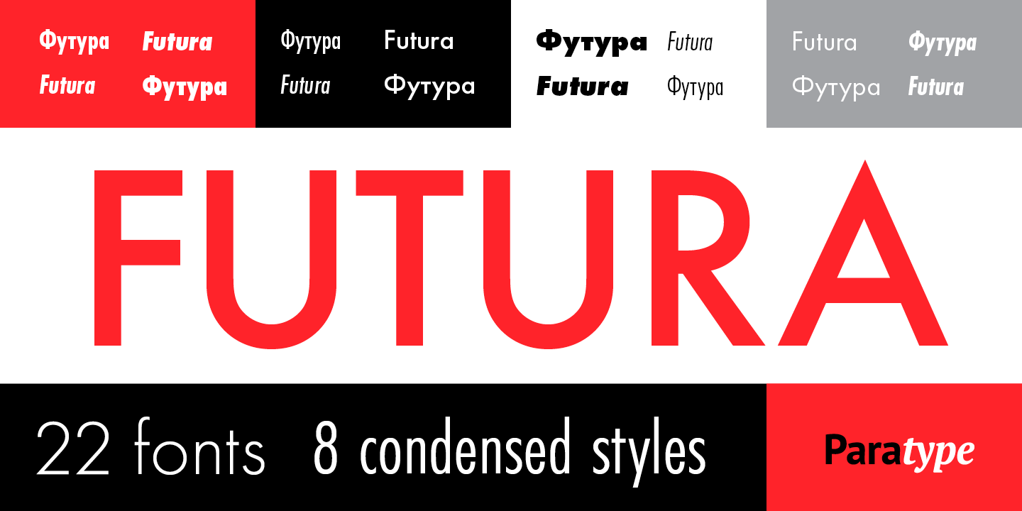
Paratype’s new take on Futura is everywhere. Designed for the Bauer company in 1927 by Paul Renner, it’s easy to see why the uniform type system is proving such a hit with our design students. It consists of seven weights with corresponding obliques and eight condensed styles, all coordinated in letterforms, metrics, and weights, so they work better together.
Are you ready to transform your career? Download our guide.
Discover how to become a graphic designer and start your creative career.
6. Untitled Sans
Untitled Sans is a plain neogrotesk sans based on the ideas of Jasper Morrison and Naoto Fukasawa’s Super Normal project. Throughout 2019, we’ve seen it pop up in many students’ projects. We can only thank Morrison and Fukasawa for bringing this brilliant typeface to life.
11. FF Meta
Designed by Erik Spiekermann, FF Meta has popped up in quite a few projects at Shillington throughout 2019. The humanist sans serif typeface family was released in 1991 intended to be a “complete antithesis of Helvetica”, which he deemed “boring and bland”. It’s always been on our radar, but it’s been interesting to see it as one of this year’s more prominent fonts.
7. TT Norms Pro
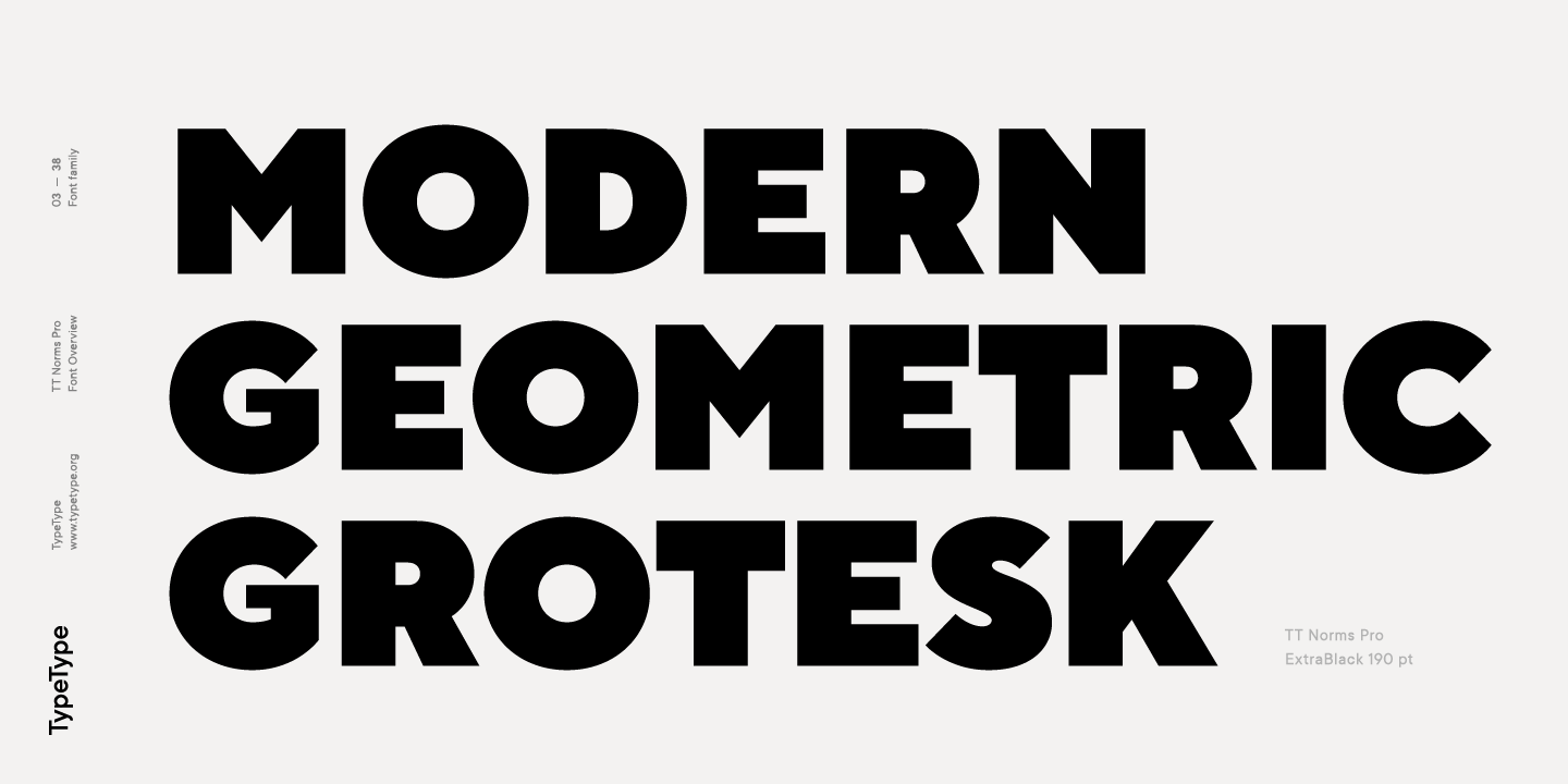
Hailed as a best-selling modern geometric sans, TT Norms Pro has 22 styles – 11 upright, 11 italics – and two variable fonts giving unlimited possibilities. It’s a reliable workhorse that will undoubtedly be in every designer’s toolkit in 2020.
8. Visuelt
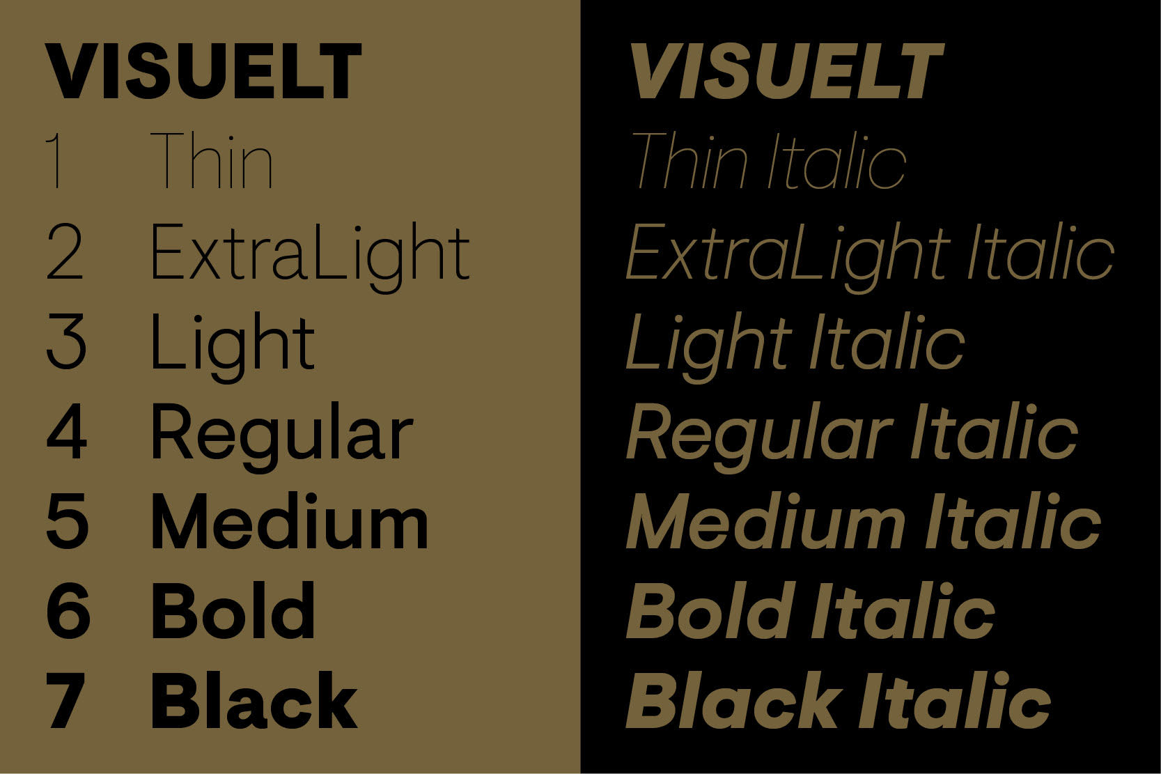
Created as a bespoke typeface for Visuelt, a design conference in Oslo, this typeface by Colophon spawned from a “more considered and constrained version” of Aperçu. Colophon revised and revisited the font and produced additional weights – the lightest of which has thin, precise curves. Understandably, this is a top choice for our students.
9. Sentinel
If you’ve ever wished Clarendons had italics or that your favourite slab serif had a few more weights and was able to look good in small text, then Sentinel by Hoefler&Co is the perfect typeface for you. And it’s a modern slab serif that’s getting a lot of attention in our design community.
10. Sweet Sans
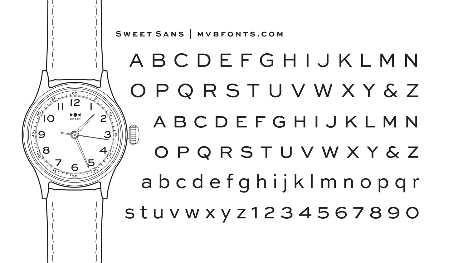
Mark van Bronkhorst designed Sweet Sans as a tribute to the engraver’s sans serif. It’s a family based on the lettering templates called ‘master plates’ but updated for contemporary use. Not surprisingly, it’s made quite an impression in 2019, and we think it’ll remain a bestseller over the next 12 months.
12. Univers
Univers was created in 1957 by Adrian Frutiger for Charles Peignot at Deberny & Peignot. A neo-grotesque sans-serif, it was one of the first consistent typeface families and has been quite the popular choice for designers everywhere. Our students loved using this typeface over the last 12 months, and we can see it being a top font in 2020, too.
13. Brandon Grotesque
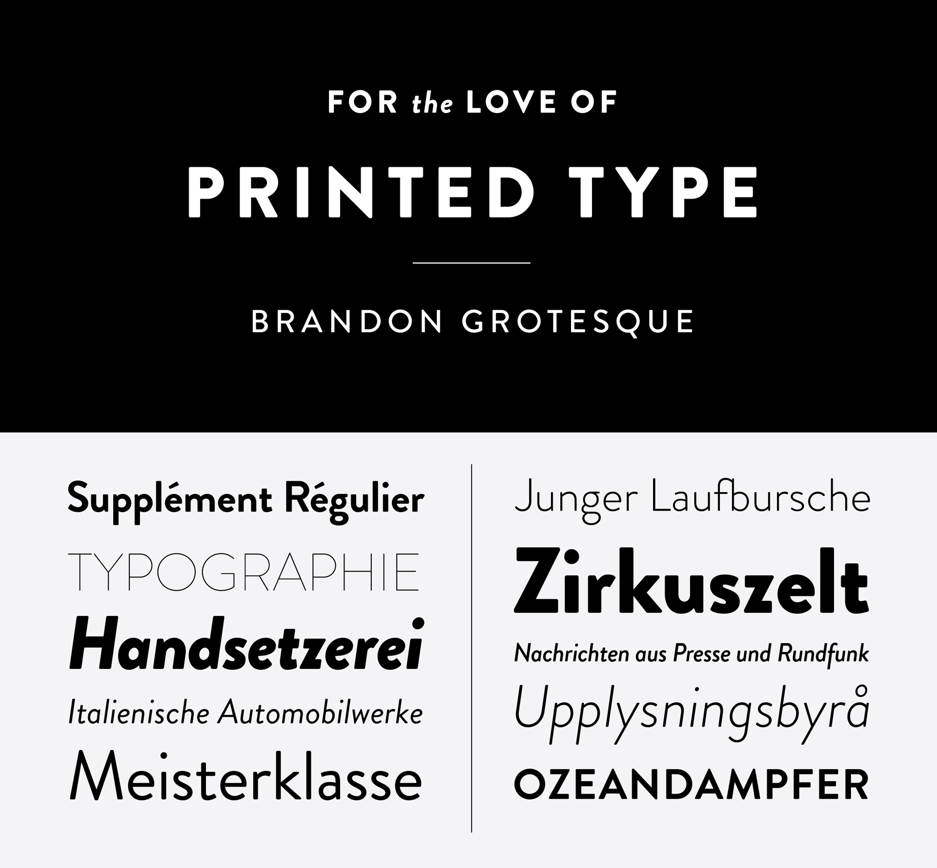
Influenced by the geometric-style sans serif faces popular in the 1920s and ’30s, Brandon Grotesque is another big prediction for 2020. Designed by Hannes von Döhren, it’s functional with a dash of warmth – and is something our students can’t get enough of. With plenty of weights and italics to choose from, and already pitched as a “modern classic”, we can understand why.
14. Peignot
A stressed sans-serif, Peignot has almost become a symbol for France and all things French since its launch in 1937. Designed by the poster artist A. M. Cassandre, it mixes capital and lowercase forms in such a pleasing way that it’s no wonder the typeface continues to set trends today.
15. Mantra
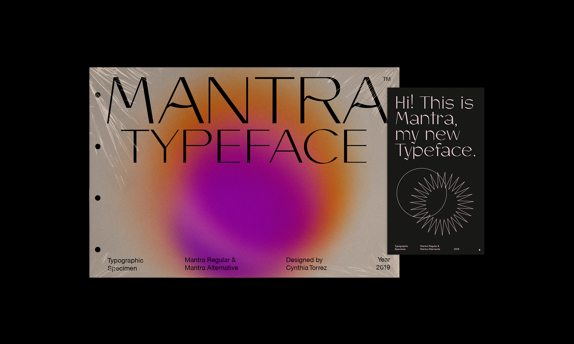
A new and experimental sans-serif typeface, Mantra by Cynthia Torrez is perfect for brand identities, logotype, headline text and captions. So much so, we’ve seen it in many student projects this year.
16. Minion
Robert Slimbach’s Minion was released in 1990 by Adobe. Inspired by late Renaissance-era type and intended for body text, the serif typeface is popping up in many editorial projects at Shillington. We think it’ll find even more ground in 2020.
17. Supria Sans
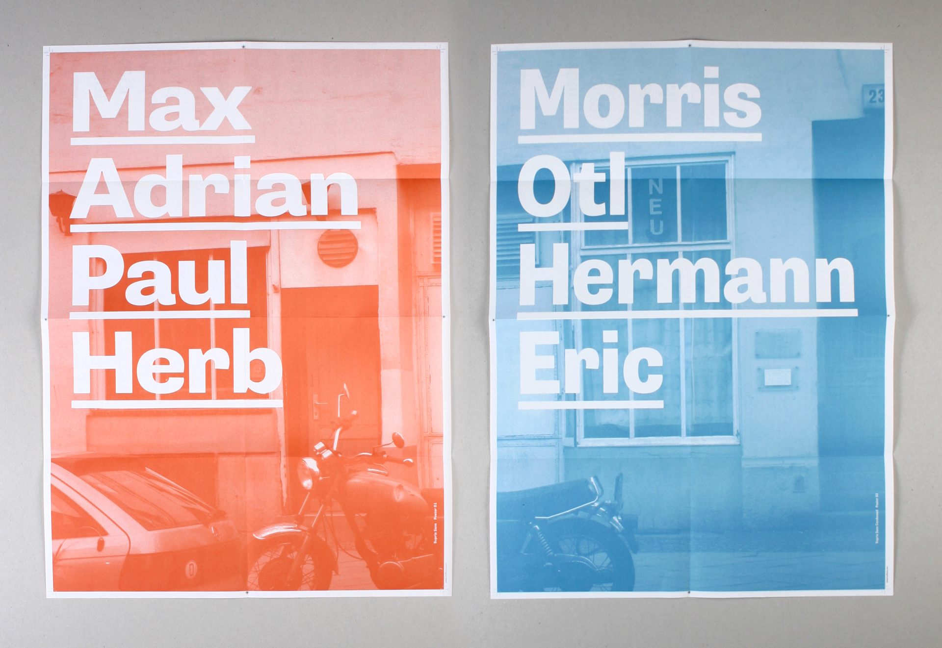
Another excellent typeface by Hannes von Döhren, Supria Sans is a type system with true italics and true obliques inspired by the practicality of Swiss type design with a more playful slant of subtle curves and fine detailing. Blown up it looks impactful and gorgeous; at smaller sizes, clean and classic. A great option for 2020.
18. Formula Condensed
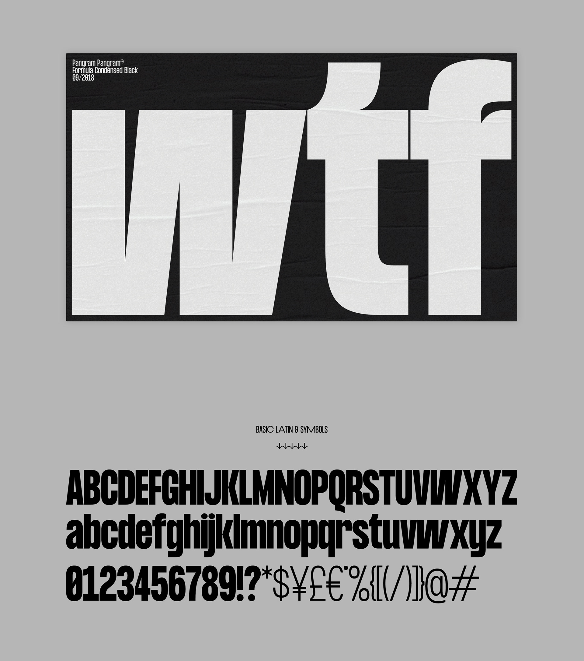
This versatile typeface has a bold and racy condensed look with the flexibility of a grotesque. And it’s graphically unique with wide alternates to the uppercase, numerals, and some symbols. We’ve seen a lot of it in 2019 and have a feeling it’s going nowhere anytime soon.
19. Matrice
A sans-serif display font family in eight weights with matching neutral italics, Matrice is rising up the font charts at Shillington. Supporting over 75 languages and influenced by the Grotesk typefaces developed in the early 20th Century, we can see why it’s a leader. Perfect for branding, logotype, headline text, and caption.
20. Panama
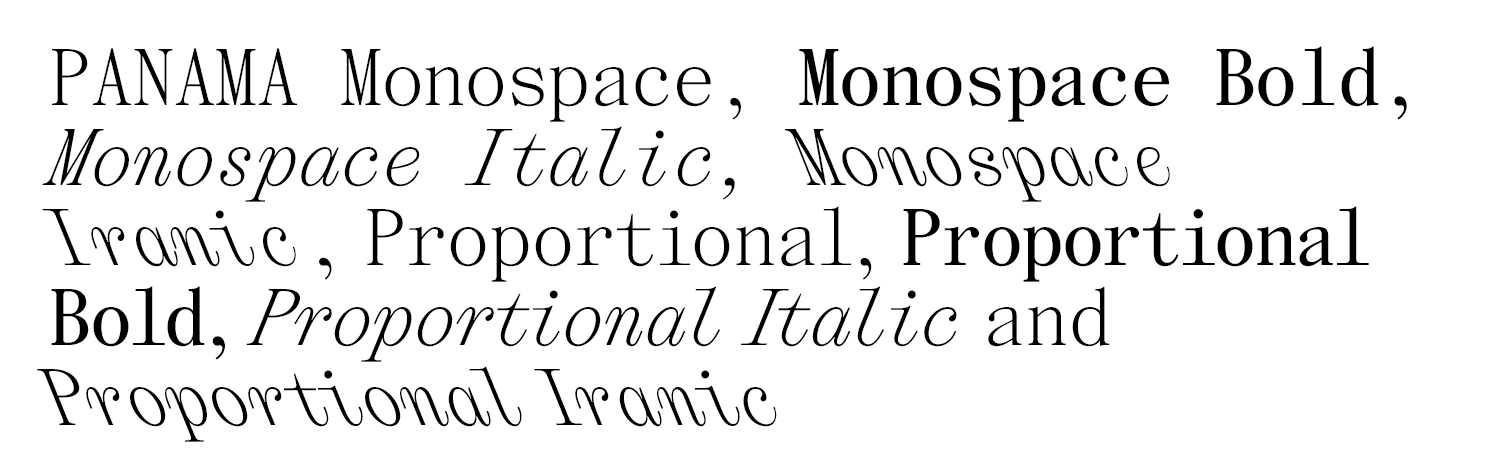
The Temporary State launched this serif typeface in 2017, and it’s been making quite the appearance in 2019. Designed by Roman Gornitsky, it’s an unusual choice to add to our list, but we think it’ll be a hit in 2020, as more designers discover its different styles.
Want to get hands on with some of these beautiful fonts? Consider taking the online graphic design course at Shillington!
Posts you might like

One of the best things about graphic design is that it never stands still for a moment. But that does mean that keeping up with...

The best graphic design books can take you on an exciting journey of the imagination, transport you to new creative worlds or...
We’ve all been feeling the squeeze over the past few years, but at Shillington we don’t want this to stop anyone getting the...

Are you considering becoming a graphic designer but want to be working online? With the increasing demand for digital design...
To ensure Shillington's commitment to the LGBTQ+ community extends beyond Pride Month, we’ve collated a list of incredible...
Are you looking to teach yourself graphic design? If so, you may be wondering if it is possible. The answer is yes—it can...
We're excited to announce Shillington's Diversity in Design Full Scholarship and Industry Mentorships and Global Half...
Are you interested in becoming a graphic designer but don't know where to start? You may be wondering if it's possible to...
Want to win some amazing prizes and stay in the loop with all things Shillington? Sign up to our newsletter to automatically go in the draw.