20 Best Graphic Design Fonts You Need to Know About in 2022
It’s that time of year again! As the new year approaches, it’s become somewhat of a tradition for us to look back at our students’ work, plus that of the design community in general, to highlight the fonts that are currently in vogue and likely to be big in the coming year. We’ve delved into the biggest Shillington projects, from our six physical campuses and our global body of online students, to predict the typefaces that will matter most in 2022.
These range from the new, radical and hip to traditional fonts that are re-emerging in style. They come from both big, established foundries and smaller, independent ones. And whether you’re working in physical or digital media, we hope they’ll help inspire for your own work over the next 12 months.
1. GT Ultra
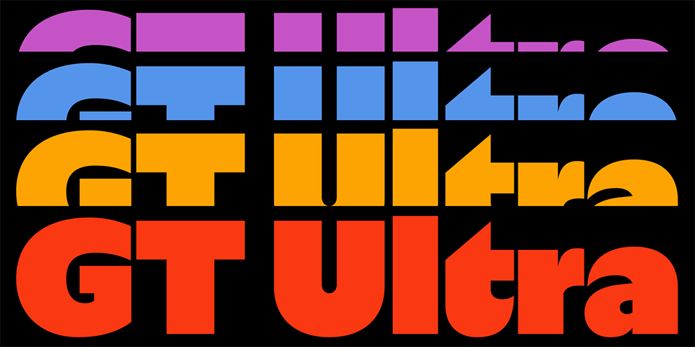
Unsure whether you want a serif or a sans? GT Ultra lies somewhere in between, fusing the sturdy context of the former with the dynamism of the latter. Finding a superb balance between flair and function, this is a unique typeface that will really help your design work turn heads.
2. Altform
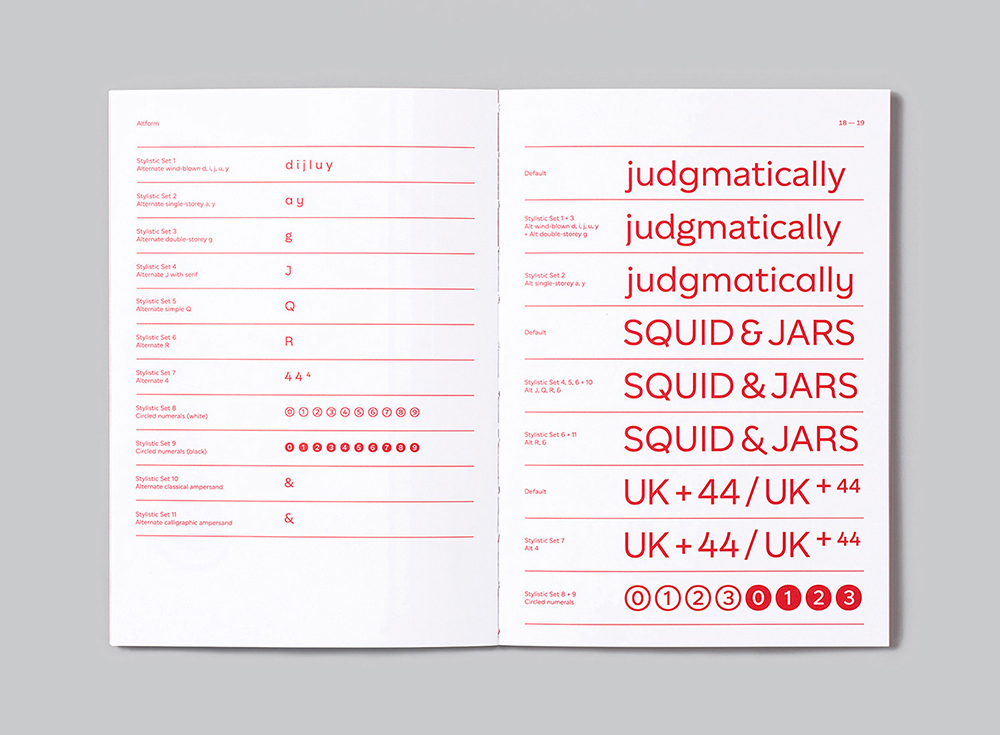
Fresh from CoType, Altform is a beautiful marriage between a geometric sans and a grotesque, giving it a universally neutral appeal. At first sight, it appears solid and deceptively simple; upon closer inspection, you’ll notice tiny exquisite curves in characters like R, t, and k, which give it a subtle sense of sophistication.
3. Prisma Text
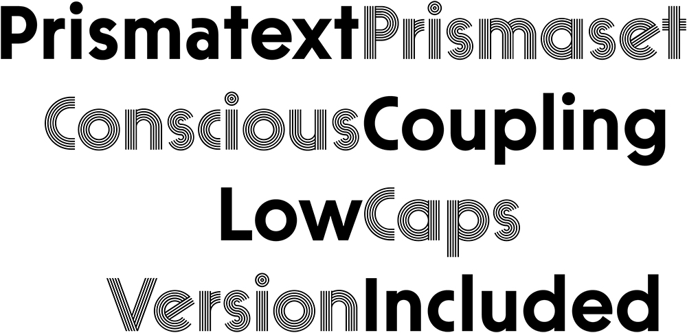
Designed by Robert Huber, Prisma Text from Lineto is full of expression and life. This geometric sans boasts a strikingly fresh and modern look while remaining highly legible, making it a great choice for body text, particularly at around 16pt sizes.
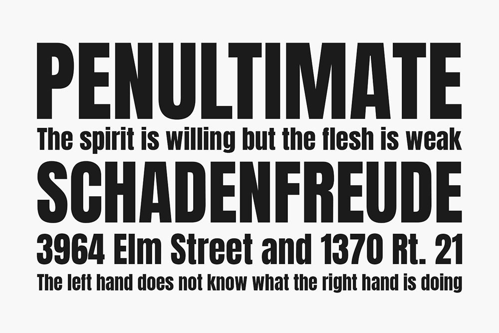
4. TT Rationalist
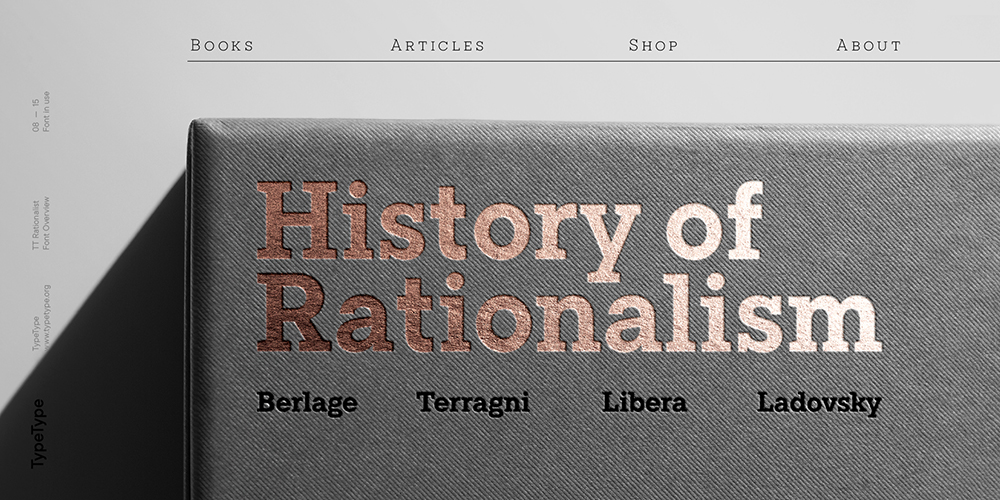
The idea behind TT Rationalist is quite something: to provide designers with a collection of matching fonts, each of which is still unique. It sounds like an impossible task, but TypeType has pulled it off with aplomb with this slab serif. Functional and original, its serifs are trapezoidal and refined, which makes them look strikingly modern.
5. Zubtrak
Zubtrak is a stencil display family in two styles designed by Vaibhav Singh. Its heady combination of sharp angles and restrained curves make for a truly original font. If you want your designs to be visually distinctive, this is an excellent choice.
6. Didot Modern
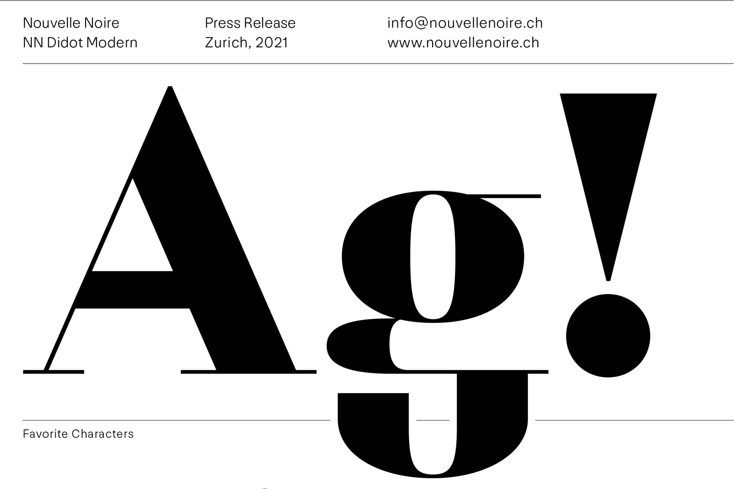
A tribute to the Didot archetype, Didot Modern is a typeface for text composition of all kinds. With its delicate thin strokes and precise details, it looks stunning at large sizes and is a great choice for corporate design or advertising projects.
7. Kobe
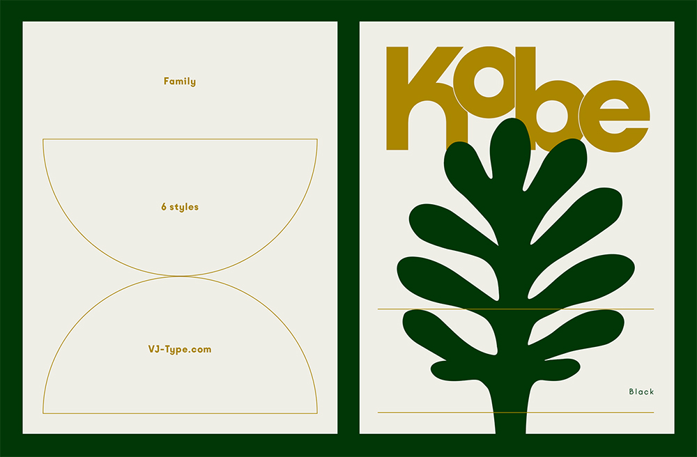
Kobe is a sans-serif designed for reading, based on geometric letterforms with optical corrections. Its well-proportioned modular structure made it a great choice for body text, while its playful terminals and many alternates make it also suitable as a display font. The regular version has just undergone a subtle makeover and now comes with five additional weights.
8. Voyage
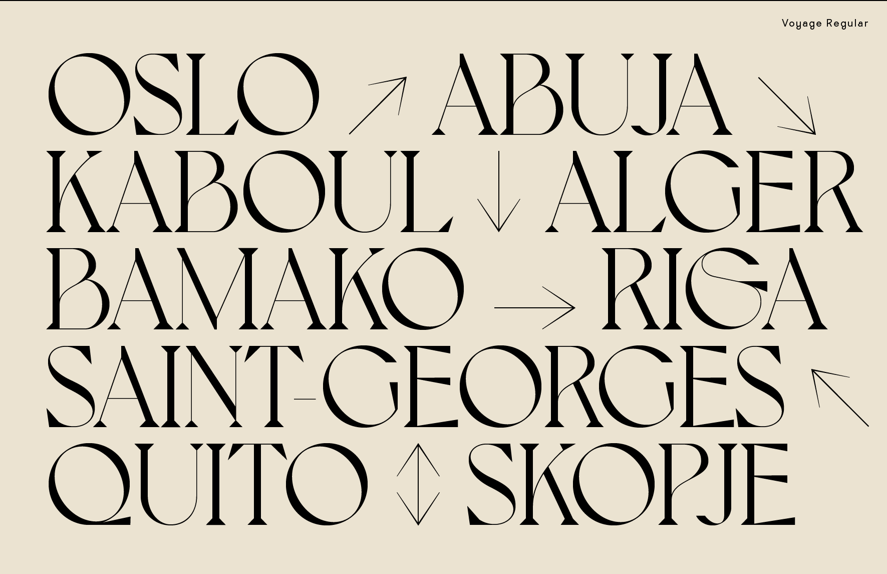
Voyage is a display typeface that’s romantic, curvy and inspired by global travel. It features delicate hairlines for maximum contrasts, from the eye of the lowercase ‘e’ to the curly ‘h’. Overall, it’s a strong contender for use in headlines, or short to medium-length text.
9. SangBleu
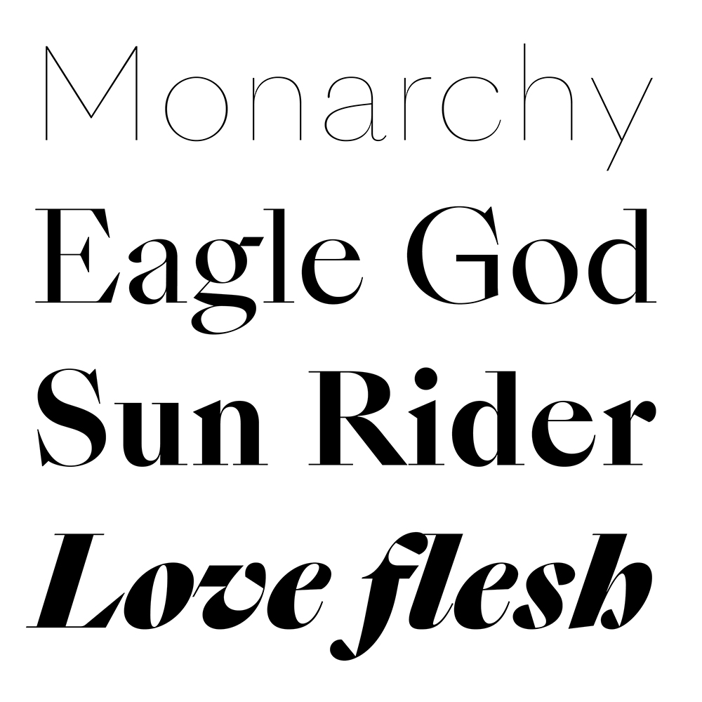
SangBleu is the name of both a media agency and a series of fonts designed by Swiss Typefaces between 2007 and 2017. Now they’ve released an all-new version, consisting of five full-featured collections: Empire, Kingdom, Republic, Versailles, and Sunrise. Each comes in four or five weights, all of which are accompanied by matching italics.
10. Basteleur
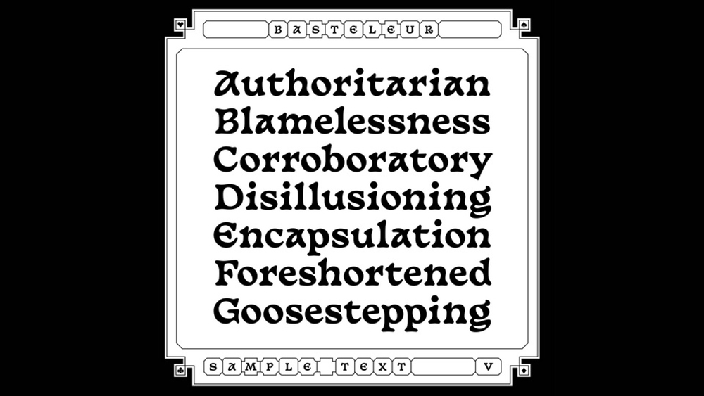
Basteleur is an unusual serif that’s basically a fun blend of medieval styles and Cooper Black-ish typefaces. It was created by French type designer Keussel to represent all the things a designer can experience: namely, “new beginnings, having fun, crafting, but also a lack of confidence and having a hard time to finish projects”.
11. Brice
A small bouncy serif with dynamic contrast, Brice has a wonderful 80s feel and would be a good choice for any display project. Designed by Cahya Sofyan, it’s available in five widths with a matching six weights and support for 75+ languages.
12. Eiko
Eiko is an original serif with high contrast that’s inspired by the work of Japanese artist Eiko Ishioka. It supports many languages and includes the Japanese syllable alphabets, hiragana and katakana. This font is ideal to pair with other kanji fonts of the mincho style.
13. FS Me
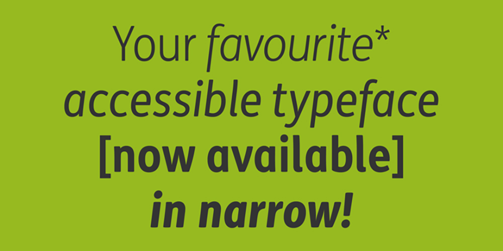
FS Me is designed specifically to improve legibility for people with learning disabilities. It was developed with and endorsed by UK charity Mencap, and every character has been tested for its appeal and readability with a range of learning disability groups. Mencap receives a donation for each font license purchased.
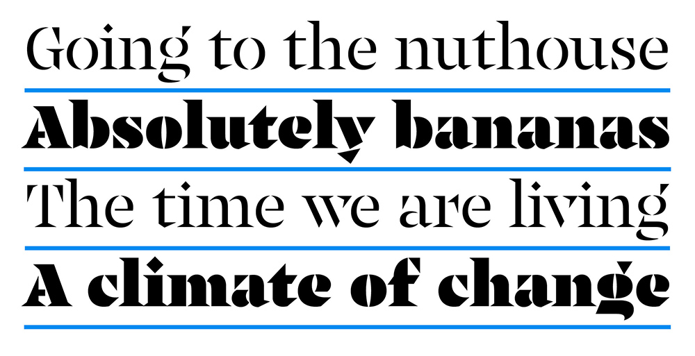
14. TNT Battenberg
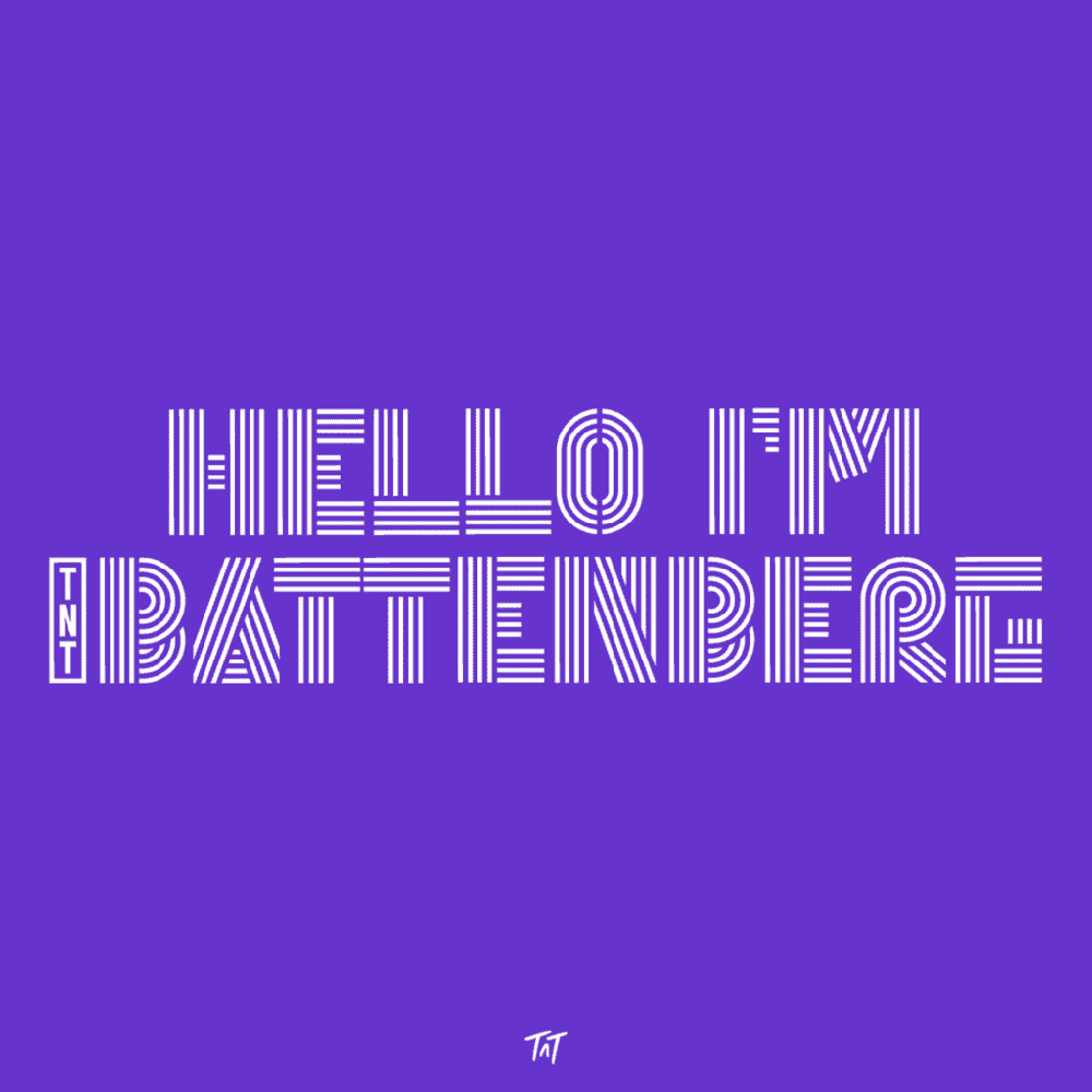
TNT Battenberg is an uppercase display font that’s big, bold and fun. It’s built from the starting point of four parallel lines and would provide a strong impact in packaging and branding designs. Incorporating Open Type features, TNT Battenberg is also very flexible and would pair well with more neutral sans-serifs in typographic layouts.
15. Libre Baskerville
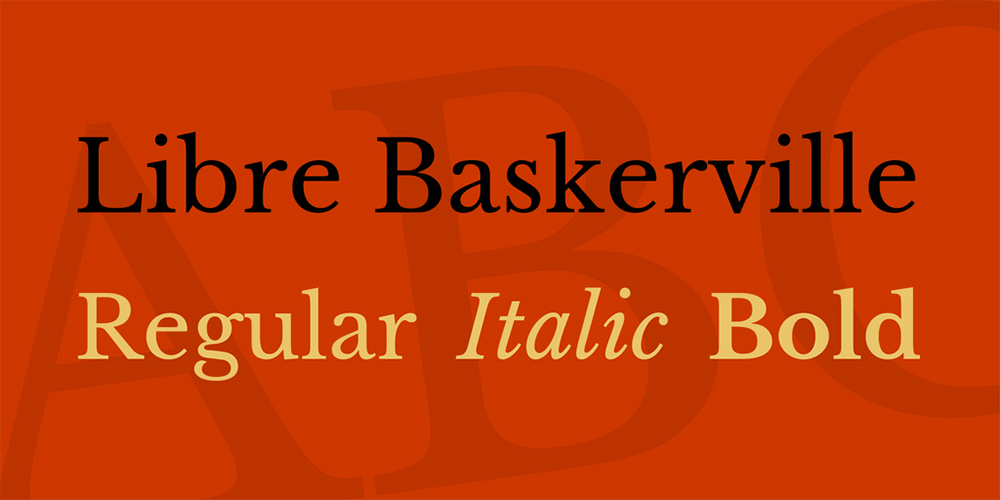
Based on Baskerville, the classic 1941 typeface from American Type Founder, Libre Baskerville is a contemporary web font optimised for body text. Its tall x-height, wide counters and restrained contrast means it works well for reading on-screen.
16. Cotford

Cotford is a contemporary serif from Monotype’s Tom Foley that’s dynamic, adaptable, and ever-surprising. This languid font ranges from delicate thins to bold heavyweights and follows a traditional model of three text and five display weights. Alternatively, you can use it as a variable font for the ultimate design flexibility.
17. HeroKid
Herokid is a grotesque style font inspired by classic fonts like Helvetica, Impact and Univers. A family, with 96 variants adaptable to kinds of design projects, it’s a great way to give high impact to your headlines, subtitles and/or body text.
18. Anton
Anton is a reworking of traditional advertising sans-serifs for use as a bold display font in modern web browsers. The letterforms have been digitised and reshaped, the counters have been opened up a little, and the stems have been optimised for display.
19. Dela Gothic One
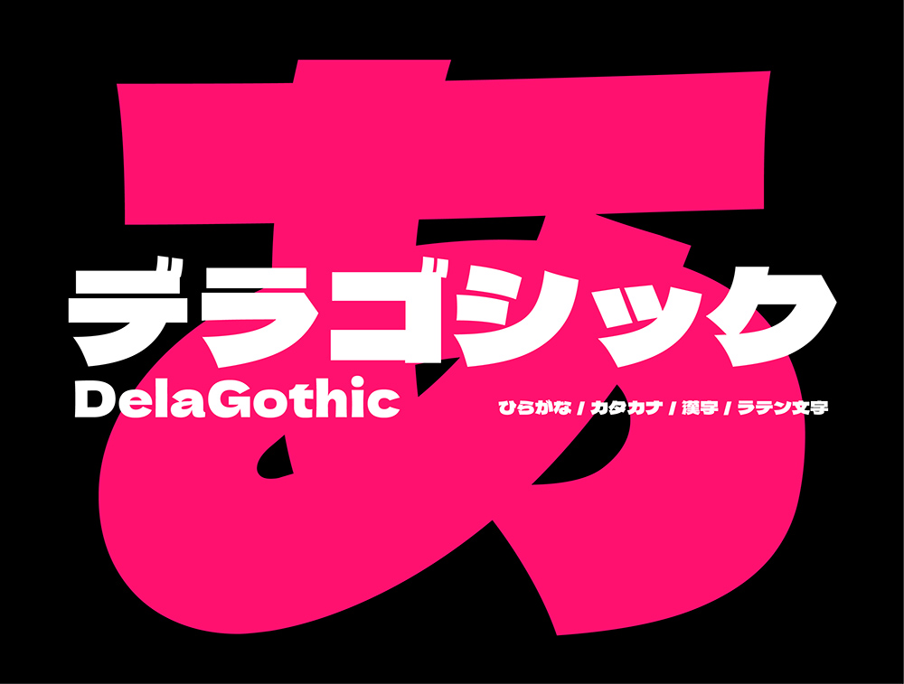
DelaGothic is a flat, thick Gothic body available for free from Google Fonts. Its letters flow into each other beautifully, and its overall stability and strength make it a good option for use in posters and packaging.
20. Alumni Sans
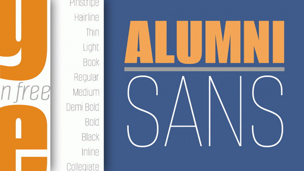
Originally inspired by the 1965 sans-serif Impact, Alumni Sans is a similar font to Trade Gothic, but free (again from Google Fonts) and variable. A great choice for advertising media, the extreme weights (Thin and Black) are designed for display situations, while the remaining weights may be used for more traditional textual design applications.
Want to get hands on with some of these beautiful fonts? Learn graphic design with Shillington—Online or on campus in Sydney, Melbourne, Brisbane, London, Manchester or New York.
Posts you might like

One of the best things about graphic design is that it never stands still for a moment. But that does mean that keeping up with...

The best graphic design books can take you on an exciting journey of the imagination, transport you to new creative worlds or...
We’ve all been feeling the squeeze over the past few years, but at Shillington we don’t want this to stop anyone getting the...

Are you considering becoming a graphic designer but want to be working online? With the increasing demand for digital design...
To ensure Shillington's commitment to the LGBTQ+ community extends beyond Pride Month, we’ve collated a list of incredible...
Are you looking to teach yourself graphic design? If so, you may be wondering if it is possible. The answer is yes—it can...
We're excited to announce Shillington's Diversity in Design Full Scholarship and Industry Mentorships and Global Half...
Are you interested in becoming a graphic designer but don't know where to start? You may be wondering if it's possible to...
Want to win some amazing prizes and stay in the loop with all things Shillington? Sign up to our newsletter to automatically go in the draw.