What is Typography? The Beginner’s Guide to Everything Typography
Selecting and crafting the right type is paramount in graphic design. Typography gives character and plays an emotive role in every design, even if you don’t notice it!
Typography can invoke a feeling, remind you of a certain brand, or create an atmosphere. In branding, think about the boldness of the FedEx logo (with a sneaky hidden arrow!) or the classic blackletter style of The New York Times’ masthead. For editorial typesetting, think about the layout of your favourite magazine. And on your phone, think about how different fonts are used across different apps.
But when typography its bad, it can be jarring and distracting, even unreadable. Think about the last time you were confused by messy type in an app, were misled by unclear signage or struggled to understand an illegible pamphlet or packaging product.
When you think about it, the art and science of typography is the basis of all communication such as logos, ad copy, headlines in magazines, and newspapers or chapter headings in a book.
And for designers, it’s especially important to have a well-founded understanding of typography to be able to explain why you’ve made certain typographic choices in your own designs.
At Shillington, we teach the basics of typography and typesetting because it’s a driving force in all forms of visual communication. Read on to learn more about the history of typography, typography rules to follow, and a go-to list of typography terms.
Typography and its history
Designers work to integrate historic principles and current thinking to create harmonious results that often have to work in print as well as in pixels. Dating from the 11th century in East Asia (yes, Johannes Gutenberg didn’t actually invent the printing press), type was the result of the work between a type creator and a typesetter. By the 1800s, the letters that were created were then made into metal blocks. Each typeface, or overall design, was turned into fonts that were then sold to print shops.
The typesetters at the printmakers shops would then set the fonts and would often decide to include space to let the type breathe, so to speak, and easier to read. The spacers they used were made of lead and so adding the space became known as leading. Both leading and fonts are measured in points such as 10, 12, 14 and fonts can have weight—bold, regular, or light—and the combination of the two is an art that when done well resulted in clear, even beautiful, communication.
Now that we’ve moved into the digital age and there’s easy access to lightning-fast computers, type creators have the freedom to create without the physical constraints of the earlier era. Nowadays, obviously the fonts don’t have to be represented by metal blocks and leading isn’t actual lead. Despite this, the industry evolved slowly, staying loyal to tried and true fonts, even as new ones evolved.
Though now most designers don’t necessarily study the original terminology, fonts, or rules of typography, the shadow and form of these principles can still be seen in typefaces that work in both print and online.
Understanding typeface, font and choice
The right type choice can communicate your message instantly. But a poor choice can change the intended message completely.
Most designers can be overwhelmed by the sheer volume of typefaces available. Have you ever scrolled through the hundreds of options on DaFont? The best designers know how to analyze fonts and hone in on the best choice for each project—rather then pick and choose a different typeface each time.
If you’re new to design, you’ve probably wondered what the difference is between “typeface” and “font.” A typeface is a designed set of characters that make up a complete set of type, while a font is the digital file that allows users to type out or design with on their computer.
Some digital companies use the term interchangeably and programs such as Microsoft Word allow users to pick a font and adjust size and weight, combining the two definitions. But for the sake of clarity, typefaces are designed by typographers or type designers, while fonts are variations within typeface families.
In more traditional design or training, it is understood that just as an album is full of songs or photographs, a typeface is full of fonts. The terminology debates are often generational and just like development languages, more modern entities use the term “font” in place of “typeface.” In many professional workplaces, it’s now acceptable to use font to mean design typeface, but it’s important to understand print designers still often use typeface.
Web designers have come to use the word font as a substitute for typeface since HTML uses “font face” to specify a family followed by attributes such as size and color to be even more specific. Additionally, CSS uses “font family” as synonym for typeface and then size and weight as attributes. The various levels of weight include extra light, normal, medium, semibold, bold, extra bold, and ultra black.
Most designers, whether print or web, understand which are the more common typefaces and which have a bit more edge. They are fluent in which choice will signal the same old, same old, and which will show that a print piece or web site is going to stand out, change the norm and reach the mind in a new way. The main point of choosing a certain typeface is to provide aesthetics—sometimes the type is easy to read and sometimes used for more of a design purpose.
If you want to become a master of using the appropriate type, it’s important that you never lose sight of the fact that the message is still more important than the style. If the message cannot be understood due to the style being too fancy or complex, then the graphic designer has failed. The key to success in this field is to mix style with clarity.
Plus, there can definitely be implications of choosing an inappropriate font. For example, if you choose a wide font with a low x-height, you might have to use a larger point size. This might not seem like a big deal on a single page of type, but imagine a 300 page book. Selecting the wrong typeface could blow it into a 500 page book, which would have a major effect on budgets and end result.
Digital type has created an explosion of available fonts and good professional typography design requires a set of disciplines to think of the reader first and then artistic embellishments later. Gothic style lettering, for example, might work for an audience of gothic fans, but it probably doesn’t connect with people who are not familiar with that particular style.
Despite the glut of options, there are those who think sticking to what has always worked is the way to go. Design master Massimo Vignelli argued in his publication “The Vignelli Canon,” that a designer should only use a basic collection of classic typefaces to avoid contributing to the visual pollution that he believed to be happening in the world of design. Vignelli only used six typefaces in total: Bodoni, Futura, Times, and Helvetica; plus Garamond and Century Expanded.
But at the end of the day, whether your type library has 200 fonts or six (like Vignelli suggests!), what’s most important is how you understand and craft the font to work within each individual brief and graphic design project.
Typography rules to follow
In order to understand the basics, it’s important to learn typography rules that will guide you as you improve your design. The five basic principles of typography design or any other type of graphic design that every designer should know are:
- Balance that conveys a consistent structure
- Hierarchy that defines organization and direction
- Contrast to emphasize highlights
- Repetition to create consistency and familiarity
- Alignment to present a sharp and structured image
In addition to this list, layout, white space and color are essential elements of typography basics. It’s important to look at the shapes created by the words and letters. Challenge your brain to look beyond what the word “says” and more closely at how it “looks.”
White space is used as a print and web design strategy to make text look less busy and more pleasing to the eye. It’s important to have a comfortable balance between the text and graphics and the empty aka white space of the blank background. Plus, you can get creative with white space to show hidden meanings!
Color psychology continues to be studied, but designers understand that a mix of the primary hues of the visible spectrum (red, yellow, green, blue, and purple) and blends of these colors and “achromatic colors” (white, gray, and black) all have certain effects on the overall design when blended with text.
When it comes to print design, a high percentage of typography design uses black text on a white background. Studies have shown that is the easiest presentation to read. Conversely, white letters on a black background is also popular, especially in presentations that are meant to be dramatic, but in many cases, these can ultimately prove difficult to read, especially for people with any type of vision impairment. Bigger visuals such as freeway billboards and movie screens obviously work well with both white on black and black on white.
Other real world visuals that use color and type to quickly and clearly communicate and that also represent basic typography rules are road signs. Road signs come in various sizes, shapes, and colors, but which are all carefully designed to bring about a definite result. A caution sign, for example, is yellow with black letters, while a more serious warning sign is orange with black letters. The bright backgrounds of these posts, particularly for yellow-green school crossing signs, are easy to see from far away. Signs with symbols such as a one-way sign with an arrow pointing toward the direction of traffic often communicate to drivers better than words can. People understand visual images instantly, whereas text can take a few extra seconds to read.
These signs are all deceptively simple but follow the rules outlined above. Engineers have conducted deep studies on typography design and what works best for promoting driver safety. The size of the lettering plays a big role in this communication. The limitations of human vision were taken into account when federal highway officials standardized the signs. The same is true with signs that are designed for handicapped individuals in wheelchairs, as specific regulations dictate that signs for disabled people must be easy-to-read and at eye level.
In web design, there is much more scope, and color and type combinations of all types have been tested. The main consideration when designing for web is contrast. Good color contrast needs to be in place to ensure readability, and steps to ensure this include choosing your color palette, finding a good color contrast analyzer, examining the body test contrast to make sure you can read it when it goes live, and making sure that buttons and links show up clearly. As with print, having a style guide to refer to is always helpful as well.
So in order to master typography, you must first learn the rules and then decide if you want to break them for artistic purposes. Even if you’re new to graphic design and have never thought about the print world or typography, understanding the basics will give you a framework to understand when to go beyond usual design parameters and when to work within the scope of usual typography. Testing is also crucial to the overall design process. What the typography looks like at the intended size in print or digital can make or break the design.
So, whether you are learning typography design for your business, to become a professional designer, or to simply know the science behind this art, you must understand that different typefaces convey or associate with different emotions. Think of popular logos you’ve seen throughout your lifetime. Two things many of them have in common are simplicity and relevance. The typeface must fit the image of the business for the logo to be memorable and effective.
The most effective typography design lives up to an audience’s expectations. A fun amusement park might have curvy colorful letters whereas a serious financial firm will likely use more traditional lettering. All the components of typography discussed here contribute to emotions and feelings attached to specific typefaces.
Applying typography basics when typesetting
Beyond the basics, typesetting is a very important component of understanding typography in graphic design, and something all good graphic designers must master. We think of it as the art of making a volume of text inviting and accessible to its intended audience.
As the saying goes, ‘good typography should go unnoticed’—in other words, your audience should enjoy reading content without being distracted by type that lacks rhythm, cohesion and a fundamental sense of readability.
Typesetting copy involves many decisions such as choosing the appropriate line length, the size, leading and font for headings, subheadings, and body copy all the way to the footnotes and buttons. Typesetting decisions can also include how letters are spaced apart a.k.a tracking, the height of letters, and other subtle details.
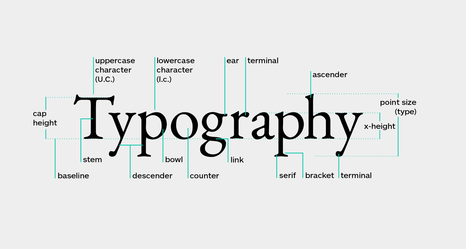
See the list of typography terms below to see a more thorough list and explanation. Important properties to learn initially are baseline, which aligns the bottom of letters in a straight line, x-height, which is the imaginary line running through the top of lower case letters, and cap height, which aligns the tops of capital letters. These three lines help define the proportions of letters and decorative elements in relation to each other.
While type properties help position letters on a grid, type classification relates more to style and shape of the characters and how a designer chooses to use there in display or headlines fonts. A perfect example of this is the difference between serif and sans serif. A serif is a small extension to a letter such as a slight curve at the end of a stroke. Think of the capital letter “I,” for example. As opposed to just a plain straight vertical line, a serif is a small perpendicular line appearing at both the tops and bottoms of letters. A more modern look is “sans serif,” meaning serifs have been eliminated, giving the letters a more plain appearance.
The main approach for all types of typography design is to use the grid system, whether visible or invisible, to line up letters so that they are generally consistent with each other. Keeping the type based on a grid gives it a more stable look, since without an axis or reference line, the results can be mixed or uneven.
Each line of text has factors that affect how the letters appear on a page. This appearance is affected by both margins and letter-spacing. A standard newspaper or magazine article traditionally uses justified margins, meaning that the text is arranged to create an even look on both sides of the page, creating a square-shaped block of text. Business reports are often structured with these even margins, which many people recognize as a high-end professional appearance.
One of the key typography rules for line length for text is to stay within the limits of 40 to 55 characters, except for desktop or other larger screen applications. Contrary to what many think, the eye does not read individual words one at a time, but it scans the line pausing momentarily to read groups of three or four words. Too long a line tends to tire the eye and makes it difficult to locate the beginning of the line that follows. On the other hand, lines that are too short disrupt sentence structure. Also it requires the eye to change lines too often.
Responsive web design keeps designers from exceeding this limit and keep things easy to read. When text extends completely across the screen, it may look too comprehensive. Under 40 characters per line can look weak and too narrow, giving it the appearance of “fluff content” when the intent may have been to present an informative blog or article.
List of typography terms
See below for a comprehensive list of foundational typographic terms.
If you want to dive into more detailed type anatomy, our Shillington teaching team recommends Typography Deconstructed’s incredible Type Glossary.
- Alignment: result of lining up letters to a reference such as a margin
- Aperture: white space at the end of an open counter
- Apex: the top point where two strokes are joined together
- Arm: when a horizontal stroke is not attached to a stem on one end
- Ascender: the stem of a lowercase letter projecting above the x-height.
- Backslanted: italics leaning backward
- Ball Terminal: ball-shape extension of a letter
- Baseline: the imaginary line upon which a line of text rests.
- Bold: a heavy weight of any given typeface, often used for emphasis.
- Bowl: the generally round or elliptical forms which are the basic body shape of letters such as C, G, O in the uppercase, and b, c, e, o, p in the lowercase.
- Bracket: a curved connection between the stem and serif of some fonts. Not all serifs are bracketed serifs.
- Calligraphy: the art of writing letters with a very specific tool (e.g., broad nib pen, brush pen, etc.)
- Cap Height: the height of capital letters, measured from baseline to the top of the capital letter. It is based on letters that are flat on the top and bottom, such as an H or an E. Capital letters with curves, such as B, C, D, G, O, Q, and S extended slightly above and below the cap height to appear optically similar in size to other letters.
- Center aligned: when text is aligned to the center of a text frame, with the rag on the left and right sides of the text frame
- instances where body copy is aligned within a text frame, creating a rag on both sides
- Character: a letter, number, punctuation mark or symbol
- Character Set: entire collection of characters for any given typeface weight
- Counter: the white space enclosed by a letterform, whether wholly enclosed, as in ‘d’ or ‘o’, or partially, as in ‘c’ or a double-story ‘a’.
- Crossbar: a stroke across a stem (as in the horizontal line of the letter ‘T’, ‘H’, ‘E’, etc.)
- Descender: the stem of a lowercase letter that extended below the baseline, such as the g, j, p, q, and y.
- Ear: the stroke attached to the bowl of the lowercase g. Some typographers use the same term for the lowercase r.
- Ellipsis: character composed of three dots.
- Extended: character with an exaggerated width a character such as an accent mark
- Grid: imaginary or actual layout of vertical and horizontal lines for alignment
- Descender: when part of a letter drops below the baseline
- Display: a category of typefaces that is primarily used for headlines and subheads due to their heavy weight and/or detailed nature
- Font Color: used in web design to specify a color
- Font Size: the height of a typeface. It is usually measured in points (8, 10, 12, etc.), from baseline to baseline.
- Font Weight: font thickness (light, regular, medium, bold)
- Hook: curved arch (such as on the letter ‘f’)
- Hand-lettering: creating custom letters from scratch for a specific purpose/client.
- Italics: forward-slanting characters, developed in early 1500s
- Joint: stroke connects with a stem
- Justified: instances when text is aligned to the left and right margin within a text frame, with no rag on either side
- Kerning: the space between individual pairs of characters.
- Leading: the horizontal space between two lines of text that is measured from baseline to baseline. In some cases, it may be referred to as ‘line height’.
- Left-aligned: text is aligned with the left margin
- Leg: short stroke in a downward direction
- Ligature: occurs where two or more letters are joined together as one character.
- Link: the stroke connecting the bowl and the loop of the lowercase g.
- Lowercase: lowercase characters are the non-capital letters of the alphabet. They make up the bulk of written text, with uppercase or capital letters used primarily only to start sentences or proper names. The term lowercase is derived from the days of metal type where the more frequently used letters were kept near at hand in the lower case while the less frequently used capital letters were kept in the harder to reach upper case.
- Monospaced: an example of a typeface where each character is the same width
- Orphan: a single word that appears at the beginning of a page.
- Point size: the distance from the top of the highest ascender to the bottom of the lowest descender is the point size of any given typeface. Originally, this was the height of the face of the metal block on which each individual letter was cast.
- Rag: the uneven vertical edge of a block of type. Could be on the left side, right side, or both.
- Readability: degree to which text can easily be read
- Right-aligned: when text is aligned to the right margin with the rag on the left side of the text frame
- Sans Serif: no extension of strokes on characters
- Serif: a stroke drawn at right angle or obliquely across the arm, stem, or tail of a letter. It is found on vertical and horizontal strokes of some characters. Serifs can also fall into different categories, such as slab or hairline, among others.
- Shoulder: curved stroke connected to a stem
- Stem: A vertical stroke in a letterform. Can be found in both lowercase and uppercase letters.
- Stress: diagonal or vertical change in stroke width across a letter
- Stroke: any linear feature on a letter
- Swash: addition of a decorative stroke
- System Font: main font used by a computer operating system
- Terminal: any stroke which does not terminate in a serif is a terminal. It can be either straight or curved.
- Tracking: the amount of space between all letters across a line of text. It is also referred to as letterspacing.
- Type Classification: type of characters based on style
- Type Properties: qualities that allow characters to fit on a grid
- Typeface design: the process of creating a complete set of characters in a specific style. This could include uppercase & lowercase characters, mathematical symbols, punctuation, numerals, etc.
- Type size: the distance from the top of the highest ascender to the bottom of the lowest descender. It is usually measured in points.
- Typesetting: the process of laying out large amounts of text (e.g., a book, a magazine, etc.) and making sure it’s legible and readable
- Uppercase: uppercase characters are the capital letters of the alphabet. Uppercase letters are normally used at the beginning of sentences and as the first letter of proper names. The term uppercase is derived from the days of metal type where the lesser used capital letters were kept in the harder to reach upper case while the more frequently used letters were kept nearer at hand, in the lower case.
- Vertex: the bottom point where two strokes are joined together
- Widow: one word on its own line at the end of a paragraph or a column.
- X-Height: the height of lowercase letters in any given typeface. The measurement is based off the height of the letter ‘x’. Lowercase letters with curves (such as a, c, e, o, s, u, and others) usually extend slight below and above the x-height, to appear optically similar in size to other letters
This glossary is a great foundation for your typography vocabulary, but please keep in mind you may come across alternate definitions or uses from different sources.
Hope you enjoyed this fundamental overview of typography in design. If you’re nerding out about this analysis, you should consider studying at Shillington and taking our online graphic design course!
Posts you might like
One of the best things about graphic design is that it never stands still for a moment. But that does mean that keeping up with...

The best graphic design books can take you on an exciting journey of the imagination, transport you to new creative worlds or...
We’ve all been feeling the squeeze over the past few years, but at Shillington we don’t want this to stop anyone getting the...
Are you considering becoming a graphic designer but want to be working online? With the increasing demand for digital design...
To ensure Shillington's commitment to the LGBTQ+ community extends beyond Pride Month, we’ve collated a list of incredible...
Are you looking to teach yourself graphic design? If so, you may be wondering if it is possible. The answer is yes—it can...
Are you interested in becoming a graphic designer but don't know where to start? You may be wondering if it's possible to...
Are you considering changing your career, but don't know where to start? Are you an aspiring creative with a passion for...
Want to win some amazing prizes and stay in the loop with all things Shillington? Sign up to our newsletter to automatically go in the draw.