Hato on Studio Life and Risograph Printing
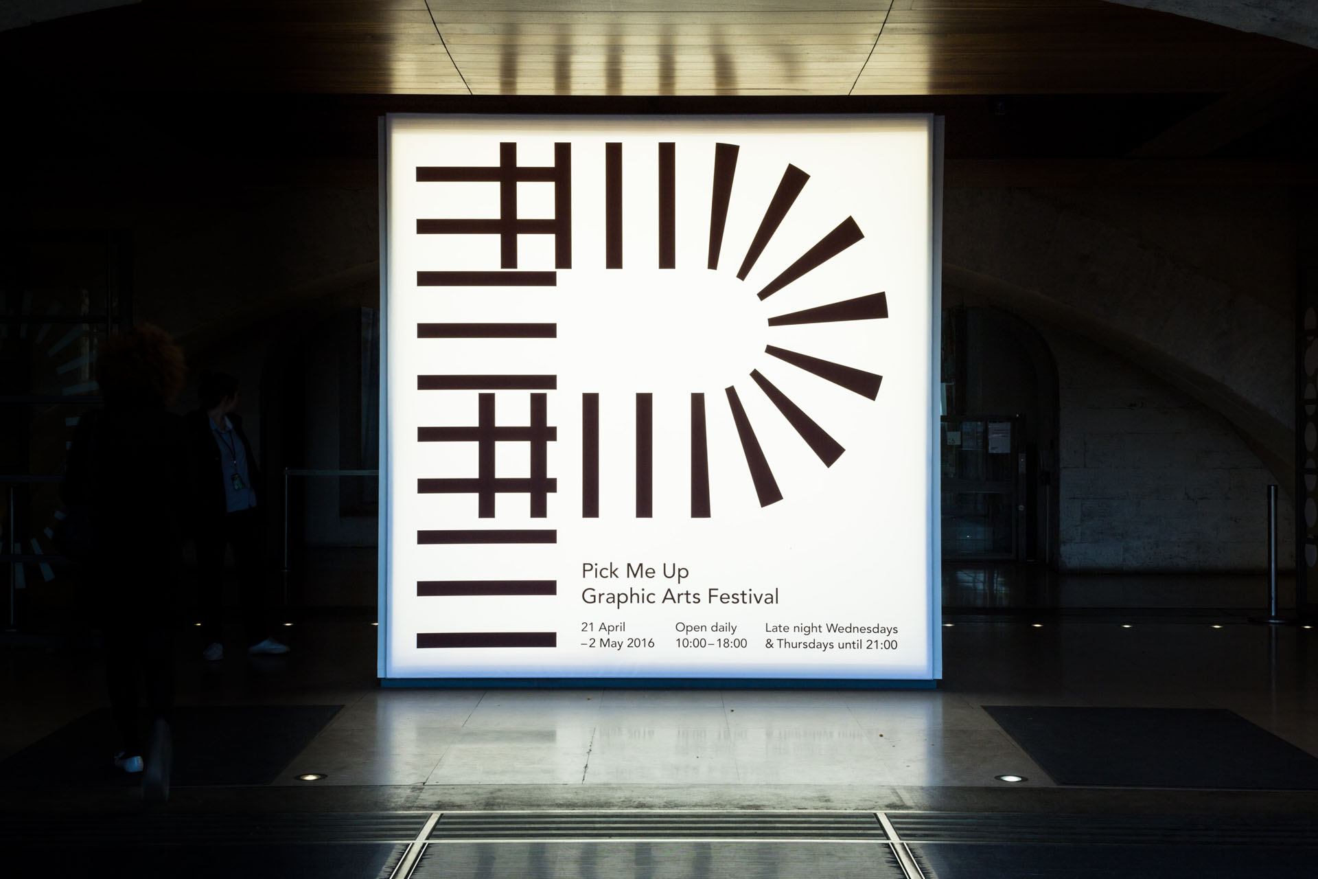
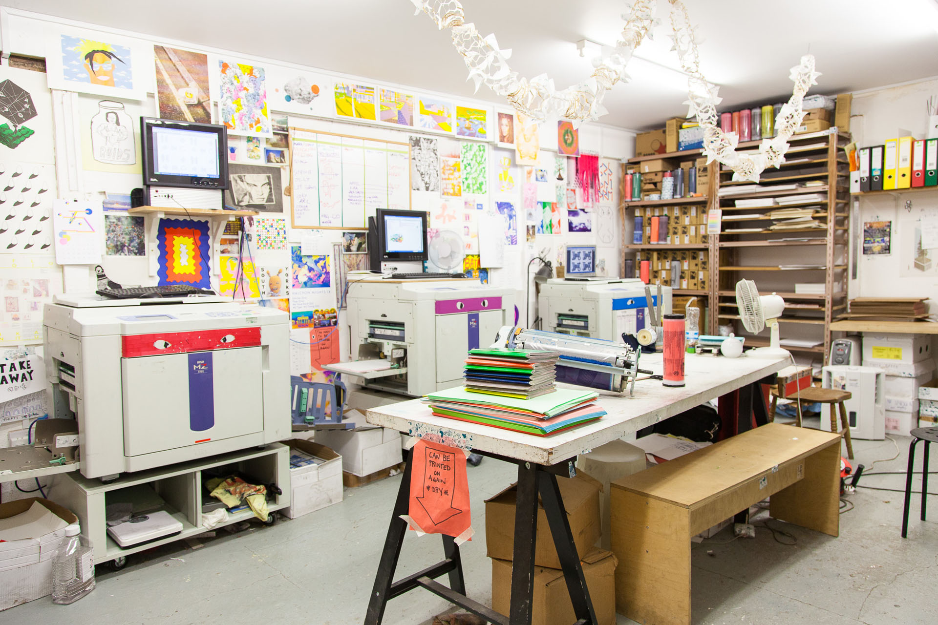
Hato certainly is a design studio with a difference. Based in the eclectic East London borough of Hoxton the studio spans over two floors to accommodate a work space alongside a printing studio, their sister company Hato Press. As a studio Hato are renowned for their collaborative, experimental approach with a roster of impressive client work for large companies like Facebook as well as creating the identity for popular annual design festival Pick Me Up, in Somerset House.
Following a visit to our London campus we caught up with Co-Founder and Creative Director Ken Kirton to find out more about the work Hato do as well as asking a few questions about Risograph Printing—the perfect resource for anyone looking to broaden their printing knowledge.
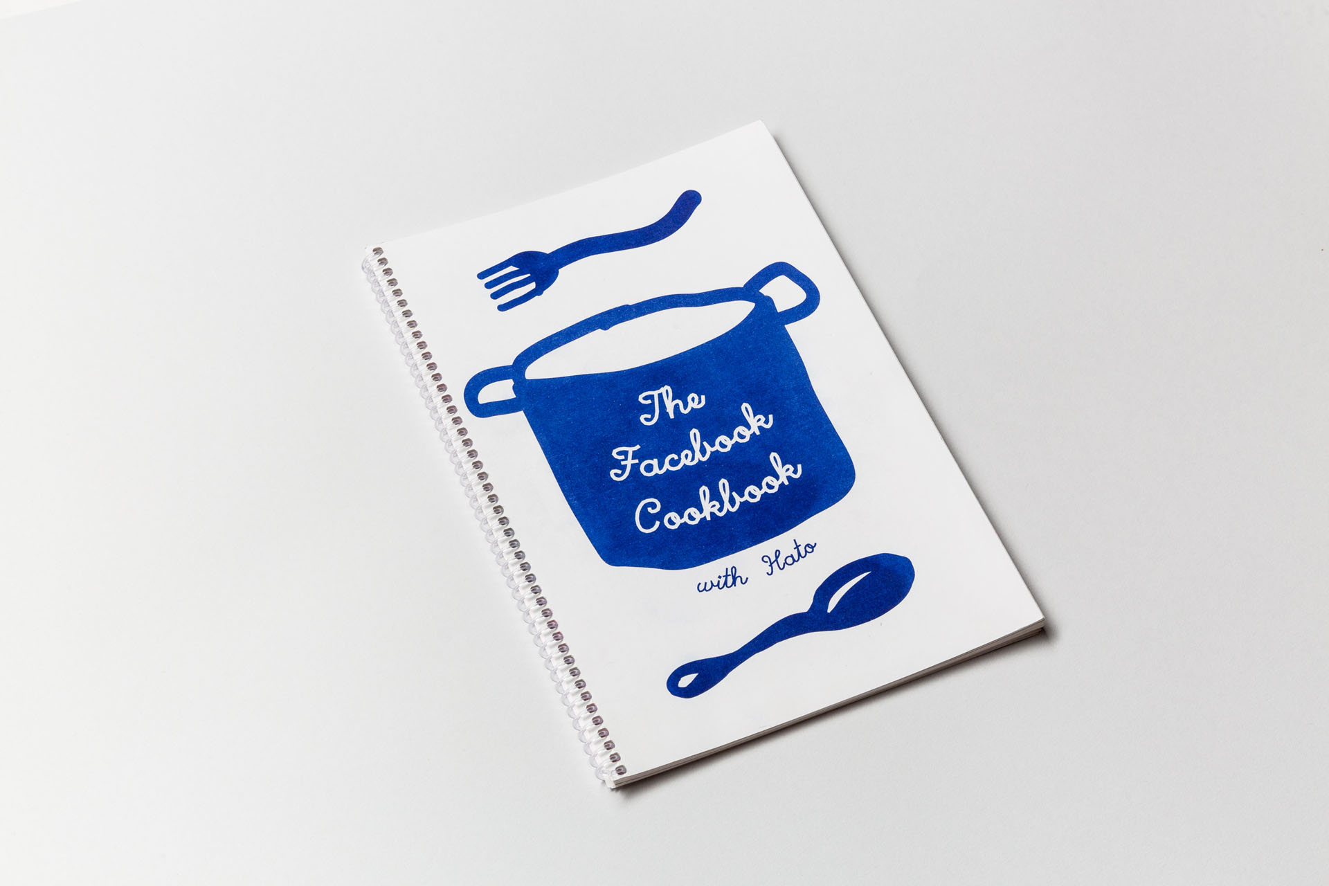
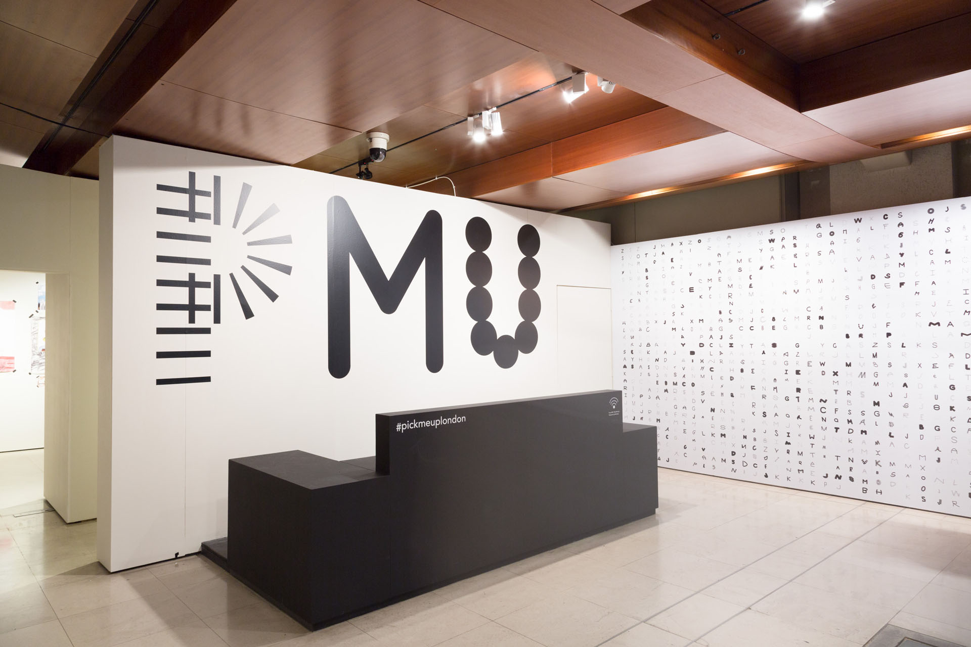
Hato have been behind some really unique work, from Pick Me Up’s 2016 interactive Typeface to the Facebook Cookbook. All of your work is bursting full of energy—what are your main tips for idea generation and how important is experimentation in the early stages of your design?
Hato is a very collaborative studio and close-knit team. We work across two floors but we have regular meetings to share ideas—in fact, we also cook for one another on a daily basis. These shared meals and meetings have helped encourage a sense of belonging and this collaborative approach has been ingrained in our culture from the very start. So when a project comes up, our teams naturally bounce ideas off one another. The difficult part is how to go about implementing the ideas, which is why experimentation in the early stages is very important as you become realistic in terms of what you want to to achieve. It allows us to test out different approaches with the aim of refining the best outcomes to show to clients for further iterations.
Do you sight collaboration as an effective tool when working on new design projects?
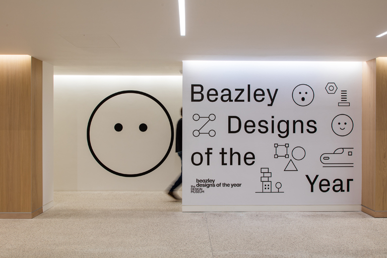
Collaboration has always played a major role in our design process; in fact, the underlying objective behind our creative endeavours—whether producing publications with illustrators or providing design strategy for cultural institutions—is the fostering of community, both internally and externally. A recent example would be the live data visualisation for the new Design Museum, which collects all of the online votes made for this year’s Designs of the Year show. This data then feeds into a communal pool and is realised through an engaging animated data stream, revealing how people are voting and their opinions on design.
Everything at Hato Press seems to stem from having fun when being creative—you even run your own workshops which promote learning through play. Do you think that there’s a lot to be said for being less precious and more hands on as a designer?
For some projects you need to be precious in terms of sticking to the brief and implementing a practical solution for the client; but for other projects, it’s good to design and learn through play and from everyday life. Our project with Facebook is a good example: we developed a digital workshop app which allowed the employees to design their own communal recipe book using their own illustrations. The resulting recipe book becomes a tangible product of Facebook’s culture and reinforces the collaborative atmosphere of its workplace environment and they did that via playing with design!
What advice would you give to our students who hope to work in a studio like Hato one day? Would you encourage them to do personal projects?
Personal projects are great but it’s equally important to be exposed to commercial projects as that’s how you learn about the less glamorous sides of design such as budgeting, project management and client liaison, all of which are important elements in running a studio.
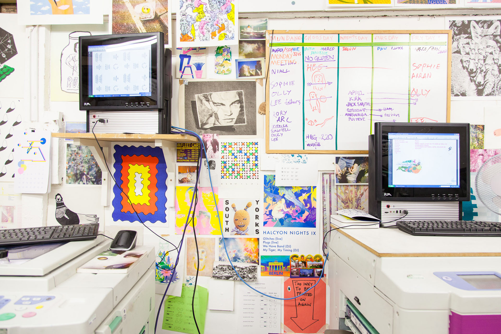
For those unfamiliar with the wonderful world of Risograph printing, could you give us the Hato definition and a quick run through of its points of difference to other printing methods?
The Risograph is an environmentally friendly and cost effective printer, which uses soy-based inks to produce unique outcomes. Each stencil (master) is made from thermal sensitive paper and unlike offset printing it only takes a single print for the screen to be fully inked and ready to print thousands of copies.
The Risograph is extremely energy efficient and generates a minimal amount of waste.
Can you take us through a step-by-step process of Risoprinting?
The underlying technology of a Risograph is very similar to that of screen printing, however the mechanics of the process are closer to offset lithography. The main difference is that the printer will burn the stencil directly out of the master sheet.
Step 1: Your artwork should be setup as separate greyscale PDF or jpeg files, one for each colour layer.
Step 2: The original image file is sent to the machine and it is burnt onto a master, the master is then wrapped around a print drum.
Step 3: This drum then rotates at high speed which pushes the ink through the screen and onto the paper as it is sent through the machine.
What are the key things to remember when doing Riso printing? Are there any definite no-no’s?
Riso-printing is generally fairly user-friendly but one of the definite no-no’s is the difficulty in covering the full printable area with 100% ink density as it causes paper jams. Large areas of block colour will not print out evenly too as it will also cause print marks. It is, however, possible to fill the entire printed area with an ink density of around 75%.
Registration is fairly accurate with two colour artwork as our Riso printer models print two colours at the same time. Printing more than two colours will require more than one pass, and is best to assume that slight mis-registration will occur. Also, riso feeds in paper using a set of rubber rollers. If there is a lot of ink on the page, it will be transferred onto the rollers leaving unwanted track marks, although they can easily be rubbed off with a rubber
When would you recommend using Riso printing, and when would you recommend staying the hell away from it?
Riso printing is best used for medium to large scale runs of posters, flyers, greetings cards, newsletters, leaflets and books. The spot colour Riso inks are relatively cost-effective compared to spot colour litho or screen printing inks, and the processes used are far less chemicals and energy too.
See what you can create with Riso-printing by checking out Hato Press’ online store. Also keep an eye on their calendar for upcoming workshops—not only is there Risograph Printing but also a series of Terrarium Workshops so you can get creative with plant-life.
We regularly have guest speakers from the design industry to our global campuses. Check out our archive to read interviews with Build, Craig & Karl and more.
Posts you might like
Are you a graphic designer who is finding themselves lacking skills, slow on one of the major graphic design programs or just...

https://www.youtube.com/watch?v=wZ_tffGtZMs New York graduate Simon Fréour worked as a software engineer in France for seven...
Are you working with graphic designers day-to-day and finding yourself jealous of the work they're doing? You're certainly not...
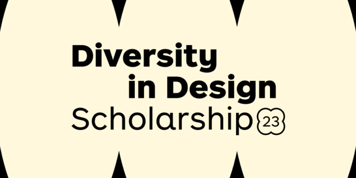
Diversity in design is an important topic to us at Shillington and we aim to support and strengthen equity by cultivating...
Last year Shillington launched, for the first time, our Diversity in Design Full Scholarship opportunities—in New York City,...
Diversity in design is an important topic to us at Shillington and we aim to support and strengthen equity by cultivating...
Last year Shillington launched, for the first time, our Diversity in Design Full Scholarship opportunities—in New York City,...
Diversity in design is an important topic to us at Shillington and we aim to support and strengthen equity by cultivating...
Want to win some amazing prizes and stay in the loop with all things Shillington? Sign up to our newsletter to automatically go in the draw.