The Awkward Stories Behind 12 Famous Logos
Logos are everywhere. They define brands, make them stand out, and communicate specific messages. Companies spend millions of dollars on logos, while designers learn visual concepts behind them to craft new ones and keep up with trends.
With dozens of logos chasing us every day, do we get what they try to say?
While some are straightforward—take circles of ShillingtonEducation.com or PlagiarismCheck.org communicating friendship and unity, or vertical lines of Cisco and Honda screaming about strength—others hide interesting (read: awkward) stories related to their birth.
Ready to look behind the curtain of 12 world-famous logo creations?
1. Android
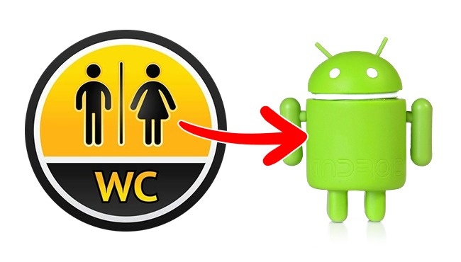
When graphic designer Irina Blok got a task to create a logo that would be recognizable and include a robot, she craved for inspiration to deal with it. As you know, creative people can find it everywhere.
What has Blok done? She took pictograms we all see in public closets, turned them into a cute green robot we all know (and love?) today, and called him Andy in honor of Android Inc. co-founder.
A bit awkward, isn’t it?
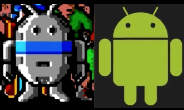
What is more awkward is an unofficial version of the logo creation:
In 1989, Atari Games launched Gauntlet — The Third Encounter. The game’s graphic looks creepy, but the most interesting detail here is a character named Android. Some insist that he reminds a traditional logo of Google Android we all know today. Not really, huh?
2. Lacoste
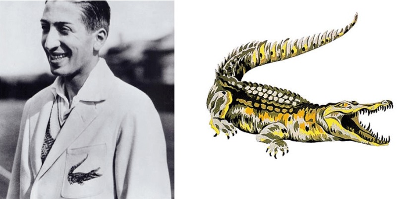
Once upon a time – in 1923, to be specific – French tennis player René Lacoste walked with his manager Alan Moore and caught sight of a beautiful alligator bag in a show window. Two men made a bet: if Lacoste won his next game, Moore would present him the bag.
René had lost. (Okay, another legend says he won then.)
However, one nosy journalist heard the story and published a column about Lacoste “fighting like a crocodile no matter the odds.” It was the way René got his nickname and later used the image of a reptile for the logo of his brand.
3. Uber
Not long ago, Uber had re-designed their logo, turning the well-recognized “U” into something bizarre that required the explanation from creators.
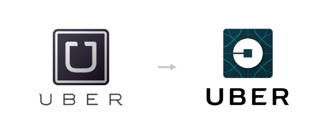
Inspired by bits and atoms building our world, designers wanted to better represent the brand’s “everyone’s private driver” motto. A new logo symbolized the fact you could find Uber everywhere, as surely as bits and atoms. But if they are everywhere, what will help users distinguish Uber from others? Hm… No logic here.

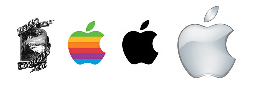
4. Apple
Legend has it that Apple had devoted their logo to English mathematician and “the father of computer science” Alan Turing who committed suicide by taking a bite of the poisoned apple. Sounds romantic, but the facts are starkly different:
According to designer Rob Janoff, there’s no hidden symbolism or message behind the logo. Steve Jobs chose this name because considered it sounding “fun, spirited and not intimidating;” and designers decided to make the logo “bitten” so people wouldn’t mistake an apple for any other fruit or cherries.
That’s what Janoff said:
“I bought a whole bag of apples, put them in a bowl and made sketches of them for a week, trying to simplify the details. At some point during my artistic experiments, I took a bite from one of the apples. Later that day, to my surprise, I found out that ’bite’ sounds very similar to ’byte’ – a computing term.”
Yet, it seems they dodge a bit: the company’s first logo was the icon of Isaac Newton sitting under the tree; so, an apple might have been chosen for a reason: to symbolize enlightenment and scientific knowledge, coming from a mother nature.
5. Ferrari
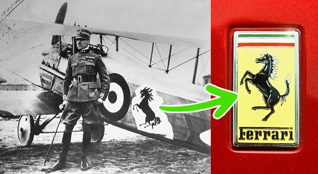
Many believe that Ferrari chose a horse for their logo to symbolize their speed, grace, and luxury. As it often happens, the truth is somewhere in between.
As Enzo Ferrari wrote in the memoirs, this logo came to him from Italy’s top aviator of World War I Francesco Baracca. It was Baracca’s mother who gifted the emblem to Enzo after his victory in a race, though initially a black horse silhouette was drawn on Francesco’s plane.
6. BMW
Many believe—some BMW employees are not an exception—that this brand’s logo symbolizes a spinning propeller, due to their ads created in the 1920s. But back in 2010, the New York Times debunked this myth.
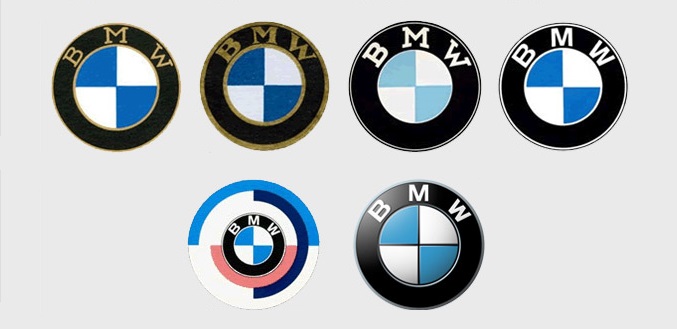
It appeared that designers crafted the logo from the national colors of Bavaria, which are white and blue. Well, everything of genius is simple, as they say.
7. Wikipedia
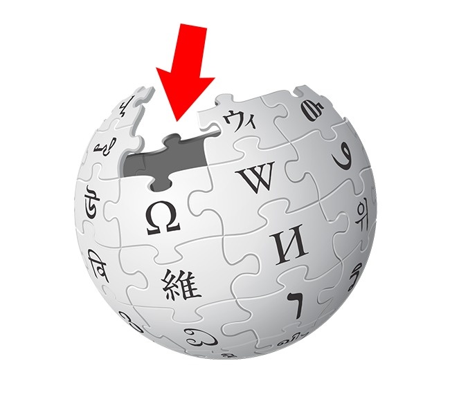
As you know, an emblem of the globe with multilingual puzzles on it symbolizes internationalism and universal knowledge. All together, they compile the word “Wikipedia.”
But what about missing puzzles in the logo?
They demonstrate an unfinished state of the encyclopedia with its ongoing updates. It’s highly unlikely if we can trust them all, but at least they tried.
8. Pepsi
Looks plain but appears to be extremely expensive: the logo cost Pepsi… $1 million. The reason hides behind the principle of golden ratio – “one where the ratio of the smaller segment to the larger segment is the same as the larger segment to the sum of both segments” – designers used while crafting it.
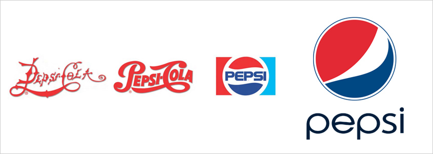
The most balanced and pleasing to a human eye, the golden ratio is often used in engineering, design, and architecture. But, wait a minute, $1 million? Pepsi, are you serious?
Taking into consideration the fact we all recognize this logo even with no word “Pepsi” on it, it seems the golden ratio did the trick.
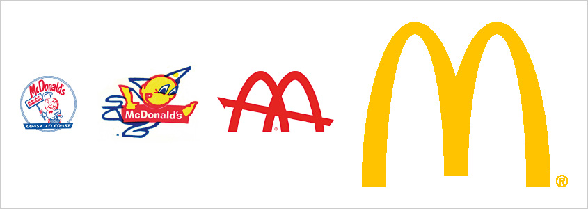
9. McDonald’s
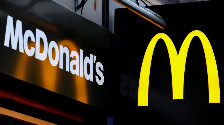
It seems the golden arches of McDonald’s have been with us since Adam was a lad. It would be wrong to assume that the big “M” is for nothing but the word “McDonald’s” itself, and every student of design schools knows that the brand used those archways to make their buildings stand out.
But far from every student heard the story about psychologist and design consultant Louis Cheskin. Hired in 1962 to design a new logo for McDonald’s, he proposed to replace their mascot Speedee with the “M” symbolizing… a pair of nourishing breasts.
Kinda Freudian, huh?
10. Nike
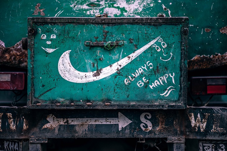
One of the world’s most recognizable logos is one of the cheapest, either. In 1971, the company paid Carolyn Davidson $35 for her “swoosh” emblem.
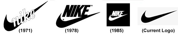
Awkward, but Phil Knight himself didn’t love the logo though approved it among four other designs Davidson offered. How wrong he was! Today most people associate the swoosh with the wing of Nike, the goddess of victory.
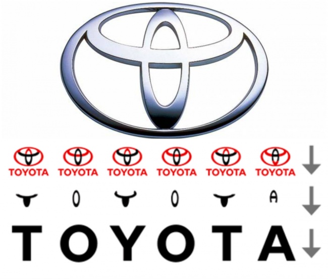
11. Toyota
Some compare this logo with a cowboy’s head. Others believe it symbolizes the unification of Toyota’s products and customers. In sober fact, it’s a needle hole with a thread passing through it and, therefore, hinting at the company’s past when they manufactured automated looms.
Another little secret behind the logo: its separate parts compile the word “Toyota.”
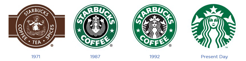
12. Starbucks
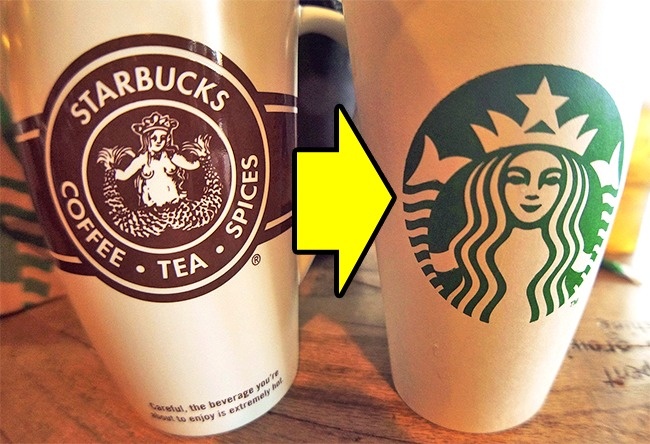
The Starbucks’ green logo is so familiar today that even those living in caves and hating coffee couldn’t avoid it. Originally, it was brown and featured Melusine, a two-tailed mermaid married to a mortal being.
The logo has undergone considerable changes over the years. You won’t see breasts and tails of Melusine anymore because of Starbucks being afraid of offending people. Yes, they released “vintage” cups with the original logo in 2008 though edited it a bit to hide the mermaid’s boobs. But consumers still complained. Oops…
Do you know any other interesting stories behind logos design? Share in the comments below.
Posts you might like

One of the best things about graphic design is that it never stands still for a moment. But that does mean that keeping up with...

The best graphic design books can take you on an exciting journey of the imagination, transport you to new creative worlds or...
We’ve all been feeling the squeeze over the past few years, but at Shillington we don’t want this to stop anyone getting the...
Are you considering becoming a graphic designer but want to be working online? With the increasing demand for digital design...
To ensure Shillington's commitment to the LGBTQ+ community extends beyond Pride Month, we’ve collated a list of incredible...
Are you looking to teach yourself graphic design? If so, you may be wondering if it is possible. The answer is yes—it can...
Are you interested in becoming a graphic designer but don't know where to start? You may be wondering if it's possible to...
Are you considering changing your career, but don't know where to start? Are you an aspiring creative with a passion for...
Want to win some amazing prizes and stay in the loop with all things Shillington? Sign up to our newsletter to automatically go in the draw.