The 5 Basic Principles of Graphic Design & Their Importance
What makes a “bad” design? What makes a “good” design? And how can you even tell the difference? Don’t you just know when you see it? Well, graphic design is undoubtedly about aesthetics, which can be subjective. Beauty is in the eye of the beholder, after all. But—here at Shillington—our teachers believe to craft a successful piece of graphic design, there are set graphic design principles you must consider and adhere to. If those aren’t working in synergy, the whole design suffers.
(If you’re wondering, wait a minute—what does the term “graphic design” even mean? Have a read here first.)
Anyone that has read an introduction to art or design would have come across a wide variety words used to describe how things look. There is terminology to comment on every single aspect. Line, tone, movement, texture, weight, scale, shape, composition, symmetry, and impact are just a few to get you started. But—having so many words to critique a piece of design can start to confuse and complicate the process.
Our approach to teaching design at Shillington is about learning the fundamentals in a simple and direct way. So, we’ve honed in on five basic graphic design principles:
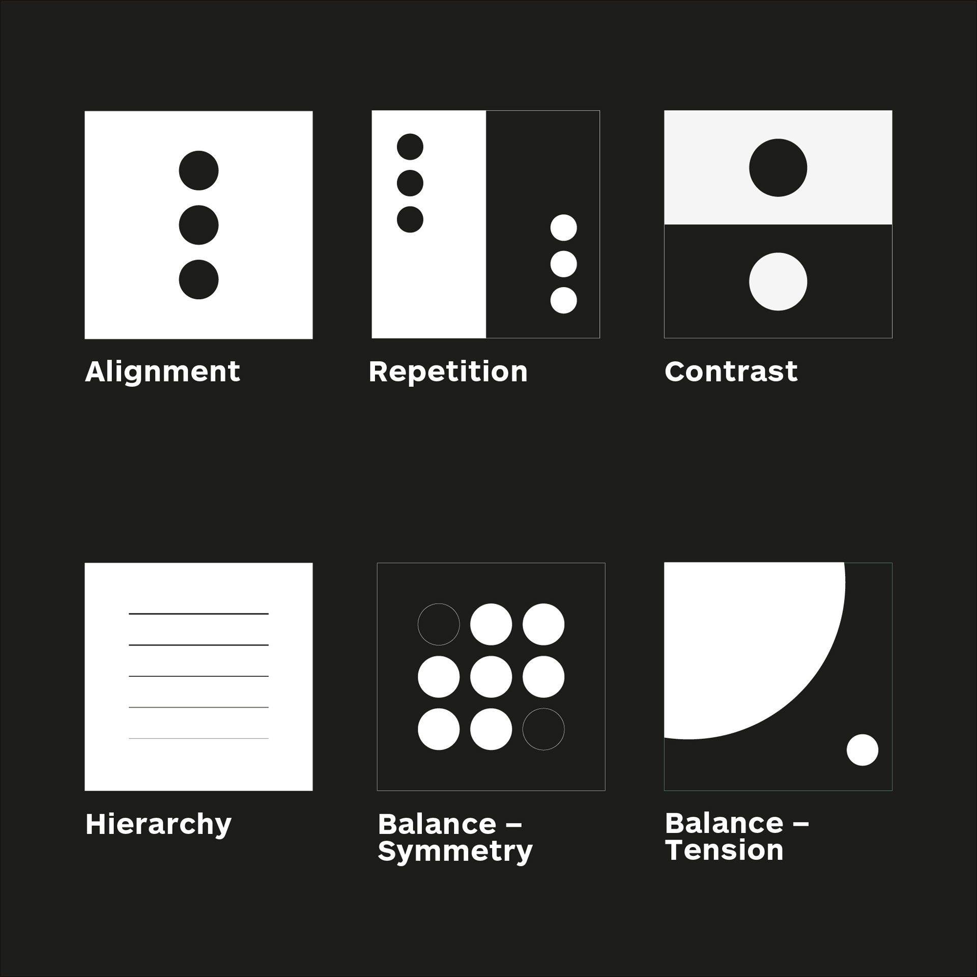
- Alignment
- Repetition
- Contrast
- Hierarchy
- Balance / Balance using tension
In our Shillington classrooms around the world, our teachers always drill back to the fundamental principles of graphic design.
From day one of demonstrations, to final portfolio reviews. If something’s not looking right, or not working, we believe you can always trace the issue back to basics.
We even have a visual reminder of the five basic graphic design principles pasted on every computer monitor in the classroom! This serves as an ongoing reminder to always refer back to the principles.
In this blog post, we will examine each principle using design examples, as well as understand how graphic design principles work together to help us communicate the right message to the right audience. Let’s get started, and learn how to master graphic design basics.
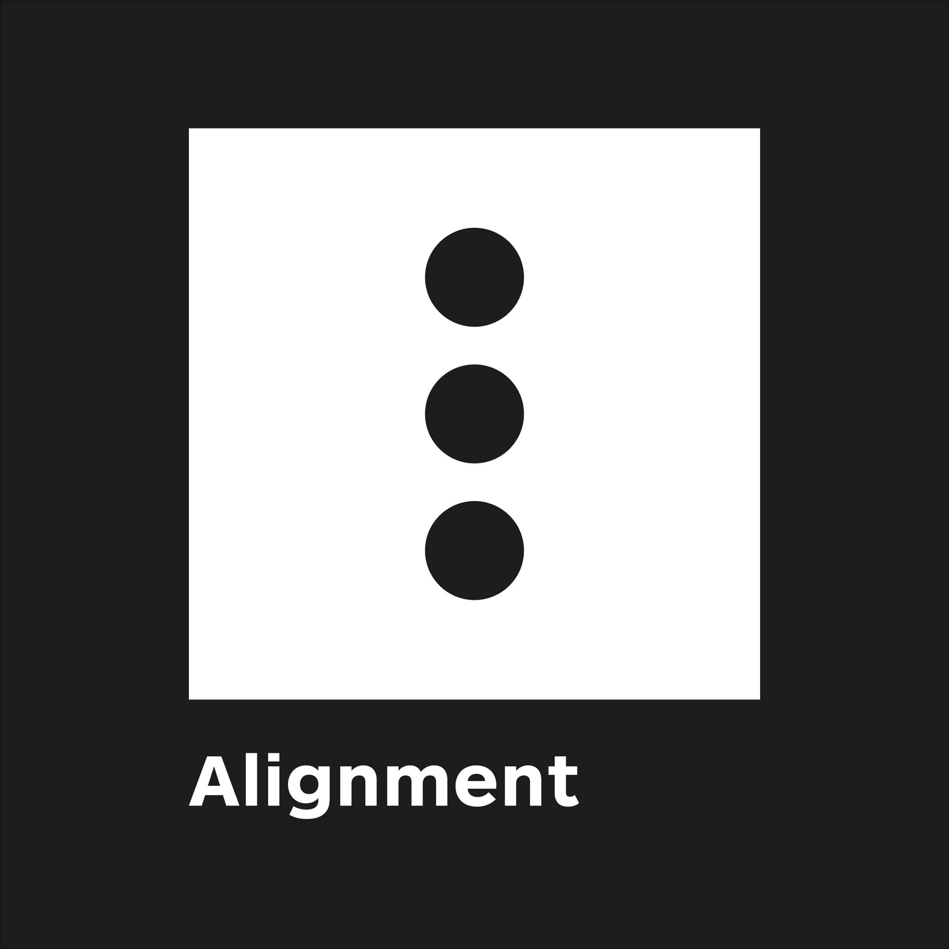
Alignment
Alignment creates a sharper more unified design
Alignment is one of the most basic, but most important principles of design, as it allows our eyes to see order, which is quite comforting to a reader.
Ever viewed a design and not known where to look? Left, right, centered? Having a strong point of alignment within design allows our eyes to seamlessly flow through the visual message. Aligning elements with one another so that every item has a visual connection with something else on the page, tightens a design and eliminates the haphazard, messy effect which comes from random placement of elements.
Aligning elements which are not in close proximity with each other can provide an invisible connection, communicating the idea that they belong to the same piece.
Outside 2D graphic design, alignment can be observed as paintings that are hung evenly along an invisible line, how you can toggle between right/left/center alignment for paragraph text in Microsoft Word documents, or parking spots marked by even lines in a row. And if you want to see some truly horrifying alignment, check out this confusing signage in Los Angeles.
Let’s look at some good visual examples of alignment in graphic design.
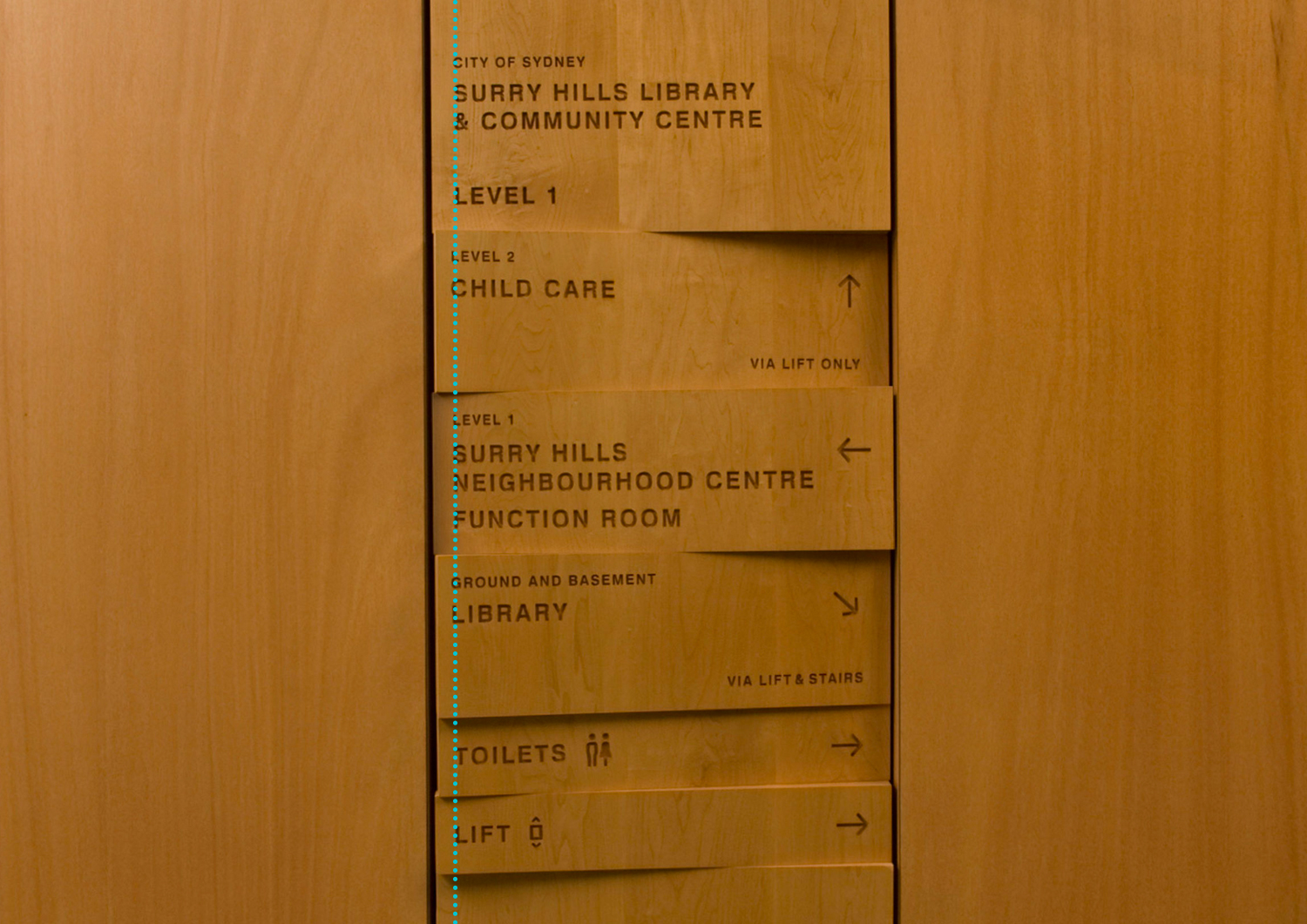
Credit: Collider / Surry Hills Library
In this first example, signage from the Surry Hills Library in Sydney, everything is aligned within a clear margin, as shown by the green dotted lines. The type and icons adhere to the left, while all of the arrows align to the right. This creates a visual connection between the elements and simplifies the layout.
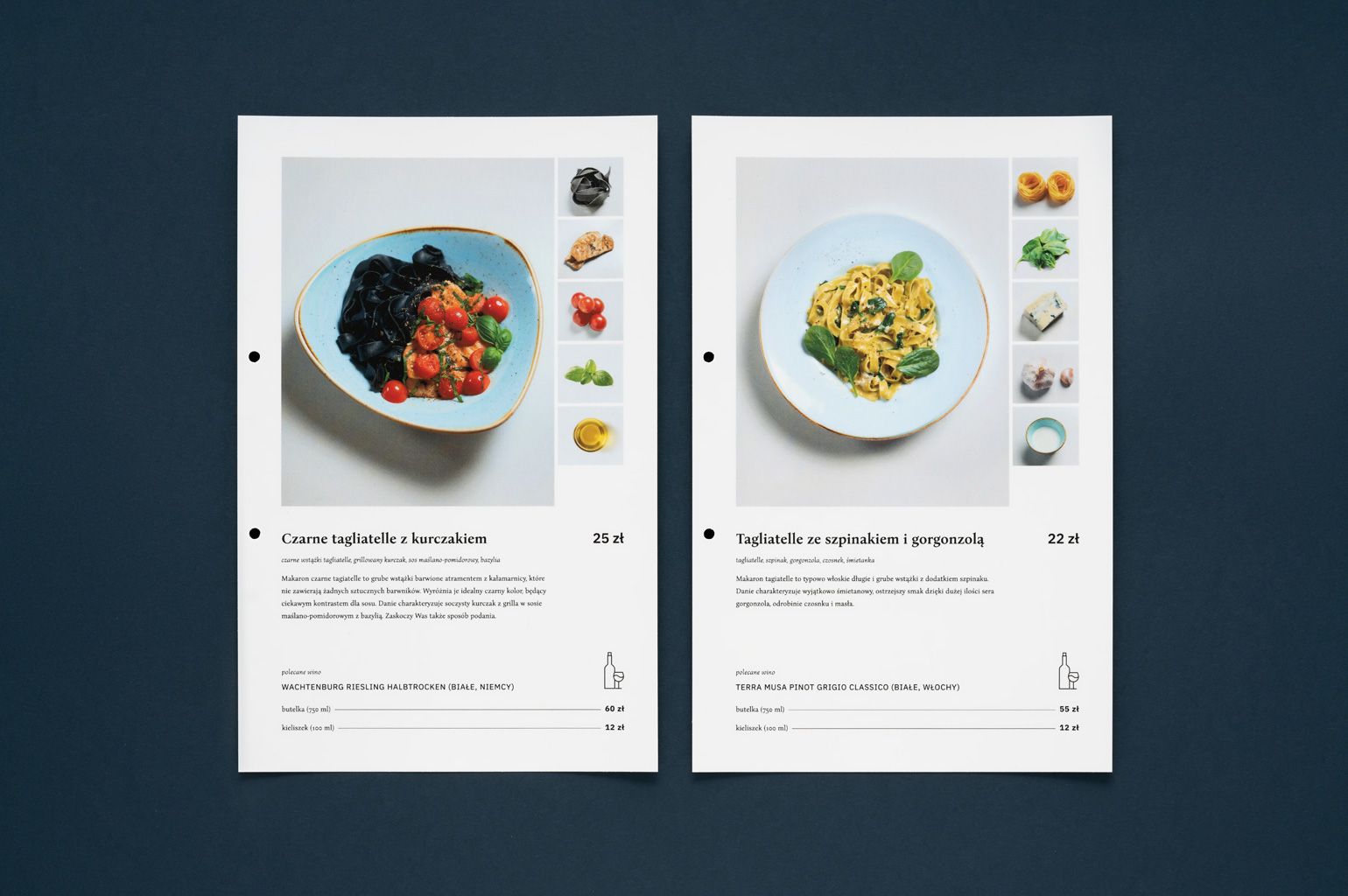
Credit: Motyw Studio’s branding for a family café
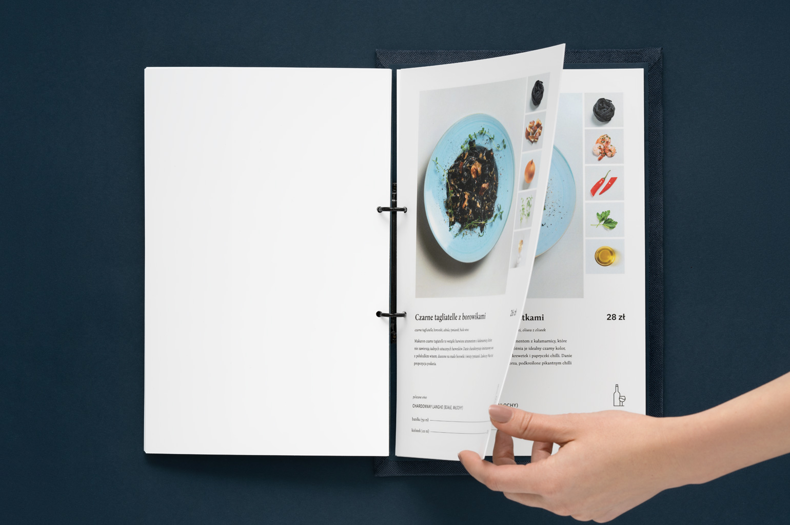
Credit: Motyw Studio’s branding for a family café
Alignment plays a big role in this menu design for a family cafe by Motyw Studio. The type aligns to the left, while all of the prices align to the right. The alignment extends across the multiple pages of the menu so that the images, headings and information always align. This creates a visual connection between the elements, simplifies the layout and ensures the viewer always knows where to find the information they are looking for.
Repetition
Repetition strengthens a design by tying together otherwise separate parts, and as a result, creates associations.
Think of repetition as consistency. By repeating elements of a design, you immediately create a familiarity or identity.
Repetition is a major factor in the unity of multiple page documents. eg. when looking at a publication, it should be immediately obvious that p.5 and p.10 belong to the same publication either by the grid, type style, font size, colour, spatial relationships, etc.
Repetition can also be used to create graphic elements, such as patterns, as long as it doesn’t become overwhelming; be conscious of contrast.
Repetition helps people identify that separate things belong together. Think of it a bit like a family. Each individual in the family looks a bit different, but there are enough similarities that you can see they all related.
Let’s look at some more good visual examples of repetition in graphic design.
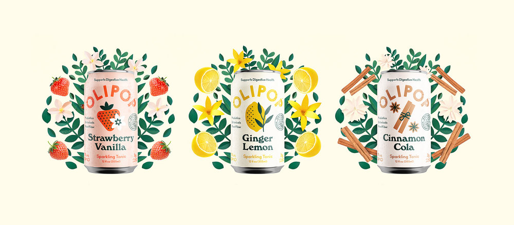
Credit: Olipop Sparkling Tonics Cans
Packaging is a great way of seeing this in action. Take these Olipop cans as an example. There is repetition of the position of the logo and it uses the same fonts. Each one has different colours and illustrations to distinguish the different flavours, but they are all similar enough to recognise that they are part of the same family.
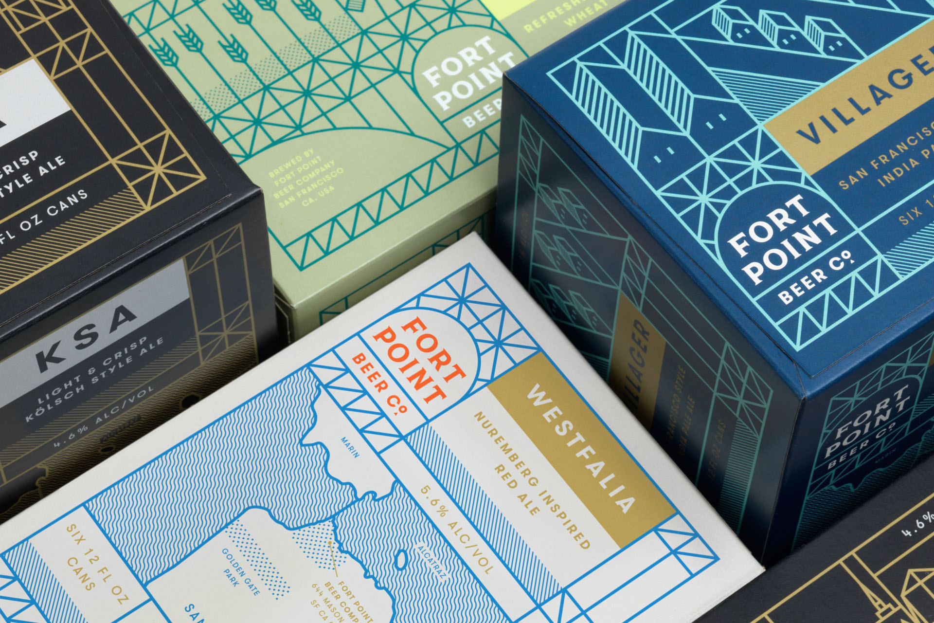
Credit: Four Point Beer branding by Manual
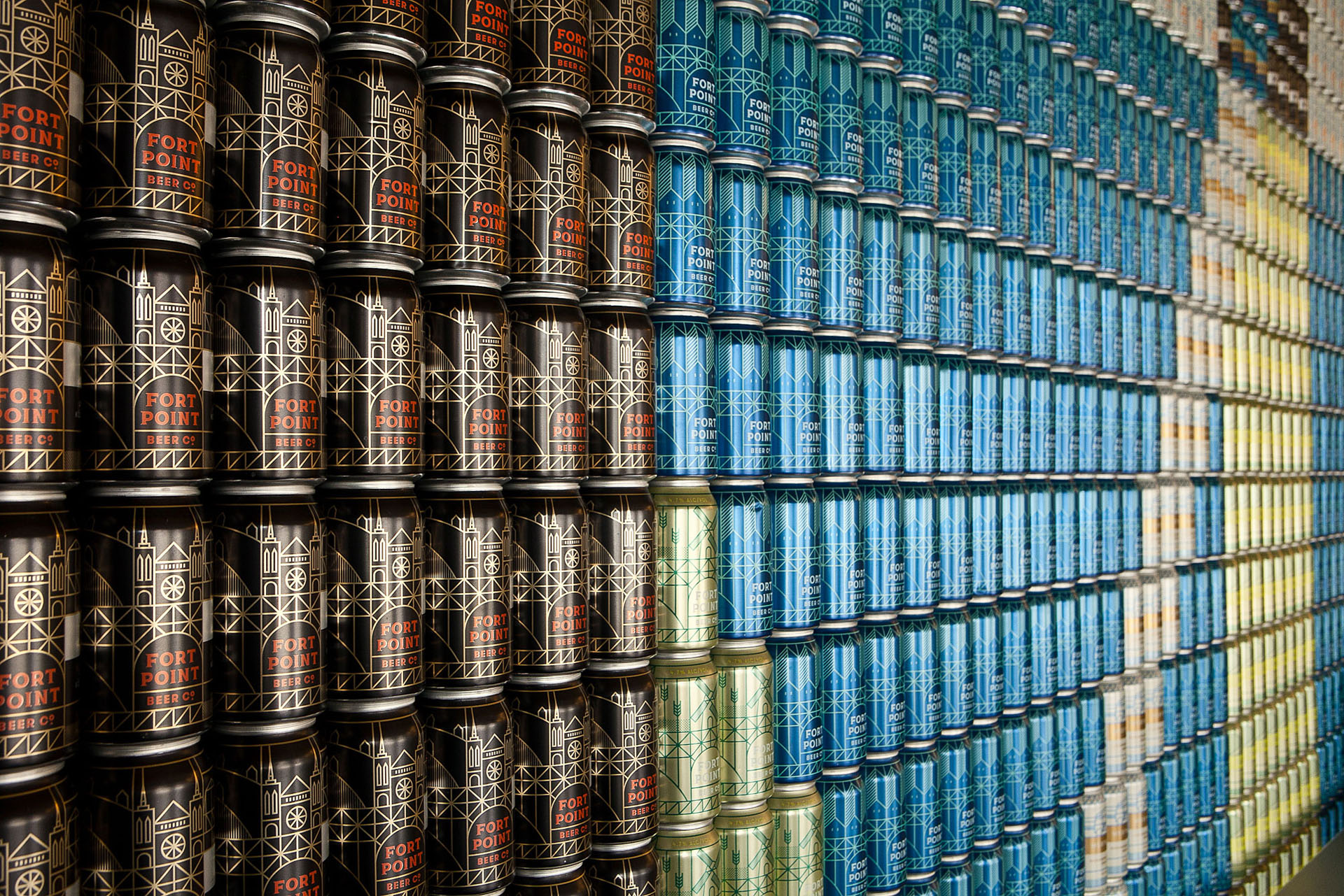
Credit: Four Point Beer branding by Manual
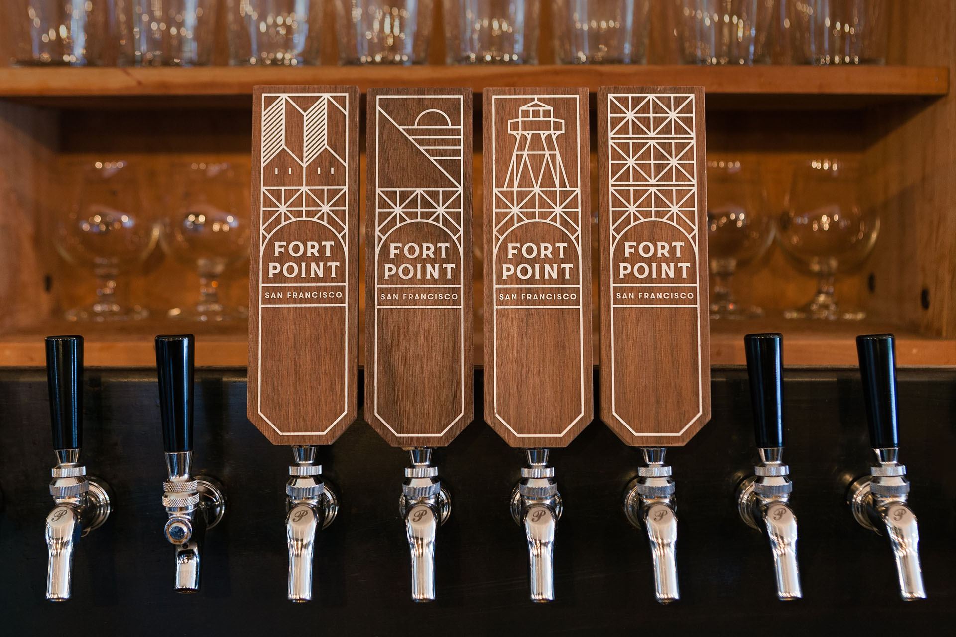
Credit: Four Point Beer branding by Manual
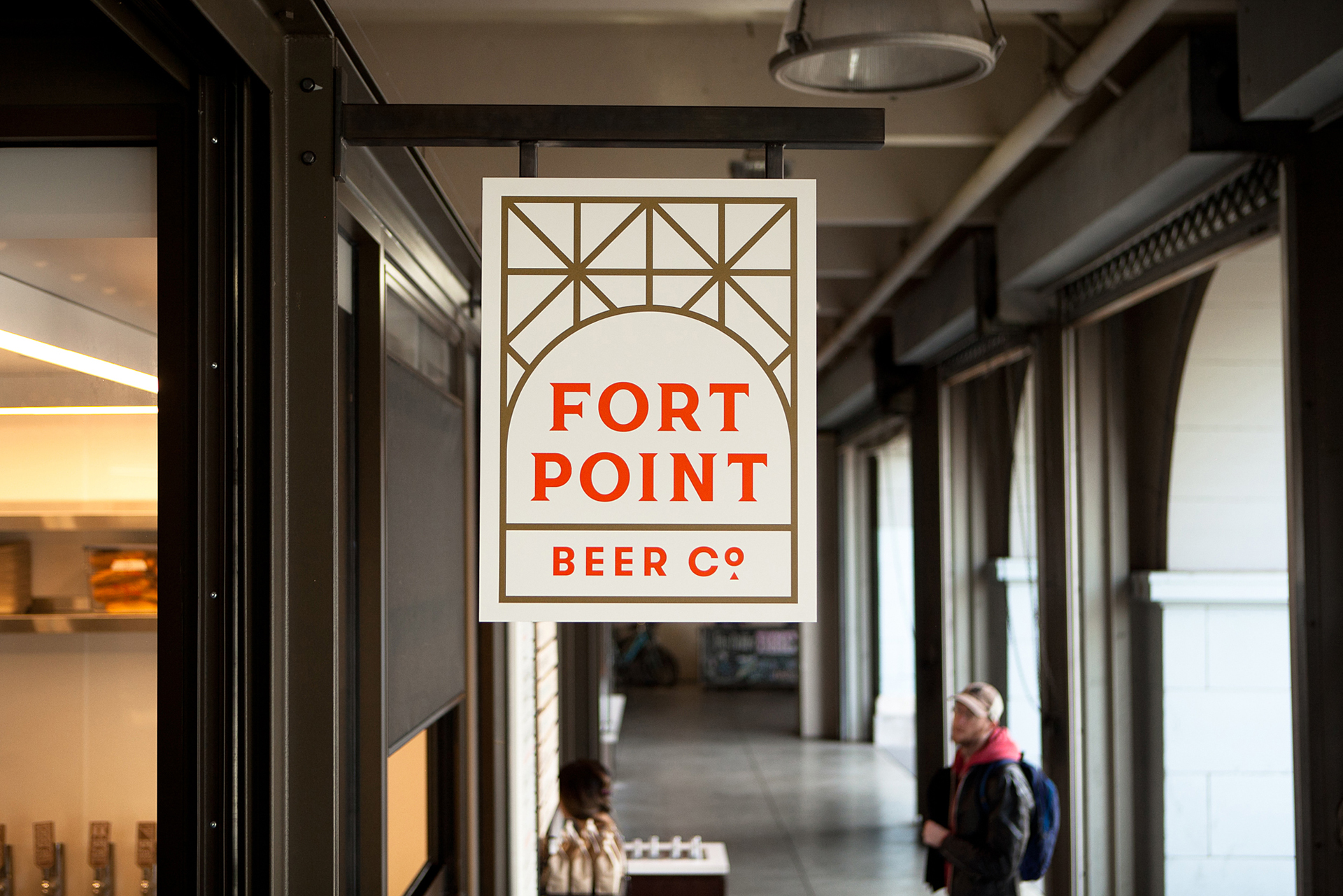
Credit: Four Point Beer branding by Manual
This example of the visual identity design for Fort Point Beer by Manual shows how repetition is vitally important in branding. The company is trying to build a strong sense of recognition and the repetition of the pattern and illustration style across the different consumer touch points creates strong consistency and brand awareness.
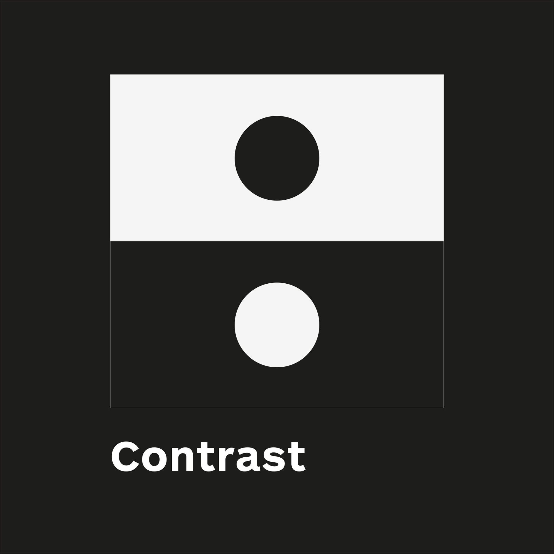
Contrast
Contrast is the most effective way to create emphasis and impact with your design.
Contrast is created when two elements are total opposites. For example: big/small size, classic/contemporary fonts, thin/thick lines, cool/warm colours, dark/light, smooth/rough textures, horizontal/vertical, etc.
Contrast plays a crucial part in the organisation of information on a page. It gives the reader a guide on where to look first; What is the most important point? What stands out the most?
For contrast to work, it must be strong and obvious. Our eyes like contrast; don’t make differences look like a mistake. To have impact, the differences must be obvious and extreme
For example, contrast in digital design can be seen when agreeing to online terms and conditions where “I accept” is in a bold colour, while “I decline” is in a lighter colour that seems to fade away.
Let’s look at some good examples of contrast in graphic design.
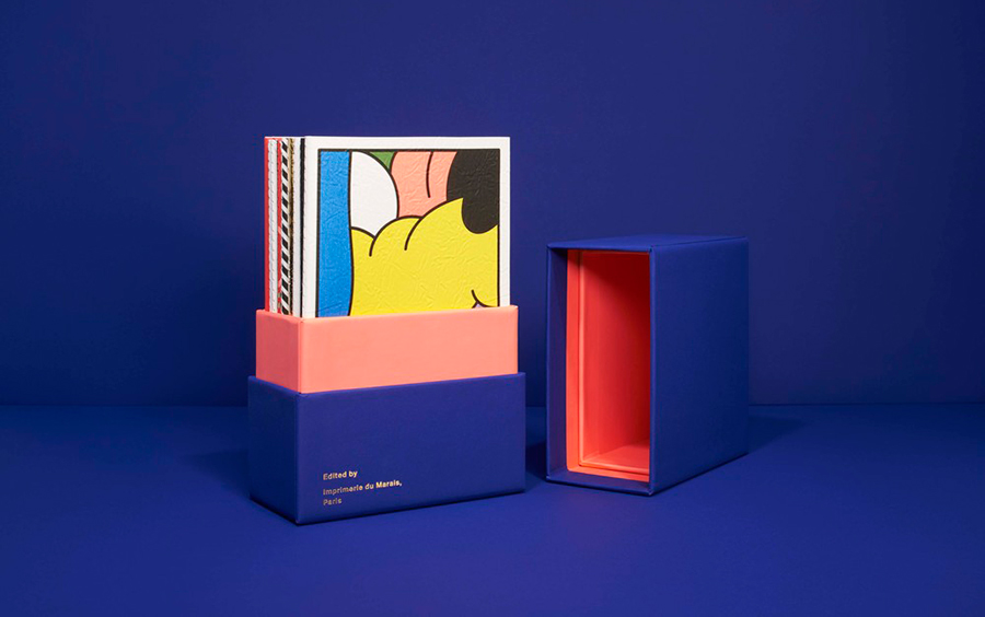
Credit: Notebook II by Imprimerie du Marais
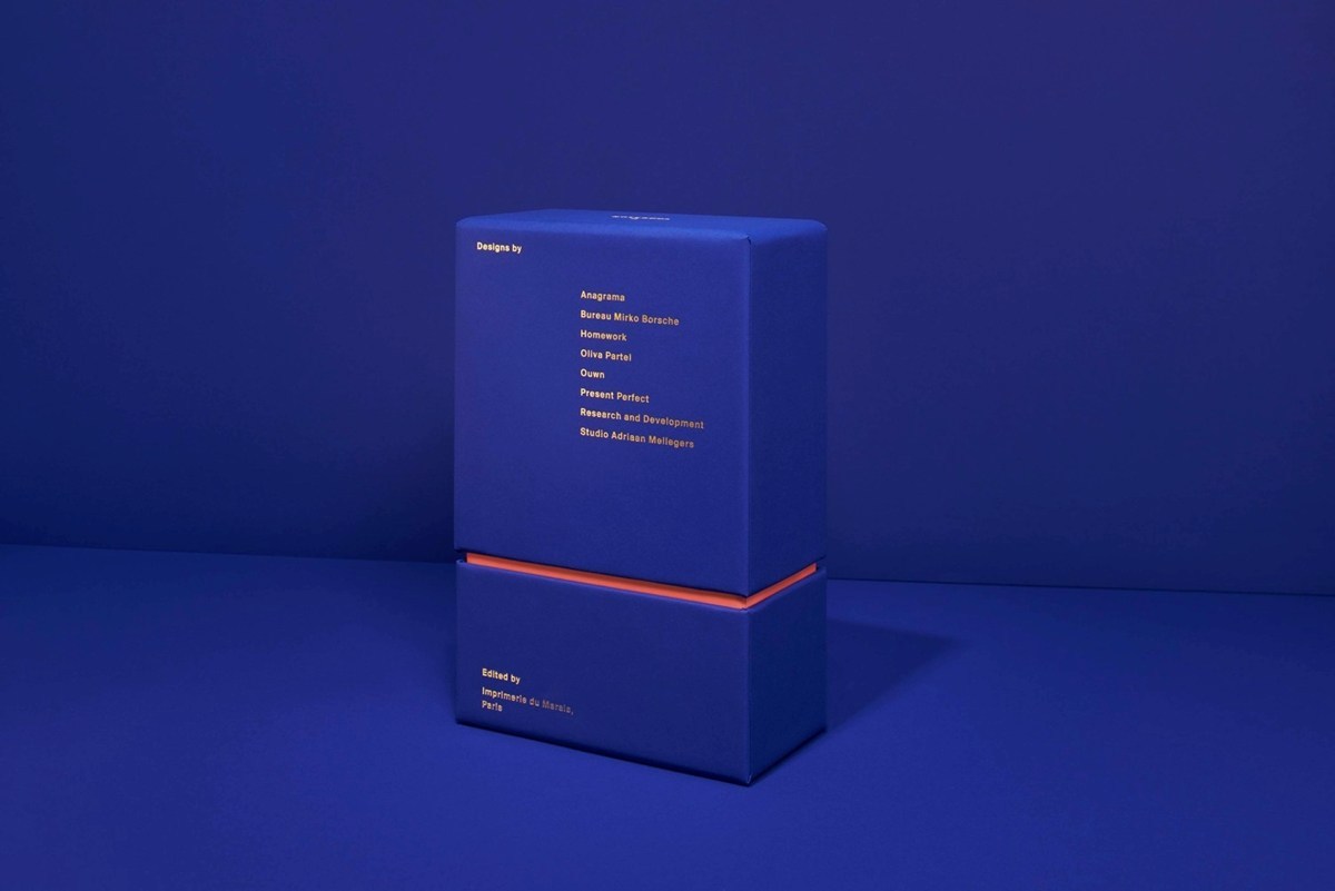
Credit: Notebook II by Imprimerie du Marais
In this example of Notebook II by Imprimerie du Marais, the contrast between deep blue of the external packaging and the bright orange hint of the interior is intriguing and entices the viewer to open the box. Once they do, a further contrast is revealed between the minimalist exterior and the heavily patterned contents. Both add a sense of delight to the unpacking of the item.
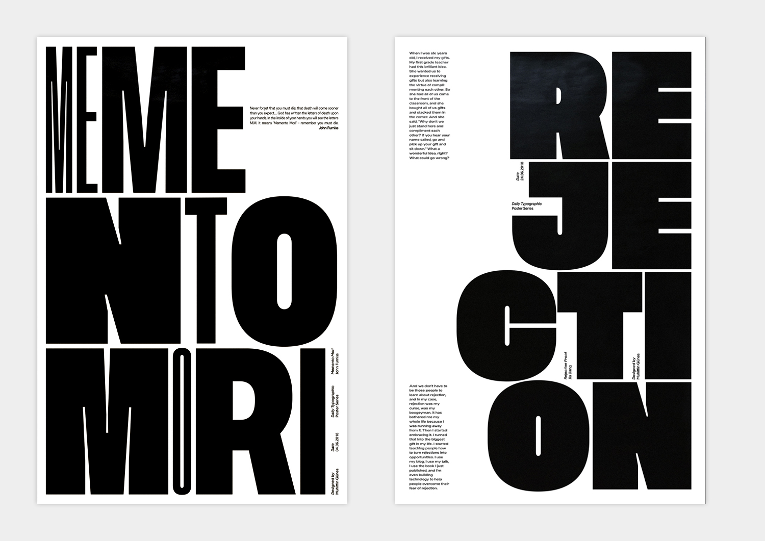
Credit: Muhittin Güneş
In these two black and white posters by Muhittin Güneş, the use of scale in headlines and body copy creates depth and a more dynamic layout.
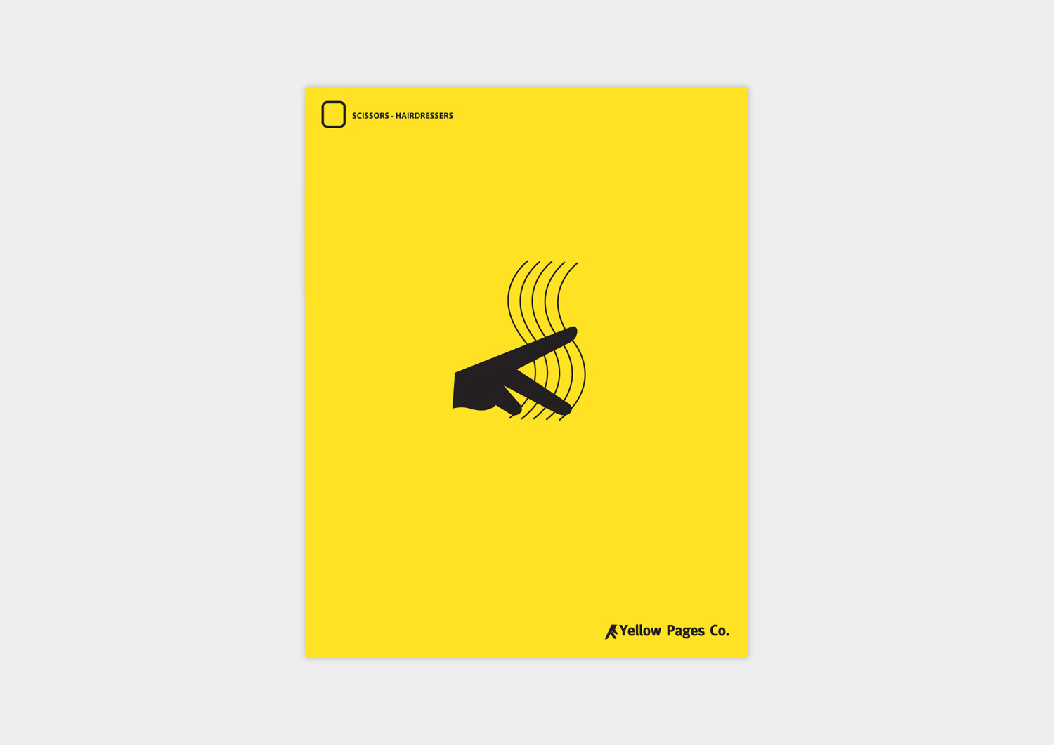
Credit: Ron Henriques and Andre Calazans
Contrast through scale also works in reverse. Like this Yellow Pages example from Art Directors Ron Henriques and Andre Calazans, where a lot of space surrounding a small object draws the eye in, creating a clear focal point.
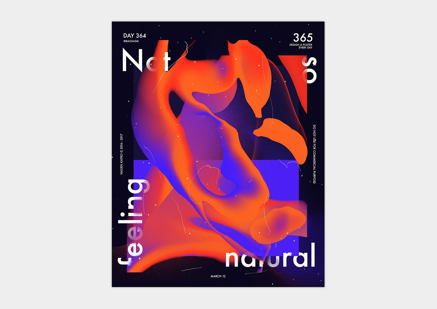
Credit: Vasjen Katro/Baugasm
And as you can see in this poster from Vasjen Katro, obvious contrast in colour makes certain elements in a design stand out, creating strong focal points.
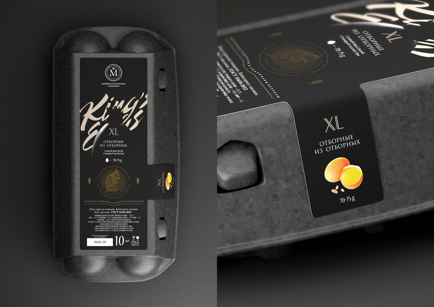
Credit: ZBS Brands
Contrast can also be used in material choices, which you can see in this egg packaging by ZBS Brands. Using different textured papers for the same project creates depth through contrast.
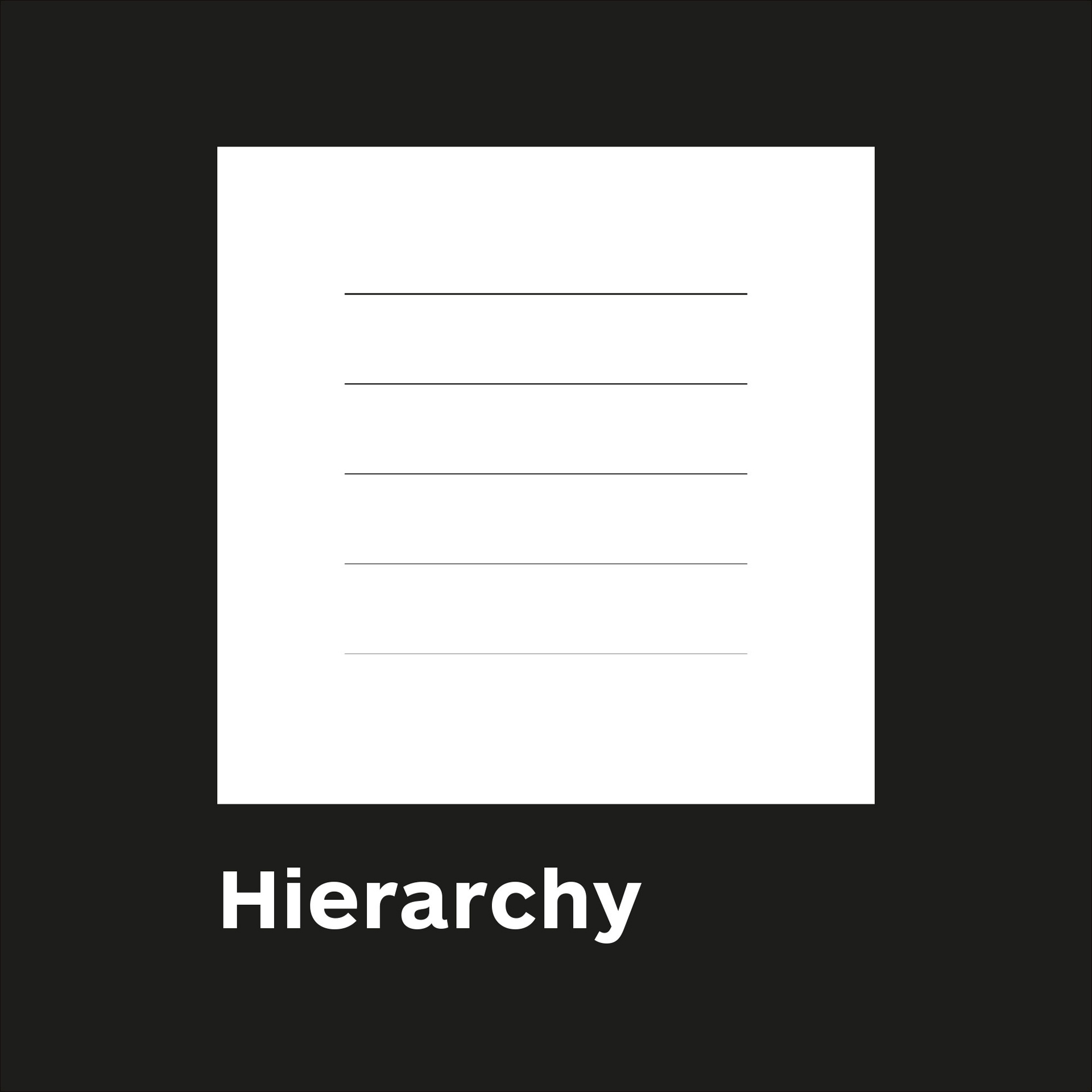
Hierarchy
Hierarchy creates organisation
Think about it—hierarchy is usually something we think about when describing ranking in a business, or organizations like politics and the Church. It’s a system in which people or things are arranged according to their importance.
In design, hierarchy creates a visual organisation to a design and gives the reader an idea of where to begin and finish reading. Each element that is part of the design can be given a ranking of priority. eg.
- Headline
- Image
- Subhead
- Website call to action
- Body Copy
A designer can then make decisions around position, size, contrast, colour etc. to ensure that the desired hierarchy is achieved.
Clients will often ask you to increase the size of lots of elements on the page as they feel that all these points are “really important”. The problem with this approach is that by doing this nothing stands out anymore.
Generally there is a single message that is more important than all others, this should stand out the most and will lead the audience into the rest of the content.
Let’s look at some good visual examples of hierarchy in graphic design.
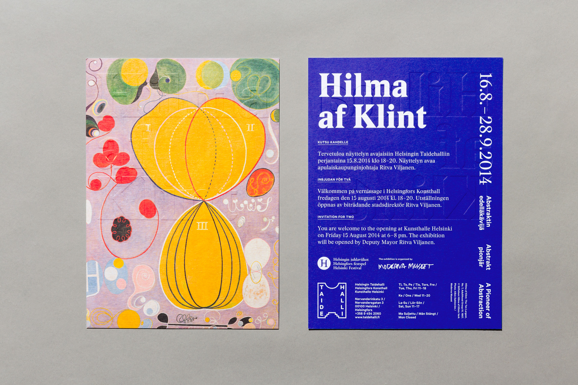
Credit: campaign materials for Taidehalli by Tsto
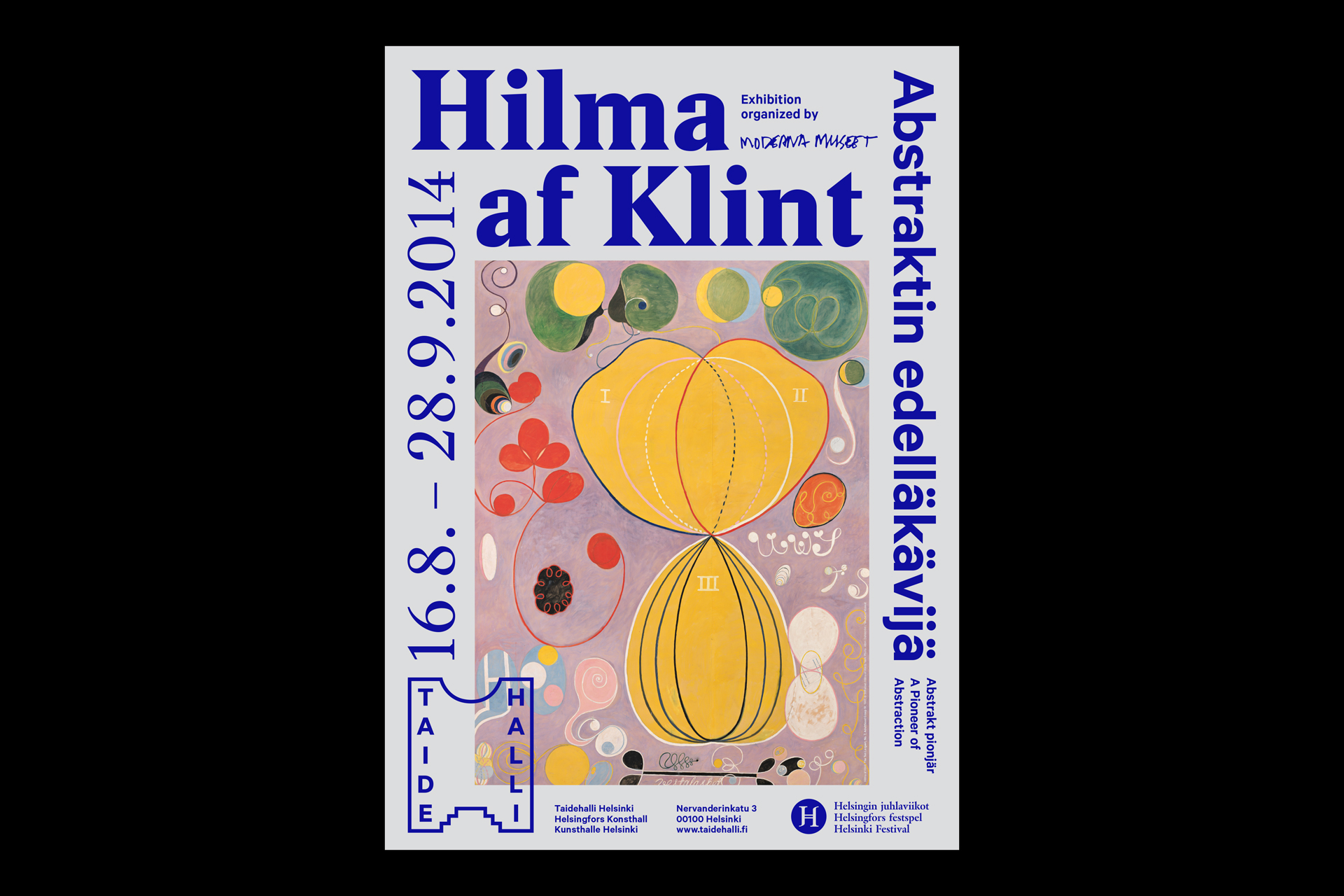
Credit: campaign materials for Taidehalli by Tsto
Hierarchy is utilised in the design of this poster and postcard, advertising an exhibition held at Kunsthalle Helsinki by Tsto, by variation within the text styling. There’s a clear grouping of information, which visually guides the viewer from the most important elements (artist and date) to the least important ones.
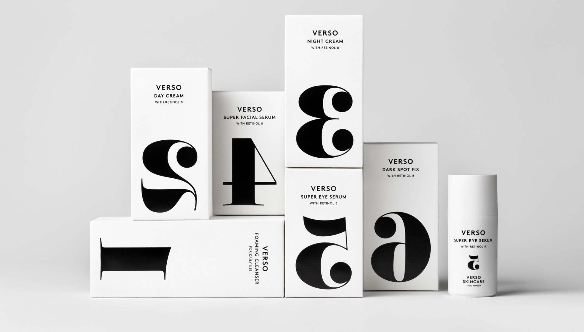
Credit: Packaging by TheStudio.se
Hierarchy in packaging is so important. The consumer needs to be able to recognise a product on the shelf and understand what they’re buying. As you can see in this example from The Studio, highlighting one focal point really draws in the customer.
Credit: Studio Dumbar
Hierarchy in terms of typography means a consistent styling of similar copy throughout the entire document. In this example from Studio Dumbar, we have a heading, intro text, subheadings and body copy. All of which work together to lead the viewer through the information in the order the client intended.
Want to learn more about typography? Check out our deep dive into terms and rules.
For more visual examples, check out this great resources from Tech Jini.
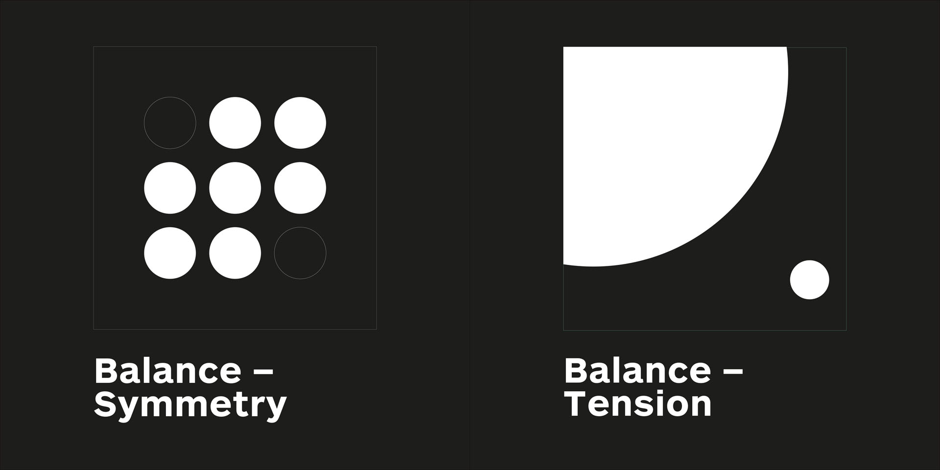
Balance
Balance provides stability and structure to a design, either through symmetry or tension of elements.
Balance is the weight distributed on the page by the placement of elements.
Let’s look at some good examples of balance—both symmetrical and through tension—in graphic design.
At its simplest, symmetrical balance can be created with an invisible centre line where the weight of the elements on both halves of the page is even. For example, symmetrical balance can be seen in the ying/yang symbol or in Leonardo da Vinci’s famous The Last Supper painting.
This form of symmetrical balance generally has a very traditional and harmonious feel even though, at times, it can seem stilted and boring.
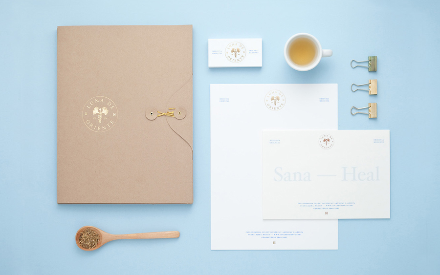
Credit: Luna de Oriente by Estudio Menta
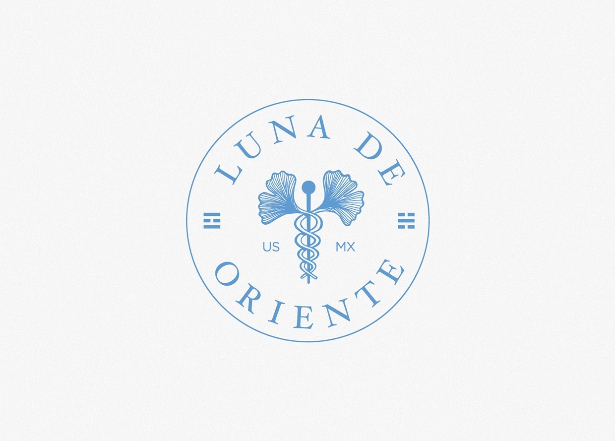
Credit: Luna de Oriente by Estudio Menta
This identity for a centre offering oriental medicine, Luna de Oriente by Estudio Menta, heavily uses symmetrical balance to convey that they are reputable, high-end and trustworthy. The logo itself uses symmetrical balance, as does the overall layouts used across the stationery suite.
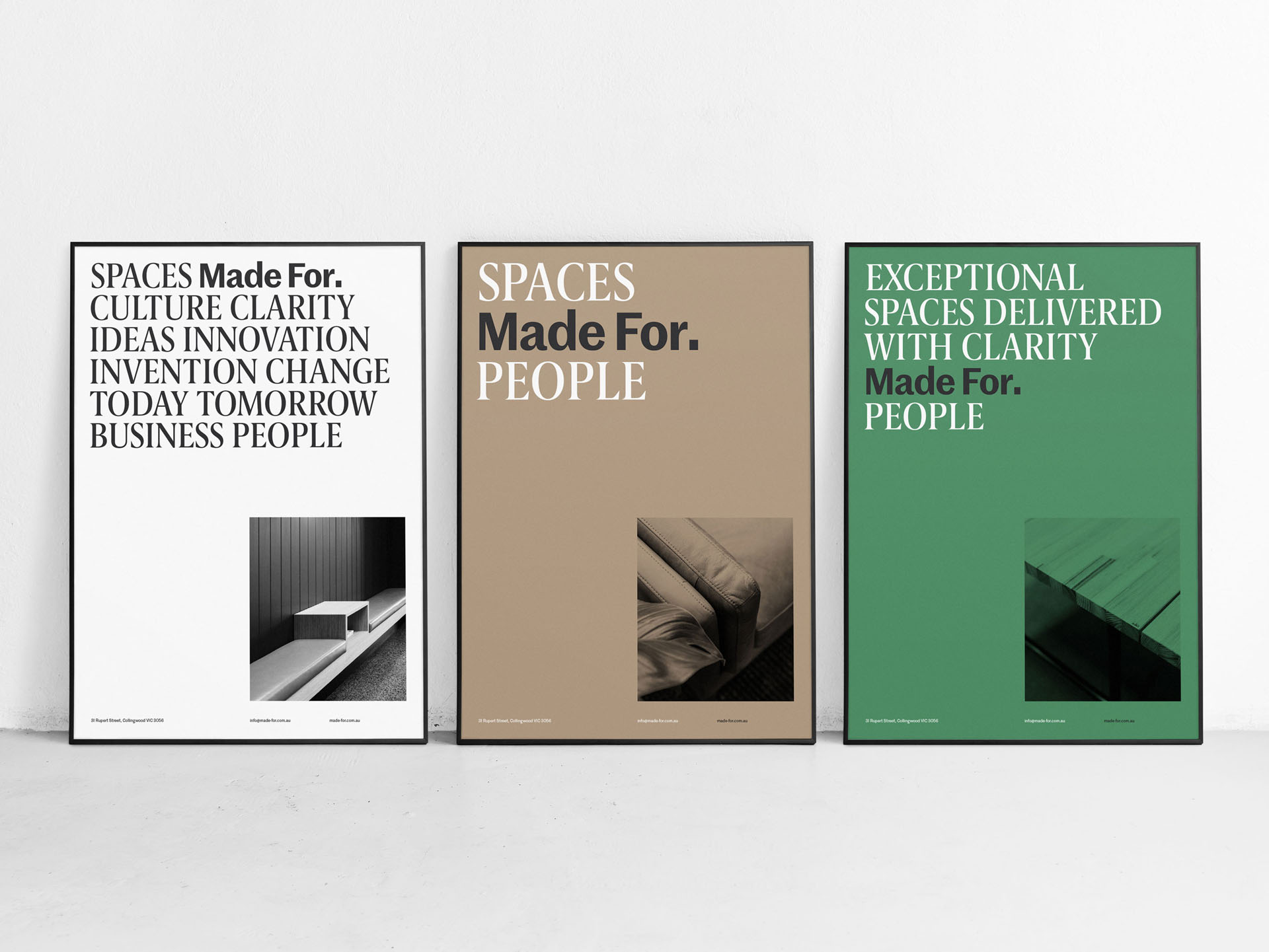
Credit: Made For by Christopher Doyle & Co.
Balance through tension is used to good effect in the visual identity for Made For designed by Christopher Doyle & Co. The positioning of the strong left aligned copy at the top of the page plays against the imagery positioned at the bottom right. There is tension between the two elements and the negative space in between. The effect is has a dynamic and bold quality.
Conclusion
So, there we have it. The five principles of graphic design. Feel like you have a better grasp on graphic design basics?
As our final challenge to you, keep an eye out next time you’re flicking through design inspiration or out in the world. Notice where the graphic design principles are working, or not working. If you tweaked one element, would the design fall apart? Or come together?
Nerding out about these five basic principles of graphic design? Consider studying 3 months full-time or 9 months part-time and becoming a graphic designer with Shillington! Campuses in New York, London, Manchester, Sydney, Melbourne and Brisbane.
Posts you might like

One of the best things about graphic design is that it never stands still for a moment. But that does mean that keeping up with...

The best graphic design books can take you on an exciting journey of the imagination, transport you to new creative worlds or...

At Shillington, our dedicated graphic design students are taught all about how to design for packaging—from FMCG (that’s fast...
We’ve all been feeling the squeeze over the past few years, but at Shillington we don’t want this to stop anyone getting the...
Are you considering becoming a graphic designer but want to be working online? With the increasing demand for digital design...
To ensure Shillington's commitment to the LGBTQ+ community extends beyond Pride Month, we’ve collated a list of incredible...

At Shillington, our graphic design course teaches students how to design campaigns for a brand, helping to spread its message....
Are you looking to teach yourself graphic design? If so, you may be wondering if it is possible. The answer is yes—it can...
Want to win some amazing prizes and stay in the loop with all things Shillington? Sign up to our newsletter to automatically go in the draw.