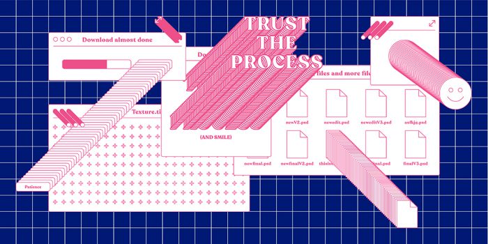
The 20 Best Graphic Design Examples That Will Blow You Away
Exposing yourself to examples of good graphic design is a healthy practice no matter who you are. Maybe you’re a student contemplating the next step in your journey. Or, you’re an award-winning graphic designer that’s staring at a blank computer screen, breaking out in a cold sweat.
We’ve curated a list of 20 amazing graphic design examples, some created by our own graphic design course graduates and teachers. Scroll through these stunning examples to see the depth and breadth of graphic design—and the kind of things you could be creating. They’re great representations of how innovative design can help articulate a company’s purpose, core values, personality, and positioning.
1. Walr by MultiAdaptor
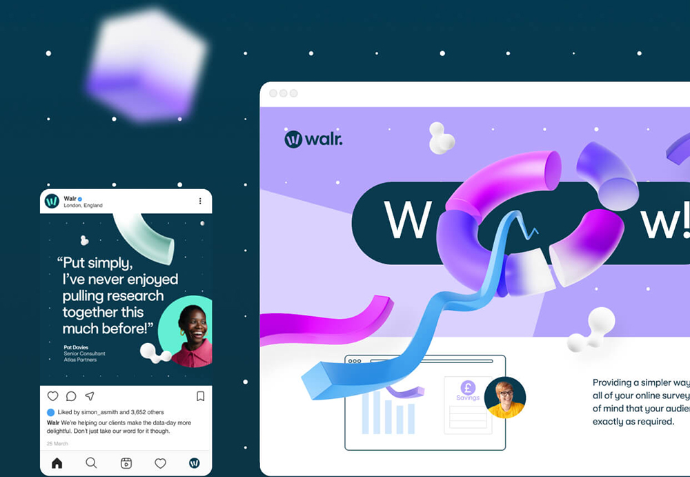
Walr is a quantitative data specialist that partners with businesses all over the world. MultiAdaptor’s rebrand for the company saw them want to take Walr away from the stuffy corporate image that is usually associated with data. MultiAdaptor created a brand identity full of joy, giving Walr a vibrant, expressive and fun look to really make it stand out from the crowd.
Read more about Walr
2. National Museum in Krakow by Podpunkt
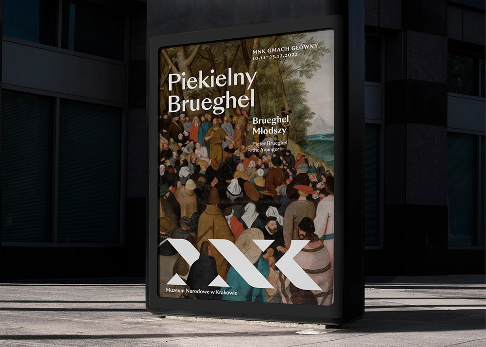
Warsaw-based graphic design studio Podpunkt has recently rebranded the National Museum in Krakow (or Muzeum Narodowe w Krakowie), one of the largest museums in Poland. The agency wanted to create a brand that was timeless as to connect all 12 branches of the museum and their collections. The museum’s new logo stands in beautiful, modern contrast to the museum’s vast collection of art and antiquities
Read more about the National Museum in Krakow
3. Amifer Folio by Typeland
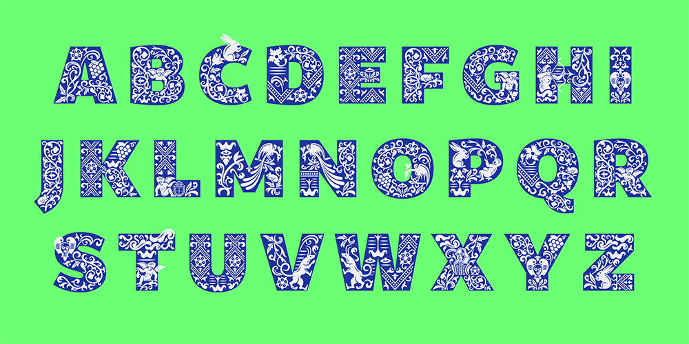
Typeland, the custom type foundry run by designers Alessia Mazzarella and Vaibhav Singh, joined forces with Shakespeare’s Globe to create a custom typeface for the theatre’s 2023 summer season. Typeland’s beautifully crafted typeface uses a selection of beautiful and intricate editorial decorations from Shakespeare’s original folio, published 7 years after the playwright’s death.
Read more about Amifer Folio
4. Nordstrom Rack by JKR
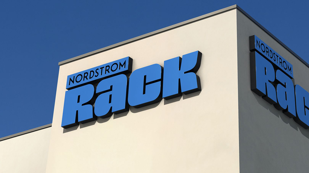
A sense of nostalgia is a really powerful tool in design and JKR’s rebrand of store chain Nordstrom Rack is a perfect example of this. Using Nordstrom Rack’s logo from the 1970s and ‘80s combined with a modern modular grid system, JKR cleverly crafted a brand that is useable and consistent across both physical and digital platforms—and looks amazing too.
Read more about Nordstrom Rack
5. Graza by Gander
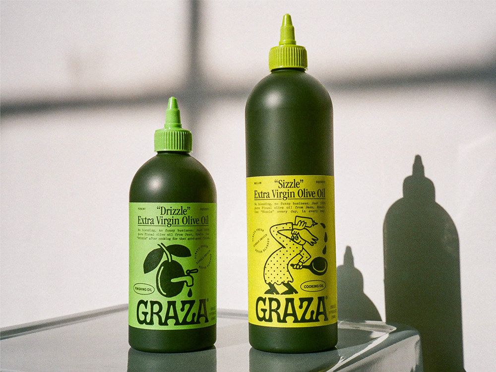
Graza, and it’s packaging designed by Gander, are making olive oil fun. Graza’s founding principle is that olive oil should be used on everything, all the time and the packaging makes you want to do just that. Combining a variation of greens, great copy and enticing illustrations, Gander’s packaging is really something that you’ll want to grab off the shelf. The clever squeezy bottle also makes drizzling fun.
Read more about Graza
6. Heely by Daniela Zapata
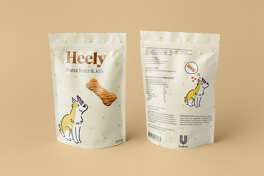
Shillington graduate Daniela Zapata’s packaging for Heely Treats is all about remembering that food is a love language—even for man’s best friend. Zapata uses a friendly and inviting tone of voice to describe the dogs who will love these treats and love you for feeding them to them. This is complimented by adorable illustrations of the dogs themselves.
Read more about Heely
7. Foresee Asset Management by Mainworks
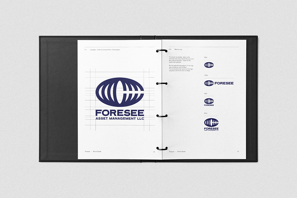
Contemporary design is not something you would usually associated with asset management, but Shillington teacher Marco Invernizzi’s studio Mainworks’ branding for Foresee Asset Management is just that—contemporary and cool. The logo is concentric, made up of the 4 Cs of the founder and their children’s last name, creating something that is striking and strong, but with family at the heart that will make it last for generations.
Read more about Foresee Asset Management
8. Wise Design System by Ragged Edge
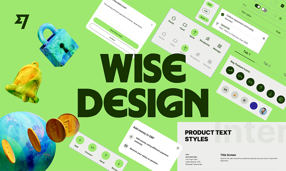
Ragged Edge and Wise recently teamed up to create a new brand for the international banking company, and amazingly accessible design system to go along with it—supporting over 146 languages. To help with this accessibility, Ragged Edge and Wise developed a bespoke typeface, Wise Sans, which incorporates letterforms inspired by different scripts from around the world. They also a created a colour palette, wordmark and logo to help make this a truly global brand.
Read more about Wise
9. Any But None by Dossier Industries
Melbourne-based experimental publishing house Dossier Industries designed Any But None, which they describe as “an exquisite corpse of text and imagery”. The beautifully designed tome is a collection of stories by Australian author Felix McNamara responding to images from the short films and photos of Thai artist Apichatpong Weerasethakul merged with an illustrative response by Greek illustrator and printmaker Tania Cimatti.
Read more about Any But None
10. The Wild Museum by Anja Zhao
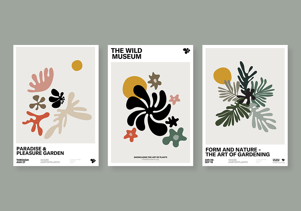
Anja Zhao, a Shillington graduate, rebranded Shanghai’s garden museum as a student project. Her resulting branding for The Wild Museum aims to embody the museum’s creative spirit and mission of showcasing the cultivated landscape as a piece of art—and does so well. Utilising bold sans serif type and abstract graphic elements informed by nature and plants, Zhao creates some enticing branding avoiding cliches.
Read more about The Wild Museum
11. Wim by Hanna Karraby and James Paris
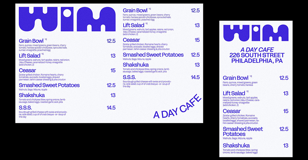
Designer Hanna Karraby and illustrator James Paris recently teamed up to create the branding for Wim, a new daytime cafe in Queen Village, Philadelphia, the city that Karraby and Paris call home. Working off WIM’s vision of “playful, elevated and unexpected”, Karraby and Paris set about creating a brand with graphic and heavy typography and playful illustrations. The resulting branding is light-hearted and welcoming.
Read more about Wim
12. Ecosia by Koto
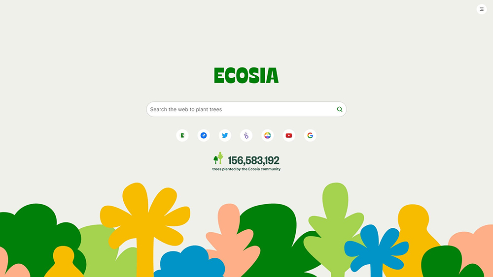
Ecosia is a pretty special company, its a search engine that uses its profits to plant trees, so they needed a pretty special brand. Koto delivered that in droves. Faced with a problem of Ecosia planting too many different kinds of trees, Koto created an expansive series of illustrations that avoid textures to make them scalable to a variety of different sizes—from a computer screen to billboards. For the logo, Koto looked to the music scene of the ‘60s and ‘70s to help craft a brand that is both holistic and approachable.
Read more about Ecosia
13. Pedally by Harrison Evans
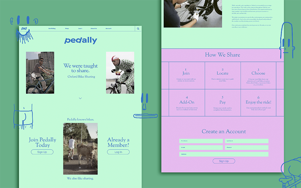
Pedally is a bike share app for modern cyclists designed by Shillington graduate Harrison Evans as a student project. Taking 21st century cycling out of the realm of lycra-clad masculinity, Evans’ app combines an unexpected, toned down colour palette with tongue-in-cheek illustrative interactive elements to create a design for everyone. It’s both easy to use and nice to look at.
Read more about Pedally
14. Lex by &Walsh
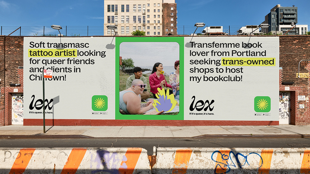
At the start of this year, Jessica Walsh’s studio &Walsh rebranded LGBTQIA+ friendship app, Lex. For the overhaul of the app, &Walsh explored custom stickers, language and tone of voice, a UI/UX toolkit and a desktop and mobile website to appeal to Lex’s target queer audience. They also developed a bespoke colour, Lex Green, and custom Lexmojis that were developed directly with the Lex community. The &Walsh team aimed to visually represent Lex’s queer playground.
Read more about Lex
15. Raise Snacks by Fred Trevor
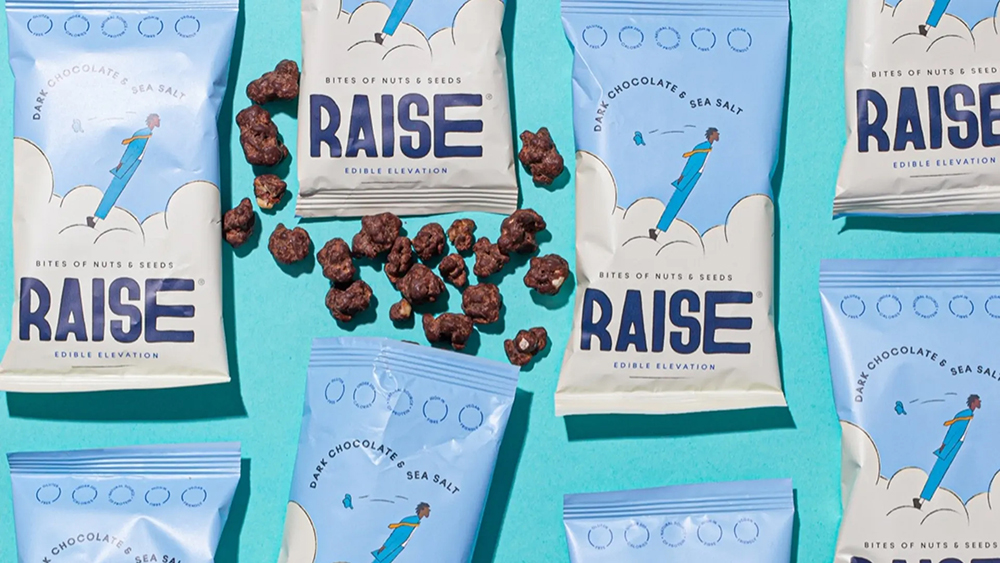
Shillington graduate Fred Trevor designed the packaging for Raise Snacks, a brand that make natural and nutritious snacks that help to refuse a busy and active lifestyle. For Trevor’s branding, he teamed up fellow Shillington graduate Juliette Van Rhyn for a ligne claire style illustration which he then combined a logotype made with a hand modified version of Vocal Type’s Bayard to create a piece of packaging that is hard to not grab right off the shelves.
Read more about Raise
16. Sundance Film Festival by Porto Rocha
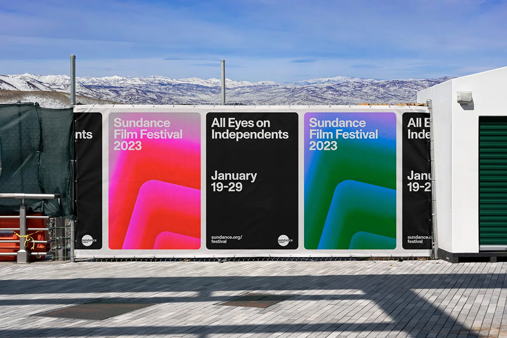
The world’s largest and longest running independent film festival, Sundance, returned to Park City, Utah, this year with a slick new rebrand from New York’s Porto Rocha. To truly reflect the festival, Porto Rocha wanted to create a brand that was both contemporary and timeless and was able to support a multiplicity of stories and perspectives. It’s easy to see that the studio achieved what they set out to do.
Read more about Sundance
17. Noita Urban Winery by Dan Wilson
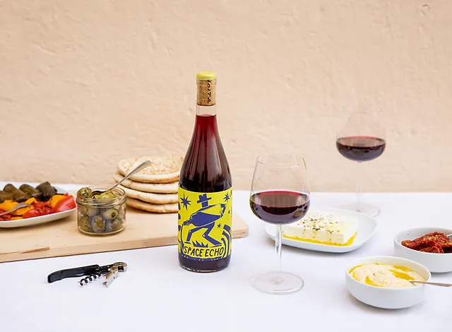
Noita, an urban winery based in Fiskars, a small village an hour from Helsinki in Finland, was branded by Shillington teacher and graphic artist Dan Wilson. Dan’s branding and packaging for the winery is imbued with a sense of playfulness. Each bottle design is focused around a central character with Dan’s signature illustrations adding a beautiful flourish. Dan’s packaging is complemented by Noita’s tone of voice which helps to truly give their unique wines character.
Read more about Noita
18. MIF Display by Charlotte Robertson
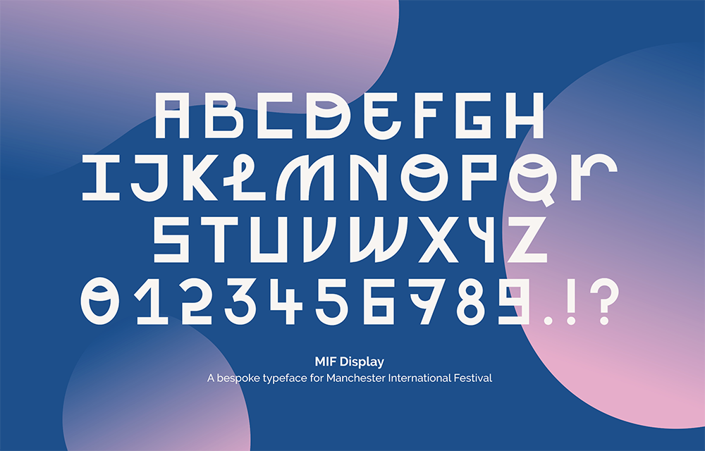
As part of her student project branding the 2023 Manchester International Festival, Shillington graduate Charlotte Robertson designed her own typeface MIF Display. Taking design cues from Manchester’s industrial past, as well as the innovation on show across the festival, Robertson’s display typeface is full of interesting quirks and flourishes. A perfect match for the progressive festival.
Read more about MIF Display
19. Ripple by Studio Chenchen
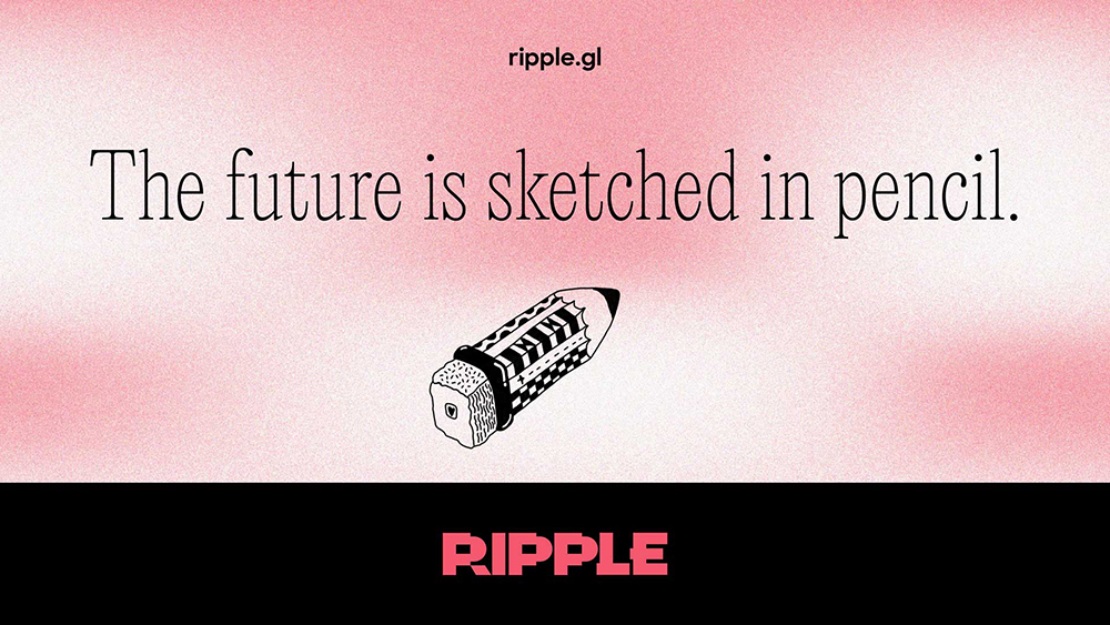
Ripple is a Australian platform that helps young people impact the things they care about. With the company’s shift to an online platform, Studio ChenChen, headed up by Shillington Teacher Olivia Chen, gave Ripple a comprehensive rebrand. Studio ChenChen’s starting point was helping Ripple to understand what truly made them special and using this to inform the shape the brand took. The resulting concept was our future is sketched in pencil creating an identity with bags of personality.
Read more about Ripple
20. Houseplant by Pràctica and MA-MA
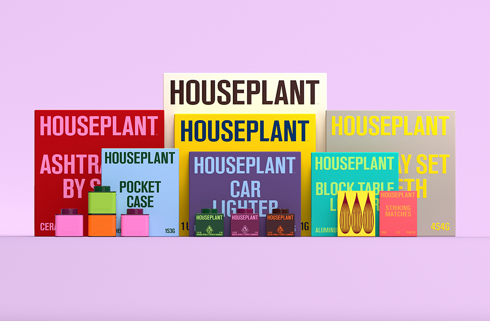
Houseplant is a modern cannabis brand created by longtime collaborators actor Seth Rogen and writer/director Evan Goldberg. Wanting to create something that stands out in drab market, Rogen and Goldberg teamed up with MA-MA and Pràctica to create some vibrant packaging that would pop on the shelf. And they seriously delivered—creating collectable, stackable packaging that’s informed by modernist product design and features a custom typeface and an eye-catching colour palette.
Read more about Houseplant
Save these graphic design examples for inspiration.
The more you study the work of others, the more you’ll be able to identify the elements of great design and know when it is present in your own work. There’s no need to suffer from designer’s block again. Bookmark this page for future inspiration, and seek out the portfolios of the talented artists featured in this post. Winning designs are always just a click away.
Would you like to create work like this? Consider studying at Shillington and enroling in the online graphic design course so that you can study from wherever you are in the world!
Posts you might like

One of the best things about graphic design is that it never stands still for a moment. But that does mean that keeping up with...

The best graphic design books can take you on an exciting journey of the imagination, transport you to new creative worlds or...

At Shillington, our dedicated graphic design students are taught all about how to design for packaging—from FMCG (that’s fast...
We’ve all been feeling the squeeze over the past few years, but at Shillington we don’t want this to stop anyone getting the...
Are you considering becoming a graphic designer but want to be working online? With the increasing demand for digital design...
To ensure Shillington's commitment to the LGBTQ+ community extends beyond Pride Month, we’ve collated a list of incredible...

At Shillington, our graphic design course teaches students how to design campaigns for a brand, helping to spread its message....
Are you looking to teach yourself graphic design? If so, you may be wondering if it is possible. The answer is yes—it can...
Want to win some amazing prizes and stay in the loop with all things Shillington? Sign up to our newsletter to automatically go in the draw.