Interview with Margot Lévêque, Graphic and Type Designer
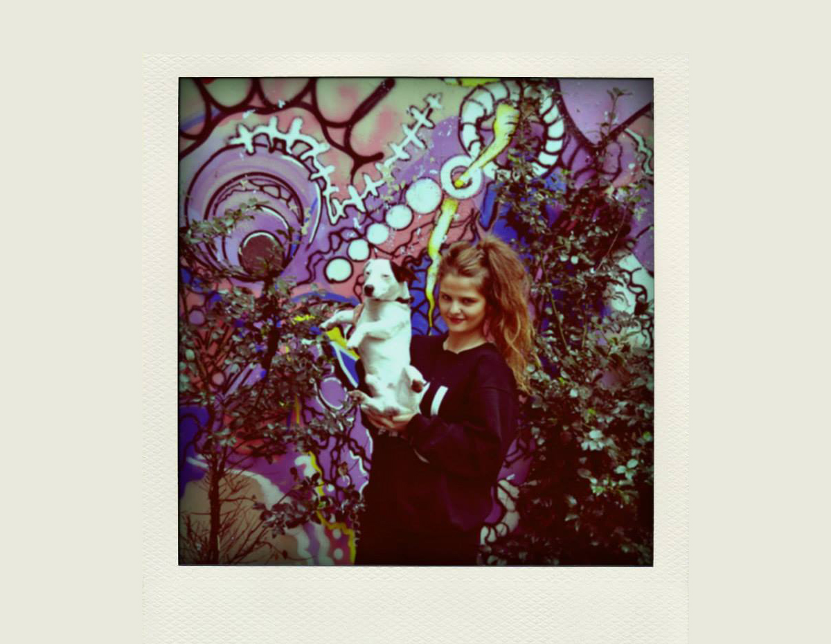
Margot Lévêque is a French graphic and type designer currently based in New York. Before becoming a designer, she studied biology then marketing, realizing that her true passion is design. She’s worked at Pentagram under Paula Scher’s team and now freelances, working across music, fashion and culture. She creates work that spans identity, type and editorial design, inspired by minimalism and new trends, while being flexible in style.
Read on to hear Margot’s story, including how she got into design, her favorite type based project and the ampersand branding she created for &Walsh.
You originally studied biology in Rennes and then marketing in Paris before deciding to become a designer. Tell us about your decision to change your studies and career path.
After my baccalaureate, I continued my scientific studies by entering a science school in Rennes. At that time I didn’t know what I wanted to do in my life. One day, I wanted to change, so I moved to Paris and studied marketing and communications at a school. We always worked in a group and I was always the one who designed presentations—this is where I realized that I wanted to work as a designer and not in marketing! I did only a year there and then I went to ECV Paris where I studied for 5 years—one year in applied art and three years to get my Bachelor’s Degree in Graphic Design and two years to get my Master’s Degree in Type Design.
I didn’t have an artistic background and I was starting from scratch. It was very hard, as I was always behind the other students, but I worked hard and never let anything go.
How did you get into type design? What tips can you offer to other designers who want to become proficient in working with type?
I think it’s my environment—my best friends are graphic designers. Nothing is better than my entourage to inspire me! My boyfriend and I work together, we have the same references, the same inspiration and love for the same museums. We help each other a lot. But it’s funny because we don’t have the same graphic style, our portfolios are totally different!
If I had to give two pieces of advice it would be work hard and be patient. Typography is creativity, but mostly a lot of rigor.
Where do you get your inspiration for typography?
My iPhone! I take pictures of everything every time I walk down the street or when I go to an exhibition, bookshop or art book fair.
Tell us about your process to create typefaces. Do you have any new typefaces in the works?
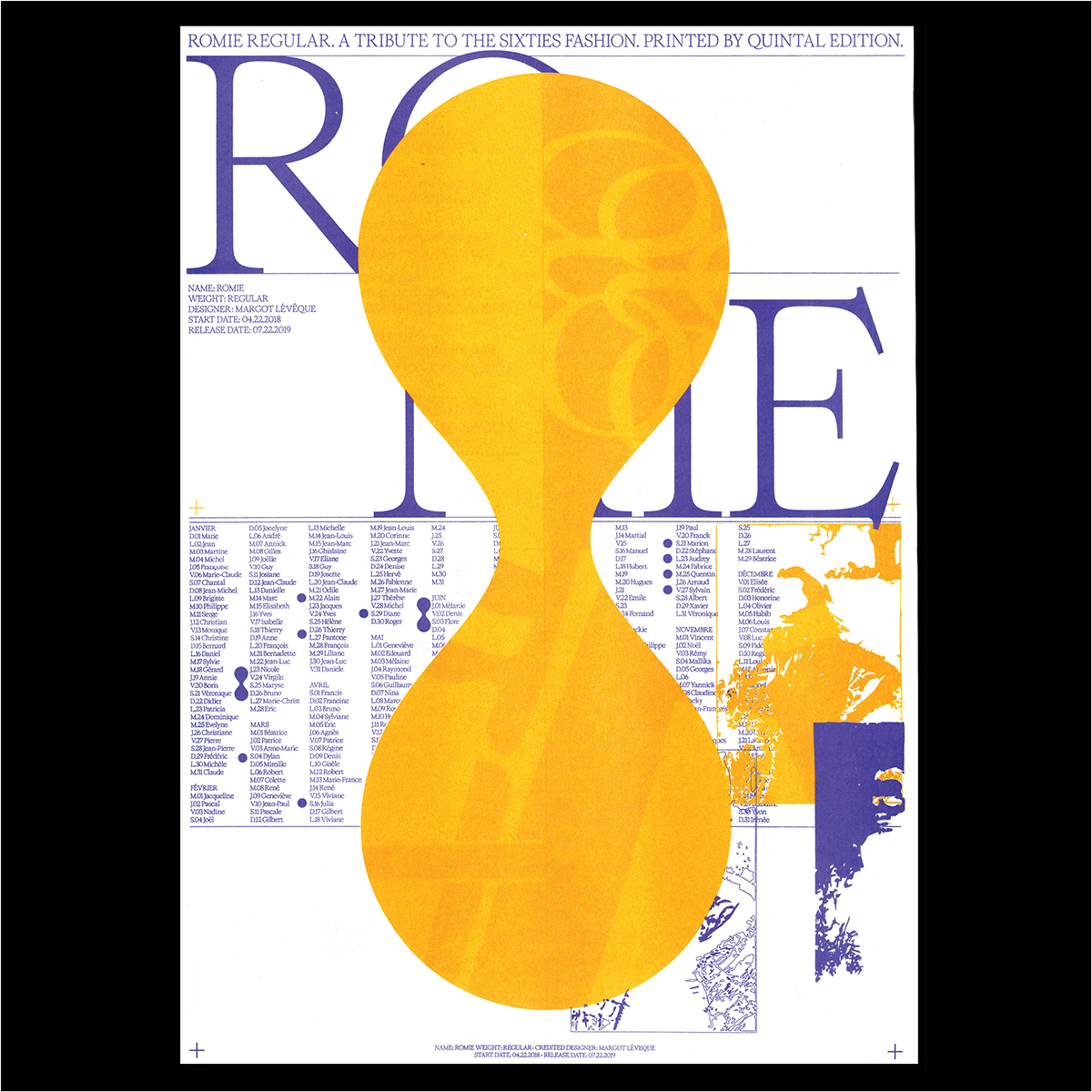
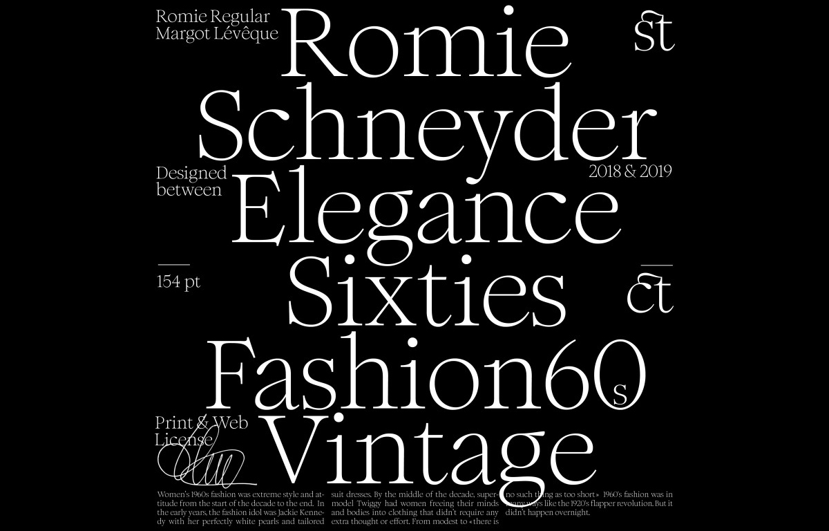
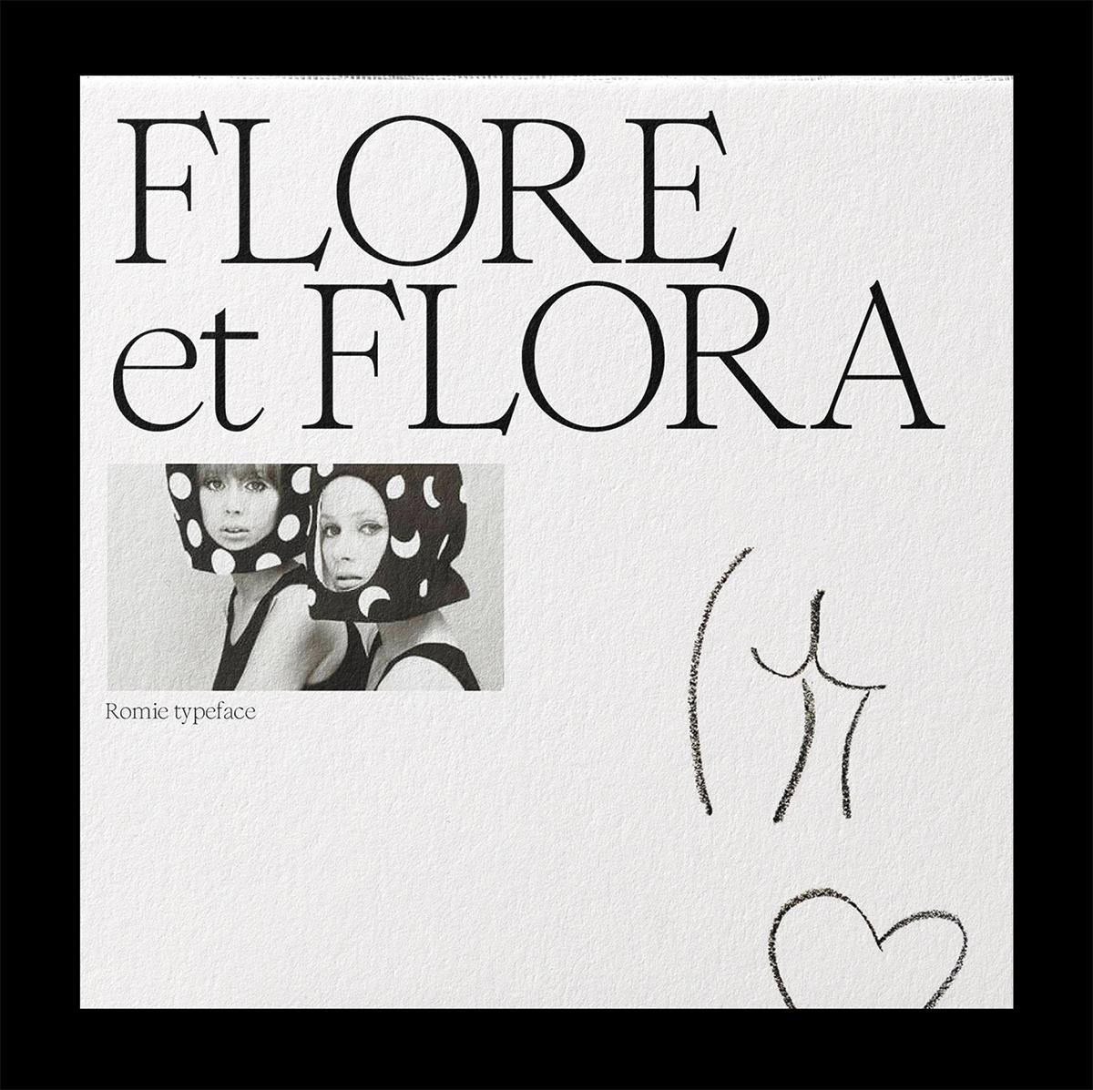
The process is: you recover a specimen, scan it and then rework the drawing in layers. With the imperfections and the evaporation of the ink, you can redesign the letter by bringing something new, it is the principle of the revival. I created the Romie display typeface which is now available for purchase.
I’m currently working on another classic typeface, Maria and doing regular updates of my progress on Instagram!
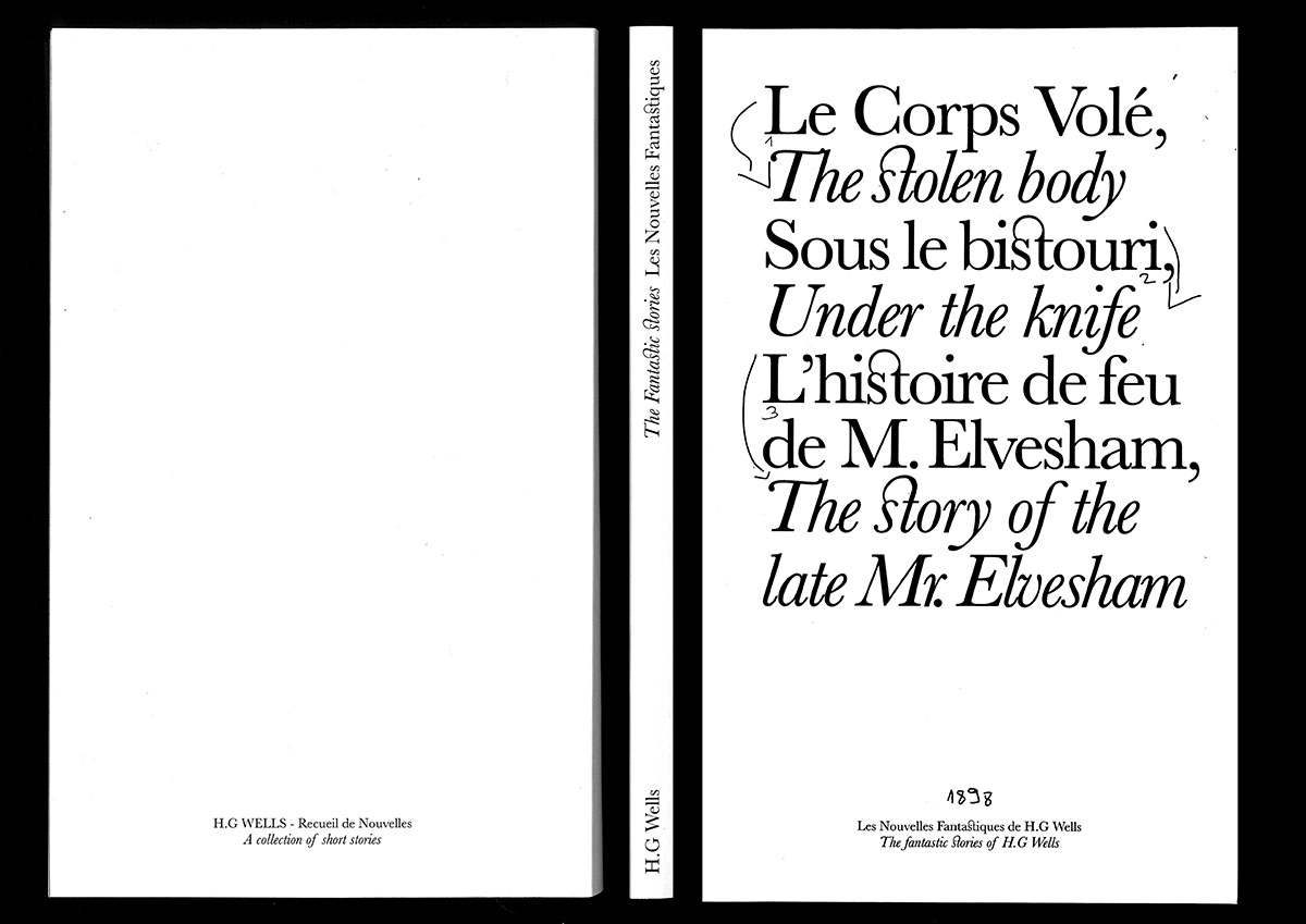
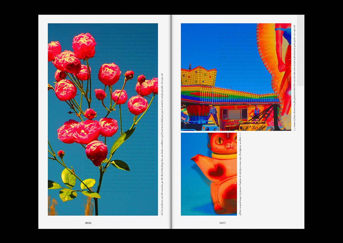
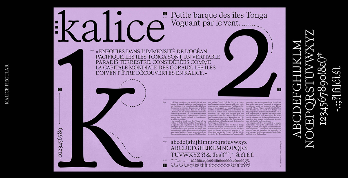
I also designed a revival of the French Turlot Foundry typeface by Elzevir Anglais. The contemporary version of Elzevir Anglais aims to reinvigorate its distinctive elegance by showing the serifs like moving shapes. Kalice proposes a unique aesthetic for headlines. Kalice means a little boat in Polynesia, so I was inspired by the marine world and created the specimen with cartographic elements.
How did you go about getting a job at Pentagram?
I sent an application asking to join Paula Scher’s team. I then received a reply the day after—I was very lucky!
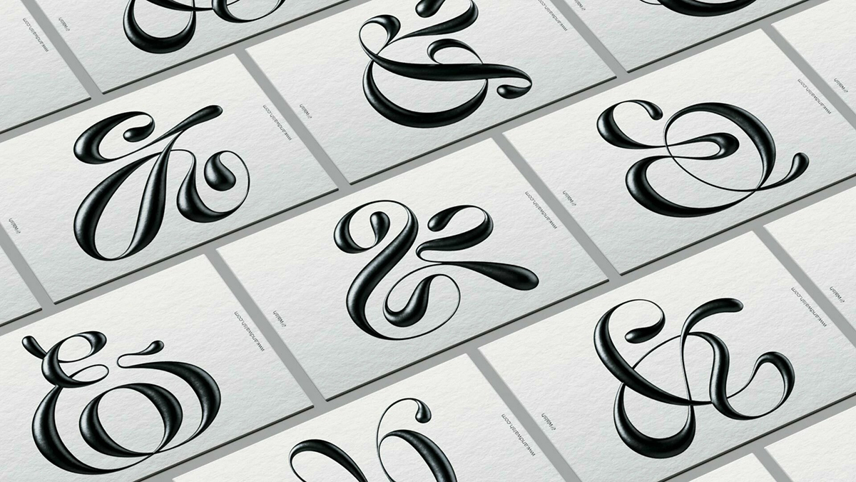
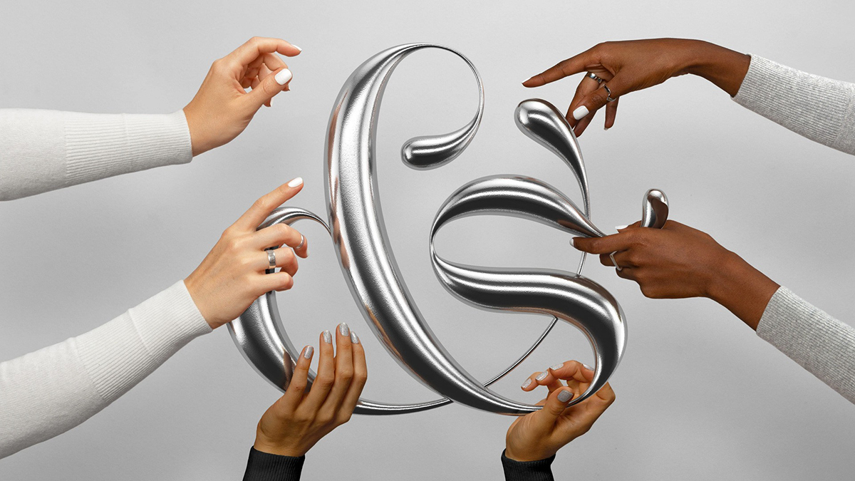
Tell us about the additional ampersands you created for the &Walsh branding.
Jessica Walsh sent me an email, and initially, I didn’t even see this first message. Luckily, she reached me a few days after and of course, I agreed to work with her team. Since I was in Paris at the time, I worked freelance remotely. She asked me to draw additional ampersands for the branding of the new studio &Walsh. I worked on this for a few weeks. And a few weeks ago, Jessica asked me to work with her team for another project, the design for Anna Wintour’s Masterclass. I finally met her team in New York recently!
Editor’s Note: Shillington Melbourne graduate Stephanie Halovanic works at &Walsh as their creative producer and writer. Read her Shillington interview and advice for graduates interested to land a job at a similar type of agency.
What was your favorite recent project?
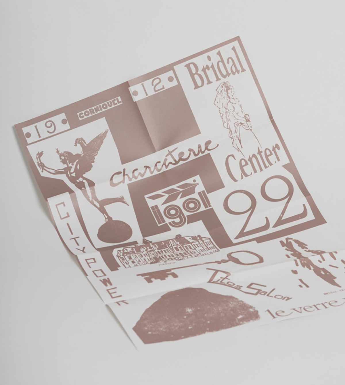
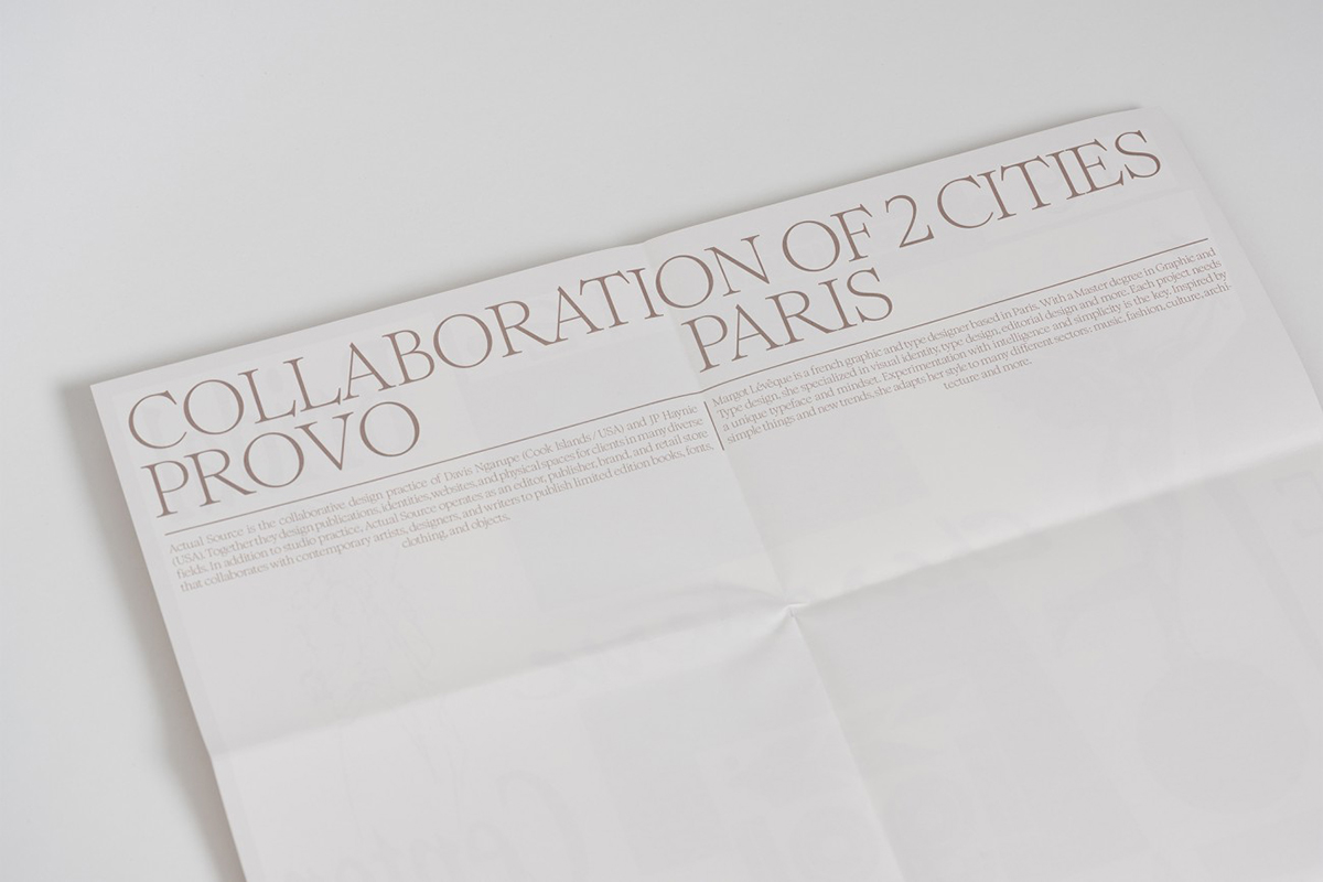
I loved working on the Provo project for Actual Source studio last June. It’s Nice That had a call for a collaboration and I was selected to design stamps and a poster. For this remote project, I looked for inspiration on the streets of Paris—it was a lot of fun and I am happy to have worked with them.
3-5 words to describe yourself and your creative style.
I asked the New York-based graphic designer Virgile Flores to answer this question and he replied to my creative style as elegant, specific and honest.
Big thanks to Margot for talking about her creative journey with us! Make sure you keep up with her latest projects through her website and Instagram.
We’ve hosted some of the world’s top creatives, design studios and advertising agencies at Shillington. Check out more industry interviews!
Posts you might like
Are you a graphic designer who is finding themselves lacking skills, slow on one of the major graphic design programs or just...

https://www.youtube.com/watch?v=wZ_tffGtZMs New York graduate Simon Fréour worked as a software engineer in France for seven...
Are you working with graphic designers day-to-day and finding yourself jealous of the work they're doing? You're certainly not...
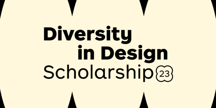
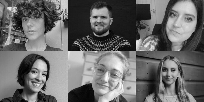
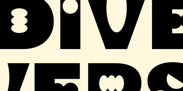
Diversity in design is an important topic to us at Shillington and we aim to support and strengthen equity by cultivating...
Last year Shillington launched, for the first time, our Diversity in Design Full Scholarship opportunities—in New York City,...
Diversity in design is an important topic to us at Shillington and we aim to support and strengthen equity by cultivating...
Last year Shillington launched, for the first time, our Diversity in Design Full Scholarship opportunities—in New York City,...
Diversity in design is an important topic to us at Shillington and we aim to support and strengthen equity by cultivating...
Want to win some amazing prizes and stay in the loop with all things Shillington? Sign up to our newsletter to automatically go in the draw.