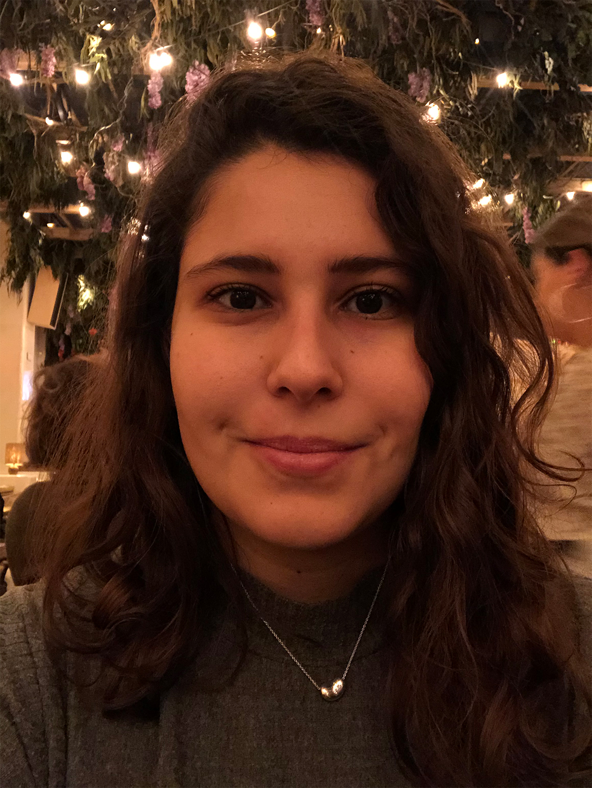
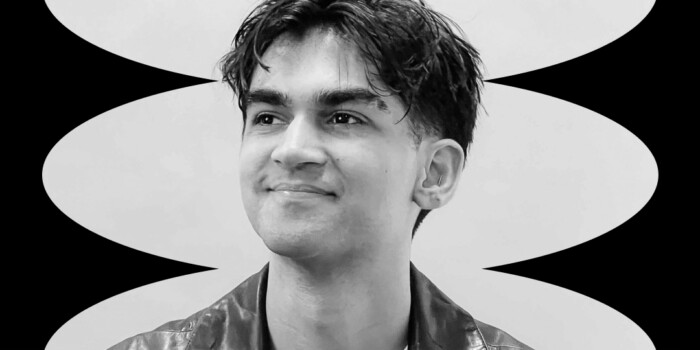
4 Years Since Shillington London: Kinda Savarino, Designer at Billion Dollar Boy
After a degree in Government, Shillington London graduate Kinda Savarino knew the route into politics wasn’t for her—always searching for something creative, she knew that was where her heart really lay. After being struck by the work produced by Shillington students and our innovative teaching methods, she enrolled on the full-time course and never looked back! Four years later, she has a day job at creative agency Billion Dollar Boy, whilst also working for Unicorn Magazine, a queer magazine for arts and culture, managing an archive of LGBTQ+ design and dappling in some freelance illustration. Wow.
We caught with Kinda to talk about her design journey so far, learn more about her work, both professional and personal, and about working on the LGBTQ+ side of design. Read on!
Why did you pick Shillington to start your design career? What was it about our course?
The quality of work coming out of Shillington caught my eye. I was really impressed by the designs and wanted to learn how to do that for myself. I was also drawn to the way Shillington approached teaching.
Everything from the studio environment, to the independence students were given when responding to a brief appealed to me.
Before Shillington, you had a degree in Government from the London School of Economics (LSE). Why did you choose to make the change over to design?
I realised quite early on in my degree that my day to day had to be more creative than what a career in politics could offer, but I stuck out the degree and at the time fully intended to find a career path that aligned with it. When it came to applying for jobs I always found myself applying to creative and design related jobs. That’s when I decided to fully commit to a career in design and applied to Shillington.
What have you been up to since graduation? How has your life changed after Shillington?
Designing! I got myself an internship shortly after graduation and from there went on to Leo Burnett where I worked with clients such as McDonald’s, Kellogg’s and the NSPCC. I was also lucky enough to work on a campaign that won a Silver Epica during my time there. After Leo Burnett, I joined Billion Dollar Boy, where I’ve been able to expand my skill set to include animation and AR development.
Although I design everyday for work, I try to ensure I’m also designing for me.
This is why I set up an archive for LGBTQ+ design, which highlights queer expression, politics and pride through design and typography.
I also love the odd illustration collaboration and have worked with GLAAD, The Dolly Effect (organised by fellow Shillington London graduates Charlotte Carnegie-Brown and Ella Donald, aka Duzi Studio) and Life on Hold. Life on Hold was particularly exciting as I got to remix an original piece by German illustrator Yeye Weller.
You’re now working for Billion Dollar Boy, who call themselves a creative agency for the Influencer age. What kind of projects do you work on there?
We do everything surrounding influencer marketing campaigns which means I’m lucky enough to work across both print and digital briefs at Billion Dollar Boy. On the print side, we’ve worked on some really exciting packaging briefs.
One of my favourites has to be the box we designed for the promotion of the It 2 film. It was fully branded and released a red balloon when opened. On the digital side, I’ve worked on social media stickers, social and digital ads, titles and AR filters. I really love when our campaigns call for animation because each concept or tagline desires a unique execution or animated solution.
Could you tell us about a recent professional project?
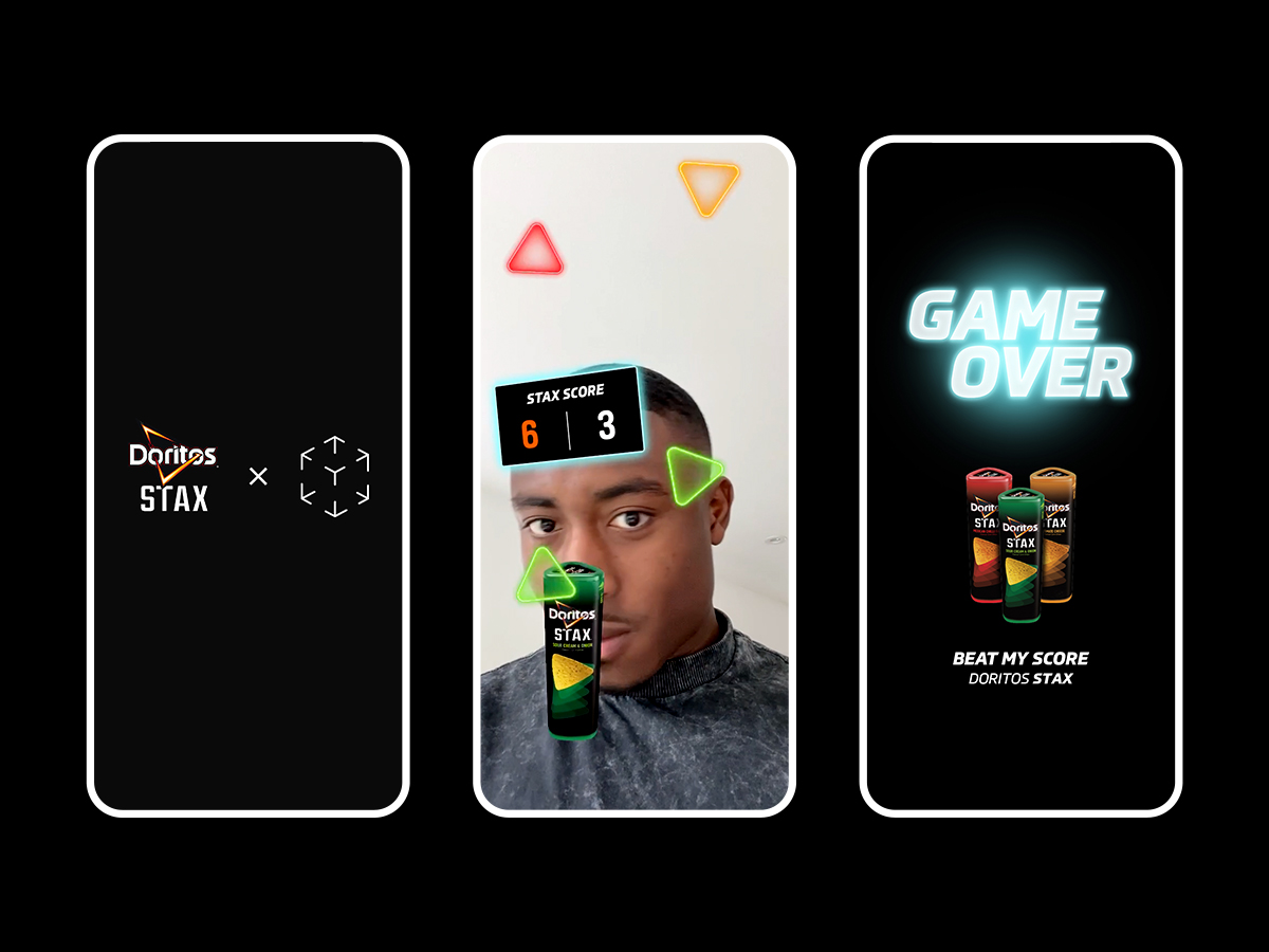
I recently worked on an AR Filter for Doritos to promote the launch of their new product Doritos Stax. Given the playful nature of the campaign, an AR filter was the perfect addition. We came up with an in-filter game idea which tied into the campaign concept around stacking the Doritos Stax. Within the filter, a green Doritos tube would track the user’s face.
The aim was to stack as many green triangles in the green tube as possible, while avoiding red and orange triangles. Alongside developing the filter I also designed the look and feel of the game. The filter ended up receiving over 936,000 impressions, which is super exciting!
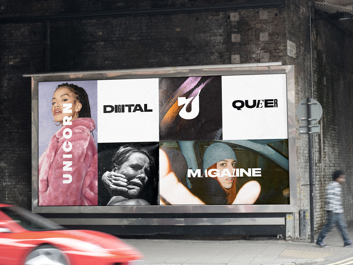
You’ve also been working with Unicorn Magazine, a queer magazine for arts and culture. Can you tell us more about Unicorn and what you do there?
Unicorn was founded by Bi Pride UK and represents the wide spectrum of sexuality and identities that fit in between gay and straight.
The stories are real and honest and I needed content like that in my life so I feel very lucky to be working with the team at Unicorn.
I initially started out working on the cover for Issue 4 and from there went on to rebrand the magazine alongside Lev (our CD) and Harry (Lead Designer). We wanted to create an identity that felt fluid, ever-changing and raw. One that allowed the content to really shine through. Since then, I’ve been designing and animating for social and around our issues. I’m currently working on the cover and teasers for Issue 6.
Can you offer some advice to a graduate who may want to get involved with the LGBTQ+ side of design?
Do your research thoroughly and don’t be afraid to reach out to other members of the community for their perspectives or for collaborations.
Does your previous experience and degree ever tie in to your work? Do you use your design and illustration to explore politics or government at all?
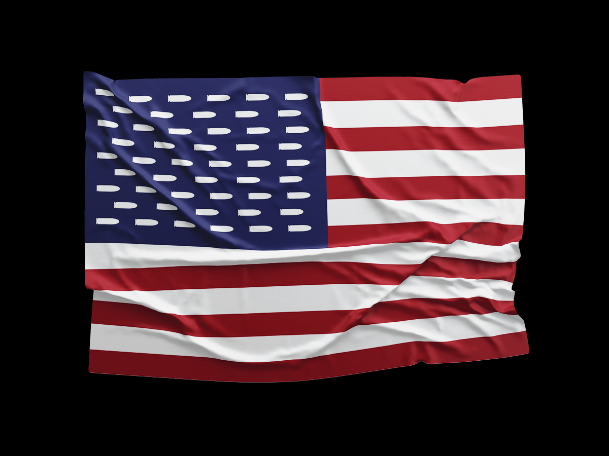
Design can be a hugely political tool and I try to tap into that when it feels right to. In 2018, I designed an alternative American flag with bullets instead of stars. It was in response to the Stoneman Douglas High School shooting and was later featured in AdAge as part of their brief for #MarchForOurLives, which is a student-led initiative to end gun violence.
The LGBTQ+ Design archive I created, and continue to curate is also political. There is so much history (especially in the fight for rights) that needs to be made easily accessible, but LGBTQ+ Design also serves to highlight current queer struggles, initatives and movements. I’m a huge admirer of the work the team at Templo do, and would love to explore the intersection of politics and design even more.
Back to Shillington, can you remember your favourite brief from the course? We’d love to hear about your processes and outcomes.
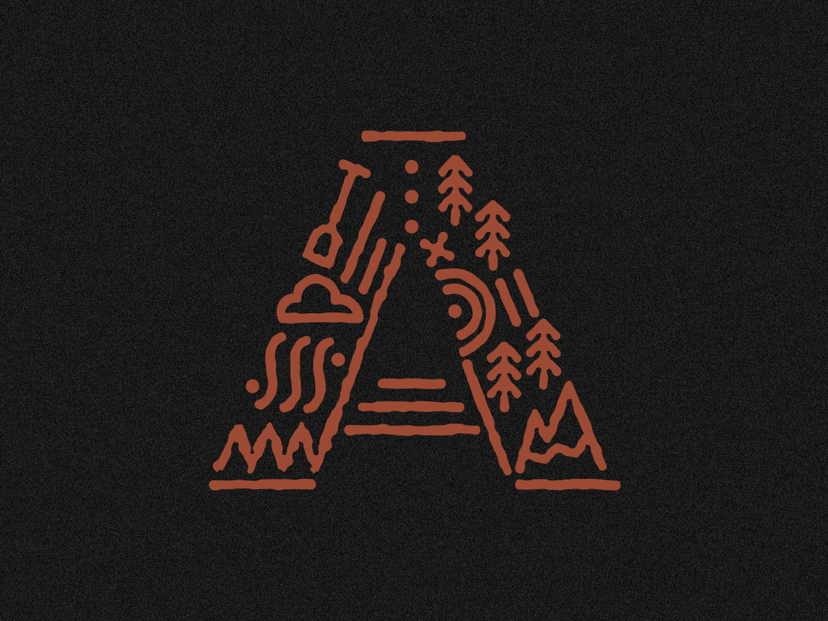
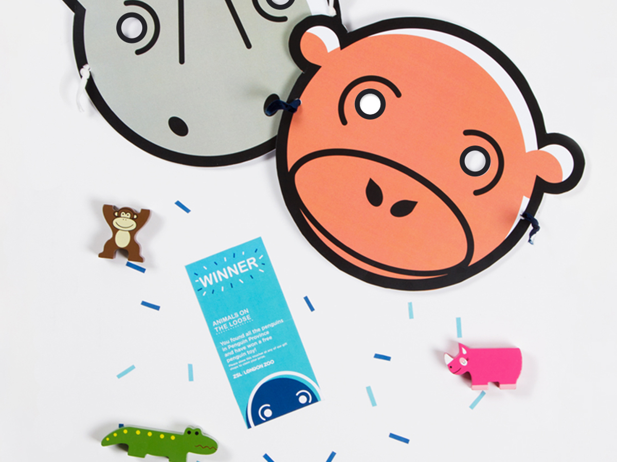
The zoo icons brief has to be my favourite. It’s not as glamorous as some of the other briefs (handmade, I’m looking at you), but I loved the process behind it.
Iconography is about reducing something complicated into a few lines or shapes, while maintaining universal recognition. It is at its core what design is all about.
I created four animal icons which ended up becoming part of a broader project for London Zoo.
Did you make any meaningful connections with teachers or fellow students during the course?
Alongside learning design, I met my girlfriend at Shillington, as well as a flatmate and some amazing fellow designers and teachers who I keep in touch with. Our class was really close-knit and it’s been really lovely keeping in touch with people.
I reckon for 1 out of every 3 design events I go to, I usually bump into someone from Shillington, which is a lovely surprise!
If you could give one piece of advice to someone starting at Shillington, what would it be?
Follow the filing system to a tee! You’ll thank me later.
Anything else you would like to share?
Step away from the screen every now and again—it will help your creative process.
Huge thanks to Kinda for sharing her story with us! Make sure you keep up to date with her projects through on her website and Instagram. It’s also definitely worth giving LGBTQ+ Design a follow—it truly is a fascinating archive of queer expression, politics and pride through design and typography.
Posts you might like
Are you a graphic designer who is finding themselves lacking skills, slow on one of the major graphic design programs or just...
https://www.youtube.com/watch?v=wZ_tffGtZMs New York graduate Simon Fréour worked as a software engineer in France for seven...
Are you working with graphic designers day-to-day and finding yourself jealous of the work they're doing? You're certainly not...
Diversity in design is an important topic to us at Shillington and we aim to support and strengthen equity by cultivating...
Last year Shillington launched, for the first time, our Diversity in Design Full Scholarship opportunities—in New York City,...
Diversity in design is an important topic to us at Shillington and we aim to support and strengthen equity by cultivating...
Last year Shillington launched, for the first time, our Diversity in Design Full Scholarship opportunities—in New York City,...
Diversity in design is an important topic to us at Shillington and we aim to support and strengthen equity by cultivating...
Want to win some amazing prizes and stay in the loop with all things Shillington? Sign up to our newsletter to automatically go in the draw.