What is Leading in Typography?: Our Complete Guide to Leading
In graphic design, quite a few decisions happen behind the scenes that clients may not grasp the importance of, yet have a huge effect on the outcome of a design. When it comes to typography, it is the attention to detail that makes a difference in how readable and legible that piece of typography is. Among the elements that require a lot of finessing is leading, one of the unsung heroes behind every typography-heavy piece of design.
What Is leading in typography?
Leading is the space between multiple lines of type, which can be as few as two lines of type to, well, as many lines as needed. Leading is measured from baseline (the imaginary line upon which a line of text rests) to baseline. In the context of digital design, such as apps and websites, leading may be referred to as line spacing or line-height.
Where does the term leading originate?
In the early days of printing and typesetting, all typography was typeset by hand, using individual characters made of wood or metal. To adjust the space between the lines so that the design could breathe more, typesetters added thin strips of lead. The term stuck around and while the olden days of typesetting by hand are long gone, the terminology and principles still remain!
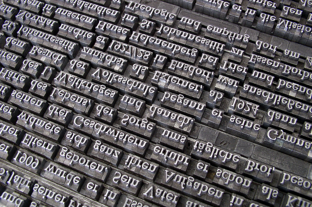
An example of metal text typeset by hand.
All leading isn’t created equal
Every program that designers use to create a typography-heavy layout has default settings for text size and leading. While making good leading choices is vital to the success of your project, there are several factors that will influence those choices.
The leading choices you make can depend on a variety of factors, starting with the aesthetic of the typeface itself.
X-height
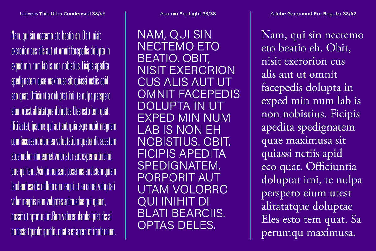
Every typeface we use is created based on its own set of aesthetic rules and principles. The x-height of each typeface will vary—sometimes it is a minor variation in size, but sometimes the range of dimensions is quite extreme, especially when you’re comparing a narrow condensed typeface to one that’s more suitable for body copy sizes. The x-height of each individual typeface is one of the factors that affect leading.
Ascenders & Descenders
These are elements that extend above and below the x-height, respectively. Depending on the design of the typeface, they can be very subtle or overly exaggerated—a good example of the latter would be a script typeface with flourishes and swashes. The appearance of ascenders and descenders, combined with the typeface’s x-height, can drastically affect the leading dimensions.
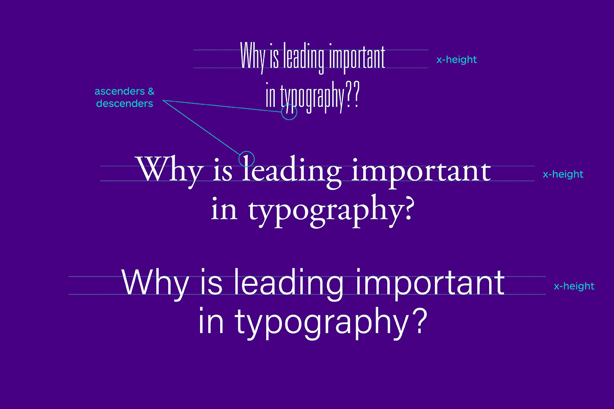
The x-height and length of the ascenders/descenders in a particular typeface are two of the most important factors when figuring out the leading.
Leading examples & measurement
The unit of measure for leading in most programs is points—same as for measuring type size. When you specifying a typeface’s measurement and leading, you’ll write Helvetica 10/12—the first number is the point size and the second number is the leading size. When you bring body copy into a program such as InDesign or Illustrator, the default starting size for leading is roughly 2 points more than the point size—this measurement is sometimes referred to as default leading. While it’s the recommended minimum to follow, it’s important to remember the following terminology.
Normal leading
Normal leading is equal to the typeface’s point size and is written as Helvetica 10/10.
Negative leading
Negative leading is smaller than the typeface’s point size and is written as Helvetica 10/8.
Positive leading
Positive leading is larger than the typeface’s point size and is written as Helvetica 10/14.
In most instances, you would use normal or positive leading.
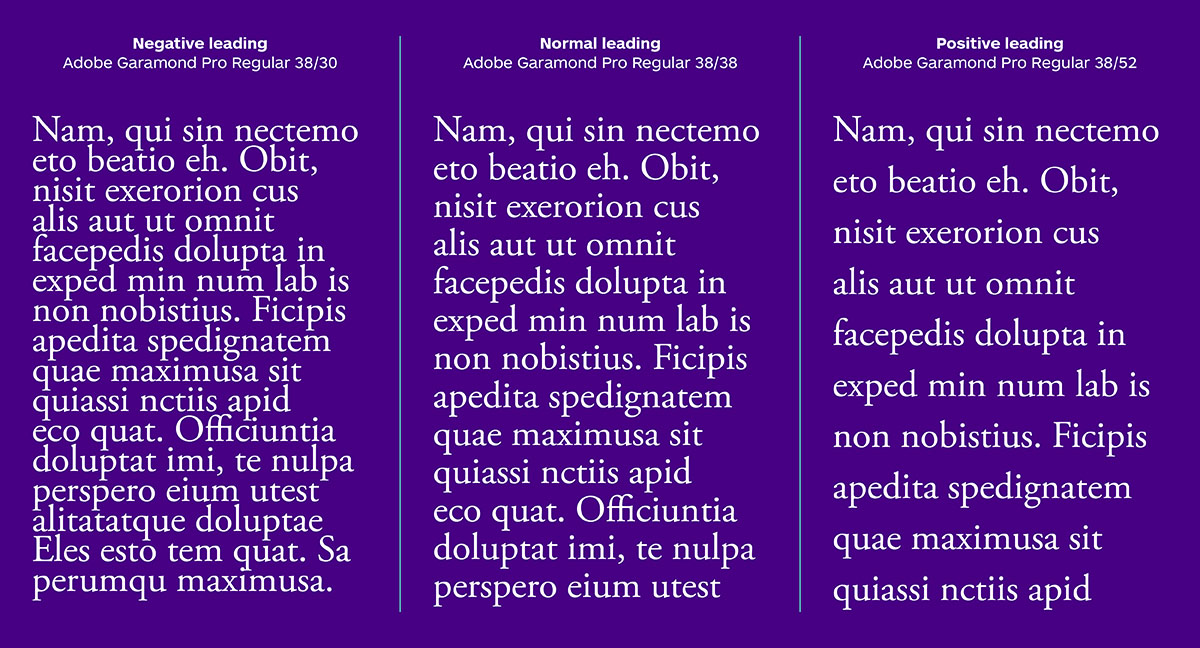
These are the three different leading categories.
But, in some cases, negative leading may be appropriate—a good example of that would be when you’re tweaking a headline on multiple lines that is typeset in all caps.
Figuring out the most effective leading
To determine how effective the leading is, you must first figure out the different elements of your typography-heavy layout that will require different leading settings—start by reading the copy you’ve been provided. For most projects, this could include the body copy, headline and some sort of caption. Once those elements are established, it’s time to do some type studies!
Type studies
These allow you to experiment with different typeface combinations before settling on a final choice, which you will then finesse and tweak.
Type studies typically include several options for typefaces, as well as an exploration of different sizes and weights of any given typeface and different parts of the text (body copy/headline/etc.) typeset in those different options. In-depth type exploration allows you to figure out not only the most effective combination of typefaces but also elements such as kerning and leading.
Type studies can also save quite a bit of time—it is much easier to work with small samples of copy rather than having to apply different typefaces and properties to an entire project, then having to change it again when you need to try a different typeface. Once the type studies are finished, you can decide on the best option for typeface combinations, point sizes for various copy elements and leading—then start applying those elements to the entire design.
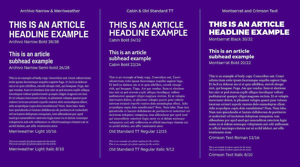
Type studies allow you to compare options that could be suitable for your project, as well as determine appropriate weights for different applications, point sizes, and leading sizes.
Once the type studies are finished, you can decide on the best option for typeface combinations, point sizes for various copy elements, and leading—then start applying those elements to the entire design.
Why finesse typography?
As mentioned before, leading is one of those elements that can go by unnoticed if you don’t know what you’re looking for, but it’s important for making your text read better and your design feeling more balanced. The leading adjustments that are often made are so minor that you might ask yourself “are they really necessary”? However, let’s take a look at what is affected when you adjust the leading.
Text legibility
How easy is it to read your text? If there is not enough leading, the text may be hard to read, as some parts of the type anatomy (ascenders and descenders) may overlap and cause problems for anyone reading the text.
More leading means your text will be easier to read.
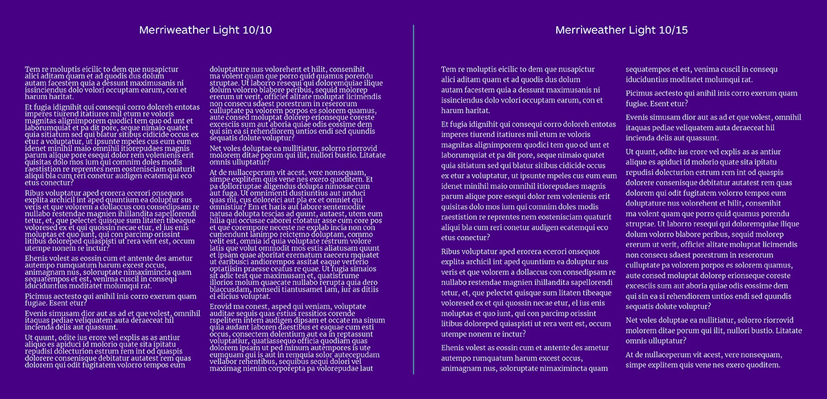
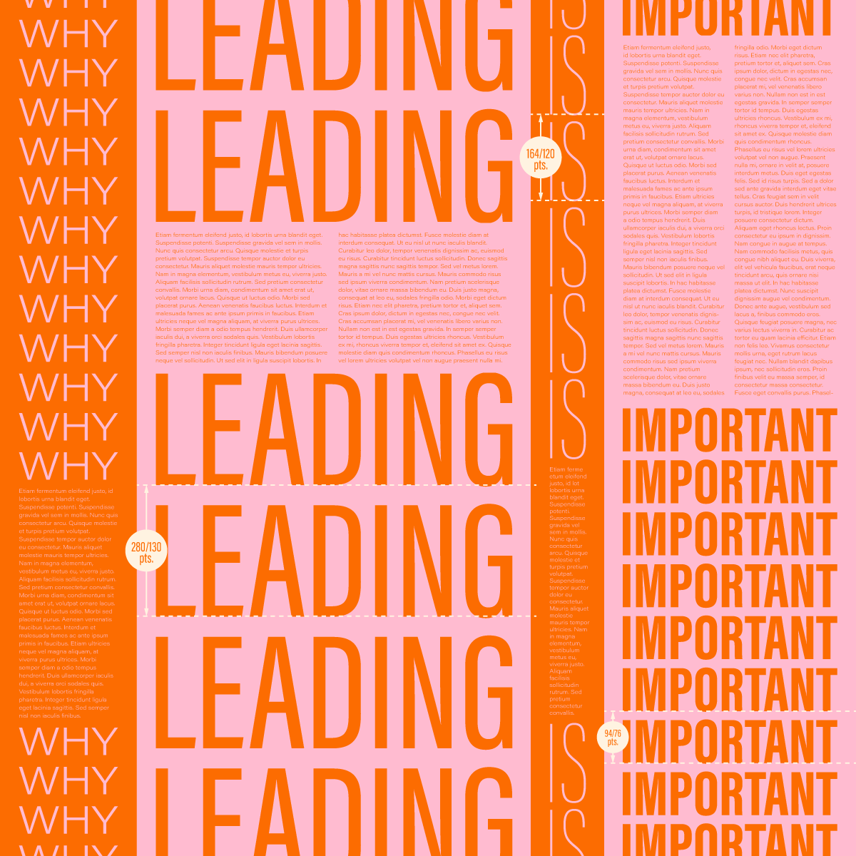
The text on the left, while a good point size for body copy, is nearly illegible because of the normal leading. For this specific typeface, positive leading would be more appropriate, as in the example on the right.
How much room does your text take up?
This mainly applies to body copy, but a small change in leading—as minor as decreasing it by ½ a point—can free up quite a bit of room in your layout. This means having a bit more negative space, which, in turn, means a more balanced design that breathes a lot easier. Consequently, increasing your leading slightly may mean that your text will take up more room, decreasing the amount of negative space and making the design feel more cluttered.
Leading is one of the variables that is vital to beautiful typography. While it may seem tedious at times, finessing your type—including leading, kerning, and other variables—can make the difference between a design that’s difficult to follow and a beautifully legible typographic piece.
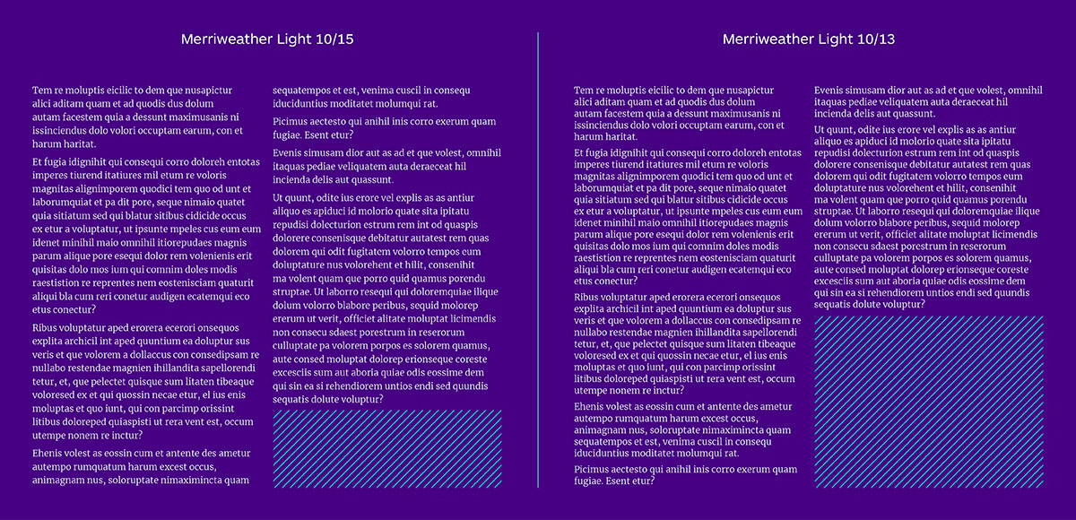
The positive leading in the text on the left leaves very little negative space at the end of the article. Decreasing the leading by just 2 points creates almost twice the negative space, while still maintaining good text legibility.
If you’re nerding out about this analysis, you should consider studying graphic design! Learn more about how to become a graphic designer 9 months part-time by taking the online graphic design course at Shillington!
Posts you might like

One of the best things about graphic design is that it never stands still for a moment. But that does mean that keeping up with...

The best graphic design books can take you on an exciting journey of the imagination, transport you to new creative worlds or...
We’ve all been feeling the squeeze over the past few years, but at Shillington we don’t want this to stop anyone getting the...

Are you considering becoming a graphic designer but want to be working online? With the increasing demand for digital design...
To ensure Shillington's commitment to the LGBTQ+ community extends beyond Pride Month, we’ve collated a list of incredible...
Are you looking to teach yourself graphic design? If so, you may be wondering if it is possible. The answer is yes—it can...

Are you interested in becoming a graphic designer but don't know where to start? You may be wondering if it's possible to...

Are you considering changing your career, but don't know where to start? Are you an aspiring creative with a passion for...
Want to win some amazing prizes and stay in the loop with all things Shillington? Sign up to our newsletter to automatically go in the draw.