Shillington Graduate Miguel Lugtu’s Creative Process Behind the BuyBust Movie Poster

Welcoming a new guest author to the blog! Miguel Lugtu is a graphic designer and art director based in Manila. He worked as an art director for a men’s lifestyle magazine called Rogue for 8 years. In 2017, shortly after starting as freelancer, he took a course in Shillington to shift his focus on branding. He is currently a freelance designer doing branding for several local and international companies in fields such as retail, food, fashion, beauty, corporate identities and the occasional movie poster.
In his first post, originally published here, Miguel shares the process behind designing the BuyBust movie poster.
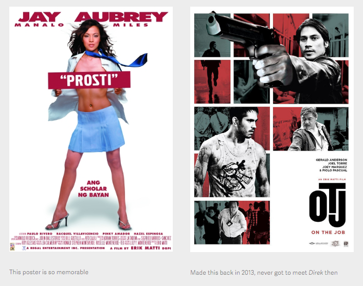
HOW I GOT THIS GIG When Anne Curtis announced that she was doing BuyBust around 2 years ago, I knew instantly that it was something I wanted to make a poster for. I like the movies of Erik Matti and actually made the poster for On The Job back in 2013. I’ve made it a point to see his recent movies like OTJ, Seklusyon, and Honor Thy Father. (And a lot of his earlier films on pirated VCD haha that Prosti poster is iconic!) He also has really blunt and honest social media posts calling out the film industry that are always eye openers and entertaining to read. The unexpected pairing of Anne and Direk Erik was a welcome surprise and the idea was enough to get me excited even without knowing what it was about!
I remember sending Anne a message about the poster back then and she said she’d put in a good word but I never thought it was gonna be something 2 years in the making. In that time, I’ve casually mentioned to people involved with the film about my interest in making a poster, especially being persistent with Erwin Romulo, who did the film’s awesome musical score. I even sent Direk Erik a Facebook message and multiple e-mails pitching myself but nothing really came out of it.
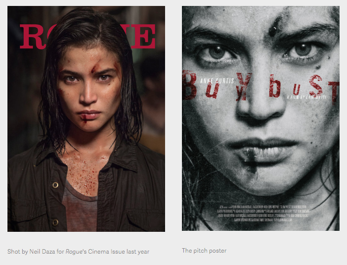
In January they released a trailer that announced a February playdate. By then I’d given up on finding ways to make something for the film. I sent Direk Erik and Erwin one last e-mail asking for stills to use for a poster for my personal portfolio. Direk Erik mentioned that there was already a team doing the key art and that maybe next time we could work on something. A few weeks later, I read that the playdate got pushed back because it was acquired for international distribution, so I took that as a sign to ask again! This time I made a pitch poster using the close-up of Anne from the Rogue cover.
I finally heard back from them saying they liked what I made and that we should meet. At my meeting with Stacey, the supervising producer of the film, she mentioned that this was a rare instance where a Pinoy movie had a full marketing rollout in terms of posters. It had a teaser, an official Philippine one-sheet, an international poster, and character posters. I was hired to do 2 of these pieces!
A week later, at the poster photo shoot with Mark Nicdao, I finally got to meet Direk Erik and we briefly got to discuss some poster ideas. I pitched a poster of Anne lying down on a pile of dead bodies which they were OK with. (Coincidentally, they had a teaser with a similar idea made by Vincent Aseo hanging in their office!) During the shoot, Direk mentioned that he wanted me to do an omnibus poster with so much detail that you only really get to see from up close. SURE! I CAN DO THAT! I said. But really OH FUCK. was what I was thinking.
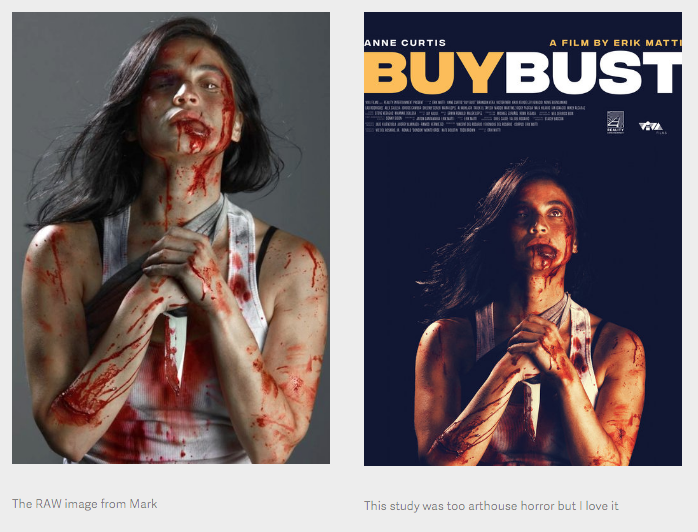
On top of that, the layout we did for the lying down shot didn’t turn out as expected. Let’s just say we were going for Jon Snow in Battle of the Bastards but ended up with Anne surrounded by 4 crew members wearing their own clothes! Lol. Here’s the test shot from Mark with me as the subject.


THE TEASER POSTER It was decided at the shoot that we were going to do a teaser poster release that Friday (shoot was on a Tuesday) using a close-up of Anne beaten up and bloody. We had a bunch of good options from this layout but since it was the first official image to come out from the film, there was a lot of back-and-forth about finding the right image. This was a really interesting process since very subtle and slight changes to the image could change the vibe and message of the poster. There was an option that looked too arthouse (an accidental Himala poster homage too!), options that looked too much like a horror movie, options that were SLIGHTLY too bloody.
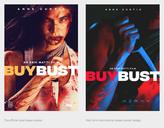
We finally settled on an image where she was holding the knife on one hand and cropped her to the side to give it some motion. This felt more aggressive and action more than slasher.
On the day of the teaser release, we got word that one of the higher ups was hesitant about having a deglamorized Anne on the teaser. The release was at 6pm and at 2pm I was asked to come up with a completely new concept and poster. I barely pulled it off and I really wasn’t happy with what I came up with. Thankfully, at around 7pm (an hour past the deadline!) we got the go-signal to revert back to our initial design. Small victory!
The international distributor, Well Go USA, also made a really cool teaser and I actually took some cues from their color treatment for later studies!
THE OMNIBUS POSTER As a designer, I usually lean towards minimalist stuff. I love white space and clean looking things. This was something I picked up from my former creative director, Miguel Mari and from being an editorial designer (especially when you work with a lot of text). Even in art directing shoots, I usually ask for negative space around the subject. I like when things breathe.
I’m also not great with color theory. That’s one of my biggest weaknesses. Finding the right colors to mix-and-match is always a struggle for me, so I usually stick to desaturated palettes and use only 2-3 colors. Color scares me!!!
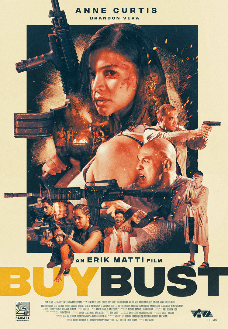
The direction for this poster was daunting. Direk wanted it to communicate the film’s chaos, neon lighting, and claustrophobia. It challenged all my instincts as a graphic designer and it took awhile for me to find a balance of things that were loyal to the film but at the same time fit the aesthetic I was comfortable with.
In these next images, you see the evolution of how I started out with so much restraint and little by little got pushed further and further out of my comfort zone. I’m only putting up one version for each pass but all-in-all I would say we came up with around 50+ variations of these posters.
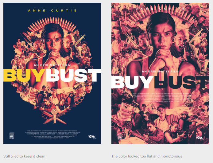
FIRST PASS This was way too clean. I liked how tight the collage looked but this didn’t reflect the movie’s chaos and colors. The poster had to be more “disorienting, suffocating”. I was told to add more images like houses, weapons, etc. (What up, stock photos!) and to find a stronger image of Anne.
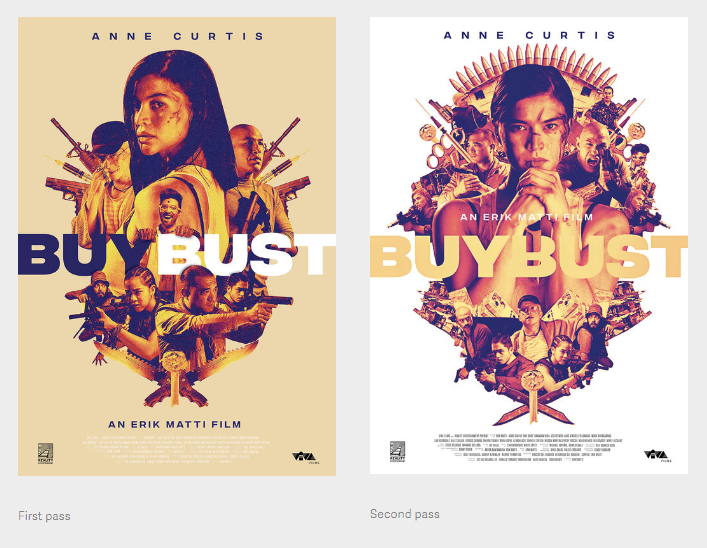
SECOND PASS I really thought that this would be it. The symmetry was nice and everything fit comfortably. This image of Anne we shot particularly for a symmetrical mirror image collage. The feedback I got was to keep the symmetry but don’t do mirror images. Try not to repeat anything. Also still too clean!
THIRD PASS In the middle of doing revisions, Stacey gave me a call saying “Direk said ‘Let’s challenge Miguel.’ Can you fill up the FULL poster with images but still keep a hierarchy and images that stand-out. Almost like wallpaper.” YES SURE! I said but in reality my anxiety kicked in! I wasn’t sure if I could pull that off in the time given but little by little I started adding images and I eventually got into a rhythm wherein it got easier to figure out where to fit things. I ended up using all the stills they provided, stock imagery, and the photo shoot pics. All in all, there was over 50 images and around 100 layers in this poster!
As usual, I still pitched an option that was cleaner and more restrained!
FOURTH PASS The collage itself was finally approved! Now comes the problem with color. Well, shit. The previous studies were too flat and needed highlights. All the images kind of merged into each other with no clear stand-outs. At this point they sent me some color palette ideas (from movies like The Iron Giant, Thor: Ragnarok, and Only God Forgives) and I remembered that I did a similar treatment on my Blade Runner 2049 poster. It was tricky dividing the layers into groups for the gradient maps to apply to but it all came together in the end. If you couldn’t tell the color combos I used were inspired by great illustrators like Matt Taylor, James Jean, and Mondo posters!
After the colors were approved, we had some slight revisions (which goes to show how meticulous Direk is) like adding blood here and there and filling up the syringes. This was the final version!
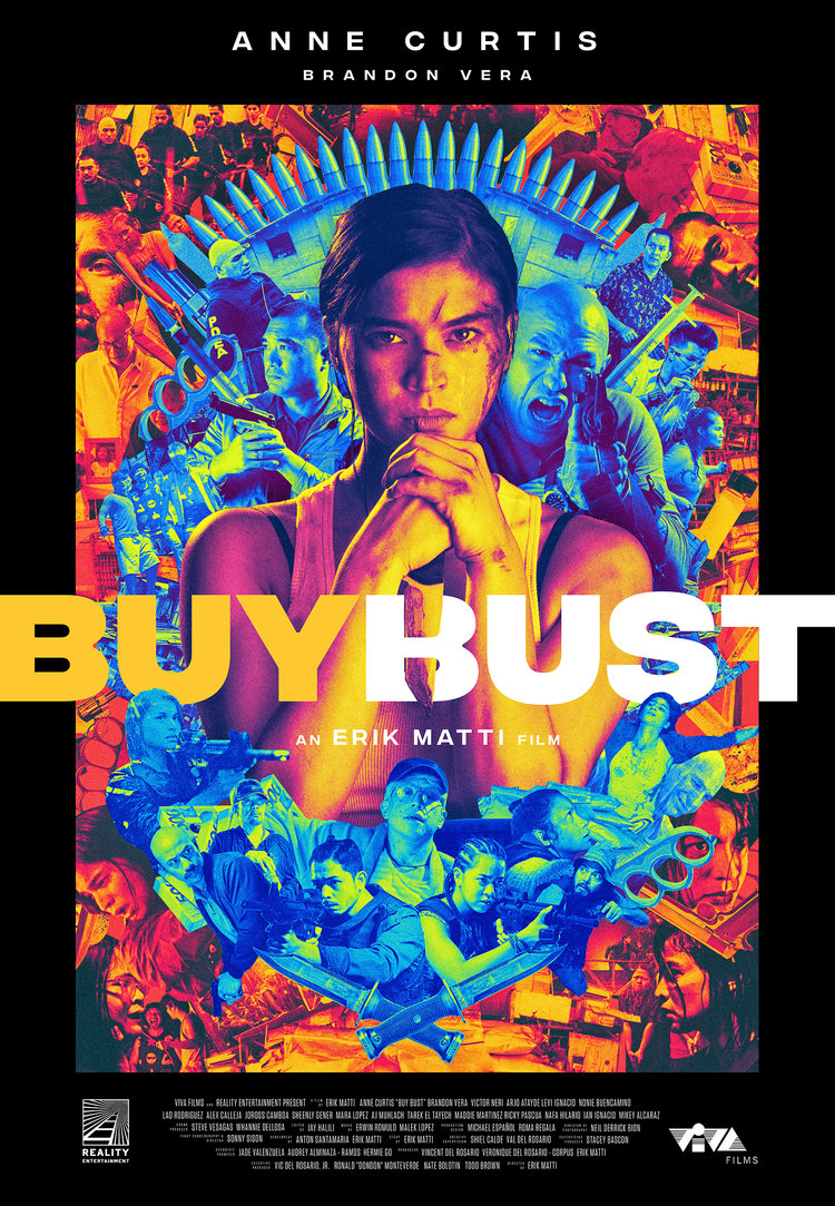
Not gonna lie, at times this process almost felt mechanical since the deadlines were tight and I didn’t really have time to sit on each design and figure out what was working and what wasn’t. At one point it felt like I was just mindlessly revising and sending so I was legit surprised to see this final version! It was unlike anything I’ve done before. Honestly, if at that first meeting they asked me to make something like this, I would’ve backed out because I wouldn’t think I could pull it off. I was super nervous about its release, but thankfully people seem to like it!
It’s also really cool that it subverts what a typical action movie poster should be with the use of color and the print on print on print. I love that it looks pretty but really you’re looking at shit that I never thought would fly on a local movie poster (ie dead bodies, murderous squatters, bloody faces, coke vials, the slums, hidden joints, a dude smoking crack, old ladies with guns.) All this thanks to Direk Erik who never settled until we got everything right. Yehey!
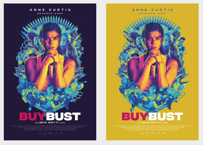
This piece was also picked up by Well Go USA and redesigned for its international release. I get a kick out of seeing this on sites like Rotten Tomatoes, IMDb, Film School Rejects, Birth.Movies.Death., etc.
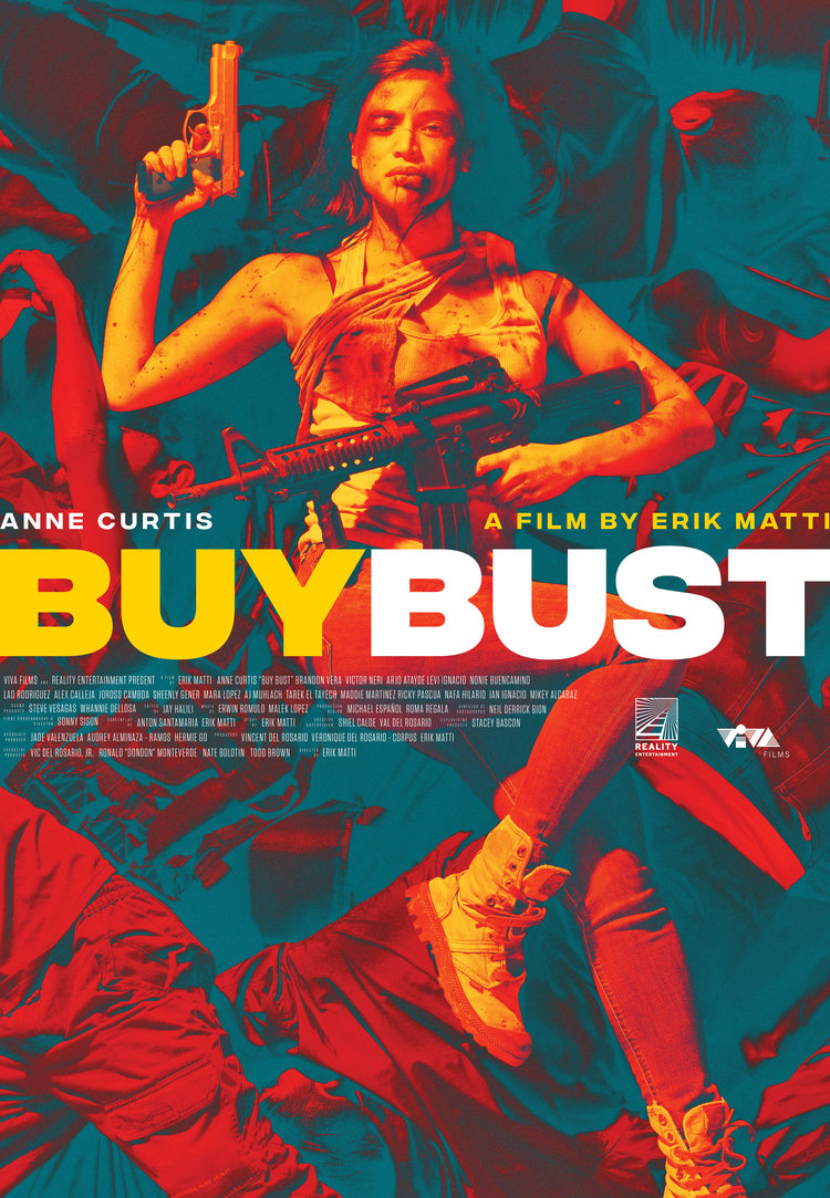
THE OTHER POSTER A week later I get a call about making another omnibus poster. They liked what I came up with so they decided that I should have a go at a more mainstream, commercial action blockbuster poster. After the last one, this was a breeze lol. Most of the assets were already dropped out so it really was more on figuring out the composition and color palette for this. I initially made a version that was brighter and cleaner but I chose the wrong main image of Anne (too passive!). We eventually got the right Anne image and color treatment.
I tried doing a stand-alone collage first but figured that having the collage within a box where pieces break out felt more dynamic and alive, as if the box isn’t even enough to contain all this madness. (And to be real, I wanted to avoid the inevitable Sicario comparison!) The borders also made it look like a vintage B-movie which was cool. Direk said it reminded him of Franco Nero movies (which I had to Google to get the reference!)
The crazy thing was that I sent a version of the poster on the same day as the press con. Within a few hours it was already printed and all over social media! I was still doing some tweaks and edits to it when it came out!
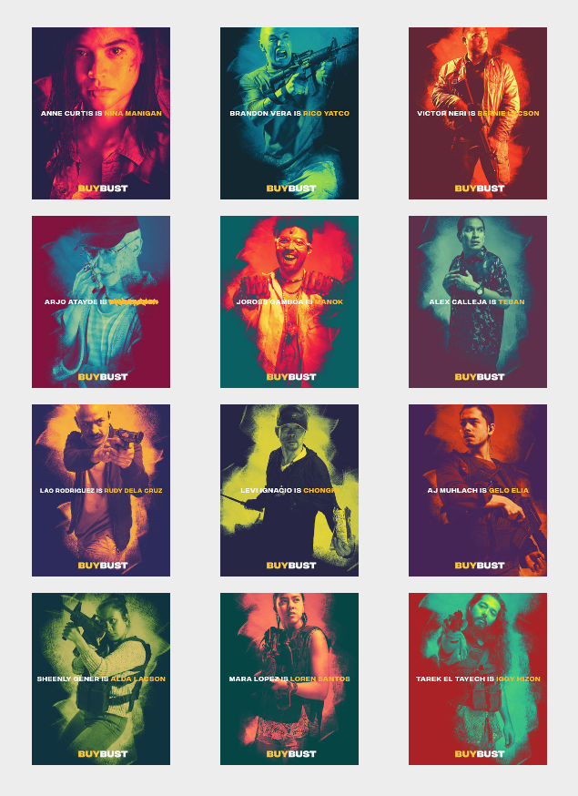
THE CHARACTER POSTERS After this I was asked to do individual character posters for an online release. I loved the idea of a local movie getting the character poster treatment. The struggle with these was how to mix elements of both omnibus posters (the color of the first one and the paint swashes of the second one) but it turned out fine. Looks good when you see them all together!
Phew.
Now it’s all out there for the world to see. Feels like I just got out of Grasya ni Maria alive!
Sorry for a long and rambling entry but this was a cool rollercoaster ride that I wanted to share. I love reading shit like this so hopefully someone out there picks up a thing or two! I never thought that I would end up designing an ENTIRE key art campaign for this, from a pitch all the way to its Netflix artwork. It might sound like I had a bummer of a time but I really didn’t! I love doing this stuff and really had a blast with it. It’s super awesome to be part of this game changer even in a little way! Plus I learned that it pays to put yourself out there (and be persistent in this case) because I tried to get this gig for like 8 months! No ragrets.
The movie hits Netflix worldwide later this year. Please watch it because you’ve never seen anything like it come out of the Philippines (an actual fact, not an exaggeration.) It is manic, anxiety inducing mayhem from start to end with something to say. And really, don’t you just wanna see Anne parkour and murder her way through the slums and Brandon Vera throw motorcycles at people?
And so I end with this unused study. This was the layout with my original idea of Anne on top of dead bodies. I got a little experimental with it to make the image work. (You should see the original raw one lol) It never got chosen for a release but I’m still into it! The colors hurt my eyes and make it look like she’s swimming in a literal sea of corpses! Action star na action star!
Thanks to Miguel for sharing this process! Be sure to check out his website for more work and articles.
Posts you might like

One of the best things about graphic design is that it never stands still for a moment. But that does mean that keeping up with...

The best graphic design books can take you on an exciting journey of the imagination, transport you to new creative worlds or...

At Shillington, our dedicated graphic design students are taught all about how to design for packaging—from FMCG (that’s fast...
We’ve all been feeling the squeeze over the past few years, but at Shillington we don’t want this to stop anyone getting the...

Are you considering becoming a graphic designer but want to be working online? With the increasing demand for digital design...
To ensure Shillington's commitment to the LGBTQ+ community extends beyond Pride Month, we’ve collated a list of incredible...

At Shillington, our graphic design course teaches students how to design campaigns for a brand, helping to spread its message....
Are you looking to teach yourself graphic design? If so, you may be wondering if it is possible. The answer is yes—it can...
Want to win some amazing prizes and stay in the loop with all things Shillington? Sign up to our newsletter to automatically go in the draw.