15 Inspirational Examples of Minimalism in Graphic Design

Minimalist graphic design is something that’s not going away anytime soon. Every day, we are inspired by our surroundings whether we realize it or not, and that’s especially true for those of us who are more creative-minded. We see inspiration in everything, from massive murals down to the packaging on that granola bar you packed for lunch. This is what all creatives have in common—a shared ability to recognize the impact of design all around us. Designers take inspiration from many references and then use their designs to either effectively communicate the message of a brand or to solve a problem.
One of the most influential artistic movements in the last century has been the minimalist movement. The roots of minimalism included the De Stijl movement, which was a reaction to the excessiveness of the Art Deco movement. Its creators sought to achieve a pared-down aesthetic that they envisioned would be a new universal visual language at a time they believed was ushering in a new, spiritualized world order. It also included the influence of Ludwig Mies van der Rohe, who was deemed the father of “less is more” architecture. Mies was an advocate for simplicity, and as a result, was influential in introducing open floor plan concepts into residential homes.
Coming out of New York in the 1960s, minimalists sought to strip away all of the extraneous influences of art and leave the viewer with only a raw emotional response. Art, in their opinion, shouldn’t refer to anything other than itself. This reductionist tendency grew out of the art world and began to influence every aspect of modern life.
We can see how this movement influenced everything from music to home furnishings, to name a few. Minimalist furniture, with its austere lines and functionality, is a great example of minimalist art giving rise to minimalist design. Perhaps the Bauhaus school and its aesthetic can be credited with the most direct influence on graphic designers. The shift towards craftsmanship in conjunction with industrial design balances beauty and utility with simplicity.
If you tend to favor a simple, clean aesthetic, then you’ll likely have a preference towards minimalist graphic design. Minimalist graphic design centers around a simple philosophy; “less is more.” It’s said so often that it has become a cliché, but it is actually the essence of the minimalist school of graphic design.
This trend seeks to focus on only the most elemental and necessary elements of a product or subject; it removes anything that might draw the viewer’s eyes away from what is most essential about the design.
You can see this in action when designing user interfaces, for example. The designs lean toward the simple and effective, rather than the jumbled and the distracting, so as not to interrupt an otherwise seamless experience.
When it comes to minimalist graphic design, there are certain elements that designers will use to accomplish their goals.
Typography
When you remove most of the other visual elements of design, you realize that even the seemingly small design decisions you make are hugely important—like typography. What seems so minimal is actually critical to the overall success of a design. Some examples of standard typefaces that are more legible on-screen and are also more easily scannable include fonts such as Arial, Verdana, Trebuchet, and Lucida Sans.
The fonts and colors of the letters themselves cease to be elements of a brand’s image and can become the brand image itself.
The wrong choices in typography can have damaging effects on design. A rugged, utilitarian brand, for example, needs an image that communicates that effectively. Swirling, delicate lettering would be inappropriate in this case.
Instead, a graphic designer should think bold fonts, bold colors, and more white space here. Imagine if The North Face logo was a thin, cursive font rather than its famous (and easily recognizable) standard bold font.
Fonts, like images, are evocative, and it’s important to take note of which kinds of fonts evoke certain responses. Recently, the art of hand-lettering has become an increasingly popular past-time again as more people are picking up fountain pens and brushes to learn calligraphy. While we live in a very image-saturated world, this just proves how powerful the written word still is. Typography affects balance and contrast, which can’t be ignored in graphic design.
Balance
Minimalist graphic design offers balance without relying heavily on symmetry. The impact is often greater because the image can’t be easily bifurcated. An image on the left can naturally draw the eye to the text on the right. An explosion of color at the top can be balanced by a stark line drawing at the bottom.
The objective is to create a balanced image, not necessarily one that is symmetrical. Having said that though, it’s also equally important that your images exist on a grid. This simple, linear way of organizing your images makes it easy for the viewer to navigate. The uniformity of the spacing and grouping maintains the spatial relationships and creates harmony. And sticking to a grid keeps information and elements organized, establishes a visual hierarchy, and, additionally, flat design elements can enhance the overall minimal design impact.
Color
The use of complicated color palettes doesn’t disqualify a design from being minimalist in nature, but simplifying the color choices is ideal. The use of a few distinct colors, even in unique combinations, can be just as impactful as a larger palette. It also can help to identify the brand with specific colors or create an indelible association with the messaging.
Going back to The North Face brand as a reference, the designer chose red to symbolize passion and courage and black to demonstrate elegance and dominance. The brand is so iconic, it’s the most copied logo in the world.
Keeping colors consistent is important to the overall brand messaging.
The use of just a few colors helps you maintain a distinct visual identity regardless of how many products or individual elements are included in the project. The continuity of the color palette across products is something that must be sustainable. Keep that in mind when picking your palette.
Impactful imagery
Minimalist graphic design trades the use of many elements to build an impactful design for the simplicity of using just a few key elements for maximum effect. To this end, the images used should be of high quality and should also be highly evocative.
Few people can forget the haunting eyes of a young Afghani girl that graced the cover of National Geographic more than three decades ago. That single image of a twelve-year-old refugee girl is one of the magazine’s most well-known covers and has been used countless times in ads for the magazine. In fact, it’s become synonymous with National Geographic itself. Choosing the right image for your project can be equally poignant.
The use of negative and white space
Minimalist graphic design requires plenty of white space. Removing imagery from the design creates a sense of calm and makes the focus of the messaging sharper and more intense. It often focuses on a single image and minimal lettering, or a single message with alluring lettering. The rest of the space is devoid of imagery, though it need not be white in color (although black and white are the preferred background colors for most designs).
Keep it simple
Less is more. Remember that. All you need to do is use just enough to effectively communicate your message. There is no need to gild the lily when it comes to minimalist graphic design. Some of the most well-known brands have the simplest designs; a distinct font with a solid background, a simple logo in a bold color, or even just a line drawing.
Whether you are a working professional or a student, taking the time to get inspired by the works of others is key to keeping your creative juices flowing. The following list includes great examples of minimalist graphic design and portfolios that can inspire your own creations.
1. Clean Fold Products by Rebecca Todd

Clean Fold is a laundromat and coffee bar that is located in East End, London. This particular part of London is very eclectic and creative, and this hybrid concept encourages citizens to work while they do their laundry. Rebecca Todd, who was a recent New York graduate, took a very simple, pristine, and sarcastic approach when she designed their brand strategy. In addition to designing their logo, she also designed some of Clean Fold’s supplies—like their laundry bag and their bleach, detergent, stain remover, and softener bottles. You’ll notice that she used bold patterns, but very straightforward and simple color schemes that, she says, “frames quippy copy.”
2. Prose Hair Product Design by Red Antler

Prose is a revolutionary take on traditional hair care products. Their line is completely customizable, and they have quickly become a household name. It makes sense that their brand and bottle design appropriately reflected their unique and effortless approach to style. They hired Red Antler, who created product labels that helped Prose stand apart from their competitors. Each product boasts a label with one of their branded colors and also features a simple typeface that lists the consumer’s name, their hairstyle, who the hairstylist is, as well as what hair issues the product is intended to repair.
3. Book Cover by Margaux Stockwell
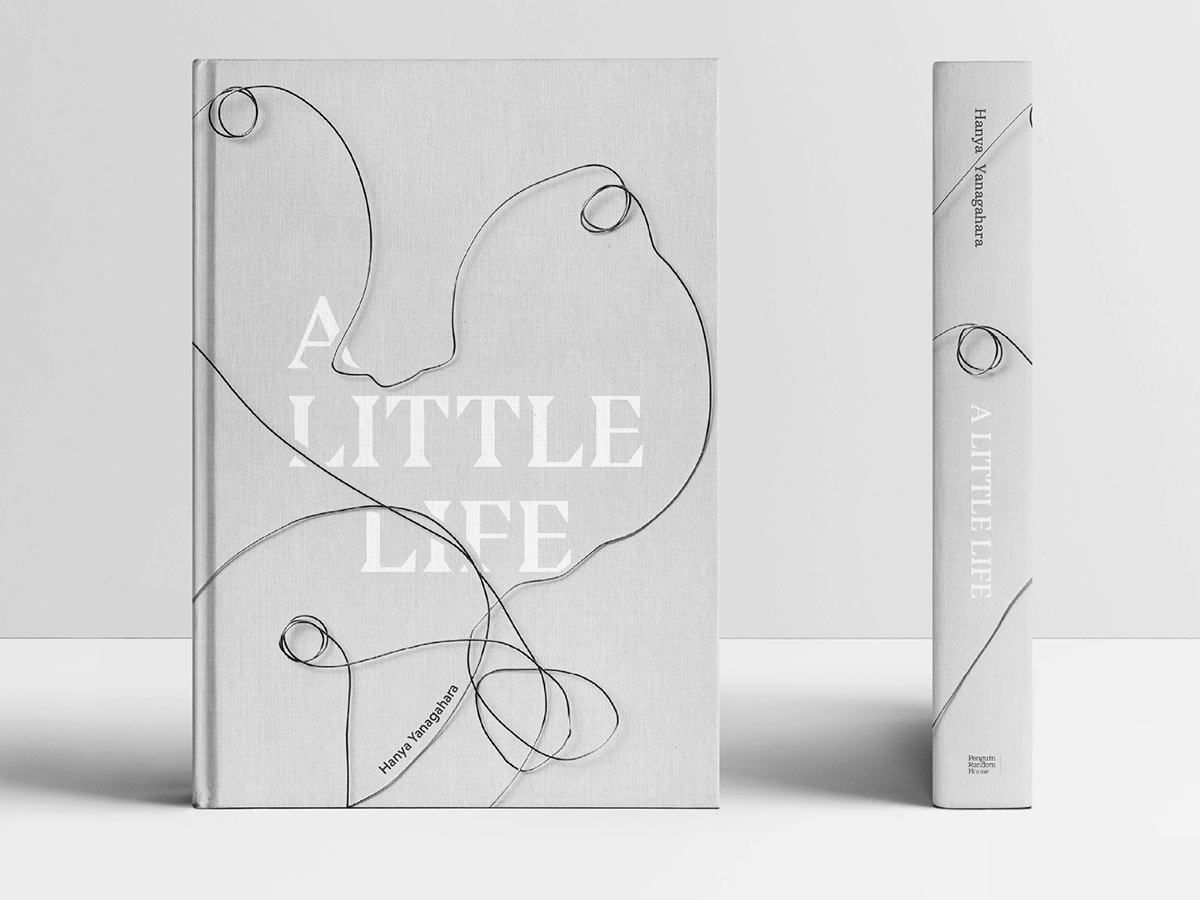
Margaux Stockwell, a Shillington graduate, created this re-design of the book cover for A Little Life for one of her projects. The themes of connection, support, and struggle within Hanya Yanagahara’s narrative inspired her design and the use of abstract, interconnected faces that were sculpted in wire. The simplicity of it reflects the relationships the characters have with both themselves and with one another.
4. Eden Nutritional Supplement Design by Saxon Campbell

Every design begins with a story. For Eden’s nutritional supplements, the story was centered around empowering women to take pride in their hormones. The color palette that was chosen for Eden’s brand embodies femininity without feeling too young, as its creators wanted women from all stages of life to see the importance of their health. Campbell created Eden’s packaging boxes, influencer boxes, bottle designs, and even a printed booklet.
5. Duet Gin Label by Michaela Early
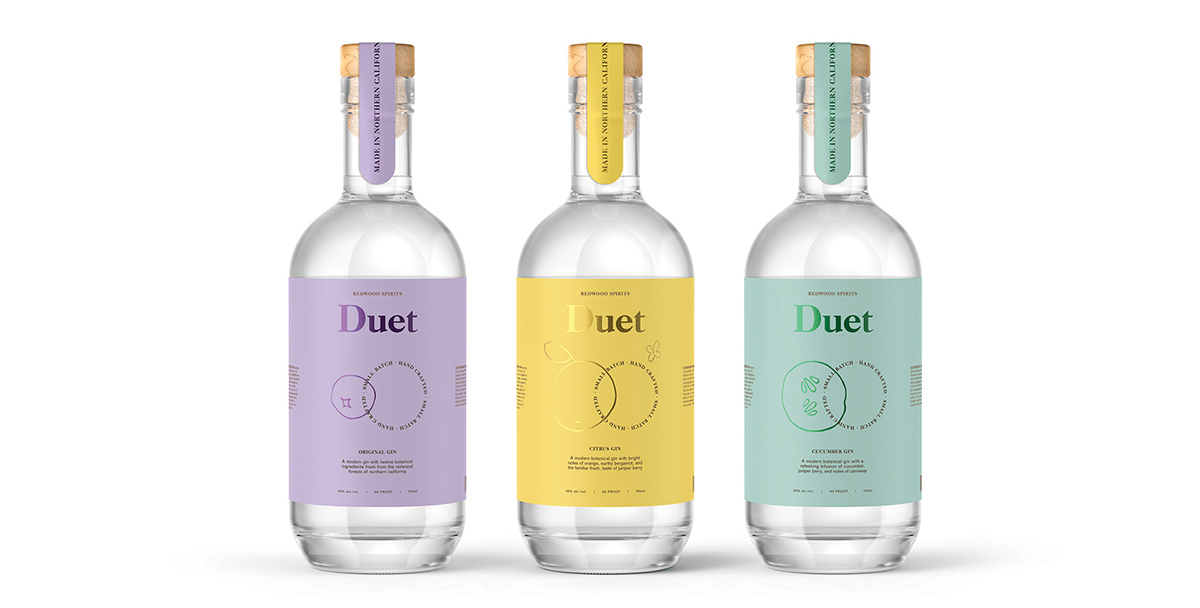
Michaela Early’s work is a great example of minimalism deployed to create a strong brand. Her design for Duet gin employs repetition to create a sense of continuity for the brand. While the labels all remain the same, the color schemes change according to the flavor of the drink. The labels themselves are both elegant and smooth; they draw attention without being distracting.
6. Metrograph Movie Theater Design by Anna Karlin
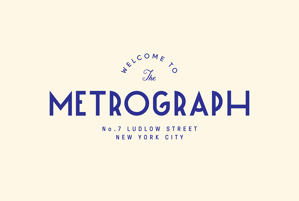
Without reading extensively into the background of Metrograph, you can take one look at their branding and see the influence of cinema right there in the font choice. Anna Karlin took a deco-inspired approach to this project and used the movement’s influence to create a custom typeface. Metrograph movie theater, a NY-based art house that specializes in 35mm film, is all about vintage, bold, yet simple design. You can see all of their branding materials here, from tickets to popcorn containers to program booklets.
7. Muse and Metta Bottle Packaging by Kati Forner
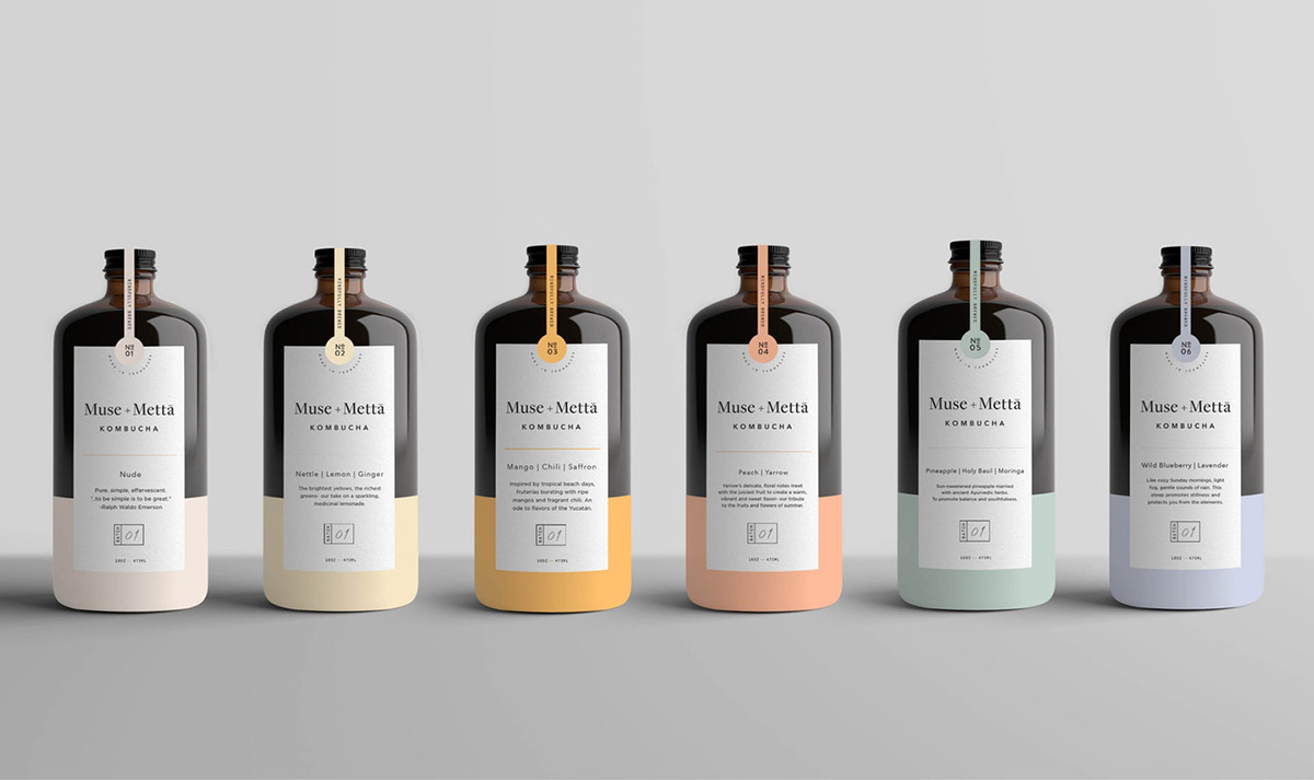
Kombucha is becoming an increasingly popular drink-of-choice for consumers wanting to incorporate healthier beverages into their daily lifestyle. It’s one of those drinks that consumers seem to buy with their eyes, which is what makes Kati’s design so compelling. Each bottle features a distinct color that represents that specific Kombucha flavor—orange for mango and saffron, a pale yellow for lemon and ginger, and a light purple for wild blueberry and lavender (and so on). Despite their individualistic appeal, the design elements are easily identifiable as being part of the Muse and Metta brand.
8. Vitamin Water Project by COLLINS
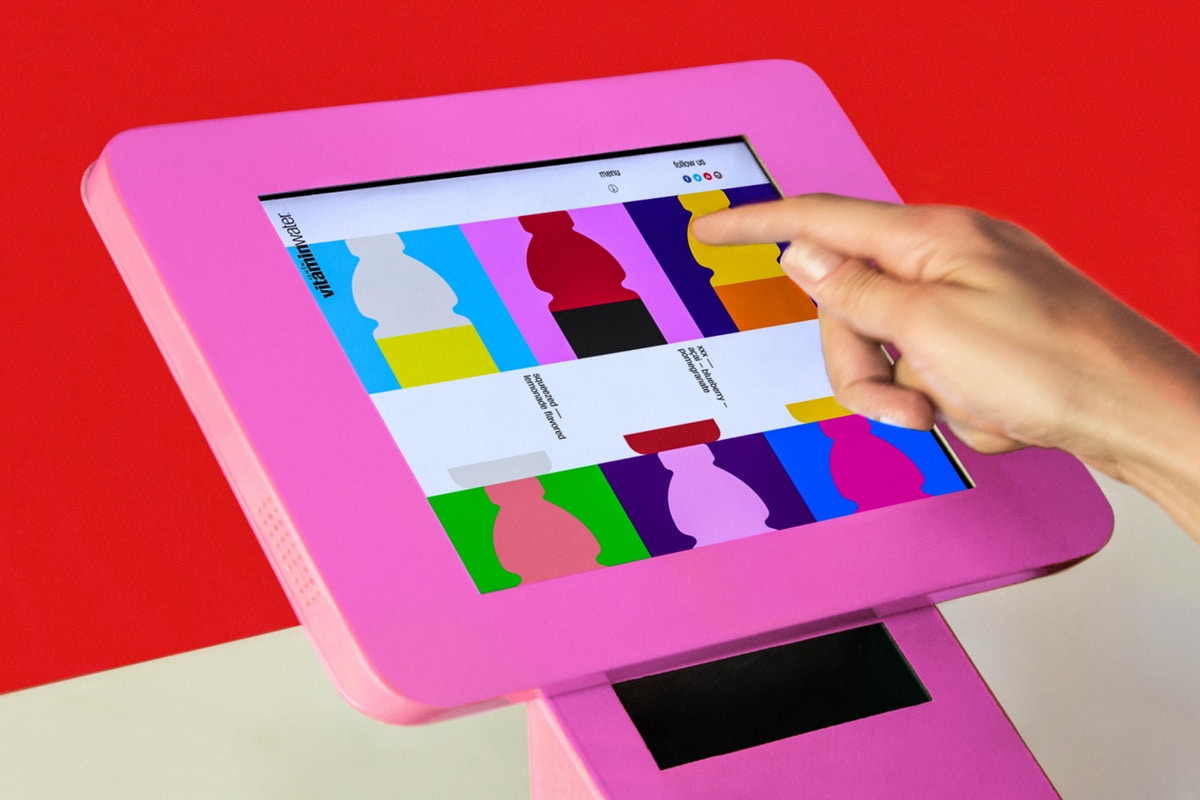
Vitamin Water is an iconic brand that has been around for quite some time. When you walk the aisles of the grocery store or pass the beverage section of a gas station, it’s easy to pick out where the Vitamin Water products are. COLLINS breathed some life back into the brand by reinvigorating their packaging. Their bottle labels and branding materials boast a variety of bold, vibrant colors, while not straying from the simplicity that made Vitamin Water so unique in the first place.
9. Miselu by Character

Character is the branding and design agency responsible for Miselu. The objective was to create a minimalist design that could be uniform both in the real world and in the digital world. The designs employ a monochromatic gray-scale with black and white details inspired by a keyboard. The effect is both clean and elegant.
10. We Ain’t Plastic by Roland
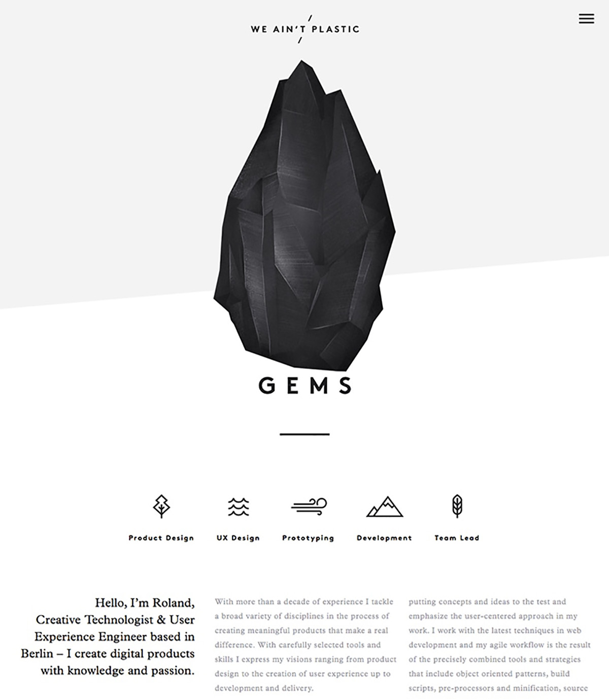
Roland is a user experience engineer with an amazing minimalist website. We Ain’t Plastic is an example of how a powerful and straightforward message doesn’t need to be embellished. The gray-scale imagery and simple fonts with a strict adherence to the grid organization keeps this text-heavy site from becoming overwhelming. Devoid of any of the pretty, flowery distractions, the single black rock that sits at the top of the page remains an almost ominous presence throughout the site.
11. Ritual Vitamins Branding by Jessica Yan

Ritual Vitamins’ entire messaging is focused on the future of clear vitamins. So it only makes sense that their product, branding, and digital elements all reflect that same imagery. Jessica Yan did an incredible job capturing Ritual’s mission, which is evident in their website and branding design. Her color choices are simple, yet effective. As you scroll through their website, you are captivated by minimal design that is also quite bold. It is distinct while also being fresh and bright.
12. The National Album Cover Design by Pentagram
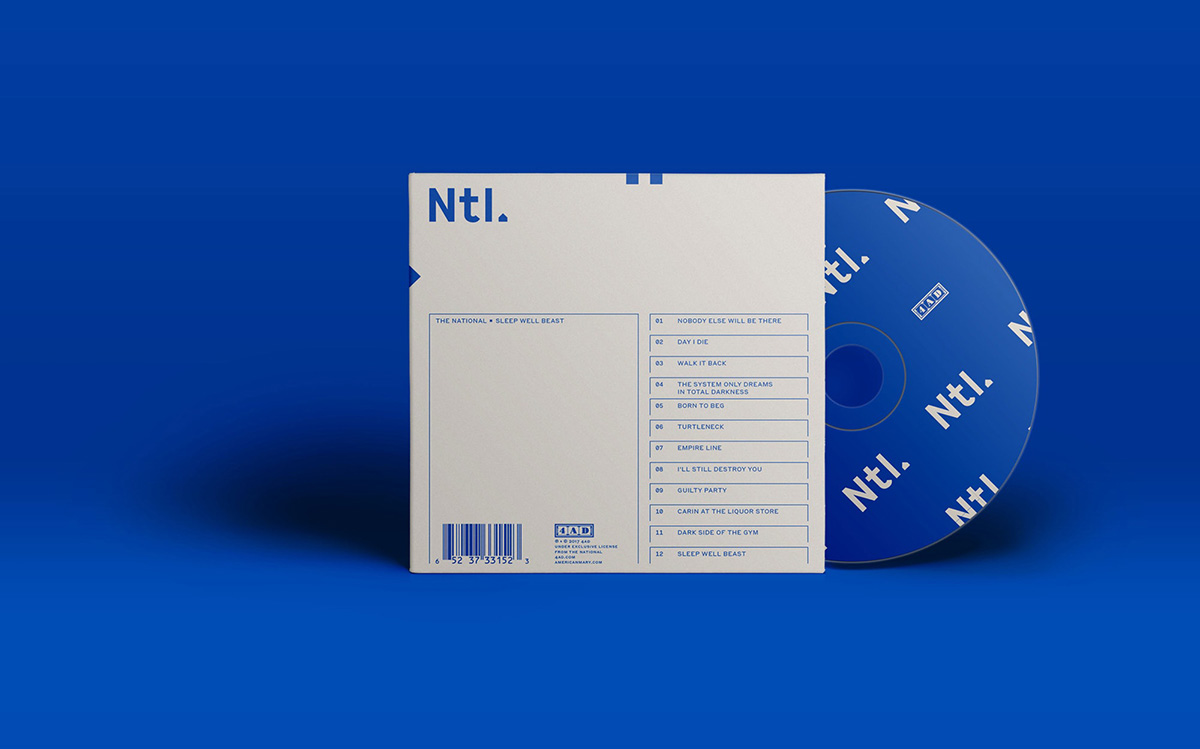
If you’ve ever listened to The National before, you know that their music is very dark and melancholy. In 2017, they put out an album, Sleep Well Beast, and Pentagram was tasked with designing the album cover and all of their promotional materials. As you can see, the colors they used perfectly encapsulate the dark melodies and somber lyrics The National is so well known for. The cover design was so well received that it was even nominated for a Grammy.
13. Bond Vet Branding by Manureva Studio

Bond Vet is a revolutionary clinic that provides top-notch veterinary care in a convenient setting. As they were thinking through their branding, they decided they wanted something that reflected both the urgency of their work and the genuine love and respect they have for pets and their owners. Manureva Studio delivered with a simple, memorable logo that feels warm, inviting, and comforting. The simple typeface and color palette are meant to make both the owner and pet feel calm when entering their facilities.
14. Astrology App Design by CoStar
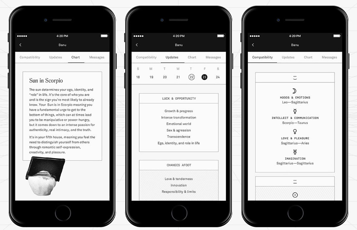
If you are a lover of astrology and like staying up-to-date with your horoscopes, consumers are finding that astrology apps are the way to go. These apps are hyper-personalized and send regular notifications to your phone that provide insights into your personality and your future more accurately than ever before. CoStar’s app effortlessly encapsulates the design elements that its audience finds so comforting and appealing—it’s simple, easy to read, and occasionally uses visual imagery that illustrates a person’s reading.
15. Magazine Design by Kinfolk
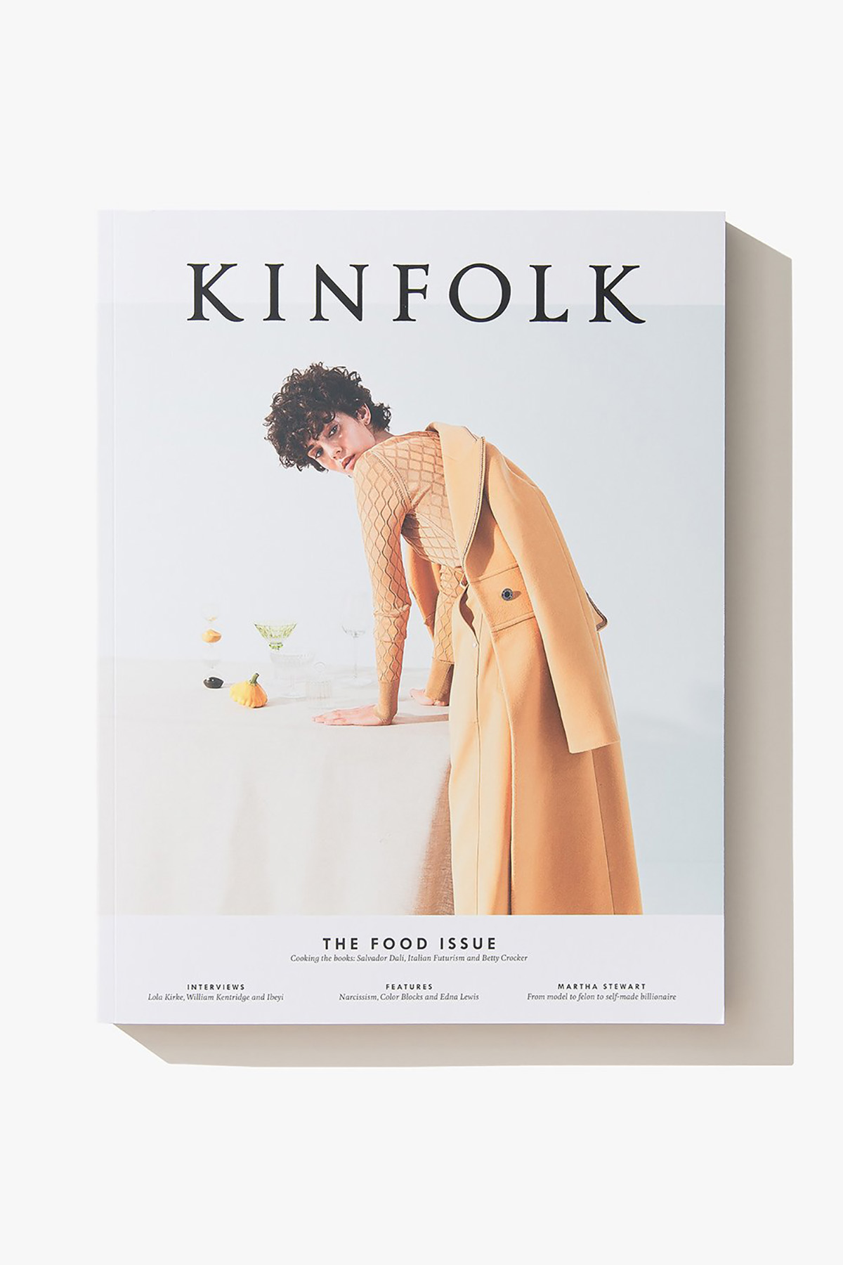
Developed by and for creative professionals, Kinfolk’s magazine uses a dynamic mix of print and online media to reach its vast audience. Everyone has their own preference when it comes to the types of magazines they read, and for some, it’s all about a focus on images over text. Kinfolk is primarily a visual display of interesting photographs and art, while also offering up stories and reflections on various aspects of life. You can see a preview of their current and past issues here!
The cardinal rule when talking about minimalism is attention to detail. It is, in fact, the small details that give the minimalist graphic design its enduring impact. You can say more by showing less and allowing the viewer’s experience of your design to do most of the talking for you. This is what inspired the minimalist movement in the first place. And so we bring ourselves back to where we started, examining art and translating it into life.
For some creative inspiration, we’ve curated a list of graphic design examples for designers. Both students and designers will surely appreciate these great examples showing how innovative design can help articulate a brands mission and personality.
Curious to learn more about graphic design and create work like this? Study at Shillington in our 3 month full-time and 9-month part-time courses in New York, London, Manchester, Sydney, Melbourne or Brisbane.
Want to win some amazing prizes and stay in the loop with all things Shillington? Sign up to our newsletter to automatically go in the draw.


