Stephen Hay on designing in the browser
Stephen Hay is well know in the web community for his excellent explorations of process when it comes to designing responsive sites. In this talk at Smashingconf Whistler he looks at some of the pain points when it comes to the concept of ‘designing in the browser’. For him though, this process is more about working up your comps in code rather than spending endless hours in Photoshop. He still advocates starting off your design phase with sketches, but that the sooner you can get into the code the quicker you really get to focus on the content.
Photoshop is the most effective way to show your client what their site will never look like.
So learning a bit of HTML & CSS is a good thing in this senario. He also discounts the common argument by designers that they are quicker with Photoshop than they could be in code, pointing out that at some stage Photoshop was equally as challenging. He does stress though that you’re not necessarily creating production ready code, just trying to get your design into the browser where it will eventually live.
Here’s his top 6 tips for approaching designing in the browser
- Tip #1 – focus on small screens first
- Tip #2 – focus on colour and type first (not layout)
- Tip #3 – use a tool that lets you easily ‘sketch’ in code (JS Bin or Codepen)
- Tip #4 – use the browser developer tools as a design tool
- Tip #5 – sketch before coding
- Tip #6 – On adding breakpoints – expand your browser window until your design looks shit, then add a breakpoint
Check out some of the other conference videos too.
See I knew I wrote that web course for a good reason!
Posts you might like

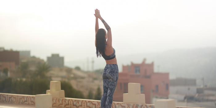
Whether you’re a newbie or have your own wellness practice, the power of a daily ritual is an important part of maintaining a...
Anthony Wymond is a guy you should know if you're in the Melbourne creative scene. Founder and Creative Director of Ignite...
Year on year, digital design becomes more and more prevalent and important—there's apps for everything from buying groceries...
Graphic Design USA (GDUSA) is a publication that covers design news, people, trends and projects showcasing the best in...
Don't believe you can totally change your career by studying 3 months full-time or 9 months part-time at Shillington? Read these...
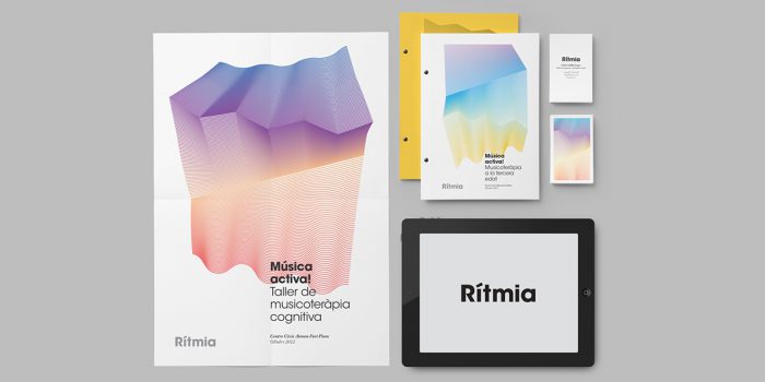
Atipus is a Barcelona based design studio that works across a variety of fields ranging from brand identity to packaging and...

Keiran McCann's passion for design evolved from her love of art, cinema, and culture. Since graduating from Shillington New...
Since graduating from Shillington Manchester back in 2011, Amy Patsalides explains how she now "designs her lifestyle". After...
Want to win some amazing prizes and stay in the loop with all things Shillington? Sign up to our newsletter to automatically go in the draw.