Typerie with Shillington’s Enza Lettieri
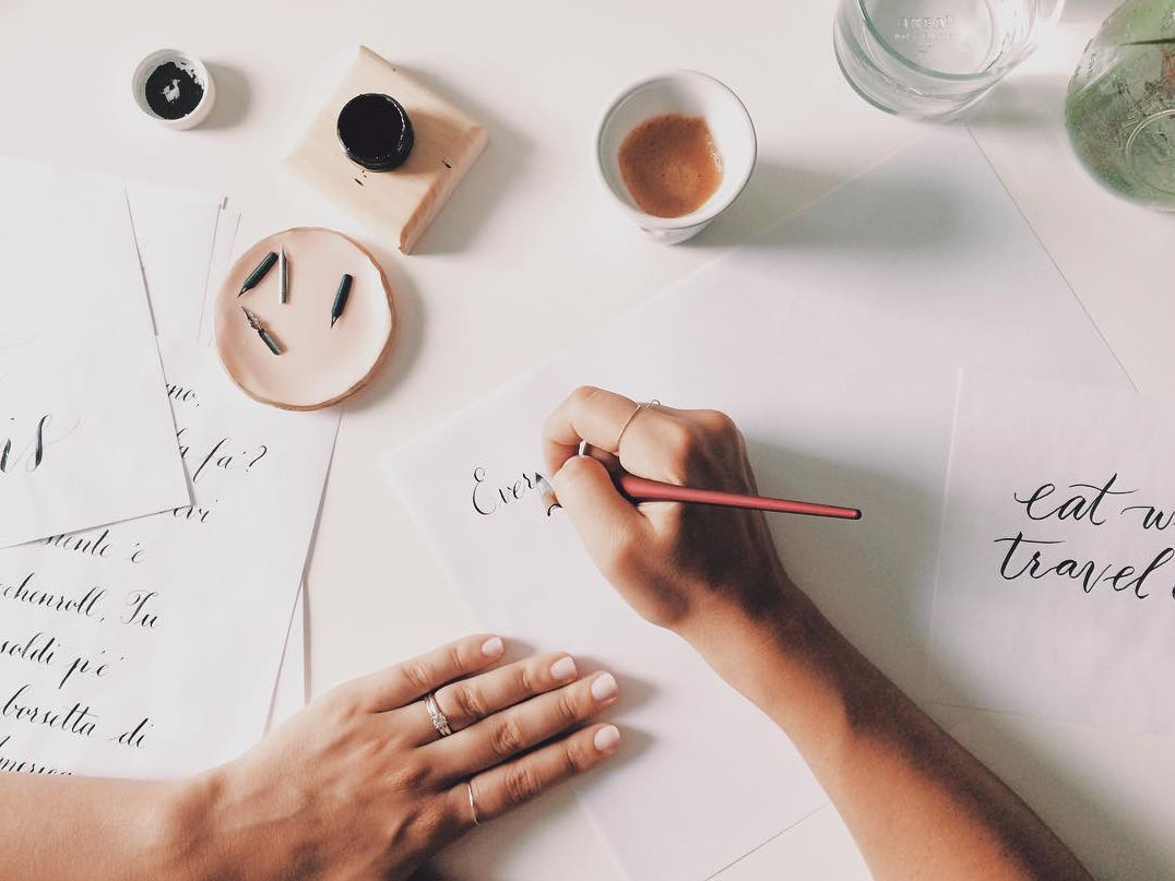
Shillington New York’s Enza Lettieri recently launched Typerie, a typography blog sharing tips, tutorials & freebies for calligraphers, letterers and lovers of type. A long-time fan of lettering, Enza’s Shillington students were actually the inspiration for her to launch this dedicated exploration of typography. She’s sharing gorgeous daily shots on her Instagram, and we love seeing her new creations and experimentations.
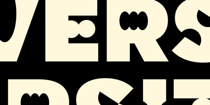
Read on to hear more about launching Typerie, her recent type series through Canada and her favorite/least favorite letters.
When did you first fall in love with typography?
I think as soon as I started to read and write. I don’t remember there being one defining moment but from an early age I remember trying to master “bubble writing” and tracing lettering books. A gem from my childhood was The Lettering Book, by Noelene Morris. I would spend hours entertaining myself with type. By the time I reached grade three, I was so excited when I got my pen license and remember I would tear out pages from my workbooks if I thought they weren’t neat enough or the tracking or kerning was out without even knowing what those terms meant.
What prompted you to start your own type studio? What are your hopes for Typerie?
My students were the catalyst to start Typerie. So many of them, in just three months were creating amazing letters and typefaces. I realized working in busy studios, pumping out design work got in the way of experimenting and challenging myself with typography. I still had a strong love for type but didn’t make the time to practice.
I recently learned a few new styles like calligraphy (at Society of Scribes) and brush lettering. Soon after, I started Typerie as a commitment to myself—I would produce type (almost) daily.
My hope for Typerie is to help build our type community.
I want to motivate type lovers to practice regularly, encourage beginners to become better and show appreciation for hand typography in design.

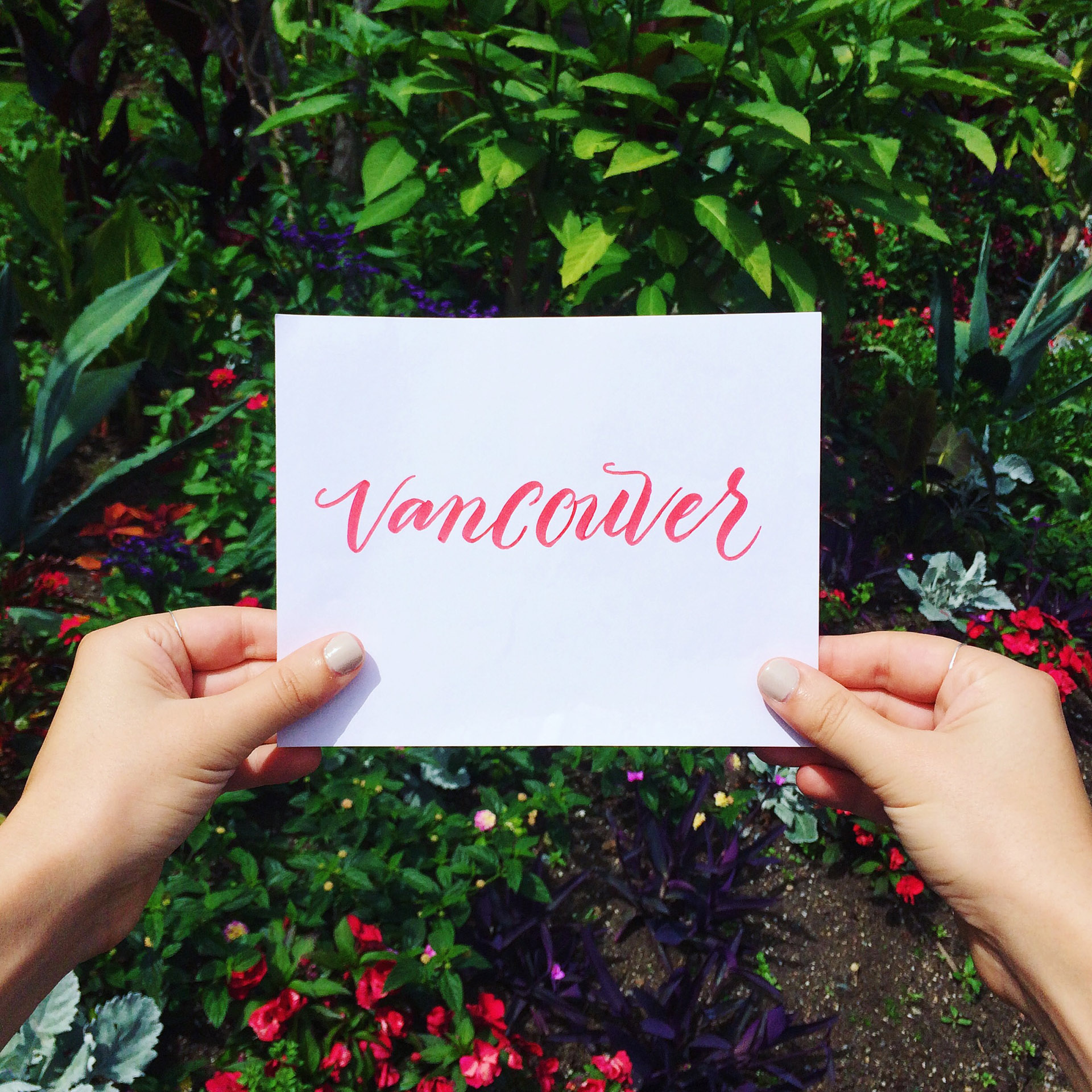
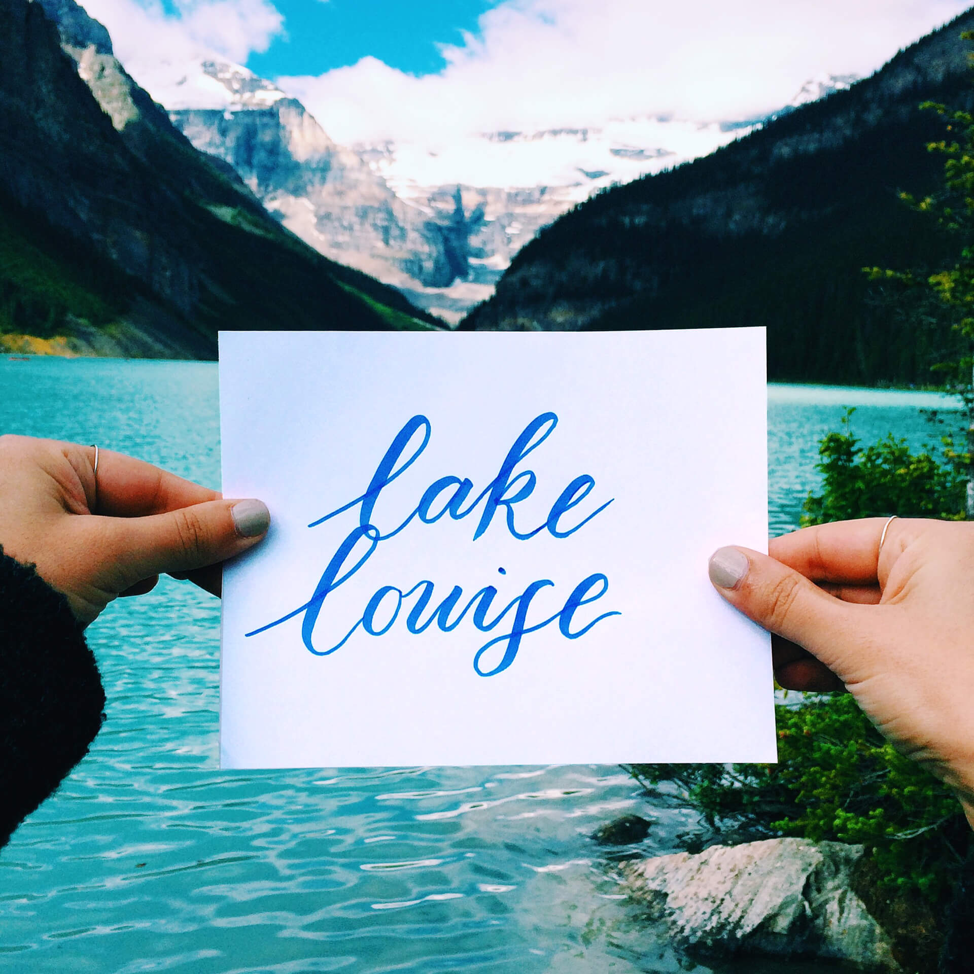
We loved following your Canadian holiday through typography. Tell us a bit about that series!
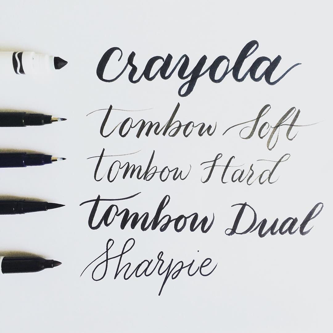
Well, I knew how easy it would be for me to use traveling as an excuse to not create type. Plus, I have been trying to master #crayligraphy (Crayola calligraphy) and I didn’t want to lose my progress. So, as a way of pushing myself I posted on Instagram “I’m traveling through Canada and will post type each place I go” message. There’s something about posting on social media that makes you take ownership, like you’ve committed to something and people will notice if you don’t follow through.
So, I packed my Rhodia pad, Crayola markers and a black Tombow dual brush pen. I would draw type before we left for the day and pack it with me.
The hardest part was not being able to use two hands while hiking through a canyon and holding a single piece of paper, trying not to crush or drop it! Yeah, I didn’t think of that.
What materials are you working with at the moment? Anything you’re looking forward to experiment with?
I love using Sumi ink for traditional calligraphy (with a nib) but I’m currently having a small love affair with Finetec paints and using them as shiny, metallic inks. Doing calligraphy with metallics is so fun. The mixing part is a little tricky but once you’ve got that right it flows easily.
Next challenge—I’m keen to get the latest iPad and pen. You draw on the tablet and it instantly vectorizes type for you.
Do you have any favorite letters? Any letters you hate? Why?
Yes! Y, E, A, M and ampersands. I love these letters because there are so many variations. I often find F, S and V challenging, but I just need to give these guys more love. I did have to write letters in the Greek alphabet on name cards for a wedding once—I found that extremely challenging.
Which typographers in the industry do you admire? Why?
Jan Tschichold, a classic genius on so many levels.
When I was at design school I was given a research and design project on Erik Spiekermann. I found his email online and reached out to him, he replied and I was gobsmacked! He was witty and charming and so insightful that he has always been someone I’ve looked to.
I recently saw Gabriele Wilson speak, she a designer of book covers and brands among many other projects and has a knack for choosing the right typeface for briefs and love her work.
There are so many great calligraphers out there these days and everyone has a different style. Some of my faves to follow are @gracecallidesigns, @theresiatarisa, @plumecalligraphy and @caligrafiabilbao.
You’re first and foremost a graphic designer. How do you think hand lettering adds to your creativity and offering for clients?
I can make each design feel unique. Hand lettering is so different to using a font.
I can almost always recognize when a type package has been created digitally. It lacks a certain rawness that hand type has.
I think once a client understands the importance of originality, selling my hand lettering skills is much easier.
It helps me when designing, too. I can search for hours trying to find the right typeface with no luck. For years I found it so frustrating, I knew exactly what typeface I needed but could never find something that fit right. Through practice, I’m more confident (and quicker) now. I recognize when I need to customize type for projects and get on with it.
Typography is a big focus of the Shillington course. Do students usually love it or hate it?
I think for the most part they love it—typography is such a fun part of the Shillington course. There’s so much to learn, there’s spacing, and type categories, type history, web-safe fonts, legibility, the art of typesetting, the list goes on.
At first, I can tell watching their faces, it’s daunting even just choosing from an overwhelming amount of fonts available these days but soon it becomes like second nature. I mostly see students enjoy create type packages by manipulating letters and experimenting by mixing type with graphic elements.
Students soon realize type needs just as much love as color or layout in a design. It needs to be practical and beautiful, but at the same time right for the brief and that’s the challenging part, I think.
Type is really what gives life to a brand or project, it gives so much emotion to projects. When students nail it, they know they’ve nailed it.

Have you seen an increase in student’s exploration of hand lettering/calligraphy in recent years?
I have. I think we encourage it at Shillington, no matter what you’re interests are, teachers try to push students to bring their own personality to the projects. In my opinion, this is what makes a portfolio engaging—I want to see what excites you whether it’s type or photography or illustration or what ever. Showing you can design as well as have another skill or interest sets you apart.
I taught Crystal in Sydney a few years ago. She had no experience with type and set herself a challenge of hand lettering a quote from the class each day. By the end of the course, she was a gun!
I also taught Emma Luk in New York, who had just learned copperplate calligraphy and encouraged me to give it a go (the students also inspire teachers at Shillington!). We recently went to a Type conference together.
But so many come to mind, Cass Deller from Melbourne is doing great stuff and Moshe Bien from New York has lovely work.
What type of projects are on the horizon for Typerie?
I’m getting lots of client requests for wedding stationery—which I love—as well as quotes and type packages for design clients. I’m working on creating some learn type workshops but that’s still a little while away.
Keep up the beautiful work, Enza! Follow along with Typerie on the blog and Instagram.
Posts you might like

One of the best things about graphic design is that it never stands still for a moment. But that does mean that keeping up with...
Are you a graphic designer who is finding themselves lacking skills, slow on one of the major graphic design programs or just...

https://www.youtube.com/watch?v=wZ_tffGtZMs New York graduate Simon Fréour worked as a software engineer in France for seven...
Are you working with graphic designers day-to-day and finding yourself jealous of the work they're doing? You're certainly not...
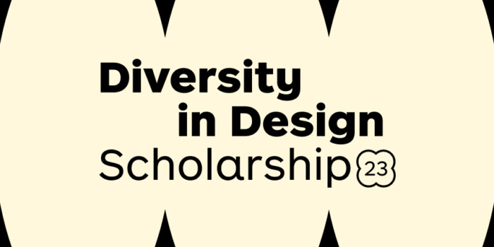
Diversity in design is an important topic to us at Shillington and we aim to support and strengthen equity by cultivating...
Last year Shillington launched, for the first time, our Diversity in Design Full Scholarship opportunities—in New York City,...
Diversity in design is an important topic to us at Shillington and we aim to support and strengthen equity by cultivating...

Last year Shillington launched, for the first time, our Diversity in Design Full Scholarship opportunities—in New York City,...
Want to win some amazing prizes and stay in the loop with all things Shillington? Sign up to our newsletter to automatically go in the draw.