11 Best Album Covers, Selected by Shillington Design Teachers
When I was a small child my Dad would frequently sit in a chair by the record player, headphones on, listening to music. He always held the album he was listening to in his hands. For a little kid this was a curious scene. Someone sitting in a chair, looking at a square bit of card with images on it, entranced! All I knew was that that square bit of card was a really important part of whatever was going on.

A decade later I heard New Order’s Blue Monday for the first time ever during a trip to the city. I was sitting in the back seat of a posh car that had an amazing sound system and my tiny teenager mind was blown. At that time I hosted a show at the local radio station. As soon as I could I went in to the station and searched high and low in the catalogue for Blue Monday. I went right through the entire physical record collection one by one in my determination to find it. And there it was. Oh. My. God. The album cover was as beautiful as the music. Black. No text. Die cuts. Small squares of bright colour all down one side. I played it every week on my show—all seven minutes of it and each time I would sit with the headphones on and hold the cover in my hands and stare at it.
Now our music is digitised is that visceral experience of sound meeting sight gone forever? Will album cover design be an antiquated skill? I’ve been musing over this while my ten year old son has been carefully collating his music collection, albeit a digital one. The music he likes is important to him and I love that. He likes to lounge sloppily, headphones on, I-pod Nano in his hands. All the while staring at the album cover artwork displayed on the screen. Maybe album cover design is here to stay. I really hope so.
Today on the blog, our Shillington teaching team rounds up their favourite album cover designs of all time. Read on to discover why these designs stand the test of time and make the album even more than music to your ears.
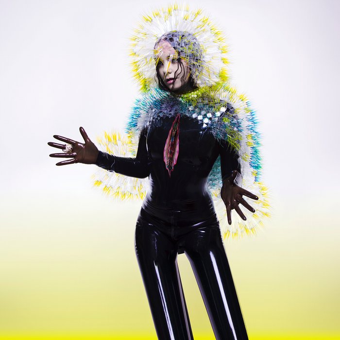
Vulnicura—Bjork (2015)
“Vulnicura features Bjork herself in a character of her own creation. All of Bjork’s album covers are insane but I do have to admire how they really encapsulate the mood and overall eccentricity of the music.”—Sarah McHugh, Director (United Kingdom)
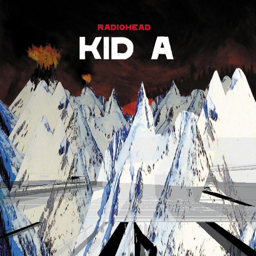
Kid A—Radiohead (2000)
“I sold all of my CDs years ago but still kept a few covers, and this was definitely one of them. What’s great about Kid A is that you pull the whole CD apart and the artwork is just everywhere. It also perfectly evokes the music; discordant, jarring, dark, moody…Love it!”—John Fry, Director of Digital
Xtrmntr—Primal Scream (2000)
“Xtrmntr perfectly encapsulates the climate of the time, and it had a fantastic video to match.”—Steve Waring, Part-Time Teacher (Manchester)

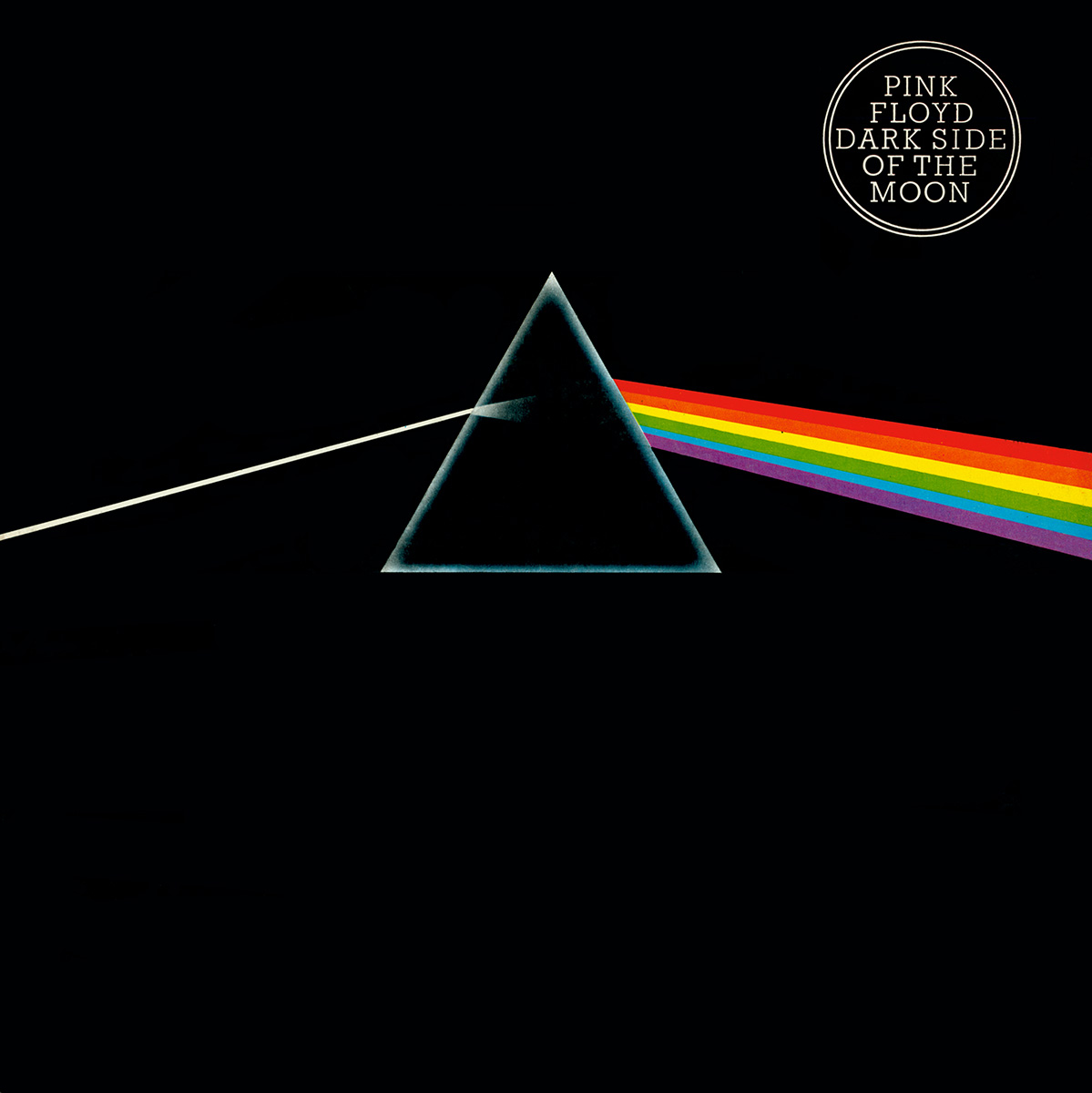
Dark Side of the Moon—Pink Floyd (1973)
“This cover is timeless and groundbreaking, in both its music production and design.”—Holly Karlsson, Director (New York)
Sledgehammer (Secret 7″ edition)—Peter Gabriel (2015)
This version of Sledgehammer is actually a special limited edition cover by Non Format that was auctioned for charity via Secret 7″. Beautifully executed simplicity, with a healthy dose of humour.”—Adam Dudd, Full-Time Teacher (New York)

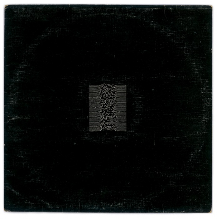
Unknown Pleasures—Joy Division (1979)
“It’s disruptive, angsty and beautiful. Designed by Peter Saville, total design crush.”—Leyla Muratovic, Global Content Manager
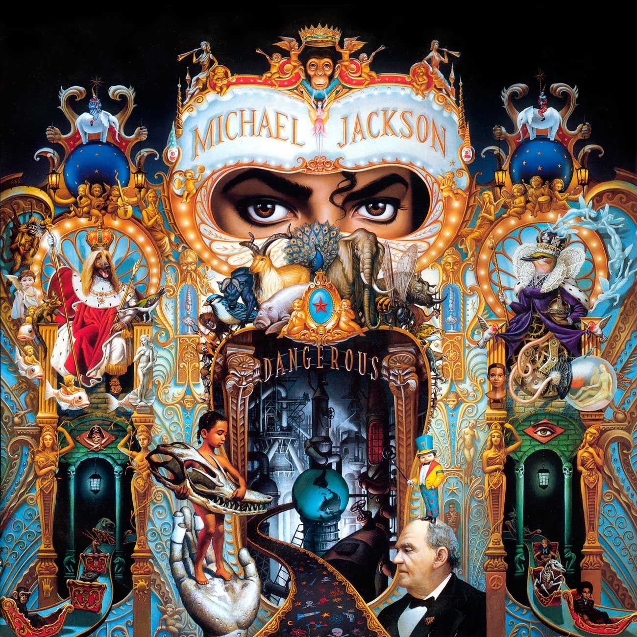
Dangerous—Michael Jackson (1991)
“I remember when Michael Jackson’s Dangerous came out, so many hidden meanings and symbolisms! You’ll never look at this cover the same after you learn about these“.—Alyson Pearson, Full-Time Teacher (London)
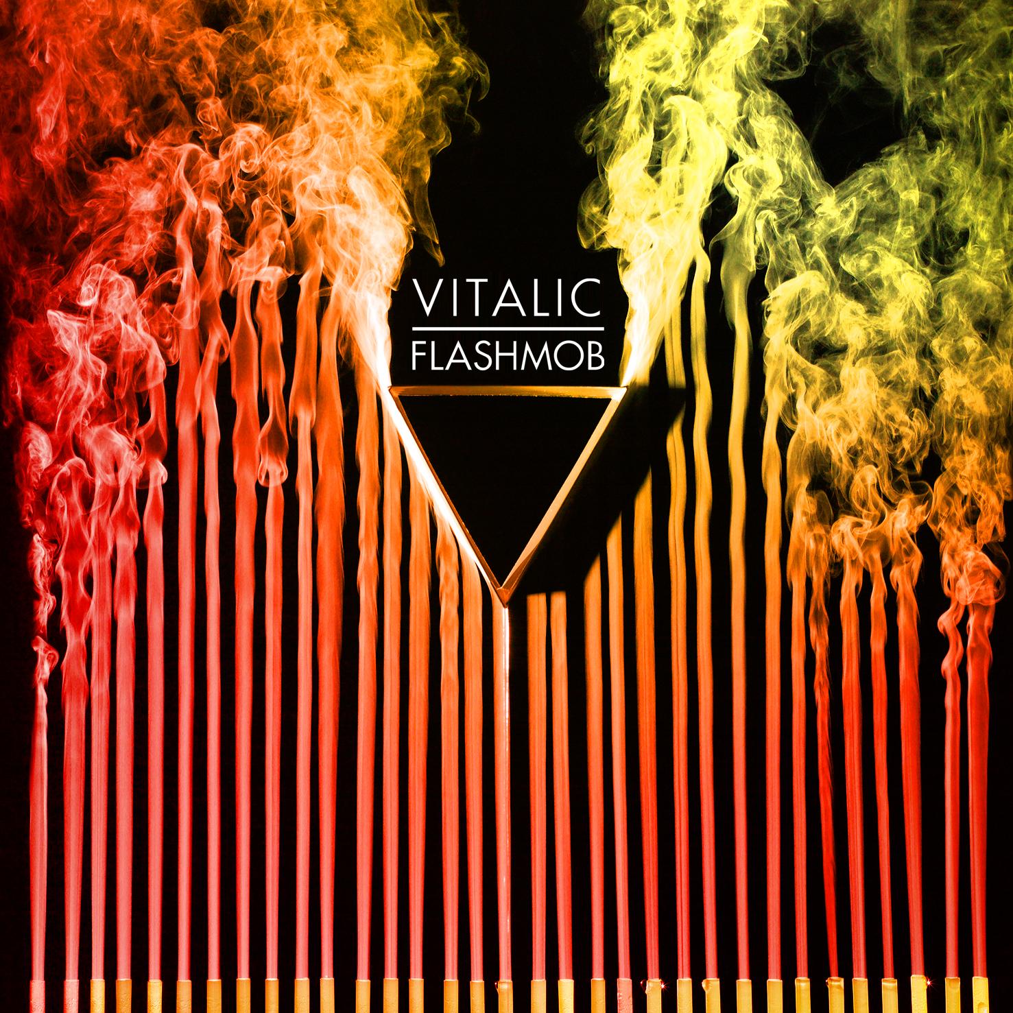
Flash Mob—Vitalic (2009)
“The smoke coming out of the straws is used to represent stability, while the triangle creates the disturbance (and the V of Vitalic). The video clip See The Sea (Red) shows how the cover was made, using dry ice and straws to create a powerful visual. The accompanying film clip apparently depicts a man recreating the 19th century experience of Etienne-Jules Marey on fluid dynamics.”—Anthony Wood, Director (Australia)
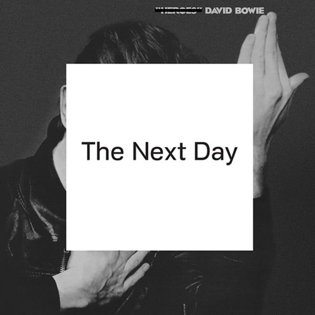
The Next Day—David Bowie (2013)
“At first glance it looks super understated and what a lot of people would call ‘boring.’ But the deeper reasons and design choices are really intriguing which makes it stand out for me.”—Jason Cooper, Full-Time Teacher (Sydney)
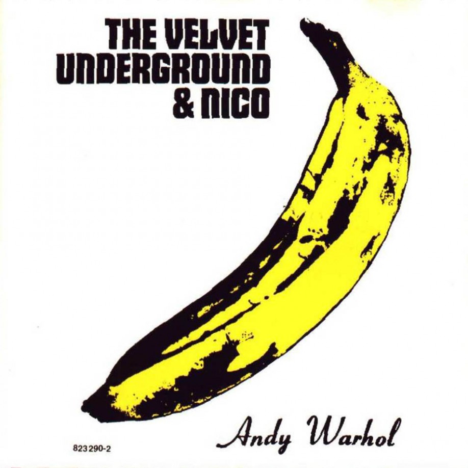
The Velvet Underground & Nico—The Velvet Underground & Nico (1966)
“The Warhol Banana is probably one of the most iconic and recognisable album covers. When it was originally created you could actually ‘peel’ off the banana skin as it was a sticker to reveal the inside of the banana—which was pink and…. somewhat suggestive. Unique interaction for album art.”—Shanti Sparrow, Full-Time Teacher (Brisbane)
Do you find yourself entranced by the artwork of your favourite albums? A love of music and the graphic design that goes with it is often how designers realise their passion for visual communication.
If you’re looking to up-skill or change career we have 3 month and 9 month graphic design courses available at our campuses in Sydney, Melbourne, Brisbane, London, Manchester & New York. Find out more -> www.shillingtoneducation.com
Posts you might like

One of the best things about graphic design is that it never stands still for a moment. But that does mean that keeping up with...

The best graphic design books can take you on an exciting journey of the imagination, transport you to new creative worlds or...

We’ve all been feeling the squeeze over the past few years, but at Shillington we don’t want this to stop anyone getting the...

We're excited to announce Shillington's Diversity in Design Full Scholarship and Industry Mentorships and Global Half...

No designer can push boundaries without having the right graphic design tools by their side. In fact, think of graphic design...

Looking to become a freelance graphic designer? At Shillington, with over 25 years experience, we know a thing or two about...

Graphic design is an ever expanding creative discipline. With our graphic design course, we teach you how to make research a...

Whether you’re an experienced designer or a recent graduate from a graphic design course, whether that's online or in...
Want to win some amazing prizes and stay in the loop with all things Shillington? Sign up to our newsletter to automatically go in the draw.