An Interview with Holly Ovenden on Book Cover Designer
Holly quit her job managing a medical practice to enrol at Shillington back in 2014, eager to develop her design skills and secure a more creative job. She produced a portfolio showcasing her passion for illustration within a graphic design context. Holly now works as a Junior Book Cover Designer at Bloomsbury Press in London where she’s able to do what she loves on a daily basis.
What’s your daily routine like?
My day in the studio starts off with a cup of coffee in my Pantone mug, followed by checking emails and reading through new briefs. I may be working on up to five or so book covers at a time. We prepare the designs up to a year in advance, so many of the covers I’ve worked on won’t be in the shops until 2016!
How may book covers do you design in one week?
It varies immensely. For one book we tend to design maybe six or eight different concepts, but it has been known for designers to do 20 to 30 different cover designs before both the author and editors are happy. I am fortunate enough to work with a fantastic Art Director, who gives each designer feedback on all of their ideas and concepts. Once the concepts have been finalised, they are printed out, ready for our weekly meeting with the editors. I still get really nervous and also excited before the meeting, because you never know how a design will go down. It’s great to hear first hand what other people think of your designs. Sometimes it can be really positive feedback. Other times? Well, let’s just say its back to the drawing board! After a cover has been decided on, it is sent to the author for final approval.
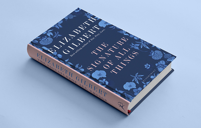
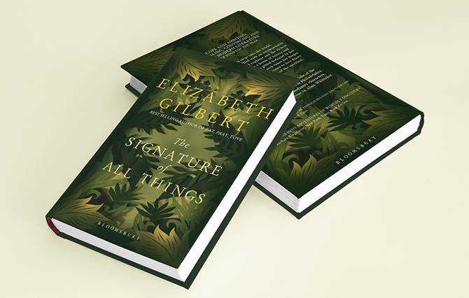
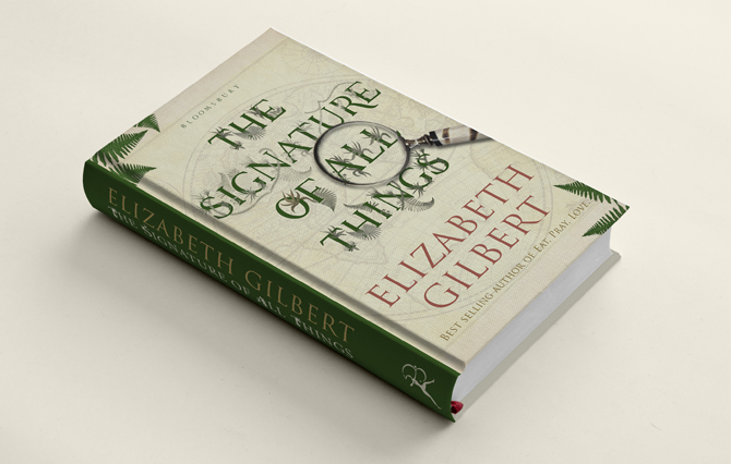
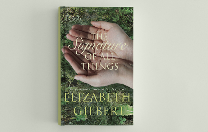
Can you take us through your process for The Signature of All Things, which you created as part of your interview process for Bloomsbury.
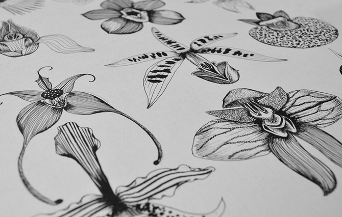
For my first interview I was given a brief to redesign an existing Bloomsbury book cover … possibly the most daunting task I have ever completed! The Signature of All Things is a fictional book by Elizabeth Gilbert (who wrote Eat Pray Love). It has botanical, historical and romantic themes. I love to illustrate natue, so this brief was meant to be. I knew I needed to show my process, so I approached the brief in a very similar way to how we were taught at Shillington. I did moodboards, word associations, colour palettes and created four different approaches: typographic, illustrative, photographic and crafted. After presenting the initial designs in my first interview, I was so thrilled to be invited back for a second time. The email also requested some amendments to my designs, things like the author’s name needs to be larger, logo needs to be on the cover, try different colours. I then had to present my revised versions to the Editor-in-Chief!
Do you get a chance to read the books you design covers for?
Everyone asks book cover designers this! It’s quite a controversial topic. On some occasions I am given a manuscript to read the first chapter or so, but most of the time our briefs are very detailed and give a good indication of the “essence” of the story, themes, reader demographic and comparable books.
Don’t be afraid to try something different, always answer the brief but always give the client something they were not expecting, something crazy and out of the box. You never know – they might just love it.
Do you work in a team on projects, or do you get assigned your own covers to work on alone?
We are each given a brief to work on individually. When I get a new brief it feels like Christmas! I love researching a new topic and find that I end up learning weird and wonderful snippets of information. I recently designed a non-fiction cover for a book about the conflict between religion and science in 17th century. My inspiration for this cover was based around historic typographic ligatures. There are four other designers in our team, including our Art Director, and it is truly inspiring working with the best in the industry.
Can you tell us anything about upcoming projects you’re working on?
My first cover to be published is the paperback version of The Pleasure of Reading, edited by Antonia Fraser, which will be in the shops in May. The paperback version of The Lagoon by Armand Marie Leroi will be out in August.
The Lagoon is one of my favourite designs signed off so far, and I can’t wait to go to Waterstones and see my name on the back!
What advice would you give to students interested in entering the book design industry?
Show versatility in your designs. Book cover design is similar to branding. At the end of the day a cover has to communicate the essence of the book, without being too descriptive. It has to be visually appealing, eye catching and with upmost importance—it must sell! Don’t be afraid to try something different. Always answer the brief, but always give the client something they were not expecting, something crazy and out of the box. You never know—they might just love it.
If you want to check out some great book cover design sites, see The Casual Optimist and The Academy of British Cover Design (A.B.C.D).
Follow Holly on Twitter for updates on her exciting design career, or check out her website for more inspiring work. You can also read more about her journey from medical practice manager to designer in our interview here.
Posts you might like

One of the best things about graphic design is that it never stands still for a moment. But that does mean that keeping up with...
Are you a graphic designer who is finding themselves lacking skills, slow on one of the major graphic design programs or just...

The best graphic design books can take you on an exciting journey of the imagination, transport you to new creative worlds or...
We’ve all been feeling the squeeze over the past few years, but at Shillington we don’t want this to stop anyone getting the...

https://www.youtube.com/watch?v=wZ_tffGtZMs New York graduate Simon Fréour worked as a software engineer in France for seven...
Are you working with graphic designers day-to-day and finding yourself jealous of the work they're doing? You're certainly not...
We're excited to announce Shillington's Diversity in Design Full Scholarship and Industry Mentorships and Global Half...
Diversity in design is an important topic to us at Shillington and we aim to support and strengthen equity by cultivating...
Want to win some amazing prizes and stay in the loop with all things Shillington? Sign up to our newsletter to automatically go in the draw.