Case Study: Bleach Design with Shillington Teacher Marcea Decker

For the musician Molly Nilsson, Shillington New York teacher Marcea Decker created a limited run of 24 unique t-shirts. In this case study, she talks about the brief and process she went through to create the album cover design and the bleach artwork for the t-shirts.
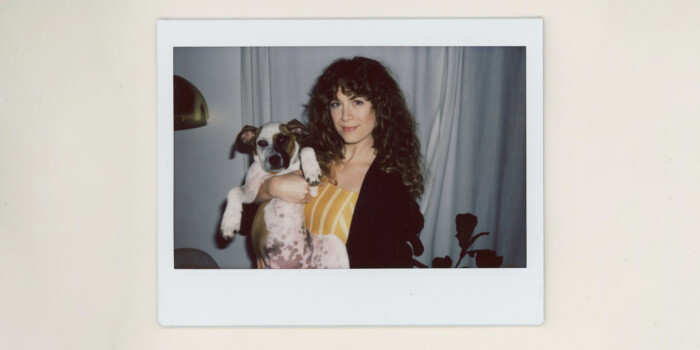
Marcea is originally from Arizona and is a New York-based educator, designer, multimedia artist and musician. Outside of teaching, she creates handpainted limited edition bleach t-shirt designs, has self-published two books and exhibited her work. This year, she was included in Creative Boom’s top 25 creatives to follow in 2019!
What was the brief?
2020 is Molly Nilsson’s 8th album, the latest opus of an artist in a constant state of development and strength. It is about emerging from the husk of your old self, about binning the chrysalis and daring to stand up both to power and your own limits. In 2018, we saw the climate changing, democracy crumbling, inequality and injustice erupting. 2020 examines the near future, seeking out clarity, reflection, renewal and opportunity.
Molly Nilsson wanted bespoke, collectible, one-of-a-kind hand-drawn shirts available at her North American tour dates.
What was the project scope?
I connected with my friend Michael who runs Night School Records after the label released 2020 and pitched the idea of doing a limited run of 20 BADSHITY created shirts for Molly’s North American tour dates. BADSHITY is collaborative work between John Dunn (MOBSHITY, sharpie shirts) and myself (BAD PENNY, bleach shirts). Molly, Michael, John and I all worked closely on these very limited run shirts from scope to design.
Walk us through your research process, mood board and concept.
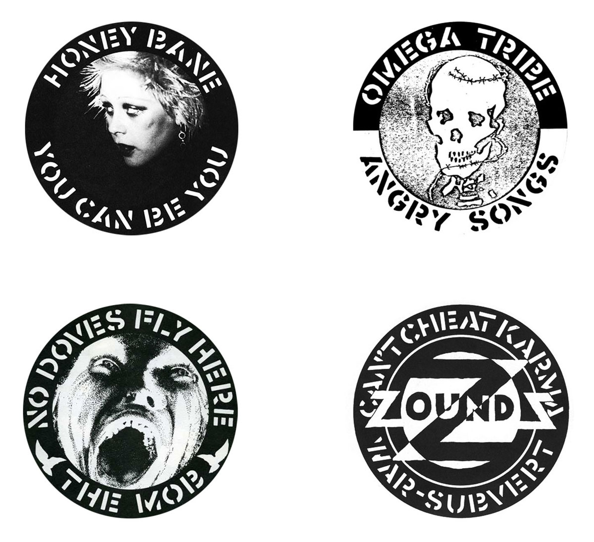
Thinking through Molly Nilsson’s key motifs from the album, I thought about anarcho-peace punk musicians’ understanding of self amidst political turmoil. Inspired by Crass records, I began to see visual language connections to similar themes. I began my mood boarding process there, and noted two reoccurring visuals between anarcho-peace punk record covers and Molly’s that are innately eye-catching: the stark play between white and black, as well as the use of peace-like symbols and iconography. From there, I began sketching variations of the motifs of duality—conflict between the external and the self.
What was the initial idea for the project?
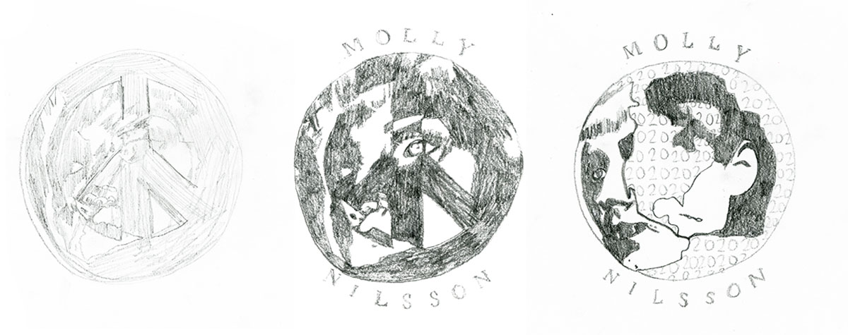
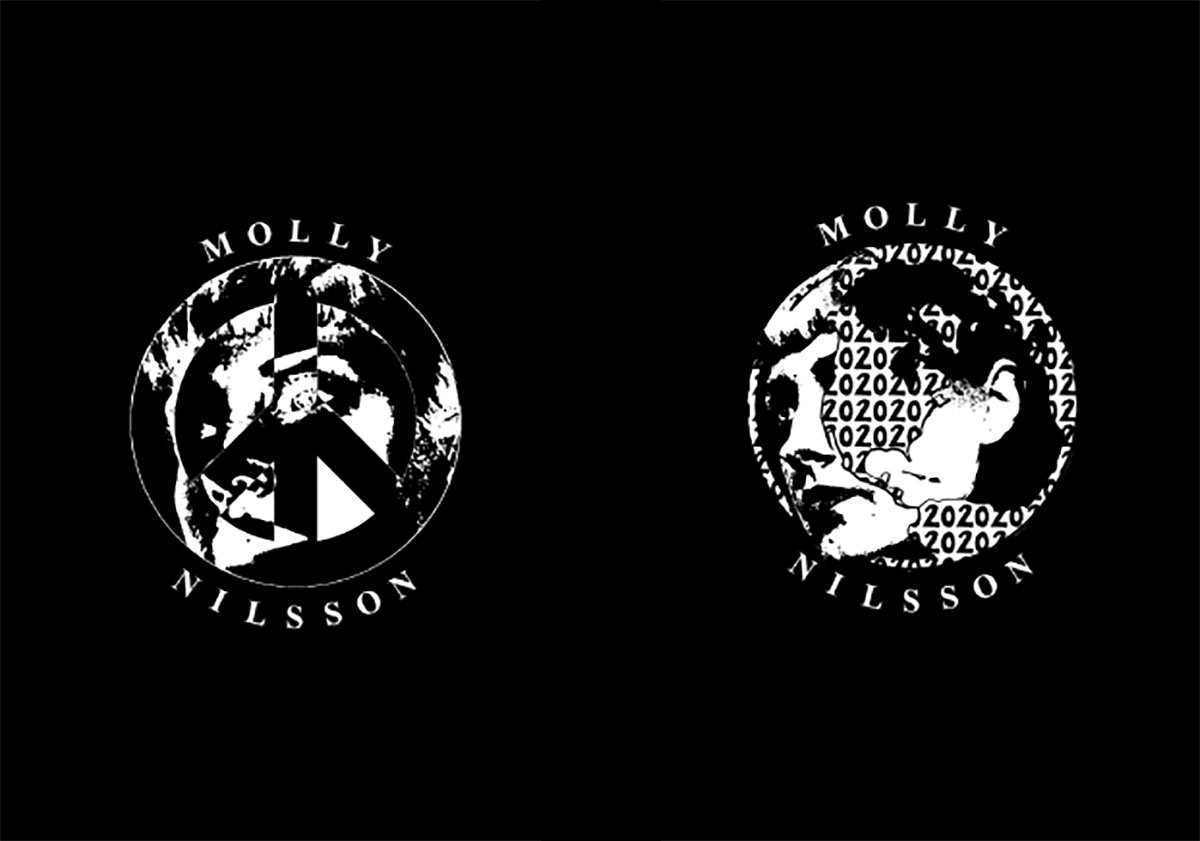
My initial idea was a monotone portrait of Molly emerging out of a black peace sign that inverts to white each moment where her side-view portrait passes through it, implying a progression forward amidst confining structures that, at times, feel like immovable barriers if we can reflect and grow within ourselves, then maybe we can push past those barriers, renew our outlook, and then change our world.
For this project, I wanted to visualize what an acceptance of self, as well as a realization and rejection of limits, could look like.
Tell us about the visual direction for this project.
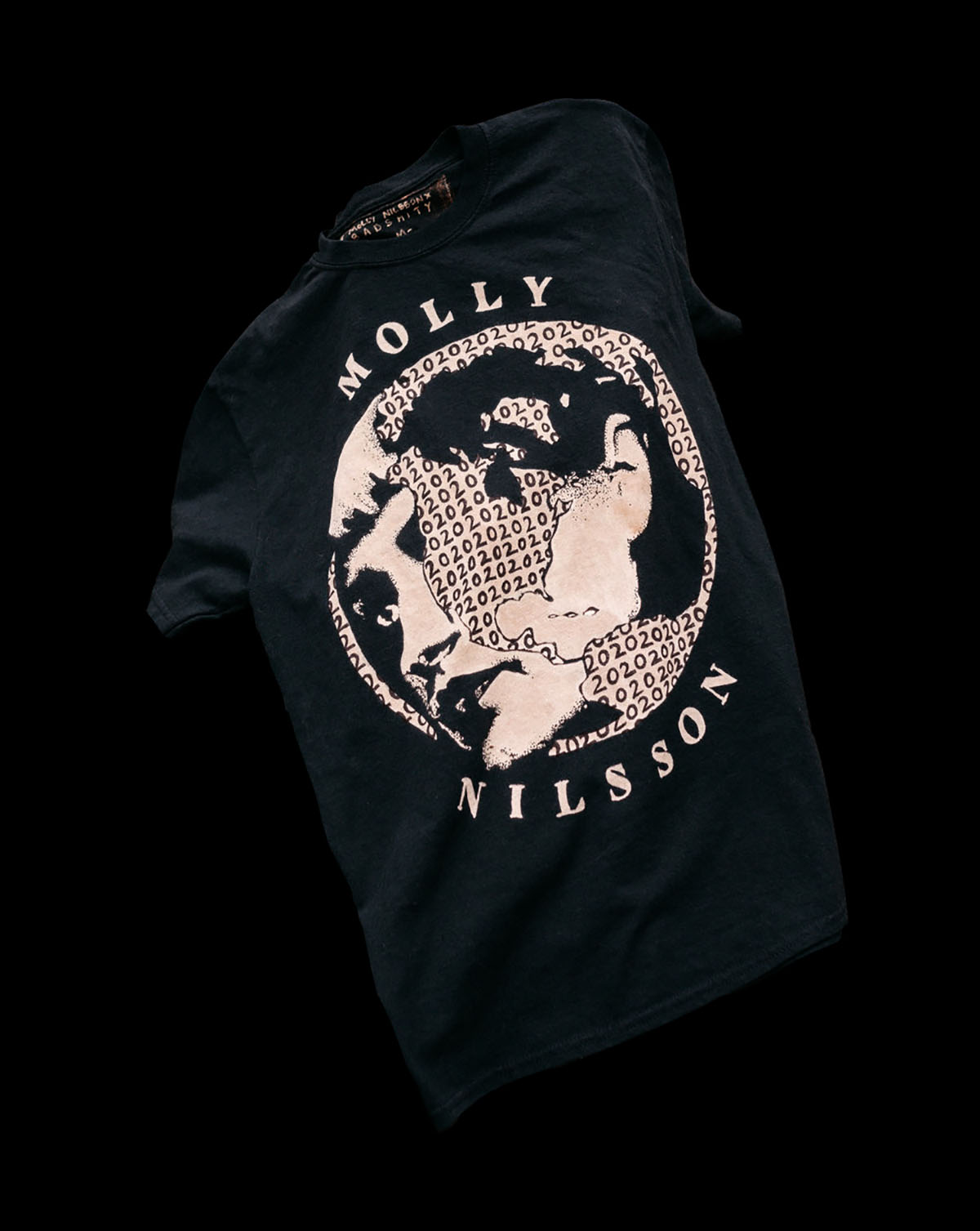
Upon showing Molly some initial sketches and ideas involving her portrait within a peace sign, she prompted the exploration of using a depiction of a globe. The second iteration was another portrait of Molly interacting with an outline of the world, with a focal point on America. Some of Molly’s features are obscured by it, though her face defiantly pushes past the confines. 2020, the title of the album, is repeated within the landmass of the globe. This was the direction we decided to go with.
Can you tell us about some of the design choices you made—walk us through the process to create the bleach artwork from start to finish.
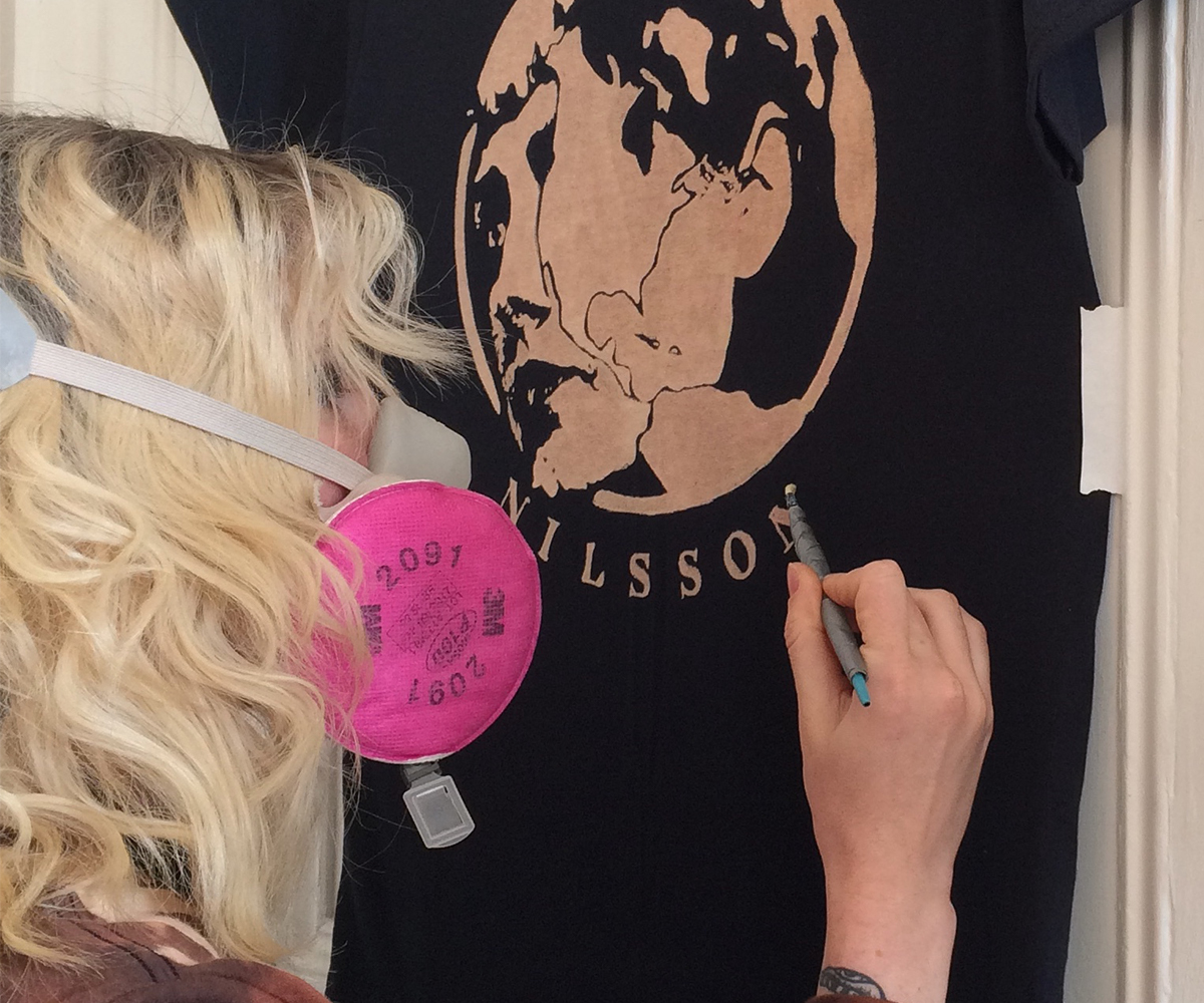
I strategically selected an influence and style that will translate to my medium of bleach and textiles. You can achieve different tones with bleach and I have done work like that in the past, but I felt that with the message of this album and the visual language I was referencing, the design needed to work in monotone—just the bleach and the black from the negative space of the shirt. It requires strong contrast in order for the image to be read clearly, so I began setting the structure of the layout by digitizing my sketches and perfecting the typography and portrait of Molly. After selecting what became the final artwork with Molly, I kicked off the production process by hand-painting the artwork in bleach on a variety of sizes. I use a few different small brushes to be precise with my linework, as well as pack in as much detail as I can, especially with portraits.
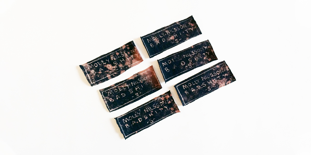
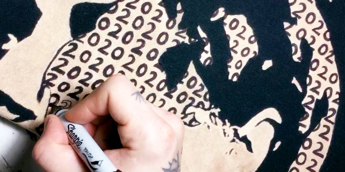
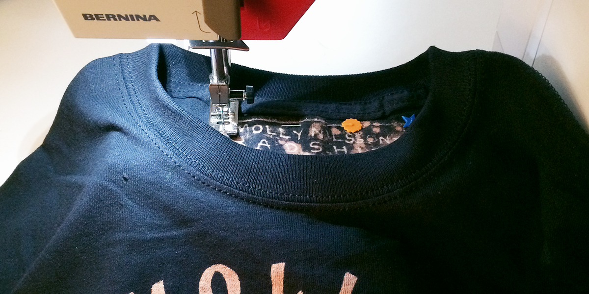
My main goal was to come out with a finished portrait that reads almost photographic, yet graphic at the same time due to the simplification that inevitably comes with using a monotone application. Once finished, I hand-painted custom tags in bleach and sewed them into each shirt. I then passed them off to MOBSHITY who added Sharpie stippling, details and finishing touches.
What part of this project did you find the most enjoyable?
Working in monotone has some interesting limitations and it can be a bit of a puzzle to accurately work off of the negative space that becomes the shadows, but it’s a challenge that is very stimulating to my creative process.
I have to really think while sketching and drawing of the context and application of my medium. I’m constantly problem-solving, not only in the initial planning process but also in production. It’s those moments that keep me fine-tuning my process and strengthens my understanding of the medium and ways of creating.
Any tips for others who want to create their own bleach design on fabric?
My first tip is please protect yourself, safety is very important and bleach is a corrosive chemical! Wear a mask, gloves, and work in a well-ventilated space, or outside. My other big tip is experiment! Happy accidents can turn into a new methodology or a way to better understand your materials.
Big thanks to Marcea for explaining her process for the Molly Nilsson project in depth. Head over to her website to see more of her amazing work! Meet the rest of our amazing Shillington teachers and team from around the world.
Want to win some amazing prizes and stay in the loop with all things Shillington? Sign up to our newsletter to automatically go in the draw.


