Christopher Doyle & Co. Creates Global Shillington Campaign
October 2018 update –> the campaign is a finalist in two categories of the AGDA Design Awards 2018.
It’s not every day you get to work with one of the best in the biz. For our latest global campaign, the Shillington team was thrilled to work with Christopher Doyle & Co., an award-winning independent and collaborative creative company based in Sydney, Australia. Chris is known for his extraordinarily clever campaigns (Spotify!), branding (Australian Design Radio, Eat Burger, Sedona) and Christmas gifts.
We were especially excited to work with Christopher Doyle & Co. because not only would we get Chris’s expertise, but had the added bonus of Stephen Grace, a super talented designer and Shillington graduate! His insider understanding of who we are and what we do was invaluable.
Read on for a complete interview with Chris and Stephen about the campaign’s challenges, the importance of colour/copy and a bit behind their creative process.
What were the unique challenges with this campaign?
Talking about design to an audience that aren’t designers (yet). In-jokes and jargon had to go out the window. We are talking to people about the exciting possibility of making a big change, to kickstart a career in design, not about the specifics of the course. So we made sure to approach the campaign from this perspective.
The other challenge was to stand out against other educational institutions, which often lean on familiar clichés (happy smiling students, teachers pointing at screens). Shillington’s design education model is different, so their marketing material should be too.
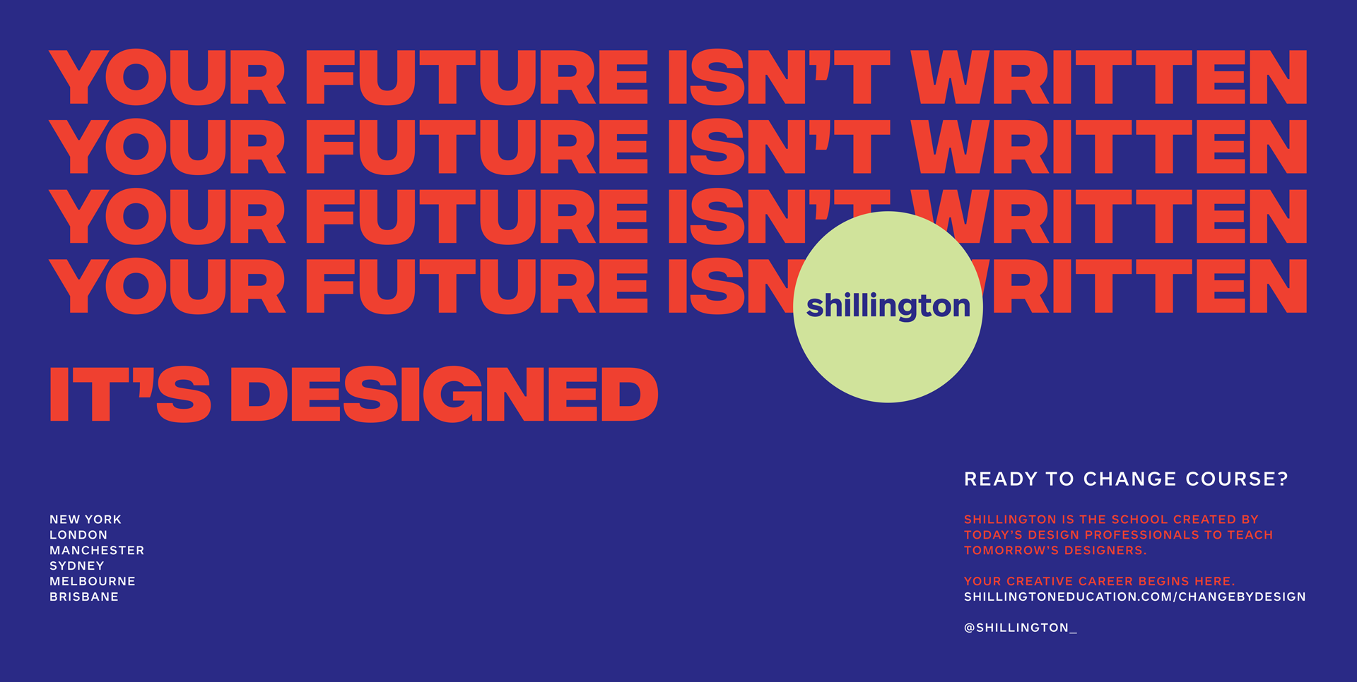
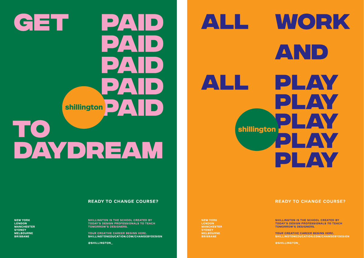
It’s a verbally led campaign, which is an unexpected direction to take for a design school.
Clever copy doesn’t come easy, and you guys are masters. How does your team ideate and develop ideas?
We write a lot. Any piece of verbal work we do goes through dozens of edits and rework stages. It’s a process of reduction and brutal edits, and constantly being aware of the brief, the message and the audience.
We do a lot of word associations. Coming up with territories or key ideas and trying to write every thought down that comes. Then seeing any connections that form in these lists. Idioms and turns-of-phrase are always helpful. Flipping the familiar into the unfamiliar. Working in language devices and patterns that give people access and are sticky. We always aim for our work, visual or verbal, to allow people a way in. And then give them an idea or a feeling they take away with them.
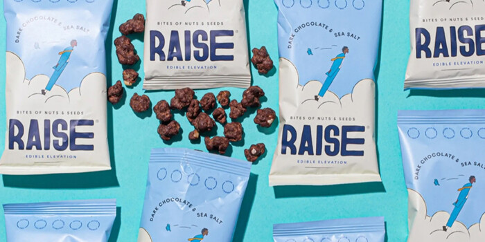
The campaign colours are so unique and punchy! How does your team develop palettes?
Particularly for this, any combinations that popped. The campaign is a message of change and positivity so we wanted maximum impact and brightness. We save colour references from all sorts of sources—films, books, blogs, fashion.
Colour is an experimentation process. You just have to try as many things as possible.
Stephen—how did it feel to work on a campaign for the design school you graduated from? Full circle moment?
It’s been a wild ride. I’ve gone from seeing Shillington in a Frankie magazine 8 years ago, then moving to Sydney and doing the course, and now getting the chance to work on the next generation of Shillington campaigns. It feels very circle of life, just less giraffes and more Photoshop. Thanks for giving me the opportunity to get stuck back in.
Huge thanks again to Christopher Doyle & Co. for their work on this campaign. Keep your eyes peeled to see it on the London Tube and New York subway.
This article was originally published in July 2018.
Posts you might like

One of the best things about graphic design is that it never stands still for a moment. But that does mean that keeping up with...

The best graphic design books can take you on an exciting journey of the imagination, transport you to new creative worlds or...

At Shillington, our dedicated graphic design students are taught all about how to design for packaging—from FMCG (that’s fast...

At Shillington, our graphic design course teaches students how to design campaigns for a brand, helping to spread its message....
Diversity in design is an important topic to us at Shillington and we aim to support and strengthen equity by cultivating...
Diversity in design is an important topic to us at Shillington and we aim to support and strengthen equity by cultivating...
In our Industry Interviews, we ask one of our Shillington Teachers to interview a creative they admire—this can be a friend...
Exposing yourself to examples of good graphic design is a healthy practice no matter who you are. Maybe you’re a student...
Want to win some amazing prizes and stay in the loop with all things Shillington? Sign up to our newsletter to automatically go in the draw.