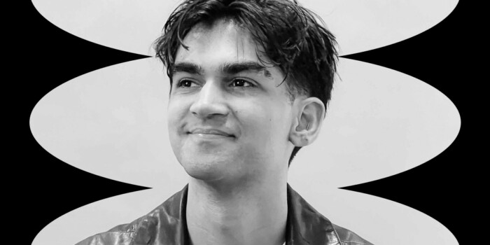
An Interview With Dave Coleman: Animator, Illustrator & Type Designer

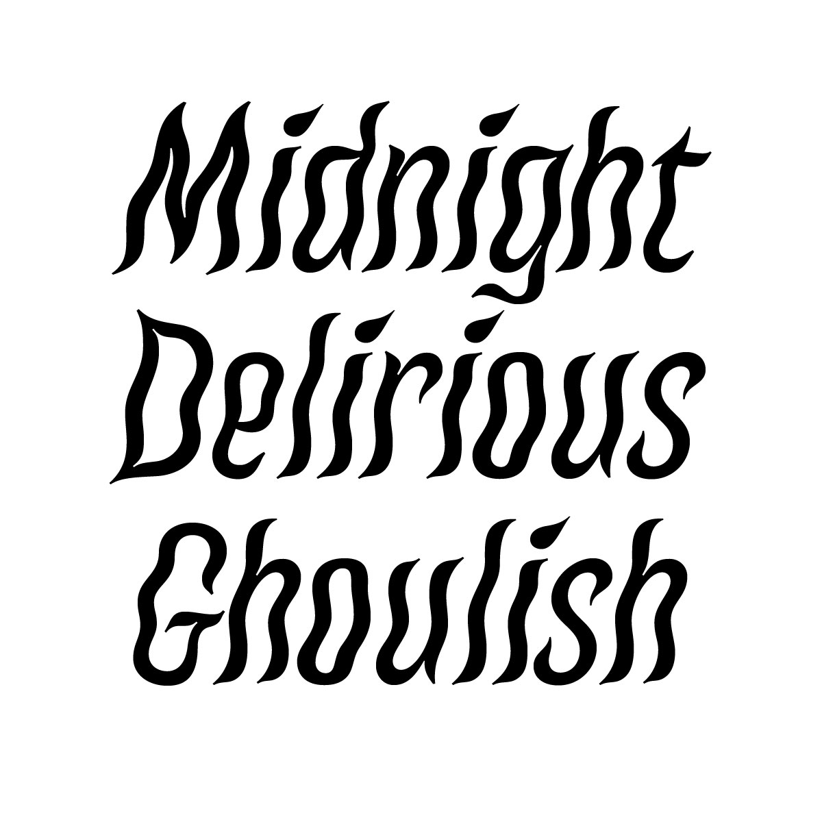
Dave Coleman approaches type design with the eyes of a designer and soul of an illustrator. His typefaces and letterforms are alive with character and story. During his recent remote lecture to Shillington students in Sydney, Melbourne and Brisbane, Dave offered up insights into his process, alongside sharing some of his favourite inspirations and influences. Our students came away with a strong sense of how type design is both a playful and deeply rigorous design process. In his lecture, Dave extolled the importance of experimentation, considering the functionality or purpose of the typeface and remembering to inspect both the structure of the individual letterforms, while also taking a birds-eye view on how they collectively sit and operate on the page.
Dave’s lecture was the perfect springboard for the class to get started with their own type design journeys. In this interview, we caught up with Dave to reflect on what he shared during his lecture, dig a little further into his process and career and some great suggestions for anyone looking to design their first typeface. Keep reading to learn more!
In your recent guest lecture, you talked about getting started in type design and your creative process. Can you tell us a little about how you got started in lettering and designing typefaces?
I had lettering on my radar in the early 2010’s because I was inspired by people like Jessica Hische, Erik Marinovich, James T. Edmonson etc, who were—and still are—doing really cool stuff. I also think the rise of social media around that period of time contributed to the modern lettering boom.
In 2013, I worked for a year as a junior graphic designer in Sydney and on my hour-long train commute, I would practice lettering. I caught the bug and really haven’t stopped drawing letters since.
With my graphic design background, I was already familiar with Illustrator and the pen tool. So it wasn’t long before I began learning to digitise my lettering, tracing them with beziers, so they could be more useful to clients in a vector format.
Somehow, at some point, type design edged onto my radar and I quickly realised that I could apply many of the skills I had been learning (even programming, via a background in web design) to this new discipline. I began experimenting with designing my own fonts and quickly became obsessed.


In 2015 you took part in the TypeParis program. Can you tell us a bit more about your experiences there and what you feel were the most valuable lessons you took away from your time in the program? Also, what were some unexpected highlights of such an intensive learning experience?
TypeParis remains one of the most rewarding and challenging experiences in my life to date. I wrote in some depth about my time at the 2015 program.
I had such a profound experience the first year, that I wrote to Jean François Porchez, the program’s founder, and requested to be allowed to come back again! I went on to attend and assist at each subsequent year, from 2016 to 2018, even enjoying some teaching assistant responsibilities the last year.
Apart from the obvious type design techniques and trade secrets, the bonding that occurs amongst both the attendees and instructors was very special. The program is held in a classroom environment, with live, in-house visits from notable figures in the type design and creative arts community. This helped the material feel tactile, and even though there was a lot of information to digest, it felt like it was sinking in.
An unexpected joy of the TypeParis experience was that I don’t think any of us attendees that first year expected to become such fast friends and so quickly.
We still remain in touch and visit across the globe occasionally. It was a very special and meaningful time together and transcended mere skill and career development.

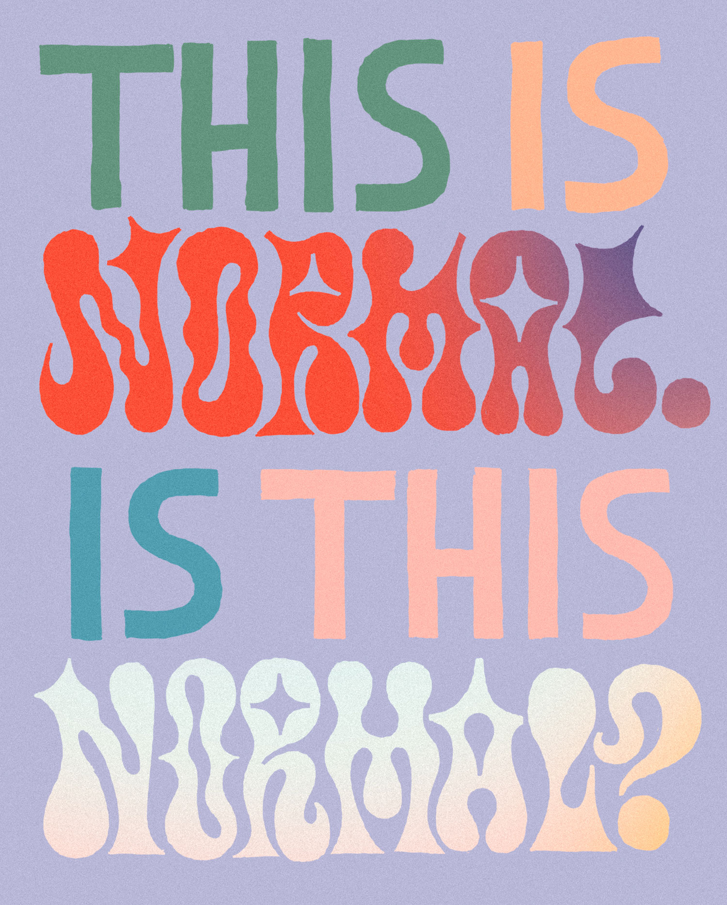
In your presentation, you spoke about finding the language of shapes when working with type. Can you explain this idea a little more and share some examples of how you do this in your own practice?
I think we’re doing this a lot in life, perhaps without even thinking about it. We consider how a pair of shoes might go with a shirt, or how an ingredient might go in a certain dish or even the appropriate way in which to act depending on where we are or who we’re with.
I think shape language in type is the same. Once we understand and learn to ‘see’ different voices or tones in certain aspects of letters, we can then put them to work in a very intentional way.
In a way that serves the brief and solves the client’s problems. And also in a way that harmonises within a system (like in a typeface), or a lockup (like a piece of lettering).

Creating a typeface is a massively laborious design process. You spoke about the benefits of platforms like Future Fonts, which allow designers to publish and sell typefaces they have developed, even when they are not yet 100% complete. Can you share a little bit more about the complete scale of designing a finished typeface/ font and equally, about some benefits would be of publishing it sooner rather than later?
There is a wide gamut for what ‘finished’ may look like, in type design. There are many considerations that determine the work involved to bring a typeface to completion, such as desired language support, open type features (small caps, ligatures, tabular figures etc), styles, hinting, kerning and more.
Depending on the needs of the individual user, a typeface in any given state may be entirely functional, or completely useless.
Future Fonts manages to put infrastructure around that concept and provides foundries with a means to communicate the level of completion of their fonts and also a roadmap of what functionality to expect as development continues.
Many of the typefaces on Future Fonts are experimental/decorative, and these, of course, lend themselves toward being used for short headlines, low word-count graphic elements for a poster, logotypes, etc—situations where perhaps glyph sets, symbol/punctuation support, kerning etc are less vital. This means the type designer is able to get a useful product into the right user’s hands and use those sales to support ongoing development. The end goal is always a useful and completed font! It is worth mentioning that there are many practical ‘workhorse’ fonts available in the FuFo catalogue too and many designs are actually released on the platform with surprisingly fleshed out feature sets. Head to Future Fonts and read the description page for any font for more information.
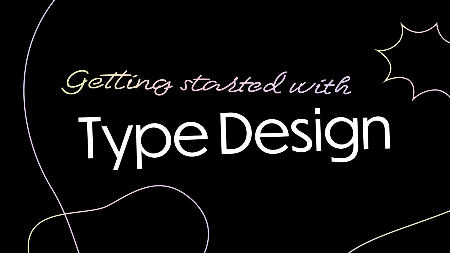
Do you have any suggestions for designers who are interested in getting into lettering and type design? What are some essential tools and resources you would suggest to get them started?
Read James T. Edmonson’s blog posts about type design. Fantastic information there.
Here’s a link to my Shillington presentation (slides viewable here), which covered this topic. I also spoke at Typism a few years ago, on more specific but still relevant topics.
If you can, consider attending a type design program in your area. It’s a really powerful way of learning the ropes.
Try Glyphs app, it’s friendly to newcomers and has plenty of resources available to get you started.
There are a host of other ways to enter the world of type design, but whatever mark-making tools you have near you, pick them up and practise drawing letters. Look at the letterforms all around you, look at other fonts, old fonts, new fonts. Draw constantly, practice and you’ll improve.
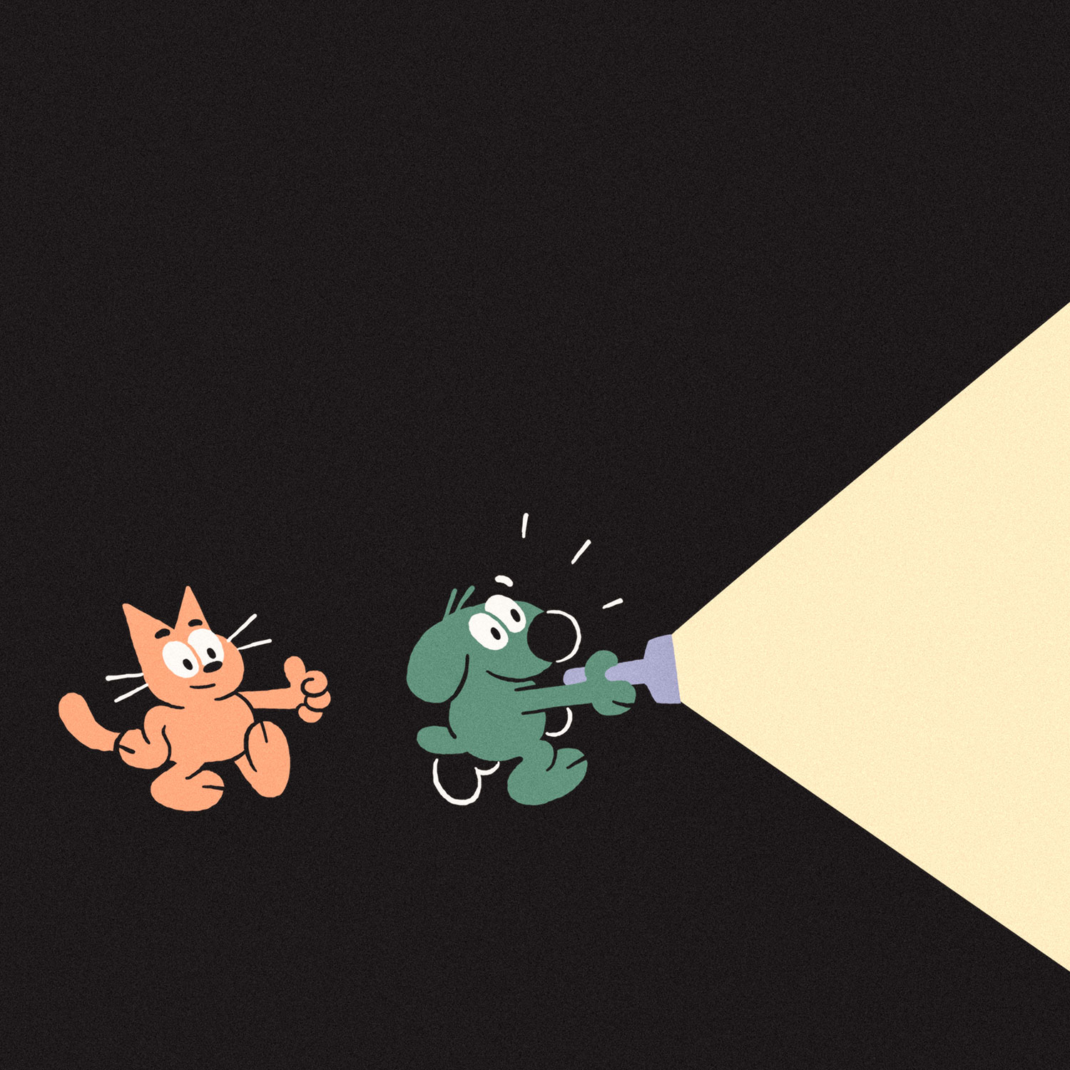
Your love and talent for animation and illustration shine through in your portfolio, from your playful character studies to your amazing client work. In particular, can you tell us a little about how you got into animation and why it’s such an important and enjoyable part of your creative process?
Thank you! I’ve had a fascination with animation ever since watching the likes of Looney Tunes, Blinky Bill, Disney movies like Alice in Wonderland and Robin Hood (Oo-de-lally!). I would play around in Flash in high school and even did a work placement in Year 10 at Yoram Gross, an Australian film studio that created the Blinky Bill cartoon, Dot the Kangaroo and many others. So I had a relationship with animation fairly early on. However, it would be many years later that I pursued animation more seriously.
My dream is to hone my writing skills, learn to tell engaging and funny stories, write for television and film, create short films (both animated and live-action) and one day create a network cartoon. For now, I am working on my fundamental animation skills and learning as much as I can every day, to prepare me for the future.
Do you have any unexpected or essential tools of the trade? What are the absolute necessities for your creative practice?
Perhaps it’s not unexpected, but my iPad Pro is invaluable to my day-to-day work.
It’s my sketchbook, pen and paper, I animate on it, send finished illustration work to clients, I create storyboards, hand-drawn lettering; nearly all my output comes from my iPad.
There are still limitations, but iOS is improving constantly, and the hardware only gets more capable as technology advances.
What have been one or two of your favourite recent projects? Why?
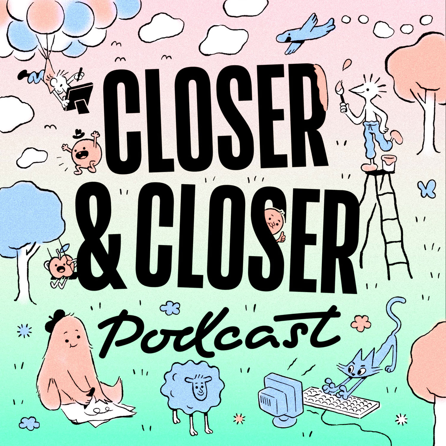
I was quite pleased with some podcast artwork I created recently for my representation agency, Closer & Closer. It was nice to draw something that felt like it could have been a glimpse into a bigger world or story.
I also had fun working with Timah Kabba from Tempest, an addiction recovery program, on some lettering and illustration work for their social media.
And to finish off, which designers or creatives are you loving and getting inspired by at the moment?
The work from the students attending animation school Gobelins CRFA22 is amazing this year (and all the years). Check out Val Gi, Tom Rameaux and Marin Inbona to get acquainted.
I always love the illustration work of Andrew Beck on Instagram).
Juliaon Roels is an incredibly skilled character designer.
I can never keep my mind off David Lynch‘s work for too long.
I am a huge fan of the minds of Tim Heidecker and Eric Wareheim.
Huge thanks to Dave for taking the time to share so many incredible insights into his practice and process with us here. Make sure to keep up to date with what Dave is creating through his website and Instagram.
We’ve hosted some of the world’s top creatives, design studios and advertising agencies at Shillington. Check out more interviews from guest lecturers.
Posts you might like
Are you a graphic designer who is finding themselves lacking skills, slow on one of the major graphic design programs or just...

https://www.youtube.com/watch?v=wZ_tffGtZMs New York graduate Simon Fréour worked as a software engineer in France for seven...
Are you working with graphic designers day-to-day and finding yourself jealous of the work they're doing? You're certainly not...
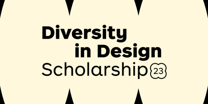
Diversity in design is an important topic to us at Shillington and we aim to support and strengthen equity by cultivating...
Last year Shillington launched, for the first time, our Diversity in Design Full Scholarship opportunities—in New York City,...
Diversity in design is an important topic to us at Shillington and we aim to support and strengthen equity by cultivating...
Last year Shillington launched, for the first time, our Diversity in Design Full Scholarship opportunities—in New York City,...
Diversity in design is an important topic to us at Shillington and we aim to support and strengthen equity by cultivating...
Want to win some amazing prizes and stay in the loop with all things Shillington? Sign up to our newsletter to automatically go in the draw.