Design Case Study: Branding and Campaign for Minaxi with Shillington Teacher Shrenik Ganatra
Shrenik Ganatra is a Shillington teacher in New York, a multi-disciplinary designer and songwriter currently based in Brooklyn, New York. His work is rooted in typography and has been featured in international blogs, publications and Creative Boom, Adobe, Graphis, The Design Kids, Design Indaba, AIGA Eye on Design, ADC Global, Typism and Behance. He is most renowned for his ADAM.CG Pro typeface, which is used by over 700k people in over 100 countries. Since 2013, Shrenik has worked both independently and in multi-disciplinary studios in New York. Shrenik’s clientele includes The Library of Congress, The Type Directors Club, The Glass House, Cooper Hewitt, Smithsonian Design Museum and Skirl Records.
Shrenik also writes songs, oversees guitar, vocal and production duties in his alternative/shoegaze band Minaxi. Since the band’s inception in 2018, Minaxi’s music/design has been recognized by Rolling Stone India, Creative Boom, Rock Street Journal, Buzz Music LA and Bands Do Brooklyn. Read on to get some insight into the visual direction and process for the album artwork he created for his band, Minaxi.
Walk us through the visual direction, research and concepts to arrive at the album artwork design.
I don’t start out with a pre-defined image in my head of how I want things to be. This applies to both my designer and songwriter personalities. I let the work dictate the direction and surrender myself to it completely. Once we had recorded, mixed and listened to the album a few times, the concept of “sonic dream” brought itself to the fore.
Do you know how they say that a sculptor merely reveals the sculpture that’s already present by taking away the non-essential pieces? This sentiment resonates with me.
I saw this beautiful series of photographs of Becca and Laura, shot by Mark. The moments captured in these photos had a dreamlike quality to them where the subjects were so much at ease with each other that, to me, they became “one”. It spoke to me on a spiritual level. I licensed the photographs from Mark, stepped into my designer personality and began experimenting. I wanted to retain the emotion present in the original photos and use color to augment their visual appeal. Additionally, I superimposed portions from photos to create the feeling of haze that aligned with the concept. This is where I landed upon the blue/red gradient that has become a key component of our visuals.
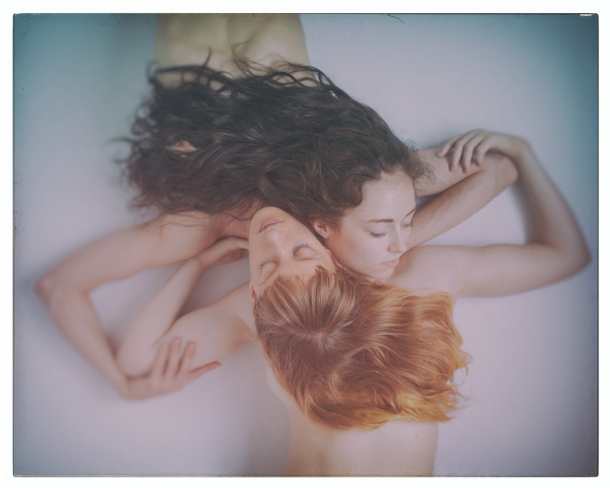
Photo: Mark Laubenheimer

Process: Khwab LP Album Art Design
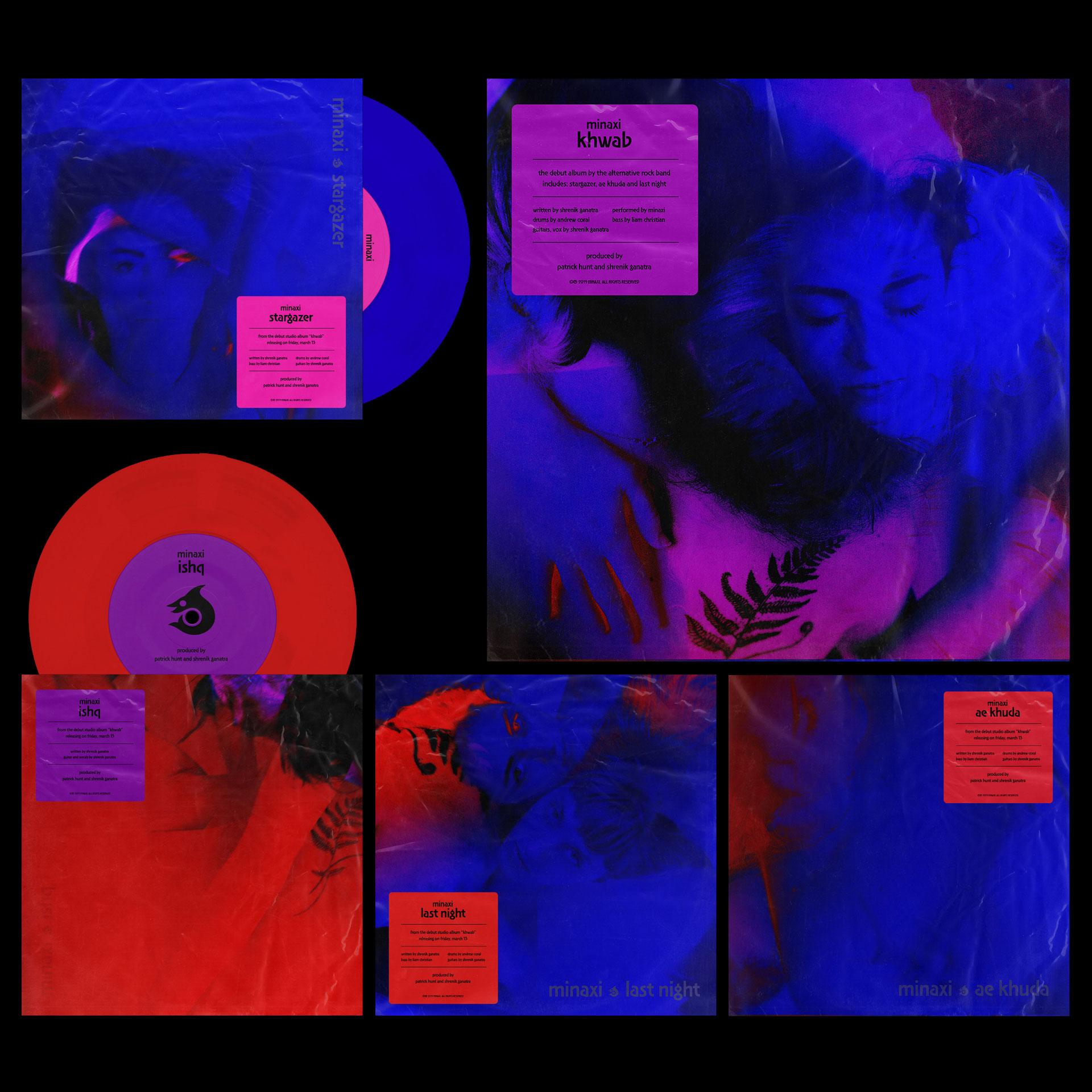
Khwab LP and 7″ Record Design
Can you give some insight into the process from start to finish for creating the music videos from the Khwab album?
I approach the music videos, especially for Minaxi’s music, as a series of visuals that evoke a certain emotion. I vividly remember dreams; just like there is no particular arc the visuals that I see in my dreams obey, our music videos don’t really have a set narrative. The music then forms the soundtrack to these sequences. It gives me a lot of freedom when conceptualizing the overarching emotion for a Minaxi video.

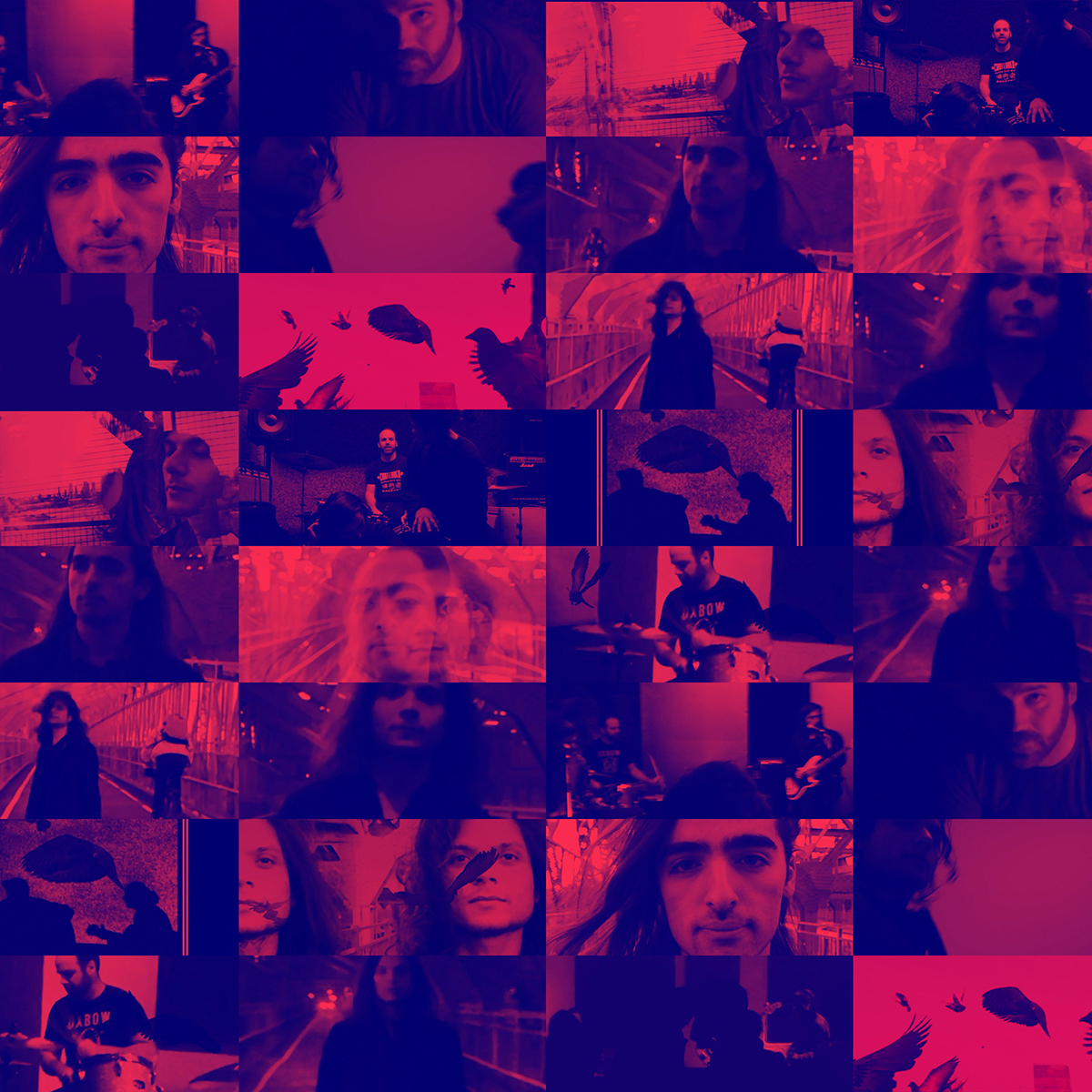
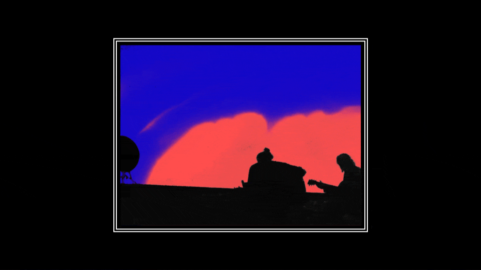
For instance, the idea behind the “Stargazer” music video was to “lose yourself in the music completely”. I saw this as the “high” you get when playing music with your bandmates. It’s like a psychedelic trip where you forget everything and you are carried to a space beyond reality. The psychedelic visuals, combined with Beardsley-esque silhouettes, is my representation of the same. Some of the process involved in creating the video is detailed here.
Similarly, the “Belladonna” music video is based on the following idea: “what does it mean for two people to be in love?”. There was no script at all. I conveyed to concept to my friend Mark who directed the video and to Becca and Laura, who beautifully graced the video and made it their own.
The band’s name “Minaxi” is a feminine name of Indian origin. Can you talk about the logotype and the subsequent brand you created for your band?
Yes! Minaxi (Me-naak-she) is derived from Sanskrit words mina (“fish”) and aksh (“eyes”). The name translates to a woman with beautiful fish-like eyes. This is where the logomark for the band originates from. Additionally, the symbolism references astrology, Chinese philosophy and Eastern spirituality (“the yin/ yang or the thought that seemingly opposite forces are actually one”).
I first sketched it out in my journal. Based on the sketch, I created several digital thumbnails before landing on the one that felt right. Moreover, I designed a custom typeface for the logotype, which was also used in our first few show posters. My friend and former Maryland Institute College of Art (MICA) classmate Ninad Kale designed the devanagari script for the same, highlighting the bilingual nature of Minaxi’s music.
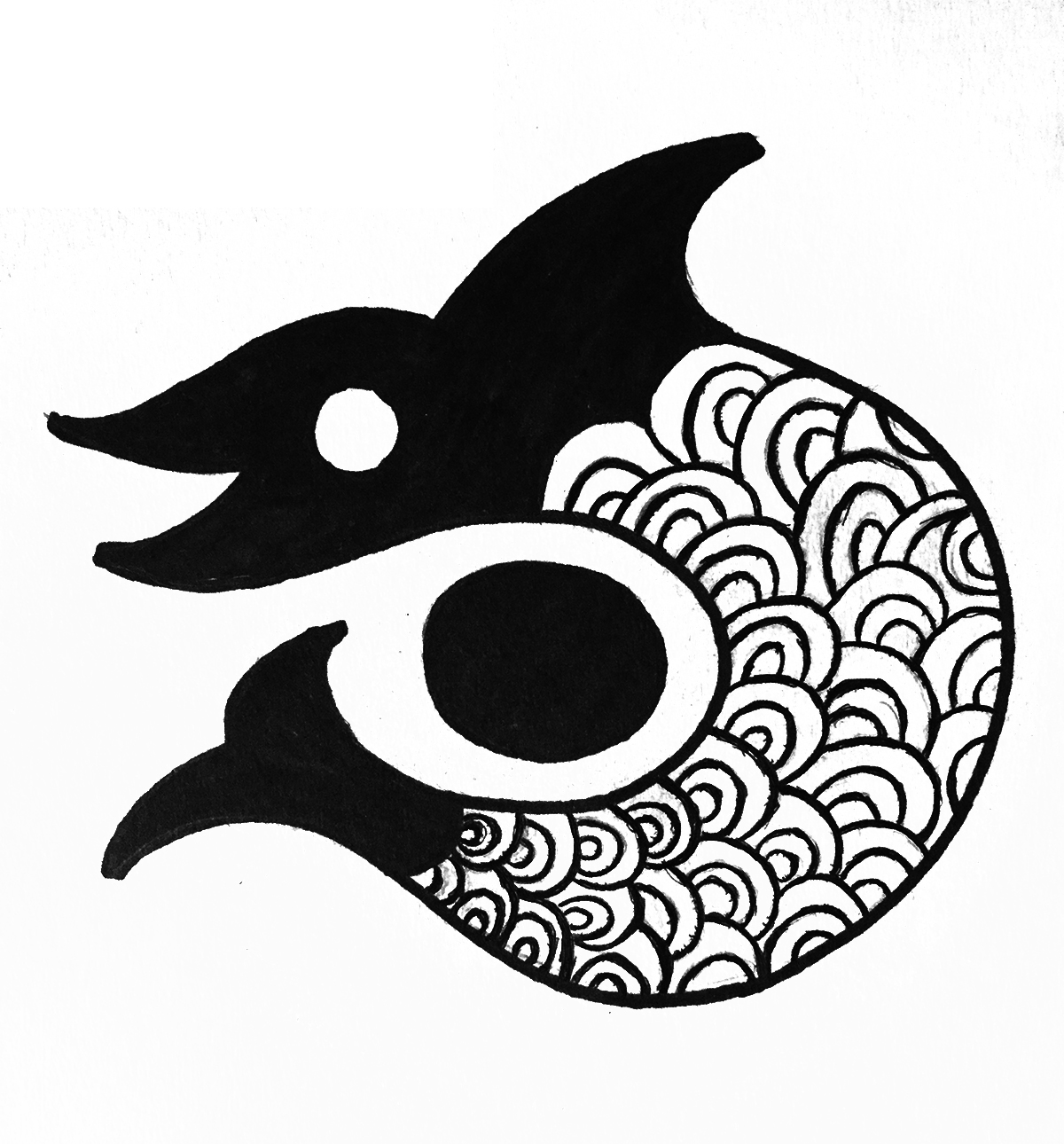
Original Sketch for the Minaxi Logomark
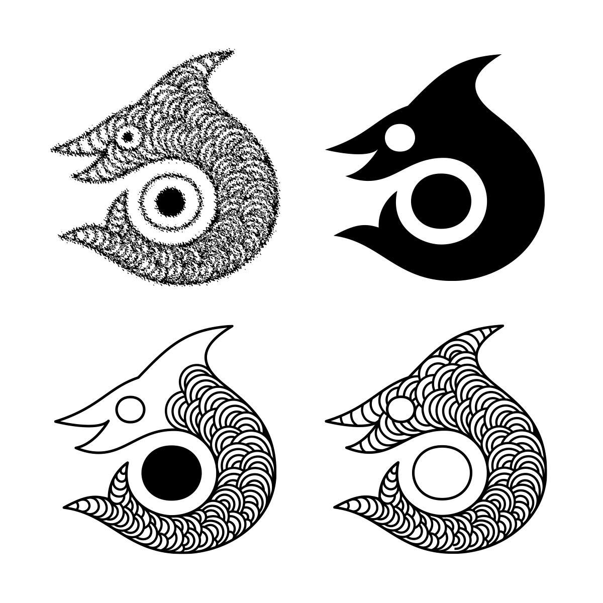
Thumbnails
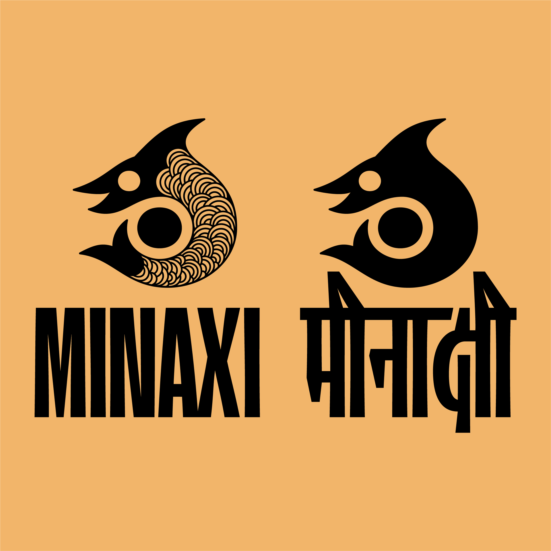
Minaxi’s Logo. Devanagari Script designed by Ninad Kale
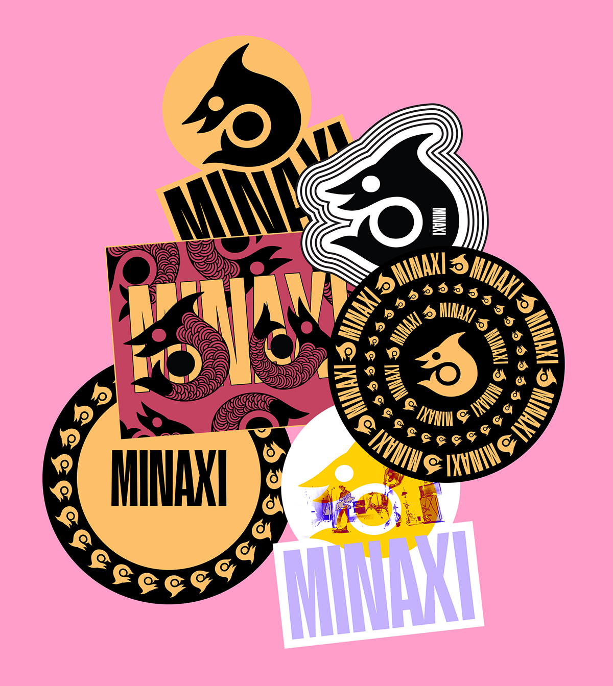
Stickers
Walk us through the process of creating the typeface for the band. Any tips for other designers looking to create their own typeface?
The primary typeface I designed for the band’s logotype is a condensed, display face. Since the band’s name is short and trisyllabic, a bold-condensed, almost “in-your-face” structure helped compliment the logomark. It also sits really nicely on large posters as well. From afar, it might appear as a generic typeface but when you actually take a closer look, there are nuances intrinsic to each character.
It also represents the sonic quality of the band—it takes some attention to realize the meticulous layering of the instrumentation for each of our tracks.
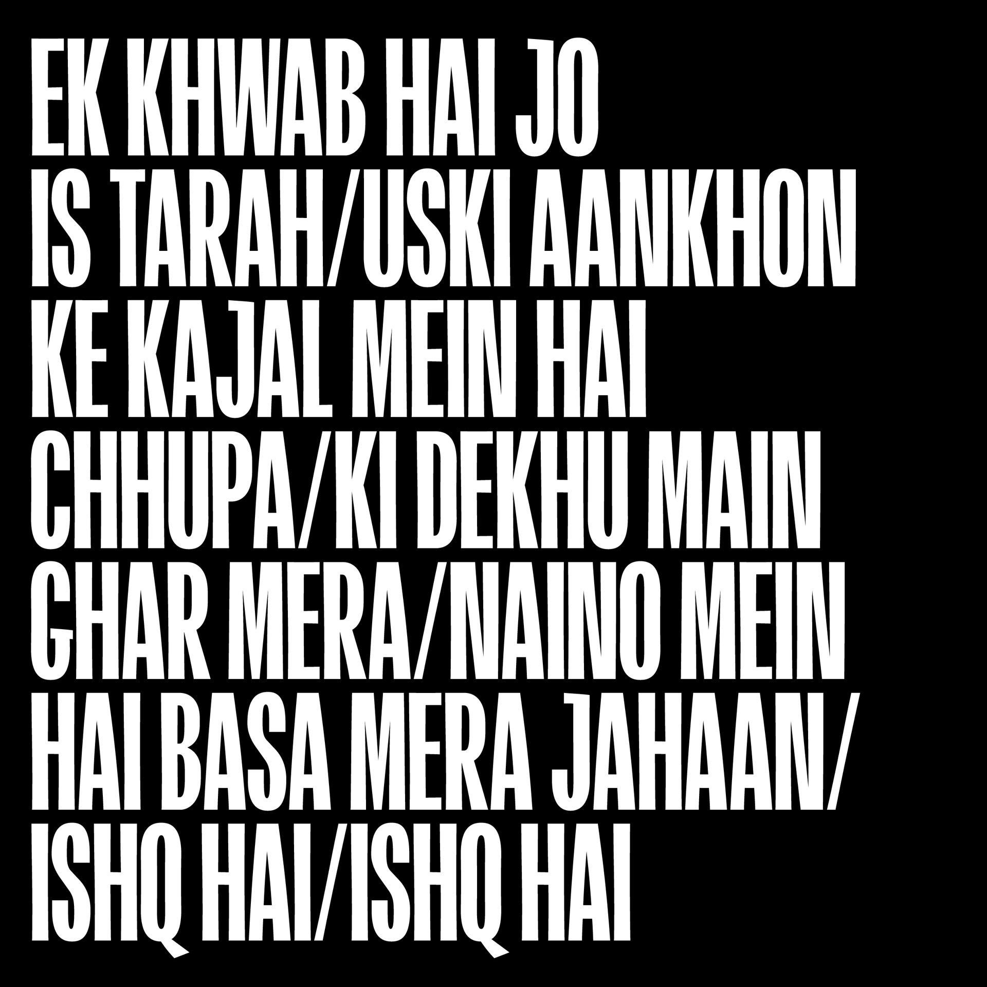
As a type designer, you have to have a solid understanding of the letterforms. It’s more about optics and less about mathematics, so referencing the letters at any point in history and tracing them on paper is a wonderful exercise. Additionally, patience is an asset when designing typefaces.
Can you offer some tips for other designers looking to create a cohesive campaign for a band including promotion on blogs and social media?
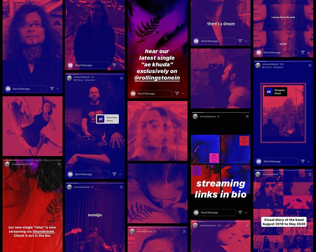
Understanding the life-cycle of the campaign helps in identifying the kind of assets a designer is required to create for a given record/artist. In a digital-driven world, the process just doesn’t stop at designing record sleeves and merchandise. The designer also needs to think about the visuals that’ll keep the audience engaged post-release and invite new listeners.
It’s the designer’s responsibility to help the band understand that designing a campaign is different from designing the band’s brand.
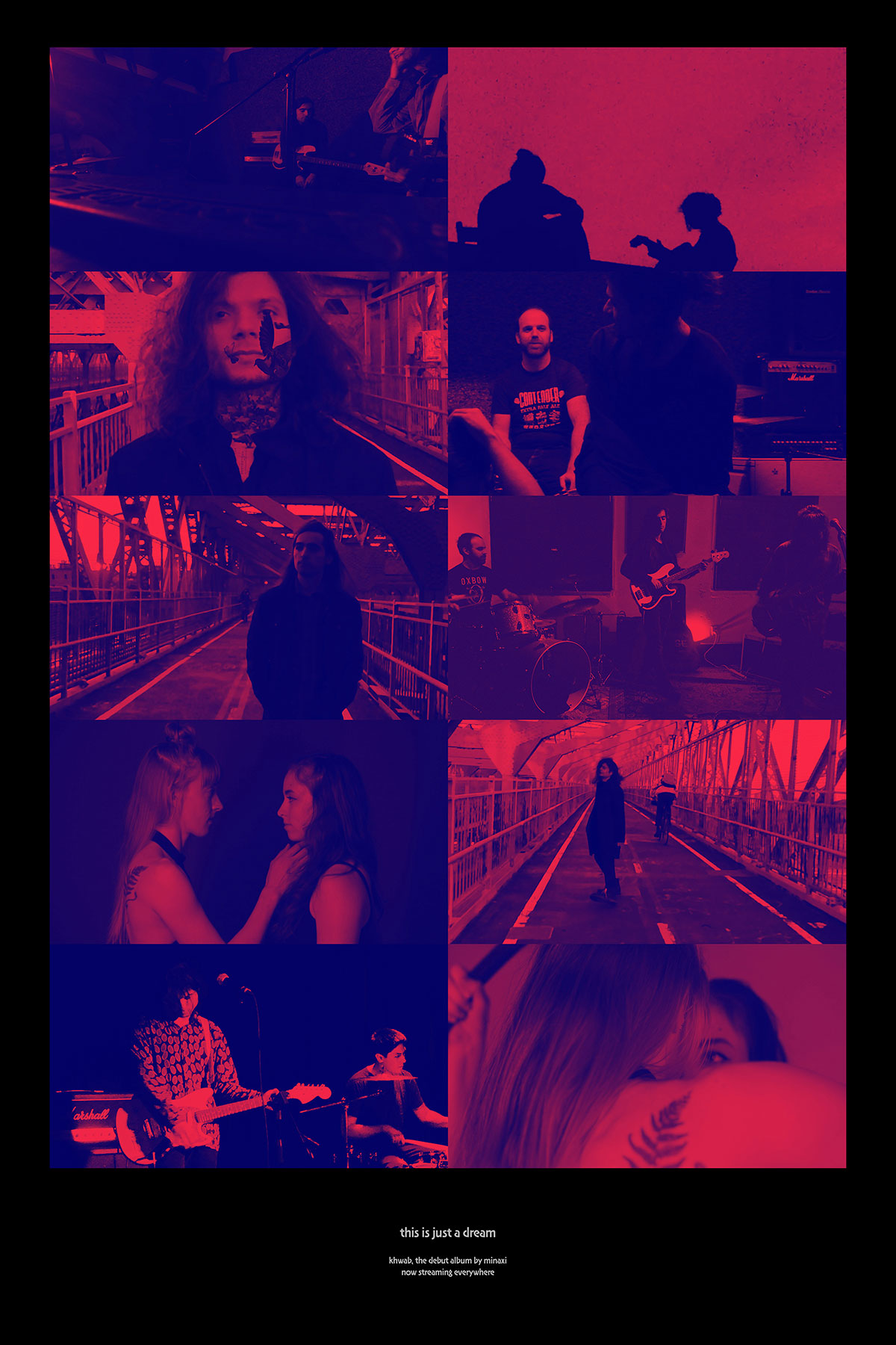
Minaxi Khwab Poster
A music-based campaign typically has more rollouts for a given timeframe than a brand; so you have to relay this early on and tailor the scope of work and pricing to the agreed-upon requirements.
The design for a band’s streaming channels opens up new design opportunities as well. You can also pitch designing the band’s Spotify, Apple Music, SoundCloud and YouTube graphics in addition to creating the assets for their Spotify/Apple pre-save/pre-add campaigns. For Minaxi, between Dec 2019 and now, I have created over 100 assets including social media posts (both static and kinetic), music videos, teasers, posters, merch, album art and several miscellaneous visuals.
You work as a designer, bandleader and full-time teacher at Shillington. How do you manage to juggle it all? Do you think it’s important for creatives to have side projects?
I have yet to meet a unidimensional creative person. I have a variety of interests; design and music are two avenues for me to express emotion. I don’t see one overpowering the other. If I didn’t have one or the other, I wouldn’t be who I am today. One advantage music has over design is that it helps me explore myself and evolve as a person (and consequently, as an artist) over time.
Teaching, for me, is a cultivated interest. I was a shy teenager lacking in the self-esteem department but over the last few years, I have been able to discover the side of me that is confident, likes sharing and being around people. In that sense, teaching is extremely rewarding. The short answer is that I’m comfortable doing all of that because I love it all. Also, I have a tight social circle which means that there are minimal distractions in my everyday life.
I believe that “side projects” are crucial to personal development. If you just go through life doing the one thing as demanded by your primary job and not pursue other interests, hobbies and/or skills, you are limiting yourself.
Surprise us!
In my tiny circle of friends, I am known for my home fries, eggs and avocado toast meal with some chai on the side. You can never go wrong with that!
Massive thanks to Shrenik for talking about his process for the branding and design for the Minaxi artwork. Head on over to his band’s Instagram to see what they are up to and follow their music on Spotify.
Meet the rest of our amazing Shillington teachers and team from around the world!
Posts you might like

One of the best things about graphic design is that it never stands still for a moment. But that does mean that keeping up with...
Are you a graphic designer who is finding themselves lacking skills, slow on one of the major graphic design programs or just...

The best graphic design books can take you on an exciting journey of the imagination, transport you to new creative worlds or...

At Shillington, our dedicated graphic design students are taught all about how to design for packaging—from FMCG (that’s fast...

https://www.youtube.com/watch?v=wZ_tffGtZMs New York graduate Simon Fréour worked as a software engineer in France for seven...

At Shillington, our graphic design course teaches students how to design campaigns for a brand, helping to spread its message....
Are you working with graphic designers day-to-day and finding yourself jealous of the work they're doing? You're certainly not...
Diversity in design is an important topic to us at Shillington and we aim to support and strengthen equity by cultivating...
Want to win some amazing prizes and stay in the loop with all things Shillington? Sign up to our newsletter to automatically go in the draw.