Herb Lubalin: An American Graphic Designer, Art Director & Typographer

Herb Lubalin (1918-1981)
Herb Lubalin was an American designer, best known for his extraordinary typography and art direction. In fact, most designers can recognise Lubalin from just one famous typeface—Avant Garde. How many design legends can say that?
In early days, Lubalin was not on track for a legendary design career. He was best known in high school for some highly erotic nude drawings. Scandalous!
He eventually found his way, and in 1939, Lubalin graduated from the prestigious Cooper Union in Manhattan. But despite his degree and innate talents, he still struggled to find work. He bounced around between a handful of advertising agencies in New York, but eventually settled at Sudler & Hennessey, where he remained for twenty years. In this role he won his first New York Art Directors Club Gold Medal.
“You can do a good ad without good typography, but you can’t do a great ad without good typography.”
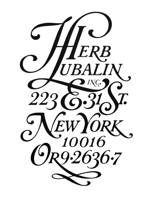
In 1964, Lubalin stepped out on his own to start his own firm—Herb Lubalin, Inc. As the studio’s director, he now had the creative license to work on a variety of projects from identities to packaging to posters to magazine design.

Lubalin is especially known for his contributions to Ralph Ginzburg’s magazines—Eros, Fact and Avant Garde. Eros was a controversial magazine that went under quickly after an obscenity. Fact was created in response as a boundary-pushing magazine that created space for controversial writers who couldn’t find channels in the mainstream media. As a smart choice, instead of matching the theme’s shocking content, Lubalin created a minimal and simple palette with dynamic typography and gorgeous illustrations. To keep within budget, Lubalin printed on cheap stock, limited himself to only one or two typefaces and paid only a single artist to do all the illustrations at a bulk rate. Talk about frugality!
The crown jewel of Lubalin’s career, the Avant Garde typeface, was developed in response to Lubalin’s letterform solution for the eponymous magazine. At that time, the tight lettering was beautifully futuristic and unlike anything else in the magazine world.
Unfortunately, not all designers used Avant Garde responsibly. In fact, it almost became a joke during the 1970s because of excessive and illogical use. Fortunately, his signature style is still much-adored and has seen a revival in the design industry during recent years.
“Typography is a servant-the servant of thought and language to which it gives visible existence.”

I especially love when great designers give back and share their passion with future generations. Later in his career, Lubalin returned to Cooper Union in New York as a visiting professor and guest lectured at several other universities.
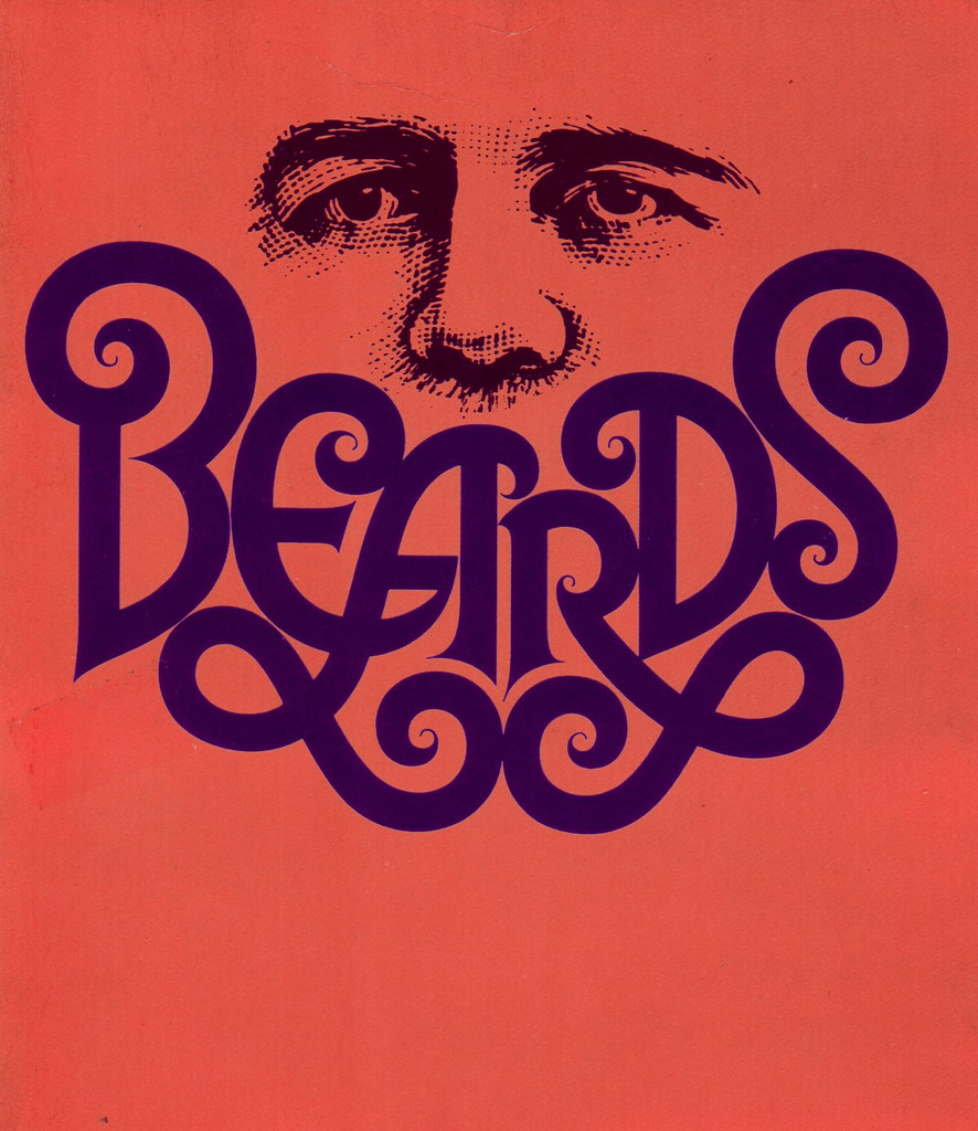
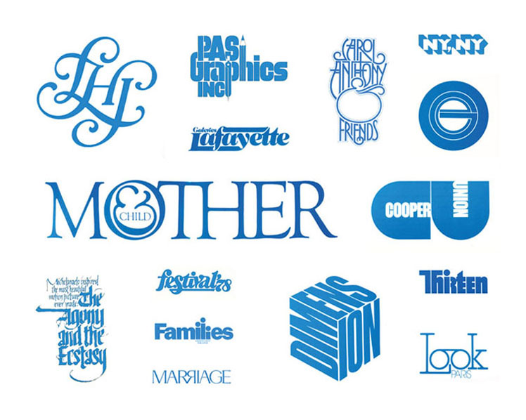
Lubalin is considered one of the most successful art directors of the 20th century, and it’s incredible how his legacy lives on. Who wouldn’t swoon for that gorgeous lettering?
Want to learn more about Herb Lubalin? Read 10 Things You Didn’t Know about Herb Lubalin.
Who’s up next week for Throwback Thursday? A woman who designed arguably the most recognisable logo in the world.
Posts you might like

One of the best things about graphic design is that it never stands still for a moment. But that does mean that keeping up with...

Exposing yourself to examples of good graphic design is a healthy practice no matter who you are. Maybe you’re a student...
In graphic design, quite a few decisions happen behind the scenes that clients may not grasp the importance of, yet have a huge...

Looking to make a creative career change at 40? There’s no time like now. It may seem like a daunting decision, but we’re...

Making a career change in your 30s can seem daunting, like really daunting. But we’re here to tell you, it’s not. As a...

Are you seeking a holistic introduction to the design industry, theory of practices, more exploratory projects for...

Are you based in the West Coast and looking to study graphic design? We’ve compiled a list of the top graphic design schools...
Ever thought about studying graphic design abroad in London? Well you can do that with Shillington’s graphic design course....
Want to win some amazing prizes and stay in the loop with all things Shillington? Sign up to our newsletter to automatically go in the draw.