Interview with Anna Fransson, Creative Lead at Aginic
Anna Fransson is a self-described brand guardian, culture enthusiast and Star Trek nerd working as the Creative Lead at Aginic, a data analytics company based in Brisbane. Starting out with the company early in their journey, Anna was the first designer to join the Aginic team and has been part of the company’s story from the beginning. Aginic boasts agile team structures and adaptive, versatile workshopping approaches. As a result, Anna and her team are able to confidently lead their clients through the design process—from research to testing and back again—to always arrive at the best quality solutions to meet their clients needs.
Anna recently delivered a remote lecture to the Shillington Brisbane campus on the subject of Designing for Data. We caught up with her following her talk to chat more about the insights she shared and learn more about her approach to problem solving and team work in the design process and the unexpected lessons Star Trek might have to offer for your design process.
Can you tell us a little bit about Agnic and how you got started with the company?
Aginic was founded in 2014 by a couple of young data analysts who saw a niche for a company that could provide streamlined data analytics services in Brisbane.
At the heart of the company is a love for independent thought and innovation and the belief that we can use that to help others.
When the company started, it was small and very lean. Aginic only had a few employees—all data analysts—and they contracted me as a freelance designer to do a logo and website. They quickly discovered that they needed me full time, not just for internal work, but also to help on client work. So the design team has been an integral part of Aginic basically since the beginning.
When you started at Aginic four and a half years ago, the company was much smaller than it is today. Can you share some of your highlights from the journey so far?
What I have enjoyed the most is growing our design team! It’s crazy that it started with just me and now there are five more designers who have joined our design studio. Another thing that has been so awesome is being a part of creating and evolving Aginic’s core brand since the beginning. Other highlights include cultural initiatives and nurturing our team connectedness. I believe that people need to feel a sense of belonging and to be able to be themselves at work. Life is far too short for anything less.
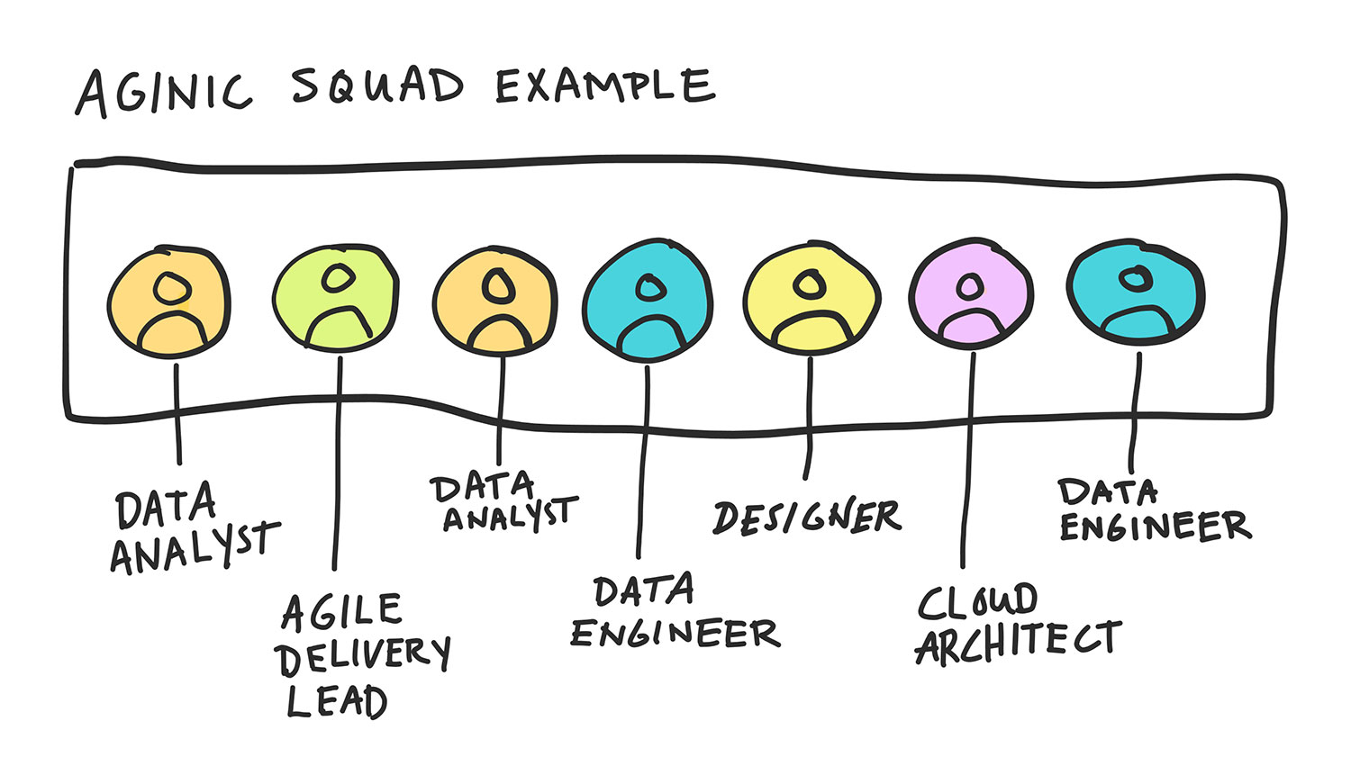
We loved your Designing for Data lecture for the Shillington students. You shared some insight into Aginic’s team structure, wherein the larger team is broken into small squads with a project focus. Can you tell us about this approach to team structure and how it works? What are some of the benefits?
Aginic started using squads in 2018. We were inspired by Spotify’s organisational structure.
Within this framework we form multi-skilled core teams, called squads, with the freedom and capacity to run agile projects almost independently.
Each squad has six to eight members and is composed of people with very different skill sets. That means any squad has the capability to see projects through from start to finish.
One amazing benefit that I have seen is that squad teams deepen personal connections beyond the standard friendly small-talk. As we work closely on project after project, we get to know each other better every day. In my squad, we are not scared of sharing personal vulnerabilities and awkward, silly moments. This is super valuable in any team. It allows people to be honest and open and permits crazy ideas to emerge! This is the sweet spot where a lot of magic can happen and how creative and valuable new initiatives spark to life!
Within the context of these squads, each team includes at least one designer—and designers also move between the squads. What does this inter-squad mobility within the design team bring to the day-to-day design process at Aginic?
Some inter-squad mobility is needed to give squads additional resources if needed. The design studio has so many different services and each designer has different strengths. It means that if a job calls for some niche skills, we have the flexibility to put the best person on the job. If you did this too much, you’d lose the cohesiveness of the squad, so there is a tradeoff. A small amount of mobility seems to work best. We also do a mix of internal work, which we manage in our design studio team. What makes this balance exciting is how every day is usually very different. There is always an opportunity to learn something new and grow our skills.
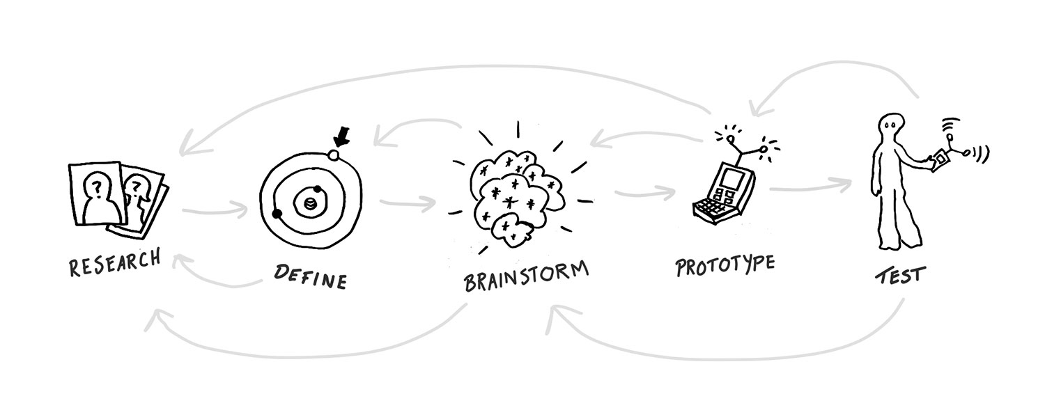
In your lecture you offer some advice on keeping the design process iterative and flexible. Can you walk us through the example you used for this process?
The design thinking process can be broken down into 5 sequential steps: research, define, brainstorm, prototype and test.
In my talk, I presented these as a sort of timeline. The testing step at the end is where you really find out how well your solution works and if there are any weaknesses. Depending on what the testing shows, you can go back in time to any of the previous four steps and start re-working your solution. Follow the steps sequentially again and hopefully your new prototype will do better in testing. It’s a good idea to document each of the steps, because this can make it easier if you need to go back and revisit them.
Also, you can jump back in time from any point, even before you reach the testing phase. Sometimes problems become clear before testing, so feel free to jump straight back to the step where things went wrong and try again from there.
The great thing about being a time-traveller is you can keep going back and changing the past until you end up in a future you like.
From your perspective in facilitating workshops for client projects, can you give us an overview of Aginic’s project workshop process? What would you say are some of the strengths of this approach?
Aginic is a human-centred company which means that we focus on understanding the end-users, so that we can provide them with good solutions. We use design thinking mixed with agile and lean methods for our projects. We use design thinking to quickly learn about users and design solutions that last. Our designers customise the design journey to suit a project’s needs.
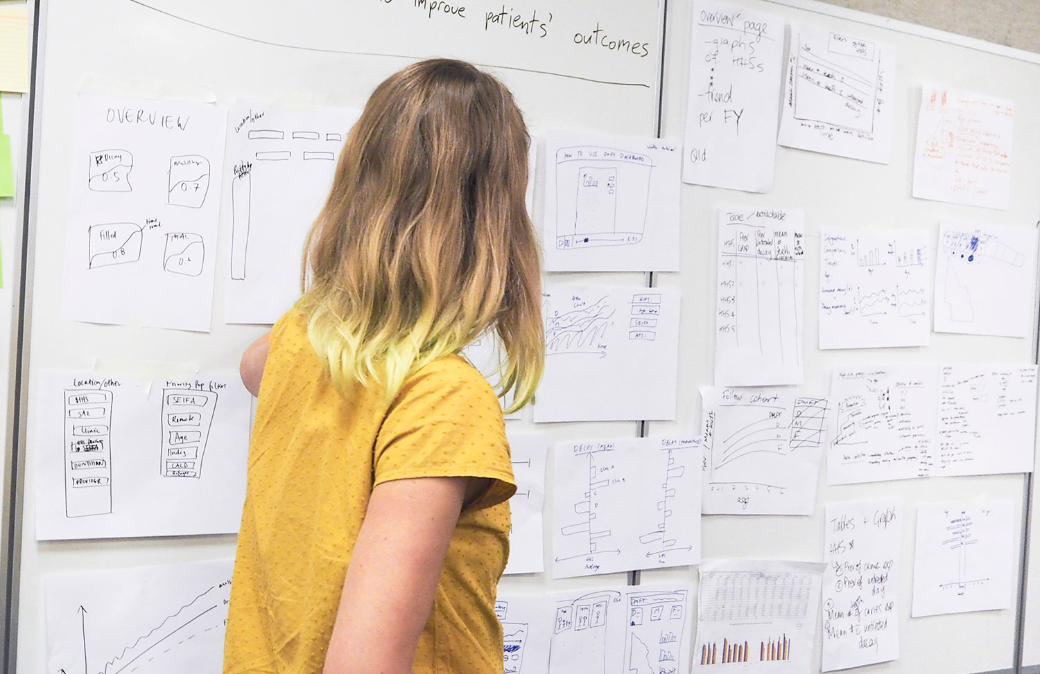
One of our most common workshops is what we call BI Design Workshop. It is a great way to work out how to proceed with a data visualisation solution before actually building it.
It is facilitated face-to-face in a half-day workshop or in two separate online workshops. The workshop is very collaborative and facilitated by designers.
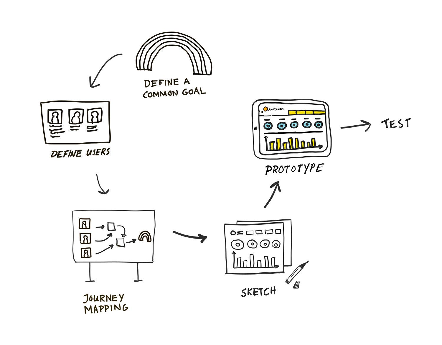 Data analysts, technical experts and target users all participate in this fast-paced workshop, in order to come up with some great ideas to move forward with in a project. During the session, we agree on a common goal, define user groups, make a user journey map and sketch ideas for future solutions. It’s a rapid way to end up with a detailed visual storyboard of a future solution.
Our designers use the sketched storyboard from the workshop as a foundation for creating a prototype for testing. We create high-fidelity interactive prototypes in a tool called Figma. These are great for testing with end-users to get important feedback and make sure we are on the right track before building the real thing. It’s an iterative process, and often we refine and add to the prototype throughout the project.
The biggest advantage of using design thinking workshops is that they give us a better understanding of the problem we are solving, and some great insights into how to tackle it.
Can you tell us a little bit more about Empathy Mapping within the context of UX design and Journey Mapping?
An empathy map is a common design thinking tool used to visualise what we know about a particular type of user. The empathy map encourages you to imagine yourself in someone else’s shoes and put words on what challenges, thoughts and feelings they might have in a specific situation or focus area. Often, the most important insights come from understanding the pain points (frustrations and challenges) a user faces.
If you get a grip on the biggest problems for a user, that can trigger ideas for awesome solutions that can improve an experience. Empathy maps is often a good starting point in a project, to help clients understand and empathise with user needs and situations.
After learning the fundamentals about selected users, we create a current state user journey map to figure out where we can improve their experiences the most.
Do you have any fun advice for keeping the discussions within a workshop on task and goal focused?
For our initial design workshops with a new client, we usually aim to keep questions high-level and broad. We try to learn as much as we can about the client, users and their long term goals. If we go too deep, too early, there is risk that we won’t see the full picture. Think of it like a camera with a zoom lens; start out in landscape mode and zoom in bit by bit after you understand the full view of the picture.
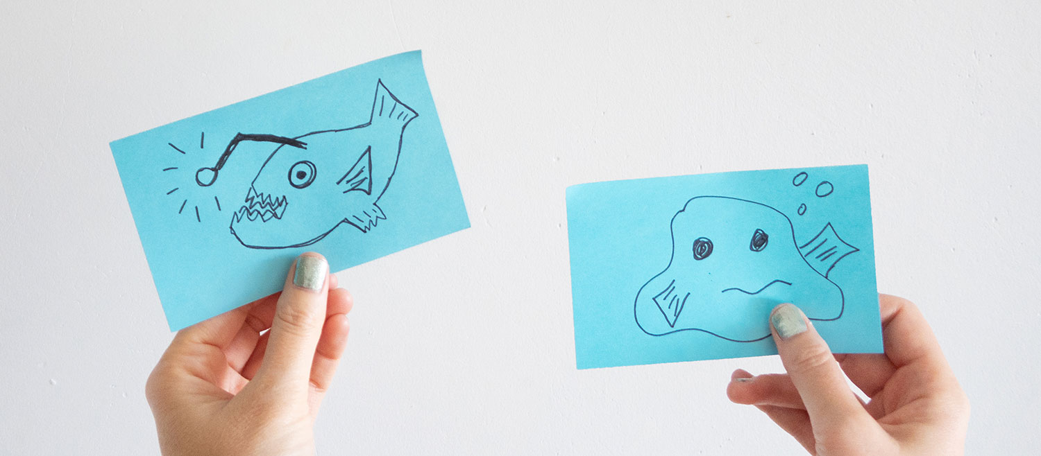
A fun and useful tip for when topics go too deep, is an exercise called “Deep sea creature”. It’s a great tool I learnt from one of our agile coaching experts at Aginic.
In the beginning of a workshop, everyone gets a blue post-it note and they get to draw a deep sea creature of their choice. You then instruct the participants of the rules: whenever a topic goes too deep, you hold up your deep sea creature for everyone to see. It’s a great way to neutralise any discussion or monologue that has gone a bit too far off the original intent of the workshop.
Do you have any unexpected or essential tools of the trade? What are the absolute necessities for your creative practice?
We have a few essential tools that we use more or less every day. Here is a list of our favourite tools, organised from most essential to nice-to-have:
Essential design tools:
- Figma (freemium)
- Adobe Creative Cloud (expensive as heck, but necessary)
- Digital whiteboard:
- Miro (freemium)
- Mural (freemium)
- Google Jamboard (free)
Other awesome tools and resources:
- Adobe Capture (free)—photograph your drawings and easily make vector versions
- Adobe Draw (free)—great app for drawing tablets
- Blobmaker app (free)—create and download quick svg shapes on the go
- Blush (free)—beautiful illustrations for everyone
What have been one or two of your favourite recent projects? Why?
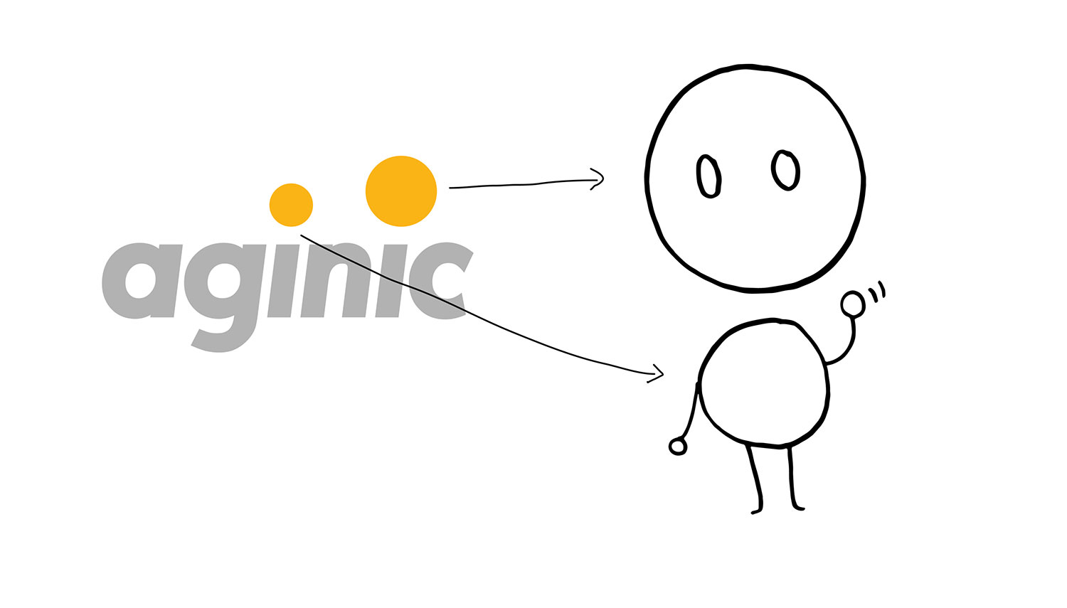
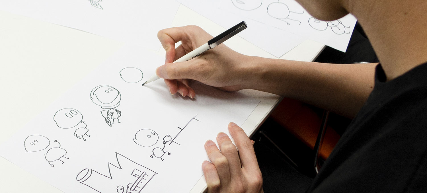
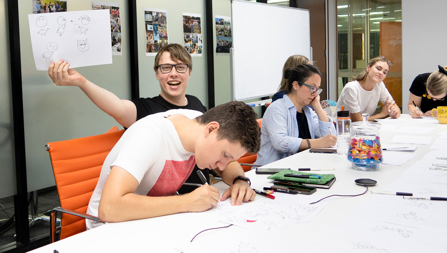
Aginicons
One of my super-most favourite projects was an internal initiative at Aginic. Aginic team members communicate in a way that reflects our working style: rapid, approachable, friendly and fun! We regularly communicate ideas using quick sketches and schematic drawings. In this project we wondered if we could create an illustration style that everyone could use and which would complement our brand. The goal was to create an awesome harmony between our public brand, our rapid work approach and at the same time energise our internal culture. What came out of this was a playful illustration style, with a heap of figures including our own Aginic mascot, that can easily be replicated and evolved by all members in our team.
It was surprising and exciting to see how our team reacted to the first drafts of the drawings! It quickly turned into a flood of individual contributions, often with comical themes! Since the middle of last year, this illustration style and mascot has stayed and evolved with our brand as well as our team culture. The awesome thing about it is the ease of how it was embraced and used. I think that is key for any cultural initiatives; you can’t force something on a group, it has to happen in an organic way.
Design has a big role in nurturing a positive culture within a company and also making sure the core brand matches that culture.
Companies that don’t think about this can lose their identity. I am passionate about using design to help us feel connected and inspired in our purpose.
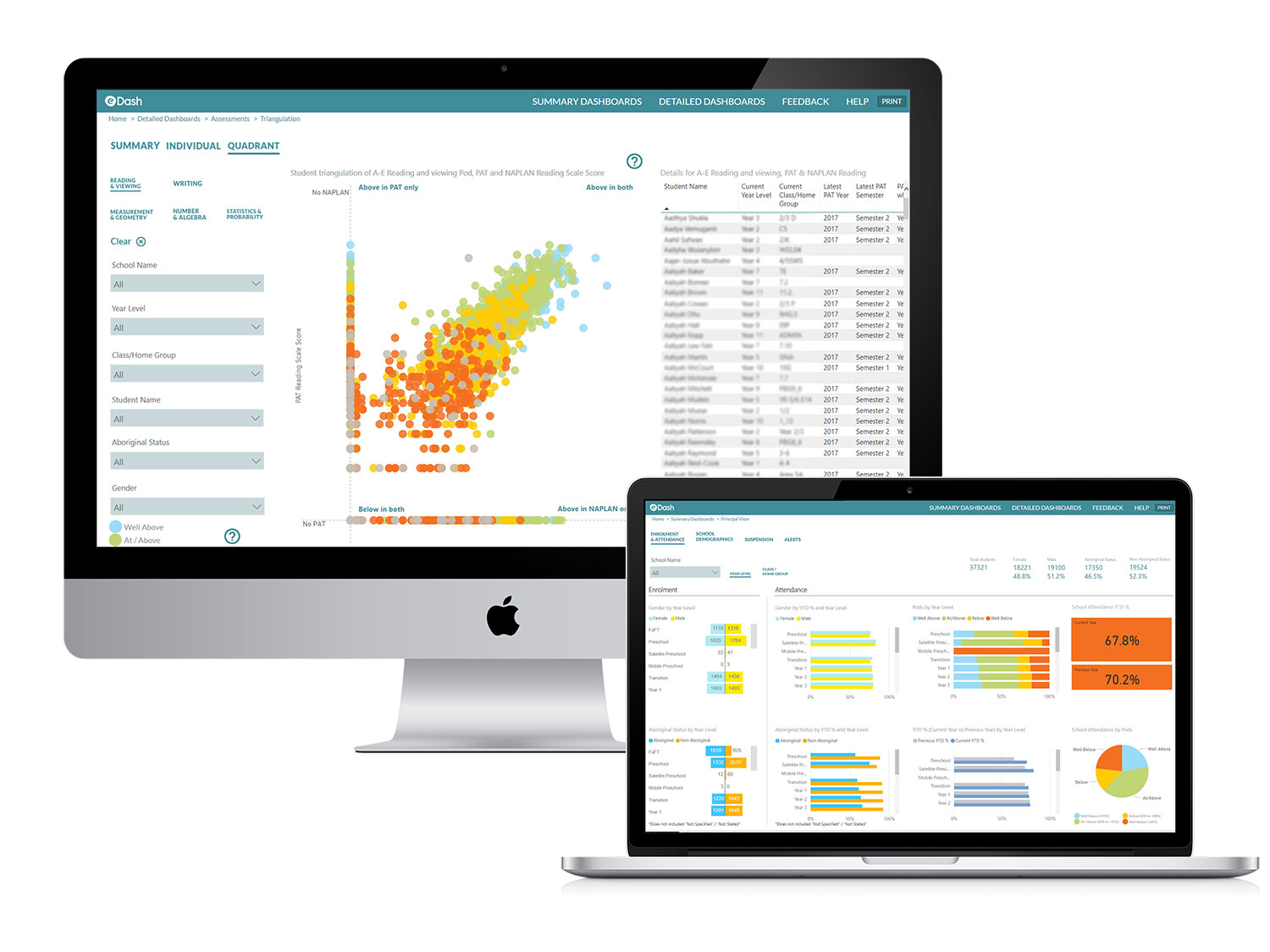
eDash
Another project I’m very happy to have been part of is a BI project which centred around creating a data visualisation portal for the Northern Territory Education Department. The portal is called “eDash” and it helps teachers gain a holistic view of their students. Teachers now have access to information that they previously could not retrieve related to detailed student performance and risk factors. It means that teachers can provide a higher level of care for their students. During the project, we worked closely with the NT Education Department team to create an easy-to-understand and use web portal with important student data that helps inform teachers on a holistic and individual student level.
The whole team working on this project was awesome and it was a huge success. It feels great to be part of improving education in remote communities.
Do you have any advice for students and recent design graduates who are currently looking at securing their first job and getting a foothold in the design industry?
One of the most important things is this: be yourself! Show who you are and what you are about. That includes your personal interests and little quirks.
Staying true to yourself and being open minded will open doors to new opportunities. Another big thing is that attitude is more valuable than skills.
You don’t need to know everything before you start a new job, you just need to show you are keen to learn and grow.
At Aginic, we look for people that will be a good fit in our team culture. You could say we look for people that are happy to join our inventive crew and jump in a spaceship to discover new worlds and learn lots of exciting things!
Your lecture was brilliantly peppered with several design problems explained through Star Trek references. What is it about this universe that captures your imagination? And have these topics and interests influenced your creative practice and approach to design in any way?
Growing up, especially during my teenage years, my brother and I used to watch a lot of sci-fi movies and shows together. Star Trek, The Next Generation was our favourite! While Captain Jean Luc Picard leads his crew throughout space to seek out new planets and lifeforms, the subplots in each episode explore deep questions about life and what it means to be human. What fascinates and inspires me the most is the optimistic ideology behind this futuristic universe. They take responsibility for the future they are building and what they leave behind for future generations. Each member of the crew constantly aspires to better themselves and they support each other in this. The show teaches us about empathy, inclusion and acceptance of different cultures and that technology should be used to free people instead of enslave them. Embrace this in your designs.
There is still so much we humans don’t know about the universe and that makes it so fascinating and full of possibilities.
Star Trek is also a sort of safe, happy place for me when the real world lets me down. It’s good therapy, watching Captain Jean-Luc Picard and his nemesis Q debating the purpose of humanity.
And to finish off, which designers or artists are you loving at the moment?
I have recently been getting into writing creatively, especially poetry. A big influencer at the moment is Darby Hudson, a refreshingly honest Melbourne poet and artist. Another amazing writer I need to mention is Margaret Atwood. She is a Canadian writer with a feminist and environmental focus in her novels. I have read all of her books! There is a great Japanese illustrator named Yu Nagaba. When I visited Tokyo last year, I spent a lot of my time in books shops and stumbled upon his awesome work. I love the way that he can draw emotions and characters with a few simple strokes! Finally, I have to mention my favourite photographer, whose work I have revisited this year: Anton Corbijn. His style is grainy, gritty and beautiful.
Huge thanks for Anna for the interview! Make sure to keep up with her work at Aginic through their website and follow them on Instagram.
Feeling inspired and considering a career in design? Find out more about kickstarting your creative career at Shillington! Become a designer and study with in New York, London, Manchester, Sydney, Melbourne or Brisbane.
Posts you might like
Are you a graphic designer who is finding themselves lacking skills, slow on one of the major graphic design programs or just...

https://www.youtube.com/watch?v=wZ_tffGtZMs New York graduate Simon Fréour worked as a software engineer in France for seven...
Are you working with graphic designers day-to-day and finding yourself jealous of the work they're doing? You're certainly not...
Diversity in design is an important topic to us at Shillington and we aim to support and strengthen equity by cultivating...
Last year Shillington launched, for the first time, our Diversity in Design Full Scholarship opportunities—in New York City,...
Diversity in design is an important topic to us at Shillington and we aim to support and strengthen equity by cultivating...
Last year Shillington launched, for the first time, our Diversity in Design Full Scholarship opportunities—in New York City,...
Diversity in design is an important topic to us at Shillington and we aim to support and strengthen equity by cultivating...
Want to win some amazing prizes and stay in the loop with all things Shillington? Sign up to our newsletter to automatically go in the draw.