What is Kerning? Here’s What You Need to Know
Mastering kerning is important if you want to pursue a career in graphic design. Putting the finishing touches on a graphic design project calls for a keen eye. But you already know this, because perfectionism is just a part of the job! You look at every nook and cranny of a project before you can consider it complete. While many people might not understand this attention to detail, this is exactly the kind of eye a designer needs—there is no such thing as “less than perfect” in this industry!
Nothing goes unnoticed, even the spacing between individual pairs of letters. Yes, this could be considered perfectionism, but a good designer knows how important kerning is in typography. Mastering kerning is crucial.
Although many clients might not understand the nuances of kerning, they would be able to identify poorly kerned typography. If you don’t know the ins and outs of kerning, you risk losing out on potential career opportunities after design school. In our industry, a graphic designer’s standard of creativity will influence the level of opportunities that come their way.
What Is Kerning? A Definition
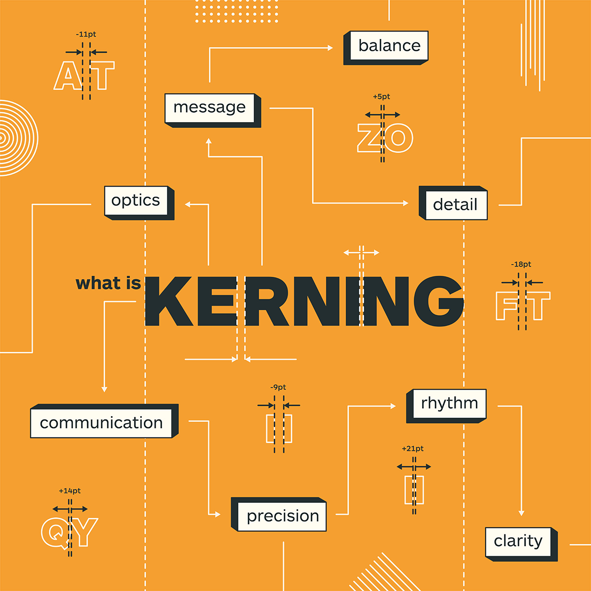
Kerning is the spacing between a pair of letters.
Whenever you are working on a project, you want to aim for an even typographic color (in other words: having no odd or uneven spacing between letters). In some instances (such as large headlines and blocks of copy), you should spend a bit more time kerning the type, while in other instances (such as large amounts of body copy) the default kerning settings, with some minor tweaks, can suffice. Even so, you might not always have to alter the kerning, but it’s good practice to ensure that you are being mindful of every aspect (big or small) of every design you do.
But kerning is also more than just spacing—it’s also a strategic tool that increases the clarity of your message. Readers in the English-speaking world, for example, gravitate to Helvetica as their choice of font. This is why Helvetica is the most widely used font in the world (although many designers consider it to be the sweatpants of the font world).
It’s easy to read and the simplicity of the text allows it to be transferable to everything from public signs to t-shirt designs. But despite its widespread use and popularity, it’s often too plain in a lot of contexts. Its owner, Monotype, recently gave Helvetica a facelift (the updated version is called Helvetica Now) so that designers don’t have to constantly alter the type when it’s scaled up or down.
The relationship between letters is almost a scientific matter to a graphic designer. A good designer realizes that it only takes a slight adjustment in spacing to render a design as either awkward or perfect. These letters aren’t limited to the computer monitor that’s sitting before you, either.
It’s important to examine your typography in the context where the design will live—on a 100% scale printout of your design or on the phone screen. Seeing how the type will look in context can and will affect your kerning decisions.
Kerning Then and Now: Examples from the Ancient World
To get a better look at kerning today, let’s go back a few centuries. This history lesson is as much of an artistic exploration as it is an exemplifier of modern kerning. In ancient Mesopotamia, Cuneiform, which is now the oldest written language, was dried on clay tablets. During this time, language was used as an accounting system. Everything under a monarchy’s rule was preserved by highly trained scribes.
What the scribes of this era needed were clear slates. More importantly, they needed to pre-inscribe lines or margins that organized these slates for writing. These lines and sections, though difficult to see among the actual writing, allowed the scribe to imprint ideas without having the figures sway to the left or right. The Cuneiform text instead remained in legible sequences that readers can follow.
The purpose of letters and words has evolved over the centuries, but their intentions have always been the same. In ancient writing, kerning allowed a scribe to record important messages legibly and so that they could be preserved indefinitely. Today, kerning also supports the legibility of a message, but it also supports the overall visual appearance of a design. If the kerning is off-putting to a reader, they’re likely to walk away hating the design without paying any attention to its intended purpose.
The Foundation of Graphic Design and Letter Kerning
There are tools, common practices and theories to be applied when kerning. The basic philosophy behind “space adjustment” is communication. As a rule of thumb, no matter what you kern, adjust, or resize, your objective is to speak with clarity. Graphic designers must not only practice what they find visually appealing but must understand what pleases their targeted audience. Closing wide gaps or opening tight spaces is done as an effort to help readers understand a message. As Alan Barba, one of our New York teachers, says:
Kerning is all about rhythm. If letters are not kerned correctly, it can put off the reader and disrupt the message.
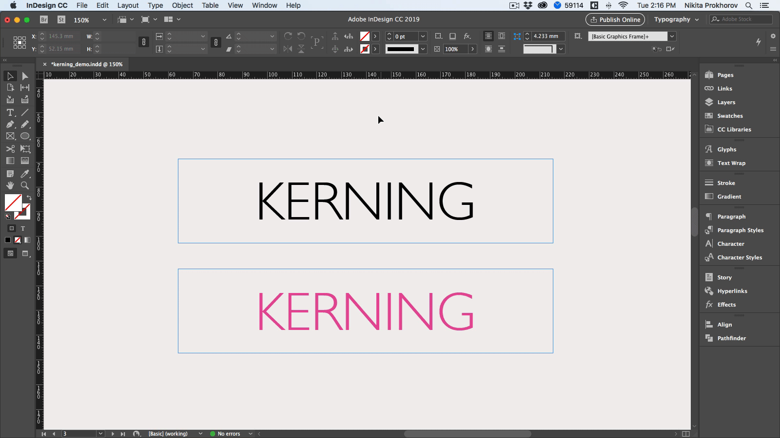
Communication is a vital part of what we do as graphic designers, and kerning plays a key role in that communication. When you don’t pay attention to the letters and space between them, it can have unexpected and undesirable outcomes (seriously, just look at these examples).
When a designer is in the midst of creating something, they to make a choice to either move an element here or there—a very minute choice. However, all those minute choices add up to make your type very easy to read and understand. It’s only when you understand the power that you have through those (seemingly minor) decisions you make that you can create a seamless process.
Limiting your kerning definition as only spacing left and right is, therefore, a nearsighted viewpoint. The relative positioning of an entire design piece is taken into consideration as we work. This is why it helps to know about the elements that provide us with our core decisions.
The Optical Illusion of Kerning
Look at the spacing and positioning of your letters as if they were an optical illusion.
As you kern, you may begin to realize that the principles that worked from a prior project simply won’t have the same leverage within a current design piece. This has to do with the factor of communication that exists within each design that you create. Every design you make should be unique and that is why letter kerning is a creative art.
It’s important to understand the consistent rules of kerning, but it’s also important that you take this knowledge and manipulate what you know to apply it to a particular design. Approaching each kerning scenario as if it were an optical illusion will enable you to pay greater attention to what’s necessary as opposed to what might work based on set rules. Consider this principle as inline with the old adage, “Things are not always what they seem.” Adjust accordingly.
Ideal Places Within Your Text for Kerning Typography
Let’s take a closer look at some of the ideal places to use letter kerning in:
Headline: The headline of a design (digital or printed) is typically its focal point. You can influence a person’s opinion about your entire company by what they see first when visiting your website. You can also manipulate their emotional connection to your brand—like creating an eerie sensation during October or capturing the feeling of festivities for your seasonal products in winter. The colors and fonts are important in and of themselves, but spacing also matters.
Logos: Logos have to say a lot with very little space, time, and few letters. If you adjust the kerning between one pair of letters, you will have to adjust the others, similar to a domino effect – and do not rely on default software settings.
Business Cards: Business professionals are always looking for a competitive edge. Some will even boast about the quality of their business cards as opposed to others’. Expanding on the design features of these “small windows of opportunity” can be done by looking closer to the letters being used.
You’re in control of the balance, hierarchy, contrast and alignment. Due to the limited amount of copy and messaging on the business cards, the typography might be scrutinized even more closely.
Font Changes: The font sizes that are set between 10 and 12 aren’t likely to benefit from vast adjustments, but expect to do more work as your text gets larger. Most fonts are developed for the common typing sizes that we use. And while you might find a need to put a legal disclaimer or logotype into an 7 or 8-pt sized font, the default settings within the font will still work. You just may need to tweak them a bit.
The Three Types of Kerning
In addition to examples where you could use kerning in everyday designs, there are also three different types of kerning you’ll come across:
Metrics kerning: This type of kerning uses kern pairs, which contains information about the spacing of different pairs of letters. Examples include To, Tr, LA, We, Ya, etc. These are included with most fonts and certain platforms use metrics kerning default so that these pairs of letters are automatically kerned so you don’t have to spend any additional energy kerning when you type or import a text. Metrics work best for body copy since it’s typically looser.
Optical kerning: This adjusts the spacing between adjacent characters in accordance with their particular shapes. Some design software provide this as an alternative to their default metrics option. Optical kerning is ideal for situations that call for tighter fonts (like headlines).
Manual kerning: This type of kerning is exactly what you’d assume based on its name—it’s when you kern type based on the specific requirements of whatever project you’re working on. Any time that you can’t find the right setting within your software, you can enter the dimensions, spacings and shapes to your exact preference.
There is one obstacle to be aware of with this choice, though: it will take more time to achieve an end result because you must enter each detail as if working from a fresh, raw slate.
Using Equal-Perceived Space in Most Cases
Though we will get into different manual kerning options, perception is established as a process within our common work cycle. It deals with the art of “finding equality” between letters. Perception is more important than the actual measurement of spaces. What we discovered is that the shape and irregular patterns of some letters can make words seem like there’s less or more space between each part. We have to adjust for this—and the adjustment is made by using the eye, not a ruler.
In some typography, for example, you can find an “uppercase T” with its right-wing hanging well over the letter that follows it. The overall design that’s being worked on is the deciding factor for your decision, but the closing of space in this manner may lead to the entire sequence finding its balance. We can only know this through the end effect. The result of your spacing and the flow of your typography is more important than the mathematical distance that each letter stands at.
The core shapes that you will work with are A, O and H. These create the basic combination of angles, curves and straight lines that can be difficult to manage at times. Leaving your kerning to the default settings of your software is likely to cause problems because of basic patterns. You certainly won’t achieve a personal touch if you leave the settings as they are.
How to Master Kerning
If you’re new to kerning, it’s probably pretty apparent by now that it’s not a straightforward practice. It’s time-consuming, complex and can even take the most experienced designers a bit of time before it becomes second nature to them. But have peace of mind knowing that as you practice, you’ll slowly start to master all the nuances of kerning. And soon, the challenges won’t feel as challenging. These are two ways to begin mastering kerning:
Know what letters are trickier to kern
Letters that take up more space are more difficult to kern because they create challenges when put next to other upper or lowercase letters. Diagonal sided uppercase letters (A, W, Y) are the most problematic, but so are letters that have larger arms (F) or crossbars (T). The most common letter combinations that need kerning at larger sizes are: AW, VA, Fa, LV, Wa, AD and AT. But that doesn’t mean that lowercase letters don’t require just as much attention as uppercase letters can. As you practice, you’ll begin to understand how to kern pairs of rounded letters (like “oo”), straight-sided letters (like “in”) or a combination of both (like “on”).
But what about in instances where letters are straight-sided and rounded? These letters (b, g, q) can be frustrating to kern depending on how early you are in your practice. A good rule of thumb is to practice kerning in groups of three. Not only does it help ease the process, but it also distracts you from the meaning of the word or phrase you’re kerning.
Don’t focus on a word’s meaning
When you put so much time into a project, it’s sometimes hard to turn the creative side of your brain off to focus on design techniques like kerning. You chose certain fonts or words for a reason, but what if the meaning of those words negatively influenced the end result of your design? It can—and does—happen more frequently than designers realize. In psychology, it’s called priming. It’s when the mind makes associates with certain words or phrases. In design, this can affect the way a designer kerns type (and they don’t even realize they’re doing it).
For example, if you are kerning the word “small,” you might feel the need to kern it tighter because of your association with the meaning of the word. Global Managing Director of Shillington Education, Anthony Wood, provides a solution for this:
Try and view the words as just shapes so you can focus on the spaces created by the letters. A simple trick of turning the page upside down can help you focus. Instead of seeing the word for its meaning, you’ll see it for its spacing.
If something as seemingly small as perfecting the spacing between letters excites you, you know you’re a graphic designer. While kerning can be a complex process to master, bringing perfect kerning together with all of the other elements of design is how you achieve a complete, harmonious project. Great kerning can make type sing and if you’d like to practice, here is a fun kerning game you can play!
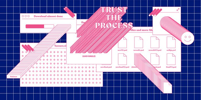
Header image by #ShilloNY teacher Nikita Prokhorov.
For more typographic resources, check out this list of typography terms and rules to follow. And if you’re curious about the typefaces that we think will be big this year, take a look at our top 20 font picks.
Thinking about launching a new career? Find out more about our graphic design course and how you can become a designer in just 3 months full-time or 9 months part-time.
Posts you might like

One of the best things about graphic design is that it never stands still for a moment. But that does mean that keeping up with...

The best graphic design books can take you on an exciting journey of the imagination, transport you to new creative worlds or...
We’ve all been feeling the squeeze over the past few years, but at Shillington we don’t want this to stop anyone getting the...

Are you considering becoming a graphic designer but want to be working online? With the increasing demand for digital design...

To ensure Shillington's commitment to the LGBTQ+ community extends beyond Pride Month, we’ve collated a list of incredible...
Are you looking to teach yourself graphic design? If so, you may be wondering if it is possible. The answer is yes—it can...

Are you interested in becoming a graphic designer but don't know where to start? You may be wondering if it's possible to...

Are you considering changing your career, but don't know where to start? Are you an aspiring creative with a passion for...
Want to win some amazing prizes and stay in the loop with all things Shillington? Sign up to our newsletter to automatically go in the draw.