Sister Corita Kent: American Artist, Designer & Educator
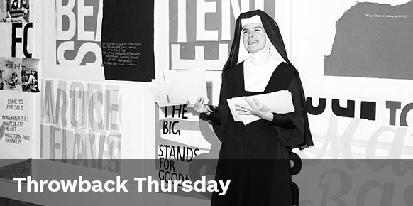
Sister Corita (1918–1986)
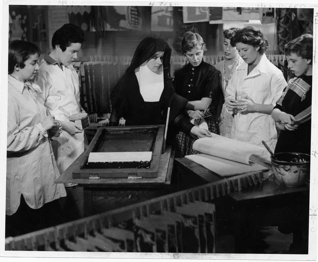
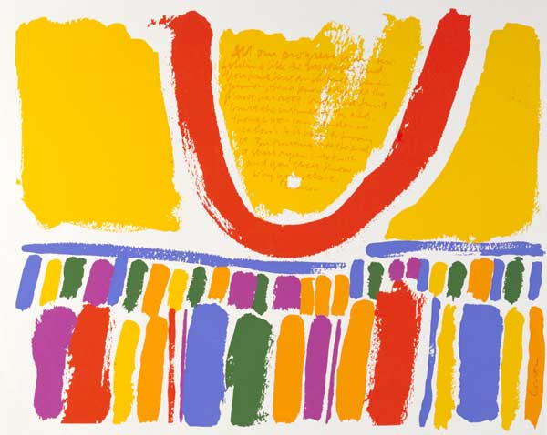
Sister Mary Corita Kent was an American Catholic Nun, activist, artist and eventually graphic designer. She is most well known for her screenprints and seriographs produced prolifically in the 1960s and 70s. Whilst early works were largely borrowed phrases and images from the bible, Sister Corita eventually began using phrases from popular culture like song lyrics and advertising slogans to make her art and social commentary.
In 1968, Sister Corita left the order and moved from Los Angeles to Boston where she began designing book jackets, campaigns for large clients like Westinghouse Group, and textbook illustrations. She remained active in social causes and created work with social justice messages like Billboards for Share, The International Walk for Hunger, Physicians for Social Responsibility and Amnesty International.
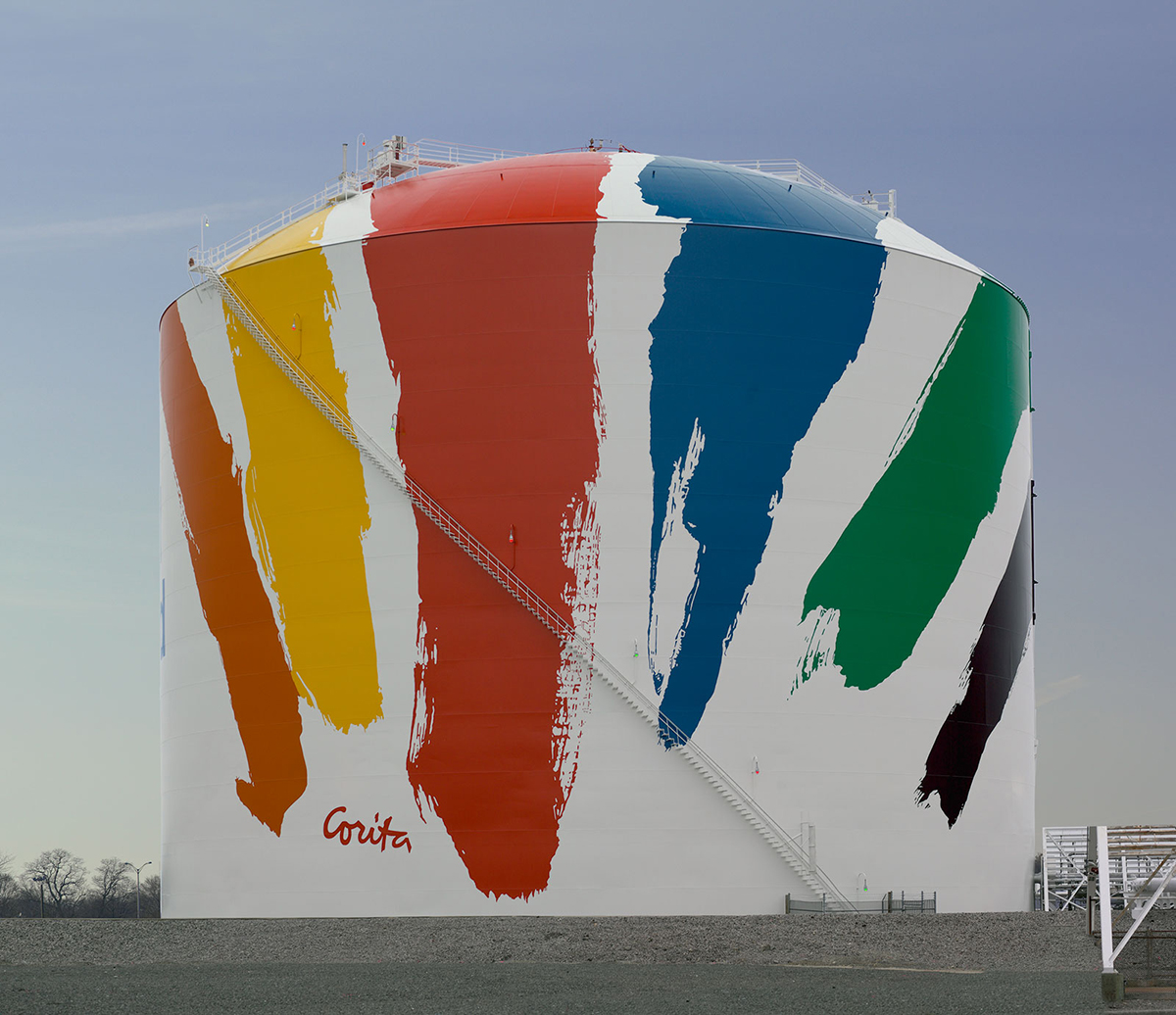
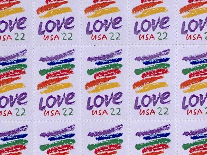
One of her most loved works is a water tank in Boston, which bears a 150 ft rainbow swash. This work is not dissimilar to the 1985 “Love Stamp” she was commissioned to design for the US Postal Service.
I admire Sister Corita’s bravery and sass. Her messages of peace and love were for the most part received with open arms during the social awakening of the 60s and 70s, however definitely ruffled the feathers of some.
Her Christmas Exhibit in the IBM’s New York show room was by some considered too subversive. Some suggested it to be ‘un-Christmas-y’ or perhaps a pretty ballsy protest against the Vietnam war. And in 1964 she created The Juciest Tomato of All—a paean to the Virgin Mary using a slogan from a Del Monte can—which was deemed sacrilegious by the cardinal of Los Angeles and banned from public display.
I love how unexpected it is that someone traditionally marginalised at the time—both a Catholic Nun and woman, could cause such a phenomenal stir! She is quoted to have said: ” I am not brave enough to not pay my income tax and risk going to jail. But I can say rather freely what I want to say in my art.” What a badass!
As a designer, I especially appreciate the visual language that she employs. Such an incredible command of colour and form!
The diversity and often immediacy of the typography that she includes in her work exudes a personality that feels akin to her ballsy messages. Plus – Corita is attributed to helping popularise the process of screenprinting as a medium. That’s cool!
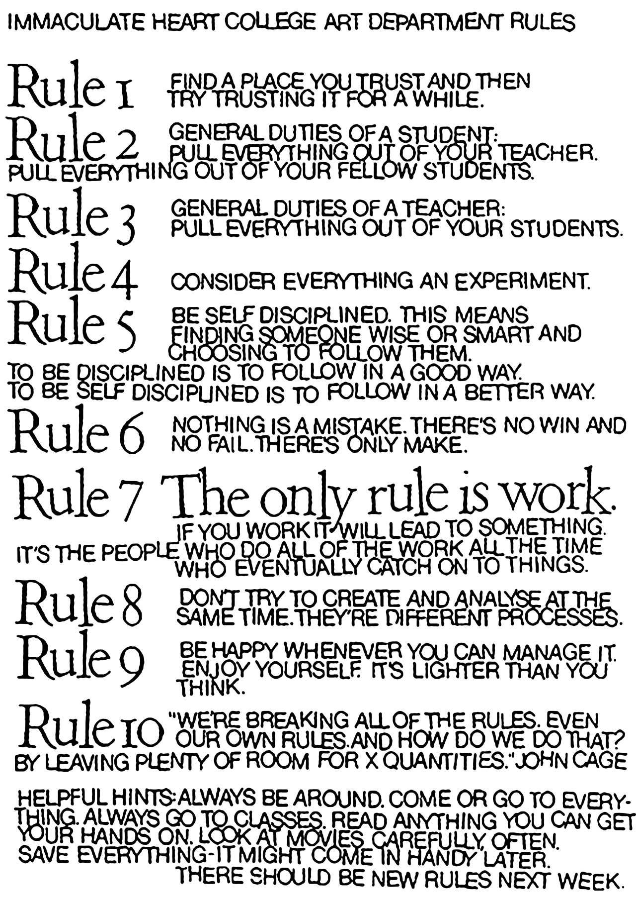
I also love the little set of ‘rules’ she gave her students. This has been widely popularised and attributed to famous composer and educator John Cage, however itactually originated in Sister Corita’s art classes at the Immaculate Heart Convent in LA. “Rule One: Find a place you trust, and try trusting it for a while.” Amazing!
Sister Corita reminds me of the fact that as visual communicators, we all have the potential to make great, positive change in our world. We have the responsibility to put forward messages filled with love, hope, and acceptance. Sister Corita is someone who lived very true to that cause. She used both her art and her design to align with messages and clients that she believed in, and created a more colourful world because of it.
Want to learn more about Sister Corita? Read this awesome summary of her life and work, discover her Art Centre in Los Angeles and watch this 1967 documentary!
Stay tuned for our next Throwback Thursday, and visit the archives for more quick design history lessons.
Posts you might like

The best graphic design books can take you on an exciting journey of the imagination, transport you to new creative worlds or...

At Shillington, we love to explore and celebrate great design from around the world. We’ve covered the work of many creatives,...
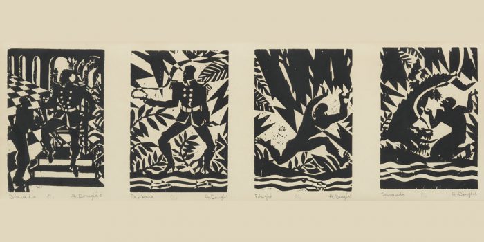
Aaron Douglas was a leading artist of the Harlem Renaissance, also known as the New Negro Movement. Douglas, along with the...
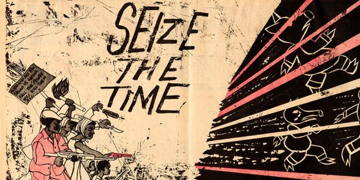
Emory Douglas is an American graphic designer most notably known for his time as Minister of Culture for the Black Panther Party...
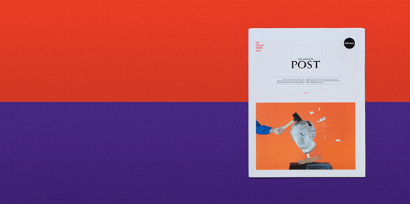
Exciting news! Now you can enjoy the latest issue of our in-house publication anywhere and everywhere. Read Shillington Post...
On Thursdays at Shillington, our teachers like to take their class back in time and introduce some of their favourite graphic...

Originally from Cairo, Eman Abdallah was studying graphic and product design, but the way she was being taught actually made...
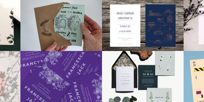
Check out these unique wedding invitations, designed by Shillington design graduates. Scroll on to see cool invitations created...
Want to win some amazing prizes and stay in the loop with all things Shillington? Sign up to our newsletter to automatically go in the draw.