21 Wedding Invitations Created by Graphic Design Students at Shillington
Check out these unique wedding invitations, designed by Shillington design graduates. Scroll on to see cool invitations created for clients, friends, family or the designer’s toughest client of them all … themselves!
Because have you noticed? Wedding invitation designs have changed in recent years … for the better! Gone are the boring, stock-standard floral designs and expected script typography. Nowadays, engaged couples want to create something different and special to properly introduce the biggest day of their lives. And designers are definitely getting in on the action.
Four of our favourites: (1) Chris Maclean’s multiple award-winning Claire and Dave booklet, (2) Amy Constable (of Saint Gertrude Design and Letterpress)’s 3D decoder surprise wedding letterpress invites, (3) Kelli Anderson’s Paper Record Player and (4) Device’s clever make-your-own-teepee invitation. All are amazing examples of the creative skills we encourage at Shillington. They push the envelope with typography, printing techniques and totally out-of-the-box thinking.
So, we did a call-out to our very own Shillington graduates to see some of their wedding invitation designs. Here are some of our favourites:
Kelly Hansen, Shillington Sydney Graduate
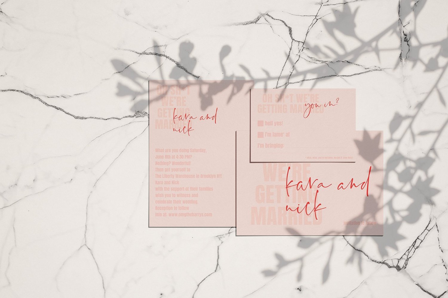
How fun are these cheeky invites created by Kelly Hansen? We love the punchy tone of voice, and definitely sets the tone for the type of celebration to expect.
Eleanor Robertson, Shillington London Graduate
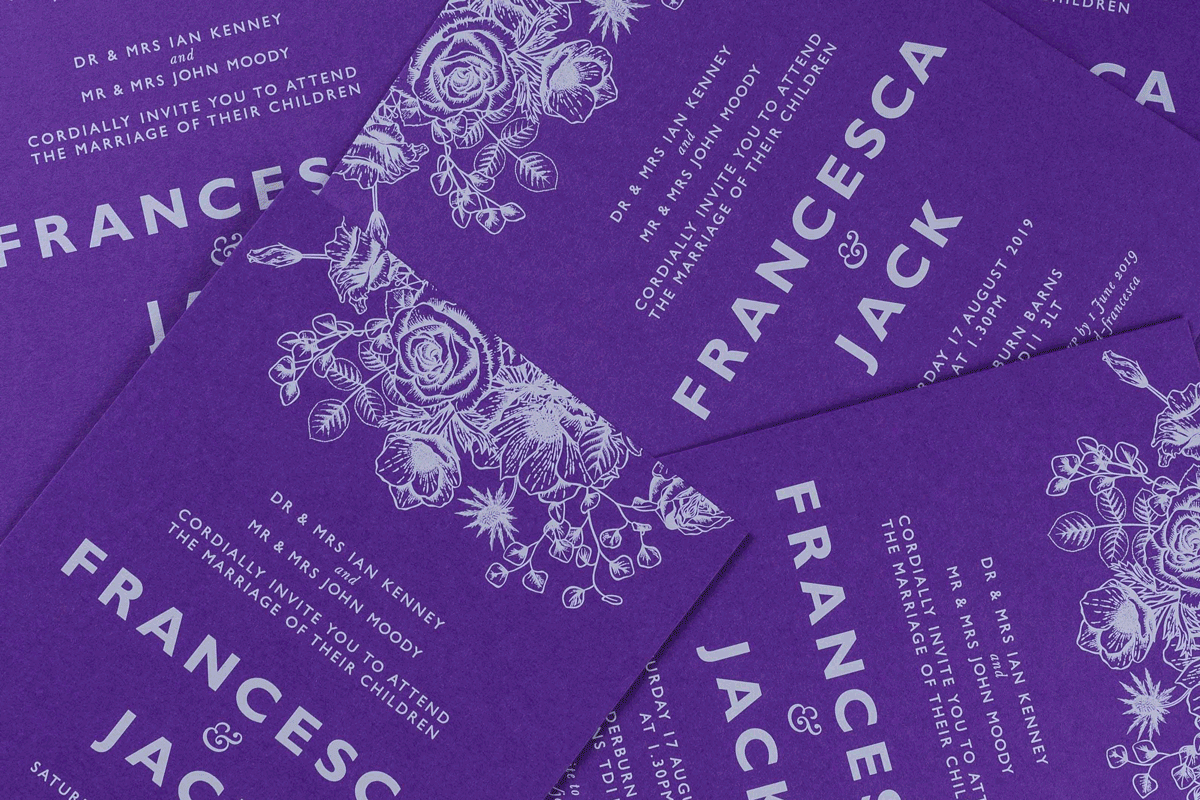
Eleanor Robertson designed these invitations for her cousin’s wedding. The groom grew up in Scotland the bride is from the South of England, so they themed their big day around the motif of a thistle intertwined with a rose. How lovely! Eleanor’s brief was to create a graphic identity that could be used across the stationery including invites, table plans and menus.
“I had no idea that the invitations would be such a challenge to print. I was keen to get them letterpressed but the printers I contacted advised that white ink wouldn’t be opaque enough on purple board. They suggested I explore hot foiling to get a solid white, but there were concerns that the finer elements of the design would fill in. For similar reasons litho was also a no-go. Eventually I found a printer in Bristol who was prepared to run the job digitally, using five passes of white ink to get a crisp layered colour. I was worried about registration issues but they came out perfectly on thick duplexed Colorplan.”
For more from Eleanor, check out her Shillington interview.
Nikki Darham, Shillington Manchester Graduate
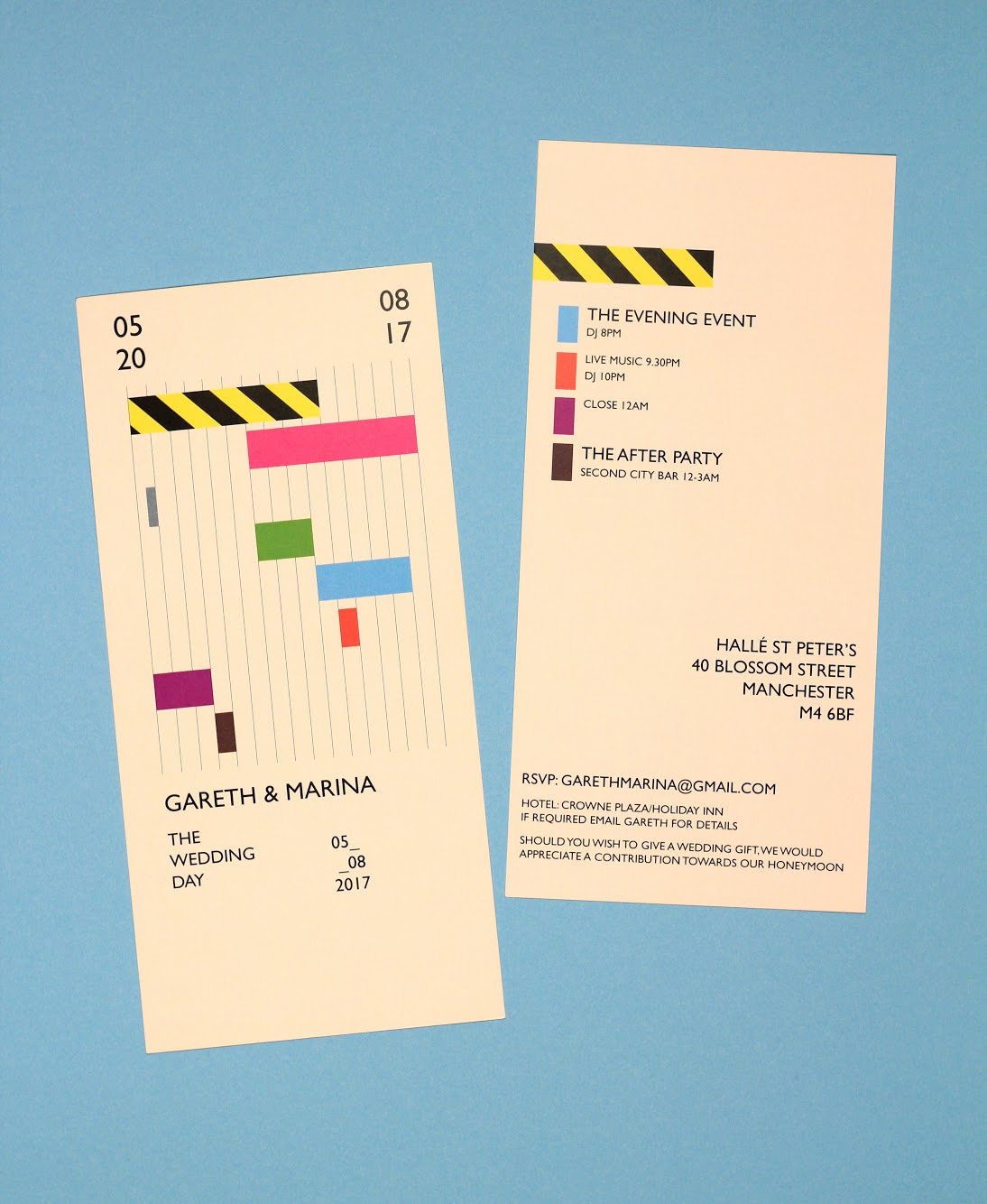
Nikki Darham created these super fresh invites for a friend. We love the unexpected look, perfect for the wedding’s vibe!
“It was for a friend who I met when working in clubs back in the 90s Hacienda days, he remained in the industry for many years, when it came to the invitations for his wedding he wanted something a little bit different. I suggested that we do something in the style of the old Hacienda flyers, he loved them. There’s two different designs for the day and evening, both following the clubbing theme.”
Alice Riley, Shillington London Graduate
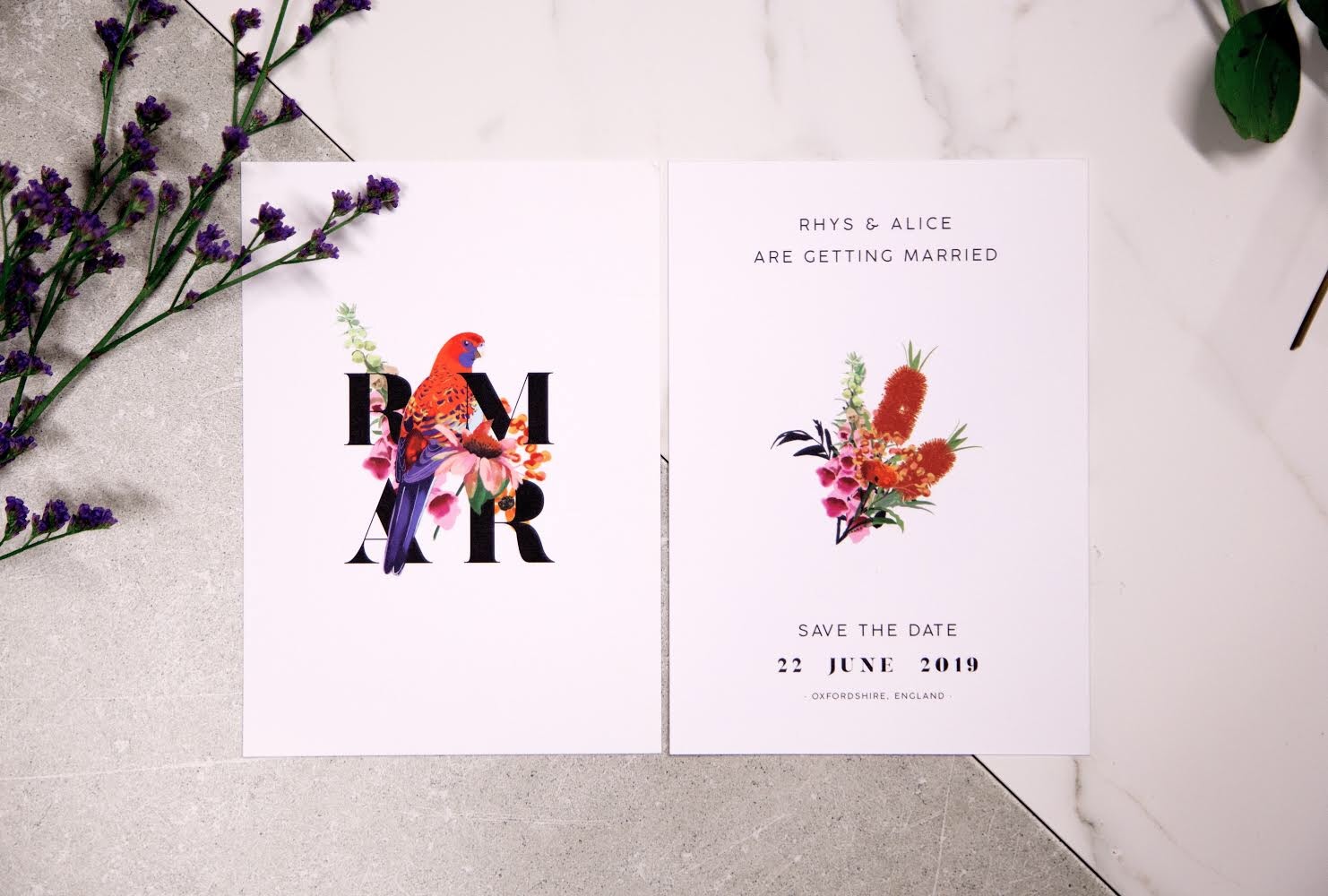
This save-the-date is particularly special, as it’s for the wedding of two of our very own Shillington graduates! No doubt Alice Riley and Rhys were their own toughest clients.
“Me and my fiancé Rhys are both Shillington graduates so we had a thousand ideas on what style to go for. It took six months, but we eventually settled on an idea that utilised my illustration style and our love of clean typography and simple design. I grew up in the English countryside and he grew up in outback Australia so the illustration combines plants and wildlife from both. The next challenge is taking this forward to the full invites!”
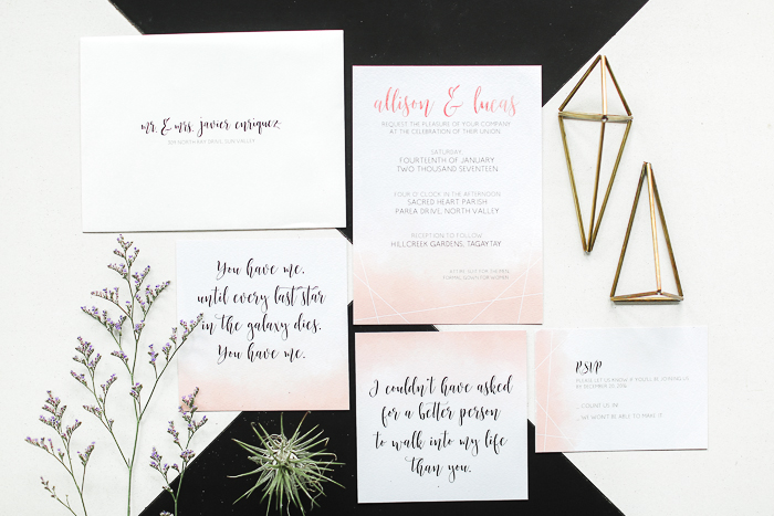
Gemma Purkiss, Shillington London Graduate
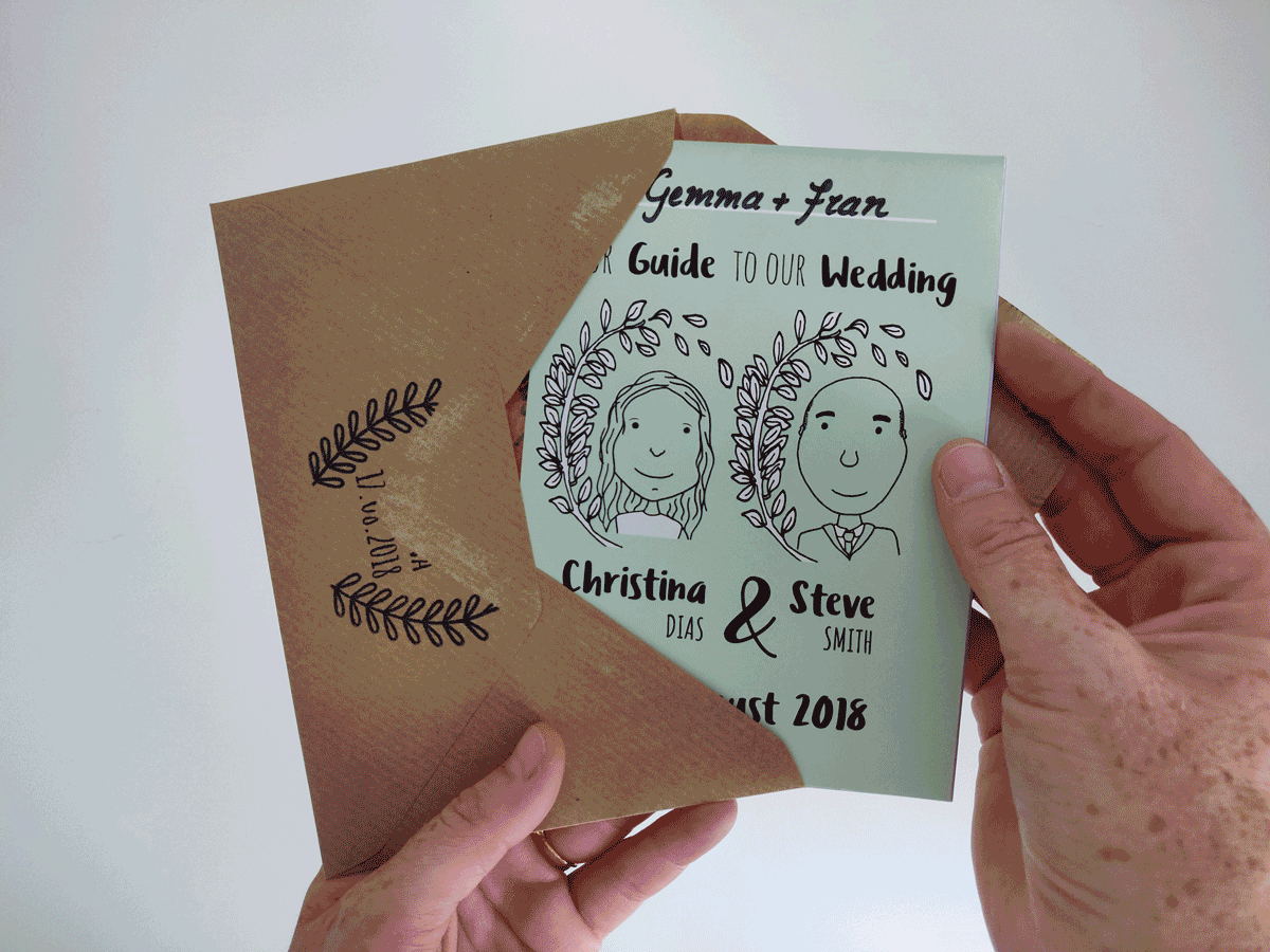
We love these fun and personalised invites by Gemma Purkiss. Jam-packed with all the information guests need for the celebration, but still sweet and easy-to-process.
“I opted for a fold-out booklet using each panel to describe and illustrate parts of their big day and the back contained an illustrated map with useful travel and accommodation information. We went through the whole process together, selecting fonts and finalising colours which was a great experience that I definitely would like to repeat!”
Georgia Shillington, Shillington Sydney Graduate
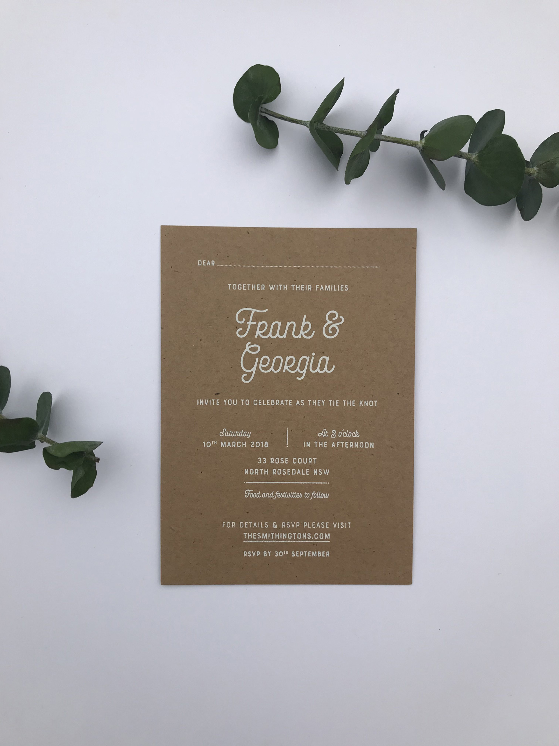
How cool is the printing method for these gorgeous invites created by Georgia Shillington? Perfect feel for a NSW South Coast wedding.
“Designing your own wedding invites is definitely a challenge! I decided to keep it simple and understated, which was essentially the vibe we wanted for our day. I took inspiration from the amazing NSW South Coast where we tied the knot, in particular the the beautiful native bush surrounding our ceremony and reception. I chose an organic mottled brown stock which was set off perfectly by a white foil finish. I still love looking at it sitting proudly on our fridge!”
Geena McInnes, Shillington Melbourne Graduate

We love this wedding invite design by Geena McInnes. Nice and simple, modern and elegant.
“It was important that illustration was incorporated to reflect the bride and groom’s love of the medium. Peonies were used as inspiration to diverge away from typical roses or lilies, but still have a ‘wedding-y’ feel.”
Linda Gao, Shillington New York Graduate

Check out these crisp wedding invitations designed by Linda Gao. Complete with gold foil, it’s clear that every little detail was considered for the set.
“My husband and I were very excited and wanted to design and produce as much as we can ourselves. So we did everything from invitations to event space decoration.”
Cecily Maude, Shillington London Graduate
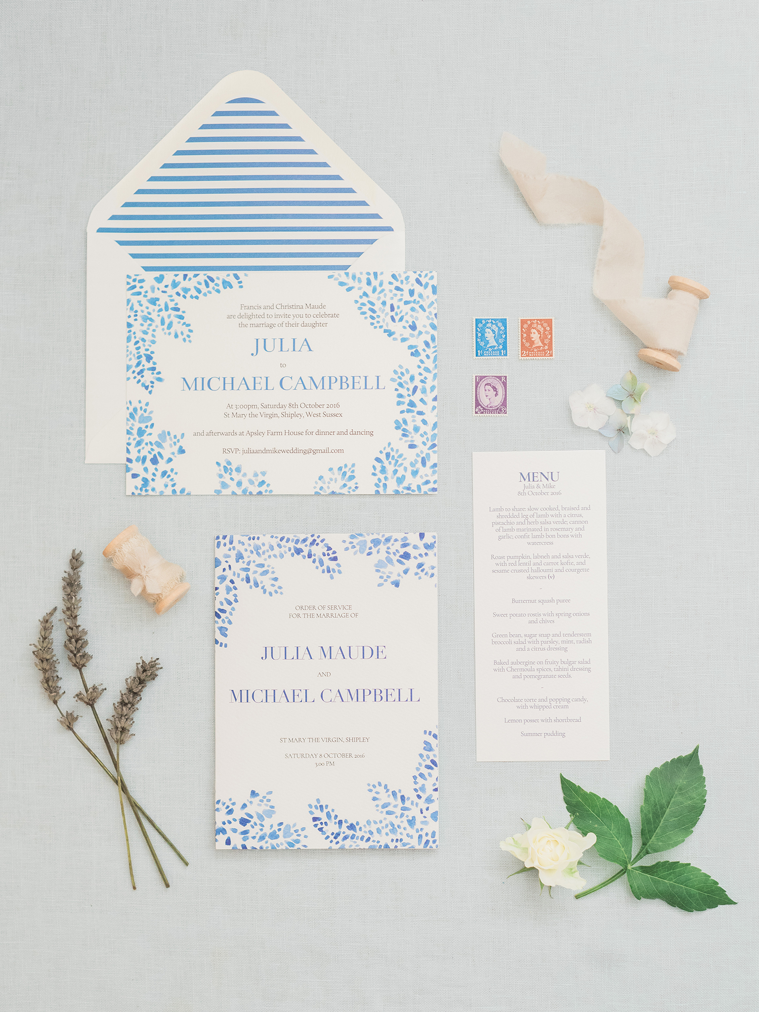
Cecily Maude‘s elegant and rustic wedding invitation design for her sister’s wedding set the tone for a DIY affair. The whole family chipped in. Cecily owned the invites, her mum did the wedding dress and cake, and everyone got involved with the floristry. The result was a day bursting with lots of love and care!
“Julia asked me to do ‘something blue’, but wanted to keep it quite classic. Hence, the layout and typography is quite simple, but I did some sort of gestural watercolour foliage to decorate. I was really happy with how these came out in the end, and she loved them, which is the main thing!”
Image by Vicky Lamburn.
Milly Hilton, Shillington London Graduate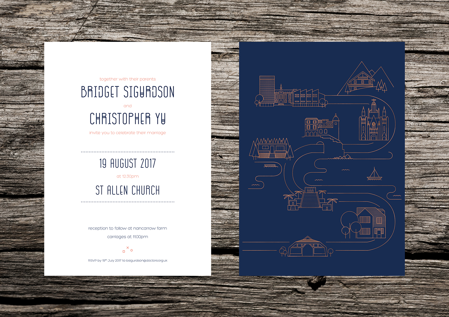
Milly Hilton’s wedding invitation design was inspired by her clients’ love of travel, minimalism and the ever chic Scandi/Japanese aesthetic. Centring on a visual representation of the couple’s story so far—Milly incorporated key destinations from their travels to form a narrative through minimalist illustration. Also, extra points to Milly for her genius execution to exude an opulent copper effect using a rubber stamp, foil and a glue gun!
“The bride was really keen to incorporate a copper accent into the design to fit in with the wedding decor choices. For the main invites I found a budget solution; I got a custom rubber stamp made of the design and hand stamped each invite, covered it in copper embossing powder and melted it with a heat gun to create a foiled effect without the need for letterpress printing.”
Ina Estrada, New York Graduate
Ina Estrada designed these beautiful invitations for a Bride and Breakfast styled shoot. With a theme of “fleek and fetch”, the style is absolutely on point for those brides and grooms who want something youthful, but still oh-so-tasteful. Loving the geometric styling too!
Jolien Steuperaert, Shillington Brisbane Graduate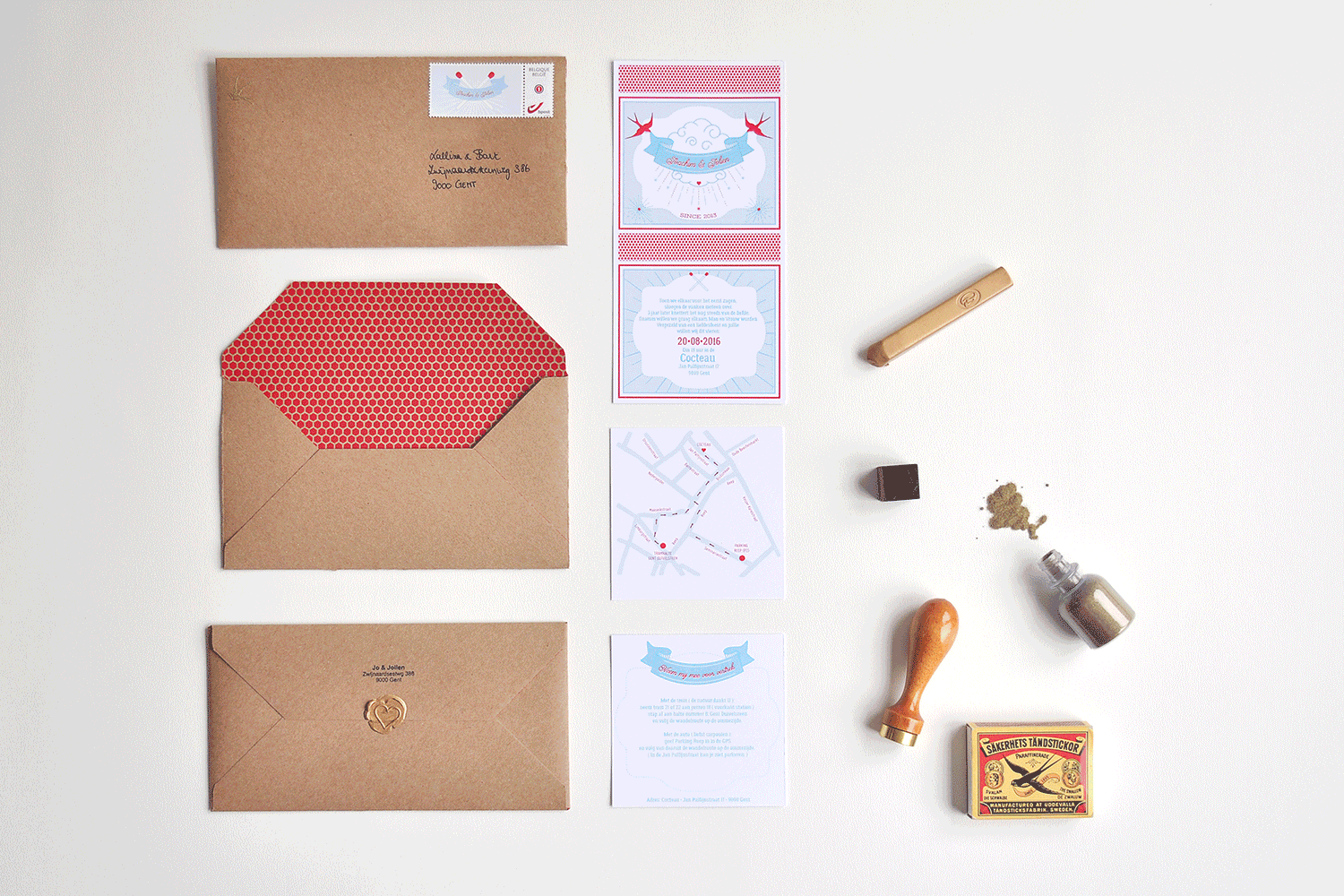
Jolien Steuperaert wedding invitation design was for her own nuptials—pulling out all the stops with maps, bespoke illustration, envelope liners and a wax seal! Wes Anderson, eat your heart out.
“The theme was inspired by a matchbox, not particularly because of the sentence “we match” but it was more about the spark that flew around from the moment we met each other. I made a whole text in Dutch that after three years the fire was still burning strong between us. I folded and made the envelopes by hand and on the inside I screenprinted them with the pattern you find on the side of a matchbox. Then, I personalised the stamps and on the front of the envelope I embossed a swallow with gold embossing powder. The envelope was sealed at the back with a gold wax stamp to make it look authentic.”
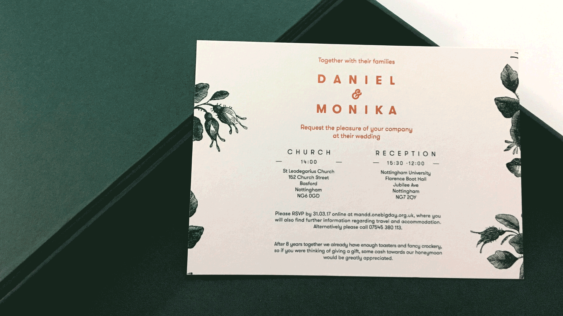
Abigail Everett, Shillington Manchester Graduate

Abigail Everett‘s freelance business actually focuses solely on designing wedding invitations, so we were spoilt for choice when it came to choosing which to share! This navy blue set oozes sophistication pairing gorgeous hand lettering with a clean sans serif type. Not settling for a generic print, Abigail selected thick print paper, backed with a coordinating coloured paper from the masters of paper GF Smith to create an extra heavy, high quality design.
Oliver Furze, Shillington Manchester Graduate
Oliver Fruze‘s clients for this stationery set were looking for the “wow” factor, and he definitely delivered with monogram, classic botanical illustration and copper foil! The wedding invitation design is timeless with an edge of modernity through the bold sans serif typeface choice.
“The wedding theme was botanical with a green and white palette. I brought this through using a classical style botanical illustration. The couple were keen for the invitations to have the ‘wow’ factor. So, we agreed that copper foiled elements on a 350gm GF Smith Natural Colorplan stock would compliment the palette perfectly. I created an interwoven monogram made up of the first initial of the bride and groom and set it alongside a stylish modern typeface.”
Emily Kerr, Shillington London Graduate
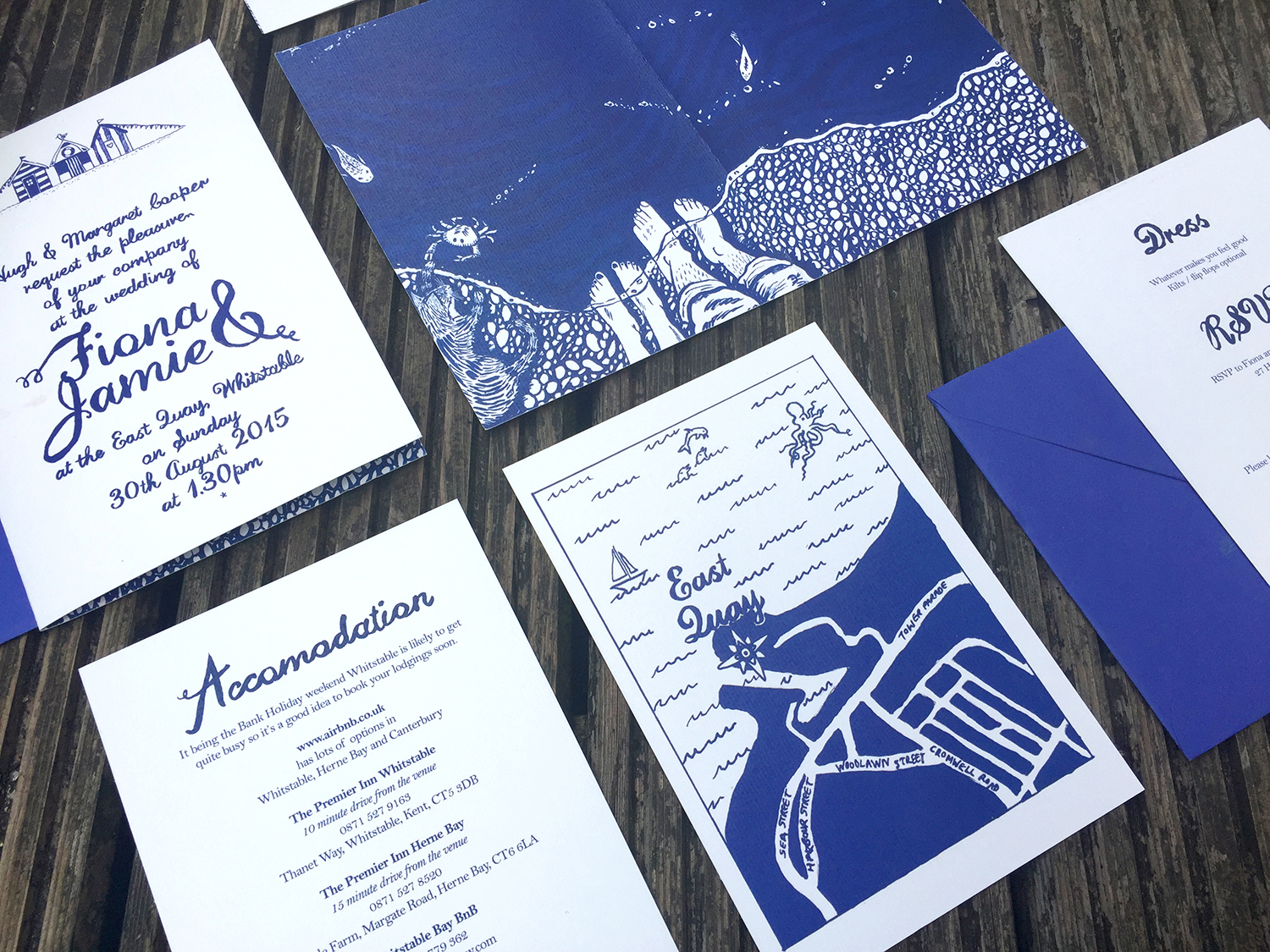
Nothing says romance like the dreamy vibes of the seaside. Emily Kerr‘s hand lettering and custom illustration for this wedding invitation set really captures the feel of a summer nautical wedding!
“My main learning from doing invites is that it’s key to involve mother of the bride from the start. So many times friends have been charmed by quirky personalised first drafts. However, later down the line, the family get to see and suddenly things have to become more traditional!”
Danielle Hall, Shillington Sydney Graduate
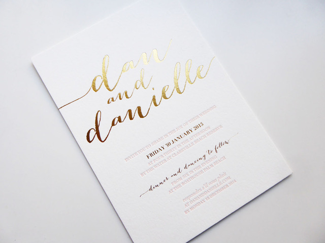
Danielle Hall‘s design for her own wedding stationery really let’s the print embellishments shine! Simple yet tremendously effective with the glimmering type dancing off the page.
“I designed these invites myself (with some designer husbando input of course). We were *those* clients for D&D Letterpress, but they turned out so beautifully and were featured in wedding blogs and directories (The Lane, Bride Story and One Fine Day) which was pretty spesh!”
“We wanted to create something so beautiful and tactile. So, we chose to letterpress on the creamiest of cream coloured thick card stock. Then we paired it with gold foil and pantone inks to mesh with our wedding colour palette.”
Matt Pealing, Shillington Manchester Graduate
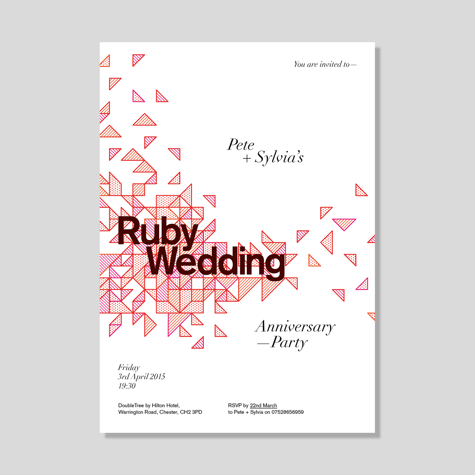
While this design isn’t a wedding, wedding anniversaries still count in our book. Matt Pealing‘s design for his parent’s Ruby Wedding Anniversary successfully fuses traditional script type with a blast of modernity through geometric graphic elements. Doesn’t it make you want to party?
“I created a series of abstract ruby-themed shapes and patterns arranged in such a way to give a celebratory feel.”
Bianca Coxon, Shillington Brisbane Graduate
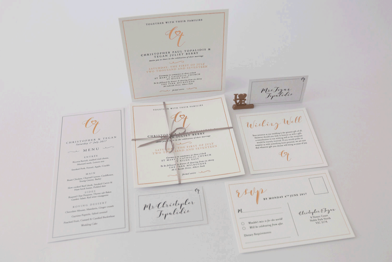
Bianca Coxon played two roles at this wedding—stationery designer and Matron of Honour! The phrase skills to pay the bills definitely springs to mind! We love the formal approach, culminating in an immaculate print combination of letterpress and foil.
“I designed her entire suite, from invites to menus to signage and booklets, and organised all the printing—embellishments galore—rose gold foiling and letterpress. She wanted something classic, clean, and quite traditional.
Ellen Blanc, Shillington Manchester Graduate
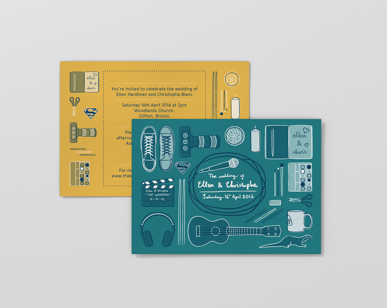
Ellen Blanc created a quirky invitation that perfectly captures her and her husband’s personality and interests. It’s what indie-film dreams are made from with a selection of detailed illustrations of objects, perfectly capturing their special bond.
“My brief was to create an invitation that reflected both of our personalities and wasn’t too feminine and flowery. So, we came up with the concept of our lives coming together as we were also moving in together and getting married. We chose different objects that represent us and laid them out to show us packing up our lives to start life together. I used one of my favourite fonts Aperçu for the invitations, just because I love how friendly and clean it looks.”
“The inspiration came from my husband, who is a filmmaker. We wanted to refer to this and his love of going to the cinema. I designed a separate cinema ticket for guests who were also invited to the evening reception. I wanted this to look retro and I took inspiration from mid century graphic design. We had two weddings, one in the UK and one in France, so all of our family could celebrate with us. With this in mind, I kept the design simple in order to change the text for two different languages and venues.”
Braden Floris, Shillington Melbourne Graduate
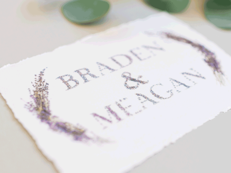
Talk about invitations made with tender love and care! Braden Floris handmade the typography for his wedding invites petal by petal, resulting in this jaw-dropping piece.
Samantha Brown. Shillington Sydney Graduate
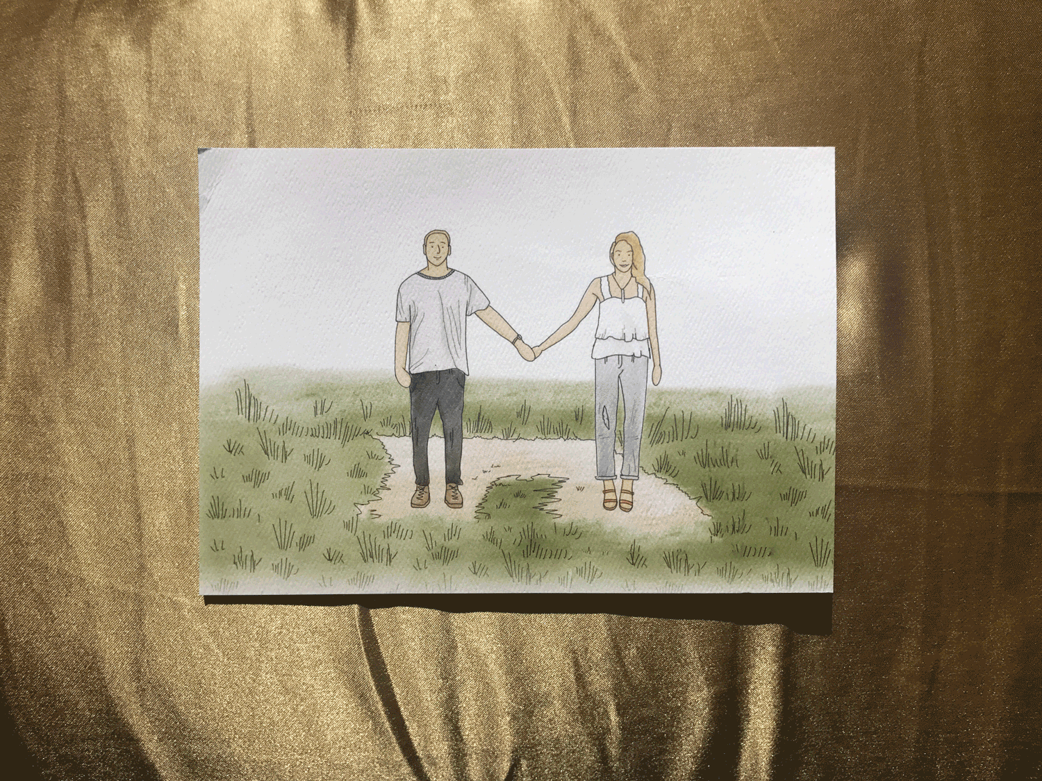
Samantha Brown‘s custom illustration of the husband and wife-to-be takes centre stage for this wedding invitation—completing the hand-rendered approach with a beautiful painted typeface on the reverse.
“This couple was the perfect first clients after getting out of college! I used my iPad Pro for the first time and loved every moment of it. It’s one of my favourite projects I’ve ever done.”
Want to design your own wedding invitations? Become a graphic designer! Study 3 months full-time or 9 months part-time at Shillington in New York, London, Manchester, Sydney, Melbourne or Brisbane –> shillingtoneducation.com
Posts you might like

One of the best things about graphic design is that it never stands still for a moment. But that does mean that keeping up with...

The best graphic design books can take you on an exciting journey of the imagination, transport you to new creative worlds or...

At Shillington, our dedicated graphic design students are taught all about how to design for packaging—from FMCG (that’s fast...
We’ve all been feeling the squeeze over the past few years, but at Shillington we don’t want this to stop anyone getting the...

At Shillington, our graphic design course teaches students how to design campaigns for a brand, helping to spread its message....
We're excited to announce Shillington's Diversity in Design Full Scholarship and Industry Mentorships and Global Half...
Exposing yourself to examples of good graphic design is a healthy practice no matter who you are. Maybe you’re a student...
At Shillington, our graphic design bootcamp students are taught how to design for digital, incorporating aspects of both UI and...
Want to win some amazing prizes and stay in the loop with all things Shillington? Sign up to our newsletter to automatically go in the draw.