Third Time’s the Charm for Shannon Gordon, Shillington Graduate

Third time was the charm for Shannon Gordon! She studied at two other schools before committing to kickstart her creative career in only 9 months part-time at Shillington in New York. Read on to hear how Shillington “filled in the gaps” of what was missing in her skill set, view beautiful work from her portfolio and learn about her new career as a full-time designer at Oberland in New York.
You already had qualifications from two other schools, so why did you decide to study at Shillington?
Before Shillington I graduated from Fashion Institute of Technology with an Associates Degree in Communication Design. I had heard about Shillington around 2012 which is about the same time I was attending the School of Visual Arts for Traditional Animation. But I realized that private schools really weren’t an realistic option financially. And I really respected the work that I saw being produced by Shillington’s students. So I decided to study at Shillington.
You recently landed a junior designer role at Oberland. How did you get that gig? Did you feel confident for the job hunt?
I landed the job at Oberland using the projects in my Shillington portfolio. It was interesting starting the job hunt after graduation because I remembered the #Shillumni Industry Talk with Debbie Millman and how she said that we need to have more confidence when we apply for places. Because sometime have this fear that we not be good enough for the jobs that we want. And at the time, that’s exactly how I felt!
What’s your typical day like as a designer?
On a typical day you would come in and set up. We would have a meeting to go through the itinerary of what exactly needs to be done for the day. You have several account managers that would set up meetings with you so they can talk about changes and what needed to be done. At the time we were working on a major client. So we would pretty much go over the clients brand guidelines then talk over concepts. And kind of jumped right into it. There were three meetings set up in order to go over what the aim and the goals were for the project or just to see where we were at in terms of our execution One in the morning, the afternoon and again before we left\
I will say that sometimes I find myself working late. But it never really feels like I’m working!
What was your favourite part of the course?
Actually, I really enjoyed the portfolio time. There are things that I would have done differently, but the time spent with my classmates to review each others work and being able to pick the brains of my teachers was the best part of it.
What was your biggest challenge?
The biggest challenge I would say is having to rely on yourself and on your instincts. Being a part-time student was a little challenging accessing teachers between class time. But at portfolio time everything became really strict, which was helpful but it was scary at the same time. It’s very much like the real world!
What is your favourite project from your portfolio? Walk us through your process!
My favorite portfolio project is Higglie. It started off as a branding assignment for pet sitting company that would have to be rolled out. The first thing I did was use mind mapping and word techniques.
I wanted to find what pet owners want for their pets and also the different pets and what they would need. I then created a persona; Jordyn, who was an artist and blogger that traveled a lot for working and with her boyfriend. So I would understand why someone would need a pet sitting company. I researched potential competitors to see what they were doing and how the pet sitting company would differ or do better. I came up values such as playful, trusting, and community.
The owners wanted their brand to convey Quality and a happy feeling through their brand identity. What I noticed other pet sitting companies were doing was using really earth tones and focusing primarily on dogs and cats , and using dogs and cats in their logos. most of the brands also felt cluttered. I knew I wanted something simple and clean in terms of a look. And in terms of the brand-name, I knew I wanted something that could not necessarily be absolutely translated like Häagen-Dazs. So I started looking words with a general positive meanings and I came across the Scandinavian word Hygglig: which can only be roughly translated in English as cozy, comfortable or the feeling between two people that have known each other for a long time.
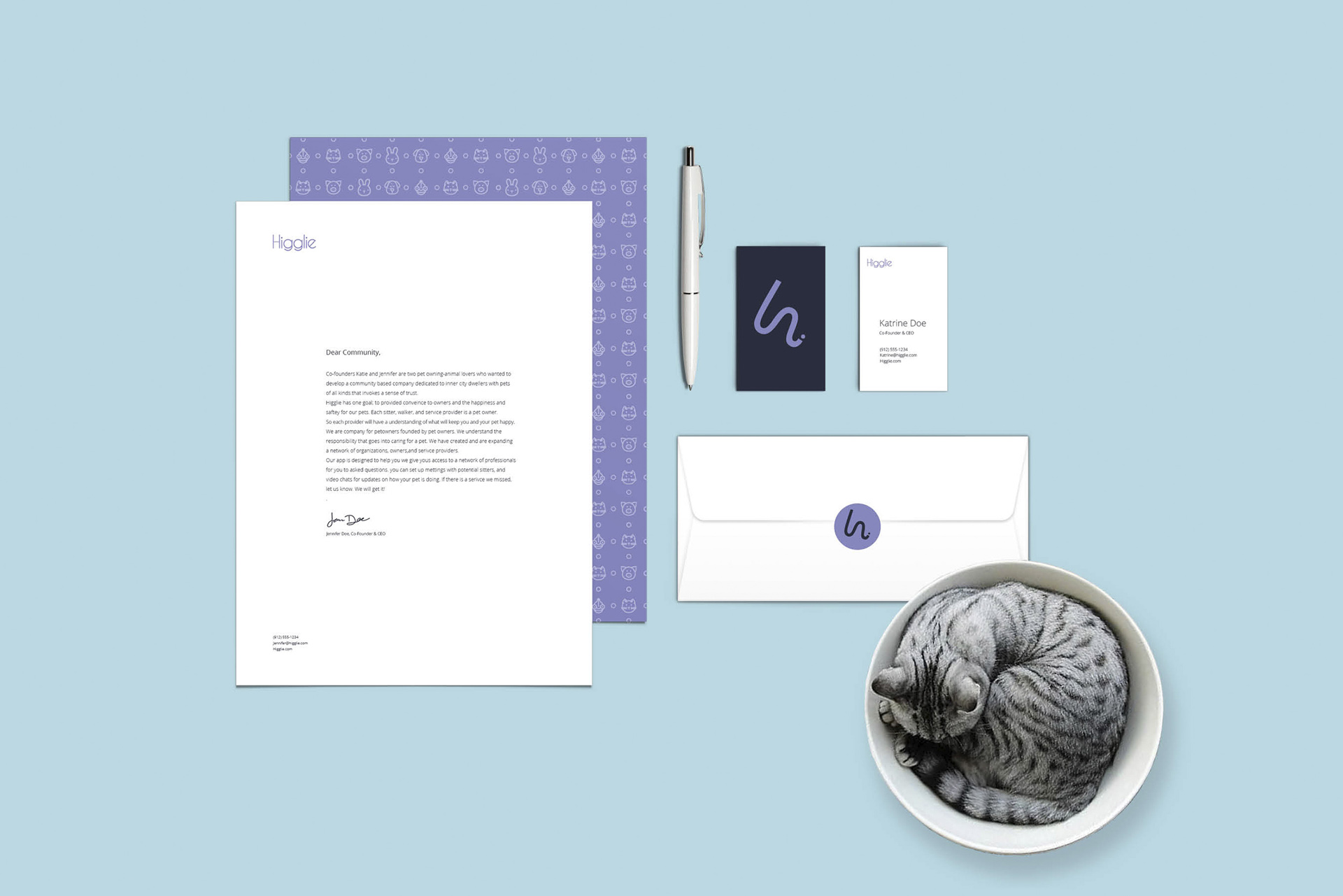
To make it more simple, fun, and easily pronounceable; I changed the name to Higglie. Keeping with the Scandinavian theme, I created a mood board of Scandinavian design. I noticed the use a lot of shapes, white space, colors selectively and minimal design. Even when they use bright colors in-home the car And design, in the still a very homely cozy feeling to the Scandinavian aesthetic. Which is how I chose the colors. I created a mood board logos that I thought translated well. I sat down and started sketching. I knew I didn’t want cliché logos with pets or paw prints. So I started thinking about the H in Higglie. The original variation of the H what kind of this really fun lowercase H, but it was realize that the logo could actually be slightly more simple. Keeping with the Scandinavian theme of simplicity, I made one bold line stroke that symbolizes an h. add also created a board for Color. I knew I wanted pastels that were homely. So I ended up choosing in muted pastel purple, and a calming mint green, and a desaturated navy blue that would go with white. I had also originally created rules for the logo. And decided that the secondary logo would be the name with Caviar Dreams and the typeface. I liked the Typeface for its rounded characters which conveys friendliness. I altered the ears if the g’s to imitate the ears of an animal.
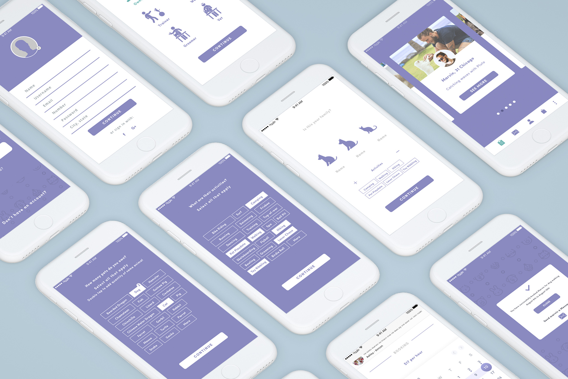
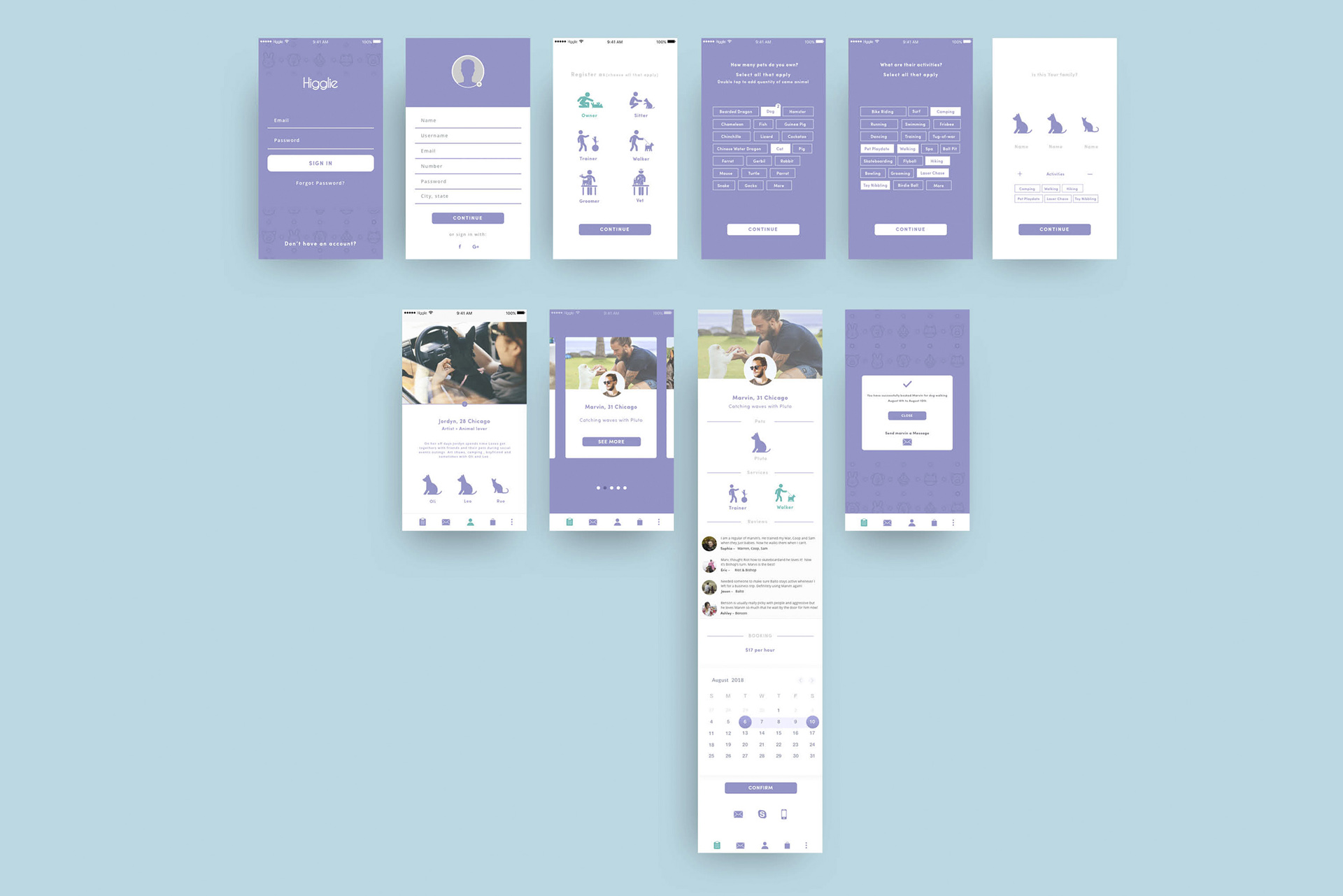
When it came to the rollout, I knew that I wanted Higglie to be an App that connected pet owners with all types of professionals. But we went kind of threw a journey how exactly my persona would find out about this company in order to find out what other items I can associate with the company for branding. I thought dog collar, bracelet, pet pillows, leashes, and regular stationary. I also thought about a pet café. Which I may still want to expand on later. One of the most important things I learned from Shillington was avoiding logo slapping. When we put so much time and consideration into a logo, we should also consider how are you where its place on stationary and other products. Which I found very helpful when producing Business cards and a letterhead. My favorite part of the roll out was creating the app. Because creating user journey the wireframes and researching just what I felt was working and what I want to take from other apps and put into this application. I created mood boards buttons, user interfaces, layouts and overall functions. Because the app was not just to be for pet owners but for professionals I wanted to create a User journey for my persona Jordyn as well as for a professional animal trainer. I knew their profiles and the way they navigate would be different. I used my mood boards to create a Style tile from that style tile I created wire frames. The user journey was trial and error. The fun part was learning what was working from what was not. Because the buttons I had originally used weren’t cohesive with each other I sketched out similar icons and buttons myself what and placed them into Adobe Illustrator then into Sketch App.
Any advice for someone starting at Shillington?
Take it seriously. Utilize your teachers while they are there. Have more confidence in yourself and make sure you give one hundred percent to all of your projects.
The more effort you put into the project the first round, the less you have to do later.
Use your class mates. There maybe something that they know or are good at and that you can learn from.
How has your life changed after Shillington?
I have a lot more confidence in what I know now. All of the information and gaps I felt I had always been missing were filled in by Shillington. In terms of utilizing design programs, taking on creative briefs, and organizing myself to get projects done.
We’re taught a lot at Shillington! More than most students who graduate from ‘prestigious’ arts schools.
Huge thanks to Shannon for sharing her Shillington story! Check out her website for more.
Watch and read more Shillington graduate testimonials on our website.
Want to win some amazing prizes and stay in the loop with all things Shillington? Sign up to our newsletter to automatically go in the draw.

