Typography Inspiration: 17 Typography Resources to Boost Creativity
Dipped your toes into the world of graphic design? You’ll know that typography is something that underpins almost every aspect of this practice. If at this point your eyes have started to blur, and the word ‘typography’ is beginning to lose all meaning, and then you feel like it actually has no meaning—never fear! Check out this article we’ve written for this exact moment, which takes a deep dive into all the typography terms and rules you’ll need to know.
If you’ve come back from that refresher still lost, or just sitting here feeling like typography inspiration isn’t going to come in your foreseeable future—then look no further!
We’ve curated a list of typographic resources to boost your creativity and get you through this typographically terrible time in your life. Whatever phase of need you’re in, of your design process or typographic journey, we’ve got you covered.
Read on to discover 17 inspiring resources, covering whatever design phase you’re in:
- Typographic Inspiration—Perfect for the Casual Browser
- Typographic Creativity Boosters—Break the Mid-Project Mental Block
- Typographic Expert Resources—What are the Top Dogs Doing?
- Typographic Ideas for your Ears—a Podcast!
Typographic Inspiration — Perfect for the Casual Browser
Unattached to a brief, or just about to embark on a typographic whim—if your relationship with type at the moment is a casual one, these resources are for you. These are mega-banks of creative typography, gathering illustrations and inspiration of type from far and wide.
They’re grounded in vivid and eye-catching examples that will be sure to revitalise your type fatigue and kickstart your font exploration!
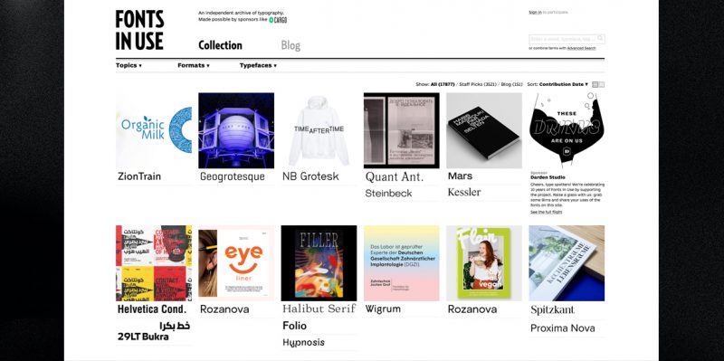
1. Fonts In Use: The Historic Archive
This master of all font resources is a “searchable archive of typographic design, indexed by typeface, format and topic – type at work in the real world”. It’s a massive website that has archived historical and current applications of the main fonts (and some unique ones) that have dominated the typographic space, past and present.
Want to see how a combination of Garamond and Cloister Bold were used in a 1971 ad for Crest Toothpaste? Or how ITC American Typewriter featured in the logo for iconic American mockumentary style TV show ‘The Office’ (amongst other gems), give this extensive resource a good peruse.
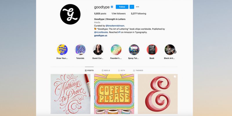
2. Good Type: A Gallery Of Great Type
An Instagram account @goodtype with over 1 million followers, this resource speaks for itself. Think of it as a curated gallery, with an ongoing exhibition.
The interesting thing about the way Good Type works is the fact that they have Guest Curators. These curators are constantly changing (not staying for more than two weeks) and never repeat. They are selected by the Good Type community, and ensure that you are fed diverse and interesting content on the daily.
And if you’re pining for some analogue inspiration, they also have a couple coffee table style books which focus on lettering, for your hands-on fix of typography design inspiration.
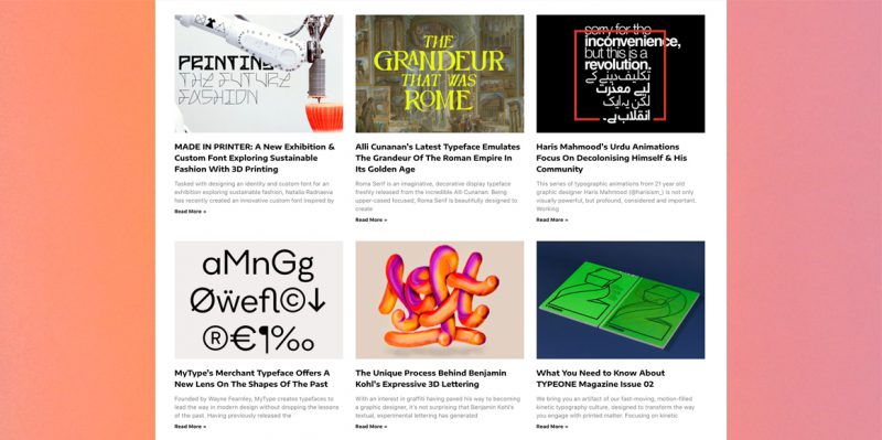
3. TYPE01: Where Typography Meets Social Discourse
Self described as “one of the leading platforms that specifically publishes type-focused media” TYPE01 has birthed some excellent offspring (FemmeType, Type Department etc.) If variety is what you’re looking for, you can’t look past TYPE01.
A great range of articles are featured, from typographic process and practice to meaningful tales of typography saving rainforests or fighting cultural erosion. There’s a rich collection of typography design inspiration to dip your toes into.
But we know the digital world is a bit all consuming, so if you’d prefer a more analogue source, they also offer a subscription to their bi-annual magazine. It also incorporates some high tech fun for those of you who enjoy skirting the fine line between tradition and innovation. QR code technology is incorporated into the publication to translate static content to moving imagery! Do with that knowledge what you will.
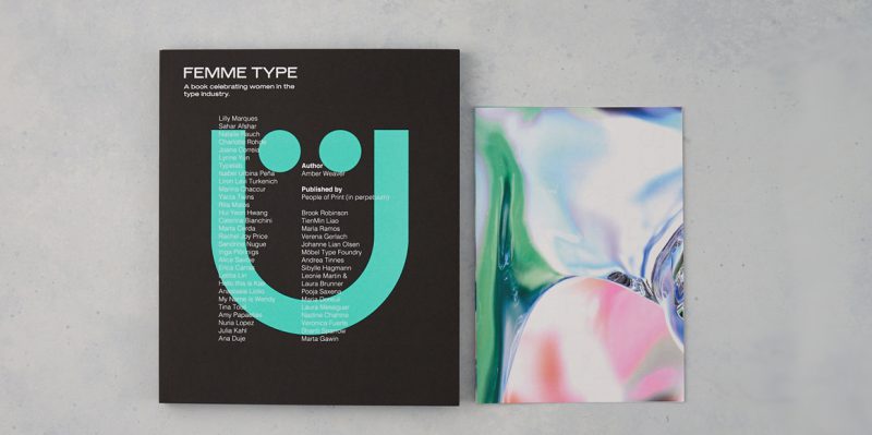
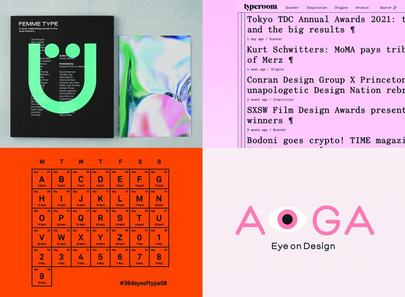
4. FemmeType: Boss Ass Type B******
From their Instagram bio: “A platform celebrating the work of women who are part of the type and typography industry” @femmetype. Their website features interesting, long form interviews packed with typography design inspiration, with female creatives about their projects, careers and practices. This daughter of TYPE01 is an excellent resource, of which their IG is highly recommended. One could easily spend countless hours taking in all the beautifully curated and powerful examples of type on their feed.
And if you want to give yourself a rest from screen time, or are partial to the old school ways—why not check out their book? A beautiful hardcover tome that celebrates type with over 40 women from around the world, on 272 litho printed pages (featuring a special Pantone spot colour ooh).
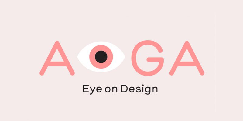
5. AIGA Eye on Design (Type Tuesday): Inspiration from an Institution
It may look funky, modern and new, but this website has established roots in the design world created by the oldest and the largest not-for-profit design organisation in the United States: The American Institute of Graphic Arts.
Their website is easy to navigate, clean, and locked to a tight grid. An excellent example of the basic principles of graphic design put to good use. Although we’d expect nothing less from this professional organisation. If you’re asking what on earth these elusive “Basic Principles of Graphic Design” are, ease your curiosity with this article we’ve written on just the topic.
Further, AIGA has a dedicated Typography section that will be sure to tick all your boxes in your search for typography design inspiration. If you want to keep your Eye on Design, do check out their Type Tuesday feature design series on their website that features a new font, surprise—every Tuesday! The posts all incorporate a cheeky and intriguing little back story, and if you love typography like you love a fine wine, the author recommends other fonts that pair well with the feature typeface at the end of each article.
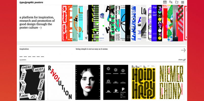
6. Typographic Posters: Poster Culture, feat. Typography
Founded in 2008, Typographic Posters is a non-profit passion project of André Felipe and Flávia Menezes.
Typographic Posters hones in on the tension, balance and superseding of typography and the other elements of graphic design. It discusses this graphic play through its curated gallery. Through their digital collection of posters, Typographic Posters excitingly unpacks the way typography can function as the primary and often sole form of visual communication.
This inspirational resource spotlights the function of type, as not just words to be read on a page, but an entire alphabet that can be abstracted and used to express a plethora of things. A fantastic vault of examples of creative typography.
Typographic Creativity Boosters — Break the Mid-Project Mental Block
You’ve got a brief, you’ve got a visual direction, but something feels off about the way the shape of the ascender on the “f” dances on the top of your page. Typography can be a complicated beast that toys with and tests your sanity, and truly makes you question your creative integrity.
Never fear, these beautifully packaged and independently curated resources are sure to be an amazing booster in your search for creative typography.
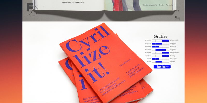
7. Font Brief: Fonts Have Personalities Too
Sometimes typography can be overwhelming, the technicality of it all, not to mention trying to look for a font that gives you just the right vibe. Creative direction is multilayered and the search term “happy font” just won’t cut it when what you really want is an “expressive font that is slightly elegant, but still friendly, organic but at the same time progressive, midway between familiar and daring, slightly more loud than discreet and lukewarm“.
Unfortunately typing that into Google would just short circuit their algorithms. They wouldn’t be able to compute these sort of dichotomies and nuances. Fonts aren’t visceral beings with qualitative values, they don’t have personalities…or do they…
Font Brief strongly disagrees with this assertion and has created a genius site that allows you to filter fonts by personality. Their filter toggle really captures the essence of a typeface, in a heart-warming, if not slightly gimmicky function. They’ve really given new meaning to the term “creative typography”. Maybe your neighbourhood Helvetica san serif is a sensitive soul who has a day job as a Fine Artist—don’t judge.
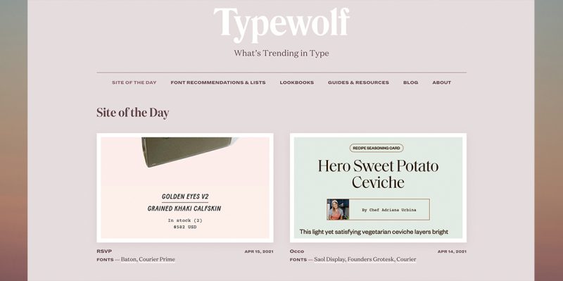
8. Typewolf: Typography Through The Eyes Of A Designer
Typewolf is an independent typographic resource, launched back in 2013 by Designer Jeremiah Shoaf. Aimed at the everyday designer like Fonts in Use, it takes a more applied approach to typography inspiration, presenting their features in context specific screenshots. Check out their daily curation of applied typography in their “Site of the Day” feature, which spotlights a live website and a succinct breakdown of all the fonts used to create said website.
And if your good old grey matter has just reached its typographic tether, or you’re just looking for a quick solution to turn around a stagnant brief that has been going nowhere forever—Typewolf has your back with their carefully curated portfolio of Lookbooks. Ready-made books that take a page from Vogue.
Instead of matching clothing items, they’ve applied this approach to the world of fonts. If you’re looking to design a website for handmade bucket hats with a retro twist, or need to create a clean and crisp flyer for a tech start-up—these pre-curated style guides will be your saving grace. Just the type of typography inspiration you need to pivot out of a creative block.
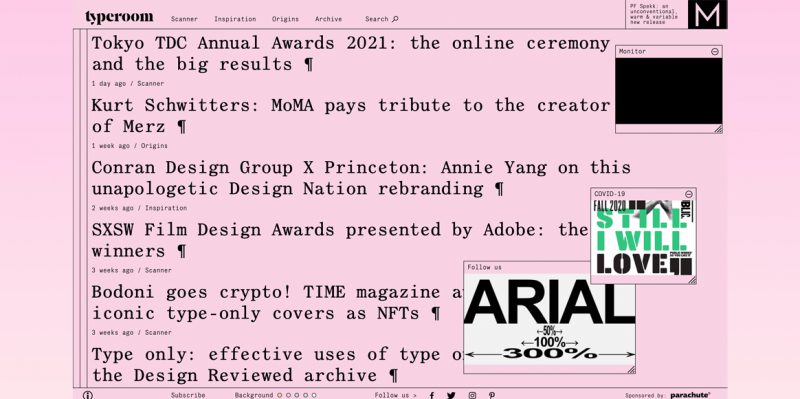
9. Type Room & 10. Fonts Wants: Straight And To The Point
Feeling a little overstimulated by typographic mockups and eye-catching thumbnails dancing across the page? Why not settle down into some minimalistic resources, where every element of the anatomy of type can be truly appreciated.
Let’s delve into our first resource: Type Room. Reminiscent of something cross between an old-school html site and a serif heavy regional newspaper, Type Room relies on straightforward headlines (emphatically punctuated with a pilcrow). Like“DC Circuit: Times New Roman is in, Garamond is out” and “Bodoni goes crypto!”
With this second offering, don’t be put off by Fonts Wants (try saying that 10x fast) tongue twister of a name, their website is modular and simple in format. And if entirely monochromatic minimalism isn’t totally your thing, the site displays tantalising offerings of colour if you roll your mouse over select boxes, revealing how the foundry or individual has chosen to spotlight their typographic baby.
If that mode of discovery still doesn’t tickle your fancy, hop over to the drop down list to filter the selection by classification (serif, san serif, mono etc.) or check out their straightforward directory of foundries. Each name arranged in no-nonsense dark bricks against the grey background – one will be sure to catch your eye. Enter: the rabbit hole of typography design inspiration.
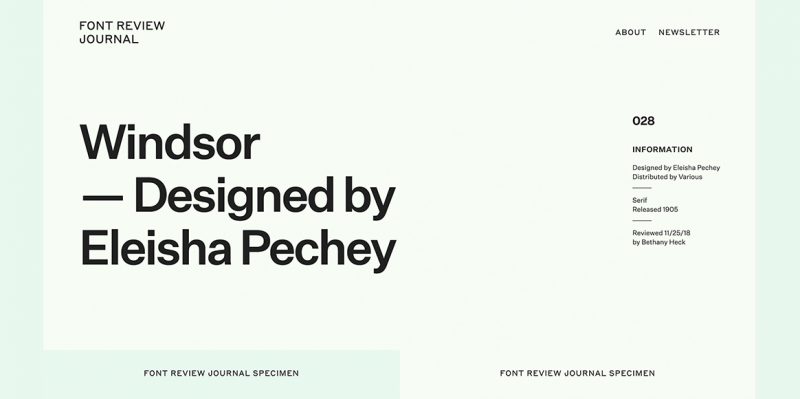
11. Font Review Journal: A Critical And Analytical Approach
Here’s how Font Review Journal describes itself: “home to reviews and analysis of typeface designs both new and old. This site is aimed at designers who want to discover new typefaces to add to their arsenal, or those who want to learn to appreciate old favourites on a deeper level.”
Started semi-recently, this tight curation by Bethany Heck (Design Director and type enthusiast) is a journal that reviews and critically analyses her favourite fonts. Its “aim is to show appreciation for these works of art through thoughtful discourse, aesthetic studies and historical context”. The journal’s intended function is to close the gap in communication, and bridge the seemingly divergent practice of the type designers and the designers that use their work.
Updates are weekly but you can still peruse the small collection for your typography inspiration.
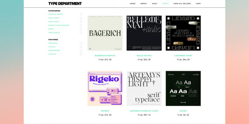
12. Type Department: Typographic Retail Therapy
Established by TYPE01 “one of the leading platforms that specifically publishes type-focused media”, Type Department is the extroverted and entrepreneurial youngest child of the TYPE01 Family (FemmeType being the strong and independent eldest daughter).
Retail therapy may not be everyone’s solution to destress in the midst of a creative crisis, but if it is yours—Type Department may just have what you’re looking for. They describe themselves as an “independent online marketplace”, and even have a dedicated Sale! section to get you spending your cash on typographic delights.
On a mission? And have a list of criteria in mind of what kind of typeface you’re wanting to find? Type Department presents a compelling sell. Their site displays their goods in inspirational and colourful little tiles, with explicitly labelled price tags below each. The display of creative typography just calling you to make the conversion and tuck away an exciting new find into your personal font library.
BUT if you’re not ready to commit, why not jump back up to inspo filled matriarch TYPE01.
Typographic Expert Resources — What are the Top Dogs Doing?
So here we are, after searching endlessly for the one, you’re still going home alone. Worry not, not everyone is going to be your “type” wink wink, maybe it’s time to connect with something a little more relatable. Something more human, with a story, a face or a tangibility to reassure you that stellar typography can and does originate from humble human lifeforms like yourself. It’s time to turn to the experts.
Typographic Experts: Collectives, foundries and individuals that dabble, immerse and experiment in the world of typography. People like you and I, but also different in the sense that they understand the anatomy of typography like a world renowned surgeon understands the human body.
See below for a curation of individual projects, campaigns, and collective portfolios. And be inspired by these exemplars of creative typography.
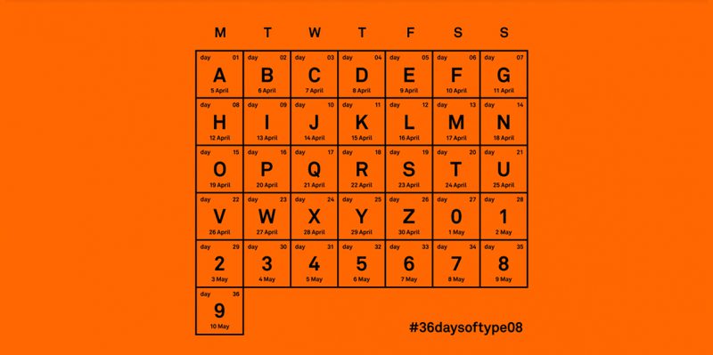
13. 36Days of Type: Something Experimental, Something New
This project has its origins in Barcelona. The brainchild of Nina Sans and Rafa Goicoechea—both Graphic Designers. It was established as an exercise to push their creativity and create a personal daily design challenge. Actually starting a project can be the hardest part of the design process and a daily challenge is the perfect impetus to catalyse creativity.
An annual project that invites creatives around the world to design a letter or number daily, on a 36 day type marathon. These submissions are then posted by the individual creators to Instagram and a select few are curated by 36Days to feature on their personal instagram.
The overwhelming feeling of having to tackle typography is abated with bite-sized snippets of inspiration that you can all too easily engage with yourself. Whether 36Days of Type is a reassuring reminder that the world of Typography isn’t an insurmountable monster, or a resource you can use to further your own practice. It is undoubtedly a fantastic platform that is full of typography inspiration.
Check out the hashtag #36daysoftype on Instagram for a limitless vault of creatively designed letterforms and numbers.
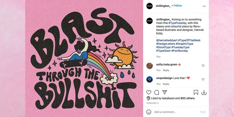
14. Shillington: #TypeTuesday
A bit of a universal hashtag. A widely used weekly checkpoint, and celebration of Typography. We’ve been on board with this for sometime now and have curated quite the collection on our own Shillington Instagram!
We love to feature a mixture of Industry experts doing their thing in the world of Typography, as well as impressive examples from our very own graduates all around the world. Tune into our feed every Tuesday, or look out for the hashtag #TypeTuesday for some powerful, playful and stunning examples of typography inspiration.
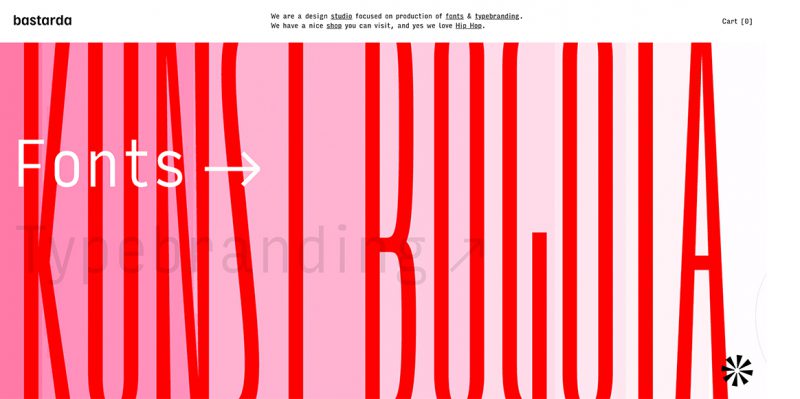
15. Bastarda Type: If You Like Hip Hop
This Hip Hop loving, bold and playful typographic foundry hails from Colombia, and specialises in innovative fonts and unique Type branding. A small studio of three, one funny, one detailed and one geeky, they delight in the experimental aspects of creative typography. They also have a shop, which is a cool way to see how typography can be translated to a wide range of collateral: from t-shirts and embroidered artworks to hoodies and coffee. And their love for typography goes hand in hand with their appreciation for music. So if you’re looking to experience another level of inspiration, visit their music blog: Digging Radio. Look no further to find sharpie-labelled mixtapes in graffiti-style hand lettering, with names like “French” “Street Life” and “Retro City”
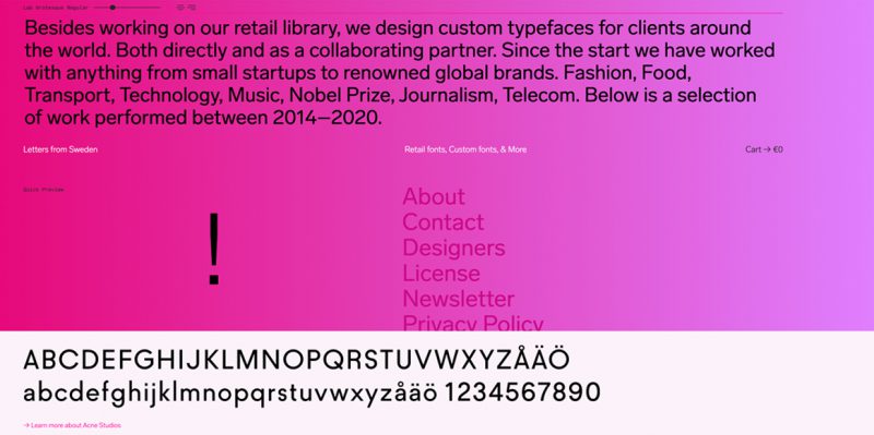
16. Letters from Sweden: Literally, Letters…from Sweden, but for everyone
Slightly romantic in name and effortlessly elegant. Letters from Sweden is a type foundry with an emphasis on designing type for clear communication, carrying the manifesto “Our letters come from Sweden, but they are for everyone.”
Established by self-taught typographer Goran Soderstrom, Letters from Sweden have designed typefaces for commercial, conceptual and retail applications. From a rebrand for Acne Studios to creating typefaces for The Nobel Prize and the Swedish Postal Service.
Looking to figure out how to communicate a concept clearly, supported through the use of type? The project gallery on their website featuring their high profile clients is a great starting point to learn how the experts play with typography in the real world.
They’ve also got a newsletter you can sign up for, if you’d like news…about letters…from Sweden.
Typographic Ideas for Your Ears — a Podcast!
Eyes tired, lids heavy, can you find inspiration with your eyes closed?
Your eyes are tired after reading this entire article, well done! But you can’t bear to look at a single letterform any longer. What if you heard about it…in a podcast? The age old question—can you find inspiration with your eyes closed?
17. Weekly Typographic Podcast (The League of Movable Type): The audible resource
Well, we were given other senses for a reason, and The Weekly Typographic Podcast (by The League of Movable Type, the first open-source font foundry) is the perfect thing to switch on when you just want to switch off. The podcast averages about half an hour, and delves into a wide range of topics. From obscure design practices to long-lost arts and the intricacies of typographic terminology. There’s a tidbit of typographic inspiration to be found in every episode, and your ears will learn so many things that you can look up later. When your eyes are up to it.
Did you enjoy this resource? We have lots more type based resources to explore such as 10 Free Google Font Alternatives to Popular Fonts and 12 Great Typefaces Created by Shillington Design Students.
If you’re still curious about typography then maybe upskilling at Shillington is the answer. RSVP to one of our info sessions to meet the team, speak with graduates and find out more.
Posts you might like

One of the best things about graphic design is that it never stands still for a moment. But that does mean that keeping up with...

The best graphic design books can take you on an exciting journey of the imagination, transport you to new creative worlds or...
We’ve all been feeling the squeeze over the past few years, but at Shillington we don’t want this to stop anyone getting the...

Are you considering becoming a graphic designer but want to be working online? With the increasing demand for digital design...
To ensure Shillington's commitment to the LGBTQ+ community extends beyond Pride Month, we’ve collated a list of incredible...
Are you looking to teach yourself graphic design? If so, you may be wondering if it is possible. The answer is yes—it can...
Are you interested in becoming a graphic designer but don't know where to start? You may be wondering if it's possible to...
Are you considering changing your career, but don't know where to start? Are you an aspiring creative with a passion for...
Want to win some amazing prizes and stay in the loop with all things Shillington? Sign up to our newsletter to automatically go in the draw.