Wolfgang Weingart: A Swiss Graphic Designer & Typographer

Wolfgang Weingart (b. 1941)
Wolfgang Weingart is a graphic designer and typographer. He is commonly credited as the father of New Wave typography, also known as “Swiss Punk Typography.”
Born in 1941 in southern Germany, Weingart attended the Merz Akademie in Stuttgart from 1958 to 1960. His design education focused on typesetting and the process of making linocuts and woodcuts. This was an important foundation, because everything changed once Weingart discovered Swiss Typography—also known as International Typographic Style.
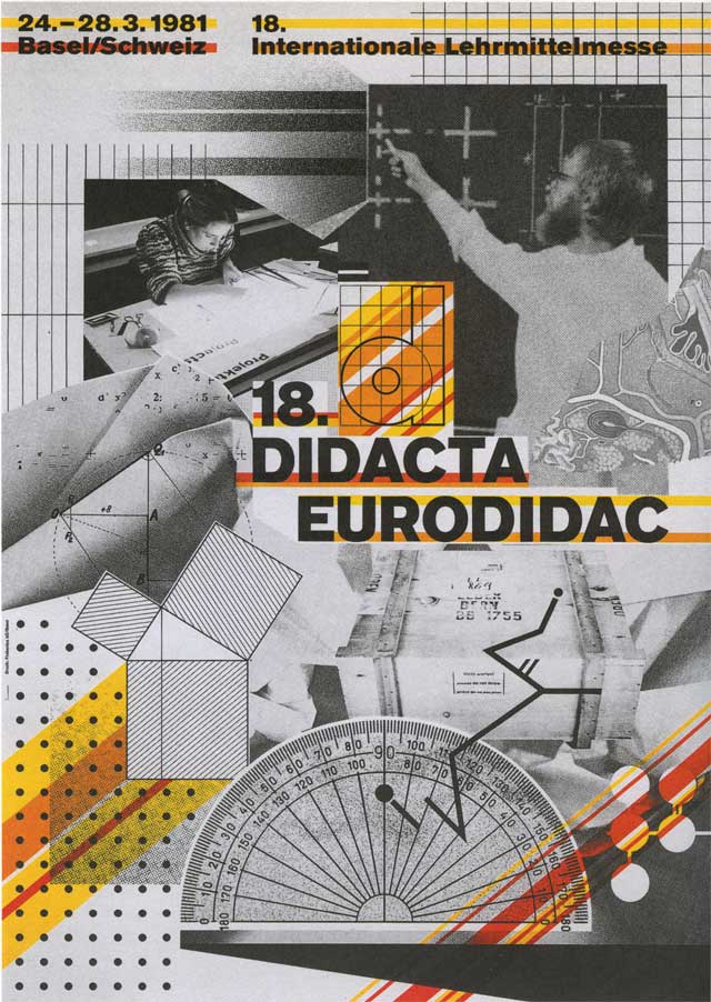
Let’s set the scene. While Weingart was still a print apprentice and design student, legends Armin Hofmann, Karl Gerstner, Emil Ruder, and Josef Müller-Brockmann were making work that would come to be referred to as International Style. This style had a goal of communication above all else, incorporating new techniques of photo-typesetting, photo-montage and experimental composition.
The fundamental elements of International Style are: (1) typography—predominately sans serif, (2) images/photography, (3) colour and (4) graphic elements. Fontwise, think Helvetica. Designwise, think angled text, vibrant colours and strict gridlines.
So, back to Weingart. Since the 1970s, he has had a decisive influence on the international development of typography. But it’s important to note that while Weingart’s work champions the four fundamental elements of International Style, at the same time—something’s different.
How, you ask? I believe the difference in the tone of his work is due to his unique process. He somehow remixes the elements and invigorates his design method. If you take a closer look you’ll see that Weingart’s design process involves:
- Deconstruction/remixing
- Extrapolation (consciously churning out variations on the design)
- Juxtaposition (setting those versions next to one another)
- Cross-analysation (analysing which option is better when they’re next to each other)
Weingart played, experimented and continuously asked: “How many different ways can I see this same old stuff?”
So instead of striving for perfect compositions, he developed a new approach the whole style.
According to Weingart, “I took ‘Swiss Typography’ as my starting point, but then I blew it apart, never forcing any style upon my students. I never intended to create a ‘style’. It just happened that the students picked up—and misinterpreted—a so-called ‘Weingart style’ and spread it around.”
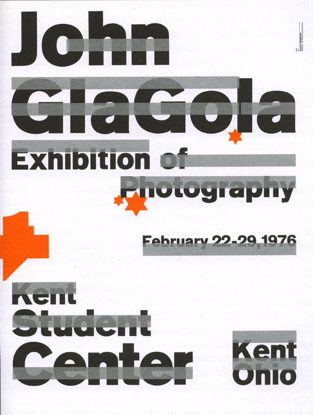
Weingart exhaustively churned out iterations, cut things up, replaced elements, changed the grid, changed the colours, changed the typeface weight, style, and point size, etc. He would develop a wealth of design options for one single brief, then cross analyse those options and pick the #1 best solution.
I would argue that Weingart’s innovative way of working—with a conscious focus on iterative design process—has changed the way the world approaches design. In this way, his “remixing” process has fundamentally changed the way the world receives information via visual communication.


Who’s next for Throwback Thursday? Here’s a hint: she’s famous for transforming signage and typography throughout Britain’s roads, railways and airports.
Posts you might like

One of the best things about graphic design is that it never stands still for a moment. But that does mean that keeping up with...

Exposing yourself to examples of good graphic design is a healthy practice no matter who you are. Maybe you’re a student...
In graphic design, quite a few decisions happen behind the scenes that clients may not grasp the importance of, yet have a huge...

Looking to make a creative career change at 40? There’s no time like now. It may seem like a daunting decision, but we’re...

Making a career change in your 30s can seem daunting, like really daunting. But we’re here to tell you, it’s not. As a...

Are you seeking a holistic introduction to the design industry, theory of practices, more exploratory projects for...

Are you based in the West Coast and looking to study graphic design? We’ve compiled a list of the top graphic design schools...

Ever thought about studying graphic design abroad in London? Well you can do that with Shillington’s graphic design course....
Want to win some amazing prizes and stay in the loop with all things Shillington? Sign up to our newsletter to automatically go in the draw.