11 Amazing Designs for Activism and Protest
Independent British designer Johnathan Barnbrook is quoted as saying “Design is both a political and cultural force for change.” He’s right: Activism, protest and design have always gone hand in hand. And design, whether a logo, a poster or a hand painted sign, can become an instantly recognisable symbol of a movement.
There is countless examples of design for activism. We have selected eleven of the most incredible and most impactful campaigns from both history and more recent years.
1. The Raised Fist
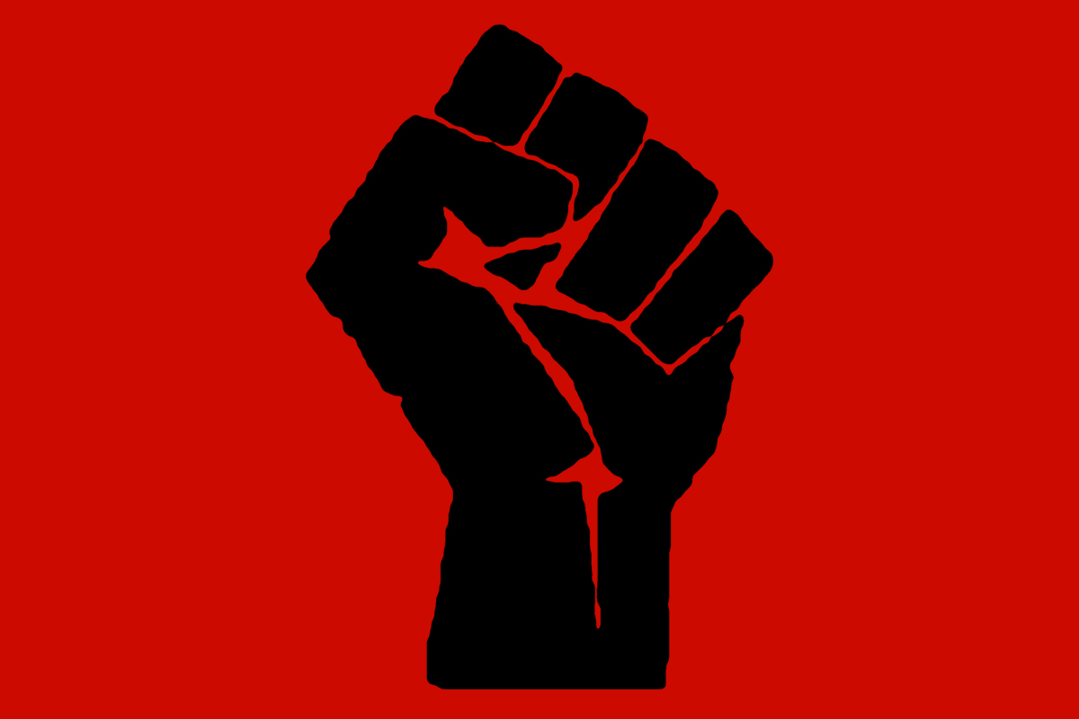
One of the most widely used graphic symbols in the world, the Raised Fist is a symbol of solidarity. It was first used by as the logo of the Industrial Workers of the World in 1917. Popularised by the Republicans in the Spanish Civil War, the symbol (and salute) is an act of unity or solidarity with oppressed peoples. It has been co-opted by many different organisations and campaigns ever since.
The Raised Fist can be combined with another graphic element to give it multiple meanings. It has been used by Irish Republicans, Feminists and during the May ’68 uprisings in France. Though the most well known iteration of the Raised Fist is the Black Fist. This represents Black Nationalism or Socialism and was used widely by the Black Panther Party in 1960s’ USA.
2. The Smiling Sun
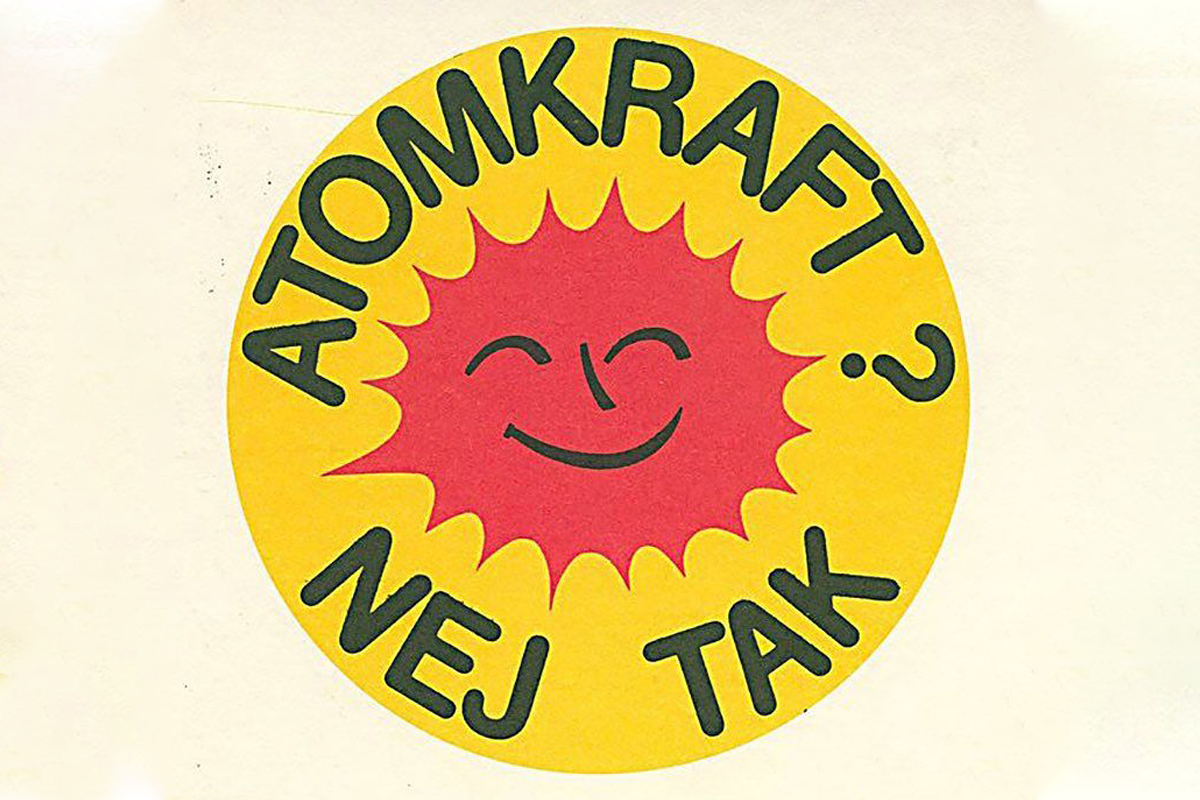
The Smiling Sun is a globally recognised symbol of the Anti-Nuclear movement. English speakers know the slogan as “Nuclear Power? No Thanks” but it was actually originally Danish: “Atomkraft? Nej Tak”. In fact, the symbol was originally a badge designed by 21 year old Danish activist Anne Lund. Lund belonged to the organisation OOA (In English: Organisation for Information on Nuclear Power).
It’s friendly appearance combined with its polite but firm questioning calls for communication by dialogue. In other words, it is non-confrontational. This badge has been produced in 45 different regional and national languages. Over 20 million have been produced and distributed worldwide.
3. Black Lives Matter Murals
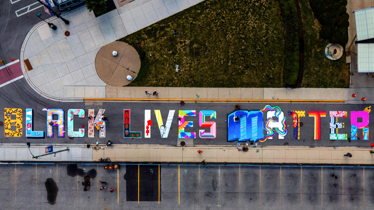
Since the death of George Floyd at the hands of the Minneapolis Police Department on 25 May 2020, tens of thousands of people have taken part in anti-racist protests in cities and towns across the USA and the World. As part of these protests, road murals depicting the words Black Lives Matter started appearing across American cities. The first of these, in Washington DC, was commissioned by the city’s mayor Muriel Bowser. Bowser commissioned 8 local artists to paint the words in 50 foot high letters on 16th street, a short distance from The White House.
Since then, Black Lives Matter road murals have been painted in Chicago, Sacramento, Oakland, Hollywood, Brooklyn, Cincinnati and many other US cities. Other cities have painted variations of the mural, such as End Racism Now in Raleigh, North Carolina, and Black Austin Matters in Austin, Texas. The murals have been seen across the world and have become a important image in the Movement for Black Lives.
4. Silence = Death
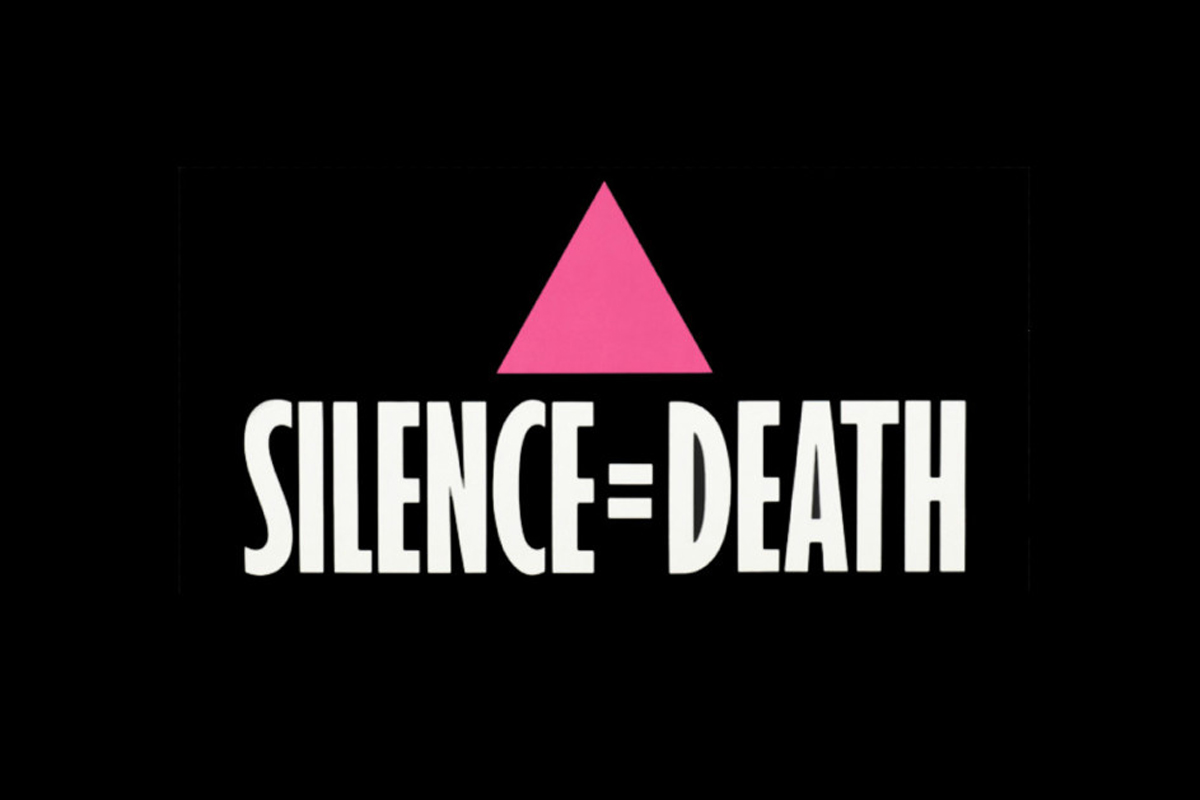
Silence = Death refers to two things. Firstly, the iconic poster and central image of ACT UP (AIDS Coalition to Unleash Power). And, secondly, the poster’s designers, known as the Silence = Death Project. The latter was a New York-based collective made up of six gay activists, Avram Finkelstein, Brian Howard, Oliver Johnston, Charles Kreloff, Chris Lione and Jorge Soccarás.
Inspired by groups like Guerrilla Girls, S=DP wanted to create a striking poster that could be wheatpasted all over New York. The ease of wheatpasting helped to create awareness of their campaign. Their design reclaims the Pink Triangle, which was used in Nazi Concentration Camps to signify homosexual and bisexual men and transgender women. Their Pink Triangle draws attention to the disproportionate affect of the AIDS crisis on gay and bisexual men.
5. The Black Panther Party Posters
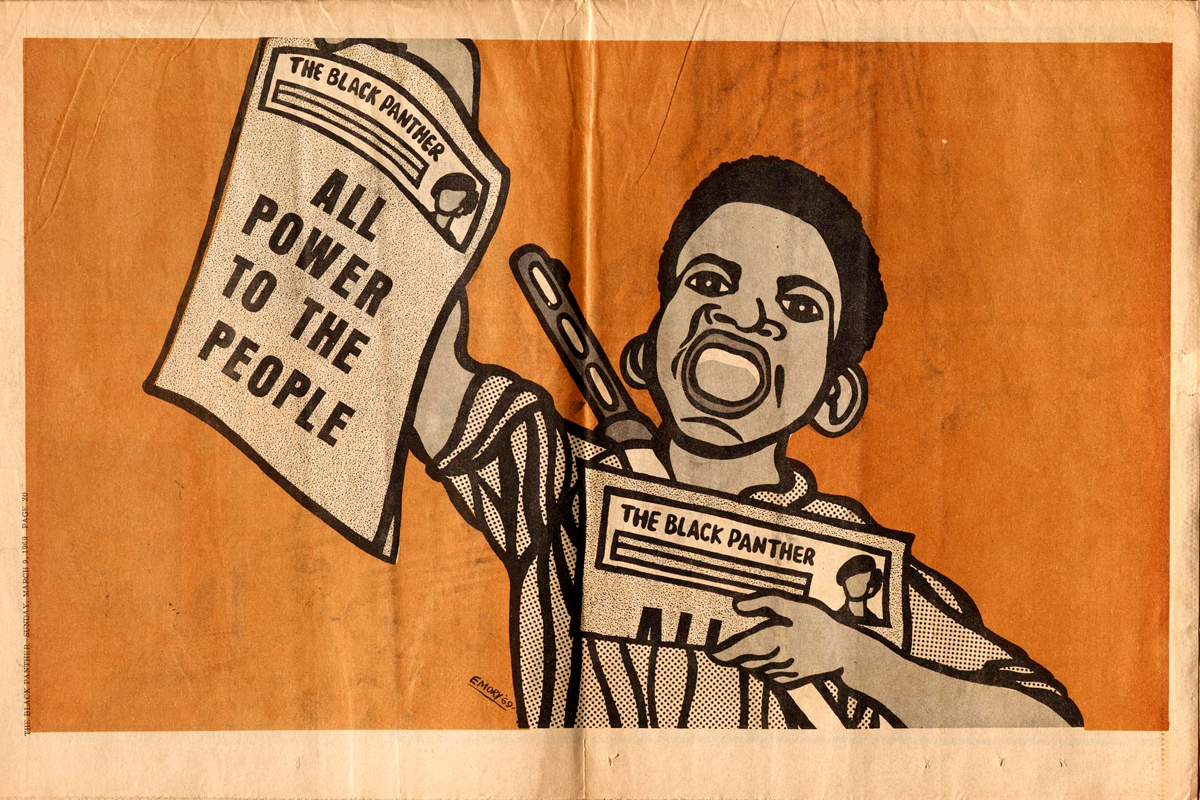
The artwork and posters of the Black Panther Party were designed predominantly by graphic designer Emory Douglas. Douglas’ posters became more than just activism—some became icons of the struggle of Black Americans in the 1960s and ’70s. Douglas got involved with the Party the year after it was founded by Bobby Seale and Huey Newton. He became the Party’s Minister of Culture and took charge of publishing their newspaper.
In his illustrations for the paper, Douglas depicted African Americans as freedom fighters and police and politicians as pigs. He used slogans such as “All Power to the People” and “Revolution in our Lifetime” mirroring the official mission of the Black Panther Party. Though, Douglas’ work did more than this. His imagery uplifted his community, depicting African Americans as revolutionaries rather than victims. Douglas was heralded by his community—but was subjected to an investigation by the US Government.
6. For All Womankind
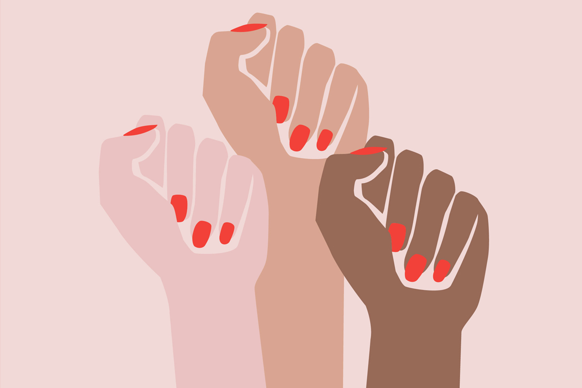
Following the election of President Trump in 2016, New York-based designer Deva Pardue wanted to create something that showed that issues of gender, race and sexuality are not distinct from each other. Pardue designed a series of posters to help raise money for women’s rights organisations. For instance, the Center for Reproductive Rights and Emily’s List. Taking inspiration from the Raised Fist motif mentioned above, Pardue created her now iconic Femme Fists image. Before the Women’s March in January 2017, Pardue put the Femme Fists poster up for free download. They were downloaded thousands of times, regrammed by Rihanna and eventually became emblematic of the women’s movement in the latter half of the 2010s.
We spoke to Pardue for last year’s Shillington Post 08—The Creative Women Issue and she told us: “It’s super cool to have created something that so many people around the world could identify with and use to express their passion. It’s very rewarding to see something you put out into the world make such visibly vast and positive impact.”
7. The Brixton Pound
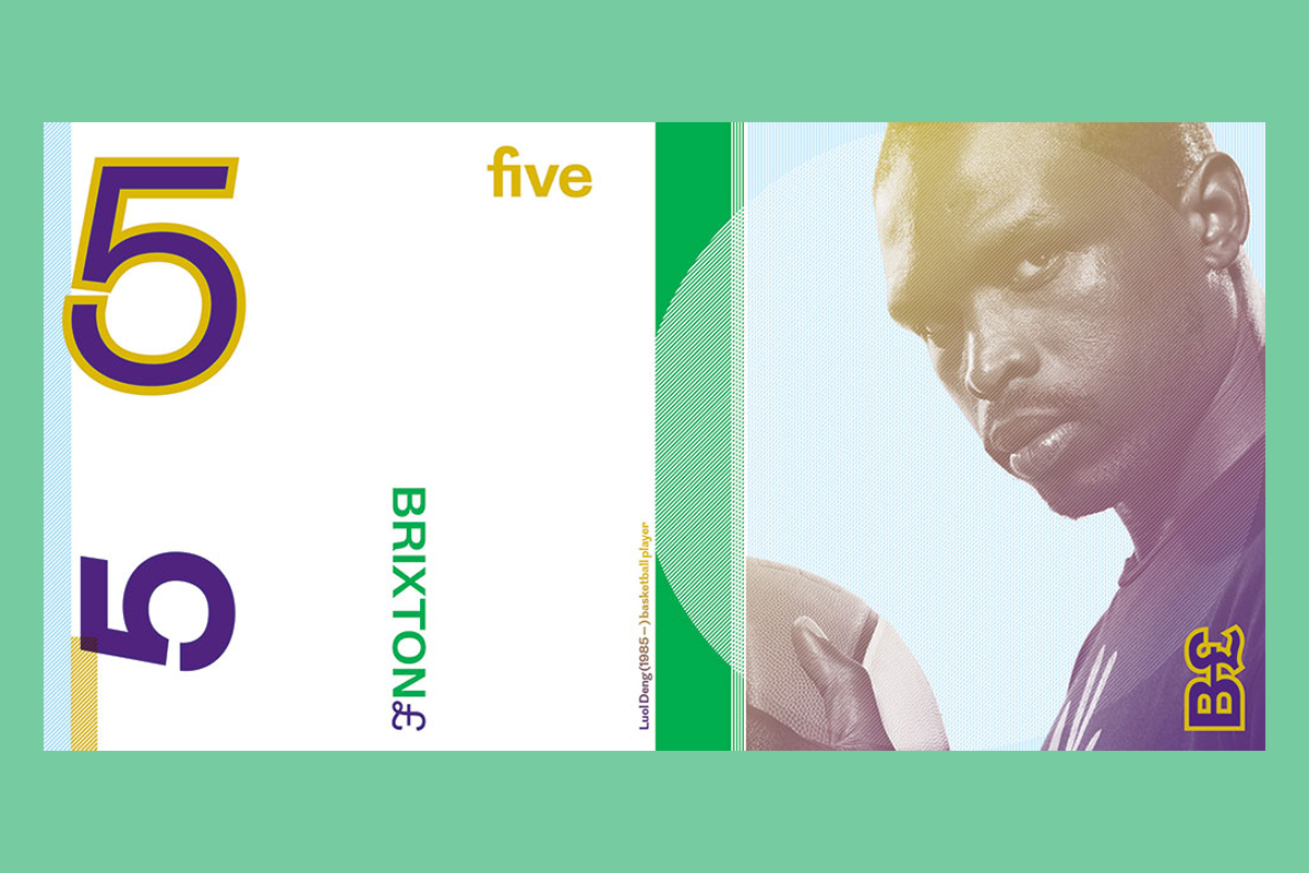
The Brixton Pound is a currency developed to be use exclusively in the Brixton in South London. Introduced in 2009, it works alongside British pounds sterling as a complementary currency to help boster the local economy and independent businesses. In order to maintain the diversity of the high street and increase local pride! On top of this, the physical bank notes are a beautiful piece of design. Designed by local agency This Ain’t Rock N’ Roll, the notes were inspired by Brixton’s Coldharbour Lane Barrier Block, a local housing development. They feature local heroes and elements of other well known Brixton landmarks. Among those featured are British NBA player Luol Deng, British World War 2 spy Violette Szabo, community activist and co-founder of the Black Cultural Archives Len Kwesi Garrison and David Bowie.
8. The Peace Symbol
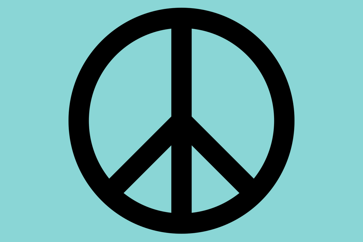
The Peace symbol has become so commonplace that it’s easy to overlook both its history and the fact that it is a piece of design. The logo, which was then known as the Nuclear Disarmament logo, was designed by British designer Gerald Holtom. Soon after its release in 1958 it became the official logo for the British Campaign for Nuclear Disarmament (CND).
The vertical line and two diagonal lines that make up the symbol are based on the letters ‘N’ and ‘D’ in the flag sephamore system. Though, Holtom has also said that he was partly inspired by the central figure in Francisco Goya’s painting The Third of May 1808. The logo was never copyrighted and in the decade after its introduction became the general purpose peace symbol we know it as today.
9. High Noon on June 4 (Solidarność)
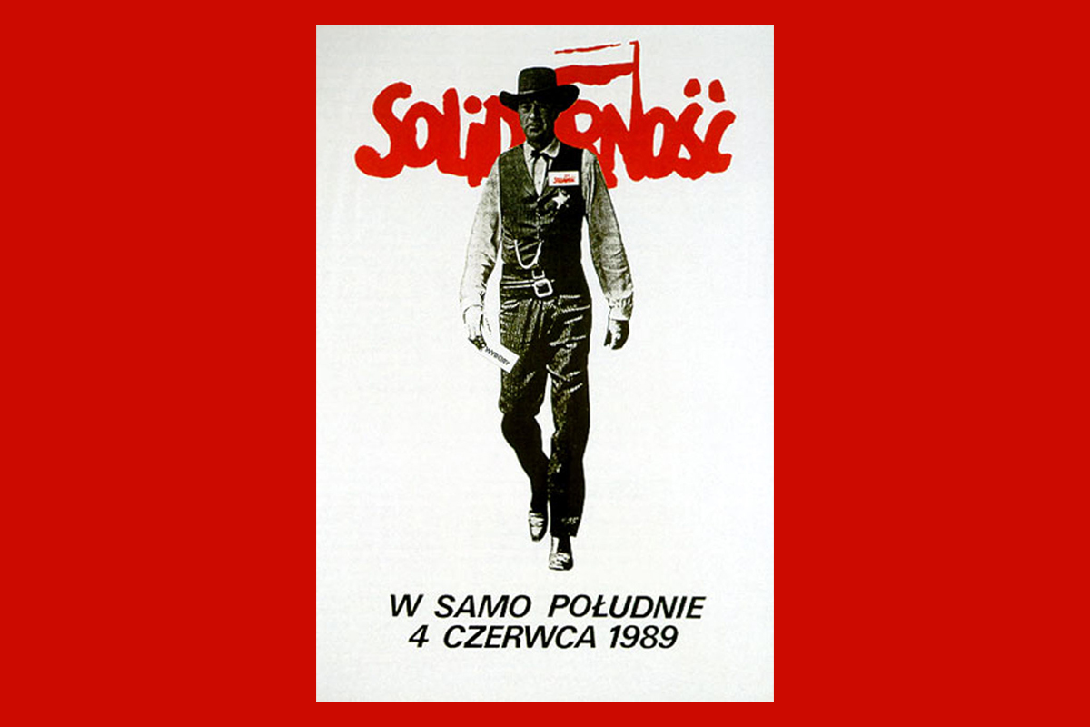
There was a lot of amazing design associated with the movement of the Polish trade union, Solidarność (Solidarity in English). Although, Thomas Sarnecki’s 1989 poster is debatedly the most famous of the lot. The poster uses the image of an iconic American figure (Gary Cooper in the Western High Noon). Cooper’s characters wears a Solidarność badge and is holding a Solidarność ballot. Jerzy Janiszewski’s famous red logo is also emblazoned on the background.
The Solidarność logo itself is a fantastic piece of design.The letters were designed to represent united individuals, which later became its own sans serif typeface Solidaryca. By combining a very American image with Solidarność material, Sarnecki showed that the upcoming June 4 elections were of momentous importance to Poland. Especially given what the US meant to Poland historically and culturally.
10. G’Ay Mate
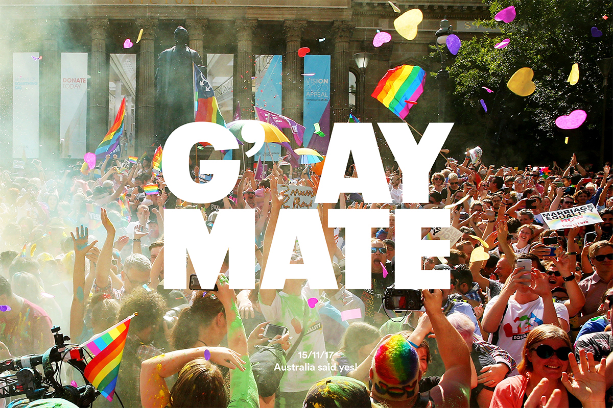
Prior to the legalisation of gay marriage in Australia in 2017, global design agency Interbrand launched it’s G’Ay Mate campaign in support of pro-marriage cohort. Cleverly reimagining the world famous Aussie greeting “G’day mate” to extend the equally famous Aussie openness to the country’s LGBTQ+ community. The agency produced t-shirts, a national poster campaign and flyers that encouraged and advised people how to vote. On top of this, members of Interbrand’s Australian studio joined pro-equality marches to help spread their message on the streets.
The campaign took a phrase that is distinctly Australian and created something that remained friendly, laid back and open while making a very important point. The campaign made the Australian LGBTQ+ community a part of what makes Australia Australian.
11. Abram Games’ WW2 Propaganda Posters
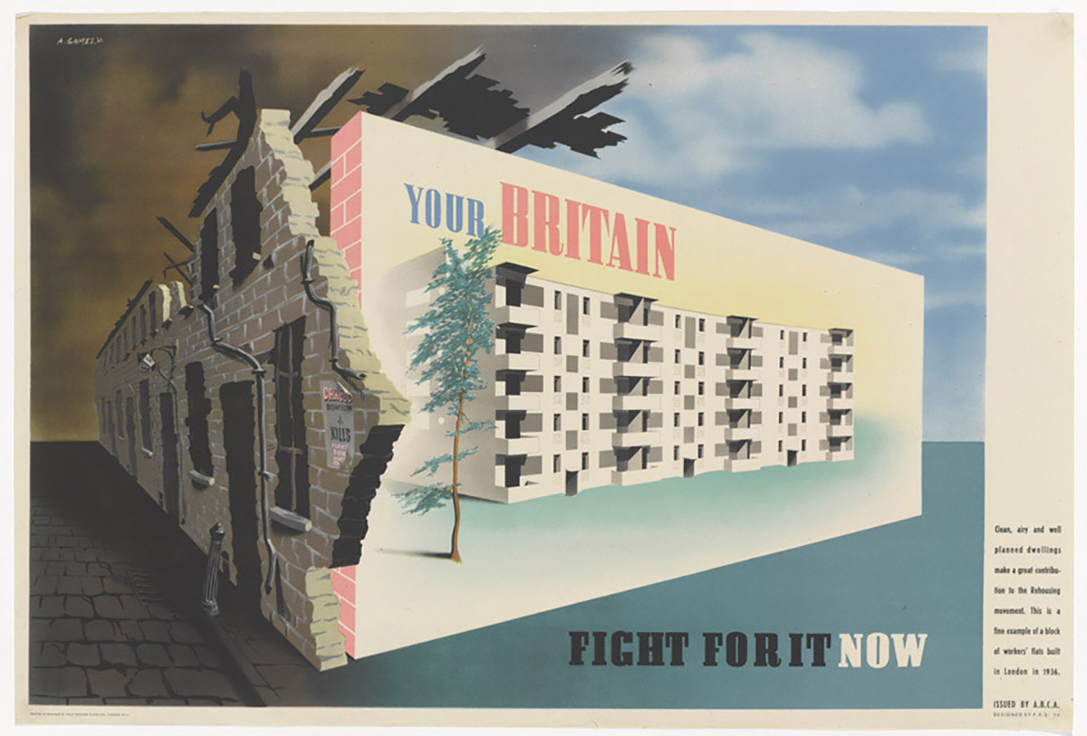
During the Second World War, British graphic designer Abram Games was recruited as an Official War Artist. Between his appointment in 1941 and the end of the war, Games created over 100 propaganda posters for the British government. He had to create posters that would encourage both soldiers and civilians and to increase war efforts. Given a certain amount of artistic freedom, the posters Games created were striking and beautiful with some surrealist elements. They took official war posters in an entirely new direction. Though, at the time, not everyone loved Games’ work. Winston Churchill even ordered that one of his posters be removed from a 1943 exhibition. His propaganda posters were ahead of their time design-wise.
Have you got a favourite piece of design that was used for activism? Share them with us on Twitter.
Fancy learning graphic designer yourself? Learn more about our innovative graphic design course and become a designer in three months full-time or nine months part-time in London, New York, Manchester, Sydney, Brisbane, Melbourne or Online.
Posts you might like

One of the best things about graphic design is that it never stands still for a moment. But that does mean that keeping up with...

The best graphic design books can take you on an exciting journey of the imagination, transport you to new creative worlds or...

At Shillington, our dedicated graphic design students are taught all about how to design for packaging—from FMCG (that’s fast...

At Shillington, our graphic design course teaches students how to design campaigns for a brand, helping to spread its message....
Exposing yourself to examples of good graphic design is a healthy practice no matter who you are. Maybe you’re a student...
At Shillington, our graphic design bootcamp students are taught how to design for digital, incorporating aspects of both UI and...
We love graphic design. And we're guessing, as you're here, you love graphic design too. This means that we all love graphic...
Graphic design is an ever expanding creative discipline. With our graphic design course, we teach you how to make research a...
Want to win some amazing prizes and stay in the loop with all things Shillington? Sign up to our newsletter to automatically go in the draw.