An Interview With David Pearson (Type as Image)
David Pearson is, to steal a phrase, “a Wonderful Man”. He achieves this title through his creative and simple approach to the book covers he designs. This is something that is surprisingly hard to do well. You are attempting to convey a very complex message with just one visual nod. David Pearson achieves this with delicate precision.
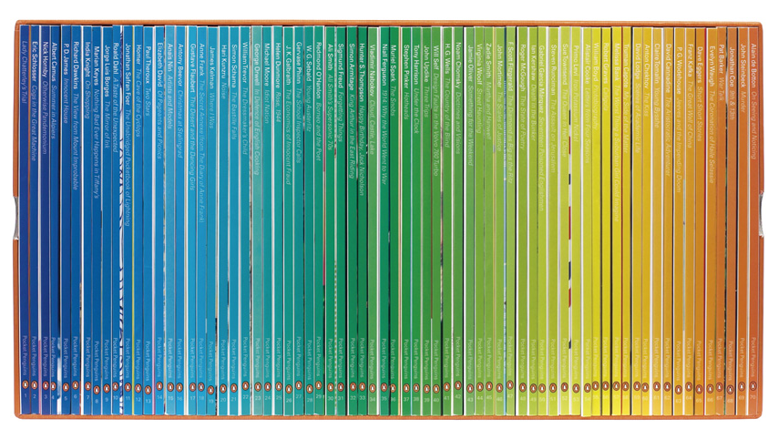
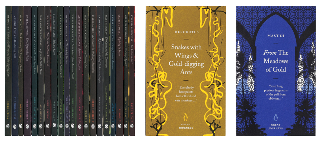
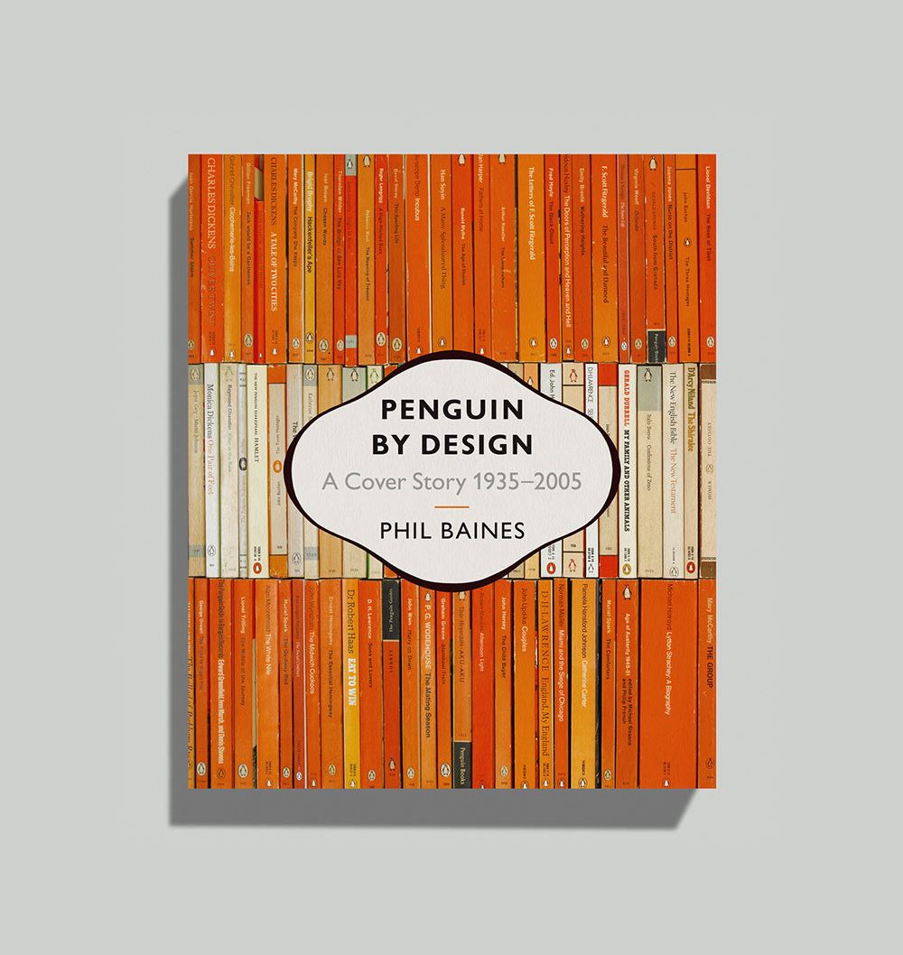
The book series Great Ideas I, for which he designed the covers, demonstrates his subtlety. The typographical treatment is simple, in its alignment and form, but effective. He achieves this through the content he chooses and the use of colour. He plays with the design principles, but never disregards them. Each of Pearson’s covers communicate the essence of the books through the use of white space, or flourish, or confinement. He does not try to make his mark but rather solves problems, and solves them with such ease; to make me incredibly envious and want to write a blog post about him.
Take note of his White’s Books as well, especially the Treasure Island Cover. Brilliant use of negative space!
If you’re loving David Pearson as much as Tilly, be sure to check out our wrap up of his guest lecture at Shillington London –> David Pearson—type as image #industrytalks.
Posts you might like

One of the best things about graphic design is that it never stands still for a moment. But that does mean that keeping up with...

The best graphic design books can take you on an exciting journey of the imagination, transport you to new creative worlds or...

At Shillington, our dedicated graphic design students are taught all about how to design for packaging—from FMCG (that’s fast...

At Shillington, our graphic design course teaches students how to design campaigns for a brand, helping to spread its message....
Exposing yourself to examples of good graphic design is a healthy practice no matter who you are. Maybe you’re a student...
At Shillington, our graphic design bootcamp students are taught how to design for digital, incorporating aspects of both UI and...

We love graphic design. And we're guessing, as you're here, you love graphic design too. This means that we all love graphic...

Graphic design is an ever expanding creative discipline. With our graphic design course, we teach you how to make research a...
Want to win some amazing prizes and stay in the loop with all things Shillington? Sign up to our newsletter to automatically go in the draw.