Design Case Study: Book Design for Oversharing My Selves with Shillington Teacher Annette Dennis
Annette Dennis is a Shillington teacher in Melbourne, a graphic designer and art director who specialises in branding, visual identity and editorial design. As a true consummate print and typography nerd, Annette runs her own independent experimental publishing imprint called Dossier Industries, where she designs and produces bespoke printed literature across a wide range of subjects. Through the imprint Annette creates unique work for clients, alongside producing exciting new self initiated projects.
While living in Texas in 2019, Annette worked with poet and artist Sarah May to design and print Oversharing My Selves, a unique book of poetry and images focusing on the authors relationship with her body. For those of you keen to explore editorial design and print production, in this case study Annette offers invaluable insights into the process from start to finish. Read on to learn how social media played a huge role in Annette connecting with her client, why passion projects can lead to opportunities in the field you love and why when it comes to designing a book, your printer should be considered your best friend in the process.
Can you tell us what the brief was for Oversharing My Selves and how you came to be working on the project?
I was living in Dallas, Texas and started following a local creative writer on Instagram as she seemed to know all the good restaurants and places to go in the city. Not long after I started following her, the writer (Sarah May) announced on Instagram that she had just finished her major in creative writing and was looking for a publisher to publish the work. So I contacted her and we met up soon after to discuss. I felt at the time and still feel, very privileged that she entrusted this work to me.
Can you tell us more about your company Dossier Industries?
I had always had a love of print and books in particular. A few years ago I moved from London to Dallas and I was unsure of what the job market would be like, so I decided to start making art books.
I had always been interested in art books and independent publishing so it seemed like a good time to actually do something about it.
I relocated to Melbourne at the end of last year and currently have a couple of books in the pipeline, for clients in Barcelona, Austin and Melbourne.

What was the project scope for Oversharing My Selves? Can you walk us through some of your process for the book design?
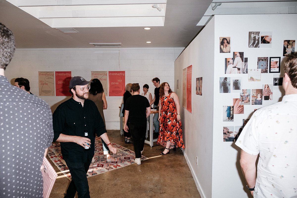
The original scope of the project was to design and publish a book however this extended into some additional collateral for the launch— posters, limited edition bookmarks and stickers, plus a microsite.
There are a couple of aspects of a book that I like to sort out before jumping into the graphic design proper. I like to nail down size pretty early on, even if it’s rough. The size of a book has such an impact on the book as an object and also affects the production cost.
Production cost will affect the retail price, so I like to know where the retail price should sit early on as well as this will affect how far we can push the production. The retail price is something that both publisher and author need to agree on, so there is usually a bit of back and forth shuffling to balance the production spec and the retail price.
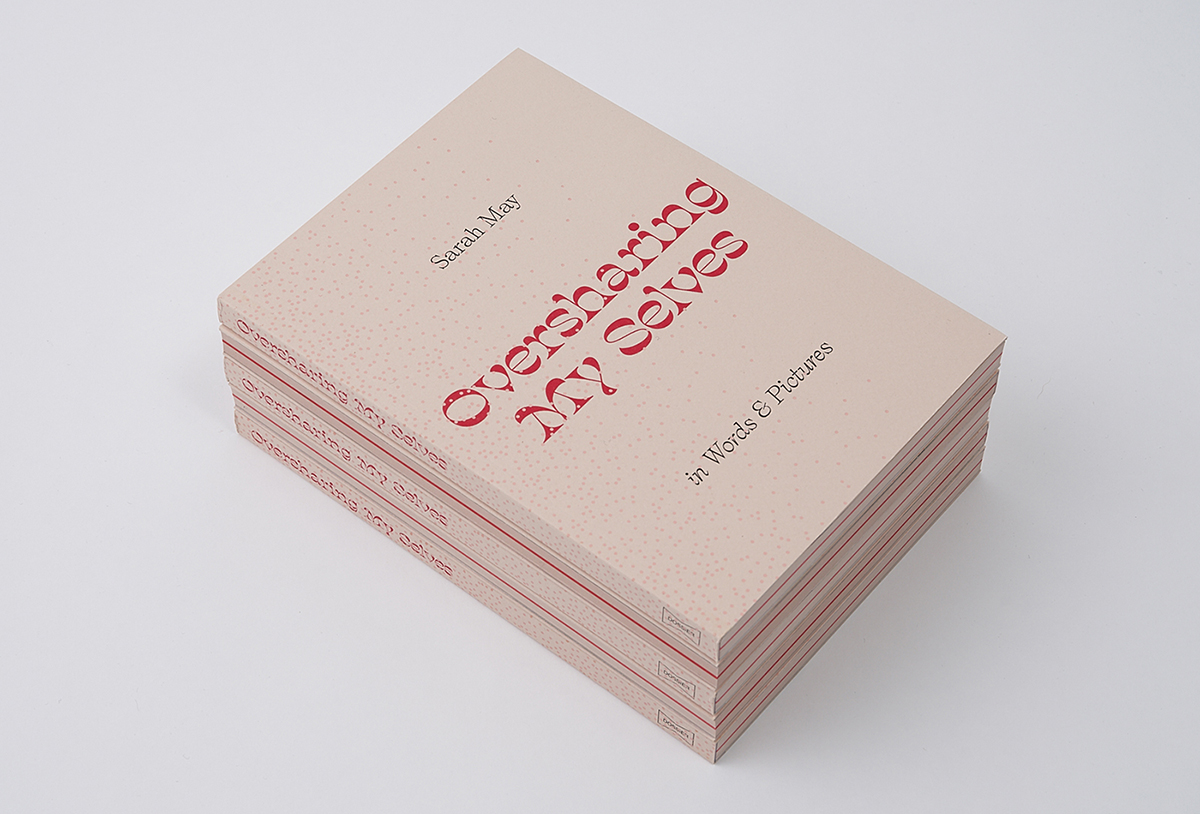
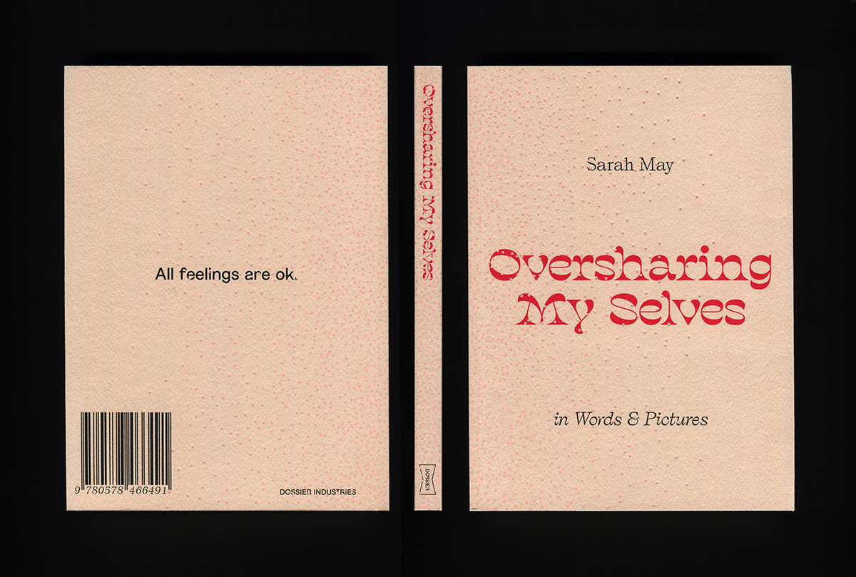
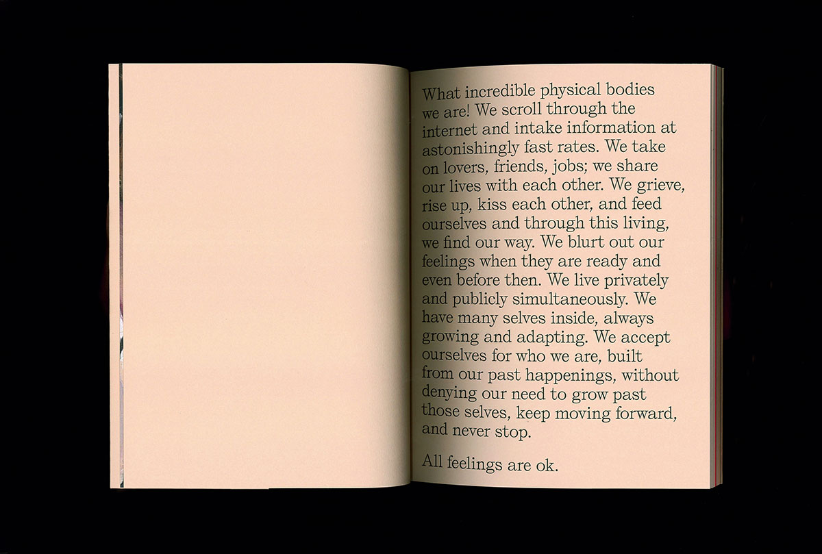
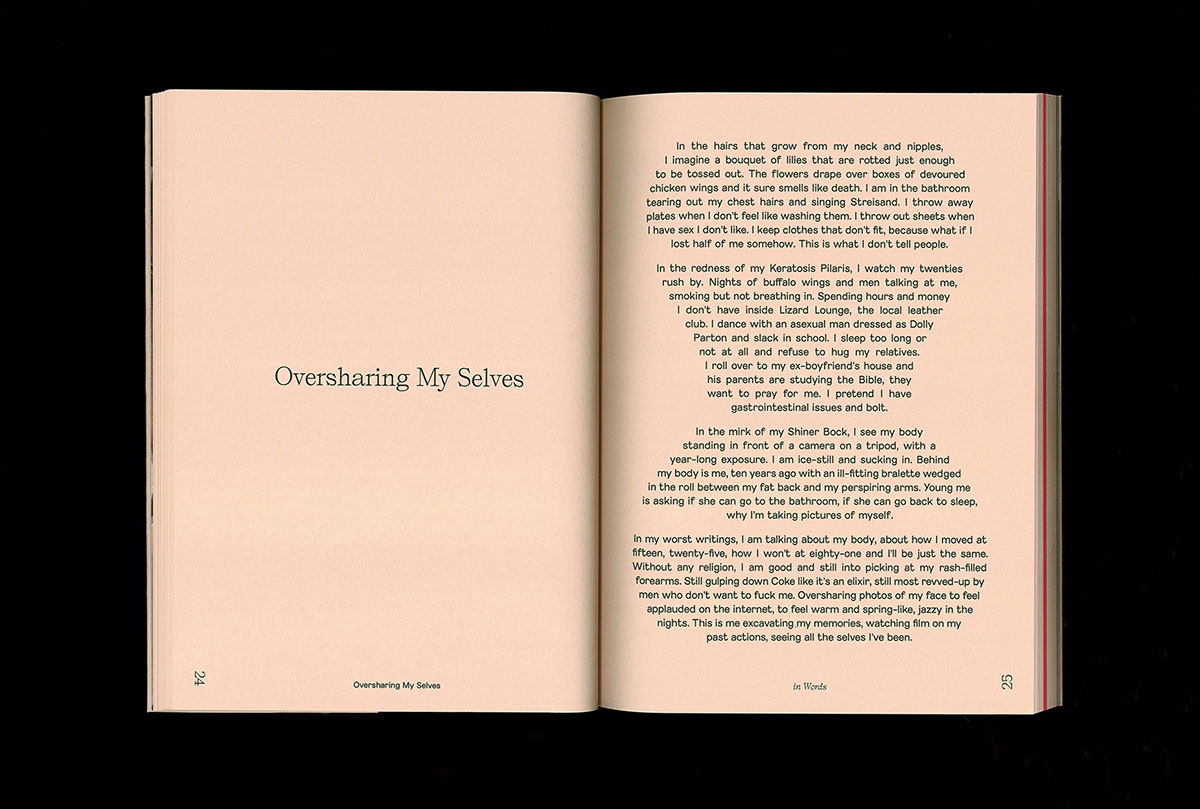
The concept for the book was driven by the themes within the text; the idea of self-exploration and the author’s experience of her physical and emotional ‘selves’.
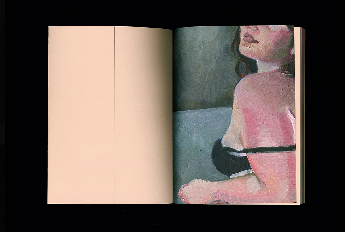
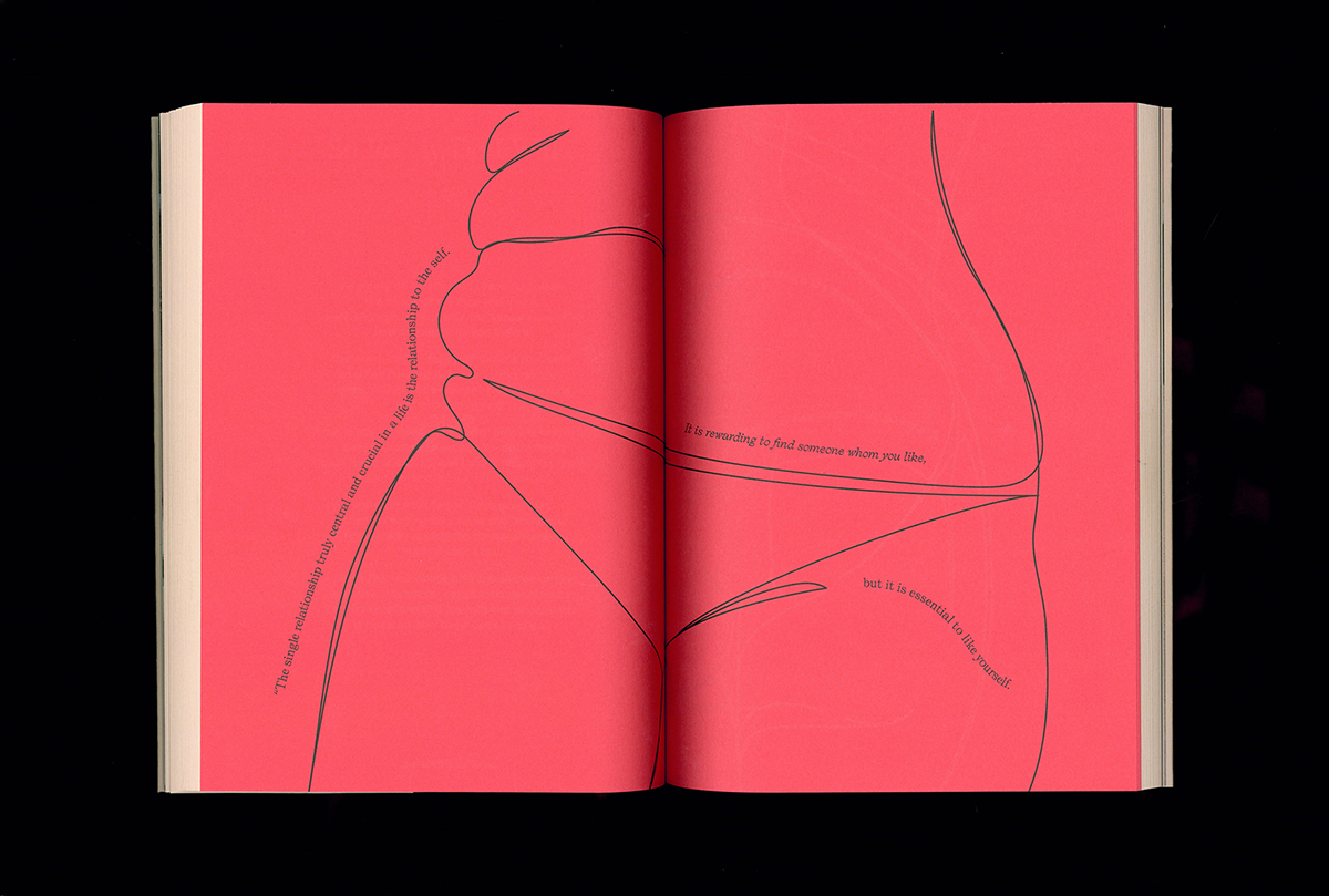
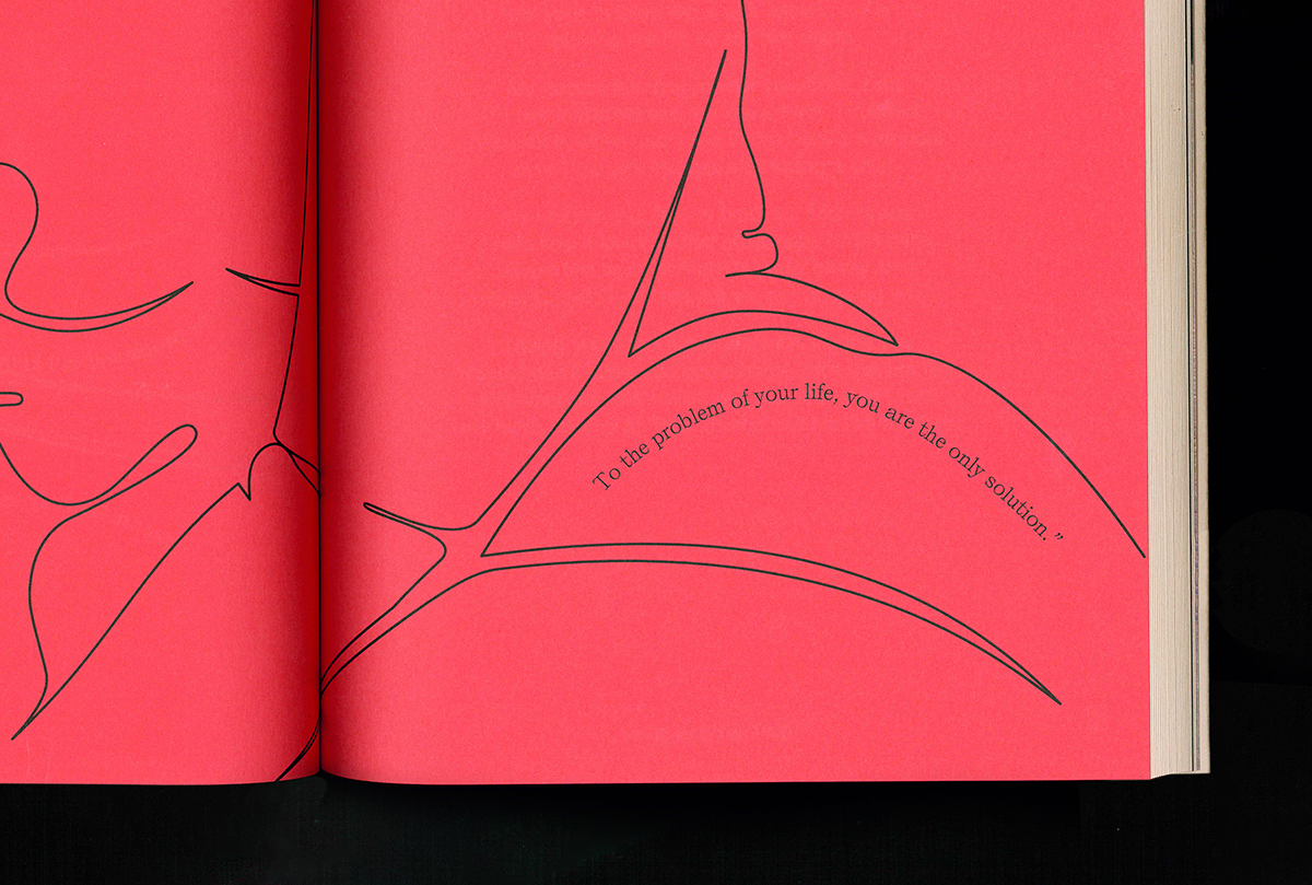
The research for this particular project was centred around the author; at first we thought the book may include excerpts from her sketchbooks in addition to the poetry collection. She had many of these beautiful sketchbooks; all filled with drawings, sketches, texts, clippings and photos. As we continued to work through the project and into the design stage we realised that actually the poetry collection needed to be the hero of the book and shouldn’t be competing with too many images.
It was important to the author to include images of some kind, as she is a painter and model as well as a writer. I proposed that I create some single line illustrations drawn from her self portraits and that we include the illustration section in the centre of the book to create an ‘interlude’ for the reader.

Considering this is a book of poetry about the body, you’ve captured a real presence of this in your treatment of the type, which has a sculptural and illustrative presence. Can you tell us more about your process and overall type choices for this project?
As this was a poetry collection, the type choice was an integral part of the design and had to do much of the expressive leg work. The typefaces were led by the narrative of the book. They needed to be contemporary in order to align with the themes at hand. I wanted each typeface to have an individual character and to be able to stand on its own whilst also working together as a set.
We used a combination of Self Modern (Lucas Le Bihan) and Marguerite Grotesk (Charlotte Rohde) throughout. Both of these typefaces reference the classics but have their own contemporary characteristics and as a pair they work comfortably together. We used Salvaje Display (Coppers And Brasses) for the titling on the cover—the titling needed to have presence, impact and a bit of bulk in order to sit under the embossed pattern.
When it came to designing and typesetting the book, there had to be a relationship between traditional typesetting and the vision of the poet—my client has a very distinctive, descriptive style of writing.
She had already typeset each poem very carefully and deliberately in order to influence the reader and emphasise certain aspects of the text. We spent a lot of time working together on the typesetting of each poem in detail.
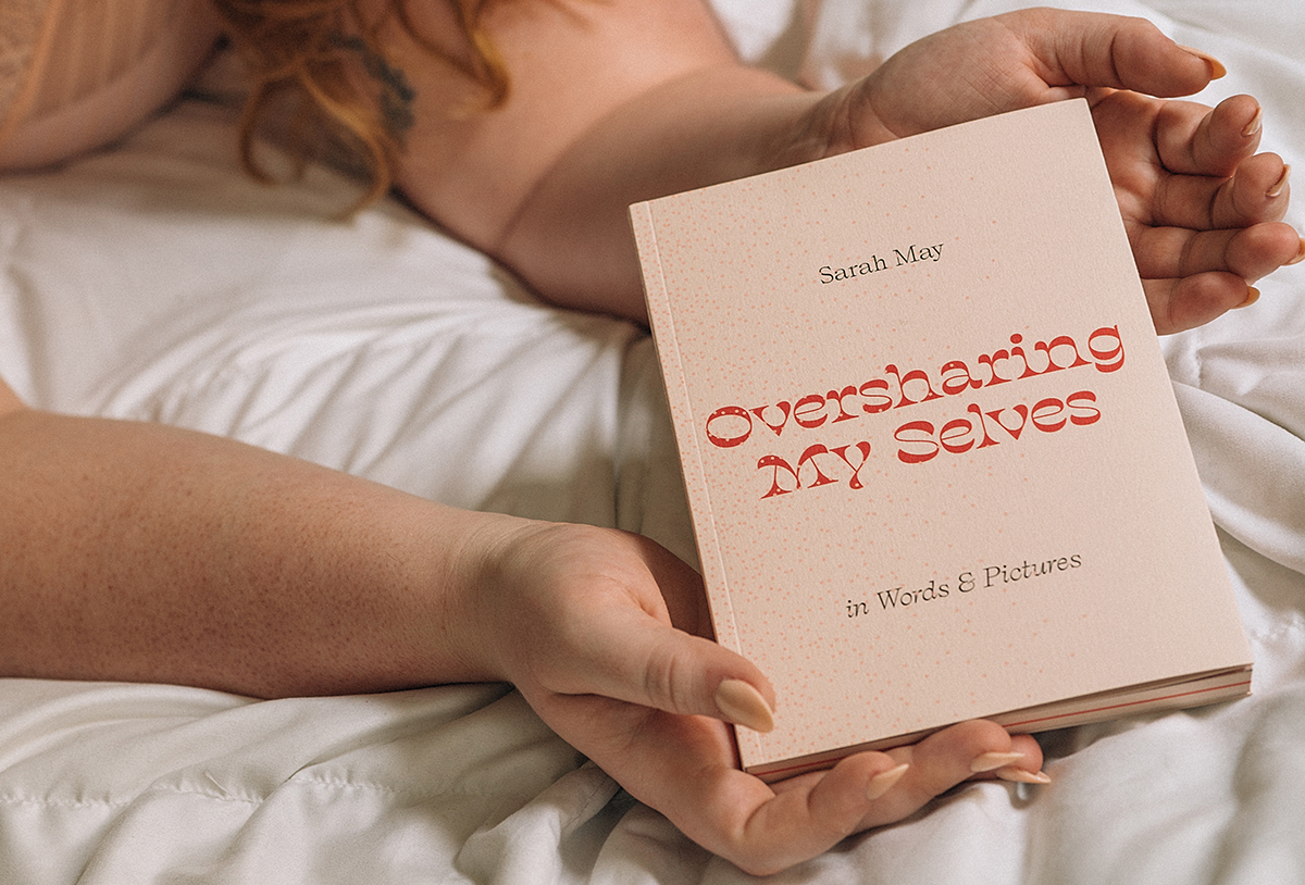
Photo by Katy Shayne
What part of this project did you find the most enjoyable?
It’s hard to identify one part of the project, as I enjoyed the whole process really. I was lucky to have a very creative and collaborative client. The ritual of meetings to establish the design direction was very enjoyable.
Sarah and I would meet up usually around once a week for a couple of months, looking at the design and production in detail and discussing all manner of things in between.
Can you offer some tips for other designers looking to create and design a book? It would also be great to get your advice on what it took to also build the website and branded collateral alongside the branding and publishing?
I have to emphasise the importance of physical mockups. For this particular project we had a fully formed mockup which allowed us to see a few things that needed corrections/improvements before the final press run.
Your printer is your friend—ask them for their advice and knowledge because production is such a critical part of a book.
Oversharing My Selves was printed by Conveyor Studio in NY and I made a few tweaks to the books production based on their recommendations—they were very helpful.
I would also say, don’t be afraid to reach out to others in the industry. Living in Texas and working on my own felt very isolated at times, so making friends with others, even just online over email, made it feel like there was a community out there that I was part of.
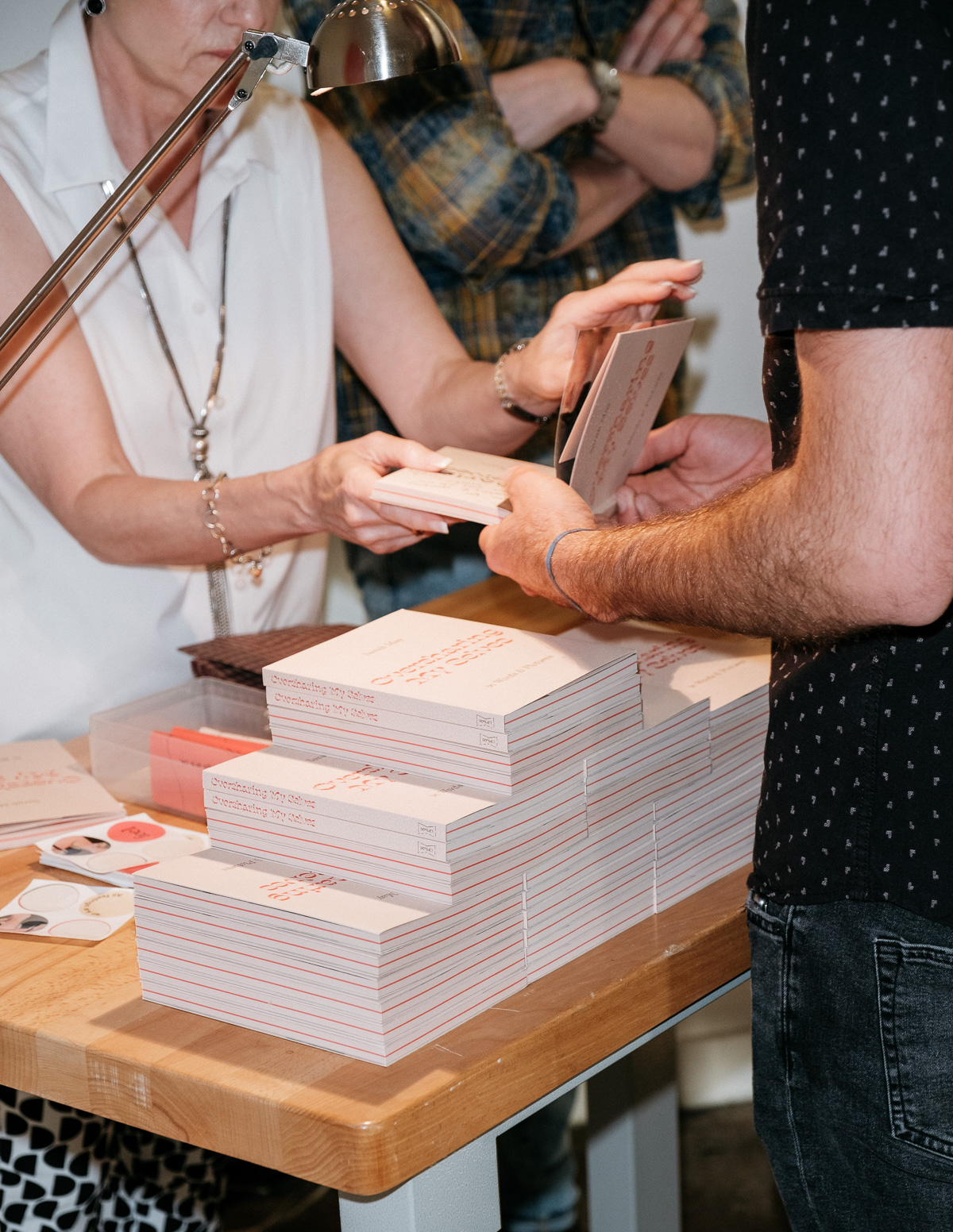
Photo by Kalan Briggs
What have you learnt from this project that you can apply forward to future design projects for yourself and for clients?
I definitely always take lessons from each project—every project is different even when the scope is similar. It could be a different design skill, a piece of knowledge, an improved workflow or a client management skill. For this particular project I learned to trust myself through the process and not second-guess everything so much.
Sometimes instinctive decisions are the correct ones and they don’t need to be dissected and reconstructed looking for a different option.
You work as a designer and art director alongside teaching full-time at Shillington. How do you find the balance in juggling all that? Do you think it’s important for creatives to have side projects?
Absolutely, I think it’s very important for creatives to maintain their momentum and energy towards their craft—everyone is different and will have different ways of doing that.
I find that juggling lecturing with different external projects helps me to maintain my energy—it allows me to give my brain a break by using it in a different way, so my brain can ‘rest’ while still being creative and productive.
When I was interviewing for the role at Shillington it was clear that the lecturers having industry work outside of the classroom was encouraged, and that was part of the attraction to the job for me.
You have an enjoyment and interest in typography and publishing, which shows in your designs. Can you share some of your latest inspirations that have come out within these realms of design?
When in the design direction phase of a project I find myself usually leaning towards typographic references as a starting point. Fonts in Use is a great resource for this, they have a huge catalogue of references from the historical to the very contemporary.
I love a good art book fair. As the art book fair calendar has been decimated by the global pandemic for this year, the next best thing is an art book store, either in real life or online.
To name just a few great bookstores, Perimeter Books is a favourite since I moved to Melbourne last year. While I was in the US I did manage to get to the mecca that is Printed Matter. In the UK you can’t go past Antenne Books—a retailer as well as a distributor. They have been very supportive and distribute Dossier Industries catalog of publications across UK and EU.
Huge thanks to Annette for talking about her process of the print design for Oversharing My Selves. For more experimental print magic you can head on over to Dossier Industries’ website and follow them on Instagram.
Meet the rest of our amazing Shillington teachers and team from around the world!
Posts you might like

One of the best things about graphic design is that it never stands still for a moment. But that does mean that keeping up with...
Are you a graphic designer who is finding themselves lacking skills, slow on one of the major graphic design programs or just...

The best graphic design books can take you on an exciting journey of the imagination, transport you to new creative worlds or...

At Shillington, our dedicated graphic design students are taught all about how to design for packaging—from FMCG (that’s fast...

https://www.youtube.com/watch?v=wZ_tffGtZMs New York graduate Simon Fréour worked as a software engineer in France for seven...

At Shillington, our graphic design course teaches students how to design campaigns for a brand, helping to spread its message....
Are you working with graphic designers day-to-day and finding yourself jealous of the work they're doing? You're certainly not...
Diversity in design is an important topic to us at Shillington and we aim to support and strengthen equity by cultivating...
Want to win some amazing prizes and stay in the loop with all things Shillington? Sign up to our newsletter to automatically go in the draw.