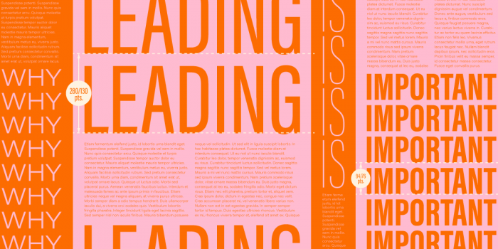
Why Logo Design is the Ultimate Craft
In my view, identity design—and more specifically, logo design—is the ultimate craft a graphic designer can hope to excel in.
We designers get to do a lot, applying our creative minds to a huge range of tasks. Posters, packaging, websites, apps, magazines, infographics, UI & UX, advertising, marketing—just to name a few.
Yet for me, the biggest draw of being a designer was the promise of doing something new every day. And I’ve never regretted my decision to follow this creative path.
Our number one goal as designers is communication. Effective logo design must do that, and more.
Think about it. Any company, product or service wants to share with the world how wonderful it is. But audiences encounter an insane amount of images everyday. Logo design needs to say a lot to many different people in a very crowded visual space.
So why bother? Isn’t a brand so much more than logo design anyway?
Well, yes, it absolutely is.
But let’s take a moment to discuss what a brand is, because it’s difficult to contextualize logo design without doing so.
Branding, essentially, is the collective, perceived experience/s associated with an organization, a person, a product or a service. In the words of Marty Neumeier, it’s the gut feeling an audience has about something (an iPhone 6), or someone (Barack Obama). Clients pour an insane amount of time, effort and cash into creating and cultivating brands and brand perception. Why, because so much rides on what we think of stuff.
We form views about brands in our environment in response to our values. Specifically, how they align (or mis-align) with the values projected and experienced. BP can tell us they’re driving toward a greener future, one “beyond petroleum” as they did as part of their 2001 rebrand. But when one significant collective experience involves a hell of a lot of dead wildlife and the destruction of thousands of livelihoods along the Gulf Coast? There’s a clear discrepancy there. The brand aspiration and brand experience do not align.
Obviously, that’s not particularly good for business. So, that’s where PR practitioners come in: experts in steering brands through troubled waters.
So where does logo design fit in?
A nice way to think about a logo is as a focal point to a brand. Simply put, a logo is the simplest visual expression of an organization, a person, a product or a service. But organizations, people, products and services can be complex beasts and often have a lot to say. They can have numerous values and aspirations.
That’s why I believe logo design is the ultimate craft a designer can hope to excel in.
A good logo is one that distills much of those values and aspirations down into one mark. Yet, that’s no mean feat. It’s incredibly difficult. Perhaps one of the most difficult things a designer can get right. But when you get it right, nothing comes close to the level of satisfaction. It’s totally worth the effort.
Let’s jump back in history to the twentieth century. We’ve got the likes of Otto Neurath and Gerd Arntz, whose incredible work on pictograms and isotypes gave rise to some of the best known graphic designers of that same century. Otl Aicher’s pictogram work for the 1972 Munich Olympics, and Paul Rand’s contribution to the likes of IBM, UPS, Yale, Westinghouse, abc (and many more—Rand is almost single-handedly responsible for the emergence of “corporate identity” as a sought-after and well-funded facet of the graphic arts industry) clearly tap into the work of Neurath and Arntz.
In a similar vein, there’s a lot to learn from the art world in relation to abstraction and representation. Picasso’s bull is an excellent visualization of an often-employed technique of logo designers: paring something down to its most basic form while still displaying just enough of the trademark form so that something—in this case, a bull—is still recognizable.
Good logos share two significant characteristics. One, they are identifiable, and two, they are memorable.
Good Visual Language
“We employ the visual tools at our disposal to achieve this uniqueness—typography, colour, form—and we draw on the points of difference that distinguish an organisation’s individual culture, ethos, activities and mission.” —Michael Evamy (in ‘Logo’, a brilliant tome from Laurence King Publishing)
It’s a lot to ask of a logo—to capture all that a thing stands for, in one identifiable, memorable mark. How is that even possible? Well, that’s one of the great challenges of logo design and a fulfilling part of being a designer.
The peace you need to make with yourself as a logo designer is that sometimes it’s just not possible, or appropriate, for everything an organization, a person, product or service aspires to be, to manifest in one all-singing, all-dancing mark. That’s why an expanded toolkit available to creatives in any kind of brand work, includes things like language & tone of voice (the art of copywriting), photography & illustration (including patterns and graphic elements), texture (fabric, paper stock, building materials), and a crafted user experience (the way a site or app responds to a user interacting with its content, and how their basic needs are being met), to name a few tools.
Along with a logo, these constitute a brand’s visual language. A good visual language will support logo design by helping to promote the values a brand wishes to project. In other words, the visual language exists to help bring life to a brand. It’s comforting to know that a visual language can be developed to help out at the party, so to speak.
Additionally, a good visual language will carry through the tenets of a good logo: the elements of that language need also to be identifiable and memorable. And the whole thing—logo design and visual language, combined — need to sing from the same hymn book. In other words, there needs to be a cohesion to it all. Cohesion doesn’t mean a carbon-copy replication across applications. Rather, considered adaptation that respects the application and remains a team player to the rest of the brand elements.
Identity Design
Fortunately, the internet is littered with truly excellent examples of identity design, which incorporate logos and visual language. These are great to look at and study but don’t dwell too long on the eye candy available. One of the downsides to all of the beautiful work online is that it tends to yield a lot of copycat work. Sometimes not intentionally, either.
I’ve always found a better place to start a logo brief is to dwell in the details of the brief to hand. That is, sit with it and digest for a bit, then get cracking with some old fashioned pen-to-paper concept development work. After all, you can’t beat word mapping and rough sketches.
It’s a leap of faith for someone just starting out. Nevertheless, there must willingness for novices to trust and value their own insights. It’s one of the most valuable things we offer our clients, and it’s what the best client-agency relationships are built on: perspective. It’s why good graphic designers tend to be very well read, curious and in-tune with their world: this all contributes to our filters—the way we interpret information and, ultimately, visualize concepts.
We all see things differently. It’s why we get, in a class of 23 students, 23 different design solutions to the same design problem. It’s fascinating.
And it’s a never-ending source of learning, for designers both new and old.
So then to round up — what the hell does all of this mean?
Logo design is difficult. It demands a lot of work — research, concept development and, understandably, technical skill. It takes time, too. But these shouldn’t be deterrents. It’s a view commonly held by employers of designers that their logo design portfolio and brand identity portfolio is the best indicator of that designer’s ability. The way a designer thinks, interprets, distills and crafts — including working at an intimate level with type, color and form — all of these things are on show in identity work. That’s pretty good motivation to work at it.
And to finish, a few links to keep you busy reading … and enjoying some eye candy!
Some favorite agencies and studios: Anagrama, Afom, Pentagram, Sagmeister & Walsh, Johnson Banks, Landor, Wolff Olins, Sigel+Gale, Designstudio, Interbrand, Moving Brands and FutureBrand.
And blogs, with a view to identity design: Identity Designed, Mr Cup, Logo Design Love and Logo Lounge.
Posts you might like

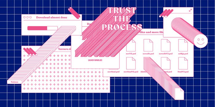
One of the best things about graphic design is that it never stands still for a moment. But that does mean that keeping up with...

The best graphic design books can take you on an exciting journey of the imagination, transport you to new creative worlds or...
We’ve all been feeling the squeeze over the past few years, but at Shillington we don’t want this to stop anyone getting the...
We're excited to announce Shillington's Diversity in Design Full Scholarship and Industry Mentorships and Global Half...
Exposing yourself to examples of good graphic design is a healthy practice no matter who you are. Maybe you’re a student...
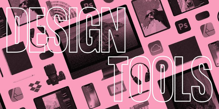
No designer can push boundaries without having the right graphic design tools by their side. In fact, think of graphic design...
In graphic design, quite a few decisions happen behind the scenes that clients may not grasp the importance of, yet have a huge...
Looking to become a freelance graphic designer? At Shillington, with over 25 years experience, we know a thing or two about...
Want to win some amazing prizes and stay in the loop with all things Shillington? Sign up to our newsletter to automatically go in the draw.