31 Incredible Examples Of Creative Packaging Design
Packaging design isn’t something that most shoppers notice; at least, they don’t think they do. But subconsciously at least, it can make an enormous difference to the buying experience, and to overall sales. So creating eye-catching and engaging packaging is an essential skill that every designer needs to nurture and develop.
To get you started, we’ve gathered together 31 brilliant examples of creative packaging design, which come from both leading design agencies and Shillington students. Full of innovative ideas, inventive typography, beautiful illustrations and more, we hope they inspire your own packaging design projects.
1. Conspiracy Roasters by Jess Leibowitz
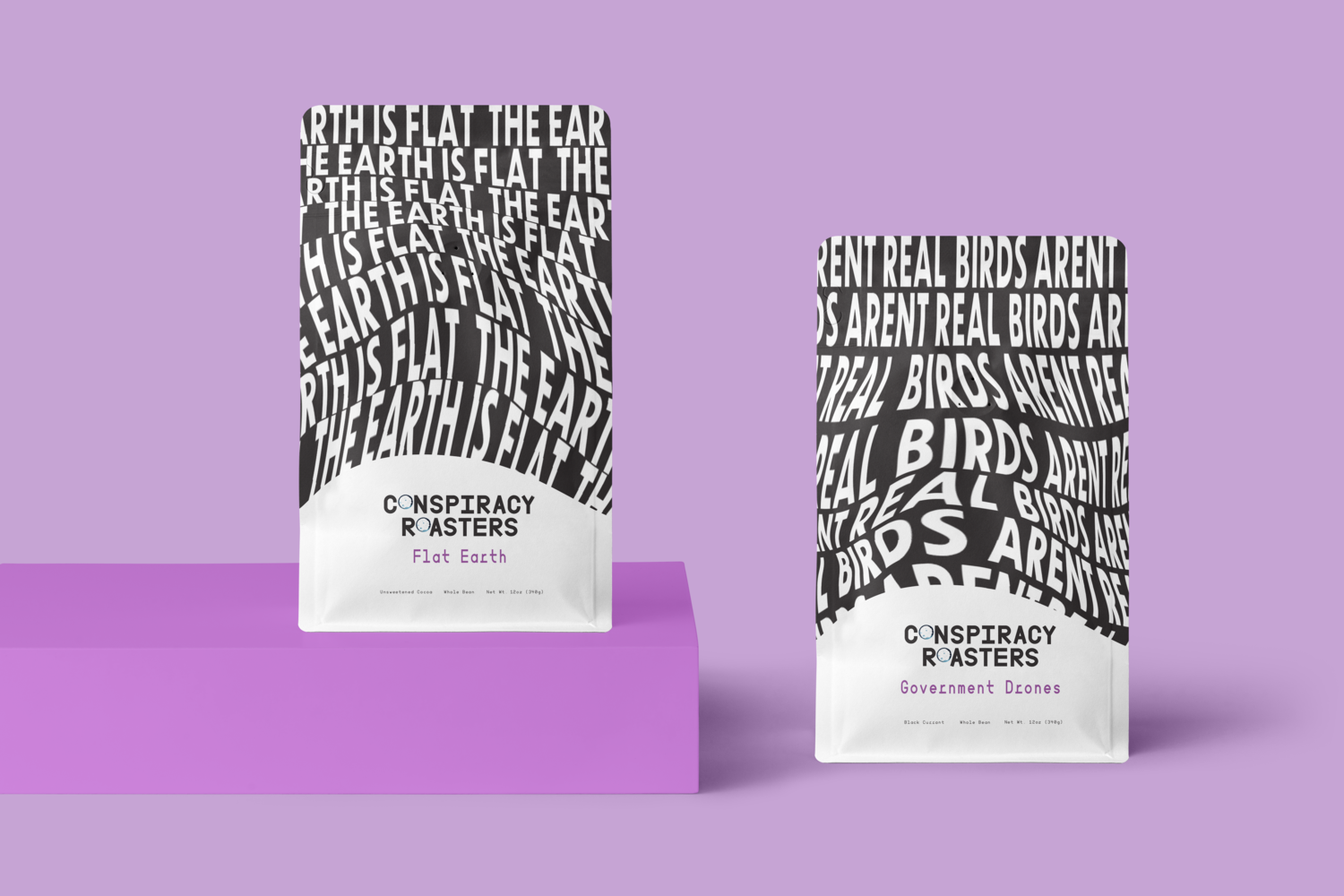
This unique packaging for a coffee roaster, Conspiracy Roasters, designed by Shillington student Jess Leibowitz, was selected for the 2020 American Graphic Design Awards. Based on the tongue-in-cheek tagline ‘designed for insomniacs, inspired by conspiracy theories’, it cleverly riffs off the mad ideas spreading around the internet right now, from myths about aliens at Area 51 to the notion that the Earth is actually flat. Combining warped typography and a clever pictorial logo to bring the concept to life, the result is a monochrome masterpiece that can’t fail to put a smile on your face.
2. Nourish Snacks by Collins
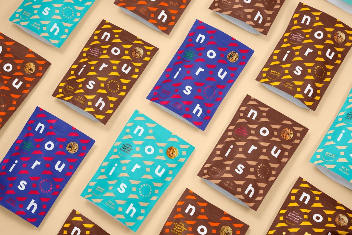
Nourish Snacks, a food company founded by nutritionist Joy Bauer, was looking to appeal to more consumers. So Collins crafted a new visual identity for them, inspired by memories from when snacking was less complicated and more fun. The bold diagonals that dominate this product packaging design evoke the stripes seen on snacks sold at the circus, carnivals and baseball games. The idea was to use this familiar, whimsical language to invite people to try something surprising, different and healthier.
3. Bent Spoon by Luke Dawson
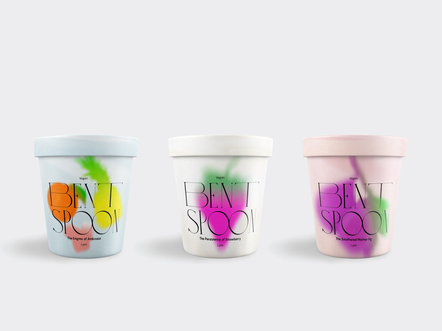
This surreal and quite unique packaging design for ice cream brand Bent Spoon is the creation of Shillington student Luke Dawson, and was also selected for the 2020 American Graphic Design Awards. With its “indulgent type and phantasmic photography,” this creative packaging is quite brilliantly imaginative.
4. Co-Op Alcohol Range by Robot Food
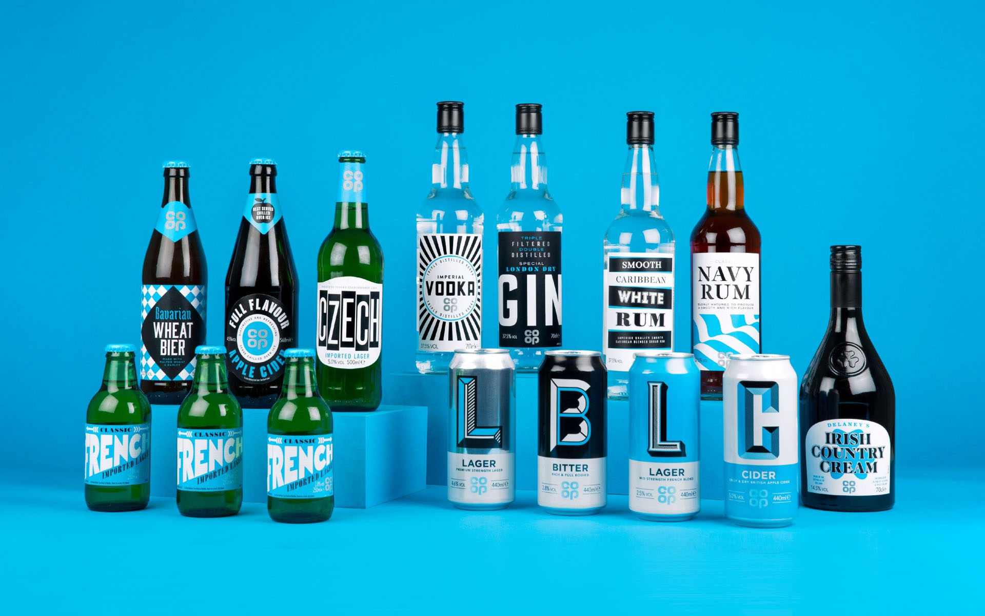
The Co-op retail chain isn’t especially known for its beers, ciders and spirits. But they didn’t want the public to perceive them as second-best. So they turned to Robot Food to create a hero brand that celebrates the individuality of each product, but in an eclectic but cohesive collection. A fixed colour palette of blue, white and black, and a silver Co-op brand mark was employed to create consistency across the range; expressive typography and impactful graphics then create a distinctive look for each product, from vodka to wheat beer.
5. Sans Skin by Madi Talbot
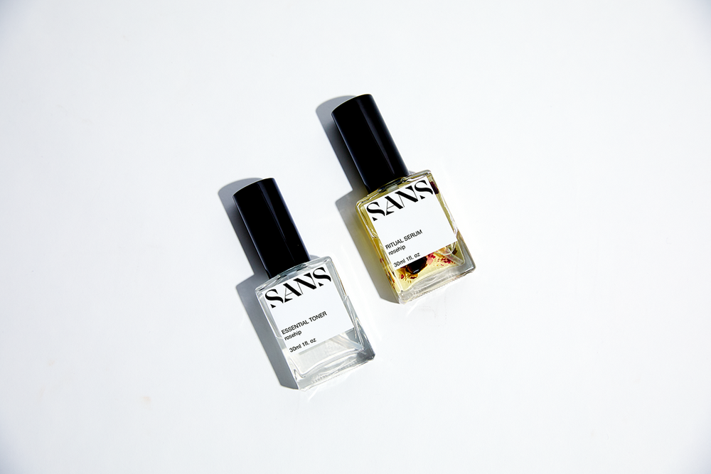
This unique packaging for skinscare range Sans Skin, crafted by Shillington student Madi Talbot, was inspired by the symbiotic relationship between a parasite and its host. The minimalist design and creative direction parallels the brand’s essentials-only approach to formulation, and positions it as a fuss-free yet sophisticated option for single mothers.
6. Brill Instant Coffee by DSR Branding
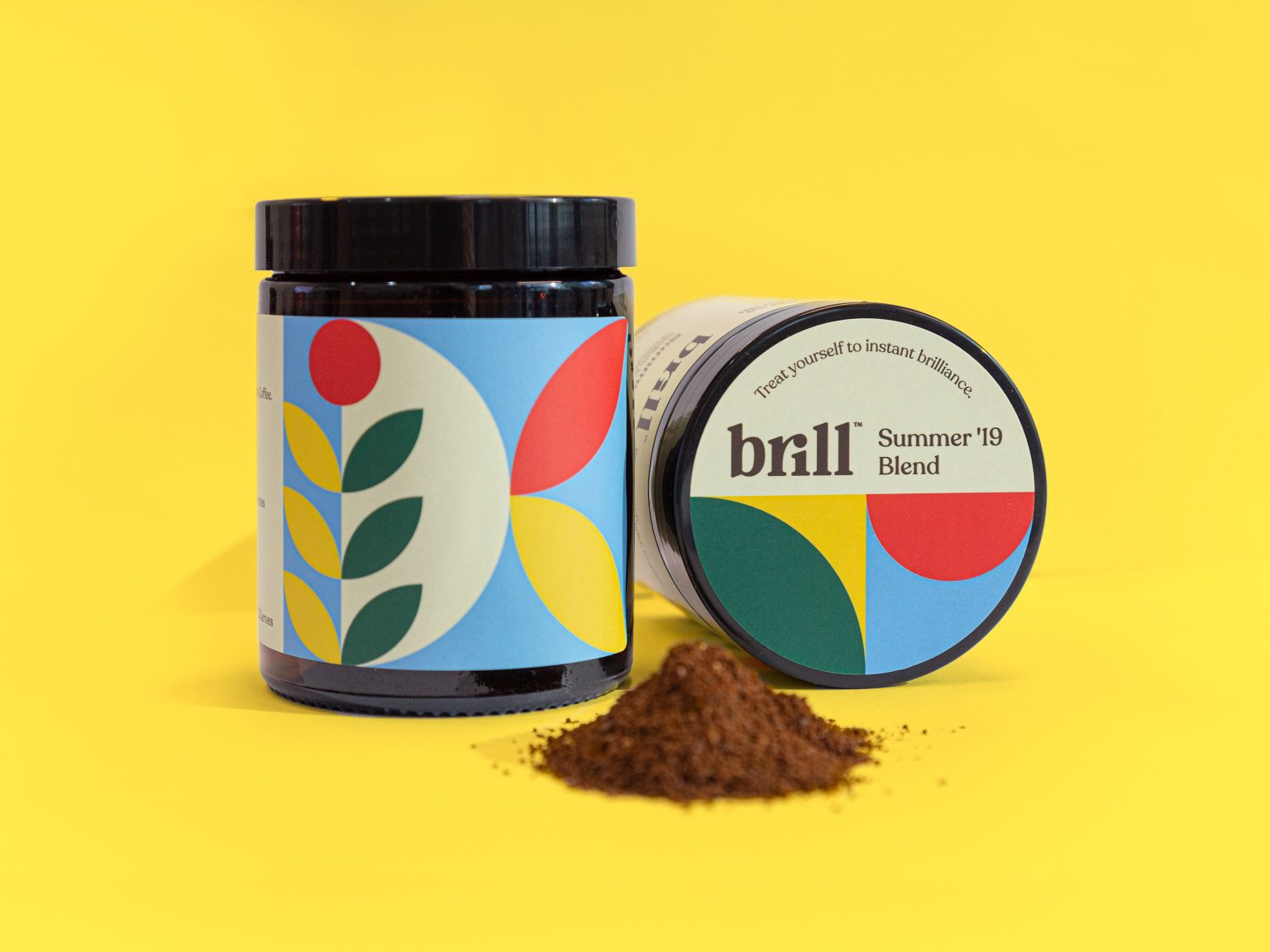
Brill Coffee is a premium freeze-dried specialty coffee business launched by Joel Brilliant and Dan Rowell, founder of DSR Branding. Unlike rival instant coffee brands, it’s produced in small batches using the highest quality specialty beans, so is more expensive. To give it a premium look, DSR devised this creative packaging design, inspired by the simple geometry and bold colours. The idea was to reimagine the flags of the places where the coffee was grown, and the results are as eye-catching as they are alluring.
7. L’olio di Bepi by Helen Tong
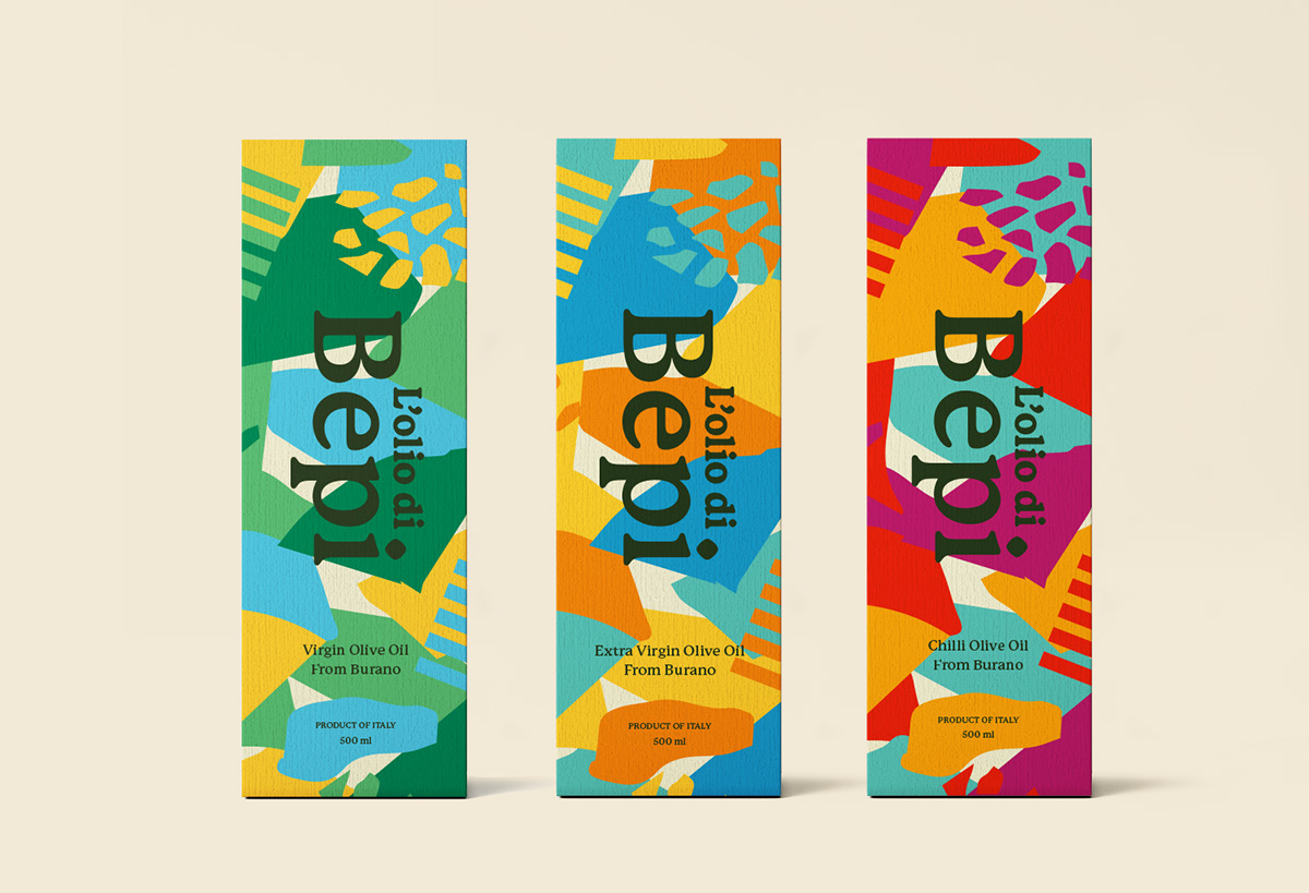
Devised by Shillington student Helen Tong, L’olio di Bepi is a story-based olive oil brand. Aimed at young families and children, the brand began as a small family business on the Venetian island of Burano. This creative packaging design takes elements and colours from the area’s colourful houses and terrazzo pavements, helping the product stand out on the shelves. Meanwhile, a soft rounded serif is used to make it approachable, while still premium in quality.
8. Socilink Canned Fish by Rui Veríssimo Design

When Socilink, a company dedicated to the marketing of selected food products, launched a new collection of canned fish, they asked Rui Veríssimo Design to present it as both a refined, gourmet experience and healthy food for your body. The graphics on this product packaging design evoke the age-old culture of the Portuguese people; drawing on the tile tradition, yet within a fresh and contemporary look. Full of life and personality, these designs feel authentic and grounded, yet simultaneously modern and daring.
9. Strange Beast by Jack Roylance
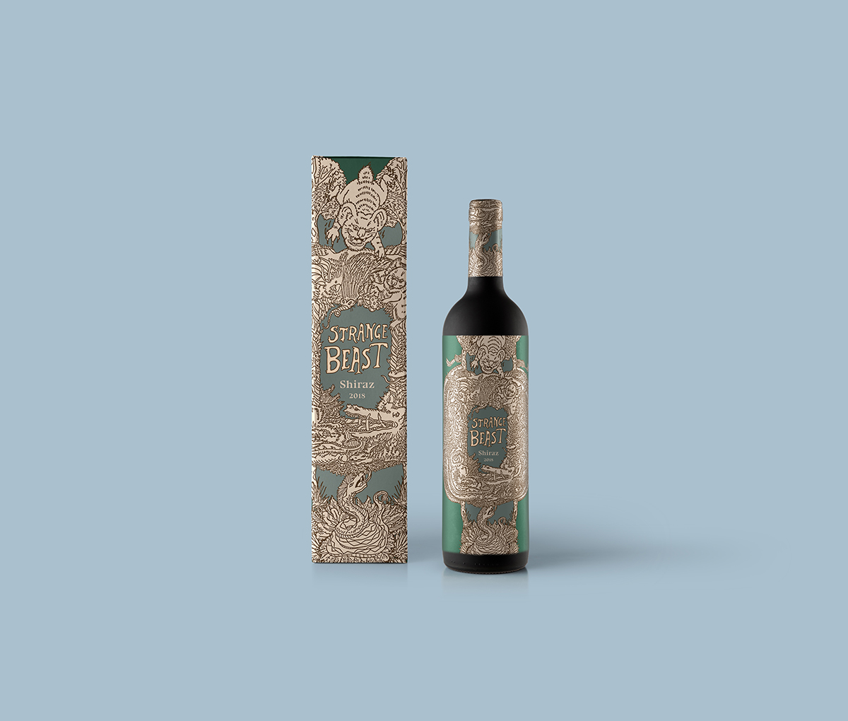
Strange Beast is a mid-priced wine that celebrates Australian ‘tall tales’ about local wildlife. The brainchild of Shillington student Jack Roylance, it’s inspired by both animals that turned out to be real—such as the platypus and echidna—and others yet to be verified, such as drop-bears and giant spiders.
10. Thesis Beer by Buddy Buddy
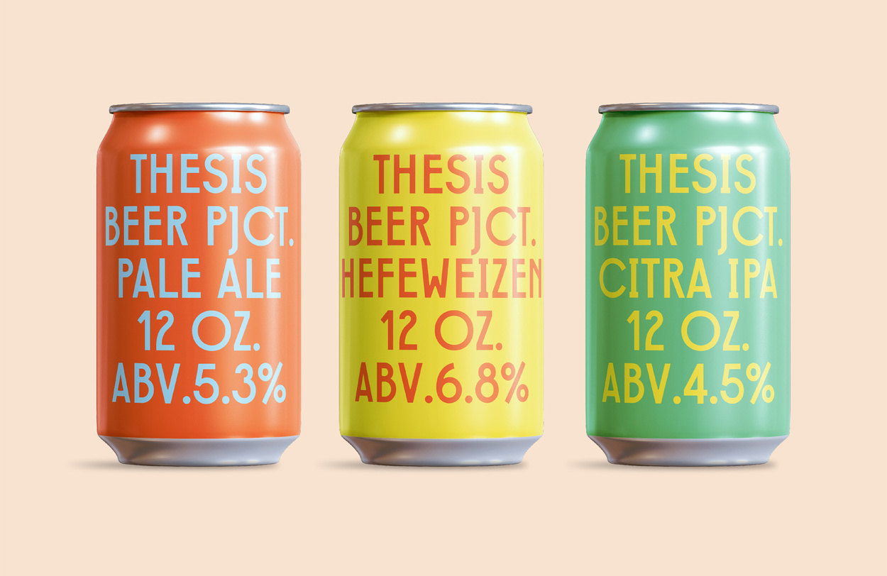
In advance of the Thesis Beer brewery’s launch, Buddy Buddy created and oversaw every branded application; from packaging and merchandise to the taproom’s interior design, signage, and murals. Rather than make everything consistent, they aimed for diversity and personality across the range. However, a few repeating elements such as hands, glasses, and asterisks were created to provide a sense of consistency and to tie everything together.
11. Diptiya Tea by Danielle Griffith
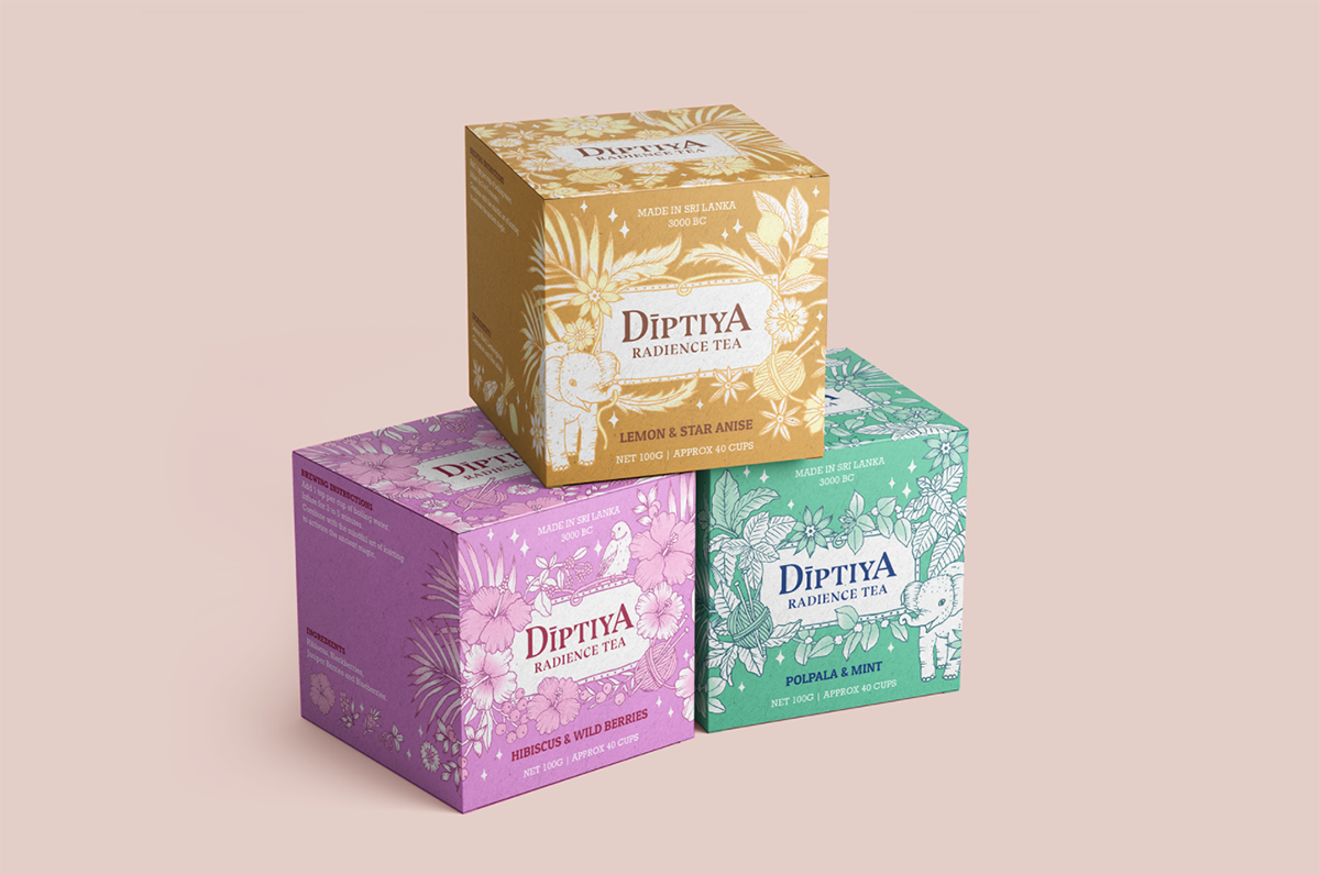
Diptiya Tea is a branding and packaging project developed by Shillington student Danielle Griffith. This range of teas, created in the jungles of Sri Lanka, was once a tightly-held secret between knitting club members around the world. Each box has a detailed, hand-drawn pattern that celebrates the ingredients and takes inspiration from the traditional clothing patterns, tropical plants and wildlife of Sri Lanka.
12. Cloud & Co. Ice Cream by Futura
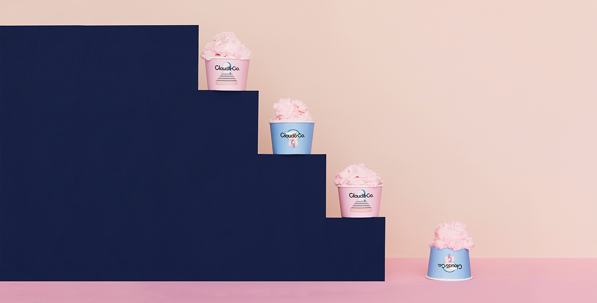
Cloud & Co. is a traditional gelato store located in Qatar. Futura designed a unique packaging system that would seduce customers and differentiate it from other ice cream shops. They took inspiration from the mind-bending art of MC Escher, and created a fantastic world of pastel skies and cotton candy clouds. The idea was to convey the idea of a place “where everything is possible, where your dreams come true, where things without sense are the norm”.
13. Runak Brewery by Oriane Rigard-Ceriso
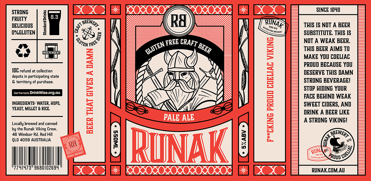
This playful product packaging for the Runak beer brand targets gluten-intolerant connoisseurs of craft beer, while paying homage to the Runak family’s Celtic heritage. This design project is the work of Shillington student Oriane Rigard-Cerison.
14. Pepper Nectar Hot Sauce by Hype Group
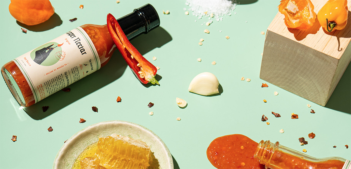
Pepper Nectar Hot Sauce is a woman-owned, craft hot sauce company based in Florida. Branding agency Hype Group felt it was important that the visuals reflect the owner’s character and sense of humour in order to stand out. So they dove deep into learning how these gourmet hot sauces were made and what set them apart, then created labelling that told the company’s story using custom-illustrated icons and monospaced type. With minimal space available on the bottle, the creative team worked hard to ensure the sauce’s flavour profile and ingredients got pride of place.
15. Pasto Pasta by Ping Ni
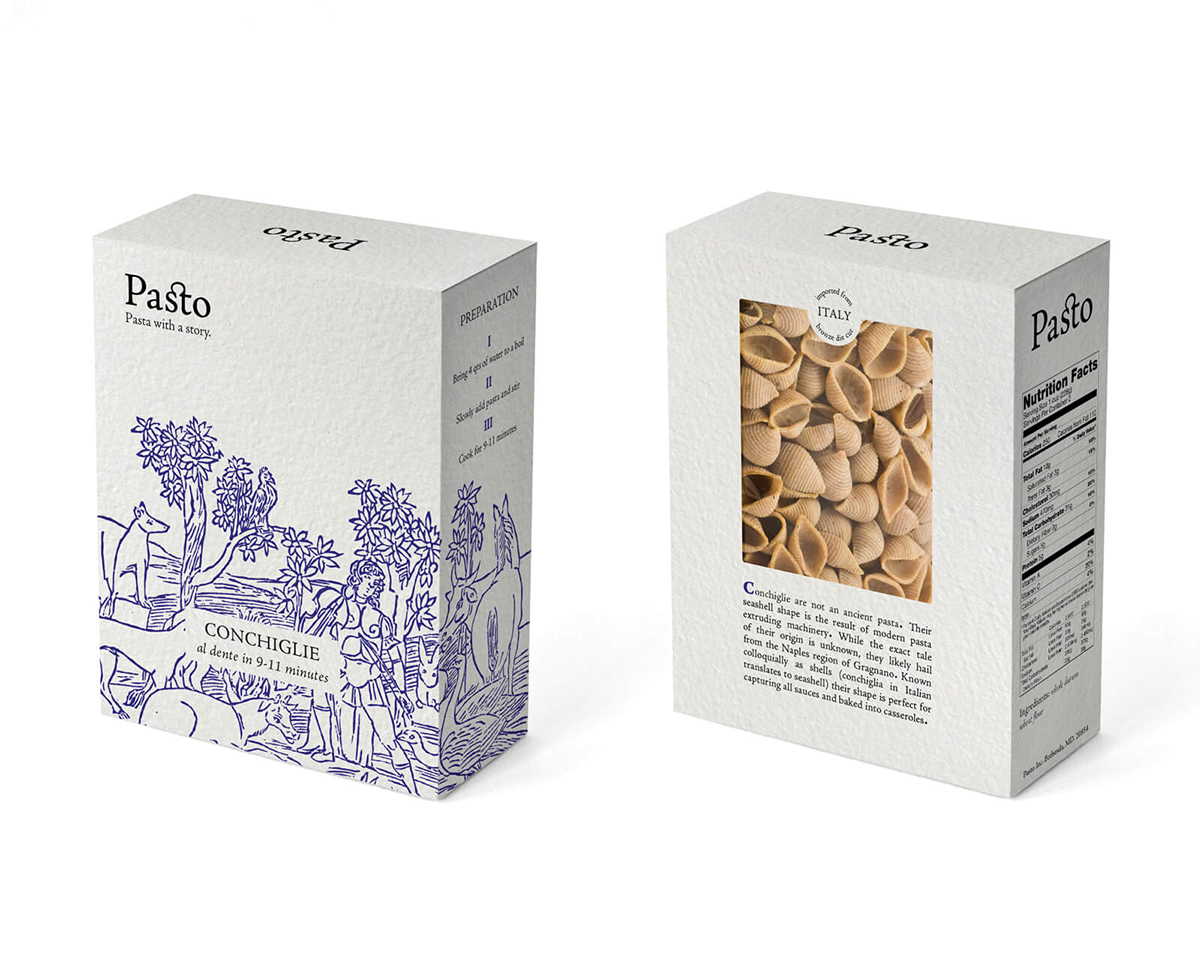
This product packaging design by Shillington student Ping Ni imagines an identity and packaging system for pasta brand Pasto Pasta. It pays homage to pasta’s ancient history and is imaginatively based around 15th-century Italian woodcut illustrations.
16. Dalston’s Drinks by B&B
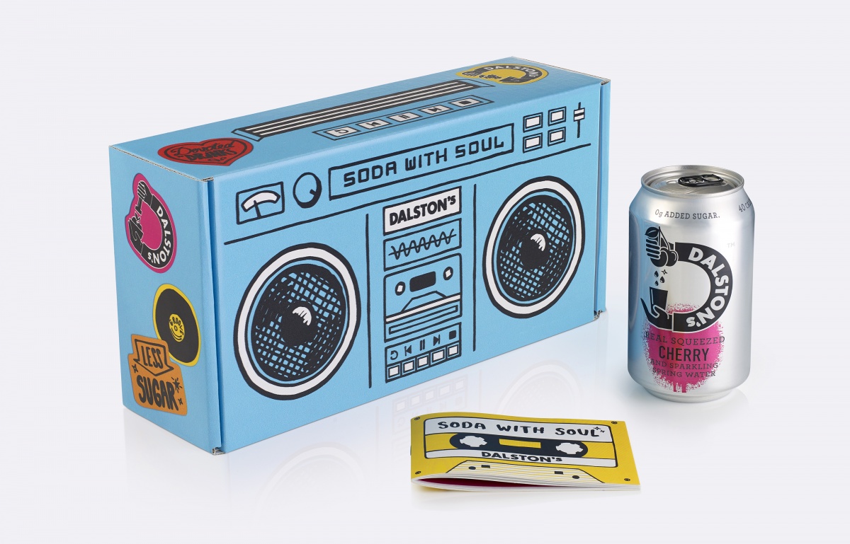
Launched in Dalston in 2012 as a reaction to Coca-Cola’s domination of the London Olympics, Dalston’s calls itself “soda with integrity”. B&B Studio worked with the brand to bring its community-focused ethos to the fore, combining its original ‘big D’ brand identity with a graphic style that reflects both its East London origins and the retro vibes beloved of young hipsters. Each flavour is music-player themed, and features such cultural callbacks as boomboxes, turntables atop hi-fi components, and cassette tapes.
17. Soapbox by Olivia Naden
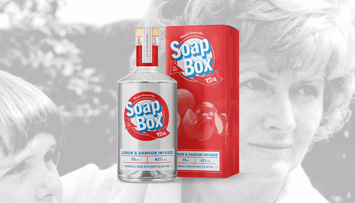
Soapbox Gin is a brand based on the story of 1960s housewife Joan Holdship. Wanting to break from the traditional housework routine, she created her own bathtub method gin with homegrown fruits. Then, to get round the Gin Act of 1751, she sold it on the black market, disguising her product in various cleaning boxes. Shillington student Olivia Naden’s creative packaging for this product is based around a simple colour palette, type lockup and image treatment that’s suitably simple, echoing the time period of the story.
18. Intermission Skincare by CFC
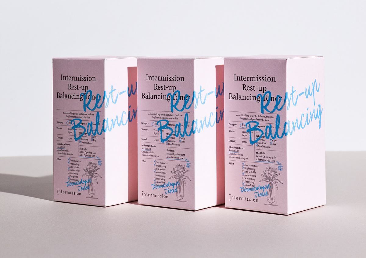
Cosmetic company Cutigen Laboratories asked CFC to develop a new look for their new skincare brand, Intermission. They based the new visual identity around the symbols of a test tube and flower, representing science and emotion. The product packaging was a development of the same concept, with systematic charts for science and calligraphic letters for emotion. These designs strike the perfect balance between these twin themes.
19. The Thirtea Nine by Fred Trevor
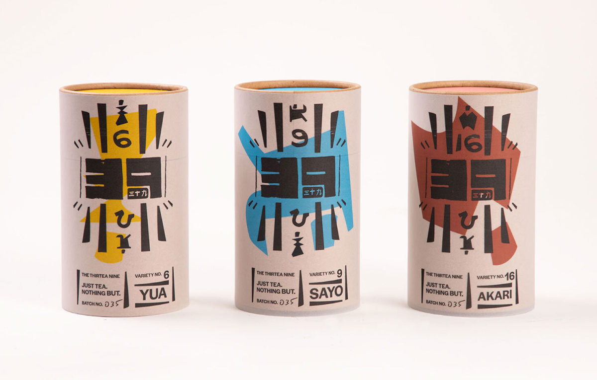
Shillington student Fred Trevor produced this creative packaging for Japanese loose-leaf tea brand The Thirtea Nine, whose ethos focusses on transparency and honesty. It was inspired by the 1930s story of 39 Japanese university faculty members, who walked out in protest of the government banning certain books. For this product packaging design, an all-natural, semi-clear outer layer material provides a sense of transparency, revealing a bold, block screen-printed colour. The idea is to create a feeling of “truthful packaging, aware of its own material”.
20. Zebra Dream Ice Cream by The Company You Keep
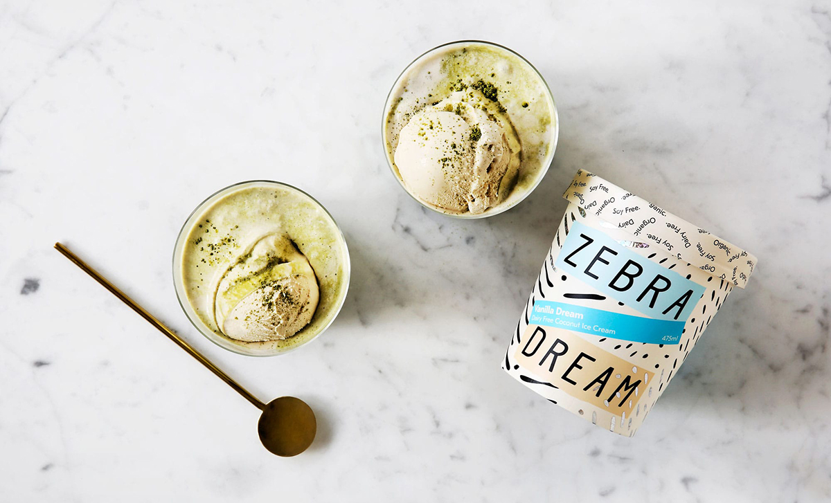
Zebra Dream is a coconut ice cream that’s organic, soy and dairy-free, and based on fair-trade ingredients. The previous packaging design was dark, and based on a rather obvious zebra stripe pattern, which didn’t tell you much about the product within. So The Company You Keep redesigned it, giving it a light, breezy and modern look, harnessing contrasting block colours, fun swirling patterns, and a holographic block foil print finish.
21. Chobani (in-house)
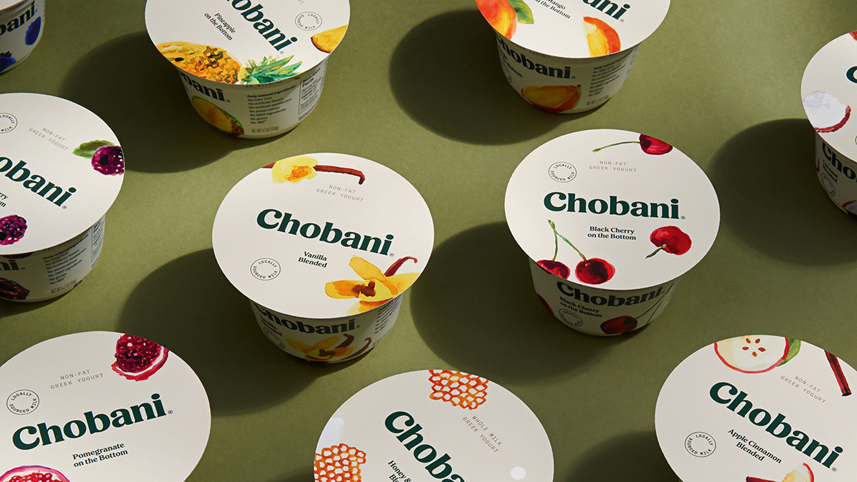
Chobani was the first company to introduce Greek yoghurt to the U.S. market, and to celebrate the 10th anniversary of this achievement, it redesigned the packaging design for all of its 120-plus products. While each product line needed to retain its own sense of identity, four principles were applied across of the designs to create brand unity. These were: be hand-crafted, be approachable, have a sense of naivety, and have a sense of nostalgia.
22. Soul Blend by Sam Hewa Nalagamage
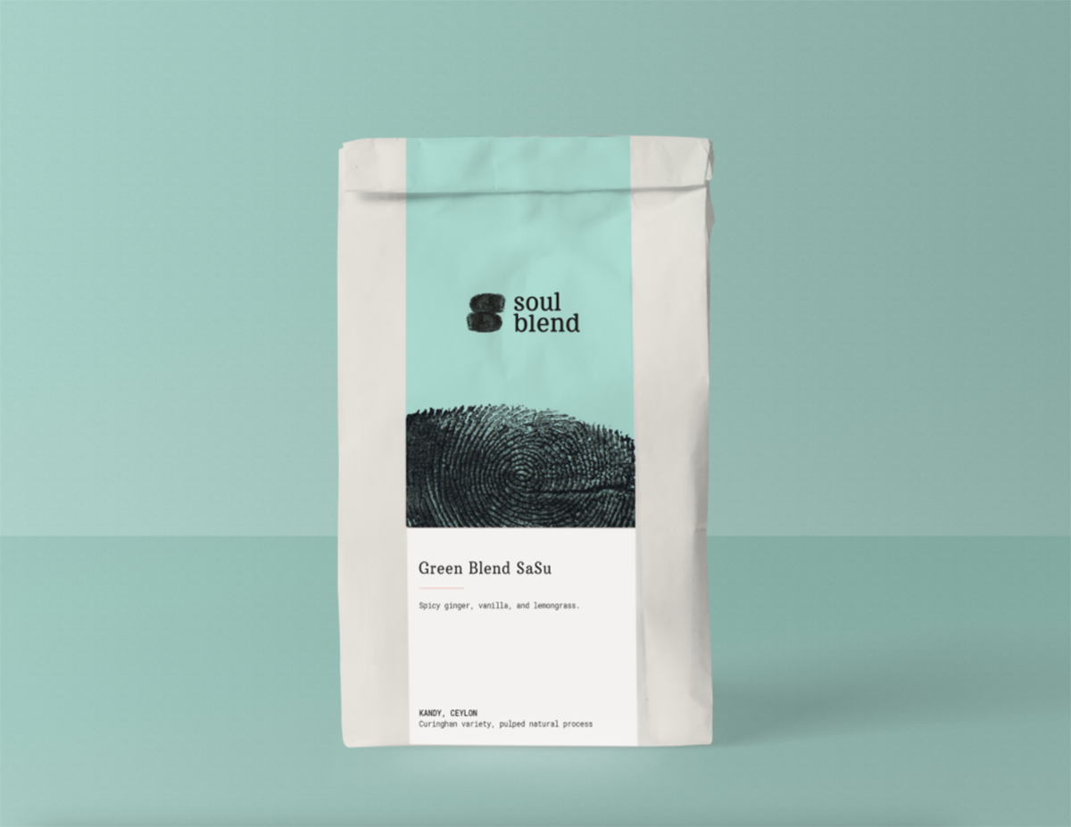
This coffee shop identity is the work of Shillington student Sam Hewa Nalagamage. Soul Blend is the antithesis of the typical group-think, coffee-chain mentality. In contrast, this brand is defiantly local, intimate, bespoke and geared toward community. The activities and purpose of Soul Blend are to enrich, enliven and activate a generation of coffee lovers who want real, authentic and flavour-filled goodness that means something.
23. Partizan Brewing by Alec Doherty
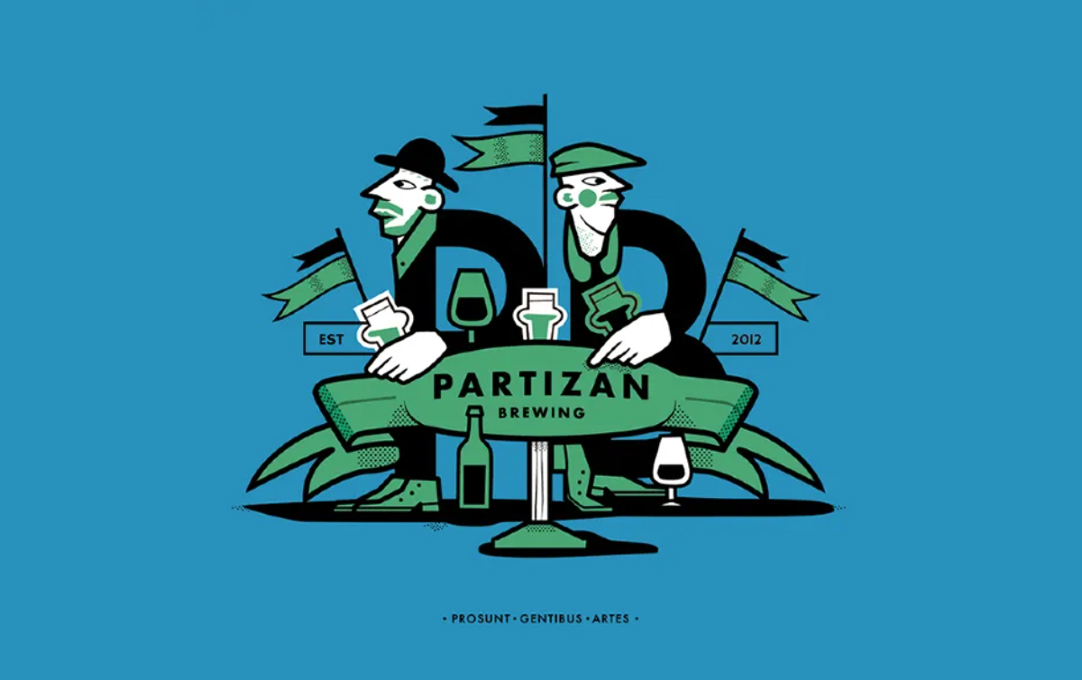
Alec Doherty, an illustrator and artist based in London, created these label illustrations for Partizan Brewing, a craft brewery based in Bermondsey. His expressive, colourful and offbeat artwork is the perfect match for this sprightly brewing startup, giving them a sense of distinctiveness and individuality that helps them stand out in a crowded marketplace.
24. Literary Press by Georgia Latham
This Literary Press coffee rebrand by Shillington student Georgia Latham puts a whole new spin on a well-known commodity. Her eye-catching and imaginative visual identity takes inspiration from the brand’s founder, an eccentric retired professor who loves both books and coffee. Over the years of reading and drinking, he noticed a strange sensation: the flavour of the coffee would morph depending on what he was reading. Sometimes it tasted bitter and earthy, whilst at other times he’d notice the fragrance or the sweetness. From analysing the themes of literature, he became fascinated with the themes of coffee, and so set out to micro-roast coffee that attempts to capture the fleeting essence of a book or a genre.
25. Tillingham Wines by Kellenberger-White
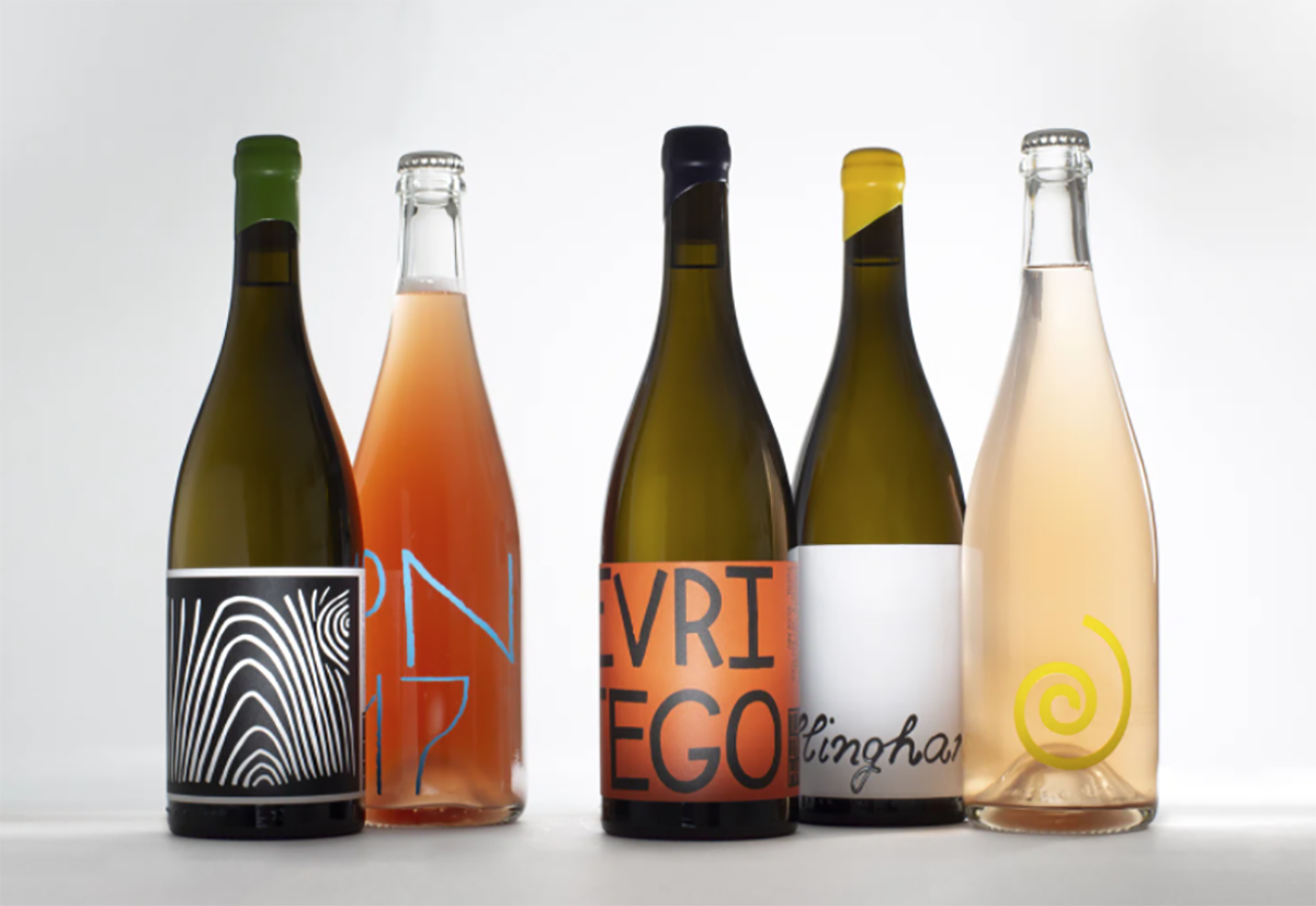
Tillingham Wines is one of the UK’s leading organic winemakers and a pioneer in eco-minded hospitality. Its vineyard in East Sussex now also incorporates a farmstead, education space, hotel, restaurant, bar and shop. Kellenberger–White took a plural approach to designing the brand. Whether it was a wine label, a menu for the restaurant or the website, the team designed each element from scratch, using hand-drawn typography, custom production techniques and a bespoke photographic language. The resulting designs showcase a brand that’s characterful and authentic, while remaining flexible in use.
26. Volta by Ruth Brooks
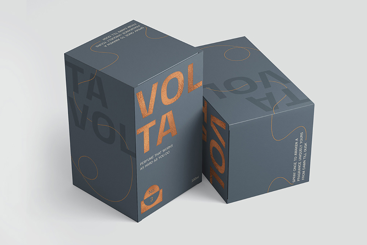
Volta is a perfume made from essential oils distilled in copper vats. A brand created by Shillington student Ruth Brooks, this is perfume developed with the hard-working man in mind: “an iconic scent that lasts from dawn until dusk, whatever you get up to”. The packaging designs for Volta are based on elegant fine lines, wandering in and out of the scene with insouciance. The result is a stylish, sophisticated and laid back look that’s perfectly positioned for the target audience.
27. Heist Chocolate (in-house)
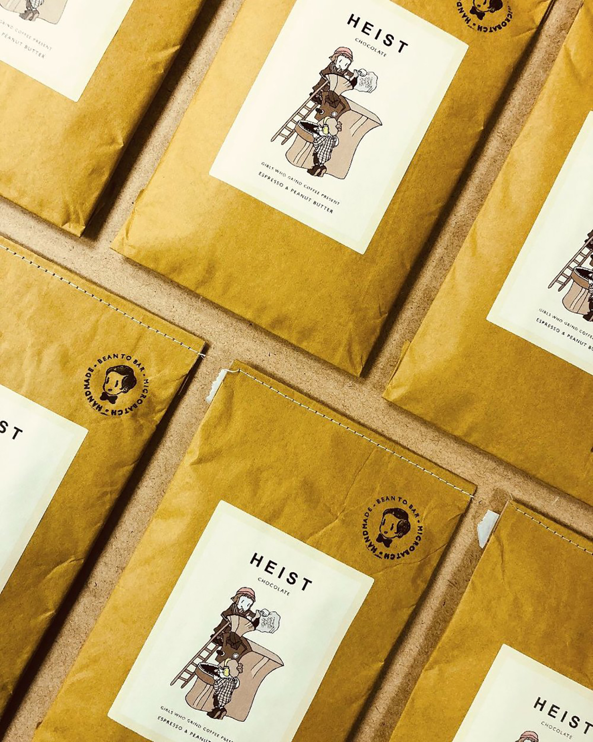
Heist is a tiny independent chocolate maker based in Cardiff, Wales which specialises in micro-batches of stone ground chocolate using single-origin, organic, cocoa beans. Its packaging, designed in-house, draws on a vintage cartoon style that effortlessly evokes feelings of childhood excitement around being granted a sweet treat.
28. Opa Sylvius by Izzy Copley
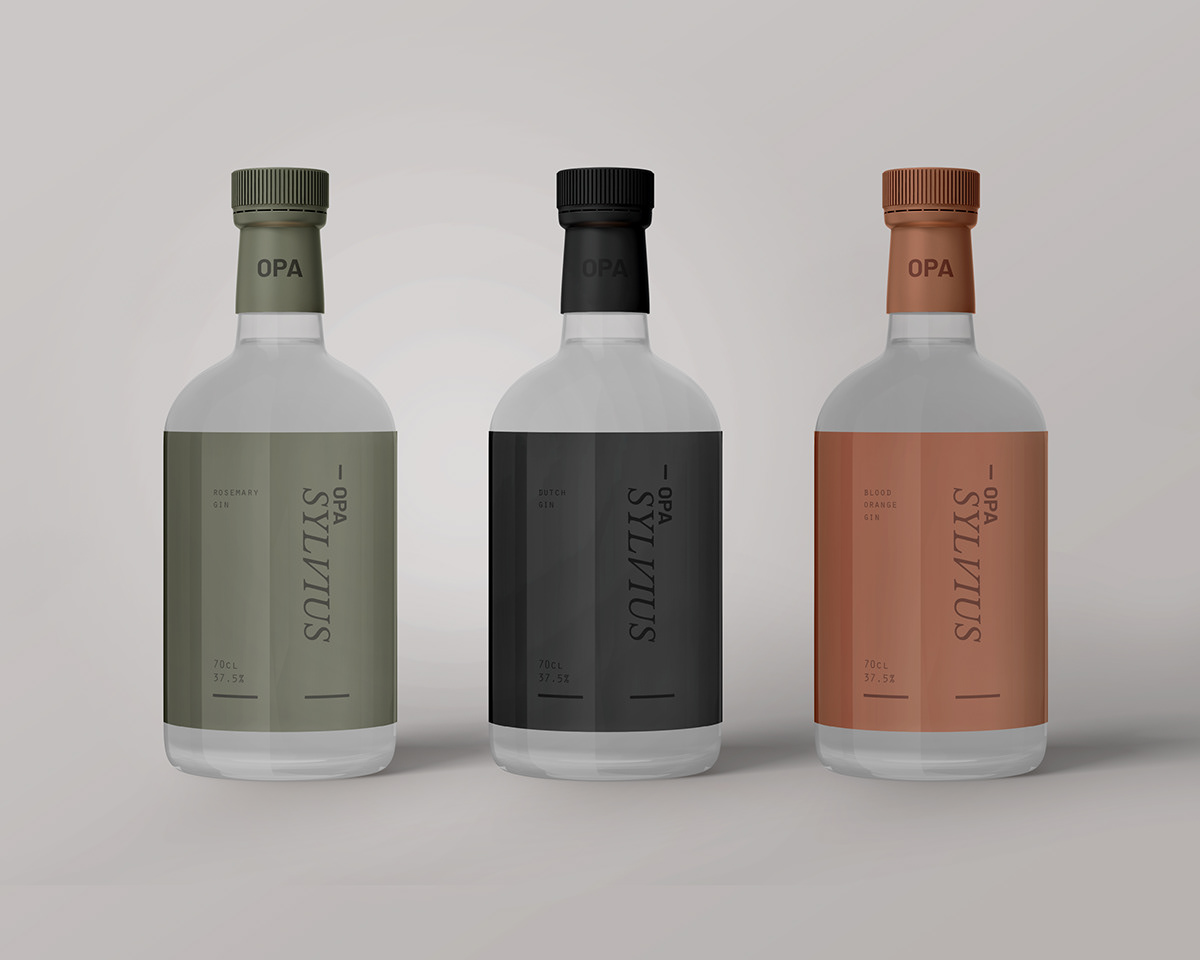
Opa Sylvius’ branding, created by Shillington student Izzy Copley, is based on the story of 17th-century physician Franciscus Sylvius who, legend has it, invented gin at just eight years old. This was hard for many people to believe at the time, branding him a liar, but derision only spurred Franciscus on, to spend the rest of his life trying to prove them wrong. The Opa Sylvius gin brand was founded by Franciscus’ grandson, as a way of continuing his grandfather’s legacy. The packaging design gives a suitable nod to this family heritage, as well as taking influence from traditional apothecary illustrations.
29. Piccolo Seeds by Here Design
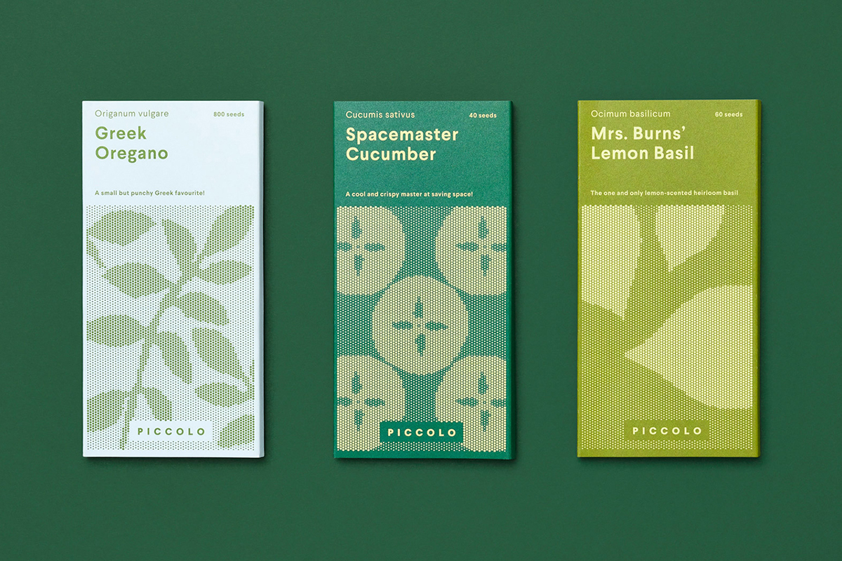
Piccolo is an Italian seed brand aimed at urban growers with limited space to grow things in such as a small balcony garden. The company worked with UK-based studio Here Design to develop a fresh and consistent visual language across all their packaging designs. Here took a storybook-like, illustrated approach that tells the story of Piccolo, bring to light the rewarding experience of growing, and intend to engage with the many urban gardeners of the world.
30. Cunning Folk by Bronte Tuxworth
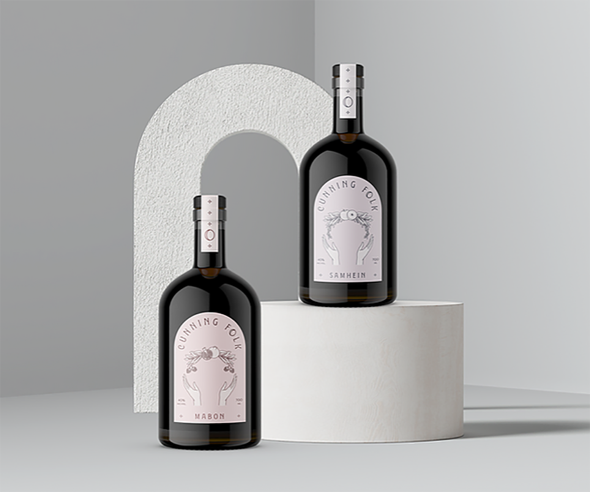
Shillington student Bronte Tuxworth created this bespoke gin label, taking inspiration from the potions and brews of both old-time and modern witches. The gins are flavoured using herbs and fruits symbolic of the season, and the beautiful packaging portrays an ancient tradition in a clean and modern way.
31. Magic Spoon Cereal (in-house)
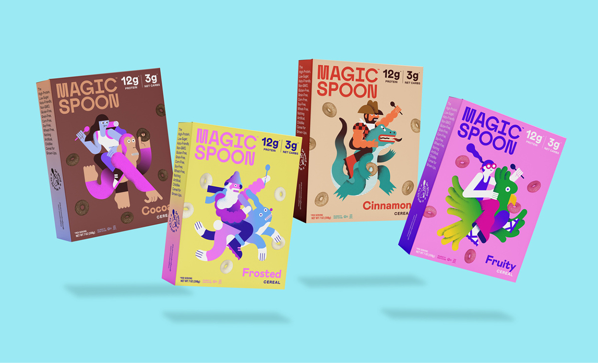
Magic Spoon Cereal is a new brand reimagining the childhood cereals of yesteryear in a high-protein, low-sugar form. A limited-edition variety pack of mini boxes comes in flavours of fruity, frosted, cocoa and blueberry, and the packaging features unique illustrations for each flavour. This were created by talented illustrators, including Levi Jacobs, alongside the company’s in-house design team. The result is a colourful, contemporary and stylish look that grabs attention, while retaining an underlying sense of silliness which both adults and children can enjoy.
Looking for further inspiration? Check out these 31 Amazing Graphic Design Examples.
Would you like to create work like this? Consider studying at Shillington and enrolling in the graphic design course!
Posts you might like

One of the best things about graphic design is that it never stands still for a moment. But that does mean that keeping up with...

The best graphic design books can take you on an exciting journey of the imagination, transport you to new creative worlds or...

At Shillington, our dedicated graphic design students are taught all about how to design for packaging—from FMCG (that’s fast...

At Shillington, our graphic design course teaches students how to design campaigns for a brand, helping to spread its message....
Exposing yourself to examples of good graphic design is a healthy practice no matter who you are. Maybe you’re a student...
At Shillington, our graphic design bootcamp students are taught how to design for digital, incorporating aspects of both UI and...
We love graphic design. And we're guessing, as you're here, you love graphic design too. This means that we all love graphic...
Graphic design is an ever expanding creative discipline. With our graphic design course, we teach you how to make research a...
Want to win some amazing prizes and stay in the loop with all things Shillington? Sign up to our newsletter to automatically go in the draw.