#ILoveTheseGuys Creative Inspiration: Seachange
Shillington students from around the world share the work of creatives who inspire them in the #ILoveTheseGuys series. In this post, New York student Janine Heinrichs highlights projects from Auckland studio Seachange.
The small Auckland studio was founded by Tim Donaldson and Amanda Gaskin, working with clients around the world, working across brand identity, art direction, editorial, illustration and packaging.
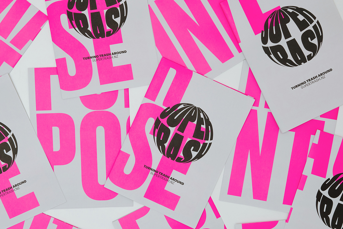
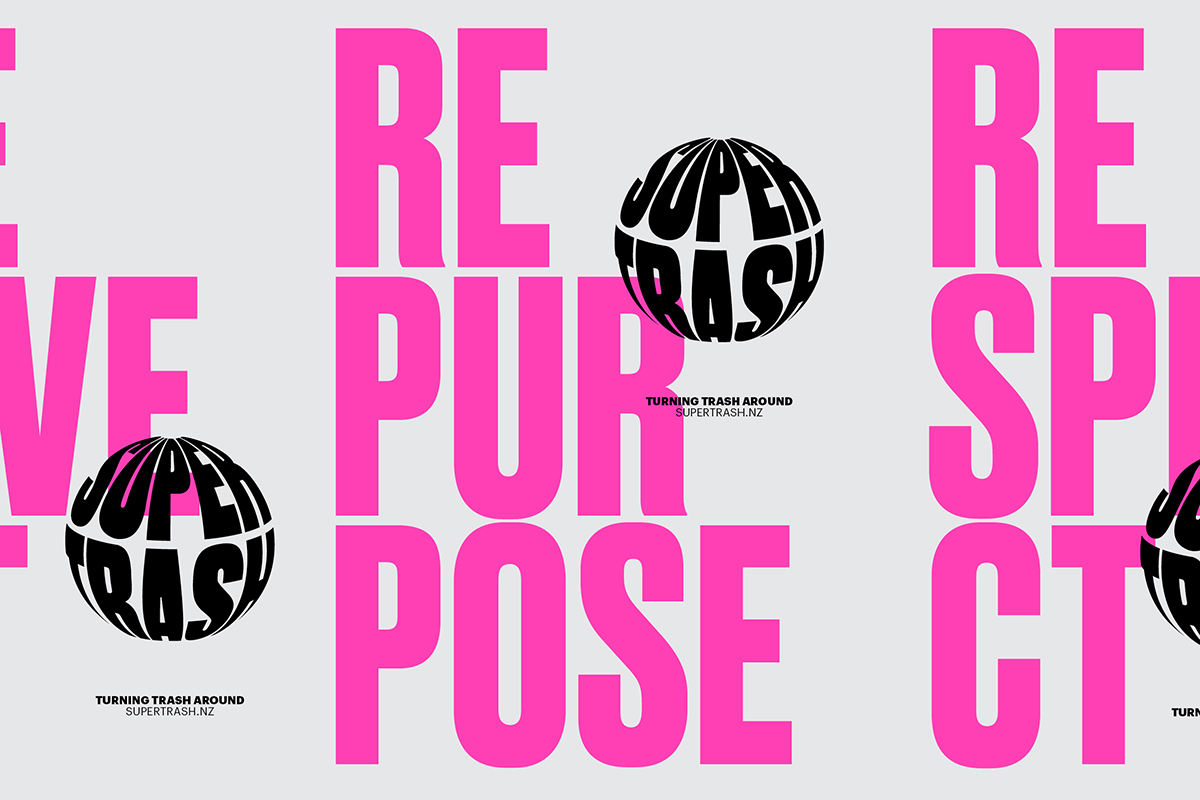
The “Supertrash” project initially caught my attention for obvious reasons: pink graphics on a garbage truck whose focus is on diverting waste to landfills by providing circular solutions (recycling, reusing and repurposing). Baird dives into how the type, colours, and logo reflect the company’s mission. The type and pink colour is bold and assertive, reflecting how the company is taking action against waste. The bright pink is youthful, meaning the company has future generations in mind. The logo itself looks like a globe, recognizing that an overabundance of waste is a global issue and we all need to take action. Finally, the pink explosion can be associated with comic books which goes well with the “super” prefix.
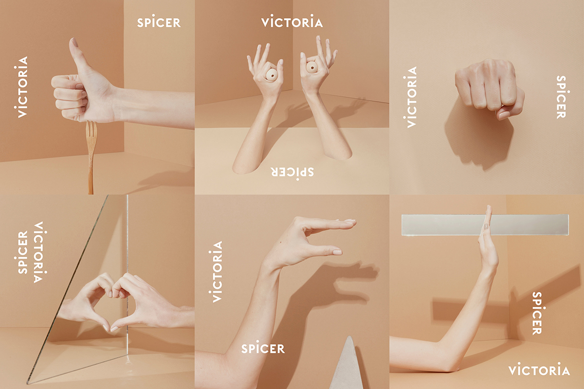
Victoria Spicer, London-based set designer
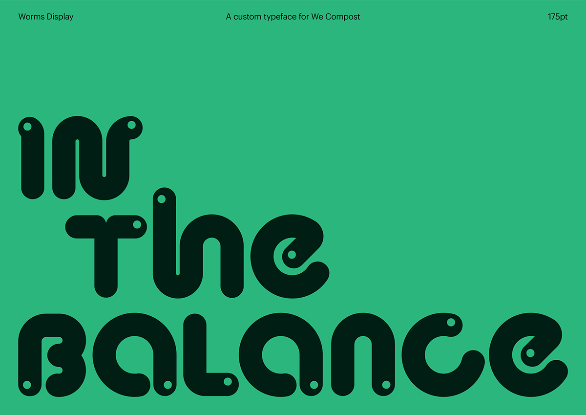
We Compost, Auckland’s compostable waste collection service
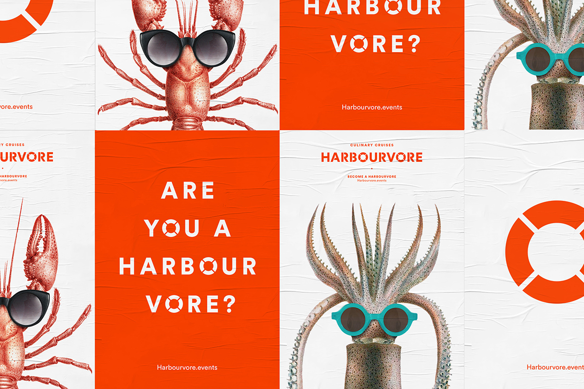
Harbourvore culinary cruises
Want to discover more studios and creatives from around the world? Check out our previous #ILoveTheseGuys posts.
Posts you might like

One of the best things about graphic design is that it never stands still for a moment. But that does mean that keeping up with...

The best graphic design books can take you on an exciting journey of the imagination, transport you to new creative worlds or...

At Shillington, our dedicated graphic design students are taught all about how to design for packaging—from FMCG (that’s fast...

At Shillington, our graphic design course teaches students how to design campaigns for a brand, helping to spread its message....
Exposing yourself to examples of good graphic design is a healthy practice no matter who you are. Maybe you’re a student...
At Shillington, our graphic design bootcamp students are taught how to design for digital, incorporating aspects of both UI and...
We love graphic design. And we're guessing, as you're here, you love graphic design too. This means that we all love graphic...

Graphic design is an ever expanding creative discipline. With our graphic design course, we teach you how to make research a...
Want to win some amazing prizes and stay in the loop with all things Shillington? Sign up to our newsletter to automatically go in the draw.