Supergiant Packaging—Student Case Study
During her time studying part-time at Shillington, Lauren Basser loved learning a wide range of ideation tools to explore a concept. And it definitely shows in her portfolio! Especially for this packaging project—Supergiant Whisky. Today on the blog, she walks us through her design process—from the brief to concept development to constructing mock-ups and more.
What was the initial brief?
The brief required us to design packaging for a bottled product, targeting a specific demographic. I chose the product whisky, intended for ‘geeks’. I purposely chose what are in my experience, uncommon or contradicting elements in the hope of arriving at a more unique outcome.
How did you approach the concept development?
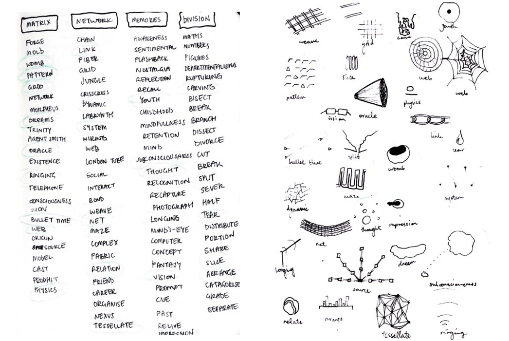
I conducted thorough research into my target demographic and product. The initial development stage began with a mindmapping exercise exploring the semantic fields of ‘Whisky’ and ‘Geek’ in order to explore my understanding of both elements. I populated my mind map with several additional nodes by browsing an online thesaurus, extrapolating word and pictorial associations, doodling and asking advice from friends and family about what these things meant to them. It took roughly 2 weeks to progress to mood board development.
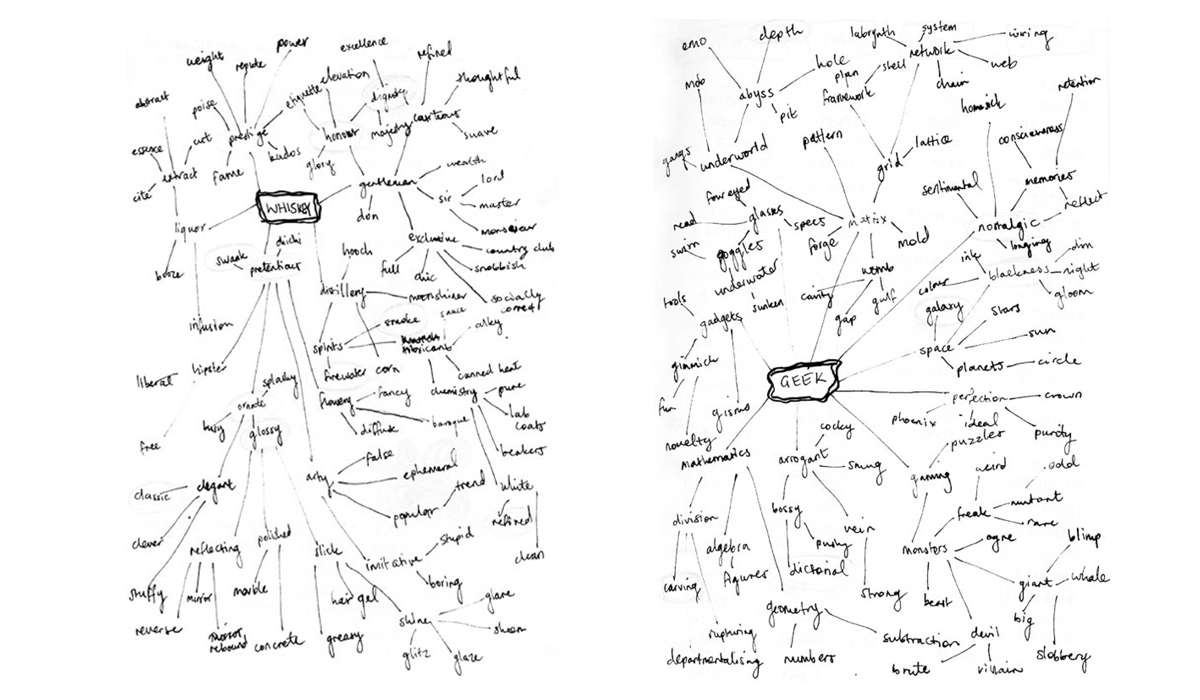
Why was it important to mind map, do word associations and create mood boards?
From a personal perspective, whenever I begin a new project, my initial, and immediate thought process produces the most obvious and unexciting ideas.
It’s only when I take a deep dive into the concepts (particularly when attempting to illustrate word associations) that I begin to cultivate more inspiring outcomes.
Tell us a bit about the background story and your target demographic. Who are Edmund and Tommy?
Edmund and Tommy are friends who have only recently started drinking whisky at the ages of 33 and 35. Self-professed late bloomers, the boys were introduced to whisky by Edmund’s grandmother. Coinciding with their consumption of the product, they found a peak in their confidence both socially and intellectually.
The men met five years ago at a World of Warcraft convention and have remained friends ever since. Bonding over a passion for gaming, comic books and mathematics, Edmund and Tommy became business partners a year later. They currently share a room in Edmund’s grandmother’s basement in Clifton Hill, where in exchange for house-work they receive free board and homemade meatballs.
Pursuit of a new product follows the success of their “Back to the Future Flux Capacitor Wristwatch”. Though failing to guarantee actual time travel, the watch went viral due to nostalgic consumers, endowing the men with a secure, somewhat comfortable financial position.
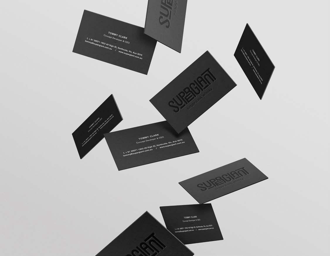
Walk us through the brand identity. We hear you drilled down to some quite specific elements!
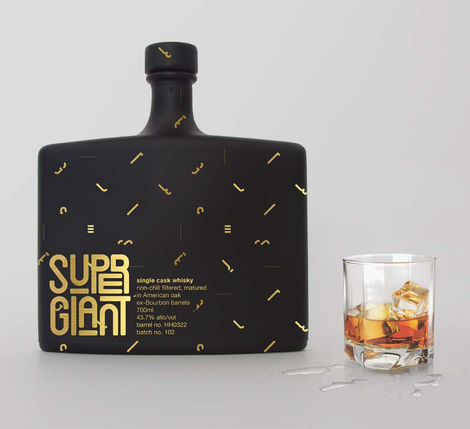
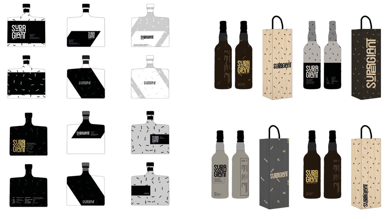
The brand objective I set for myself was to create a coming-of-age whisky for fellow geeks to facilitate a transformation from socially awkward to confident and ambitious gentlemen. After extended research into what defines the audience, ‘Geeks’, I arrived at the concept of constellations as an overarching theme for product aesthetics (think Star Wars, Star Trek, 2001: A Space Odyssey). The name was inspired by an obscure reference to supergiant stars (among the most massive and luminous stars).
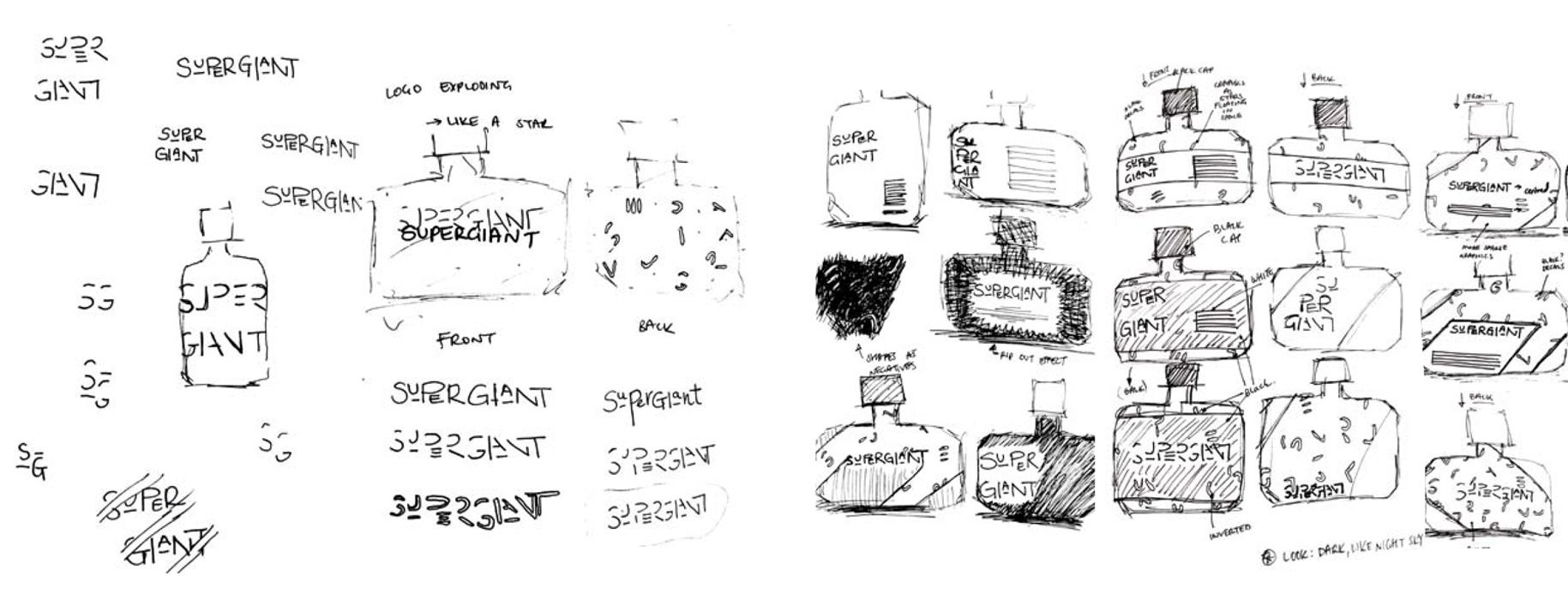
The brandmark is a play on contrast between the large scale Supergiant stars and the surrounding smaller stars. The secondary system plays on the notion of streamlined shooting stars, causing interruption in each character to form pattern work.
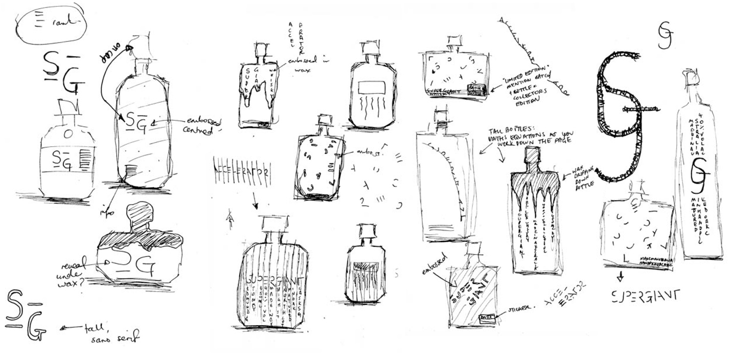
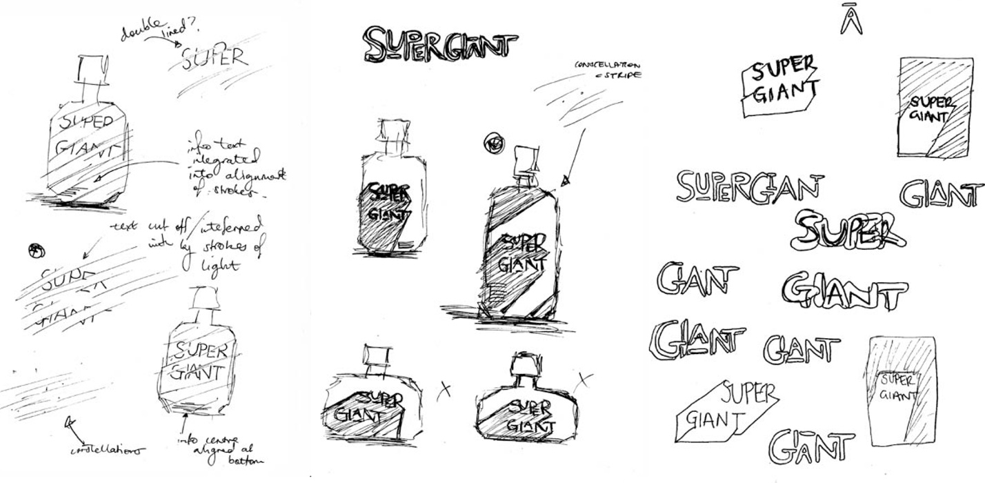
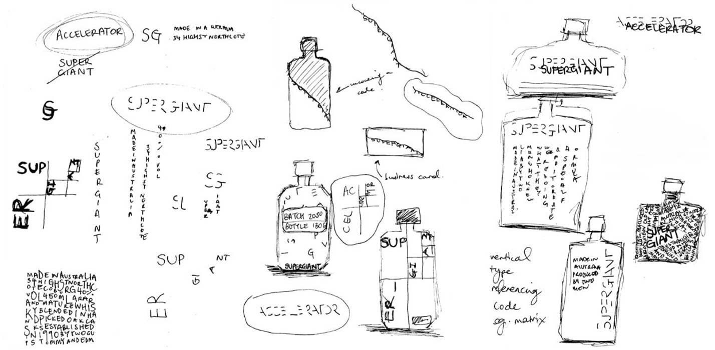
Your thumbnails are awesome. Do you just scribble down anything and everything?
Sure did! I’m actually hopeless at drawing, fortunately this means I’m not fussy about things looking right.
With respect to design and concept development, I find drawing to be a more productive and relevant tool than writing.
Your mock-ups really bring the project to life. Tell us about them.
Thank you! Unbeknownst to me, I selected an obscure limited edition rum bottle for my whisky packaging, leaving me with one week to purchase from a solitary stockist nationwide. Luckily it arrived on time!
I spray painted it a matte black for a cosmic aesthetic and shot the mockup in a makeshift photoshoot at home.
How important was your process to the finished result?
Process was everything to the outcome of my project.
The first stage was concept development, involving mind maps, word and pictorial associations. This cultivated in various mood boards that outlined three possible design directions. I then chose one direction and went to paper with numerous sketches of the brandmark and secondary systems. From here I converted my very rough drawings into digital thumbnails, culled some more and then refined my design for the final outcome. With respect to time spent on each task, I’d say a good half of the brief was attributed to concept development.
How did your Shillington teachers help guide the project?
Leyla and Spencer supported me particularly during the first phase of the project. They exercised appreciative enquiry, hearing my ideas and acting as a constructive sounding board, pushing me further to develop and innovate on my initial concepts. Where I became stuck with what I felt was a clichéd concept of associating mathematics with geeks, they asked the right questions, guiding me to delve deeper and to venture into the idea of galaxies, constellation maps and cosmology.
And final question—do you like whisky yourself?
Not at all! It’s possibly my least favourite beverage.
Huge thanks to Lauren for sharing this in-depth look at her packaging project. Be sure to check out the rest of her work!
Posts you might like

One of the best things about graphic design is that it never stands still for a moment. But that does mean that keeping up with...
Are you a graphic designer who is finding themselves lacking skills, slow on one of the major graphic design programs or just...

The best graphic design books can take you on an exciting journey of the imagination, transport you to new creative worlds or...

At Shillington, our dedicated graphic design students are taught all about how to design for packaging—from FMCG (that’s fast...
We’ve all been feeling the squeeze over the past few years, but at Shillington we don’t want this to stop anyone getting the...

https://www.youtube.com/watch?v=wZ_tffGtZMs New York graduate Simon Fréour worked as a software engineer in France for seven...

At Shillington, our graphic design course teaches students how to design campaigns for a brand, helping to spread its message....
Are you working with graphic designers day-to-day and finding yourself jealous of the work they're doing? You're certainly not...
Want to win some amazing prizes and stay in the loop with all things Shillington? Sign up to our newsletter to automatically go in the draw.