Handmade Designs: 14 Inspirational Designs Created by Shillington Design Students
Out of the 30+ briefs that students are given during our graphic design course at Shillington, the Handmade project is often a firm favourite. It gives the students a chance to get off the computer, think outside the box and create something amazing with their hands—and, with this, comes unlimited possibilities.
We looked back and chose fourteen of our students’ handmade projects that boggled our minds—using everything from flowers and origami to toast and marmalade to create a record sleeve, film poster or book cover.
1. Wonderwall by Oasis—Theodora Lamprinaki, Manchester
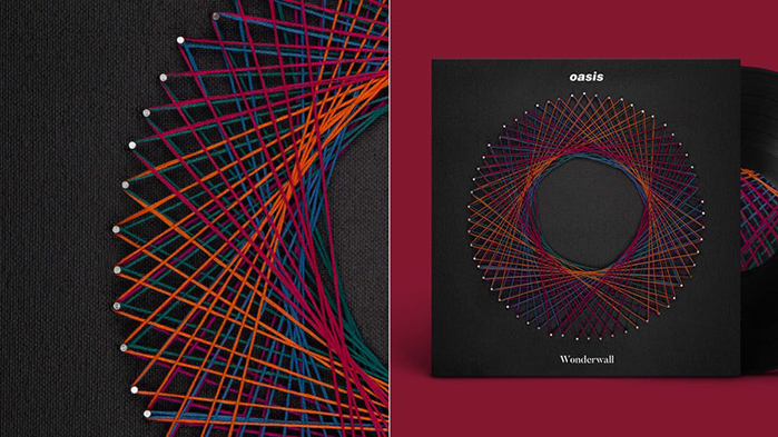
Theodora Lamprinaki created a record sleeve design for the 1995 Oasis single ‘Wonderwall’ using the string art technique of weaving coloured string around nails to create patterns. Theodora chose the string art technique to indicate the connection to a soulmate, metaphorically referred to in the song as a “wonderwall”. She also chose the shape of circle to represent wholeness and perfection.
2. The Girls by Emma Cline—Molly Keene, Sydney
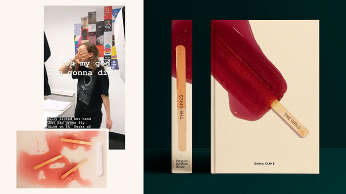
A very cool, minimalist book cover design for Emma Cline’s 2016 debut Novel ‘The Girls’ by Molly Keene used a hand-printed popsicle stick set into a popsicle and then melted represents the book’s main themes of infatuation, loss of innocence and decay. Molly explained that the idea of a melted popsicle reflects the book’s idea that nothing can return to what is was before the summer in which the book is set.
3. Get Out—Stephen Nutley, Brisbane
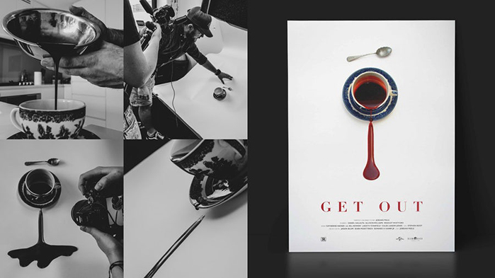
Using important motives from the film itself, a china teacup and silver spoon, Stephen Nutley created a very clever movie poster design for the 2017 thriller ‘Get Out’ directed by Jordan Peele. As well as using physical objects from the film, Stephen’s homemade fake blood cleverly embodies the film’s storyline and themes of racism, slavery and trauma. The drip of the fake blood also references the film’s references to “the sunken place”.
4. The King of Limbs by Radiohead—Mario Baltodano, New York
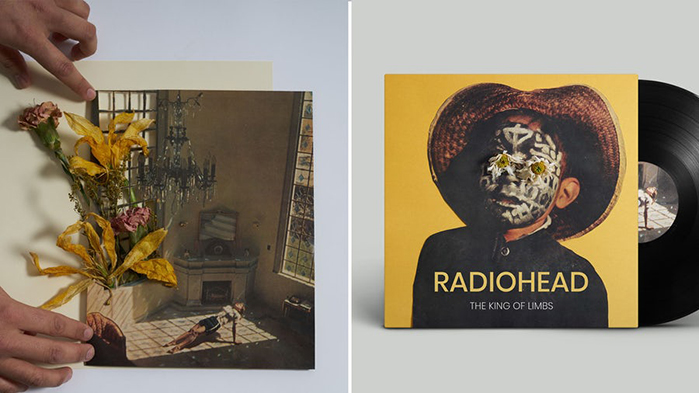
New York student Mario Baltodano got hands on to make a record sleeve design for Radiohead’s 2011 album ’The King of Limbs’. Taking inspiration from the album’s opening track ‘Bloom’, Mario used collaged photographs coupled with dried flowers, mirroring nature and the natural decay of living things—two major themes of the album. These themes are also reflected through natural sounds, such as birdsong and wind, in the songs themselves.
5. Sound & Color by Alabama Shakes—Kerry Underhill, Melbourne
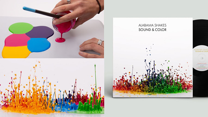
‘Sound & Color’ is a 2013 album by American blues rock band Alabama Shakes. The titular song is about a colourless, silent world devoid of both sound and colour. Kerry Underhill’s design flips this concept on its head by using both elements, sound and colour, very literally—paint was laid on a vintage speaker and, with the volume cranked, was allowed to “dance” creating a colourful, eye-catching visualisation of sound.
6. Carmen—Martina Larrante, Manchester
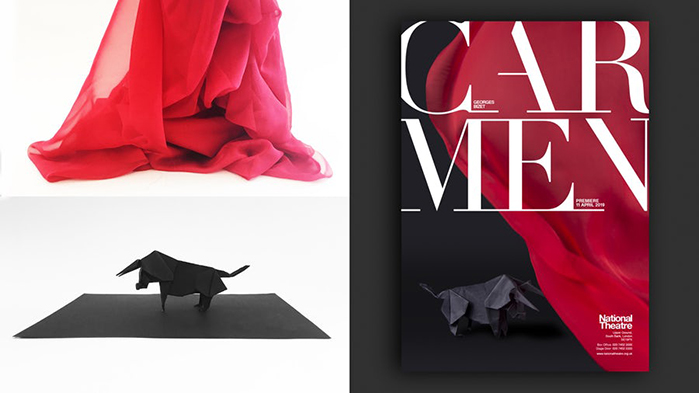
Martina Larrante took a very traditional piece of opera, George Bizet’s ‘Carmen’ for 1865, and gave its poster a modern twist. To cut a long story short, the opera follows attractive, flirty Carmen who escapes prison by seducing a guard, José, before the two run away to the mountains. There, she falls in love with a bullfighter Escamillo and plans to elope with him. José is blinded with jealousy and stabs Carmen to death. Martina’s handmade design uses two major elements of the opera—a hand-folded origami bull to represent Escamillo and a draped red piece of fabric to represent Carmen’s traditional red flamenco dress, the red muleta used in bullfighting and, finally, Carmen’s bloody murder in the bullring.
7. Sound and Vision by David Bowie—Joanna Dudderidge, London
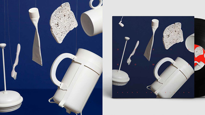
Joanna Dudderidge chose to hand make a record sleeve design for ‘Sound and Vision’, a 1977 song by David Bowie. The design was inspired by Bowie’s lyrics from the song “waiting for the gift of sound and vision”—Joanna wanted to make these lyrics literal and capture the anticipation of sound in a still image. Using handpainted everyday objects, suspended by wire as if suspended in mid-air—Joanna brilliantly captures the moment of silence before they inevitably crash to the ground.
8. Frida—Amy Forsyth, Sydney
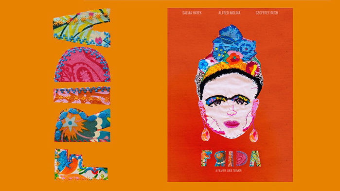
The most common colours in Mexican artist Frida Kahlo’s paintings are green, yellow, orange and blue, so these were an obvious starting point for Amy Forsyth’s design for the 2002 biopic of the artist, ‘Frida’. Employing these colours, and some amazing patterns that are also reminiscent of Kahlo’s art, in hand-sewn appliqué and embroidery Amy truly captured the spirit of the film as well as the majesty of Kahlo herself.
9. Migration by Bonobo—Adam Waldock, London
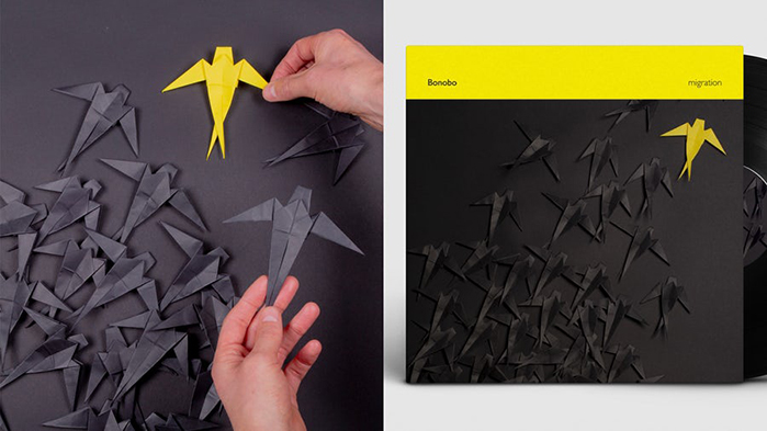
British producer, Bonobo’s, 2017 album ‘Migration’ contains heavy themes of nature and, of course, migration. Adam Waldock wanted to reflect these themes and the album’s titles through his flock of hand folded origami birds, nature’s more prevalent migrators. The design’s single yellow bird also mirrors the solitude that is a part of Bonobo’s album—the musician sees his creation as a passage of learning and solitude, much like the yellow bird standing out from the rest.
10. The Life Changing Magic of Not Giving a Fuck by Sarah Knight—Ashley Gordon, Brisbane
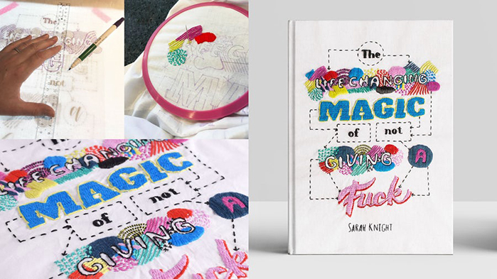
Ashley Gordon chose to design an alternative cover for the excellently named ‘The Life Changing Magic of Not Giving a Fuck’, a 2015 book by Sarah Knight. The design uses both hand lettering and embroidery to recreate the ‘Not Sorry’ flowchart which features in the book—which guides the reader how to prioritise what’s really important and, as the title suggests, give less of a fuck. The handmade elements embodies both the magic the title names and the sense of irony it invokes.
11. Ferris Bueller’s Day Off—Martha Hindle, Manchester
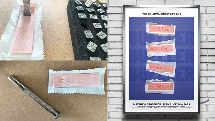
Martha Hindle’s stripped back design for the classic 1986 film ‘Ferris Bueller’s Day Off’ reflects the eponymous characters’ rebellious character and blasé nature to school and authority. Martha used chewing gum, the scourge of many teachers, hand-stamped with the film’s title to create a simple but effective design. The blue type lock-up behind the photographed design is a callback to the film’s now iconic roll call scene.
12. The Secret Garden by Frances Hodgson Burnett—Lynette Spry, Melbourne
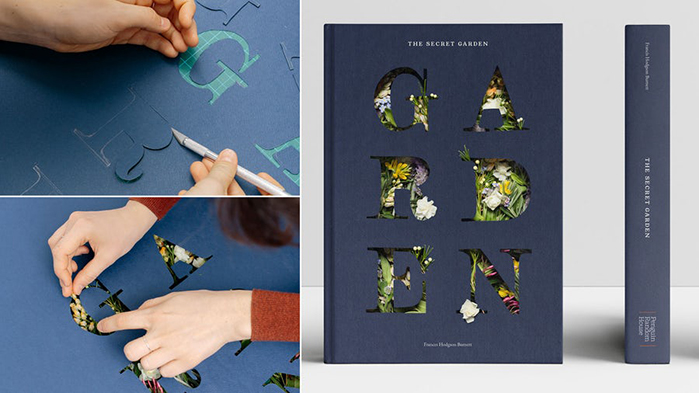
This beautiful floral design by Melbourne student Lynette Spry is a refresh of Frances Hodgson Burnett’s classic childrens’ novel ‘The Secret Garden’. Influence by the book’s main premise of a secret garden discovered by a intrigued young girl is shown in Lynette’s design through flowers being arranged to appear to grow through the word ‘garden’ cut by hand out of a sheet of card, as if the reader is the book’s protagonist peering into the garden. The flowers chosen were taken directly from the story—they are mentioned to have grown in Mr and Mrs Craven’s garden.
13. Raw Power by Iggy Pop and The Stooges—Sholto Douglas, London
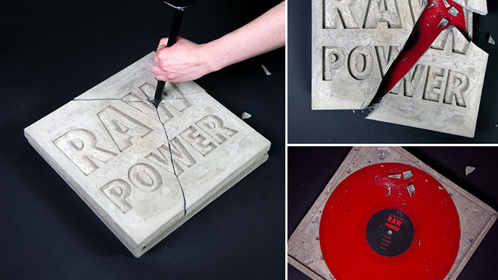
A very literal record sleeve design for a special edition of ‘Raw Power’ Iggy Pop & The Stooges’ classic proto-punk album from 1973. Sholto Douglas encased a deep red vinyl in a handmade concrete sarcophagus with debased typography—the raw nature of the material reflecting both the album’s title and content. The only way to get into the record is to use brute force, or raw power itself, to crack through the concrete shell.
14. Letters from the Road by Jack Kerouac—James Shakeshaft, Manchester
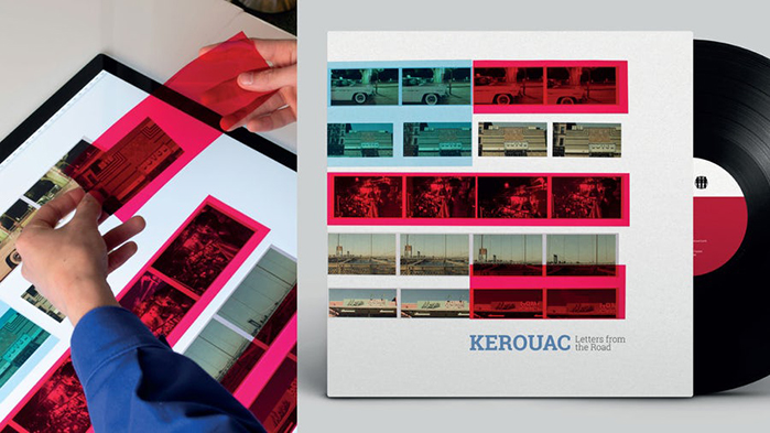
Jack Kerouac’s spoken word recordings ‘Letters from the Road’ is a snapshot in to post-war America delivered in Kerouac’s fragmented style. In James Shakeshaft’s design the content and delivery of the recording is echoed through the use of literal snapshots of post-war America overlaid by hand with strips of coloured acetate, which obscures parts of the photos in a similar way to how Kerouac’s narrative obscures parts of his stories.
If you want to start making your own handmade projects and become industry ready in just three months, head over to the Shillington website for more information on how to sign up – it could be the best decision you ever make.
Check out more work created by Shillington students in our Student Showcase.
Want to create your own amazing handmade design like these—and learn graphic design at the same time? Study design 3 months part-time or 9 months part-time at Shillington in New York, London, Manchester, Sydney, Melbourne or Brisbane.
Posts you might like

One of the best things about graphic design is that it never stands still for a moment. But that does mean that keeping up with...

The best graphic design books can take you on an exciting journey of the imagination, transport you to new creative worlds or...

At Shillington, our dedicated graphic design students are taught all about how to design for packaging—from FMCG (that’s fast...

At Shillington, our graphic design course teaches students how to design campaigns for a brand, helping to spread its message....
Exposing yourself to examples of good graphic design is a healthy practice no matter who you are. Maybe you’re a student...
At Shillington, our graphic design bootcamp students are taught how to design for digital, incorporating aspects of both UI and...
We love graphic design. And we're guessing, as you're here, you love graphic design too. This means that we all love graphic...
In graphic design, quite a few decisions happen behind the scenes that clients may not grasp the importance of, yet have a huge...
Want to win some amazing prizes and stay in the loop with all things Shillington? Sign up to our newsletter to automatically go in the draw.