Adrian Frutiger: An Influencial Swiss Typeface Designer
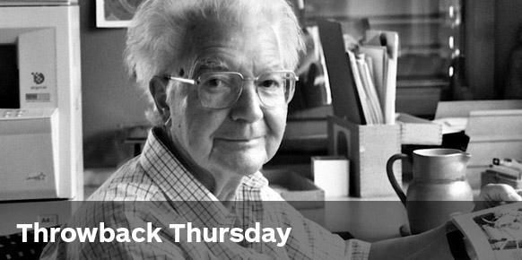
Adrian Frutiger (1928-2015)
The design industry lost a typography legend last week. Adrian Frutiger was a Swiss designer who created some of the most popular typefaces of the 20th and 21st century. During his life he received many prestigious awards including The Gutenberg Prize, the Chevalier de l’Order des Arts et Lettres, Typography Award from SOTA and the New York Type Directors Club Type Medal.
Born in Unterseen, Frutiger explored and experimented with type since his childhood. In a rebellion against the required cursive curriculum in his Swiss school, he invented new stylised handwriting and played around with invented scripts.
After secondary school, Frutiger landed an apprenticeship as a compositor at a printing house. He worked for a handful of years and then moved to the Kunstgewerbeschule in Zurich in 1949 to study under masters like Walter Käch. During his academic career, Frutiger concentrated on calligraphy, but simultaneously sketched the foundations of the typeface that ultimately became Univers.
Most designers would know and love his most famous typefaces—Univers, Frutiger and Avenir.
He produced more than 30 typefaces throughout his career, including serif typefaces, but his main passion was clarity, which is obvious in his landmark sans-serif creations. He described these as his “main life’s work”.


Frutiger apparently produced the Univers font system in only 10 days. Can you believe that? It was extremely popular during the 1960s and 70s, championed by brands like General Electric and Apple. Even today, Univers can be found in Frankfurt International Airport, on London street signs, in history books as the typeface of the 1972 Olympics in Munich and at Disney World. It also has aesthetic longevity due to its legibility on digital screens.

“On my career path I learned to understand that beauty and readability—and up to a certain point, banality—are close bedfellows: the best typeface is the one that impinges least on the reader’s consciousness, becoming the sole tool that communicates the meaning of the writer to the understanding of the reader.” —Frutiger
Later in his career, Frutiger worked to create revivals of classic fonts like Franklin Gothic and News Gothic. His most famous was an evolution of Didot called Linotype Didot, which remains popular today.
I’m a huge fan of Frutiger’s work. In fact, Avenir is my one of my go-to fonts for design projects!
It’s been incredible to see his work and legacy celebrated during the past week. There’s no doubt his work will live on for many years to come. What more could a designer ask for?
Interesting stories about Frutiger’s life can be found on Dezeen and Gizmodo, while creatives around the world took to Instagram to honour him with #adrianfrutiger.
Posts you might like
In graphic design, quite a few decisions happen behind the scenes that clients may not grasp the importance of, yet have a huge...
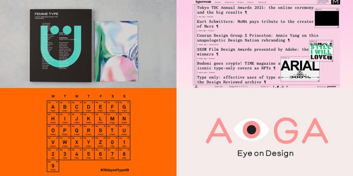
It’s that time of year again! As the new year approaches, it’s become somewhat of a tradition for us to look back at our...
We all know that sometimes finding the perfect typography for a design project can be like finding a needle in a...
Dipped your toes into the world of graphic design? You'll know that typography is something that underpins almost every aspect...
Considering how much the world has changed since this time last year, making general predictions for what the next 12 months have...
Whether you’re a student or a recent graduate, living on a tight budget means looking for savings wherever you can, including...
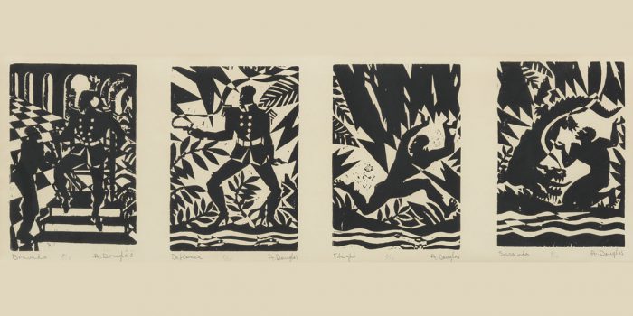
Aaron Douglas was a leading artist of the Harlem Renaissance, also known as the New Negro Movement. Douglas, along with the...

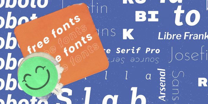
You need some typography for your project and you're on a tight budget. You'd love that stunning sans serif or stylish...
Want to win some amazing prizes and stay in the loop with all things Shillington? Sign up to our newsletter to automatically go in the draw.