37 of the Best Free Modern Fonts to Add to Your Toolbox
We all know that sometimes finding the perfect typography for a design project can be like finding a needle in a haystack—especially when a client has given a vague notion of what they want. You know the classic “oh yeah, we want a modern font on there”.
We at Shillington didn’t want you to lose any sleep over the choice, so we’ve put together a list of the best modern typefaces that you can use to give any project that perfect contemporary twist. Better yet, they’re all free so you don’t have to worry about breaking the bank either.
From Aileron Black all the way through to Yatra One, we’ve hand-selected the best of the best modern typefaces for you to scroll through, find one you love and get kerning. Delve in!
List Of Modern Fonts
1. Outward
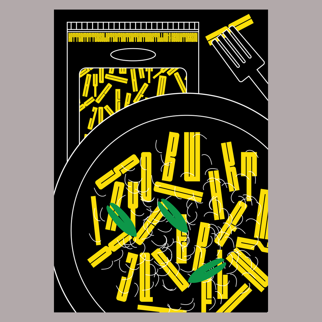
Outward is a family of display fonts designed by Raoul Audouin for Velvetyne Type Foundry (VTF). Founded 11 years ago by Frank Adebiaye, VTF designs and distributes free and open source typefaces and Outward is one such typeface. Outward comes in three cuts Block (regular), Round (italic) and Borders (bold) so can be used in a variety of different ways for your project.
2. Yatra One
Inspired by the hand-painted signage of the Mumbai local railway, Yatra One is another display typeface available for free through Google Fonts. Featuring both Latin and Devangari (a traditional Indian script), Yatra One is a beautiful typeface that features angular cuts and open knots to faithfully recreate the railway’s hand-painted signs. The project is led by US-based type designer Catherine Leigh Schmidt.
3. Compagnon Script
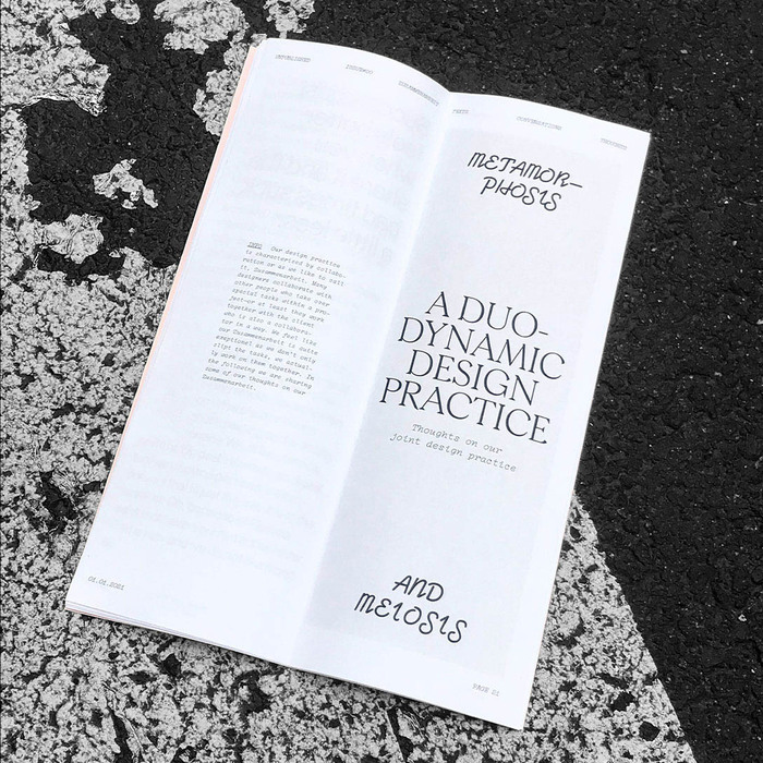
Another winner of a typeface from Frank Adebiaye’s Velventyne, Compagnon Script is part of a family of typefaces that finds its inspiration in the online Typewriter Database. Each different specimen recalls a different time in the evolution and history of typewriter typefaces. Compagnon Script is designed by Chloé Lozano and is the perfect way to add a bit of modern flourish to a project.
4. Rational
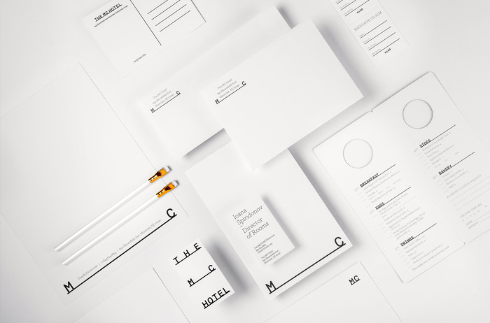
Rational, designed by Studio René Bieder, is firmly rooted in the traditions of American Gothic and Swiss traditional typefaces. It is a highly utilitarian typeface that aims to bring the Grotesk genre into the 21st Century. Featuring horizontal terminals and uniform widths, Rational is a highly adaptable typeface that also brings a sense of tradition and functionality to an otherwise modern typeface.
5. Lunchtype
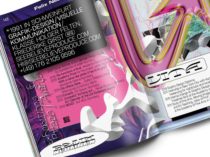
You know you’re off to a good start when a typeface makes you think of food. That being said, Lunchtype did actually come from lunchtime. It’s a contemporary WIP typeface experiment, which is irregularly updated by designer Stefan Wetterstrand. As well as that it’s also a beautifully formed sans serif font that is free to download and use for your designs.
6. Alegreya
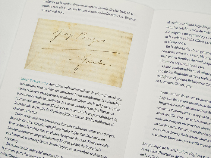
Alegreya boasts an impressive history—it was chosen as one of the Fonts of the Decade at the ATypI Letter2 competition in September 2011 and was selected in the 2nd Bienal Iberoamericana de Diseño in 2010. A serif font intended for printed literature, Alegreya is great for adding a touch of class to a project. It’s designed to help the reading of long texts, creating a sense of harmony through its dynamic and varied rhythm.
7. PT Mono
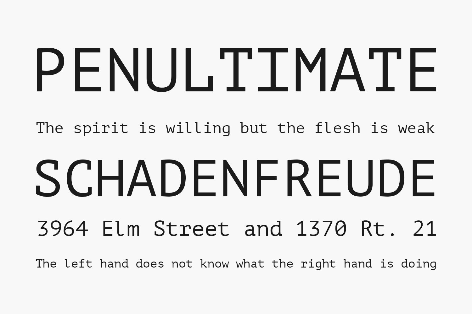
Paratype‘s PT Mono is modern in its very invention. It was developed specifically for use in forms, worksheets, tables and other digital contexts. For this reason, every character in the typeface is exactly the same width—check out the w to see exactly what we mean! Like the rest of the typefaces here, PT Mono is free so whether you’re typesetting a complex document like it was intended for or something else totally off piste, then it might just be what you’re looking for.
8. Sporting Grotesque
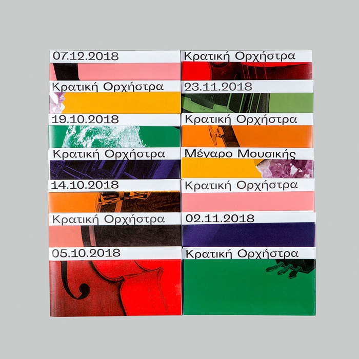
The meandering, round typeface that is Sporting Grotesque was originally designed for Velvetyne by Lucas Le Bihan in 2016. Over the past five years it has had two adaptations, with George Triantafyllakos adding the Greek alphabet in 2017 and Maciej Połczyński adding Polish diacritics the following year. A uniquely weird, or maybe weirdly unique, typeface, Sporting Grotesque can transform any design and is a definite “must add” to your toolbox.
9. Quantico
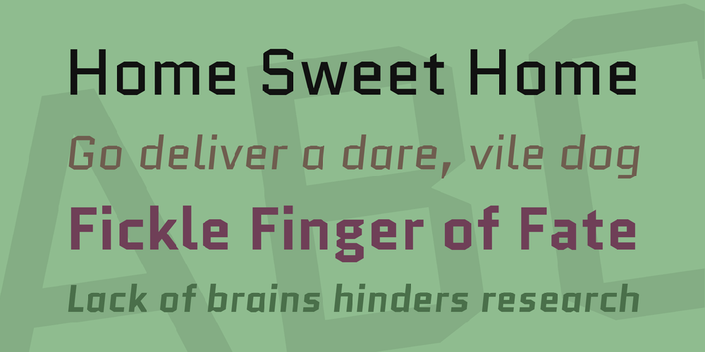
Inspired by old beer packaging and military lettering, Quantico uses 30 degree angles and entirely straight lines to maximum effect. Designed by MADType, its unique character styles will stand out on any design. On top of that, you can download it for free today from Google Fonts.
10. Lack
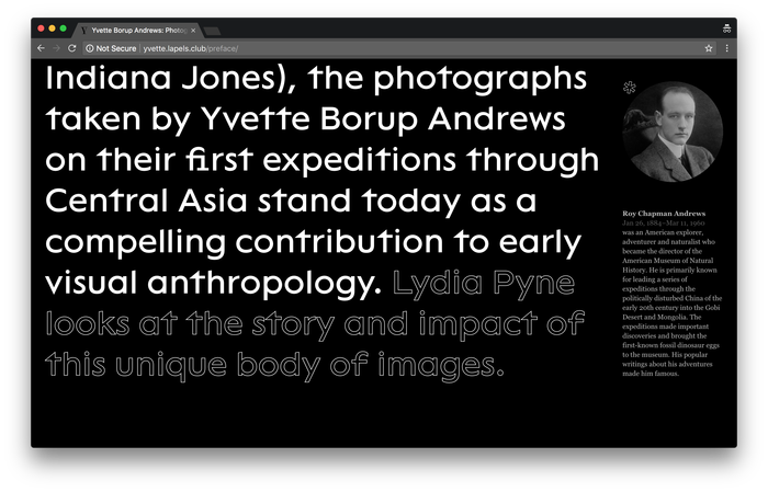
Another beauty of a Velvetyne typeface, Lack is a sans serif that doesn’t mess around. Strikingly contemporary, it can be used just effectively as a display typeface for headings as it can for the smallest of body copy. Designed 8 years ago by Adrien Midzic, there are some wonderful flourishes hidden away in Lack that will surprise both designer and viewer. The perfect modern sans serif for your next design project.
11. Snap-It Mono
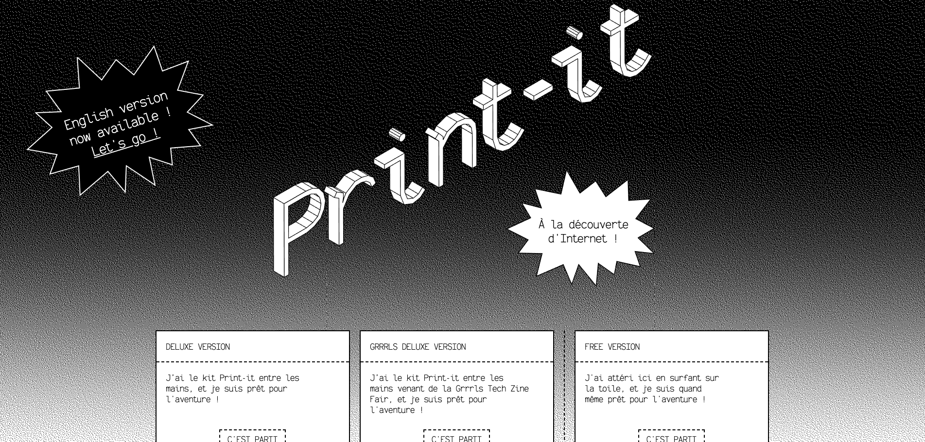
A typeface with a very cool background. Snap-it Mono was designed by Morgane Bartoli and Corentin Moussard for Print-it, a fanzine that you could print and make yourself using a website and a manual created by Objet Papier. The resulting typeface stands out amongst other modern typography, with serifs, strokes and other elements of the characters used in ways we haven’t seen before.
12. Dotties Vanilla & Chocolate
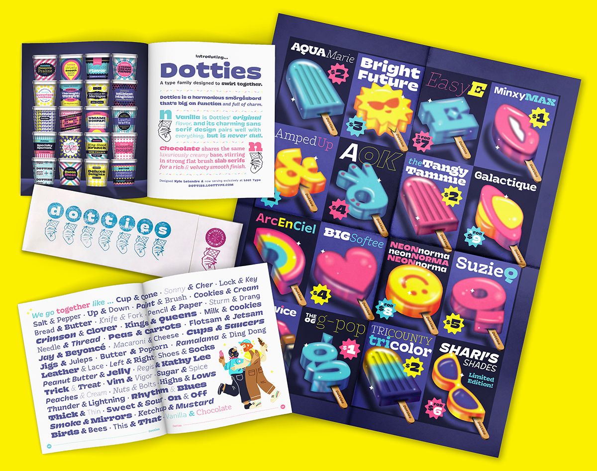
After Lunchtype, we didn’t think another typeface would make us hungry but then along comes Dotties Vanilla & Chocolate. Two separate typefaces that come together as a pair, the Dotties twins are a sans and slab pairing that go together to create a delicious duo for your designs. Though, make a note that the free version of Dotties Vanilla & Chocolate is only free for student projects and personal unpaid projects.
13. Orkney
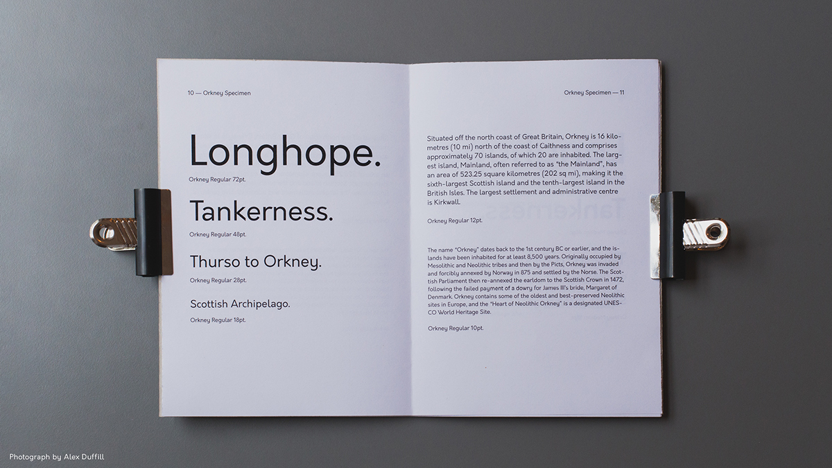
Orkney is a Renaissance man of a typeface—it can be used to great effect on both print and digital projects. Designed by Samuel Oakes of Hanken Design Co., Orkney is a functional, geometric typeface that is as gorgeous as its island namesake and super easy to seamlessly slot in to any project you have at hand.
14. Gap Sans Bold
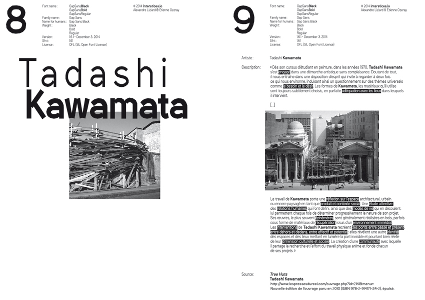
For Gap Sans Bold, designers Étienne Ozeray and Alexandre Liziard took Sani Trixie Sans and forked off from it creating a visually stimulating typeface of their own. Looking like someone has taken characters, broken them up and then reformed into new characters, Gap Sans Bold have created one of the best modern fonts around. Give it a go in one of your projects to see for yourself.
15. Moche
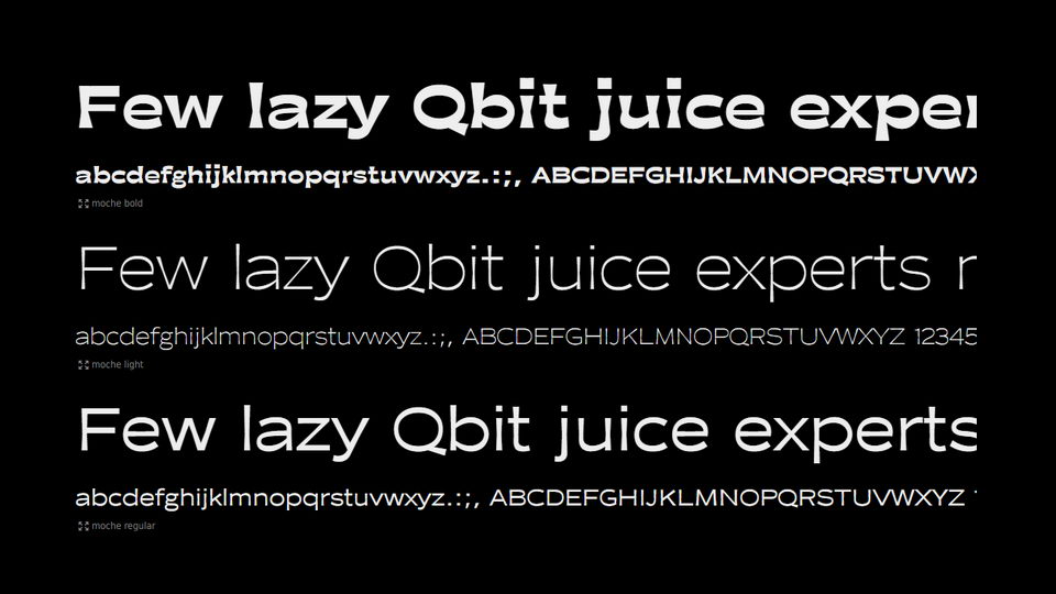
Another visually striking typeface, Moche was designed by graphic designer Vivien Gorse. Moche is what is called a reverse contrast sans serif typeface and, to put it in layman’s terms, looks like the characters are wearing flairs. A bit of retro flair in modern typography. With three different weights, Moche can be used for a variety of applications. Moche Light and Regular are great for both text and display, while the chunkier Moche Bold is display only.
16. Cassannet Plus
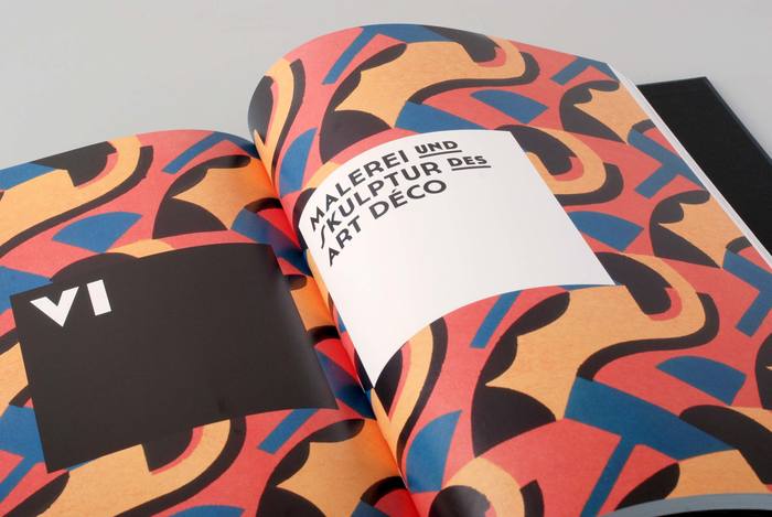
Art Deco is not something you would necessarily associate with contemporary typography but Atipo Foundry’s Cassannet plus is exactly that—a modern renditioning of that early 20th century flair. In fact, Cassannet is directly influenced by the posters of A.M. Cassandre, the legendary French-Ukranian Art Deco poster artist. Have a quick google—you’ll know exactly who you mean. So, if you’re interested in inserting a piece of history into your designs, look no further. Though, if you’re looking for something authentically vintage, then check out our list of the best vintage typefaces.
17. Public Sans
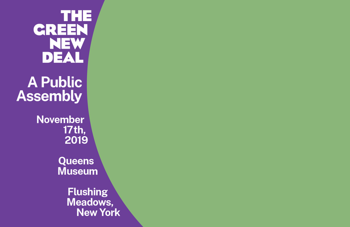
A list of the best modern fonts is not where you would expect to find something designed by the US government but Public Sans is special. Designed by the unglamorous sounding United States Web Design System (USWDS), Public Sans is a free typeface that is both strong and neutral and created specifically for use on interfaces, text and headings. So, while it may not be the most remarkable typeface on this list, its usefulness cannot be understated.
18. Aileron Black
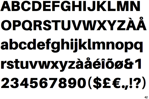
Sora Sagano’s Aileron Black is a neo-gothique interpretation of perennial favourites Helvetica and Univers. Luckily, it’s available in 16 different styles—from UltraLight to Black Italic—so it’s definitely going to come in handy at some point. So if you’re looking for a free, modern font to take the place of those sans serif darlings then you’ve come to the right place.
19. Pilowlava
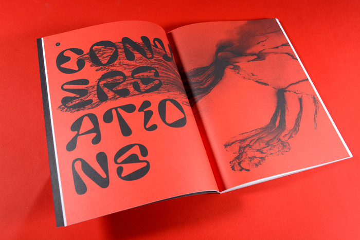
One of the least conventional fonts in our list, Pilowlava was the result of a game of design ping pong between Anton Moglia and Jérémy Landes with each designer trying to surprise the other. The resulting typeface seeks a balance between viscous energy and controlled geometry. It is also a super eye-catching typeface that will transform any design. And the name? It’s named after lava pillows, a natural phenomenon that is produced when lava is expelled by an underwater volcano. You can totally see why.
20. Oswald Bold
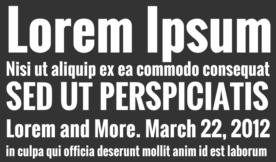
Oswald Bold is a modern reworking of the classic gothic style and is one font that brings more traditional fonts into contemporary typography. The fundamentally modern twist of Oswald is that the characters have been reformed and re-drawn to better fit the pixel grid of standard digital screens. This means that Oswald Bold is the perfect font to be used across digital design and the internet—it looks great on desktop, laptop, tablet and phone screens.
21. MuseoModerno
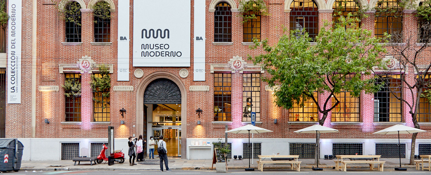
Some fonts are designed for a very specific purpose. This is definitely true for Omnibus Type‘s MuseoModerno. As the name suggests it was designed especially for the Buenos Aires’ Museum of Modern Art—which in Spanish is, you guessed it, called Museo Moderno, AR. Now available for complimentary, public use, MuseoModerno is a contemporary, geometric typeface. We absolutely love those curves.
22. Archiv Grotesk
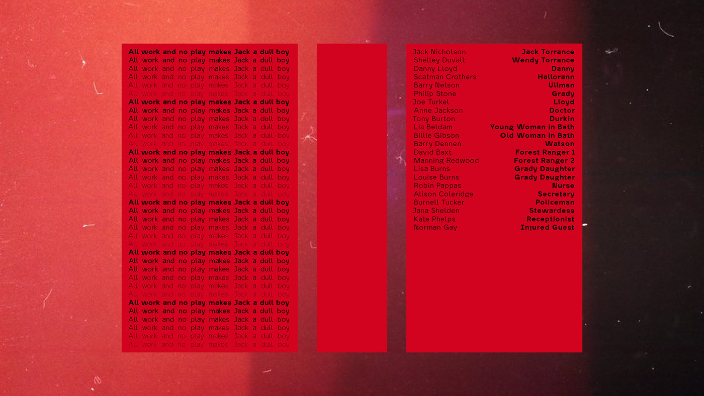
Archiv Grotesk was designed by Berlin-based designer Tomas Clarkson after several visits to the archives of legendary film director Stanley Kubrick at London College of Communication. This modern font is a sans serif typeface that features unusual ascenders, descenders, ears and hooks to help it stand out from the crowd. It’s a great typeface for use if you’re looking for legibility with a little added quirk.
23. Almarai

Almarai is a bit different from the other modern fonts in our list as it is designed specifically for the Arabic alphabet and has no option for the Latin alphabet. Designed by the Boutros Fonts, who have been spearheading Arabic design and typography for over forty years, Almarai was created for optimal readability of the Arabic alphabet in online and digital applications. The typeface is famed for its clarity and simplicity, but also sticking to more traditional calligraphic rules and structure.
24. Le Murmure
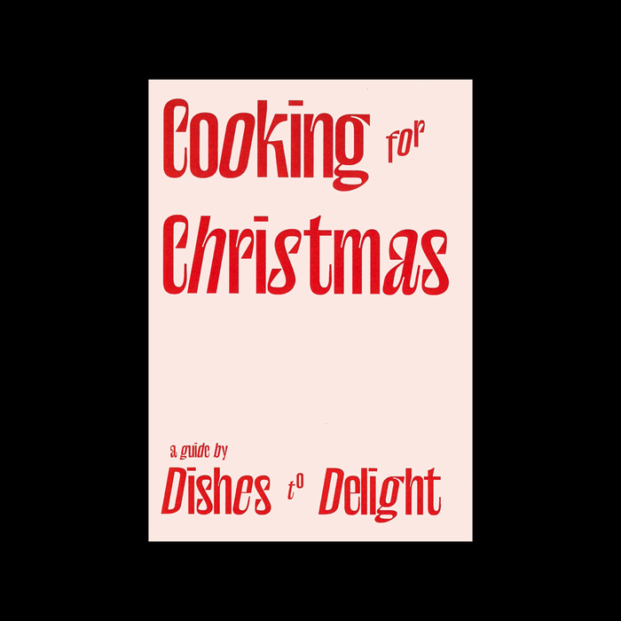
A custom typeface designed for Caen and Paris-based Agence Murmure, Le Murmure is another front from modern typography masters Velvetyne. The agency was after a font that was both distinctive but also elegant—and Jérémy Landes’ typeface hits the nail on the head. It also demonstrates a clever (and intentional) mismatch between the characters which carries the unique rhythm Murmure were after. Want to add that rhythm to your own project? You know what to do.
25. Averta
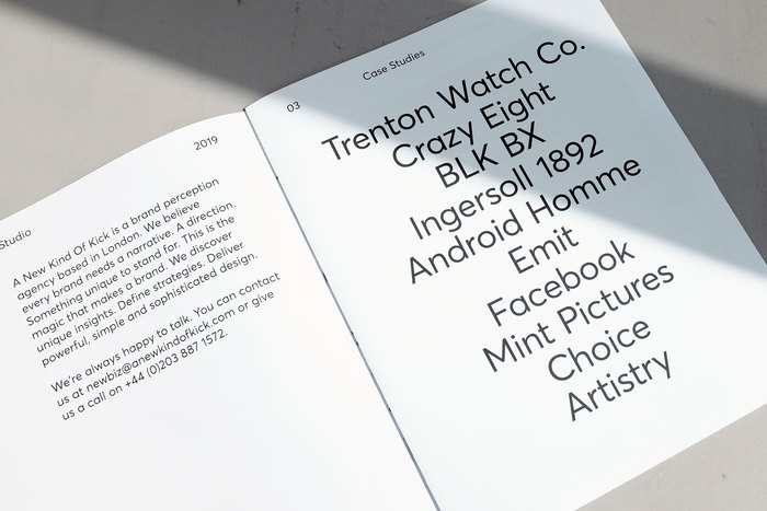
A font by award-winning designer Kostas Bartsokas, Averta is a geometric, sans serif typeface with bags of personality. Averta features geometric rounds, open apertures and low contract strokes to create a neutral and friendly typeface that can be used over and over again. It also supports over two hundred languages, including the Latin, Cyrillic, Greek and Vietnamese alphabets, which is a winner in our book.
26. Ubuntu Font
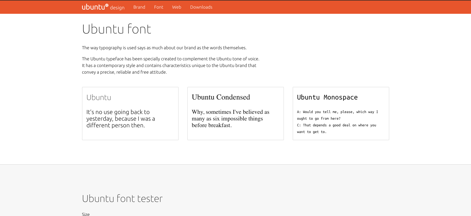
Ubuntu is another modern font that was designed to perfectly complement the eponymous design studio’s tone of voice. Designed by international type foundry Dalton Maag, Ubuntu is a sans serif typeface that, like others on this list, is designed specifically for ease of legibility on screens—both desktop and mobile. Though, it’s no surprise that this is the case; a majority of the text we now read in our day-to-day lives is on screen so it makes sense that these contemporary fonts are crafted for this.
27. Prospectus Pro
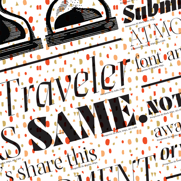
A humdinger of a serif font, Prospectus Pro is crisp, bold and instantly recognisable. Designer Dave Bailey drew on some very early typography—Imperial Roman letterforms from the height of the Roman Empire—as inspiration for his modern font. Prospectus Pro is also available in optical sizes, taking yet more inspiration for historical type, so it can be used for a huge variety of outcomes for all your typesetting needs.
28. Format 1452
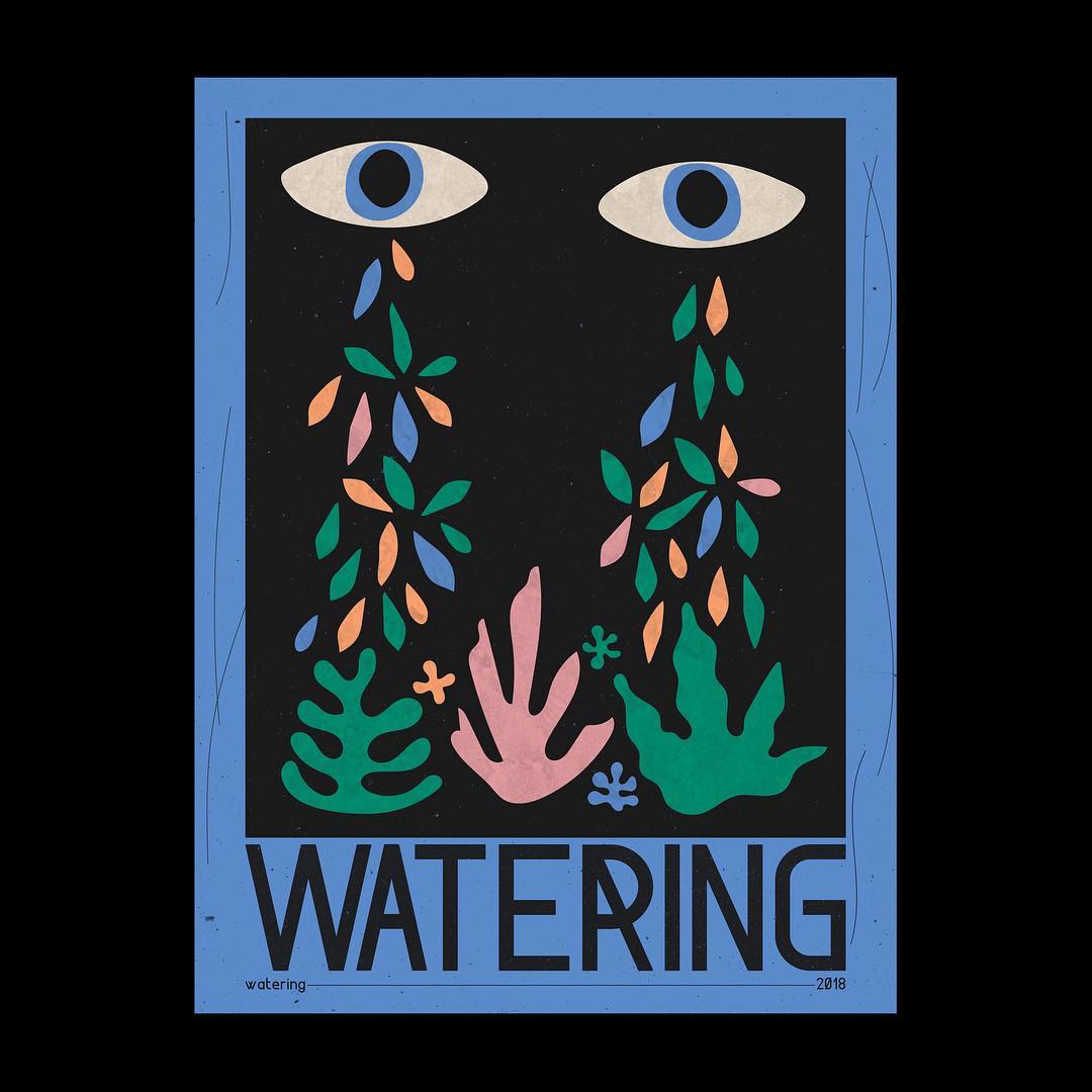
Format 1452 is a modern typeface that is made up of modules. This means that all the characters are made up of a limited number of shapes. Take a closer look at Format 1452 and you’ll see exactly what we mean. Designed by aforementioned Velvetyne founder, Frank Adebiaye, Format 1452 works best when used in headlines, posters and other designs where you really want to catch somebody’s eye.
29. Bluu Next
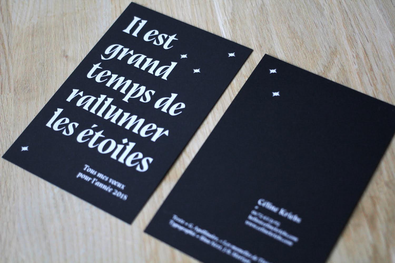
Tired of the likes of Times New Roman, Caslon Graphique and those other run-of-the-mill serif typefaces, JB Morizot of Phantom Foundry set about designing a sharp, contemporary serif font. This took the form of Bluu Next, a modern font which plays with notions of how serifs should look. The characters in Bluu Next feature chunky, angular serifs which, combined with skinny uprights, produce a truly incomparable typeface.
30. Shrimp
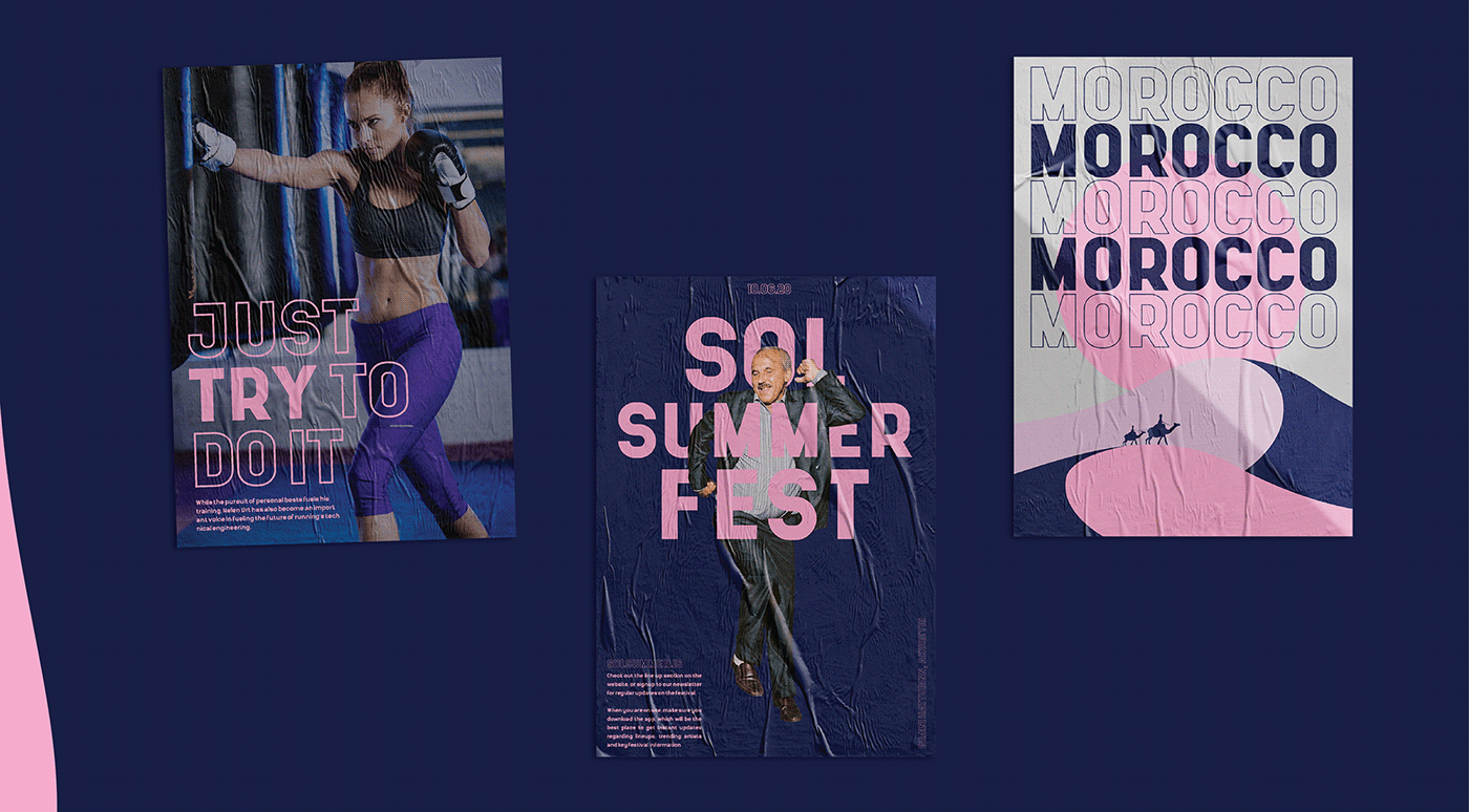
Though you wouldn’t expect it from the name, Shrimp is a modern typeface with a big impact! Shrimp is a display typeface with top heavy characters—with the ‘top section’ of each character filling up to three quarters of the total space. This creates a typeface that will stand out in any design project. Designed by Anton Darri Pálmarsson, you can download it for free off his Behance.
31. Kayak Sans
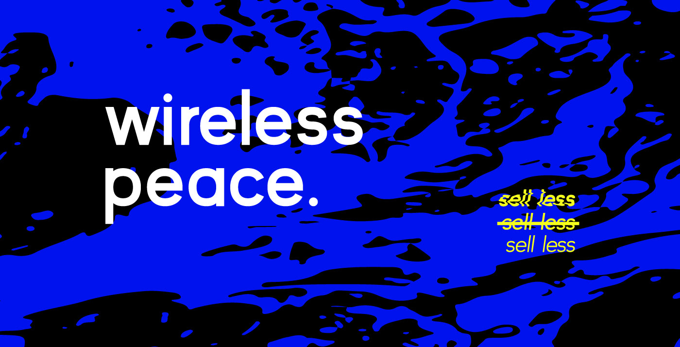
Kayak Sans is a modern, sans serif, grotesque typeface that designer Jack Harvatt says was designed with the intention of not standing out. A quick look and it’s easy to see what Harvatt means. Kayak Sans is a beautiful discrete modern typeface that could seamlessly fit into any design. Available to download for free for personal use only, straight from the designer’s own Behance.
32. VG5000
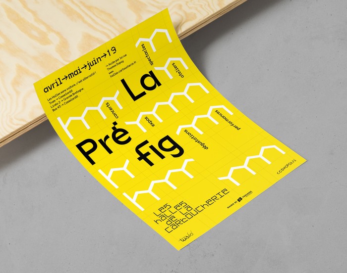
Velvetyne typeface VG5000 showcases an ingenious marriage of both curved and linear elements in its characters creating a unique modern typeface. The tail of the capital Q is even reminiscent of pixels of retro computer games. This, of course, is no mistake. Designer Justin Bihan aimed to create a typeface reminiscent of early digital fonts. The name, VG5000, also recalls historic technology. It is taken directly from a 1984 computer that had a processor which displayed bitmap characters built in a common matrix of 8×10 dot.
33. Kollektif
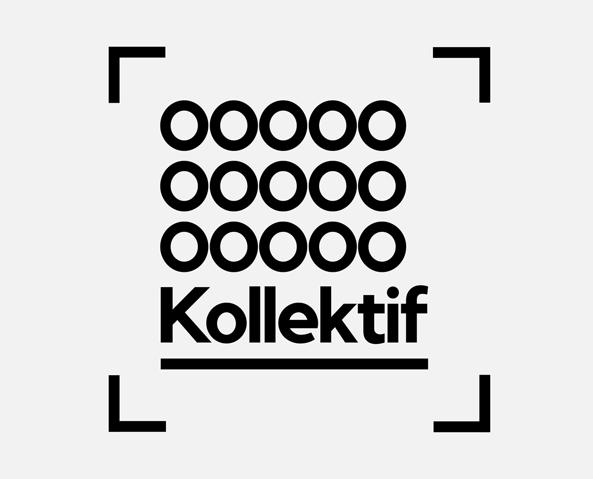
Another modern font that works beautifully as both a display and text typeface, Kollectif was designed by German designer Doğu Kaya. Designed as an alternative to 21th century low-contrast, geometric and clean typefaces, Kollektif is equally at home in both print and digital designs. This all makes it an easy adaptable and easy-to-use typeface that you will come back to again and again.
34. Poppins Medium
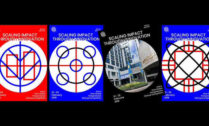
Like Yatra One, Poppins is a modern typeface that supports both the Latin and Devangari alphabets. But unlike Yatra One, Poppins is a simple, sans serif font that works perfectly for body copy. Though don’t let its simplicity fool you, many of the characters in Poppins are much more constructed than you would imagine—check out the ampersand for one example. Poppins is designed by Jonny Pinhorn of the Indian Type Foundry and is a great way to take your designs international.
35. National Park
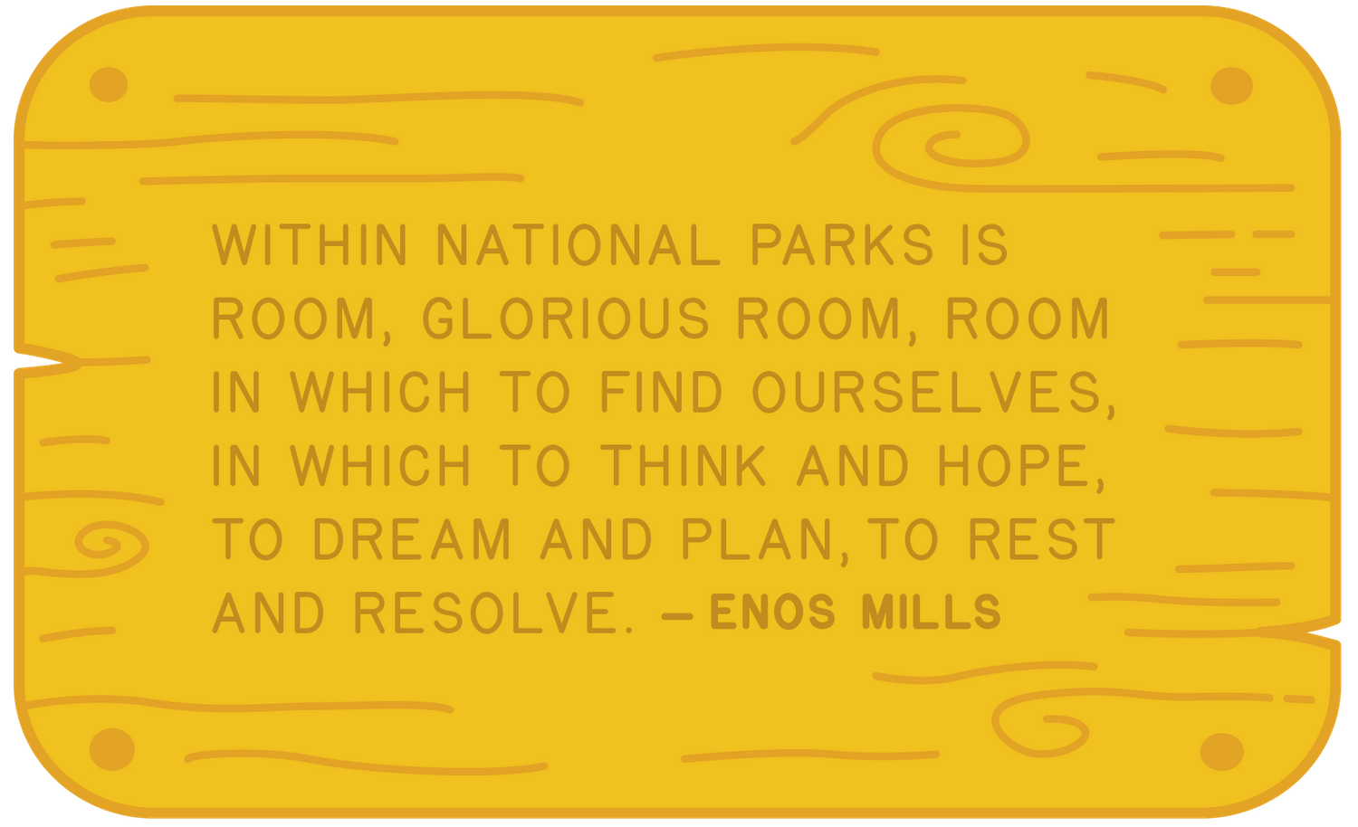
National Park is a modern font with not so modern routes. It is designed to mimic typefaces created with a router bit that can be found on service signs in National Parks throughout the United States. Design Outside (DO) Studio‘s resulting typeface is a sans serif with rounded characters that brings a soft, sophisticated element to a design. As the American National Parks belong to the people, the designers wanted this typeface to be as well so they released it for free for anyone to use.
36. Amagro Bold
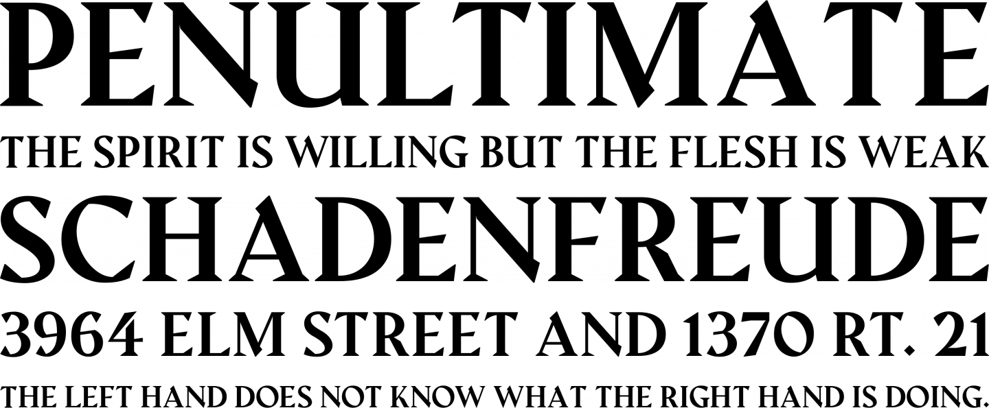
An angled serif font, Amagro Bold is another contemporary typeface that gives slams more traditional serif fonts into the 21st century. It was designed by Turin-based designer Fabio Servolo. With it harsh angles and heavyset serifs, it’s definitely an attention grabber.
37. Faction
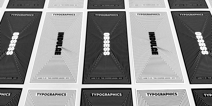

Last but definitely not least is Faction, a hard-hitting display typeface. The modern font doesn’t leave much space for gaps, which are squeezed to the limit as the characters are pushed to their limits. It definitely packs a punch. Designed by Indian typography and designer Shiva Nallaperumal, it is a top notch headline typeface that will definitely complete any design that you use it on.
There we are—37 of the finest modern fonts that money can’t buy. Hopefully this will help sort the wheat from the chaff and you’ll be able to find the perfect modern typeface for your project.
Want to learn more about typography? Maybe even design your own typeface? Become a graphic designer with Shillington in just three months full-time or nine months part-time, Online or on campus in New York, London, Manchester, Sydney, Melbourne and Brisbane.
Want to win some amazing prizes and stay in the loop with all things Shillington? Sign up to our newsletter to automatically go in the draw.
