17 Advertising Design Examples & Why They Work
From the time you wake up in the morning to the time you go to sleep, you will have seen between 4,000-10,000 ads. That’s a lot of ads; probably more than you expected it to be. We’re surrounded by advertisements literally everywhere we go. If you’re still surprised by how high the number is (and some of you are probably thinking about fact-checking us against the range), it’s only because you’ve gotten used to how heavily ad-saturated your life is. When you’re sitting on the subway, driving to work, walking to a friend’s house, or using your cell phone, you’re constantly being exposed to an influx of ads.
But if you see that many ads every day, why are there some you remember and some you don’t? It depends on how strong the messaging is and how relevant it is to you at the time you see it. What makes an ad impactful could depend on who you talk to. Each medium has its own genre-specific elements that influence the end product, but there are some universal elements that can be used by any ad designer, like these five characteristics.
Good ads are relatable
Graphic designers want the brand’s intended audience to feel that the company or product is made for them.
Sometimes that means incorporating people into the ads that more accurately represent the audience. Old Spice used a former American football player to embody masculinity while at the same time challenging the masculine ideology that men shouldn’t care about the way they smell. Dove’s all-inclusive ‘Real Beauty Pledge’ was one of the first marketing campaigns that marketed to women of all shapes and sizes.
Good ads are memorable
Some ads are memorable because they are annoying. Others became so pervasive that they became cultural icons. Others stuck with us because they evoked strong feelings.
A year ago, an ad for Tata Motors made its way around the globe by making us all cry as children banded together to do something nice for their older bus driver. Even for audiences who’d never heard of the company or were unfamiliar with the culture and language of the commercial, it was genuinely moving. While almost nothing was said about the company or its products, viewers heard (and felt) the message loud and clear. Good ad design doesn’t have to beat you over the head with direct messaging, sometimes all it takes is an emotional connection.
Good ads inspire trust
There is one key component of good advertising that every company should abide by: don’t f***ing lie. It sounds obvious, but you’d be surprised at how many brands fabricate lies to make their products sound more interesting. If you have to lie about your products to appeal to your market, you need to rethink your business. Your ads should inspire trust. Your audience doesn’t want to feel as though they are being distracted by a shiny object in order to buy a product or connect with your messaging.
While transparency has become a bit of a buzzword, giving the audience the impression that they are dealing with a messenger whose words can be trusted is paramount. Whether you are crafting a user experience that ensures that users feel fully informed as they progress through the system, or designing an ad for diapers that assures new parents that the materials are safe and sustainably harvested, inspiring trust is key to good advertising design. You don’t want to be the next Elizabeth Holmes.
Good ads are invisible
It happens all the time: you’re in the store or online shopping and you see a product that you don’t remember seeing before, but it looks familiar. You just can’t seem to remember where you’ve heard the name or seen the logo before. So what do you do? Look it up, of course.
This is a classic example of “invisible advertising”, which is a strategy used by a lot of nontraditional ad companies. A person is introduced to a product so subtly that it plants a seed in their memory, but they feel the need to look it up when they come across it again because they can’t connect the dots. As a result, they’ve now learned more about the product than they would have otherwise.
Good ads are valuable
Ads should be easily digestible and understandable.
We can all recall ads that were pretty to look at but left us wondering what was being promoted. Was it a cologne? A bank? A jeweler? In the end, you may have become familiar with the logo or name of the company but had no idea why you should care.
Good advertisement design tells us what is being promoted and why we should care without losing out on the aesthetics of the design. Hopefully, it tells us something we didn’t know before or shows us something from a different perspective.
The principles of good advertising tell us what to say. They help us to craft a strong message. As a graphic designer, you want to use these five principles in conjunction with the five basic principles of good graphic design. These five universal principles teach us how to communicate our message regardless of the medium used to create the advertisement design.
Good advertisement design has alignment
Have you ever looked at a photo and weren’t sure what you were looking at? Sometimes the photo itself is blurry, or, more often than not, it lacks alignment. In this case, there is no unity or order to the photo. You find yourself asking who or what is the subject of the image. Alignment helps to put the images in order. It lets the audience know how they are supposed to interact with the image; in the case of a series of images or clips, for example, it lets the viewer know where to begin and how to follow along. This is key to effective design.
Good advertisement design has repetition
When it comes to advertising design, we think of the repetition of messaging in terms of catchphrases, slogans, or logos, but it goes much deeper than that.
Repetition creates uniformity.
When you are looking at a pictorial by your favorite photographer, you may be able to tell right away that it’s their work because of its repeated, unique elements.
Repetition of certain color schemes, fonts or layouts helps to create a style that is easily associated with the brand so that even when all of the obvious branding is removed, the audience still thinks of the company. A great example of this is to look at the packaging of several different products from the same cosmetic line, like Kylie Cosmetics. Kylie Jenner’s famous pout influenced a lip kit line and all you have to see is the image of the lips with the melting lip color to know it’s her products.
Good advertisement design has contrast
Contrast is the use of two opposing elements to direct the viewer’s attention.
For it to work, it should be bold and obvious. This can be done using colors, shapes, textures, and even timing. This element can be especially important when communicating important concepts like consent. Being able to distinguish one set of information from another can be crucial when delivering your message. A good example of this is an infographic for an emergency plan that you might find posted on a train or bus. The contrast must be bold and reflect the most important information so that the audience can extract the information quickly. In most advertising design, the use of contrast isn’t a matter of life and death, but it is no less important.
Good advertisement design has hierarchy
Hierarchy is a way of organizing the narrative in a way that is easily understandable by the audience. It moves the most important elements to the right place so that they are easily identifiable. Magazine articles are a great example of the effective use of hierarchy. The layout editor is careful to make sure that every element of the page moves the narrative along and makes the important details stick out without overshadowing everything else.
Good advertisement design has balance
Good ad design uses symmetry, tension and negative (or white space) to effectively create structure in the composition. These are the invisible grids or blocks that layout editors use when designing print media. Balance creates order and harmony in the composition.
The use of color, images, fonts, and space are balanced so that the ad looks well constructed and complete.
The history and development of advertising are indelibly entwined with the history of graphic design. Much of what we commonly think of as traditional advertising is the work of great graphic designers and other artists. To this day, a large portion of graphic designers find themselves working in advertising in one form or another. Some agencies hire graphic designers directly, creating an in-house team to handle all of their graphics. Others employ graphic designers to work on one-off, specialized projects.
Regardless of where you fit on the continuum, it’s a good idea to begin looking at advertising design as both an advertiser and a graphic designer. We’ve talked about everything that goes into ad design, so now let’s look at some examples from the masters:
1. Paul Rand’s Jacqueline Cochran Cosmetics Ad
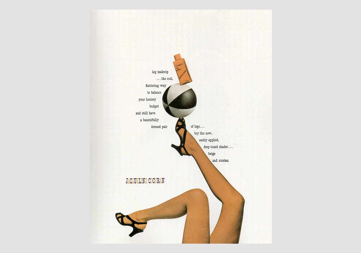
It’s impossible to talk about modern ad design without talking about Paul Rand. This man almost single-handedly revolutionized how we view advertising design and convinced us all that good design is, in fact, good business. His work includes everything from packaging to book covers, and each demonstrates a simple principle that was relatively unheard of at the time: advertisement design should do more than just appeal to the senses, it should also be functional.
Paul Rand saw that words and images should work in conjunction with each other, shifting the focus of the ads away from blocks of illustrated text and creating what we see more frequently today.
2. Mohawk Airline Ad
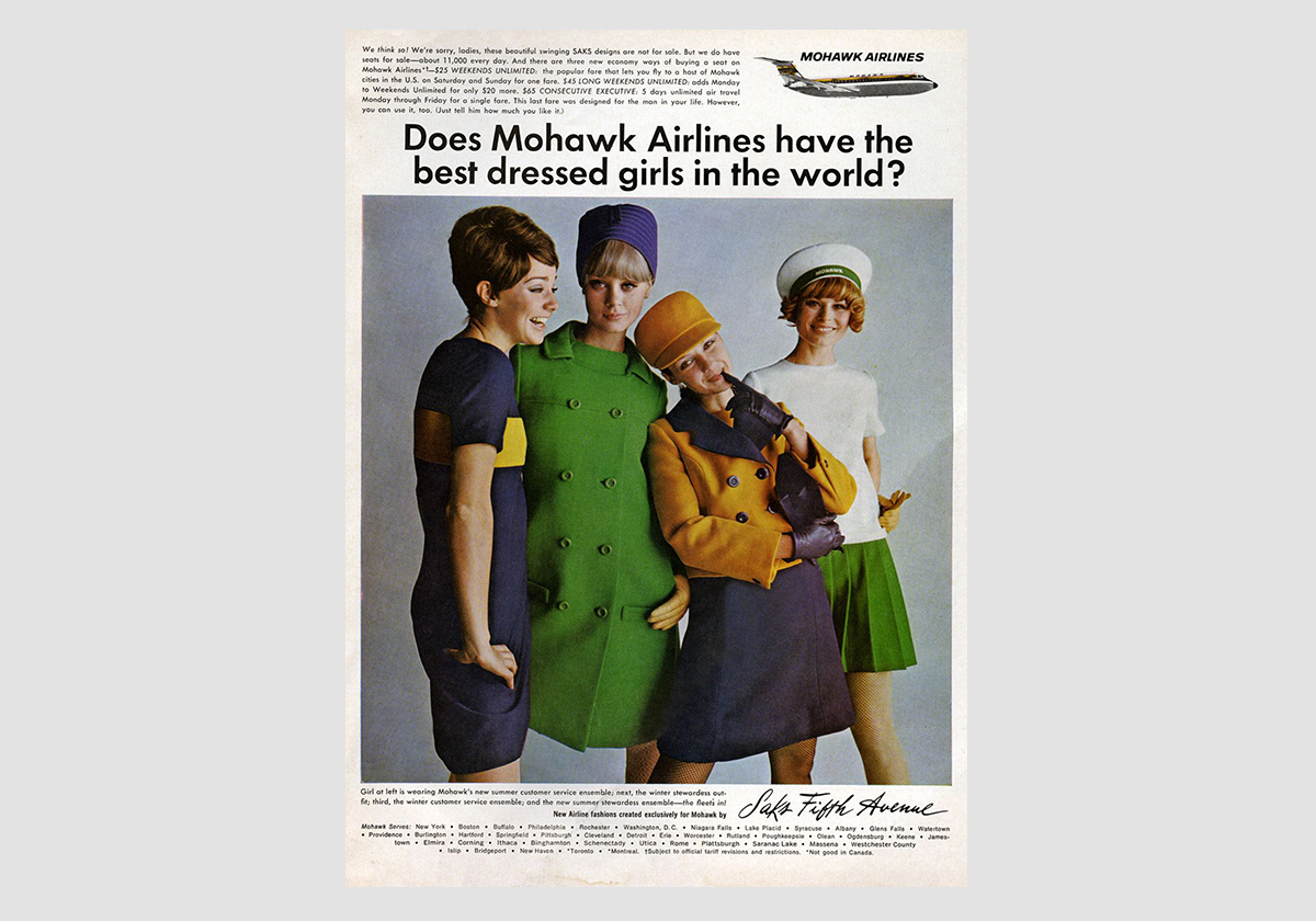
Sex sells. This 1968 Mohawk Airlines ad decided to ride a delicate line between the absurd and the provocative, inviting the audience to take the opportunity to spend some time flying the friendly skies. The use of colors and poses are very on-trend for 1968. The central image is a bit messy but it contrasts well with the neat and ordered composition of the overall ad. Although these types of ads were commonplace in the 60s, the messaging would not be considered appropriate in the modern-day.
3. Billie Razor Ad
Women buy razors to shave their body hair, but razor companies never show pictures of women with body hair in their ads—it’s just assumed. Billie is one of the first companies to show body hair in their ads, and it was well-received.
Billie’s ad came off as not only relatable but the honesty around the hassle of grooming expectations for women made them seem trustworthy. The ad design used women of varying body shapes and skin tones, as well as a variety of fun and flirty images both with and without pubic hair, which drove home the point. Shaving is a choice, and if you choose to do it, they have a product for you. It was a daring move that paid off, proving that it’s sometimes best not to play it safe.
4. Volkswagen Beetle Ad
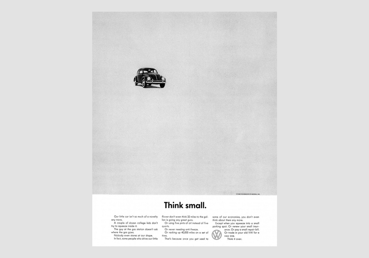
This VW Beetle ad is a great example of using a product’s unique selling point and repetition to make it impactful. At the time when this ad ran, America was coming out of the Second World War and was thoroughly enamored with the large, American made cars coming out of Detroit. This tiny, odd-looking foreign car was going to be a hard seller even under the best circumstances. Add to that the fact that the VW beetle was one of the pet projects of Hitler himself, and it seemed like an impossible dream.
Fast forward just a few years and the Beetle is now a part of American life. Why? This ad made the Beetle’s smallness part of the appeal. It was a stripped-down, affordable and safe vehicle. That’s it. Nothing fancy. The advertising design reflected that idea, using a minimalist approach and lots of white space to attract consumers who were looking for function over style.
5. Hustle Energy Drink Ad
Hustle is a plant-based energy drink that also happens to be sugar-free. In a world where everything is becoming plant-based, including hamburgers, the label is becoming more and more of a gimmick. The trick is to separate yourself from the crowd. Hustle’s ad design didn’t use plant-based or sugar-free labels to sell the product, they focused on the vibe of the company. They wanted to bring positivity and fun to the energy-drink market. After all, who wouldn’t choose an energy drink that tastes great and is also made by an entertaining company?
6. Hinge App Ad
This app wants you to delete it. The Hinge dating app is in the business of making itself obsolete. Its ad campaign features an anthropomorphized version of its logo which is killed in a number of comedic accidents as couples who meet through the app make a meaningful connection. The ad design relies heavily on narrative and comedic timing that make Hinge, the doomed mascot, the focus of the ads.
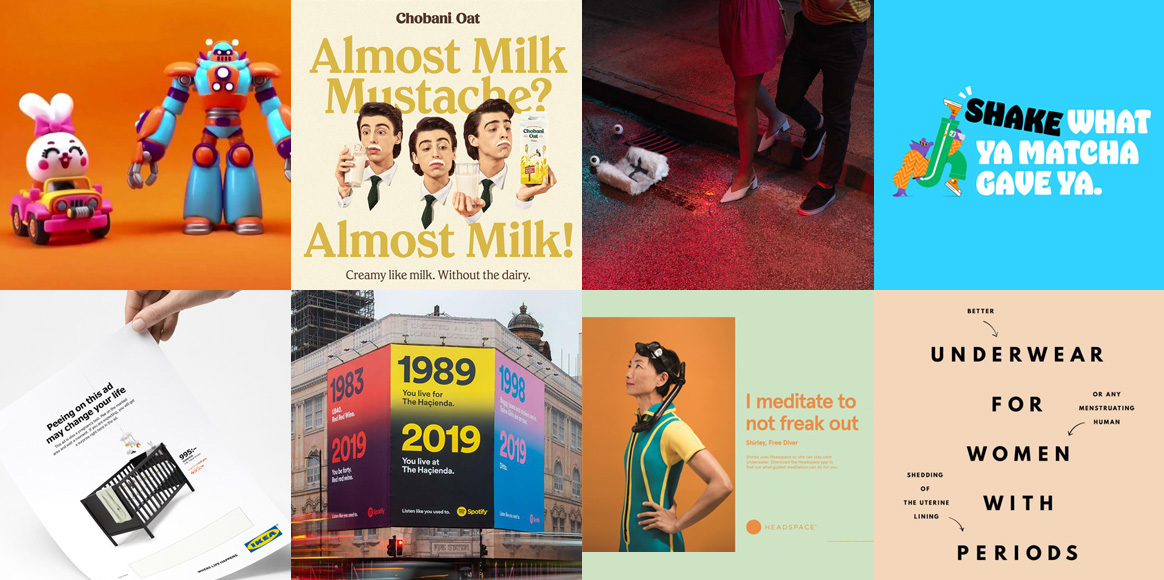
7. Chobani Ad
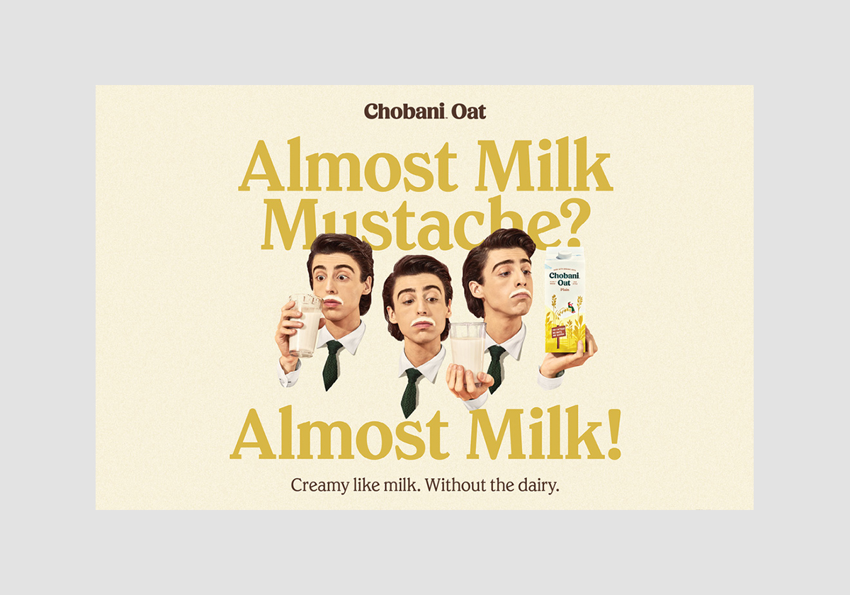
This ad is a throwback in many ways. This advertisement design features classic old school elements, celebrating a classic product (milk) while promoting a very “now” product (oat milk). The ad design uses the imagery of ads seen thirty or forty years ago to appeal to an audience that may not be making the switch voluntarily. The message is clear. Milk is great but if you can’t have it, this is the next best thing. The ad design is clever, paying homage to a classic while promoting what is invariably the wave of the future.
8. Casper Ad
Most companies want to promote their products in the most obvious way possible. While it’s important to avoid talking down to your customers, most ad designs shy away from making them work too hard to figure out what you’re trying to say. Casper decided to take a risk on this minimalist advertisement design. They used brain teasers to draw in the audience and build a positive association between Casper and sleep. The result is a unique advertising design and a memorable campaign.
9. Spotify Ad
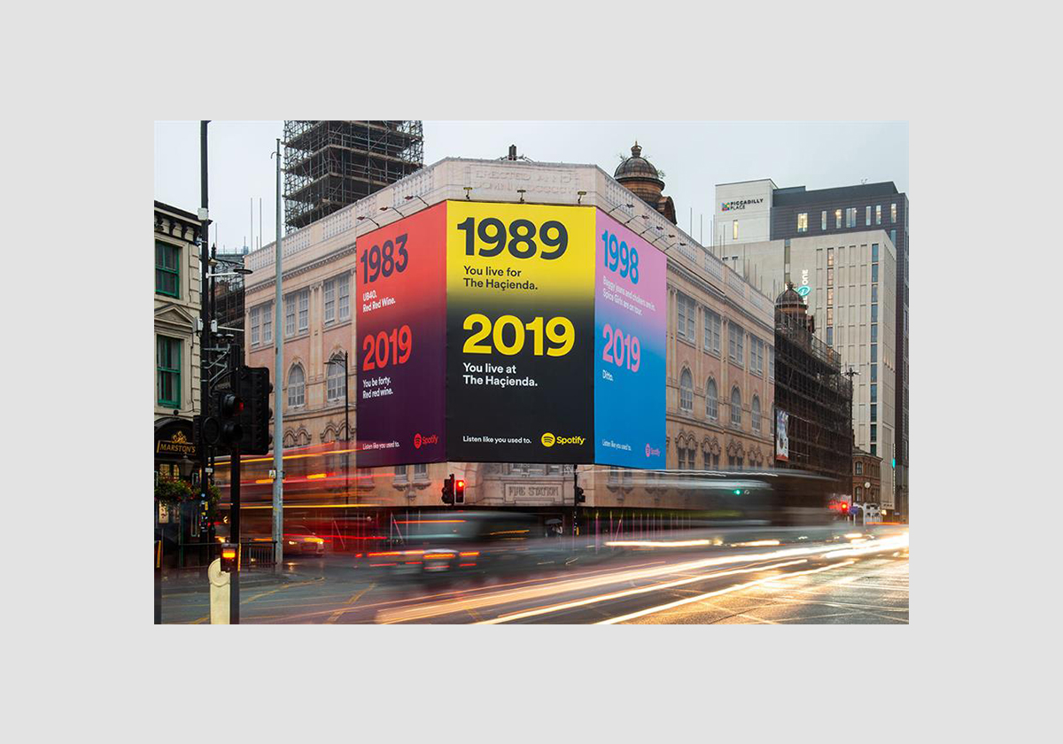
Not all advertising design has to be right on the nose with it’s messaging. Sometimes the trick is to be subtle. Take, for example, this Spotify ad that used lyrics from old songs to appeal to older millennials who grew up before the days of music streaming and may not yet have taken the plunge to signing up for the platform. The message is clear: we are here for you. You can have all of the music you want without being left behind. The ad design feels mature without being dated, even if the references are, and the use of colors gives the ads the energy it needs not to feel like they are pandering.
10. Apple Ad
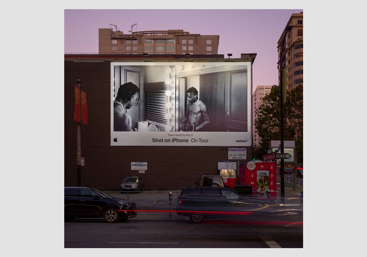
Apple has transcended the corridor of a “lifestyle” brand. It is now the toolbox for every pursuit. Want to create amazing animations? Run a small business? Spend quality time with the kids? Take amazing photos and videos on the fly? Apple has a product that will help you achieve that. This iPhone ad campaign drives home that point. Photographers were asked to take photos of well-known artists’ live-in-concert using the new iPhone. The results were stunning photos that became the center of the advertising design.
11. Thinx Ad
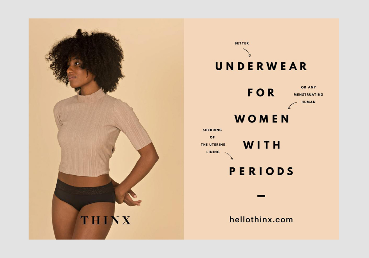
Thinx is a brand that is no stranger to having hard conversations, pushing the envelope with their ad design, or shocking their audience. In this ad campaign, they imagine a world where both halves of the human race experienced monthly periods. The message is that if we all had them we would all be more comfortable with them, physically and emotionally. Thinx offers itself as a step in the right direction, making periods more “comfortable” for women by providing innovative products but also by sparking dialogue.
12. KFC Ad
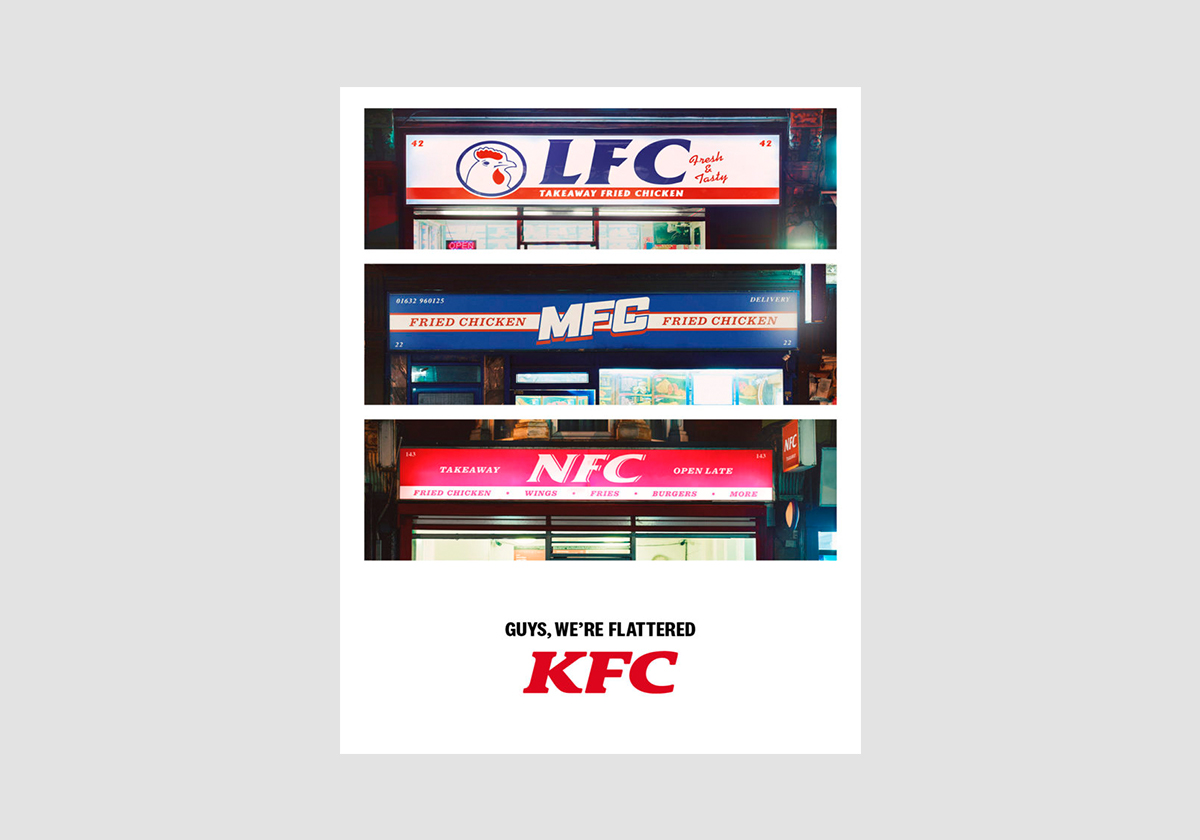
We’ve all seen them. Knock-offs of famous brands in an attempt to secure the same level of profitability they enjoy. Handbags, shoes, everything has the potential to be copied—even food brands like KFC. In their ad campaign, KFC takes aim at the mom-and-pop chicken shops that have become “pretenders” to the throne. The chicken giant has a strong global brand, one that has inspired hundreds of similarly branded chains and shops. The ad design is focused on reminding the viewer who is the real king of fried chicken.
13. Nike Ad
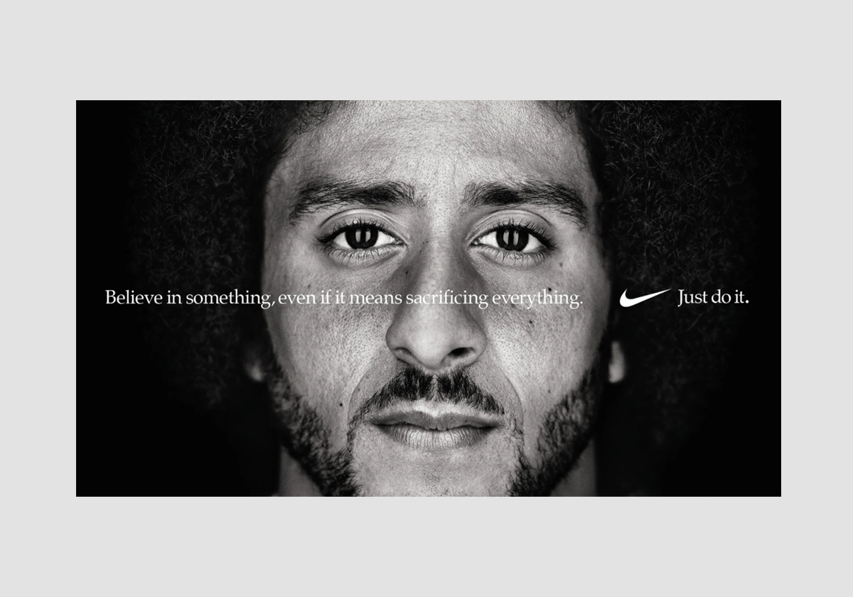
The Nike brand isn’t just about performance or athletics, it’s about inspiration. It not only celebrates athletes but the athlete in all of us. Their recent ad campaign is a great example of a design that doesn’t rely on the direct association of Nike with its featured athletes. It is both memorable and invisible at the same time. It feels like a pep talk from your coach just before you hit the field. The cutting-edge advertising design is very typical of Nike campaigns, who have nailed their one-of-a-kind approach.
14. Burger King Ad
How can clever ad design help to ease the tradition of long-standing company policy? The “Melt Down” ad campaign from Burger King answered this question, by convincing kids not to implode when the company stopped offering small plastic toys with the children’s meals. The campaign was a success, but the clever advertising design made the act of doing away with the small plastic toys an exciting event in itself.
15. Cadbury Ad
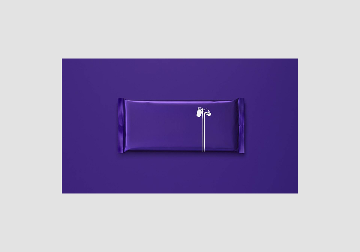
The Cadbury brand is strong all over the world. The UK’s number one chocolate bar needs no introduction to its UK audience; when they took the words off of the packages, leaving them bare in their traditional purple foil wrappings, it was clear the company was making a statement. This advertising design relied heavily on the audience’s familiarity with the product and the brand. This move was made as part of a larger move to support Age UK and encourage people to spend time with older folks, proving that good advertising design can spark conversations of all kinds.
16. IKEA Ad
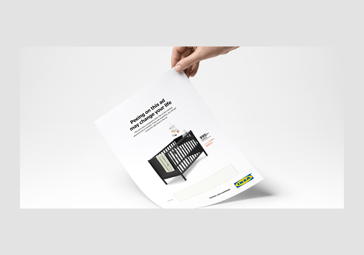
Audience participation is not typical for advertising design, yet IKEA decided to take it to the extreme with an ad that you literally had to pee on. In 2018, the home furnishings giant decided to run an ad that acted as a pregnancy test. If you were pregnant, you got a discount on a crib. If not, well, better luck next time. The ad itself was well-designed in the minimalist style that we have come to expect from IKEA, but the added bonus was both genius and highly memorable.
17. Headspace Ad
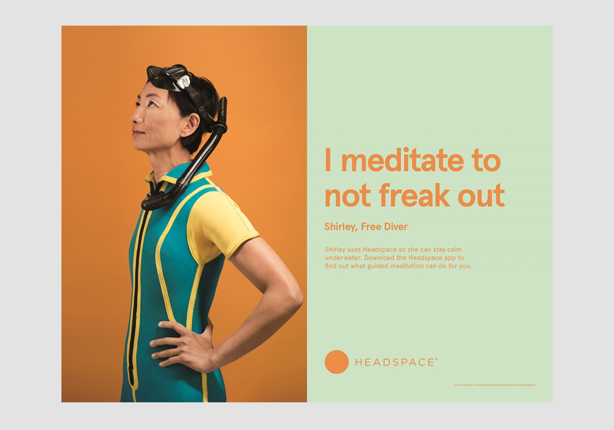
Meditation isn’t (always) about doing nothing. That’s the message that Headspace wants you to get with its new ad campaign. The advertising design features active, healthy people from all walks of life, explaining how meditation helps them do what they do a little bit better. The choice of colors, athletes and quotes are inspiring and the compositions are balanced, which makes them visually appealing. Even though you already know this message well enough by now, Headspace wants to continue to empower you to actually act on it.
Understanding what works and why is key to great advertisement design and great design career. Are you a creative interested in learning more about advertising design? Take a look at our graphic design course and become a graphic designer in 3 months full-time or 9 months part-time in New York, London, Manchester, Sydney, Brisbane or Melbourne.
Posts you might like

One of the best things about graphic design is that it never stands still for a moment. But that does mean that keeping up with...

The best graphic design books can take you on an exciting journey of the imagination, transport you to new creative worlds or...

At Shillington, our dedicated graphic design students are taught all about how to design for packaging—from FMCG (that’s fast...

At Shillington, our graphic design course teaches students how to design campaigns for a brand, helping to spread its message....
Exposing yourself to examples of good graphic design is a healthy practice no matter who you are. Maybe you’re a student...
At Shillington, our graphic design bootcamp students are taught how to design for digital, incorporating aspects of both UI and...
We love graphic design. And we're guessing, as you're here, you love graphic design too. This means that we all love graphic...

Graphic design is an ever expanding creative discipline. With our graphic design course, we teach you how to make research a...
Want to win some amazing prizes and stay in the loop with all things Shillington? Sign up to our newsletter to automatically go in the draw.